First lets rewind to this post where I said “As for if the bed can move, the floor plan of this room is a definite challenge thanks to “things” on each wall (two very off-centered windows, a nook across from the door, and a nook with the sink tucked into it on another wall – and a chandelier in the exact center that looks off if the bed isn’t in the right place). So we’ve tried the bed in a bunch of spots, but the place that works best for us is where it lives now (it’s the only long flat wall in our entire room).”
Well, after seeing a few inspiring glossy mag photos, we decided it might not be the weirdest thing in the world for the bed to be right next to a window. See, moving the bed would do one major thing for us: allow us to ditch our sadly-too-small-for-our-giant-room side tables (which we couldn’t do on the old wall where they lived, since the door would swing open and hit anything larger).
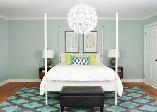
So although we weren’t 100% sure how we’d handle the odd nook to the right of the bed and the window that would nearly touch the bed on the left, we just decided to go for it and see what we could come up with. But before we moved anything, we got new curtains from Ikea for $5 a pop (Vivan panels, which are our favorites from our first house). They come two per pack for $9.99, and aren’t super heavy or super sheer, just sort of breezy and light – which we thought this room could use since it has a big dark rug on the floor (and we’d eventually love to stain the wood floors a dark mocha color).
They definitely layer right in and add some softness (we hope to reuse the old green curtains I made in the playroom). Didn’t hem the new guys yet though- but I probably will someday. Haha.
Then it was time to move stuff around. First we removed our insanely heavy organic mattress (which can best be described as the equivalent of lifting 50 dead bodies, not that we’d know…) and then we slowly inched the bed over to its new spot across from the doorway (so you can walk at least ten steps into the room instead of three before slamming into the side of it, which happened in its old position by the door).
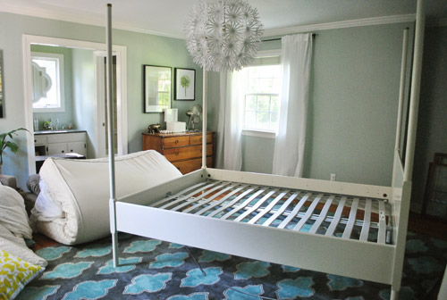
Next we shimmied the rug into position under the bed in its new spot before nearly blowing a gasket moving the mattress back onto the bed in its new spot. It still looked really really weird.
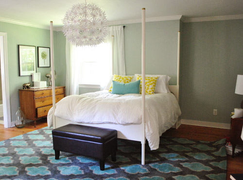
I was excited to start moving some other furniture around, but John had to duck outside to work on some deck stuff and Clara was napping so you know what I did, right? That’s right, my 5’2″ self got it done on my own. Haha. I hauled our dresser into the nook to act as a much larger bedside table and then stared at the blank space under the window on the other side of the wall for a nice long time while I caught my breath. It wasn’t functional to give up a night table and we definitely appreciate the balance of having two bedside lamps (especially along a wall with an off-centered window and an odd corner nook without any sort of symmetry going for it at all).
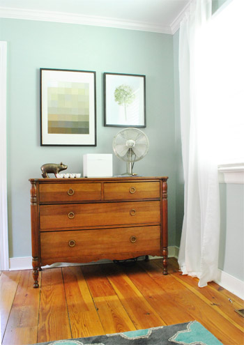
So I literally walked around the house (avoiding the nursery so as not to wake the dragon Clara) to see if there was something we already owned that I could bring in to use as my bedside table under the window. Sure enough, my eyes rested on this guy who has been hanging out in the dining room:
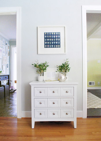
The funny thing is that this cabinet is actually meant to be a bedside table, so here I was thinking I was being a rebel to stick it in the dining room, only to drag it into the bedroom and realize that I loved it under the window. Don’t get me wrong, I loved it in the dining room too, so for one of those places we’ll have to grab something else (it might just be a placeholder in the bedroom and we’ll get another table and return it to the dining room eventually – or vice versa). Update: Folks are asking if the chandelier is still centered over the bed, since it’s hard to tell from this angle. Thankfully it’s still perfectly centered! If the nook were a foot wider this arrangement wouldn’t have worked – and if we had a king-sized bed instead of a queen it would have been no dice! Whew.
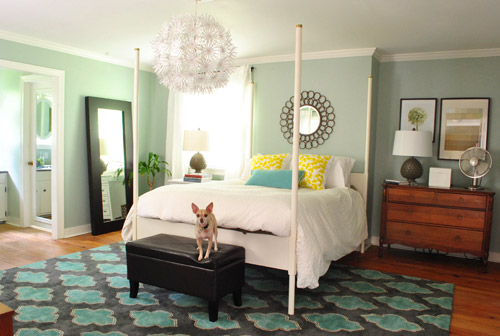
Then I hung the art that used to hang above the dresser in the nook, and put up an old oil-rubbed bronze mirror over the bed – which used to hang in our living room, but was replaced with a white mirror about six months ago. It added a little more “something” to the big blank wall above the bed, but we’re thinking that down the road we’d love to make a big upholstered headboard for that area and maybe move the mirror up so it’s closer to the height of the big round chandelier in the middle of the room since we think height in the center of that wall might be really nice and will further disguise the fact that our bed is jammed between an awkward nook and an oddly off-centered window.
Here’s Burger stretching. That is the only reason I took this shot. Cracks me up. I actually really liked the smaller white table on one side with a larger wood dresser on the other side since they both seemed to fit into those spaces well and the matching artichoke lamps added some nice balance. Ideally the white night table would be a bit taller so both lamps would be at the same height, but for now I just grabbed a stack of books to add some height to that light on my side of the bed. Maybe down the line we’ll add castors or little legs to give it a bit more lift, but for now it does the trick.
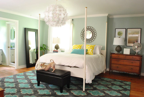
Moving that art into the nook to sort of balance the window on the other side of the bed seemed to make an instant difference since that nook no longer looked like a big blank wall, and the two frames felt rectangular and balanced with the window on the other side of the bed (admittedly more so in person since the window is blown out in this pic, but is very easy to see in real life).
I also mentioned that I dragged the leaning mirror from across the room to where the wood dresser used to be, which seemed to add even more balance to the new setup since it was a nice shot of dark wood next to the white nightstand to tie into the wood dresser on the other side of the bed. We had that guy anchored on the wall so Clara can’t pull it down on herself, but thankfully the system just uses cable ties, so we were able to reuse the same system with two new zip ties in its new spot (you can see how the whole anchoring thing works here).
Here’s another view of things. Of course those two botanical frames look crazy on the wall with no bed under them, so we’re planning to rehang them in the corner of the room that’s on the other side of the sink nook (not pictured, but there’s a chair and a side table over there). And then anything from a cabinet or console to a large piece of art could end up on that wall someday. But this view definitely looks extra weird since it’s so unfinished on that back wall.
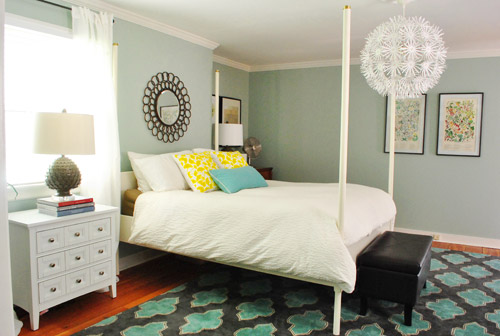
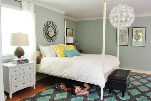
At this point we were tired but hopeful. It still looks kind of crazy to us, but not bad for about an hour of work. And we definitely have bigger plans to help it make more sense over time, so we’ll keep you posted. In the meantime, here’s Exhibit A that we’re dorks for life. Yes, we had the tripod all set up so we took a moment to pretend to be angry monsters under the bed. Although looking back John just looks like a mischievous kid and I look like a sullen teenage vampire.
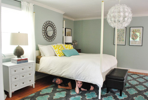
Then we pretended to sleep. Totally normal, right?
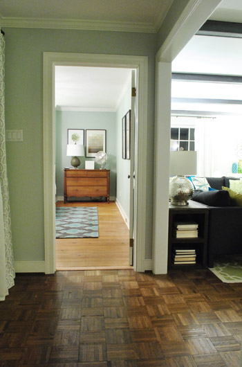
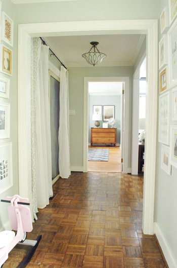
Then we thought we were done taking pictures, but later that night we found ourselves standing in the hallway – just marveling at the new view.
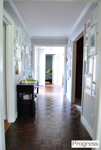
We couldn’t find a recent pic of the old view into the bedroom, but this is one from over a year ago, just to give you an idea of how the side of the bed was sort of the only thing you’d see before:
Now instead of seeing the bed, there’s just a straight shot into the room with the dresser in the nook. It’s actually really nice not to see the bed from the hall anymore, and the nook looks a lot less weird and bare when there’s actually something in it.
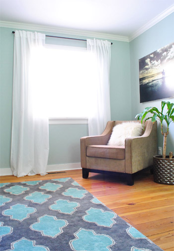
So that’s where we landed after a few hours of bedroom noodling. Although I must admit that we did something a little more DIY-heavy after this little furniture-move-a-palooza, so we’ll share those details this afternoon (just have to upload the pics and write the post). In short: we’re getting somewhere, but we’re definitely not completely there yet (but what else is new around here, haha). More soon!

Angela Edwards says
Love the new look! Have you thought about a mirror above the dresser? It would balance out the window and would look great looking down the hallway. I really like the room this way!
YoungHouseLove says
Always another possibility down the road! Just using what we have for this phase of things!
xo,
s
Kat says
Oh my gosh! Huge difference! This re-arrangement totally works. The view from your hallway makes it seem like your house goes on forever. I think the bedroom set up makes more sense this way! Awesome!
Chaucea says
*SQUEEEE!!*
I LOVE the changes!! Love it. Love it. Love it!
The whole balance and dynamic of the room has changed dramatically.
Fantastic! :-D
Elieth says
I LOVE THE NEW LOOK! It somehow makes the room look cozier without being cluttered..loved it!
Naomi says
Looks wonderful :)
-Naomi {Starry Eyes + Coffee Cups}
Lizzy says
I love it! It makes your room seem bigger somehow. You have that whole wall to put in extra storage or just a place to put more white animals. :o)
Emma says
Not that you needed it, but you have my approval ;) I really like the changes. I think most of us have a weird bedroom to deal with. Last year we moved our queen bed/side tables in front of our huge windows overlooking the lake. I felt so bad to “block” such a beautiful view BUT the only other place the bed could go, we had no view from the bed, and now when we walk into our room, it is like our bed is framed with view. Sometimes you just have to be a little crazy!
Ash says
Do you miss waking up and seeing your chandelier reflected in the quatrefoil mirror over your sink? Or was that a sacrifice you were happy to make for overall improvement? That was one of my favorite things about the old set-up, but this layout is pretty darn fab!!!
YoungHouseLove says
I thought I’d miss that, but we hope to add a french door that leads out to our future deck across from the bed, so waking up to that would be cool we think!
xo,
s
how2home says
I love rearranging our furniture in our room, it gives it such a fresh and different look. I think you guys did a fantastic job in your master bedroom. So if I didnt mistaken, you used $5 for the curtain rod as the bed post correct? You’re a genius!
YoungHouseLove says
I don’t think that was us. Ed came with those posts (from Ikea), so we didn’t use curtain rods as those posts. Hope it helps!
xo,
s
Ted says
I think what how2home may be remembering is that you got inexpensive finials for the tops of the posts.
YoungHouseLove says
Oh yes, that could be it! We switched those out for ribbon a while back!
xo,
s
Karen says
Love this! It would also be beautiful if you do end up adding french doors to the deck off of your bedroom. They would add a nice balance to the other side of the room!
YoungHouseLove says
Oh yes, we’d love to do that down the line!
xo,
s
Sara says
BEST MOVE YET!!!!!!!!!!!!!!!!!!!!! I absolutely LOOOOOOVE this room now. Layering feels so right. Non matchy-matchy bedside tables. The lift you gave to the lamp by putting books under it is sooo perfect. New drapes (they’re in our house now and will be all over our new house, thanks to you telling us about them!). LOVE EVERYTHING!
Nikki says
That looks ten times better! Before, the photos of your bed against that wall looked so bare. This is definately more cozy looking. =)
Callie says
I really really like the asymmetry of the new arrangement! It makes your room look bigger and more luxurious. Way to go out on a limb! And ooh the idea of casters on that little white table…that would be so cool! Haha and you guys are hilarious. Sherry way to channel teen vampire angst in that one photo, hehe!
reva says
You are so funny with your naughty sounding headlines! This looks awesome. It’s interesting how designing within the parameters of a problem wall brought about a cozier, more layered and interesting feeling.
Brooke says
Nice! Much cozier. You guys have a way of improving things when I didn’t even think they needed improving to begin with!
Since you asked (kidding), I’d build bookshelves into your nook and then place furniture in front of the bookshelves. I always think that looks cool or sophisticated or something. Can’t wait to see it evolve. :)
Alison says
Totally off topic (and maybe I’m behind on this) but, YOUR BOOK HAS A COVER!!!! It’s in my Amazon cart and it now has a cover! It’s so exciting and adorable!!! I LOVE IT!
YoungHouseLove says
Ahhhhhh! I know, isn’t that exciting?! We can’t believe it! It’s not the final one (that should go up in the next month or so) since we’re still revising little things, but it’s so EXCITING!!!
xo,
s
Ofelia, México City says
Very nice, I like to see the dreesser instead Ed the bed, pretty much. Did the dresser get a name? I don’t remember. I change the position of my bed one year ago by myself too. A lot of work.
YoungHouseLove says
Haha, I think the dresser needs a name! It’s a hand me down from John’s parents, Tom and Kathy. So maybe we should call it Tathy. Haha.
xo,
s
Ted says
How about Roman (the Roamin’ dresser)?
YoungHouseLove says
Haha, I like it!
xo,
s
elspeth says
Feng shui says to never put the bed in front of the door like that. The chi will go right over the pillows.
Aly Wags says
I love it! The room looks fab like this! What a great $0 re-do.
Barbara says
Sherry,
I love, love, love the new arrangement!! It just looks so much more cozy and warm than before! The bonus view from the hallway is just great!
YoungHouseLove says
Aw, thanks Barbara!
xo,
s
Jordan says
Would you consider painting the dresser white?
YoungHouseLove says
Oh yes, we’re open to that or staining it dark- will have to see where we end up! Once the floor is refinished in a dark tone it might help us make the call!
xo,
s
Emily says
I love it! And while I pretty much love everything you guys do, the bedroom was the one space that I never embraced. Great work!
YoungHouseLove says
Thanks Emily! We have both been saying for a while that it was totally off for us too- so glad it was a free change to get it back on track!
xo,
s
gina says
Love it! as always, everything ya’ll touch turns to gold!!
am I seeing that sexy John doing some thumb sucking over there? LOL
I love your family! and Burger too! <3
YoungHouseLove says
Haha- he was imitating Clara for that shot.
xo,
s
Sarah says
love love LOVE the new arrangement. It looks great! I just did a recent bedroom rearrangment that is kind of similar- moving the bed from right by the door to more of a walk-in-on-the-bed arrangement. I found that it made my room feel way bigger and felt much more like a bedROOM then a BEDroom… (if that makes any sense?)
Nora says
I like the new arrangement. But the Ikea bed and light fixture have got to go.
Alex says
hey, unrelated question – do you guys still have a discount code for joss and main??
YoungHouseLove says
So sorry, we don’t. If we have them they show up in the discount button on the sidebar. Hope it helps!
xo,
s
Joanna A. says
My husband and I have lived in two places together and it is almost a requirement to have our bed by a window. We love the fresh air and light. Your room looks great!!
Kim says
I actually like it a lot better that way! The wall behind the bed/the space around it looked a bit lonely before, thanks to being a work in progress. This arrangements looks much more finished.
KathyG says
That looks AWE-SOME!
Diana says
Love the new bedroom arrangement. It has a very warm look to it, and besides I think it has good feng shui.
Barb says
Brilliant…looks marvelous.
My two favorite things in that room now are the white nightstand. Love it no matter where you put it!! Also, I love that wooden dresser and how nice to see it as you look down the hallway.
You nailed it Sherry!
B.
Diane says
You’re lucky that Burger is such a calm guy. I had a friend whose dog would “mark” in the house whenever she did any kind of major furniture rearranging, apparently under the notion that this constituted creating an entirely new territory that needed to be claimed. Nightmare canine!
YoungHouseLove says
Oh no, that sounds terrible! I think Burger honestly thinks this stuff is normal. Clara too! She wakes up from a nap and looks for what’s different! Haha.
xo,
s
Laurel says
MUCH better. Better feng shui too ; )
H. says
I know the arrangement is still in-progress, but I think the new set-up makes the room look cozier.
Meredith says
I’m such a sneak. I clicked on your “house tour” and saw the changes to the bed. I assume that’s your afternoon post:)
YoungHouseLove says
Haha, you busted me!
xo,
s
Ashley @ sunnysideshlee.com says
Cool! Looks good guys!
Bibiana says
good job. makes a lot more sense this way.
Keisha says
LOVE the new arrangement! My first thoughts for the big blank wall is maybe a big photo arrangement of vacations or various artwork. Or maybe some shelving? I’ll be watching because we have the same kind of wall in our Master. We are redoing our Master with a beachy theme. Found an awesome solid wood headboard at Goodwill and painted it white and found two matching dark stained nightstands on craigslist. Trying to decide if I want to paint the nightstands white to match the headboard or leave them stained. Decisions…decisions… :)
Katie says
I love the new arrangement! The view from the hallway is great, and the space looks so much fuller. Best part: it’s free! It has me thinking about rearranging…
Amy says
Looks great guys! Thanks for the giggle… The shot of you sleeping under the bed is too funny! Can’t wait to see what else you were working on!
amybeth says
I LOVE IT.
Hannah says
Love it! Very charming.
Katherine says
LOVE. IT.
I cannot believe how much more like a proper bedroom this looks…
Can you do me a favor and promise to never paint that beautiful dresser? The current finish is so gorgeous, and it really works with the room; gives it a great eclectic feel and it isn’t too matchy matchy with everything else. So antique looking.
If you want to paint it, find another dresser instead and give me that one!!
YoungHouseLove says
Haha, I can promise you that we’ll think long and hard and won’t rush into anything!
xo,
s
Carley says
Nice change! I like how the room looks larger and more open! When we moved into our house two years ago, we couldn’t wrap our heads around our master bedroom. The room is nice and big, but we have a whole wall of huge closet, a wall of windows, one empty wall, and the door to our master bath, entry door on the fourth wall. I literally had to walk away from it, and my mom came up with the perfect layout. talk about brain dead! Two years later, and we’re still loving the set up!
YoungHouseLove says
Isn’t it funny how you can stare at a room for so long and just can’t “see” the solution, no matter how much you stare? I really think shimmying things around in person and just playing around is one of the only ways to get past that sometimes!
xo,
s
Lori says
Love the new bedroom! I think it looks fantastic!
Amber says
I really like the new arrangement. Our master bedrooms are similar with the sink being kinda apart of the room. Your rearranging makes me want to try working on my bedroom. What do you recommend with almost floor to ceiling windows? Is putting a nightstand/dresser in front of the window going to look ok or just weird? Thanks!
YoungHouseLove says
I think it can look really nice! We like putting sofas and beds in front of a window- it can look like a nice big headboard!
xo,
s
Gil says
So funny! Here was your reply in May when someone suggested you place the mirror exactly where you ended up placing it.
I just don’t want to wake up and see my sleepy face staring back at me (scary! Haha).
xo,
s
I do this sometimes when my best friend suggested that I remove doors to some of my kitchen cabinets. My first response was are you crazy? Then four months later I did that very thing. What’s that about??? :-)
YoungHouseLove says
Haha, oh yes, thankfully with the bed moved I make a point to sleep facing in towards John no so I won’t scare myself! Haha. I wake up to a Burger face most days!
xo,
s
jeannette says
isn’t it better feng shui to sleep facing the door? let us know if y’all sleep better, from a geomancy pt of view.
YoungHouseLove says
I have been sleeping well the last few nights but pretty much always sleep like a rock since we fall into bed around 1 or 2 in the morning!
xo,
s
Susan says
That looks so much better it’s scary!! So glad you listened to your fans and at least gave it a try.
I have a big bedroom that has never quite hit the nail on the head but my bed is so heavy that I don’t want to bother moving it.
You just inspired me to at least give it a try!!
sally G says
I like the new arrangement… much more character. A little imperfect balance looks fantastic in the space. That rug is still amazing.