This art wall makes us so happy – and we didn’t overthink it (to the point of what-should-we-frame paralysis – which can happen if we’re not careful). Although we did talk about a few other options and eliminate them based on certain factors, such as:
- one giant piece of art on each side of the window = too symmetrical for our taste, and too repetitive with the big rectangular window in the middle (so it would look like three big boxes)
- open shelving = too much shelving since there are two walls of it thanks to the dining room built-ins (it would be shelving with more shelving beyond it)
- mirrors = too much, since we already have a large framed mirror hanging over the file cabinet on the opposite office wall
So we decided to use frames that we already had in a balanced-but-not-completely-symmetrical arrangement. And as is the usual agenda, we tried to go with things that have meaning, feel personal, and make us smile. Are they perfect? Nah. But perfect is overrated. They just make us happy like our chipper green office chairs. So in a way, the fact that it’s not perfect is kind of perfect for us.
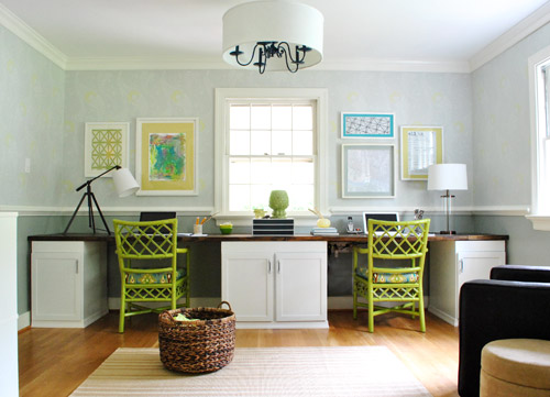
We liked that we had a “John’s side” (the right) and a “Sherry’s side” (the left) so since John loves maps, typography/handwriting, travel, and high-contrast geometric shapes, he ended up with this little medley:
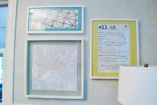
Not only does it represent a bunch of things he loves (type, maps, travel, geometric shapes, etc), it’s also personal because:
- the map is a typographic map of Richmond by a local artist (it’s actually made up entirely of words, more on that here) – I just painted the Ikea mat with the same gray paint that we used under the chair rail to help it pop
- the handwritten/typed item on the far right is a blown up copy of a tiny comment card from a meal that we shared in Alaska during our Honeymoon (we wrote things that we ate and what we saw on the comment card and kept it as a souvenir to remember that day)
On my side I knew I wanted Clara to paint me something (everything she makes is my favorite thing ever, what can I say?) and I liked the idea of framing a textile that I loved (some fabric leftover from Clara’s weekly project, which I also used a few years ago to reupholster a bench that now sits in her nursery).
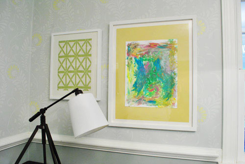
It doesn’t hurt that the lattice shape of the fabric ties in with the lattice detail on the chairs… and also seems to relate to the high-contrast geometric print on John’s side. Gotta love happy accidents like that. To us that just screams: meant to be.

As for how we approached the whole office art thing, here’s the order of this whole project (although we’ve done this multiple ways so there’s definitely not one “right” formula):
- Went through our existing frames to see what we had to possibly work with (and found the five that we used for a grand total of $0 spent)
- Laid the frames out on the floor in groups until we hit on a balanced but not symmetrical arrangement that we liked
- Hung the frames without anything in them, just to get a sense of how they’d look on the wall instead of the floor
- Began the art hunt (we figured we could trim/blow things up to work with the frames we had – although sometimes art comes before frames for us – it varies)
- Pulled our typographic Richmond map out of the playroom since we knew it was one of the things we wanted to hang (and painted the mat for that frame with leftover wall paint from under the chair rail)
- Went through our “memory box” full of movie stubs and love notes (it’s just a shoebox-sized container full of keepsakes), which is where we found the comment card from our honeymoon (which we blew up 420% at a copy shop to fit the frame)
- Dug up some sentimental fabric that I loved (which was also used here and here)
- Found a high-contrast print in my little file o’ art from years past that worked nicely on John’s side (it balanced out the handwritten comment card and the detailed type-map)
- Stripped Clara down to a diaper with some water-based Crayola paint and had her go to town on a large sheet of paper that would fit the frame I wanted to use with it
- Ran to Michael’s to grab some large colorful sheets of paper to create “mats” for some of the art (to better fill the frames and tie in some happy color since the office is our cheerful little bubble of unicorns, rainbows, and puppy dogs)
It definitely feels mixed & matched yet balanced enough for us – and it’s bold & happy without giving us a headache. We like that the color palette is diverse (Clara’s painting is full of color and there’s a black & white print, so it’s pretty varied). Even with all those colors/styles, the dominant tones (like teal and grellow) relate to the chairs and the dining room curtains – and the white frames help unify things. We definitely plan to play around with room accessories in other colors though (some pops of orange or coral on the desk might be fun) so we’ll have to see where things go…
Oh and here’s the view from the dining room. I love that the office is so light-washed and the dining room built-ins are so dark. It really helps keep the spaces from blending into one big rectangle-fest. Oh and I’m on the hunt for a new runner that’s not so matchy (plum could be fun – or even textured burlap).
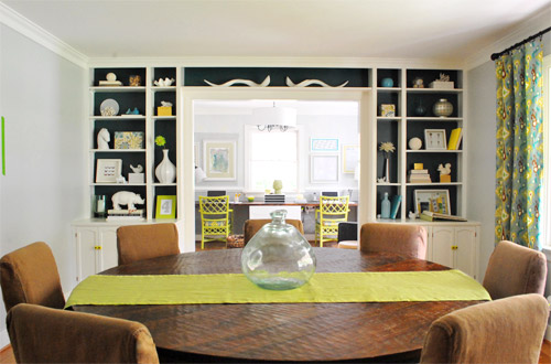
As for how much this entire update cost us, since we already owned all the frames we just spent around $9 at Michael’s on the large colored paper “mats” and $4 at the copy shop (FedEx Office) blowing things up. So that’s a total of 13 bucks for five pretty big pieces that we get to stare at whenever we’re not gazing at our laptop screens.
We still have other office things on the agenda, like: getting a permanent rug (most likely longer, not as wide, and darker), adding more permanent art to the other side of the room…
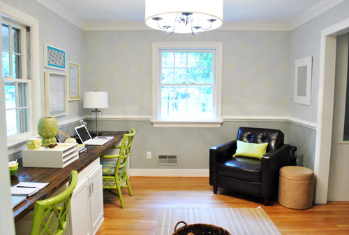
… hanging some window treatments (probably homemade roman shades), and adding a proper lamp and side table for the leather chair corner, etc. But for now we’re just grateful to have something on those have-been-blank-for-the-last-ten-months walls. Can’t believe we have stared at blank walls for almost a year. The shame! Especially since the frames were just sitting around in our playroom and it was only $13 to fill them with some happy-go-lucky stuff.
But enough about us. Have you guys ever blown things up at a copy shop like a comment card from a memorable meal? How about stripping down your toddler and “commissioning” some custom art? I thought I was going to be really Type A about colors and design but I just gave her every color of the rainbow and watched her go to town. My little artist…
Psst- Here’s another post about a ton of sentimental things we’ve framed around the house.

Sally @ Exploits of a Military Mama says
Love the idea of framing sentimental notes and such. We have a huge box filled with love letters from the time my husband was deployed last year. I think I’ll sort through them and find the ones that won’t make people want to throw up to consider framing them for our “someday” office.
BTW, your office is turning out absolutely beautifully.
YoungHouseLove says
Thanks so much Sally!
xo,
s
Lacy @ downMODERNhome.com says
Such a sweet project. I love the use of personal momentos- great for so many reasons (lime making a house a true home and sticking to a budget)!
Veronika says
I LOVE it! So perfect! you know perfect in the imperfect-but-so-right kinda way just like you said! I mean that’s what I love about this ol’ blog! We can get all the “perfect” we need from catalogs right? And I don’t want my home to look like a catalog! It gives me courage to do stuff like this too! I mean anything can be art if you love it enough!
love, love !!!
BarbaraL says
Ooh! I was TOTALLY thinking orange would be a nice addition when you were painting the chairs! Can’t wait to see if/where you’ll add it :). Also, I saw burlap-looking runners and placemats at Tar-jay for around $20. Honestly though, I’d like to see what the addition of plum would do for the dining room…
Liz says
I love it! I love how you guys always try to incorporate sentimental things, other than photos, into your wall art – that’s definitely something I need to do more! I’m just curious, what did you guys do with the sleeper sofa that used to be in your office? And did you move something new into your bedroom where the leather chair used to be?
So jealous of your office! It looks awesome!
YoungHouseLove says
That’s in the sunroom right now- just waiting for a more permanent spot. Who knows where it’ll end up!
xo,
s
Jen @ The Decor Scene says
Love it all!!! Great choices!!!
I’m very into “plum” right now. Such a great color. I have pillows and a small bowl in the LR that are plum…both found at HomeGoods…my BFF. ;)
Melody says
Oh it looks lovely. Makes me wish for some more gyp walls – plaster is just so…uncooperative.
YoungHouseLove says
Ours are actually plaster too! Super annoying but we use anchors and screws for the best results!
xo,
s
Amanda C says
I am not familiar with plaster walls so if I am dead wrong please just ignore me…but would the 3M Command products work? They have new “poster” fasteners which I love. Basically velcro for your wall. haha
YoungHouseLove says
They could definitely work with light stuff. I’d worry about a big heavy frame though- just in case…
xo,
s
Erin says
I would love to get a look inside the desk cabinets to see how you have used them for office work (since weren’t they hotel end tables?). Thanks!
YoungHouseLove says
They have pull out drawers so they’re full of things like CDs and notepads, and the shelves on top have boxes for things like receipts and incoming/outgoing paperwork. We’ll have to photograph them one of these days!
xo,
s
ScullyPA says
I’ve commissioned art from my boys, had them paint two very large canvases that I purchased using half off coupons from JoAnn’s, for a total spent of about $25. I did a post on it for my blog, but I don’t know the link off hand right now…
Samantha says
Okay, did I miss that blog?? Where did you get that cool lamp on Sherrys’ side?!? =)
YoungHouseLove says
HomeGoods! It was mentioned here. Hope it helps!
xo,
s
Tash says
Love seeing everything come together. I vote for a plum runner in the living room. Or any other plum accessories since I think it would look great in that room.
Lara says
I really like how the wall turned out, Sherry.
It’s amazing how you notice how all the shapes & possible “sameness” relate to the other rooms around & you find such great solutions allow for both function & beauty.
I’m really struggling with that in my open living area. I know I have too many things that look too much the same, but I don’t really know how to solve my problems–I think I feel committed to some past furniture choices & limited on editing pieces because of the storage needs of a family of five living in 1200 sq. ft.
Anyway…I admire the way you put a house together. Thanks for sharing it with us every day:)
Katie says
Love the map art, and that I am not the only person that frames scrap pieces of fabric! : )
I keep seeing the awesome new table lamps for the office and see the more “feminine” one on John’s side and the more “masculine” one on Sherry’s side…I don’t if you have ever looked at them and thought that…?! They are both perfect for the look and feel of the room too!!
YoungHouseLove says
Yes! We just placed the lamps there for functional reasons (we’re both righties so we use the space to the right of our computers to write- and if the tripod lamp was on John’s side it was encroaching on his writing space a lot more than placing it to the left of my computer where nobody writes anything).
xo,
s
Katie says
Ah, gotcha! Isn’t it funny how a lamp can be so gender specific…who would have thought!! Well makes sense, and it’s your room so you have to make it functional for you both! : ) Love the way it is all coming together!
Tanya from Dans le Townhouse says
Looks great! I love the everything is personal. And the balance is perfect (sorry, have to use that word!)
Paige says
definitely like the chairs more now with the colorful art–it’s coming together nicely! I’d love to work in there ;-)
jawsie says
looks great! i love the colors that these pictures add. very balanced, yet not too matchy-matchy. as always, i’m smitten!
just posted my apartment tour and am biting into my first big project. thanks for all of your inspiration!
http://jawsiesbitoflife.blogspot.com/2011/10/tour-of-our-pad.html
x,jawsie
YoungHouseLove says
Love the tour!
xo,
s
Janelle D says
Now all I can think about (at work) is finding something sentimental to frame… haha. I think that’s such a sweet idea. And the comment card is not too mushy, lovey-dovey either. Ouuu, I like the idea of a plum or burlap runner. Burlap is plastered all over Pinterest!
Valerie says
PLUM RUNNER!!! (sorry… I got a bit excited at the thought. But consider that my official vote.)
Office art looks fantastic! I’m caught up in the what-to-frame paralysis, but this is inspiring to just throw something in there instead of looking at the faux-family-portraits that came in them! I was also thinking of doing what you did above the karl couch, and just throw in some solid-color paper!
brett says
I see a coffee table book coming. Seriously, you guys are getting really really good at fantastic do-it-yourself design. You keep setting the bar higher and it keeps us tuning in to see what’s next! Get your butts up to DC and use some of your energy on my place!
Noelle says
I love it! and what I love more is the way you two work together!! I love the homes you’ve created!! Keep up the awesome work!
Amanda J. says
I love the art! Speaking of blowing things up … My daughter loves How to Train your dragon. She wanted a giant Toothless plushie and you can’t buy them. We found a pattern on Deviant Art by Katie A. It printed on an 8 1/2 x 11 piece of paper. So we took it over to the Fed Ex store and enlarged it 300-400%. I have it all cut out and I’m going to work on sewing it today :). She’s very excited about it!
YoungHouseLove says
Fun!
xo,
s
Chrissie says
THAT IS SO COOL! I love How to Train Your Dragon! I couldn’t sit still, I kept bouncing in the happy bits. Yep, I’m a three year old at heart! I can’t sew for anything, but if you ever feel like selling Toothless plushies, I’ll be first in line!
Debbie says
we’ve taken some really wonderful photos on our travels around the world & we like to spread the images around in all of our homes (between all of our homes we have roughly 16,000 sq ft to work with). one of our favorite things to do is to have them digitally re-printed on stretched canvas here (http://www.canvasondemand.com/prices-and-sizes/). you upload high resolution photos & pick your size. we’ve purchased probably four dozen of them in varying sizes over the years to mix & match with other artwork.
Karen F says
love it!
sarah (sarah learns) says
i love how everything you have is so personal! right now we mostly have actual photographs of loved ones framed in our apartment now, but i would love to do a frame collage like yours in our future house!
Sarah says
Well, I love it – so much homier now!
(Cue, Bob!)
Amy{Eat.Sleep.Decorate} says
I am loving how the office is turning out! The yellow mats on the pictures really make the stenciling stand out! Great job you two!
Ashley says
loved the “blowing things up in a coffee shop” :) Love those types of typos… you think a word in your head and fingers type a similar word that isn’t the same at all. There’s got to be a word for why that happens :) It made me smile especially since 99% of you posts seem to be typo free!
Anyway props to you guys. Wasn’t sure where you were going with the bright green chairs at first but I like where it’s heading now, with art on the wall. Love that isn’t not too symmetrical and matchy-matchy. You guys have a good eye!
Laura says
Yay for the new art! It probably is different in person, but my eye keeps begging for a pop of bright blue/aqua on the left… like maybe the mat on the geometric fabric? Otherwise… need an office assistant?
YoungHouseLove says
Haha- come on over! As for the aqua on the left- there’s actually some in Clara’s art that pops in person. It’s hard to see in the pics though!
xo,
s
Dani says
I just want to let you know I love watching your house come together. I live in an apartment right now and am doing what I can without painting walls or changing light fixtures or remodeling the kitchen, so it’s nice to see everything happening at your house since it can’t happen at mine at the moment. But I especially love your art posts, because that’s something I can do!
Marci says
Looks great! You guys have such an eye for these things. I especially love Clara’s painting and how it looks on the wall.
Skye says
My favorite place to find/print art? http://commons.wikimedia.org
I have printed old encylopedia pages, maps, artwork, children’s book illustrations – you name it. It is all copyright free work, and it has become my go-to place when I need to find something to slap on the walls, as Sherry would say :)
Kristen says
I love the art you used!! It looks great and it’s extra special that it personalized.
melody says
I love how you made the art asymmetrical on each side of the window. It looks great, and it’s giving me more ideas for my new house: http://melodyjmartin.wordpress.com/2011/10/27/the-new-house/
Pip says
Looks great! Love the view from the dining room too – so light and airy, it just draws the eye in. Does Clara check out her artwork now it’s on the wall? My little man is a bit disinterested in his enthusiastic scribblings once he’s done drawing. But I love every one of them!
YoungHouseLove says
She totally ignores it! Haha. I hold her up and say “who’s my little artist? did you paint that?” and she looks around and says “turtle!” because she sees our iron turtle paperweight. Funny kid.
xo,
s
Alison says
Quick question, did you glue, tape or adhere the art to the “mat” in any specific way? I have a poster I’ve been meaning to frame for SO long, but I can’t bring myself to pay for a framer since it was just an inexpensive poster I loved. This seems like an amazing alternative that would work for me. The office is really coming together, I LOVE it! Nice job as always blogger friends!
YoungHouseLove says
I lay the “mat” (colored paper) down on the table and center the print/painting/image in the middle of it. Then I just use small loops of scotch tape at each corner to adhere it to the paper. Then I stick the whole thing in a frame and hang it up!
xo,
s
Alison says
awesome, thanks Sherry! Sounds easy enough, I wasn’t sure if you had some fancy trick. :-)
Regan @ RenovatingRothenbergers says
The office is coming together sooooo nicely. I love the pops of color in the frame mats. Oh and Clara’s artwork is adorable – It makes me so giddy to see parents hang their kid’s creations :)
Julia @ Chris loves Julia says
Love the art. I just put a whole slew of art in our laundry room/half bath and it really makes it feel more “us” in there. Who knows, maybe I’ll even do more laundry now. We also got a pretty great (cheap!) runner for that room from ikea. It might work great in your office.
http://www.ikea.com/us/en/catalog/products/40114014/
YoungHouseLove says
Thanks! My sister in law Emily has that rug and I love it!
xo,
s
Allyn says
So great! I especially love that you frame Clara’s art!
We have two big prints we need to have matted and framed. Even with sales though, big frames and matts are not cheap.
We have a little shadow box on the wall in our bedroom that we keep our special things in. Right now it has the menu Josh made me for our first Valentines, his boutonniere from our wedding, and tickets to the first show we went to together as a couple. I have some heather I picked on our Scotland honeymoon that needs to go in there as well. It’s so fun to see those sweet things!
Karen says
Love that it’s a mini gallery wall and not all matchy matchy. I think art that has meaning is the best kind… not something purchased just because it “goes” with the decor.
I really love how that turquoise mat pops on the wall. Some more of that color in the room would look gorgeous.
It doesn’t hurt that it’s my favorite color, either. LOL
Sherry says
I absolutely love how your office and dining room are coming together! The colors are just wonderful together!
Louisa says
I just did a painting session with my 6.5 month old. We stripped her to her diaper, put small canvases in the bottom of the bathtub, dumped some non toxic paint on each the canvases and put the baby in the bathtub. The results were amazing! I am excited to give her art to her grandparents this Christmas!
YoungHouseLove says
Such a cute idea!
xo,
s
Brittany says
Love it! It looks so perfect and so “you guys”.
Rachel @ http://rachelrefurbished.blogspot.com says
Um, I think it IS perfect.
Betsy says
dang. so good. feels like home.
Sherry from BC says
I am loving this. I was waiting to see what you would put there. This collection looks great and is personal. Love the map. That is amazing. And the pop of colour from that new abstract artist you discovered, Clara. She must be famous if she is only known by one name like Beyonce and Cher. I am sure the art there will evolve over time as on your photo wall but what a great start. I would think it makes you both smile when you look up after slaving over a hot blog entry.
Ashley@AttemptsAtDomestication says
I love the art! (especially since you worked with stuff you already had) It’s definitely inspiring! And I love that it’s all sentimental and the way the colors pop against the gray! Between you and Pinterest I can’t wait to try some more creative projects!
Katie says
I immediately recognized the Snow City Cafe comment card – love Snow City! We went there three times during our Alaskan vacation in August. Delish! And it reminded me that our son brought home his beautifully decorated kid’s menu from one of our meals at Snow City, and I may just have to steal your idea of framing it and hang it up somewhere in our house. :)
ashlee says
this is beautiful and so meaningful. our entire play room is made up of children’s art. and while it may look cluttered and overly children’s artsy, it all holds so much meaning so i slapped it all up. well, not ALL, but my most cherished pieces.
then i broke my husband’s lawnmower. all in all, an awesome day.
YoungHouseLove says
Aw man, sorry about the mower. Ours broke on us a few years back but we figured out how to fix it by watching youtube videos!
xo,
s
Lilly says
it’s asymetrical but a lil symetrical it looks really good. It’s funny I thought John’s side was Sherry’s and vice versa. It looks really good I love it.
Karin K says
SO smart, you are. I have been having mat angst ever since I got new bedding for our master bedroom (straight from your “we’re digging” lineup, btw). All my art suddenly looked terrible because of the mat colors, and I was resigned to having to get a framing store custom cut new ones. Paint! Why the heck didn’t I think of that???? Thank you thank you.