This art wall makes us so happy – and we didn’t overthink it (to the point of what-should-we-frame paralysis – which can happen if we’re not careful). Although we did talk about a few other options and eliminate them based on certain factors, such as:
- one giant piece of art on each side of the window = too symmetrical for our taste, and too repetitive with the big rectangular window in the middle (so it would look like three big boxes)
- open shelving = too much shelving since there are two walls of it thanks to the dining room built-ins (it would be shelving with more shelving beyond it)
- mirrors = too much, since we already have a large framed mirror hanging over the file cabinet on the opposite office wall
So we decided to use frames that we already had in a balanced-but-not-completely-symmetrical arrangement. And as is the usual agenda, we tried to go with things that have meaning, feel personal, and make us smile. Are they perfect? Nah. But perfect is overrated. They just make us happy like our chipper green office chairs. So in a way, the fact that it’s not perfect is kind of perfect for us.
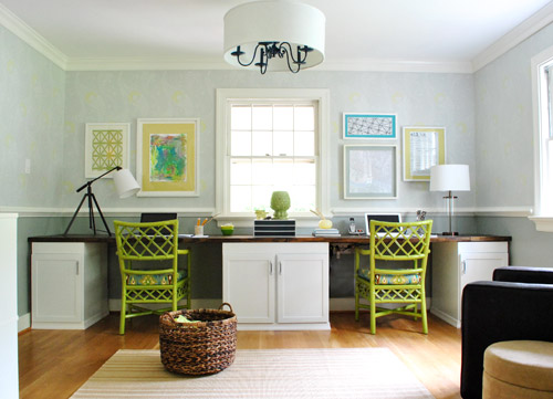
We liked that we had a “John’s side” (the right) and a “Sherry’s side” (the left) so since John loves maps, typography/handwriting, travel, and high-contrast geometric shapes, he ended up with this little medley:
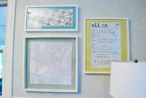
Not only does it represent a bunch of things he loves (type, maps, travel, geometric shapes, etc), it’s also personal because:
- the map is a typographic map of Richmond by a local artist (it’s actually made up entirely of words, more on that here) – I just painted the Ikea mat with the same gray paint that we used under the chair rail to help it pop
- the handwritten/typed item on the far right is a blown up copy of a tiny comment card from a meal that we shared in Alaska during our Honeymoon (we wrote things that we ate and what we saw on the comment card and kept it as a souvenir to remember that day)
On my side I knew I wanted Clara to paint me something (everything she makes is my favorite thing ever, what can I say?) and I liked the idea of framing a textile that I loved (some fabric leftover from Clara’s weekly project, which I also used a few years ago to reupholster a bench that now sits in her nursery).
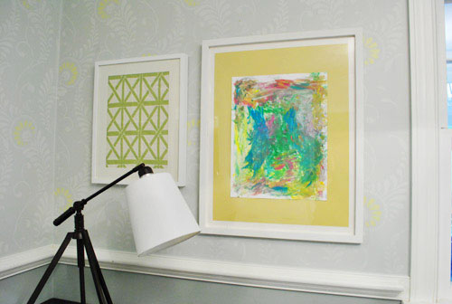
It doesn’t hurt that the lattice shape of the fabric ties in with the lattice detail on the chairs… and also seems to relate to the high-contrast geometric print on John’s side. Gotta love happy accidents like that. To us that just screams: meant to be.

As for how we approached the whole office art thing, here’s the order of this whole project (although we’ve done this multiple ways so there’s definitely not one “right” formula):
- Went through our existing frames to see what we had to possibly work with (and found the five that we used for a grand total of $0 spent)
- Laid the frames out on the floor in groups until we hit on a balanced but not symmetrical arrangement that we liked
- Hung the frames without anything in them, just to get a sense of how they’d look on the wall instead of the floor
- Began the art hunt (we figured we could trim/blow things up to work with the frames we had – although sometimes art comes before frames for us – it varies)
- Pulled our typographic Richmond map out of the playroom since we knew it was one of the things we wanted to hang (and painted the mat for that frame with leftover wall paint from under the chair rail)
- Went through our “memory box” full of movie stubs and love notes (it’s just a shoebox-sized container full of keepsakes), which is where we found the comment card from our honeymoon (which we blew up 420% at a copy shop to fit the frame)
- Dug up some sentimental fabric that I loved (which was also used here and here)
- Found a high-contrast print in my little file o’ art from years past that worked nicely on John’s side (it balanced out the handwritten comment card and the detailed type-map)
- Stripped Clara down to a diaper with some water-based Crayola paint and had her go to town on a large sheet of paper that would fit the frame I wanted to use with it
- Ran to Michael’s to grab some large colorful sheets of paper to create “mats” for some of the art (to better fill the frames and tie in some happy color since the office is our cheerful little bubble of unicorns, rainbows, and puppy dogs)
It definitely feels mixed & matched yet balanced enough for us – and it’s bold & happy without giving us a headache. We like that the color palette is diverse (Clara’s painting is full of color and there’s a black & white print, so it’s pretty varied). Even with all those colors/styles, the dominant tones (like teal and grellow) relate to the chairs and the dining room curtains – and the white frames help unify things. We definitely plan to play around with room accessories in other colors though (some pops of orange or coral on the desk might be fun) so we’ll have to see where things go…
Oh and here’s the view from the dining room. I love that the office is so light-washed and the dining room built-ins are so dark. It really helps keep the spaces from blending into one big rectangle-fest. Oh and I’m on the hunt for a new runner that’s not so matchy (plum could be fun – or even textured burlap).
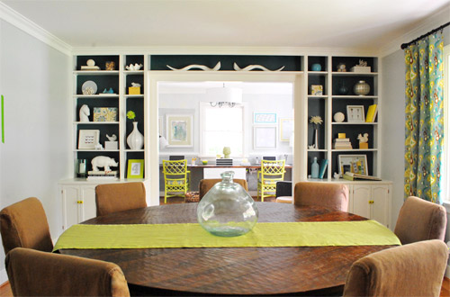
As for how much this entire update cost us, since we already owned all the frames we just spent around $9 at Michael’s on the large colored paper “mats” and $4 at the copy shop (FedEx Office) blowing things up. So that’s a total of 13 bucks for five pretty big pieces that we get to stare at whenever we’re not gazing at our laptop screens.
We still have other office things on the agenda, like: getting a permanent rug (most likely longer, not as wide, and darker), adding more permanent art to the other side of the room…
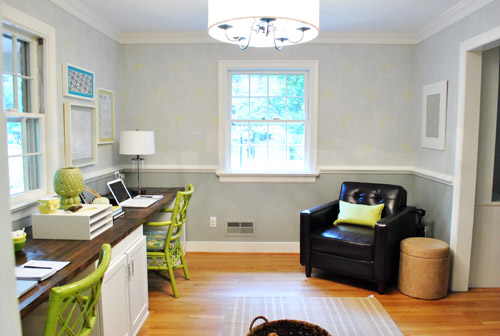
… hanging some window treatments (probably homemade roman shades), and adding a proper lamp and side table for the leather chair corner, etc. But for now we’re just grateful to have something on those have-been-blank-for-the-last-ten-months walls. Can’t believe we have stared at blank walls for almost a year. The shame! Especially since the frames were just sitting around in our playroom and it was only $13 to fill them with some happy-go-lucky stuff.
But enough about us. Have you guys ever blown things up at a copy shop like a comment card from a memorable meal? How about stripping down your toddler and “commissioning” some custom art? I thought I was going to be really Type A about colors and design but I just gave her every color of the rainbow and watched her go to town. My little artist…
Psst- Here’s another post about a ton of sentimental things we’ve framed around the house.

Miss Riss says
Did you see the green totem guy she painted? He has a green face, yellow lips, pink tongue and eyes and a crazy blue collar.
YoungHouseLove says
Who are we talking about here? Sounds intriguing but I’m missing the reference.
xo,
s
Katie says
I think she’s talking about Clara’s beautiful picture! I see it now…if you kinda squint a little, tilt your head, and maybe stand on one leg…you can see a face:) Love love love all the art in here! Just a great room altogether!
YoungHouseLove says
Haha- so funny!
xo,
s
Jenny C says
Quick question I’m curious about it. Is there particular reason you’ve opted out of curtains/shades for the windows? I would just always automatically head to curtain aisle if I had ‘naked’ windows.
YoungHouseLove says
Oh yes, they’re still on the list (see the bottom of the post). I’ll probably try my hand at some DIY roman shades!
xo,
s
Nikole says
A Snow City Comment Card! I’d recognize one anywhere – they are the cutest, most unique comment cards ever! I just ate there 2 weeks ago when I was in Anchorage for work. Love the office art, J&S!
Dave says
Just a suggestion, but in this one spot you should go for a black frame…. i think it would give more visual interest, all the light colors are kinda just like a blur with the exception of the counter.
YoungHouseLove says
Thanks for the thought Dave! Frame color is definitely one of those personal preference things, but we thought it would be too heavy with the dark desktop and chair (and ORB lights) so we went white!
xo,
s
Janelle D says
Sorry for the double comment on this post. I know you have a million to approve. How often do you dust your built ins & what do you use? Just curious… I hate dusting. Haha.
YoungHouseLove says
I use a microfiber cloth or one of those big old school feather dusters. Maybe about once a month? Haha. I’m bad!
xo,
s
Andrea says
Love the art and frame arrangement! Have you guys considered navy blue or plum slipcovers for the dining room chairs? It would coordinate nicely with the curtains (LOVE them btw) and back of the built-ins.
YoungHouseLove says
That definitely could be fun! I keep wondering if I’ll end up dying those again since it was so easy to do!
xo,
s
Dave says
Room is coming along….I’m surprised you when with green for the chairs…. i liked them better in the dark color, more sophisticated…..green is fun though
Wrenaria says
Fabulous! And just last week (I think) you were telling me you couldn’t promise office art happening soon. Seems like quick turn around time to me! Love the pops of blue in the matting and Clara’s art. So much happy color! It must be a joy to work in there now.
YoungHouseLove says
Haha- things in the kitchen are going so slow! So we had some time to spend on office art after all!
xo,
s
Jill says
I love the asymmetry (I think it’s really clever, actually), but I think the fabric on Sherry’s side matches the chair TOO well. Those three things (two chairs + framed fabric) jump out at me, and because the framed fabric’s hanging out on the left, it kind of ruins the balance. :(
I wish the green in the fabric were just a touch darker or maybe a little less yellow, to make it more distinct from the chairs.
Besides that, I love it.
P.S. I was trying to think what to suggest to put in that frame instead, so I was going through your Clara photos, and this one made me laugh so much: http://images.younghouselove.com.s3.amazonaws.com/2011/03/clara47weeks.jpg
Can you imagine having her frowning at you like that while you work?! Ha!
YoungHouseLove says
Haha- too funny! We opted not to put baby/family pics up but that’s always a favorite shot of ours! In person colors are a bit different than they look in photos, so as we sit here and type we love how it looks. But art is definitely one of those personal preference things!
xo,
s
Jen says
You guys are so freakin’ fantastic at picking out the most perfect art and arranging it just right. It was just what the room was needing and I adore it! It’s also just the inspiration that I needed as I work through my own need to add some art in places around our abode, so THANK YOU! :)
xoxo,
Jen
emma says
Have you guys checked out Cocoa and Hearts? (http://www.cocoaandhearts.com/?c=gallery). I came across her art from another blog but she has great paintings that would be easy to mimick and remind me of your punches of color. Might even be fun to do holiday colors and swap them out seasonally.
Love the new personal touches!
YoungHouseLove says
OBSESSED!! Thanks so much for sharing!
xo,
s
Loves Moose says
Looking forward to seeing more substantial (and less busy) chairs in your office, but loving the art on the walls. The frames really anchor things nicely. The chairs will be great on your patio or sun porch someday as the design evolves and you replace them.
Eve says
I like the asymmetrical-ness of the frames, too. I’m having a similar issue with what to place to either side of our woodstove/mantel wall. I have some ideas, but they’re feeling a tad bit too matchy-matchy. I know I’ll hit upon something eventually but waiting for the epiphany can be frustrating. :)
FWIW, I think plum on the table would be lovely. I’m sure they even make plum burlap. Or maybe a large plum geometric stamped pattern on natural-tan colored burlap? (something that wouldn’t compete too much with the drapes…)
YoungHouseLove says
Ooh that would be fun!
xo,
s
Emilie says
OMG ! Diagnosis, at last ! What-should-we-frame paralysis ! This is what me and my husband have ! We have dozens of frames, tonnes of prints and pictures, but our walls are still empty ! From time to time (about every 6 weeks, according to my medical log…), I take everything out of storage, fully decided to start putting “art” on those poor walls. After a few hours of total paralysis, I end putting everything back in storage… Now, that I know what I have, pleaaaaaaaaase tell me what the cure is !
Thank you
Love your blog, btw. Absolutely fantastic.
Beth C says
It looks great! The room is really coming together. What a happy place to work.
Donna says
I think you have a budding little Monet on your hands! Great job, Clara!
Sandy says
Snow City Cafe!!!! I live in AK and it is one of our favorite places to eat in Anchorage. That is crazy! I love that you guys came to Alaska for your honeymoon. It’s an awesome place.
Larissa says
So vibrant! I love everything that you two do…this is a bit off topic, but I was wondering where you purchased that great, BIG toy basket that is sitting on the floor in your office area? I have a little guy with too many toys and I would love to buy something similar to store them in a “stylish” way! Thanks in advance!
YoungHouseLove says
That was $25 at Target! Hope it helps!
xo,
s
Larissa says
Thanks so much!
Leslie says
As an Anchorage resident I immediately recognized the Snow City logo. Glad to know you two still think fondly about your time spent in Alaska! I’ll have some stuffed French toast or a Ship Creek eggs Benedict for you the next time I head over for a great breakfast!
Paula says
I love how the yellow mats really bring out the details in the stenciled walls! My favorite shot, though, is the one from the living room. It highlights the layers of green and how the objects in the built-ins quote the frames.
One thing I thought I should warn you about, though, is if the map is original and valuable to you, I would buy a colored mat or paper (preferably non-acid). The latex paint you used to paint the mat looks great, but it will eventually seep through to your print.
YoungHouseLove says
Thanks so much for the tip!
xo,
s
Jacque says
You should grab a burlap painter’s cloth for your table runner! Huge piece of fabric for $5. I’ve used mine to cover diaper boxes to create baskets for shelves, to create a message/bulletin board background, and for a shower curtain. All from one piece. :)
YoungHouseLove says
Great idea!
xo,
s
Jenny says
Love it! The whole room is coming together soooo beautifully. This might just be my favourite room in your new house :)
Jenny
http://www.simcoestreet.blogspot.com
Heather W. says
Love the artwork. Just this weekend I hung up some wonderful artwork that my kids have done in our family room. We had redone the room a few months ago and the wall space over the couch was empty until this weekend. I love the pops of color and my kids love seeing their work displayed for all to see. I also used white frames with mats. Everyday it make me smile to see their work everyday. So, I was pleasantly surprised to see your post today. Love it!
Eri says
I definitely think you should go with a plum runner for the dining room! I think burlap, while it is very fallish, would just be too much brown with your brown chairs and brown table. I love what you are doing with your home and wish we had the time and money to fix ours up as quickly as you are doing yours. I finally got the ball rolling though and actually bought some paint to finally do my daughter’s room! I of course bought the Olympic no-VOC since I wi be the main one painting and I am 41/2 months pregnant. Thankfully my OB gave me the ok when I told him what I was using and that the room would be fully ventilated, with fans, and a mask on my face. Otherwise I don’t think it would ever get done!
AmandaonMaui says
I like Clara’s painting! From far away it looked like a piece of framed art from a shop. You might have an artist on your hands.
While the chairs a big lime green for me, I do like the overall look and feel of the office. I also like that you didn’t go perfectly symmetrical with the frames. Having it be balanced but not match-y is good.
toni from says
Great art choices, I especially love Clara’s masterpiece. I too am a sucker for kid’s artwork. You should get a frame that allows you to hold a lot of art inside. Sorry I don’t know what they are called, but basically this frame is about 1 inch thicker and inside where you would put your pictures at ithas black straps so that you can center art work inside. Also it hold up to 40 pieces of art since it is thicker and you can rotate them as you see fit. I have one for both of my kids. They have them at Target in the frame aisle I believe.
YoungHouseLove says
Oh yes I have one of those on the frame wall in the hallway. Love it!
xo,
s
cara says
haha, I recognized the snowman from snow city cafe framed right away!! I live in anchorage….side note, it was Drew Barrymore’s favorite restaurant when she was filming “Big Miracle” last fall :)
YoungHouseLove says
Really? It was so delicious. We still talk about it (and drool).
xo,
s
toni from says
how about dyed plum burlap. I saw a lady at Joanne Fabric yesterday and she was making a burlap table cloth for a rarely used dining room, but she was dying it white. I think plum burlap would look awesome, great color and texture.
YoungHouseLove says
Love it!
xo
s
Izabela says
The shot of your dinning room and the office is awsome. Your house is coming along so nicely.
Heidi P. says
Love it. Especially the colored “mats”. Awesomeness.
Caroline says
I had some stuffed french toast at Snow City a few weeks ago and thought of both of you…is that weird? :) It’s where we always go with our out-of-town guests who come to visit us up here in AK!
YoungHouseLove says
Haha- it’s so good! We dream about it!
xo,
s
Stephanie says
I love the new art! It just seems so perfect for the space. The room is looking so good!
Brandi says
You have absolutely achieved perfect asymmetrical balance – my goal in life ;)
My husband says that I should stop reading your blog because all of your beautiful cool tones make me want to change all of the reds and oranges in my house. The grass is always greener..
Katie Jo says
Many apologies if I missed this in another post…. but where is the tripod like lamp from? I am smitten!
YoungHouseLove says
HomeGoods! Love it.
xo,
s
Michelle says
Hey! Just a quick question. Are you making your own matting for the pictures? If you are, they look great and what are you using and how are you using it?! I have to get on this train!
YoungHouseLove says
I just use colored paper as the background- so I grabbed big pieces of colored paper from Michael’s and laid them on the table and centered the image/art/print on the page and taped it down in the corners and popped the whole thing into a frame.
xo,
s
Katie says
Obsessed! OB.SESSED. This is becoming my favorite room in your house.
Karah says
Great art choices! I love all the sentiment, true meaning translates into true beauty! Question…you mention a “file o’art”. How do you store random sized pieces you want to keep on hand but are not currently using in your home? Thanks!
YoungHouseLove says
We use one of those long flat under-bed storage bins for miscellaneous prints and posters and other art that we want to keep nice and flat.
xo,
s
Bex Crowell says
When we renovated our kitchen back in 2002/03, we put down solid-surface countertops and love them.
I cannot, for the life of me, remember what brand they were, we looked at so many, but here, 8 years later, they look the same as the day they were installed. We like the darker shade too because in the spring and winter when the outdoor ants tend to find their way into the house and one appears on the countertop, I don’t like to come down in the morning and see him/her standing there on the counter. With the darker marine blue/green colour, I can eventually see them but they don’t scare me so much!
Bex Crowell says
I don’t know how to post a photo here yet! Bex
YoungHouseLove says
You can just link to it on Flickr or Pinterest if you have uploaded it there! Or you can upload it on facebook!
xo,
s
Rachel Grider says
I know the frames are old but do you remember where you orginally got them?
YoungHouseLove says
Ikea and Target (on clearance)!
xo,
s
Sabrina says
When I first saw the picture I assumed you had deliberately taken the color scheme from that picture you shared recently with the color groupings on a table, the bowls, a ceramic pear, a globe, I think. The colors were yellow, blue, green, white. I’m on my phone so I can’t find the specific post, but maybe you were subconsciously pulling those colors together again.
YoungHouseLove says
That’s so funny! They’re inspired by Sue the Napkin I think!
xo,
s
Kimberly in AK says
I love Snow City! I’m 10 weeks preg had my first cravings.
Their biscuts and gravy & raspberry stuffed french toast- I think we might go again tomorrow morning.
Did you get a chance to eat at the Mooses Tooth while you were up here?
YoungHouseLove says
Sadly we didn’t, but it sounds delicious!
xo,
s
Cassie says
Question:
For the desk, are those kitchen base cabinets? And did you blog about it somewhere that I can’t find? It’s such an amazing idea and I’d love to replicate it in our we-have-no-idea-what-to-do-with-it-yet room.
YoungHouseLove says
Oh yes, they’re $1 thrift store cabinets. Here’s one post of a few about them: https://www.younghouselove.com/2011/09/attack-of-the-13-foot-counter/
xo,
s
Kate says
You guys always seem to have a million extra frames hanging around. Where do you get all of these frames and what do you use for mats? I’m trying to put up pictures and art in a new house with pretty much blank walls and everything seems EXPENSIVE!
YoungHouseLove says
We got them slowly as we owned our first house (which eventually had frames on the walls of every room- usually from Ikea or Target on clearance which come with their own mats). Then when we moved we had all of those frames to work with, but in this house we have only hung art on some of the walls (the dining room, playroom, guest room, and all the bathrooms are still bare, for example) – so those frames from the old house are still hanging around. As for the mats, we use the ones that come with the frames from Ikea or Target on clearance. Or I get craft store paper like I did in this post to make “mats” (I really just tape the image centered in the middle of the paper so it shows through around the edge like a mat).
xo,
s
Heather W says
Kate,
Definitely check out Target. I wanted to switch to white frames and they will periodically run theirs on sale at least once a month. Also, recently my Target had some on clearance for as little as $9.00 with the mats included. When I saw those I bought a few just to have on hand. Also, I have spray painted frames I already had white and they mix right in too. So, if you already have some frames or see some cheap at garage sales or other retailers you can always spray them ORB, white or other color. Hope it helps.
Rachel @ Common to Moms says
I am so in love with your office! Your guest room has been my favorite room so far and I think this room might actually be rivaling it. The pictures make everything else make sense in there for me. Looks. Awesome. :)
Greg and Andrea Summerhays says
We love how you guys make your art personal. Every time we travel we try and buy artwork. It is so fun to look at those pieces now hanging in our home and remember the great trips we have been able to take.
Laura says
no way!! i am making roman shades too! I hope you do some, it is pretty easy so far!
Cheryl Balmas says
Your office looks GREAT! Love the stencil on the walls and your artwork, colors, etc. I read how labor intensive the stenciling was but it looks great. You’re so creative with your artwork and have inspired me to look around my house and see what I can frame, reframe, etc. And to look at pictures I like in frames I don’t like and either paint or swap out frames. Much more affordable and personalized!
tosha says
hey hey YHL! You guys probably mentioned it somewhere (I’ve been searching!) but I have to know where you got the light fixture for the office! I love it!
YoungHouseLove says
We actually DIYed it from an old brass chandelier. More on that here for ya.
xo,
s
Emily Drake says
Ok, we’ve been moving so I’m a bit behind on your YHL posts. But I have a question…how do you keep yourself from filling all your picture frames with pictures of Clara? I find it hard not to post picture of my baby girl all over the house. But I love how you guys have found a balance. How to you resist the urge??!! :-)
YoungHouseLove says
Hahaha- it’s hard I tell ya! We make an annual bound book of photos (from sites like mypublisher) so we know we can fill that with 100 pages of pictures (with many pics on each page) so maybe that helps? We also have a hallway frame wall and some frames in the laundry room where we put family pics (aka: lots of Clara pics) – so maybe having dedicated family photo places helps to keep all the walls from getting Clara-fied?
xo,
s