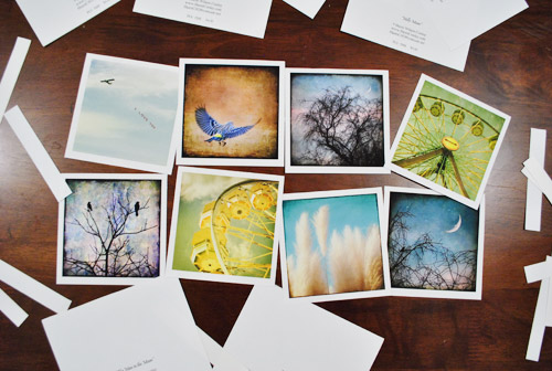
Well well well, if isn’t those little photography note cards again. You know, the ones we bought on our anniversary from a local art gallery to hang in our bathroom? You might not even have registered them in that post since everyone went bananas over the whole Sherry-haircut thing.
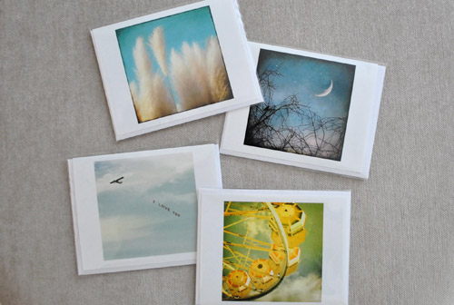
Anyway, hanging them in the bathroom was the initial plan. Until I noticed some of the photo colors were in the same neighborhood as our framed $5 scrapbook paper. That neighborhood being Sue-the-Napkin-ville. Or is it Sue-the-Napkin Heights?
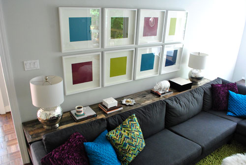
We figured that maybe our $4 a pop Sherri Conley note cards were destined to live in these eight frames (plus we couldn’t decide on a configuration for the bathroom, so we liked the idea of enjoying them out in the living room). But it meant we had to get four more of them first, so we shucked out another $16 to round out our “local art collection” (from Crossroads Gallery here in Richmond).
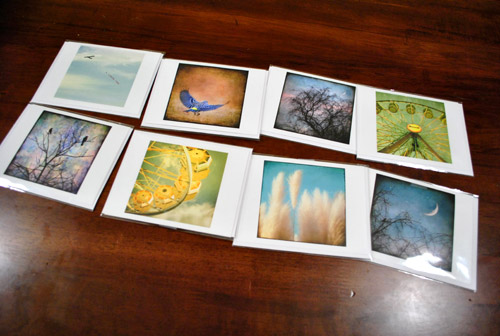
The idea was to add the small square of art into the middle of the colored paper square that already sat inside the square frame. Thereby making the colored square of paper into a fun little colored square mat. Wow, lots of squares going on. We’re one do-si-do short of a square dance.
First we had to cut our rectangular note cards into… you’ll never guess… squares. I used an exacto and a ruler to keep my lines straight, but was brave enough to just eye the placement of my slice. Yup, my middle name should be Danger. Or soda. Or both. John Danger Soda Petersik. I like it.
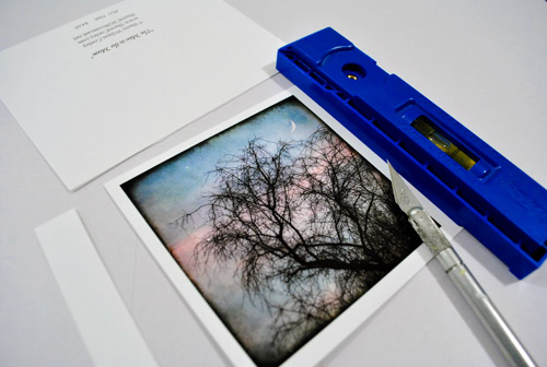
As you can see, we left a thin white border on the pictures to, I dunno, further emphasize their squareness? They sort of looked like little polaroids to us.
Then one by one the frames came off the wall so the photos could be scotch taped into place on each colorful background which essentially became the “mat.” To get them centered we eyed them, then used a yardstick to make sure they were actually centered. To do that we just lined up the yardstick across two opposite corners, and then repeated that with the other two corners to make sure they seemed to intersect equally.
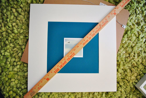
Finally, everything was reframed and ready for our viewing pleasure.
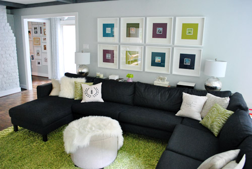
Only problem, we weren’t totally psyched by the result. We didn’t mind the small size (it just makes us want to lean in and take a closer look) – although I know some folks might think bigger is better (that’s what she said). Our issue was that something about them was really interrupt-ish and busy and, well, just too square-y (it honestly looks better in pictures than it did in real life). And yes, the reflection on the glass totally bites for taking pics, but we’re not quite ready to splurge on eight panes of museum glass just yet.
We realized the white borders I left on when trimming the note cards might be the problem. It made the distinction between the photo and the colorful mat so defined that we kind of lost the fun coincidence that each pairing was sort of linked by color. So rather than the paper feeling like an extension of the art’s hues, it just felt like a tiny picture on top of a thick bright mat on top of a thick white mat. It was a square vortex and it was threatening to eat our brains.
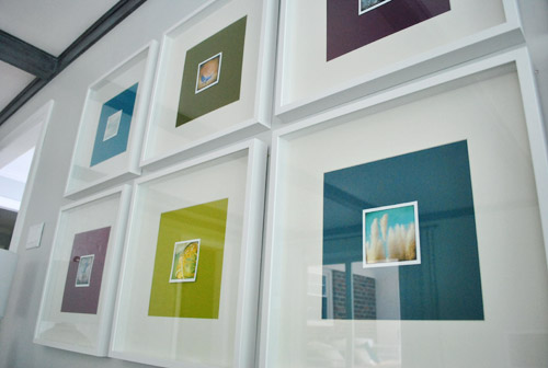
So after a few days of living with it (and not growing any fonder) Sherry took it upon herself to remedy the situation. And since she has a much steadier hand than I do, she didn’t even use a level and an exacto (just a regular old scissors). Cocky much?
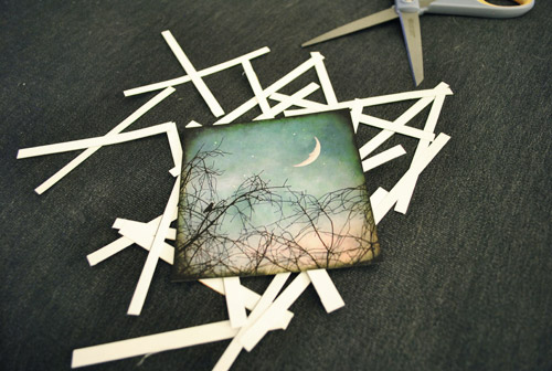
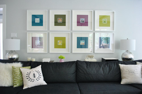
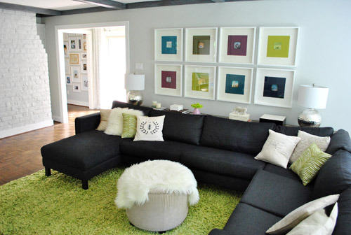
Of course her cuts were great. And now we’ve got this:
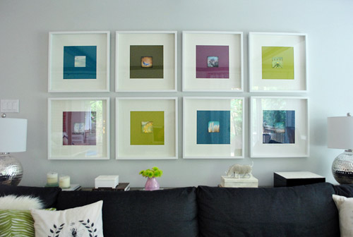
We like it muuuuch better – especially in real life. Although we’re the first to admit that for some reason the white framed note cards didn’t photograph as crazily as they looked in person, so there’s not as much of an obvious improvement from the square-on-square-on-square action that was going on before. But in person it was such a relief. We worried we might have to scrap the whole note card idea entirely, but once they were trimmed down and put back in place, all was right with the world. Or at least with the left wall of our living room.
We like that they feel less busy and that subtlety is much preferred. They don’t scream “check-me-out!!!” but are nice when your eyes meander around the room and happen to land on them. So for a total of $4.64 per frame (64 cents for the scrapbook paper backgrounds and $4 a pop for the photo note cards) we’re psyched.
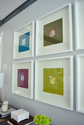
I still wouldn’t go as far as to call this our forever art solution for these frames. We’ve learned our lesson when it comes to making those sort of giant declarations since our house is always a WIP (work in progress). Not to be confused with an ORB (even though Sherry is definitely demonstrating her undying love of all things oil-rubbed-bronze). So we think adding these small photographs are a good warm-up for us since they might end up laying the ground work for something else that we may want to transition to a bit further down the line. So let’s call it a baby step. We’ve introduced some small photography, so maybe in a while we’ll try some larger photography, rehang the note card photos somewhere else, and scrap the 60 cent scrapbook paper altogether… who knows.
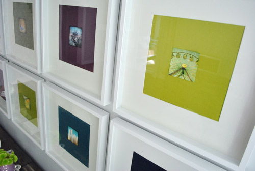
What I do know is that looking at some of these photos makes me want to go on a ferris wheel. Oh, and eat funnel cake. Yeah, definitely that.
Has anyone else made any art-y updates lately? Or used note cards as wall decor? Or gotten sucked into a square vortex, never to be seen or heard from again? Well, if you have, I guess you wouldn’t be able to comment…
Psst- We announced this week’s giveaway winner. Click here to see if it’s you (plus the $15 discount code for everyone is still valid until August 31st).

bridget b. says
what a difference that made! looks great and the notecard images are so neat.
Mallory says
I absolutely LOVE the frames! Trimming the white edges really did make a big difference.
It’s funny how your projects really all seem to fall in place to compliment each other even when you don’t mean for them to. I’m slightly jealous. ;0)
YoungHouseLove says
I think the lesson is to keep noodling! Never stop! Haha.
xo,
s
liz says
I really like the addition of the prints without the white border. Nice job. But I would love to see what it would look like with the ORB frames. I just really like how the frames in the bedroom turned out.
Jessica says
Funny you should mention art… On Monday I broke open my acrylics from nearly 2 years ago (!! I haven’t painted since our second daughter was born!) and started painting again. In a frenzy. I’ve completed 2 paintings so far and the girls have contributed in a very pretty abstract watercolors way. (I missed creating in a big way. Er… Art. Babies are one thing. But art is another.)
Actually, in the mess of somewhere around 10-12 paintings each, there were 3 that were beautiful… So much so that my husband took out 3 photographs, trimmed the paper down and hung the girls paintings on the walls. They look amazing next to our other art. So yay for happy accidents!
Jen says
I agree with much of what’s been said already… liked the paper, like adding local art, don’t like how the art looks centered in the frames. I could see moving the art in the top row of frames lower, almost to the bottom of the colored “mats” and the bottom row artwork higher. Then, move the outer edge pics more towards the center of the wall as well. Or, maybe add a patterned paper as another colored mat? I love that you keep trying to find what it is you like best. Can’t wait to pick up local art on our next vacation for a corner of our new house. We moved furniture around last night, and boy does our living room look bigger now! Keep the projects and blogs coming!
Taylor @ TheProposalEnthusiast says
My roommate and I just bought 3 Ribba frames to put over our couch. Still no idea what to put in them but great to see this look for inspiration!
heartartz says
Did you ever think of taking (or using some already taken) your own photos in those colors?
You 2 have taken some pretty wonderful photos and I am sure you could take or collect more. Just keep a list of the “colors” you need and go for it.
As for printing the prints, I have used Costco. They will print an 8×8 for $1.49 each or 12×12 for $2.99 each.
If you need larger you can trick it by printing it 16×20.
Using Photoshop or another photo-editing software, size the square image to the size you need (ie 14×14), add white borders to take the square image to 16×20, save the whole thing as a jpg, print and finally cut away the white borders. Voila square print!
YoungHouseLove says
We’re definitely open to adding our own photography (maybe tinted to match the color mats in photoshop) in the future. Although our anniversary art feels pretty sentimental now too, so we’ll have to find another place for it if we swap it out down the line.
xo,
s
Bryanna S says
NOOOOOOOOOOO! My favorite thing about your house was the solid colored ‘pictures’! So unique and fun and pretty! I plan on copying that someday :D
I GUESS the added pictures are nice… pretty pictures… just not as fun as solid colors… :P
Kristen J. says
Hey guys, how is Karl holding up? We are couch shopping and I am trying to convince the hubby that not everything from Ikea is no good. Are the cushions getting wonky? Do you still love it?
YoungHouseLove says
Still loving Karl. No complaints! Sometimes I fluff the pillows if they get flat, but they bounce right back.
xo,
s
Melissa @ HOUSEography says
Maybe a solid white background might be the solution? Poster board could be a miracle worker! Still, I like it and the bold pop of color seems to be the current direction so live with it for a while… Fortunately it’s much less than permanent!
Crystal says
different topic but have you seen the diy rope rug on Ohdeedoh today? http://pinterest.com/pin/83647841/
Now I chant…Sherry can do it. Yes she can. If she can’t do it, no one can!
YoungHouseLove says
Woah- that’s amaaaaazing.
xo,
s
Elizabeth says
SO COOL! I may be tempted into some DIY rug making!
kristen says
do it! do it! withabritishaccentdo it!
YoungHouseLove says
Hahahaha.
xo,
s
Stephanie Handy says
Thankfully we sealed off the only square(ish) vortex in our house (for real): http://www.thehandylife.net/2011/06/holy-patchwork-batman/
My only fear is that since we only covered it, some day a hapless house guest will stumble upon it and unleash the forces of darkness.
YoungHouseLove says
Haha- so funny.
xo,
s
Sarah says
We LOVE to decorate with little notecards, postcards, etc. I’ve had a group of them taped on the wall of every bedroom I’ve had since I went away to college. We just moved into a new place in March that has a plate rail (I think that’s what its called) all around the dining room. While it made painting the room and even BIGGER nightmare, its the perfect way to display a whole bunch of cards leaning against the wall. And since they aren’t mounted in any way, its easy to swap em out and rearrange them.
My favorite cards come from this local artist from Portland, ME: http://www.mainelylabs.com/
Heidi says
Off the subject but I feel totally jipped not having the Burger cameo appearance in any of these photos! I always look to see how he horns in on your action. Kind of like Where’s Waldo. Only cuter. :)
YoungHouseLove says
Haha, hopefully his cameo on Tuesday’s post will tide you over until he makes his next appearance. He’s mysterious like that.
xo,
s
Eilene says
I had a square 12″ black frame with a pretty designed scrapbook paper, then on that I put a picture of my son in the bottom left corner, and on the right his initial cut out of paper… it was soo wrong. I think it’s exactly the same problem you had. There is a border around the picture and it’s driving me nuts. I’m going to leave work and fix it!
;-) but not really because that would be bad.
candace @ thecandace.com says
So glad that square vortex situation was remedied and it didn’t eat your brain! :) I think your DYI/WIP art looks great!
Kim says
Jenna Smith-how about one of those no- slip rubber mats that go under rugs, cut to size? I think that would work.
Sarah T says
I love using notecards for art! Easy and inexpensive. I have one framed in my bathroom:
http://housethrift.com/quick-and-inexpensive-art/
YoungHouseLove says
Sweet!
xo,
s
Paige says
Oh! I didn’t realize how small they were. Maybe I just read it wrong, but I was expecting them to fill up the entire colored part.
Reading comprehension aside, they look great!
Blair says
What a cute concept! I used some recipes cards a while back to hang in my kitchen and they add just that touch of fun without breaking the bank! http://thefirstapartment.blogspot.com/2011/04/pretty-pretty-recipes-cards.html
Got to love cheap (I mean inexpensive ) art!
~Blair
YoungHouseLove says
That’s such a fun idea.
xo,
s
Kate says
We are in need of art for our bedroom, but it just hasn’t happened yet. Maybe I’ll take some inspiration from the two of you and get my art on this weekend!
And I see a big difference with the white edges trimmed off, even in the pictures. I’m so glad you did it, I was a bit concerned when you left the white border on at the start.
Kristin says
Haha, I like the “WIP” and “ORB” abbreviations.I love “WAF” ( http://en.wikipedia.org/wiki/Wife_acceptance_factor ), partly because when we bought our new TV and hi-fi system, it was actually me who wanted the larger TV and the giant floorstanding loudspeakers. I love them.
Like your new art, too. Especially the color-matching coincidence. However, from the picture I would say that they’re a bit too small for the frames. But maybe that’s just the picture.
Casey says
Totally un house related. I have a friend that actually used Danger as their son’s middle name. Blue Danger. He will forever be able to tell people that Danger is his middle name.
YoungHouseLove says
That. Is. Amazing.
Burger’s middle name is King, but for a slightly less high-brow reason (say it out loud).
xo,
s
abode love says
This is such a great look! I love when art is arranged in such a way that it looks precious. When you use d a big frame, large mat (or background in your case) it really makes the art more elevated and important. I LOVE what this has done for your space- it looks SO great!
abodelove.blogspot.com
Amber says
You guys need a paper cutter.
Gloria says
What if you hung some of the notecards not-centered, like maybe in the upper right corner or lower left? Maybe that’d help some of the square/square/square feeling? Just an idea, I am definitely no decorating expert.
YoungHouseLove says
Others have mentioned that, so we might just try it down the line! Ya never know…
xo,
s
Kathy C. says
What an easy and eye catching upgrade! I love your wall collage! It actually was a main inspiration for our living room! I made a point to source you guys! See it here…
http://lovelacefiles.blogspot.com/2011/05/progress-reveal-living-room.html
Keep up the amazingness!!! (<–That's totally a word…totally.)
YoungHouseLove says
Cool project! Love the shadows the 3-D-ness! (<-- even less of a word, haha) xo, s
Diane says
I love how the whole project turned out. (In fact, I liked it so much I pinned it. LOL)
I think notecards and postcards are an awesome source for affordable artwork. My favorite wall in the living room has four notecards that we brought back from a trip to Santa Fe (three from the Georgia O’Keefe museum and one from a local artist who draws Dia de Lose Muertos-inspired art). I love them doubly since they’re not only pretty but remind me of a great trip too.
We also just acquired these postcards: http://psc.disney.go.com/eventservices/artofdisneyparks/media/SHAG_POSTCARDS.jpg (We’re big Disney geeks). I haven’t had a chance to do anything with them, but the plan is to pick up some Ikea Ribba frames and hang them along with some other art we have floating around in our bedroom. Should be fun!
YoungHouseLove says
Those are so fun! I love the one with the retro camper!
xo,
s
Lisa says
Love what a difference some small shots can make. I loved the colourful squares on their own and was unsure about you guys adding pics – but you really coordinated the photos to each colour block. Love it!
Kristen says
Very cute! I framed some vintage looking Hawaiian postcards that I picked up on vacation and hung them in my guest bathroom. I love them and they’re actually pretty good conversation piece. I’m going to try to attach a link, cross your fingers that it works! (Does html work in these comment boxes?) :)
Amanda P says
Hmmm, not sure if I’m a fan. They seem too small for the frames maybe? I think I like the scrapbook paper in those frames by itself better. Maybe use the small pics in some other type of framing collage/area/etc? I’m sorry, I’m not being a hater, I love you guys! Just giving an opinion. :)
brooke cox says
i just did a little artsy update in my dining room:
http://brooketc.blogspot.com/2011/07/small-edits.html
YoungHouseLove says
Love those small tweaks!
xo,
s
Rachel Tatem says
I agree, I much prefer it without the white border. Great idea though!
Beckie@Cubicle57 says
I still have cards that I framed and hung on the wall wayyyyyyy back in my college days. Big fan. But recently I’m back on the wagon. I got these cards from Heather Smith Jones on etsy. And I’m so in love, want to put them in my office. And bring something “organic-y” to the computer environment.
YoungHouseLove says
Fun!
xo,
s
carolinaheartstrings says
I love them. I think they look fantastic!
Valerie says
My favourites are the ones where the pic is almost the same colour as the paper (the lime green ones)! I love that look!
Gina @ Running to the Kitchen says
Love that inexpensive way to jazz up the frames. Looks great!
Alex says
I have been saving a vintage Italy travel poster calendar since 2006 to use somewhere, just never had the right place. Been re-doing the family room and bam! Finally put them up in some Ribba frames with an extra mat and they are perfect. And I am finally able to prove to my hubby that I WAS saving that calendar for 5 years to actually use it! Ha!
Pam the Goatherd says
I have a set of notecards from a local artist http://www.papercutters.info/SA/ByName/Gilbert_Gudrun/index.php who does scherenschnitte (silhoutte paper cutting) that I plan to use in my future sewing/guest room someday. She did a series of children in the children’s garden at our local arboretum as a fundraiser for the garden. Since they are black and white I can’t decide if I want to put them in black frames or white. I’m leaning more toward white frames, thinking the black would be too overpowering in a room that has all white furniture and trim. We are very much blessed with some excellent artistic talent in our small, rural community and I like to buy local art whenever I can.
YoungHouseLove says
Seriously???!! Those are amazing!
xo,
s
tamrah ryan says
Love it! I especially like the fact that the art is from a local shop vs. a big box shop. Nice work!
Kate says
I’m working to curate an art wall. I’ve collected a few vintage maps (Paris, Edinburgh, Prague), a great whale print, a watercolor, and this cute Etsy typography (linked below). But I can’t decide…matching frames or mix it up? I do love my symmetry, but…what do you think?
http://www.etsy.com/listing/62602691/oh-darling-lets-be-adventurers?ref=sr_list_3&ga_search_submit=&ga_search_query=oh+darling+let%26%2339%3Bs+be+adventurers&ga_search_type=handmade&ga_facet=handmade
YoungHouseLove says
I would try using the frames you already have to see what you think. You can always spray them to work together better or go matching after you give what you have a shot! And I love that print you linked to!
xo,
s
Krysta @ Domestic for Dummies says
So I love love love the way they turned out! And I had a random dream that your rug was on the news for causing some huge controversy. Weird.
YoungHouseLove says
Haha, Kermit the troublemaker.
xo,
s
Melanie says
I like this so much better! I wish the pictures were a bit larger but I think it’s such an improvement. Perhaps even inspiration for a project to use those notecards again since you aren’t totally inlove. But I do love the colorful matte idea.
Marriah says
I’m currently putting together a gallery wall in our bedroom. In order to add some smaller items to the mix, I went through all of our wedding/shower cards and picked out my favorites to frame and add to the wall. I was able to even leave the cards together so that I could pull them out and still read the notes from our loved ones. It’s nice how a frame can turn something so simple into art.
Amanda J. says
Glad for you guys, but I couldn’t live with it…even temporarily. The scale just looks too disparate for the space.
That said, I like the prints, but I’m not a fan of the format.
Kim says
Ok, this is a very serious question for you two. We are planning a small vacation to Charlotte with kid activities planned, and a trip to ikea for much needed items for our newly renovated house. The problem is that we are 3 hours from ikea, so we have to make this trip count. On our list?couch. Bookshelves. Frames. Desks for kids. Help! How do we strategize this? How do we measure for the Billy bookcases? It seems overwhelming and I’m afraid we will miss important items! How do you guys do it when you are planning a trip to ikea?
YoungHouseLove says
Hmm, I would prioritize what you really need the most and just measure the car using the packaging measurements on Ikea.com to help ensure you can squeeze it in! They’re really helpful there too, so if you bring the measurements of your room for those billy bookcases they can help you decide what configuration will work for ya. Good luck!
xo,
s
FancyFunction says
I finally tackled a wall collage project for over our sofa that I was putting off for months! I’m really happy with the results. Love the colors and the frames you used!
Barb says
Nice job you two!
Jessica says
Yeah, I don’t love this. They’re like art eye charts. Hoping for something bigger when ya’ll move towards the forever solution.
Corinne says
I may be stealing this idea! I have some adorable dog-themed and fashion-themed note cards from the $1 bins at Target that I’ve been trying to find a use for, along with some random scrap paper….just need frames now! I like the artwork you have much better without the white around the pictures. The original colored paper alone was a great little fix, but I think adding the pics really brought it up a level!
I haven’t done anything really art-y lately, though I did bust out my own version of a book page wreath (photos on the blog). I’m stuck on where it should live, so right now, it’s hanging on the side of my stair case!