Well well well, if isn’t those little photography note cards again. You know, the ones we bought on our anniversary from a local art gallery to hang in our bathroom? You might not even have registered them in that post since everyone went bananas over the whole Sherry-haircut thing.
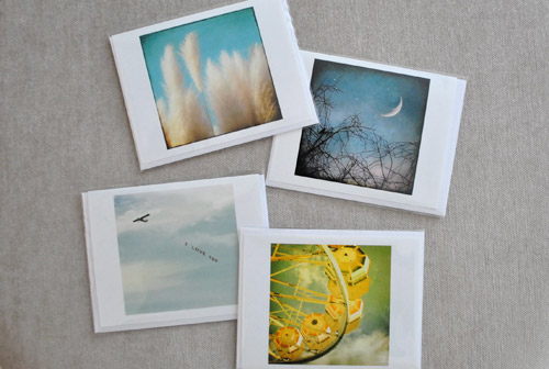
Anyway, hanging them in the bathroom was the initial plan. Until I noticed some of the photo colors were in the same neighborhood as our framed $5 scrapbook paper. That neighborhood being Sue-the-Napkin-ville. Or is it Sue-the-Napkin Heights?
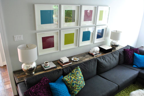
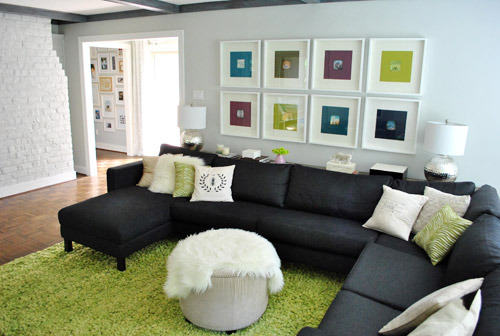
We figured that maybe our $4 a pop Sherri Conley note cards were destined to live in these eight frames (plus we couldn’t decide on a configuration for the bathroom, so we liked the idea of enjoying them out in the living room). But it meant we had to get four more of them first, so we shucked out another $16 to round out our “local art collection” (from Crossroads Gallery here in Richmond).
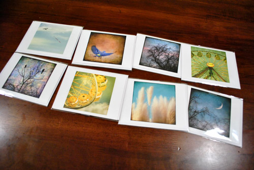
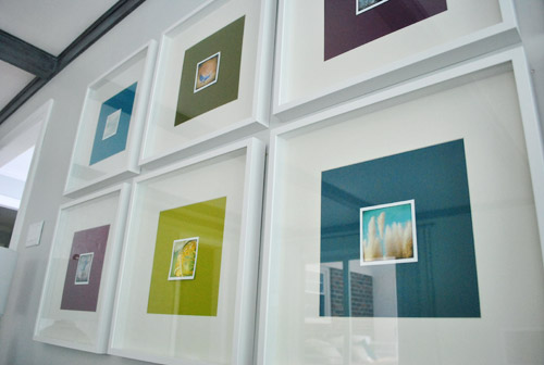
The idea was to add the small square of art into the middle of the colored paper square that already sat inside the square frame. Thereby making the colored square of paper into a fun little colored square mat. Wow, lots of squares going on. We’re one do-si-do short of a square dance.
First we had to cut our rectangular note cards into… you’ll never guess… squares. I used an exacto and a ruler to keep my lines straight, but was brave enough to just eye the placement of my slice. Yup, my middle name should be Danger. Or soda. Or both. John Danger Soda Petersik. I like it.
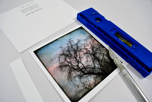
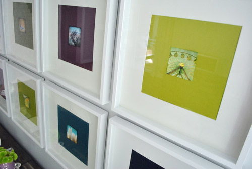
As you can see, we left a thin white border on the pictures to, I dunno, further emphasize their squareness? They sort of looked like little polaroids to us.
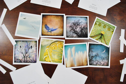
Then one by one the frames came off the wall so the photos could be scotch taped into place on each colorful background which essentially became the “mat.” To get them centered we eyed them, then used a yardstick to make sure they were actually centered. To do that we just lined up the yardstick across two opposite corners, and then repeated that with the other two corners to make sure they seemed to intersect equally.
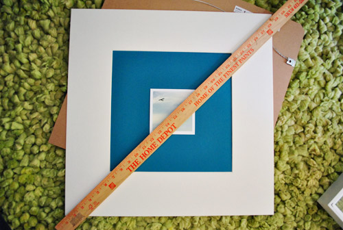
Finally, everything was reframed and ready for our viewing pleasure.
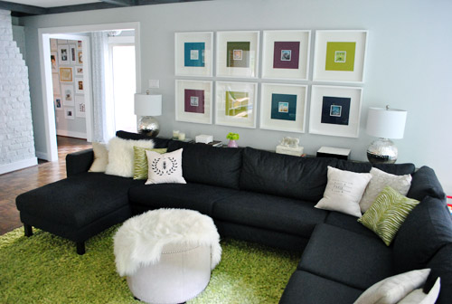
Only problem, we weren’t totally psyched by the result. We didn’t mind the small size (it just makes us want to lean in and take a closer look) – although I know some folks might think bigger is better (that’s what she said). Our issue was that something about them was really interrupt-ish and busy and, well, just too square-y (it honestly looks better in pictures than it did in real life). And yes, the reflection on the glass totally bites for taking pics, but we’re not quite ready to splurge on eight panes of museum glass just yet.
We realized the white borders I left on when trimming the note cards might be the problem. It made the distinction between the photo and the colorful mat so defined that we kind of lost the fun coincidence that each pairing was sort of linked by color. So rather than the paper feeling like an extension of the art’s hues, it just felt like a tiny picture on top of a thick bright mat on top of a thick white mat. It was a square vortex and it was threatening to eat our brains.
So after a few days of living with it (and not growing any fonder) Sherry took it upon herself to remedy the situation. And since she has a much steadier hand than I do, she didn’t even use a level and an exacto (just a regular old scissors). Cocky much?
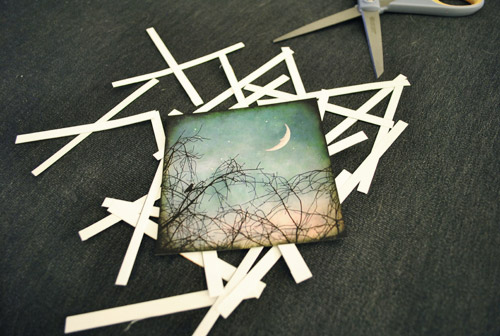
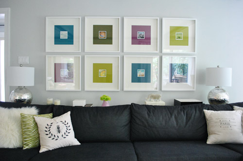
Of course her cuts were great. And now we’ve got this:
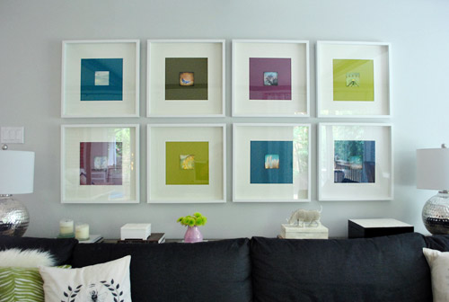
We like it muuuuch better – especially in real life. Although we’re the first to admit that for some reason the white framed note cards didn’t photograph as crazily as they looked in person, so there’s not as much of an obvious improvement from the square-on-square-on-square action that was going on before. But in person it was such a relief. We worried we might have to scrap the whole note card idea entirely, but once they were trimmed down and put back in place, all was right with the world. Or at least with the left wall of our living room.
We like that they feel less busy and that subtlety is much preferred. They don’t scream “check-me-out!!!” but are nice when your eyes meander around the room and happen to land on them. So for a total of $4.64 per frame (64 cents for the scrapbook paper backgrounds and $4 a pop for the photo note cards) we’re psyched.
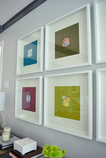
I still wouldn’t go as far as to call this our forever art solution for these frames. We’ve learned our lesson when it comes to making those sort of giant declarations since our house is always a WIP (work in progress). Not to be confused with an ORB (even though Sherry is definitely demonstrating her undying love of all things oil-rubbed-bronze). So we think adding these small photographs are a good warm-up for us since they might end up laying the ground work for something else that we may want to transition to a bit further down the line. So let’s call it a baby step. We’ve introduced some small photography, so maybe in a while we’ll try some larger photography, rehang the note card photos somewhere else, and scrap the 60 cent scrapbook paper altogether… who knows.
What I do know is that looking at some of these photos makes me want to go on a ferris wheel. Oh, and eat funnel cake. Yeah, definitely that.
Has anyone else made any art-y updates lately? Or used note cards as wall decor? Or gotten sucked into a square vortex, never to be seen or heard from again? Well, if you have, I guess you wouldn’t be able to comment…
Psst- We announced this week’s giveaway winner. Click here to see if it’s you (plus the $15 discount code for everyone is still valid until August 31st).

Renee says
Since we rent, I’m always hesitant to put stuff on the walls. It’s a drab place around these parts. However those are adorable! Much smaller than I thought. Since I can’t paint, or hang much on the walls, I took my creativity out on a set of Goodwill lamps that I had a love affair with http://memyselfandmommy.com/2011/07/25/i-love-lamp/
YoungHouseLove says
Those came out so awesome!
xo,
s
NOTyourrunofthemill says
Much better without the white border. A trick I use to squaring the photos… use a rotary cutter and clear ruler. I actually have two cutters, One for fabrics and the other for anything else (freezies anyone?)
Kara says
Just a random note but I really liked the Sue the Napkin pillow, with the teal and purple pillows on the couch – I think all the strong colors against the white frames and light grey walls and lamp shades and ottoman really make the room pop.
Just my two cents ;)
Love your house, your blog!!
YoungHouseLove says
Those are in the adjoined sunroom now, just to bring some of the colors from the art over the sofa into that space too. But you know pillows are nomads in our house- so I’m sure they’ll be back around soon!
xo,
s
Ashley @ DesignBuildLove.co says
OMG!!!! LOVE these… I totally didn’t see this post yesterday. I am SUPER in love with the update!!! Way to go guys!!! And up against the colorful “mattes” they are totally perfect!
Nicole says
I love this idea…and it looks great!
MelissaG says
How crafty of you! Your wife is so lucky to have a mate that enjoys these things just as much as she does!! My husband would never pay attention to these kind of details.
tracy says
When I first starting reading, I was like “oh no! I love the scrapbook paper so much!” but I didn’t have the scale of the note cards right and I thought they were going to fill the whole frame. This is absolutely brilliant. I thought I loved it before, and now I really really luuuuuurve it! Awesome job.
Kristin says
I cannot tell you how much more I am loving your living room with the new, more neutral toned pillows and the modified art. I think it looks more sophisticated than it did before. (I love the colors in Sue the napkin, and love them as the scheme for your home, but don’t like the pattern of the pillow.)
Anywho. I’m such a huge fan of yours, and I was sad that I wasn’t liking your family room–but changing the pillows and adding the postcards totally converted me. Hooray! :)
Patti says
Where’s your like button? Like!
YoungHouseLove says
I think we have one at the bottom of the post. Haha. Thanks!
xo,
s
Sharon S says
I really like the new pillow combo on the sofa!
Sheila Zeller says
Oh so fab! Love what you’ve done :-)
Joe Adelaide says
I finally realise how to look at your site with out all the flickering, bouncing advertising ANNOYING my view!!!! I just reduce the size of the page. Phew Thank god for that I thought I would have an epileptic fit. as a result of all that movement!! I know you make money from it but it could make a girl go crazy
Kate V. says
I was on vacation when you posted about your haircut, I mean, anniversary, and holy hotness, it looks great, Sherry! I guess I should have gone back and read all the posts I missed! Love the addition of the cards on the plain paper, too. :)
YoungHouseLove says
Aw thanks Kate! I’m still getting used to it, but it helps that I can put it in a tiny ponytail when I’m painting! Haha.
xo,
s
hjc says
John Danger Soda – kind of like John Cougar Mellencamp, only better! And you should spell it Danger$oda, to be cool like $herDog.
My brain eating vortex story is from when I was about six – at the grocery store one day I noticed the Mop & Glo lady on the label holding the Mop & Glo bottle with her picture on it holding a Mop & Glo bottle with her picture on it holding a Mop & Glo bottle with her picture on it – let’s just say I was almost lost forever that day.
YoungHouseLove says
Hahaha. I would totally get lost in that business too!
xo,
s
Jessica Horton says
OH ME! I’m in the process of framing “southern” things to hang in my new photography office! I’ve been scouring ebay for cheap, colorful bowties this week…. and plan to hit the fabric store for some seersucker swatches :-)
YoungHouseLove says
That. Is. Awesome. Send pics when you get ‘er done!
xo,
s
Ashley says
A couple weeks ago i printed my Hipsta and Instagram’s. I used them to fill my awkward stairs wall. Its been dying for a face lift!
http://www.flickr.com/photos/56432405@N05/5984984585/in/photostream
YoungHouseLove says
Fun!
xo,
s
Carolyn says
I love this so much!! It does look much better without the white edges. The little photos work so well with the paper colors too!
Amanda says
I think the art looks great. I just bought a day journal filled with artwork from a local artist that I plan on cutting up and framing some of my favorite pieces. It’s definitely cheaper than buying the large prints (the average print is anywhere from $100 to $300 for this particular individual). I got 350ish prints that are about 4×6 for $30.
Brooke says
Awesome place for cheap art… the Anthropologie catalog! I have some great images in red spray painted frames that make me happy all the time:)
YoungHouseLove says
That’s a really fun place to look!
xo,
s
Emily says
I bought these exact frames from Ikea and put VERY similar art into them. The art was DIY from a cell phone app my husband has called instagram. Then I sent them to Costco to be printed 12X12 for $2.99 each. Even though the pixel level was low, they still turned out great, I think because they were already so heavily filtered. I even put an edge on them just like your pics above!!
YoungHouseLove says
That sounds amazing! We might have to instagram those frames next time around!
xo,
s
RLR says
Oh, was I anxious when I thought you were getting rid of the big squares of colored paper! I know – it’s not even my house! – but I really do LOVE the simplicity of that wall of frames! The photos are a great enhancement – and I do like them better without the border.
Oh, and freehanding with scissors? $herdog, you rock! I stink with cutting straight lines, and shapes are definitely a no-win for me.
YoungHouseLove says
Oh yeah, I can’t freehand shapes at all. I look at those people who do cut paper arts and I’m in total awe.
xo,
s
Katie @ The Inspired Life says
So I have to be perfectly honest, I was never a hufe fan of the scrapbook artwork (altough I do think it is a genius idea- I just didnt like it in such a well decorated oversized room such as your living room) I think that the added postcards really upped the anty! I love the way it looks. The scrapbook paper adds pops of color while your eyes go to the center to see whats there! Love it! Think its great!!!
Sarah says
I had a thought …
The frames seem to be the problem, not the eight individual photos, and the glass. I know you can replace the glass, but that would still leave eight hard-edged chunky frames that are competing with the dark, angular beams overhead and the huge sharp angles of the couch.
Although I’m not a fan of the horse posters, I loved what you did with those canvases. I think something similar would be lovely in your family room. But the art would need to be full-sized and uniform. What about black and white closeups of your little dog, each something different and special. The uniformity of black and white and the theme, combined with the gallery wrapped canvases and large prints (done in a texture … see the link below), could be great. Or a collection of photos from your honeymoon, all scenic and printed with a similar texture effect.
Just a thought.
http://www.easycanvasprints.com/
YoungHouseLove says
It’s always a possibility down the line!
xo,
s
Erin says
I love it! I did something similar and ordered vintage postcards from ebay of California and places that were meaningful for me and my hubs and put them in square album frames (because their cheap). For a picture mat I used a matting board that you can get at a hobby store for about $4 and cut it down to size. I love cheap but meaningful art in the home!
Kim at Yellow Brick Home says
I love the tiny prints in the large frames – we do that a lot around here, too. I have this idea that they would look ahhh-mazing in the middle of just white matboard, floating on top of the “mat.” Sort of how Aubrey and Lindsday did their flamingo:
http://aubreyandlindsay.blogspot.com/2011/05/ikea-frame-hack-inspired-by-sarah.html
And since you asked, we DID do an arty update very, very recently! A cute pic on crazy wallpaper. Just this week, actually:
http://www.yellowbrickhome.com/2011/07/27/how-we-frame/
Regardless, I do enjoy how colorful your living room is!
YoungHouseLove says
I love him!!!! Such a cute little piglet.
xo,
s
Kacie says
Those look great. I love the vibrancy against the white. You ROCK!
Kacie
http://www.acollectionofpassions.blogspot.com/
Trude says
That looks awesome! Definitely better than without the white borders. For years I had prints of my favorite paintings at the Getty as my wall art, but now I’m doing more and more original/customized prints from Etsy as well as my own work. It’s kind of addicting! :)
Ashley says
But, but, but… I miss the “Sue-The-Napkin” pillow. Where did she go?
YoungHouseLove says
She’s in the adjoining sunroom on the daybed (to bring those colors from the living room into that space too). But our pillows move around a lot, so you never know where she’ll pop up next. Haha.
xo,
s
Ashlee says
Just after my husband and I moved into our house, I found in a cute little antique shop an old postcard showing two women baling hay in their dresses and bonnets … while smiling! The top of the card reads, “Farming is pleasant as well as profitable.”
It made me laugh so much that I bought it, put it in a frame, and hung it by our closet where we’d see it every day.
Love these pictures. Love even more that they have sentimental value to you and a tie to Richmond!
YoungHouseLove says
Hilarious. I totally would have bought that too.
xo,
s
Kel says
I like to buy postcards or little photo art cards from holidays and mini trips to frame and remember the places I visited. More often than not they are heaps better than my photos and will actually make it to frames and be hung up for display instead of remaining on the memory stick and never printed.
funloveadventures says
I agree they look much better without the white border and I’m always for a little white border! Yes we have been super inspired by your diy artwork and have been trying our hand at a little of our own..what do you think?
http://funloveadventures.wordpress.com/2011/07/08/cheap-and-cheerful/
YoungHouseLove says
So cuuuute! Love it all.
xo,
s
Lori says
Random somewhat related question for you. Do you find the top edge of all your ikea frames warp/bow over time? We have that problem as well as some friends, but it doesn’t look like yours have. Do you have a secret to keeping them from doing that?
YoungHouseLove says
We hang them with the picture hook and wire (which they provide) so the top rail isn’t resting on nails or screws and bowing. Hope it helps!
xo,
s
Kim says
This is exactly why I love you guys…..you do something amazing like put up pictures from cards….not quite sure you love it….so then you take them all down and do more work on it……I need your motivation!!
Becky H. says
I like, I like. I have been waiting to see what you two do with the vintage map calendar you purchased last year. I rushed out to buy the calendar; however, I am a big time copy-cat. I am stuck until I see your wonderful ideas!
Please make that your next adventure…
YoungHouseLove says
We’ve been seriously considering that for a project in the guest room (we thought maps might tie into the whole visitors from all over thing). We’ll keep you posted!
xo,
s
Mari says
Where, Oh where did you get those fabulous frames for such a steal? IKEA? I’m dying here….
Looks awesome!
YoungHouseLove says
Yup! Ikea. They’re the ribba frames in white. Hope it helps.
xo,
s
Rachel says
I ADORE this!! This is one of my favorite projects so far. It made all the difference to trim the white boarders off. Amazing how great that little change looks. I love how the colors have no separation now. That looks so good! You guys have such an eye (4 of ’em, actually).
Eileen says
A great decorating friend of my family’s told me this nugget of advice: Little artwork belongs in a place where you can view it up close and personal. The edge of a wall by a turn (make sense?) or next to a door works. It makes huge difference. Maybe find a spot where people can pause and be close to it.
SaasyApple says
I used your sofa art for inspiration, and a few weeks ago snagged some white (excited, aren’t you?) square frames 1/2 off and picked up several fabric samples with colors that coordinate with the kitchen ( khaki, white, espresso and crimson). Framed the fabric and hung them above our huge windows (with white trim). Our ceilings are the original 10 ft., so lots of room to play with fun projects. Thanks again for the DIY inspiration. Total cost of project? @ $17, with fabric left over for other things. Napkins perhaps??
Lindsey says
Hi there, I’m new to your blog and am enjoying it so far. Thanks for sharing! It’s funny that you just posted this about square art. I just recently made some myself for a hallway at our new house. There are 5 “name” tiles I made. I can explain further if needed. Hopefully you can see this picture I pinned: http://pinterest.com/pin/85054656/ Thanks!
Steph says
I actually just used a card from my kitchen tea as art. I just popped it into a white frame and stuck it up in the kitchen. Bit of extra cuteness :)
Courtney says
I have those same purple flowers in my garden. Even prettier when they open up. Purple balloon flower. Mine come back each year and have multiplied over the years. What a fun find!
Matthea says
Nicely done, y’all! I prefer the subtle no-white version you’ve landed on, even photo’d here.
Becky says
I found a great box of vintage postcards from Paris at a flea market. Bought the box and put my favorites into frames for the guest room. They turned out great and look nice with the black and white photos I took while visiting Europe.
Rad Designing says
Oh my gosh, you guys are so funny… definitely removing the white frames was an improvement – love the bold colors!
Brittany Kramer says
I love the postcards and the frames above Karl are perfect. You asked if we have some creative art…I too just found some funky art for our master bathroom. I bought these pages from a 1903 book that have different kind of fish/marine life. I also bought these shark jaws to go with them. You can check them out at http://www.beautifulbydesigndc.com/portfolio.html. I think you will like it.
YoungHouseLove says
Woah- amazing.
xo,
s
CChristy says
Really love the put together vision of your living room. Who knew such a big dark couch would be/could be in such an airy, light room? I’m embarking on a picture adventure right now, too. I have this lovely, gorgeous print a friend did that is square. Couldn’t find a perfect frame, though. Finally went to Lowe’s and found a chair rail with leaves embossed on it (works with the print). Now I have to take my handy dandy mitre box (yeah, I had to buy one) and measure 2-3 times before I make my cuts. Tried making one cut and all the sawing just tired me out. Would be nice if I had a friend with a table saw…zip, zip, zip, zip!! Well, that was my last life. This life I have to do that stuff for myself! And it is fun!
YoungHouseLove says
Ooh I love that idea! Good luck! And feel free to post pics on our Facebook page when you’re done so we can all see how it turns out!
xo,
s
Nicole says
I’ve always liked polar animals and snow scenes, so for many years I would select Christmas cards with that type of theme. Each year I always kept one for myself although I was never sure what I would do with them. Then when I was pregnant, I was looking for nursery ideas and found a nursery set with penguins, polar bears, and whales, so I made the nursery a whole polar theme and framed the Christmas cards I had saved, along with some others I found for sale on line, and that is the art on a couple of walls in the nursery and connected bathroom. I was really pleased with the way they turned out and was really glad to be able to use some of the cards I had saved all these years!
YoungHouseLove says
That’s such a cute idea! I LOVE it!
xo,
s
Chrissie says
I love this project, it’s so simple but cute! I thought the squares before were nice but just a little too stark, the pictures really add something.
Also, I’m with John when it comes to cutting – although I can’t even cut straight with lines to follow, so maybe I’m worse. Hmm…
Amorie says
I love them, they are delicious! I had an idea though, so I thought I’d share it. I thought it would be sweet to make them a little more 3D by using a thick foam tape behind them. I do that when I make greeting cards sometimes and it really makes the picture pop.
(PS, just for Bey you could even get it archival quality! hehe)
YoungHouseLove says
That could be fun!
xo,
s
JoDi says
That’s a nice update, and they defintiely look better without the white around the picture! It’s a noticeable difference.
I do wish they were a bit bigger though, and I agree that you’ll probably find the ideal art for that space somewhere down the road. That’s the fun of trying out new things that aren’t too expensive though – you never have to be stuck keeping something up just because you spent a ton of money on it!