Me + a picture of our kitchen + photoshop = this post.
Back in December when we bought our kitchen stools (from a school supply store for $32 a pop) we mentioned we were entertaining a number of ways to tweak them down the line (painting them, upholstering/staining the seat, etc) but just couldn’t shake the feeling that we should live with them a while first – just to make sure we weren’t doing anything rash in the middle of a kitchen remodel. We basically wanted the room to come together, live with them a little, and then make the call.
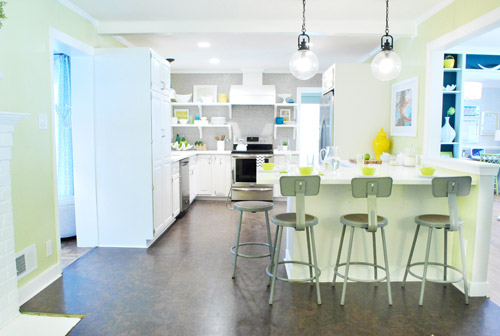
It was actually really nice how they tied into the stainless appliances, felt kind of geek-industrial, and even brought the gray color in the wall of penny tile over into the other side of the room. But after a nice long time of thinking it through and weighing our options, we decided… it’s time to paint them! It’s not that we don’t like how they look as-is as much as we think a new coat of paint could look infinitely better. From good to great if you will. So without further ado, our musings…
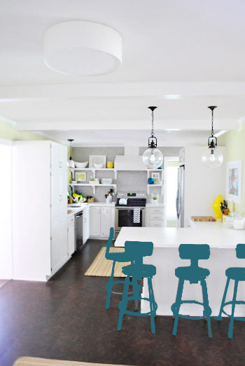
Our first thought was a dark teal color. Don’t mind our horribly photoshopped stool rendering (it’s not a very accurate portrayal at all, but in our brain we think we can almost picture it).
Why dark teal? Well, see the back of the built-ins in the adjoined dining room in this older shot of the room on the right?
Since the kitchen and the dining room are now open to each other, we just love seeing a sliver of that dark teal on the built-ins when we’re in there, so we thought bringing a bit more of that color in with the stools could be fun. Although it could be a little too matchy-matchy too, so we kept playing around with other options.
Like white, which is a little too… white for us. Haha. There’s just so much lightness in the cabinets and counters that although glossy white stools would look modern and clean, we think it’s just too flat for us.
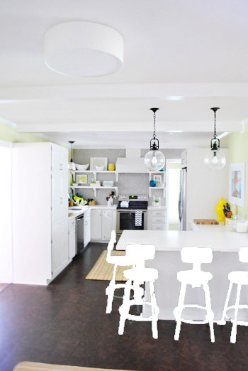
Next we tried ORB (oil-rubbed bronze), which would probably be an easy win. We worried it would blend in too much with our floor, but at least from this terrible rendering they look like they’d pop in front of the white cabinets/counter. And they’d balance the dark hardware on the pendant lights above (I also tried a dark charcoal gray but they didn’t look as good as the ORB rendering, so I figured that was the better option. But it’s not the most happy and exciting choice out there.
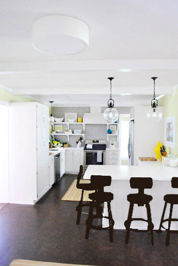
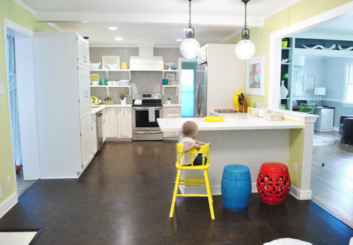
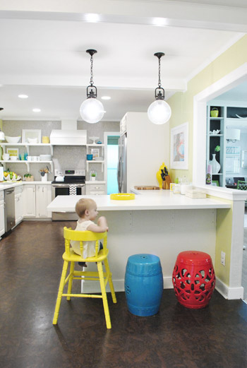
Then we tried yellow since we like the other random pops of yellow in the room – like that jar next to the fridge and that planter on the open shelves. But it looked crazy-scary. Might just be photoshop though, so I decided to bring Clara’s yellow highchair in and see how that looks in front of the peninsula (since surely it can’t look this nuts in real life).
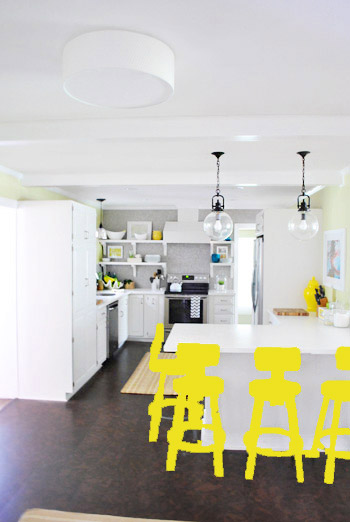
Sure enough, it looks pretty cute:
I also brought in a random HomeGoods/Joss&Main stools from other rooms (blue = HomeGoods, red = Joss&Main) just to see how those colors would look. We actually really liked all three of these color options. It’s fun to have a little pop of happy at the peninsula, right?
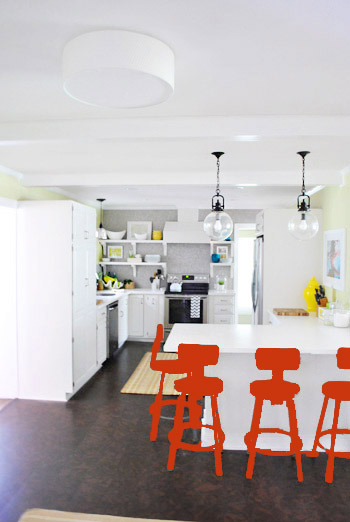
Of course the blue one looked awesome with the pops of blue on the open shelves, but this exercise actually got us seriously considering tomato red, since it’s not in many other places around the house (so it feels exciting and new). It would also pick up some of the red tones in our Lady Swimming print next to the fridge, which could be fun. But since the chairs wouldn’t be low-lying garden stools, and would be four metal stools with backs, in order to picture it, I bounced back to my good friend Photoshop.
Our only fear is that with the yellow-green walls, red or deep orange chairs are a little too McDonalds for our tastes (especially when viewed from the other side of the kitchen – looking back towards the fireplace nook, which has a lot more green paint going on than this view). So next we decided to give leaf green a try…
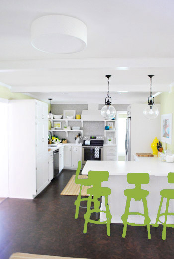
… and a deeper emerald color…
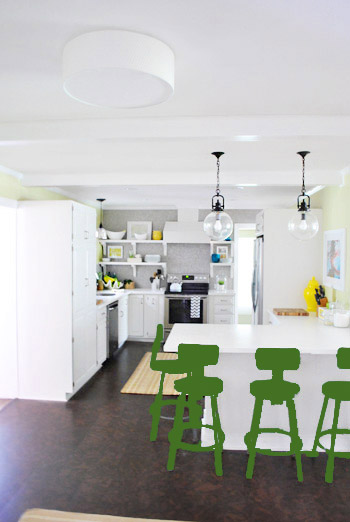
All of them could probably work, so they got logged as other alternatives. It was at this point that we realized that a number of things could work in our pretty neutral kitchen (white and gray and brown pretty much goes with everything), so it’s just going to come down to choosing whatever color we like best.
Next it was onto blue, where we tried a lighter teal color with a fair amount of gray in it:
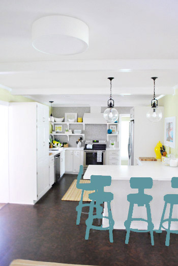
Of course these renderings aren’t very true to what things will really look like in real life with light bouncing around and not everything being the same flat shade – so something that looks the best here could totally read differently in real life. But the truth is that we love a room with a pop of color in the stools, like this, this, and this), and our minds change about what color we want to go with every day.
Oh and how funny is this? Right after I shot this picture…
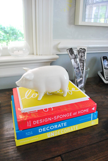
… I walked into the office and saw this stack of books…
Guess I’m just a die-hard fan of those colors. Haha. For accessories, potential stool colors, and beyond!
You know we’ll keep you posted when we make a final decision! Hopefully within the next week or two – because these renderings are getting us excited. Haha. And this little photoshop exercise was comforting because it helped us realize that there are any number of ways we could go instead of having to find the “one right color” like hunting for a needle in a haystack. I’m sure you guys will weigh in with your favorite stool colors in the meantime, right? Anyone else playing around in Photoshop or bringing items from other rooms to see how certain colors or shapes will work?

Sayward says
Dear Sherry,
I love you so much for the way you always respond to comments so graciously. You show so much kindness and patience and appreciation to everyone. You guys set a great example of how to treat other people regardless of their behavior. You’re like a classy Internet role model princess! That title should come with a sparkly crown, or at least some complimentary throw pillows. Or adult care bear underwear, which I totally want.
YoungHouseLove says
Aw thanks so much Sayward! You’re so sweet!
xo,
s
Renee says
I really like the tomato red or the teal/grey color!! But, I know whatever you guys choose it will look incredible!! PS – love that clipboard idea b/c I have lists EVERYWHERE! :)
Hil says
You have a lot of good options there… I personally like the leaf green and teal-grey. Good luck with the decision!
Melissa says
I love the yellow and both greens.
Laura says
Hey guys. My day job is picking paint colors and doing renderings of said paint colors on photos, so just a quick tip for more realistic color renderings. Color in the shapes you want (just like you colored in the stools) on a separate layer in photoshop. Then duplicate that layer three times. Change the blending layer of the top layer to “multiply”, the second layer to “overlay”, the third layer to “color”. You can play around with the opacity of the “overlay” layer to get it looking just right.
There are probably a hundred ways to accomplish this in photoshop, but this is just my way. Hope it helps!!
YoungHouseLove says
Oh yes, I love the multiply/overlay method! I was just doing it really fast with the paint dump tool on the same layer! Haha.
xo,
s
Jocelyn says
Funny thing, when I logged on to this post I thought it looked like you painted your stools celadon green and I really liked it. I personally think painting the stools a bright color draws attention from everything else in the two rooms. Your pops of color fade away.
Krista says
You could be really brave and leave it up to a reader poll! That would be fun to see anyway and like you say you could always change it if you didn’t like it. My vote is for keeping them as is – I like gray.
YoungHouseLove says
We wish we could leave up a reader poll! The last time we put one up our site crashed from all the clicking at once! Haha. Technology confounds us sometimes!
xo,
s
monika says
this is off the reservation, but i wanted to ask where you got the ceiling light in the kitchen, the big round flush-mount. it wasn’t mentioned in the list of goodies in the “where we got it” section…. many thanks and i vote for the teal stools :-)
YoungHouseLove says
Oh that’s from Ikea! We blogged about it a few weeks ago I think- have to add it to the where we got it section- thanks!
xo,
s
monika says
thank you kindly! i shall saunter down to 13A and get myself one. enjoy the weekend!
Erika says
In order of my favorites:
1. Leaf Green
2. Teal
3. Emerald Green
4. Yellow
Mary says
I can’t tell whether it was already suggested, but I wonder if a deep purple might work?
I actually really like them the way they are. I like the industrial look.
YoungHouseLove says
We tried purple in photoshop and weren’t too crazy about it, but you never know where we’ll end up!
xo,
s
Heather says
I love the leaf green and the lighter grayish teal! What about two of each? That way you don’t have a rainbow brite effect, but a little bit of a mix?
YoungHouseLove says
That’s definitely another way we could go!!
xo,
s
Lisa says
LOVE the post! I know it’s a bit girly, but have you thought of the colour coral? Or have you considered colour blocking? Like painting the stools white and then dipping the legs into another (perhaps teal) pop of colour? Could be a cool look. Can’t wait to see what you do!
YoungHouseLove says
Other fun ideas for sure! So many choices!
xo,
s
Amy Knisely says
I agree, I like the leaf green and the grey-teal the best. What might look really cool is painting the metal part of the chair one color and then upholstering the seat in fabric that ties in with the dining room. That way you can incorporate more colors in the chairs without it being crazy over-powering. I don’t know if that’s even an option (or you could paint/stencil a design on the seat if that works)
Another color I thought of… somewhere between a toned down fuchsia and raspberry? It plays nicely with greens/teals without being too stark of a contrast (especially when muted) and it will pick up colors from your print.
Then again, it might look kinda girly…
YoungHouseLove says
Not sure John will go for anything in the pink family (he lives here too so we work by mutual agreement) – we’ll have to see where we end up!
xo,
s
baila says
i loved the first idea of the dark teal to match the built ins. my eyes went right there when viewing the kitchen and it would be a perfect way to have the rooms flow visually.
i agree with you that they should all be the same color.
you have enough “pops” in the kitchen to satisfy the color itch. :)
Amber says
Ok, I was going to read all the comments, to make sure I wasn’t re-saying what others had, but there’s just too many! (Side note, one of the earliest commenters mentioned that you’ll have 750 posts today…mine is 750.lol(I know there is more waiting to be moderated, but let me have my math-nerdy-conincidence-fantasy, ok?) ANYhoo, I have two ideas for you for the stools…1. Plum. Nice with the teal of the dining room, different enough to tickle $herdog’s fancy, and pop-y enough for the kitchen. Idea #2, OMBRE!!! Paint them in three-four gradient shades, lighter on top, darker on bottom, so that the bright pop of color is against the white cabinets, but the lighter shade up top isn’t competing with the rest of the house. It would add interest and would allow you to ponder deeper/funkier colors that you couldn’t otherwise. : ) Also, I totally get you having an entire post about a clipboard. I mean, you’re not raising a kid or keeping a house and a marriage, right? Every. Post. should be high octane, as you have nothing else to do…; ) Love the way you guys do everything, keep going strong! : )
YoungHouseLove says
Haha- so funny about the 750 comments thing! And as for your two ideas- they’re always another way to go! Will keep you posted!
xo,
s
Krista says
First of all, I love your blog – it’s the first thing I check after my email in the morning! But about the stools.. I really like how the teal looks, either the darker or the lighter. I think it could look cute if you did that, and then put cushions of different colors (yellow, green, tomato red…) on them. That way, it’s fun but not so rainbow-y! :)
Lauren says
Where is Clara’s highchair from? It’s adorable!!
YoungHouseLove says
It’s actually the highchair my mom used to use when she was a child! It was handed down and we painted it yellow here: https://www.younghouselove.com/2012/03/hi-chair-how-are-ya/
xo,
s
Ashley says
I am LOVING both teals (darker and lighter). They look like the perfect pop of color.
Nicole says
Delayed thought on this post… what if you “dipped” the legs? You could use a neutral or darker color (ORB?) and then have the legs pop against the cork floor and white peninsula (teal still has my vote!!). Dipping, so hot right now, dipping. (Zoolander dorking out: Hansel, so hot right now, Hansel.)
YoungHouseLove says
That’s another fun idea for sure!
xo
s
Stacy Moore says
I liked several of the options. Tough call. Did you guys think about plum? Sorry if someone mentioned plum already. I just didn’t have the time to read over 750 comments. How do you guys do it?!?! :)
YoungHouseLove says
Haha, we love reading everyone’s ideas! Plum has come up and we tried it in photoshop but it wasn’t our favorite. Who knows where we’ll end up!
xo,
s
Dessica says
I vote for yellow!
Stephany says
I like the dark teal especially with the pop of teal from the next room. Or what if you did dark teal on one stool, lime green and then yellow on the other stools. A gradient of color. Just a thought.
I love your new grass also!!!!
Allison says
I love the COMBINATION of the yellow/blue/red. Are you guys brave enough to go mis-matchy?!?!
YoungHouseLove says
You can read back through our comments (I think on the first page) to see what we think about that!
xo,
s
Tonya Berryman says
So glad you posted this! I bought your stools for my kitchen and they are great except for the kids greasy finger prints on the seat that doesnt clean off easily. I am excited to see what you do with yours and how they turn out. Do you think you will paint the brown part too? If not, do you think I could use some kind of sealer on them?
YoungHouseLove says
Yes, I think we’ll paint the whole shebang! I bet you could use some sort of clear spray gloss to seal them if you’d like!
xo,
s
SarahW says
I just saw that someone else has already suggested this but I thought about Ombre in green to yellow or teal to green. It would be fun and different and give your room the colors you want.
Something to keep in mind about colors, Blues and greens tend to make you want to eat less, reds and yellows stimulate hunger, which is why you tend to see it a lot in fast food places.
Heather Flint says
I’ve always been in love with the color you painted the ceramic rooster in your kitchen!! https://www.younghouselove.com/2012/01/a-giant-rooster-who-does-that/
All I know is that I’m certain whichever color you pick will be be amazing!!! :)
YoungHouseLove says
Aw thanks Heather! We tried that color in photoshop and it didn’t look so hot. Haha. But who knows where we’ll end up!
xo,
s
Jessica Brooks says
Yellow was definitely my favorite! It tied everything together! :)
Eugenia says
I like them in yelow :)
Tara says
My vote would be the teal color, but then I am a lover of all things blue!
Julie Lanner says
Hi, I’m voting for the bright yellow. Pulls the other yellow bits together and is cheery.
Julie
lark says
Thanks for this article. It appeared in my inbox at a good time. Ironically, I have recently been researching replacements for my current bar stools… which are dark, heavy and bulky. I love the idea of painting them a lighter, less visually heavy color. My current bar stools are super old and from Pier one… mahogany stained legs and faux leather chocolate brown upholstery. I am little intimidated by trying to reupholster them though so might just end up getting new ones and craig-listing the ones I have. I have a small space… so I’m leaning toward the CB2 acryllic/chrome bar stools…for less visual weight in my tiny kitchen/living/dining room. They seem to have nothing but positive reviews. I’m just worried they are too modern…I am still trying to figure out my style… I like the industrial/rustic modern look but with subtle, feminine touches.
I personally loved the pale green color that you mocked-up. I think it adds a sense of serenity to your bright kitchen and you wouldn’t have to worry about it looking like McDonald’s.
Jennifer says
Love the ombré idea. I was going to suggest a different color on the legs. Maybe white with the seat and back painted in a color you love. Or, how about painting each stool a different color? I always love when chairs at a seating area are different. It gives each seat some individuality and personality. I love your kitchen by the way. Nice work guys!
Emily says
navy!!!
Kate says
I LOVED the dark teal…. with all the light colours around that area I think you could go with something really bold. You could have different coloured stools? Miz and match a bit (e.g. pick a couple of colours and mix and match where on the chairs they will sit… but I love a bit of mis-matched goodness)
Pam the Goatherd says
While red is my favorite color, it just looks really out of place in your kitchen. The yellow gets my vote. I think the teal/greens are too much of the same-old/same-old with the grellow walls. But you guys are the ones who have to live with the colors, so whatever you choose will be the “best” choice.
As for the earlier commenter who groused about your clipboard post, I say “pfffffttt” to them! Like so many other YHL followers, I really appreciate the attention to detail that you share with us. It’s nice to know that even people as talented at DIY as the Petersiks don’t instantly know exactly what is going to look right in every situation. Thank you for keeping it real!
Natalie says
Sheesh, 780 comments already… doubt you’ll see/notice mine. Which is exactly why I rarely bother to comment, but just HAD to put in my two cents anyway on this – please, please DON’T paint those beautiful chairs white or black! I think they look great as they are with this kitchen, but if you do paint them, I really hope it will be yellow or the light teal blue color you posted here. Those would both be gorgeous on these chairs!
Joan says
So I definitely haven’t read through all of the comments on all of your stool posts, but could we please please please get a picture of what the peninsula would look like with just 2 stools? I just feel like 4 stools looks *so* crowded, especially since there are only 2 of your that can actually sit on them.
I would love to see 2 there on an everyday basis and keep the extra 2 in storage somewhere to bring out when you have company. Just my opinion :)
Also- any of the bright colors would look awesome! I’m a sucker for yellow, so I always lean towards that. Orange is totally unexpected in an awesome way. Can’t wait to see what you end up picking!
YoungHouseLove says
Oh yes I’m sure lots of nooks of our house would look better if we ignored function! Haha. We use all four stools all the time (multiple times a week- enough that breaking out stools and storing them just doesn’t work as well for us). Hope that makes sense!
xo,
s
Joan says
Not gonna lie- it still doesn’t make sense to me. Two people and four stools just seems excessive. But then I live very minimally in a tiny NY apartment so having extra furniture really isn’t an option.
YoungHouseLove says
I lived in a tiny NYC apartment for six years. Haha. I remember it well! We’re actually three people though – Clara’s baby chair straps into the stool on the end and it’s where she eats almost every meal. We have John’s mom, dad, and four sisters over all the time since they’re local – so we do a lot more house-hanging-out than we did back in NYC so our stools really are in use a ton. Back in NYC we’d met up with people out to eat and didn’t have so much family around (and a kid) in our casa, ya know?
xo,
s
rosa says
apparently i’m not alone in thinking they’d be cool in different colors – just like the other readers, Clara’s high chair + the garden stools are just too lovely to ignore!
Patty C says
I thought for sure I would like the blue best. . . a peek in this room, a pop in the other but then Clara’s chair just looked so dang cute! Of course, maybe I just love her chair. :) I’m sure whichever way you go will look great .
Brenda says
It’ll be fun to see what color they end up. If I was choosing, I’d probably give a dark plum a whirl. I’m pretty biased towards purple, though, as it’s my favorite color. :)
Katie H. says
I’m loving the lighter green!
Angela says
I like the light teal the best! Its still in the same color family as the dining room walls/curtains and some of the kitchen accessories but its not matchy-matchy!
Erin says
I need a bit of advice on a color scheme and was thinking maybe you could help.
My twins nursery is painted BM Haystack yellow. Its a pretty bold yellow when you have an entire room coated in it but I like the energy it gives the room. I’m thinking of putting a dresser in their room and painting it. No clue what color I should paint it. Everything else in the room is white or wood tones. I like how the teal looks in your kitchen but I don’t want the dresser to be the focal point in the room. Any thoughts?!
YoungHouseLove says
I think if you don’t want it to be a focal point, you could go with a similar (slightly lighter or darker) yellow like the walls so it blends in. Or you could go with white or wood or dark brown or mocha, just to make it a neutral without it being too bright. Even a pale green could be sweet. Hope it helps!
xo,
s