Me + a picture of our kitchen + photoshop = this post.
Back in December when we bought our kitchen stools (from a school supply store for $32 a pop) we mentioned we were entertaining a number of ways to tweak them down the line (painting them, upholstering/staining the seat, etc) but just couldn’t shake the feeling that we should live with them a while first – just to make sure we weren’t doing anything rash in the middle of a kitchen remodel. We basically wanted the room to come together, live with them a little, and then make the call.
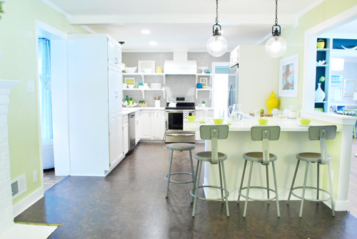
It was actually really nice how they tied into the stainless appliances, felt kind of geek-industrial, and even brought the gray color in the wall of penny tile over into the other side of the room. But after a nice long time of thinking it through and weighing our options, we decided… it’s time to paint them! It’s not that we don’t like how they look as-is as much as we think a new coat of paint could look infinitely better. From good to great if you will. So without further ado, our musings…
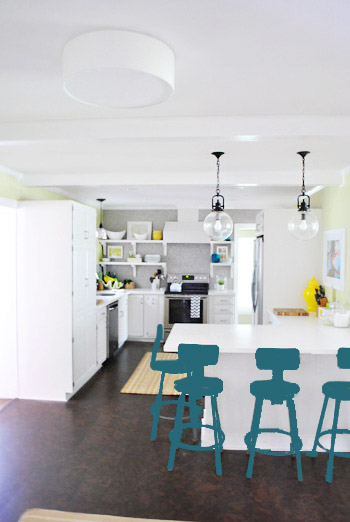
Our first thought was a dark teal color. Don’t mind our horribly photoshopped stool rendering (it’s not a very accurate portrayal at all, but in our brain we think we can almost picture it).
Why dark teal? Well, see the back of the built-ins in the adjoined dining room in this older shot of the room on the right?
Since the kitchen and the dining room are now open to each other, we just love seeing a sliver of that dark teal on the built-ins when we’re in there, so we thought bringing a bit more of that color in with the stools could be fun. Although it could be a little too matchy-matchy too, so we kept playing around with other options.
Like white, which is a little too… white for us. Haha. There’s just so much lightness in the cabinets and counters that although glossy white stools would look modern and clean, we think it’s just too flat for us.
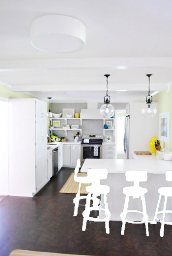
Next we tried ORB (oil-rubbed bronze), which would probably be an easy win. We worried it would blend in too much with our floor, but at least from this terrible rendering they look like they’d pop in front of the white cabinets/counter. And they’d balance the dark hardware on the pendant lights above (I also tried a dark charcoal gray but they didn’t look as good as the ORB rendering, so I figured that was the better option. But it’s not the most happy and exciting choice out there.
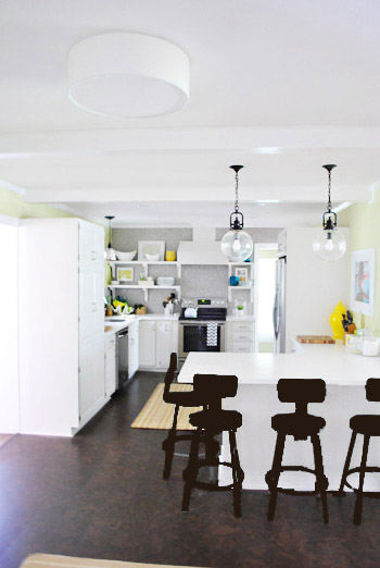
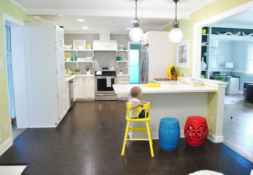
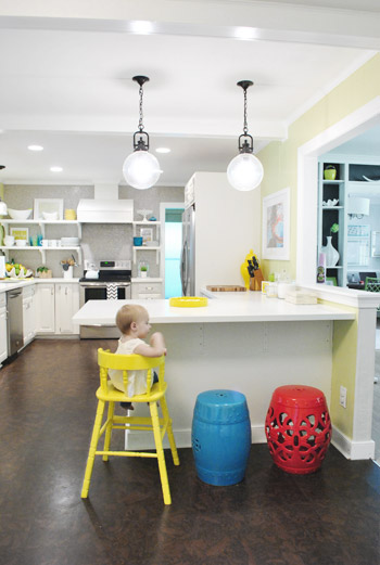
Then we tried yellow since we like the other random pops of yellow in the room – like that jar next to the fridge and that planter on the open shelves. But it looked crazy-scary. Might just be photoshop though, so I decided to bring Clara’s yellow highchair in and see how that looks in front of the peninsula (since surely it can’t look this nuts in real life).
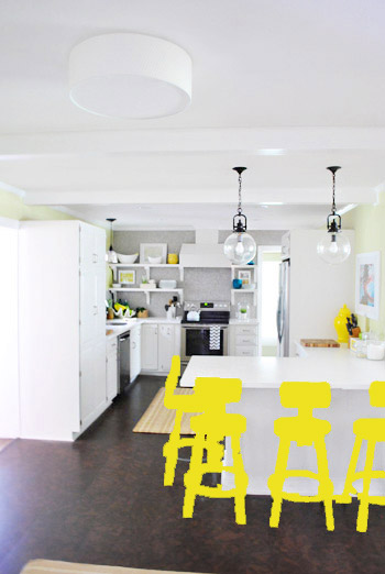
Sure enough, it looks pretty cute:
I also brought in a random HomeGoods/Joss&Main stools from other rooms (blue = HomeGoods, red = Joss&Main) just to see how those colors would look. We actually really liked all three of these color options. It’s fun to have a little pop of happy at the peninsula, right?
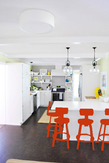
Of course the blue one looked awesome with the pops of blue on the open shelves, but this exercise actually got us seriously considering tomato red, since it’s not in many other places around the house (so it feels exciting and new). It would also pick up some of the red tones in our Lady Swimming print next to the fridge, which could be fun. But since the chairs wouldn’t be low-lying garden stools, and would be four metal stools with backs, in order to picture it, I bounced back to my good friend Photoshop.
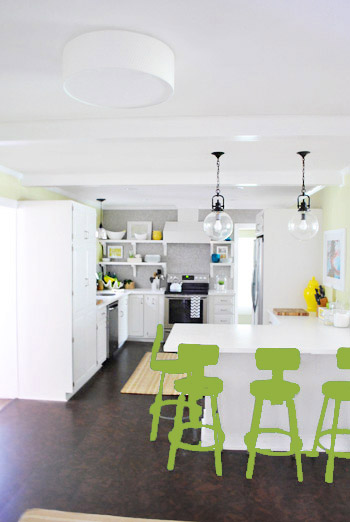
Our only fear is that with the yellow-green walls, red or deep orange chairs are a little too McDonalds for our tastes (especially when viewed from the other side of the kitchen – looking back towards the fireplace nook, which has a lot more green paint going on than this view). So next we decided to give leaf green a try…
… and a deeper emerald color…
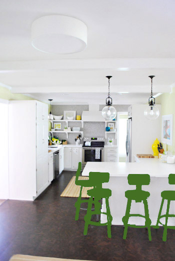
All of them could probably work, so they got logged as other alternatives. It was at this point that we realized that a number of things could work in our pretty neutral kitchen (white and gray and brown pretty much goes with everything), so it’s just going to come down to choosing whatever color we like best.
Next it was onto blue, where we tried a lighter teal color with a fair amount of gray in it:
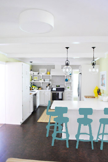
Of course these renderings aren’t very true to what things will really look like in real life with light bouncing around and not everything being the same flat shade – so something that looks the best here could totally read differently in real life. But the truth is that we love a room with a pop of color in the stools, like this, this, and this), and our minds change about what color we want to go with every day.
Oh and how funny is this? Right after I shot this picture…
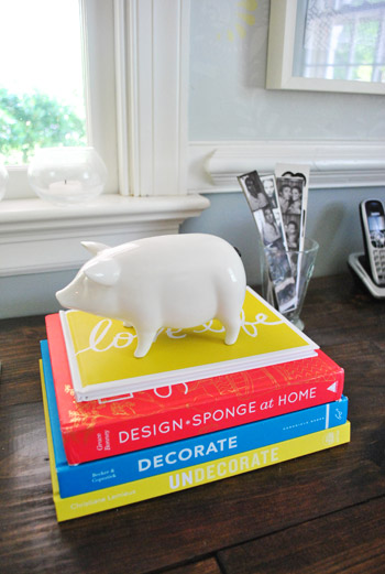
… I walked into the office and saw this stack of books…
Guess I’m just a die-hard fan of those colors. Haha. For accessories, potential stool colors, and beyond!
You know we’ll keep you posted when we make a final decision! Hopefully within the next week or two – because these renderings are getting us excited. Haha. And this little photoshop exercise was comforting because it helped us realize that there are any number of ways we could go instead of having to find the “one right color” like hunting for a needle in a haystack. I’m sure you guys will weigh in with your favorite stool colors in the meantime, right? Anyone else playing around in Photoshop or bringing items from other rooms to see how certain colors or shapes will work?

Amelia says
I like the dark teal (the light teal still feels too neutral for this room) and the leaf green. Maybe paint the stools the same color as your desk chairs as you can also see them at certain angles. Plus there are always pops of green in a kitchen like flowers or limes on the counter. What are you going to do with the seats since you actually see a lot of that when looking at the stools? Maybe that will help determine the color for the metal part. Can’t wait to see!
Donna says
I know what you mean, Sherry. My favorite color forever has been yellow. I will buy ANYTHING, providing it’s yellow. You have no idea how jealous I was of your kitchen radio! Thankfully, my DH is the voice of reason, and talks me down from the proverbial ledge. But it can be hard! I mean, love is love…
YoungHouseLove says
Haha- someday I hope you find one at a yard sale or on clearance somewhere! You guys are in love, you should be together! Haha.
xo,
s
Jill R says
I love the leaf green!
Jessica says
I vote for leaf green or ORB. I love how the leaf green works with the walls without being matchy-matchy, and I love how the ORB ties in with the pendants. : )
Melissa @ HOUSEography says
What does Sue the Napkin say? :) I like the red but would go with an orange-red or dark coral since none of your colors now are primary colors but really just modern takes on primary colors – teal, grellow, etc. Can’t wait to see what the final decision is!
YoungHouseLove says
Yeah, I think Sue is cool with everything but the red, which we also nixed for the McDonalds thing. Haha.
xo,
s
Shelly says
My favorite is definitely the teal, but I love the leaf green as well. The only one I recoiled from was the red- it looked “off” to me when I looked over it to the penny tile wall…
Are you going to paint the stools,then get a new rug or visa versa?
Also, will the seat of the stools take paint differently than the rest of them?
YoungHouseLove says
The rug we ordered should be here any day now, so we’ll get to look at that before picking a final stool color! Will keep you posted! As for the seats, we’ll have to see how they work, but we have seen them all painted the same color with success, so we think it’s possible!
xo,
s
Erin says
I don’t know that I’ve ever commented here before, but for once I’m weighing in. I think the perfect color is one you didn’t even put up there…MULBERRY! Or some shade of magenta. I loathe purple, but for some reason like these colors for decorating. I feel that you’ve got a lot of green/blue (cool colors) going on, with the random yellow in the mix…and yellow and purple are complimentary colors. I think orange and red should be saved for other rooms, and I think green and blue (although they are my 2 favorite colors and the colors of my office and living room – our dining room being yellow) are getting a bit old. But rather than orange and red, magenta/mulberry (purple) should be your new jam!
YoungHouseLove says
Definitely another possibility!
xo,
s
Martha says
Oooo, yeah! Like that color they painted the rooster?
Erin says
Martha – that was the exact color I was thinking! But I couldn’t remember what they painted with it. I think it would look awesome in the kitchen :)
melissa says
I read your blog every day but I never comment… Somewhat of a creeper, maybe? But I had to comment to say I LOVE the yellow chairs the most! I’m sure whatever you choose will look beautiful though. And I love your blog!
YoungHouseLove says
Aw thanks Melissa! Thanks to all of you guys for your thoughts!
xo,
s
Victoria Elizabeth says
I like the first, lighter/leaf green… (I actually like the color they are now.)
Our home’s previous owners painted their kitchen stools each a different color. They were absolute color-lunatics, (they also painted some of our ceilings bright orange, rooms intense, blinding blue… ) so I’m not necessarily endorsing the idea. But perhaps in the hands of someone less color-mad, could be charming.
Ariana says
I was like “don’t do yellow…don’t do yellow…” and of course it looks adorable. I realllllyyy like the light gray/teal though as well!
Allyn says
Your own personal McDonalds would be pretty sweet. If you can make a good Big Mac from scratch, I’m totally going to come over.
I really like the lighter teal/grey. Yum.
Jessica G. says
I really like the lighter teal/gray color! It seems to flow nicely and still calls back to the penny tile. Normally I’m a big fan of bright poppy accent colors, but with four tall stools it just seems a little jarring.
Marci says
I’m LOVING the dark teal. And the light teal is pretty good too. What about staining the wood circles on the seats a dark stain like the floor with tha dark teal. That = magic to me!!!!
Lauren says
That is a GREAT idea! Gets my vote!
Anne says
I don’t really know. Those stools have me stumped. What about ombré on the legs? Or just paint “dipped” legs?
And whatever happened to doing something to the back side of the peninsula? Like the planked wood you talked about. That might help nail down a color easier!
YoungHouseLove says
We definitely have settled on the back of the peninsula staying white since we realize that from the side (seeing the white cabinet front and the wood side) would look really odd. So we might add white beadboard or white wainscotting, but it’ll stay white. As for the dipped legs- that’s another really fun idea!
xo,
s
Amy says
I love the idea of ombré stools! Good idea Anne!
Jenni says
I recently found (and fell in love with) your blog, so I went back to the beginning to read through all the adventures with the old house and the big move, etc. I’ve been keeping up with the new posts too, but there are about a year’s worth of posts I haven’t ready yet. (Currently at May of 2011 in the back reading!) So I was “surprised” to read today’s post and see the updated kitchen! LOL. I knew it had been done, but Jumping from its dark past to its bright “future” self was a little shocking… In a good way of course.
Anyway, I think Apple Green for the stools, like you wanted the dining room chairs to be once upon a time.
YoungHouseLove says
Haha- that’s so funny! So sorry to skip ahead for ya! Haha.
xo,
s
Mel says
I am really digging the greens and teals!
Taya says
I love the leaf green and the light teal the best out of all the choices! Bright and cheery without being too much in your face! Happy painting!!!
Paige @ Little Nostalgia says
Ya know, I like the red! I think it would be really unexpected and fun since you don’t use a lot of it in general.
Robin @ our semi organic life says
What about dipped??? ooohhh. ahhh..
also. I like green.
YoungHouseLove says
Love that idea! Always another possibility!
xo,
s
Karen F says
I’ve always thought they should be dark teal…but the yellow is really nice, too. Also the blue stool (a lighter teal) works. I don’t think you can go wrong, and if you end up not liking it, you can always paint over them!
Amelia says
I vote for the greens or the blues. The yellow is cute, but I think it fights too much with the grellow…
Nat says
Maybe the candy apple green Sherry wanted in the dining room can transfer over to the stools and you can live vicariously through them? Like this kitchen: http://www.decorpad.com/photo.htm?photoId=1829
PS- I’m currently studying abroad and in 13 hour different time zone, but I always clock in at 11pm (my time) to check if you guys updated. Thanks for helping me feel “at home” when I’m far away!
YoungHouseLove says
Ooh- that’s fun! Thanks for the link Nat! I love that you guys check in at 11pm. So sweet of you! Happy travels!
xo,
s
Shellie says
I love being on the west coast because it means that YHL is updated right when I get to work. It’s the first thing I check when I turn on my computer!
YoungHouseLove says
Aw, you’re sweet!
xo,
s
Beth says
I’m thinking a version of the blue in the back of the dining room shelves is way to go. That one just seemed the best to me!
I have taken photos of the outside of my house to play around with different front door colours. It sure did help me pick the right colour to paint the door, not that I’ve done it yet, and it helps my husband visualize what I have in mind.
Rachel says
I vote for dark teal or yellow for sure!
r8chel says
Call me boring, but I vote for metallic stainless steel to tie in with your appliances. :)
Kitty O says
I agree–that or ORB. I think another bright color on the stools is a mistake; there are already so many in the room. I love bright colors, but when they’re not JUST on accents, or just on the walls, or just on the furniture–when almost everything is a super-saturated bright color!–well, it starts to look juvenile to me. I mean, I thought the stools in your inspiration photos looked sophisticated simply they were all either stainless steel or ORB, and they were all in neutral rooms. (I have a feeling some readers might call me mean, but I promise, I’m just offering constructive criticism.)
YoungHouseLove says
Oh no, no worries! There are lots of ways to go and whenever we make choices in our house we’re totally aware it’s not what everyone reading would do if it were their home! That’s what keeps it fun- it’s such a subjective thing!
xo,
s
Kitty O says
I guess I’ll also add that I do think they need something, because I really don’t think the flat gray on them now looks good with the appliances. It just kind of highlights that they’re NOT stainless steel, you know?
YoungHouseLove says
Yeah, in person that’s more apparent- there’s more gleam in the backsplash tile and the appliances!
xo,
s
Teri says
I’m not a yellow fan either, but I sure did like the high chair there. It tied in the other pops of yellow in the room. But I think my favorite would be ORB (to match the lighting) with yellow cusions, with maybe a yellow stencil/vinyl design on the backs of the chairs.
YoungHouseLove says
Thanks for all the fun ideas everyone! So fun to read all these comments!
xo,
s
Tiffany says
Maybe paint the chairs a color and then possibly get inexpensive removable cushions that you can switch out in other colors and still be able to go without them as well?
YoungHouseLove says
Another possibility for sure!
xo,
s
Margo says
I definitely thought we were going to talk about a more…unsavory topic when I read the title. =P
My vote is for yellow! You have a lot of yellow accessories in the kitchen and it really made them pop when you brought in the highchair!
Brynn says
Haha it crossed my mind at first, too!
ashley says
I tend to lean towards a lighter teal or a yellow with teal seat cushions.
When I look at just the stools, I like all the colors but the brown. But in the grand scheme of things, my OCD self would pull the yellow or blue down to that end of the kitchen, too.
Ashley Jensen says
Ok so I vote for one of the teal chairs, leaning more towards the lighter teal. I think the yellow would be too in your face and draw the attention away from everything else, and something like the ORB would get lost against the floors. I also vote for a rug with gray in it in the “living” area. While I think the gray and white striped rug colors were perfect the pattern was all wrong!
Holly says
Am I the only person that thought this was going to be about poop?!?
I love the teal or the slate-teal-blue!
YoungHouseLove says
Haha, I think a few others mentioned it could go that way. Haha.
xo,
s
Amy says
OOh, its definitely a tough choice! Good luck with the decision :)
Leslie says
Either of the teal colors or the leaf green.
Tracy says
Oh yeah, I constantly move stuff around to see how it might work in various rooms (the actual item, or just the color/size/shape of said item).
I recently painted two of our dining room chairs that leaf green color you showed. Our kitchen and DR are situated similarly to yours, though both have different color schemes (our kitchen is painted in a terra cotta color, has mid-tone wide-plank flooring, maple cabinetry and dark-but-not-shiny countertops, stainless appliances; the flooring/walls are the same in the DR, with a large dark farmhouse style table). Anwyay, at first the two leaf-colored chairs at each end of the table felt very cartoonish (Max and Ruby!) but they are growing on me. I might use a muted mustardy glaze, or they might stay as is. The bigger question for me is whether to paint the other 4 chairs. If I do, and it goes badly, I can always just paint them black to match our peninsula stools (our peninsula does not turn, so the stools are essentially in the DR anyway). This experimental painting is one very nice benefit to having fairly cheap hand-me-down circa 1979 DR furniture!
Hah – sorry for the book I just wrote :-)
Oh, and I vote for teal!
Tracy says
chapter 2 ;-)
I’m realizing now how awful it must sound (the green chairs with the color scheme I’ve described)! BUT, our DR is pretty bright, has a ton of kid arts/crafts displayed (our dry sink piece of furniture is called a “craft cart” in our house). We also have a large multi-colored “license plate” map of the USA and a bright-colored chandelier.
Ha – before it sounded bland, with green chairs; now it sounds CRAZY!!!
YoungHouseLove says
I don’t think it sounds crazy at all! I can totally picture it! Good luck with everything Tracy!
xo,
s
Martha says
I feel like I can’t really vote without knowing what the new rug looks like! I really love the yellow, especially when you brought in Clara’s highchair. OOOOOO, decisions, decisions!
Susan says
I know you have had alot of comments about different colors and you are thinking it would be too rainbow bright, but what about different shades of teal so there is some variety but it would be more subtle. My other suggestion would be navy. I am loving navy, green, teal, and yellow together right now.
Happy decision making!
YoungHouseLove says
Always another possibility for sure!
xo,
s
Donna Jean says
I really like the leaf green or the lighter teal. Will you be leaving the seat part brown or painting over it with the color choice as well? What about a nice plum color?
Donna Jean says
that would be plum for the stools, not just the seat – i really like the brown for the seat part, even with a color change to the stool!
YoungHouseLove says
We’ll paint the whole thing the same color we think (others have done it with success, so we hope they work!). Fingers crossed!
xo,
s
Ryan says
Have you thought about going down to 3 stools at all? It seems like with 4, that’s alottachair for the kitchen. :) But, then again, I don’t live with it, so I don’t really get a true feel for the space.
YoungHouseLove says
We thought about three but four is just a better number for us. Clara sits in the one on the corner and J and I sit in the ones on the other side (and with plans for at least one more future kiddo, we thought it was a more family friendly number).
xo,
s
Katie of Cabbage Ranch says
You guys are my new best friends (lucky you). I’ve been searching for stools for our counter this week, and seeing you work through your thought process helps me out a ton! And for the record, I LOVE the stools you chose and I’m sure they’ll be fun in any color you end up with. Can’t wait to see your final product!
YoungHouseLove says
Aw thanks Katie!
xo,
s
Stacey says
You probably should have added a poll to the end of this post! It would be interesting to see which colour gets the majority vote. Although I know you would never kowtow to your audience and would confidently make up your own mind!
That being said. . . I like the toned-down teal chairs! Good luck with a tough decision!!!
YoungHouseLove says
Haha- I wanted to add a poll but the last time we did that our site crashed. Boo technology! Haha.
xo,
s
Brandy says
I’ll admit I’m a color junky, but I’m loving the yellow. Could you paint the chair portion and leave the legs alone – you keep a little of the industrial look but still add some color?
YoungHouseLove says
Definitely another option for sure!
xo,
s
Hillary says
I love the darker teal the best–I’m having a fling with teal these days and am debating what to paint teal in my house! I also loved the yellow until I remembered the yellow rug with the walls. I’m sure I will love whatever colors you guys pick but I like that the teal didn’t really match anything in the kitchen but didn’t clash and picked up the back of the bookcase. Good luck, I am also completely indecisive when it comes to these things and wish I had a blog so I could hear people weigh in!
Randee J. says
I don’t usually comment, but I LOVE the blues showed as options! I’m also a fan of keeping all the stools the same color =)
Shinay says
Hey guys I love how you’ve decided to paint the stools although I love how they are now. I think all the colors you selected can pretty much work which makes your job that much harder but if I was to help you narrow it down a little how about the deeper emerald color but that is one of my favorite colors so that’s not fair for me to tell you to use my favorite color. But wait for it!!! I have a really good idea how about using all the colors there are no rules when you have all these pretty colors. No think about it one chair yellow, one green and the other tomato red. Hmmm this can work!! No really; all joking aside I think you have a pretty hard choice and my pick for your kitchen is the (leaf green) I think it looks so good in there.
Thanks for sharing
Shinay Key
nancy@owensolivia says
i like the teal and orange best. fun colors!
Abby says
Tomato Red and Tealish-Gray were my faves!!
Jeri says
I know it’s not a vote, but have to throw in my 2 cents anyway. It kind of surprises me, but I’m really loving the tomato. The dark teal is gorgeous, too. And while I generally love ORB or white, they’re kinda dull in comparison to the others. And I LOVE bright green, but it’s a bit much w/ the wall color.
LaMadre says
How about painting them a silver/stainless metal color so they are more like the appliances, they will stand out more without taking over the place. Then add a nice color to the seat. And, while I can see not painting the stools red – a bit of red here and there could look really great in the room. Love how the room is coming together.
YoungHouseLove says
Always another way to go for sure! Will keep you guys posted!
xo,
s
Lauren@FilingJointly says
My vote is for the yellow, such a happy color. Though I also like the color in the built-ins and the teal/grey color at the end of this post. So I’m pretty much no help at all. Haha.
I tried to photoshop something once. And then I quit photoshopping things forever.
http://www.filing-jointly.com/2011/08/why-yes-i-do-know-how-to-photoshop.html
Also, this has nothing to do with photoshop whatsoever, I just wanted to share my most favorite picture in the world.
http://www.filing-jointly.com/search?updated-max=2012-03-01T21:05:00-06:00&max-results=5&start=5&by-date=false
YoungHouseLove says
Bwahaha- best picture ever in that last link! Ha.
xo,
s
Stephanie says
Where do you keep the red and blue stools from Home Goods/Joss and Main? I don’t think I’ve seen them before in pictures.
YoungHouseLove says
The blue one is outside on the patio sometimes (it ties into our blue hydrangeas, our blue birdhouse, and our blue rainbarrel- haha) and the red one moves around a lot (from the guest room to the leather chair in the office, etc.
xo,
s