Me + a picture of our kitchen + photoshop = this post.
Back in December when we bought our kitchen stools (from a school supply store for $32 a pop) we mentioned we were entertaining a number of ways to tweak them down the line (painting them, upholstering/staining the seat, etc) but just couldn’t shake the feeling that we should live with them a while first – just to make sure we weren’t doing anything rash in the middle of a kitchen remodel. We basically wanted the room to come together, live with them a little, and then make the call.
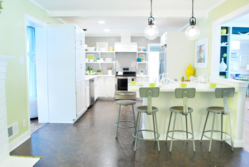
It was actually really nice how they tied into the stainless appliances, felt kind of geek-industrial, and even brought the gray color in the wall of penny tile over into the other side of the room. But after a nice long time of thinking it through and weighing our options, we decided… it’s time to paint them! It’s not that we don’t like how they look as-is as much as we think a new coat of paint could look infinitely better. From good to great if you will. So without further ado, our musings…
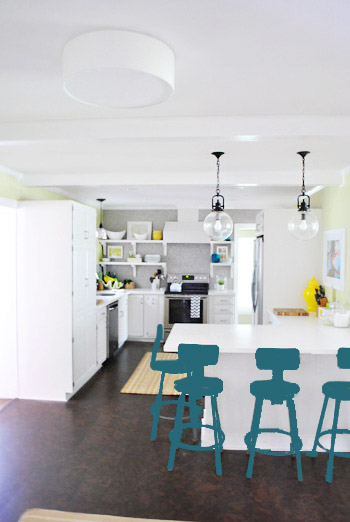
Our first thought was a dark teal color. Don’t mind our horribly photoshopped stool rendering (it’s not a very accurate portrayal at all, but in our brain we think we can almost picture it).
Why dark teal? Well, see the back of the built-ins in the adjoined dining room in this older shot of the room on the right?

Since the kitchen and the dining room are now open to each other, we just love seeing a sliver of that dark teal on the built-ins when we’re in there, so we thought bringing a bit more of that color in with the stools could be fun. Although it could be a little too matchy-matchy too, so we kept playing around with other options.
Like white, which is a little too… white for us. Haha. There’s just so much lightness in the cabinets and counters that although glossy white stools would look modern and clean, we think it’s just too flat for us.
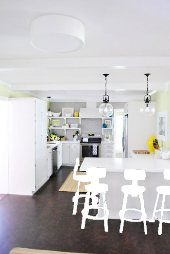
Next we tried ORB (oil-rubbed bronze), which would probably be an easy win. We worried it would blend in too much with our floor, but at least from this terrible rendering they look like they’d pop in front of the white cabinets/counter. And they’d balance the dark hardware on the pendant lights above (I also tried a dark charcoal gray but they didn’t look as good as the ORB rendering, so I figured that was the better option. But it’s not the most happy and exciting choice out there.
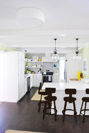
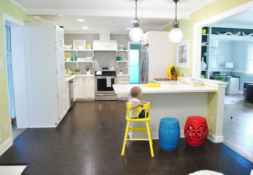
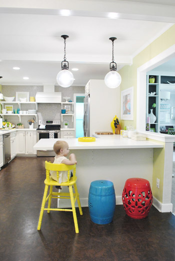
Then we tried yellow since we like the other random pops of yellow in the room – like that jar next to the fridge and that planter on the open shelves. But it looked crazy-scary. Might just be photoshop though, so I decided to bring Clara’s yellow highchair in and see how that looks in front of the peninsula (since surely it can’t look this nuts in real life).
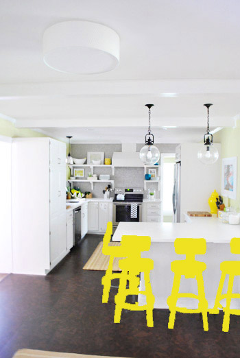
Sure enough, it looks pretty cute:
I also brought in a random HomeGoods/Joss&Main stools from other rooms (blue = HomeGoods, red = Joss&Main) just to see how those colors would look. We actually really liked all three of these color options. It’s fun to have a little pop of happy at the peninsula, right?
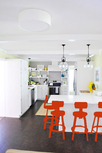
Of course the blue one looked awesome with the pops of blue on the open shelves, but this exercise actually got us seriously considering tomato red, since it’s not in many other places around the house (so it feels exciting and new). It would also pick up some of the red tones in our Lady Swimming print next to the fridge, which could be fun. But since the chairs wouldn’t be low-lying garden stools, and would be four metal stools with backs, in order to picture it, I bounced back to my good friend Photoshop.
Our only fear is that with the yellow-green walls, red or deep orange chairs are a little too McDonalds for our tastes (especially when viewed from the other side of the kitchen – looking back towards the fireplace nook, which has a lot more green paint going on than this view). So next we decided to give leaf green a try…
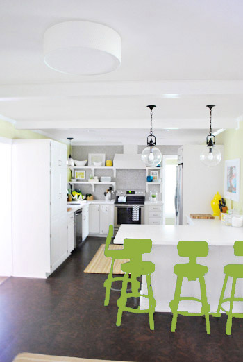
… and a deeper emerald color…
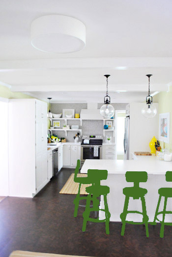
All of them could probably work, so they got logged as other alternatives. It was at this point that we realized that a number of things could work in our pretty neutral kitchen (white and gray and brown pretty much goes with everything), so it’s just going to come down to choosing whatever color we like best.
Next it was onto blue, where we tried a lighter teal color with a fair amount of gray in it:
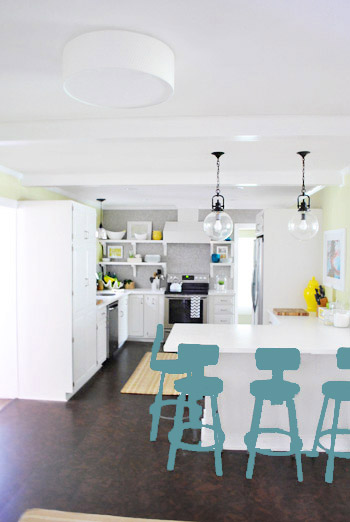
Of course these renderings aren’t very true to what things will really look like in real life with light bouncing around and not everything being the same flat shade – so something that looks the best here could totally read differently in real life. But the truth is that we love a room with a pop of color in the stools, like this, this, and this), and our minds change about what color we want to go with every day.
Oh and how funny is this? Right after I shot this picture…
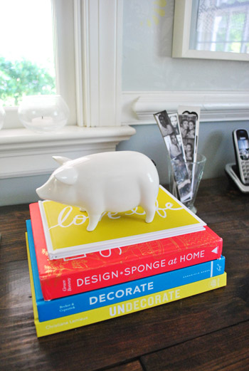
… I walked into the office and saw this stack of books…
Guess I’m just a die-hard fan of those colors. Haha. For accessories, potential stool colors, and beyond!
You know we’ll keep you posted when we make a final decision! Hopefully within the next week or two – because these renderings are getting us excited. Haha. And this little photoshop exercise was comforting because it helped us realize that there are any number of ways we could go instead of having to find the “one right color” like hunting for a needle in a haystack. I’m sure you guys will weigh in with your favorite stool colors in the meantime, right? Anyone else playing around in Photoshop or bringing items from other rooms to see how certain colors or shapes will work?

margo says
pale pistachio. which was not a contender but should’ve been!
YoungHouseLove says
Ooh always another possibility! Only hope it doesn’t clash with the soft avocado walls…
xo,
s
AmyW03 says
My vote is for the teal/blue color!!!
Laura @cookicrumbsandsawdust.blogspot.com says
When we bought our first house years ago, I purchased an inexpensive paint software from lowes to help me decide wall colors. It was really useful and completely fun to play with. I just uploaded pics of my own house and went to town.
Besides, knowing you two, if you paint a color you don’t like, you’ll just change it until you love it. I’m not worried. . .
YoungHouseLove says
Haha it’s true! We’ll totally repaint if we don’t like something!
xo,
s
Lindsey says
Teal gets my vote!
jennT says
I think it’s so neat that as you change colors on your zombie-esque photoshop chairs the little tiny bits of similar colors in the background really wake up! I especially noticed that with the lime green and the time on the oven! :)
YoungHouseLove says
So funny!
xo,
s
Amy H says
How about blasting them with walnut shells to remove the gray paint and let them be the natural steel?
You would want to put a wax sealer over it them to eliminate potential rust spots.
YoungHouseLove says
Always another possibility!!
xo
s
Kay says
I love the yellow and teal options! I’ve been photoshopping a lot lately too- I took a picture of our backyard and photoshopped some railroad ties in to get a visual on how it would look- and then tried to add in some crepe myrtles and smaller plants. It was hilarious! It did give me a good sense of my spacing though. Next project: photoshopping my ideas into a picture of our kitchen. You know, after we finish the backyard and all. :)
melanie says
I like the two teals – light and dark. I think tying in that color from the dining room is a great idea plus it looks like you have teal-ish accents in some dishes in the background. If it were me I’d figure the color out at the same time that you figure out what rug to add to the room which you were working on the other day. I’m thinking that you might have a harder time finding a rug if you go all crazy with the stools, just a thought but I’m a design scarred cat!
YoungHouseLove says
Oh yes we already ordered a rug that should be here any day now and then we’ll make the final call on the stools!
xo,
s
Cynthia says
I’m with all the people that mentioned the one yellow, one red, one blue, and one to-be-determined color. And if not, then definitely sunshine yellow like Clara’s chair – that would make me smile every day when I walked into the kitchen.
Jocelyn Pascall says
I think I like the bright yellow or the bright green. You two know how to use color, so I say go for it!
Abigayle says
I think you should do them blue like the stack of bowls that are on the far side of the kitchen (on the floating shelves). Those bowls caught my eye in every picture you had and it obviously goes with the rest of the kitchen. Can’t wait to see what you guys decide!
Julie says
I like the darker emerald/kelly green best.
Jenn E says
I like the lighter teal and the leaf green! Can’t wait to see what you guys decide.
Deanna says
Ok, so I am definitely in the minority, but I kinda loved the red stools :) I know that it isn’t a contender anymore, but please bring in some red somehow – it is a great pop in that space. Would you ever consider a dark plum/eggplant color? It would look pretty sweet with your avocado walls. Excited to see what you choose – when you run out of projects there you can come do a segment of “your house love” in my place :)
YoungHouseLove says
Haha- we definitely want a few more pops of red everywhere. We’re going all out with color I think- Clara is helping us embrace it!
xo,
s
Mary says
DARK TEAL!!! It looks AWESOME!
Kim says
This post made me think of the movie “Waiting for Guffman”.
Now I’m singing the “Stool Boom” song……
YoungHouseLove says
Haha- we love Stool Boom! We sing it all the time.
xo,
s
Lindsey says
Any of those colors would look good, but my favorite is leaf green:-)
Btw…I play this little guessing game with myself when reading your posts – I try to figure out which one of you wrote it and I’m usually wrong, haha! You are both so much alike it’s hard to tell!:-)
YoungHouseLove says
Haha- I can usually tell who is who when I’m back in the archives but sometimes I get it wrong too!
xo,
s
Samantha says
I vote light teal!
Also, just for the record, I love reading all of your posts, about projects large or small! The fact that you post every single weekday, without fail, means that you’ll never hear me complain about the content. :)
YoungHouseLove says
Aw thanks Samantha!
xo,
s
Jessica says
Personally, I like the brown option. How about adding a pop of color by painting just the seat part a different color – yellow, red, teal, etc…
YoungHouseLove says
Thanks for all the suggestions guys! So many possibilities!
xo,
s
Saleha says
What a bout dipping the legs another color.?
YoungHouseLove says
A bunch of people have suggested that fun option too! Always another possibility!
xo,
s
Jenny says
I’m not sure exactely how the stool are built but can that middle area pop out? I was thinking a nice fabric (scothguarded to death obviously) in a yellow pattern with the tealish-blue paint for the rest of the chair would be a great way to tie in the kitchen and dining room. Just an idea, I know whatever choice you make will look great, it always does!
YoungHouseLove says
Always another way to go!
xo
s
Kristy Swain says
All great options! This is when a mostly white kitchen pays off! I like them all in different ways, but sometimes that makes for the worst dilemma. I like that you are considering primary pops of color – whatever you choose will look great!
sofia says
I didn’t read through all the comments so someone may have suggested this already, but what about a nice purple color? Like maybe a plum color? Just a thought.
YoungHouseLove says
Alas, we tried that but it didn’t look so hot! Haha.
xo,
s
mjr says
I like the yello or the multi colors. I think you need to ditch that 4th stool at the end of the bar so it doesn’t look so ‘busy’ right there.
YoungHouseLove says
That’s there for functional reasons, but we can always pull it out if we’re entertaining and want more room for folks to saddle up to the peninsula for snacks!
xo,
s
sarahbclark! says
i haven’t read through all of the other comments, so it may have already been suggested, but the “paint chip” look is popular right now, with the stools all being shades of the same color, just getting darker as you go down the row. wow, that was one big sentence with lots of commas. :)
YoungHouseLove says
That could be fun too!
xo,
s
Martha says
oh my – decisions, decisions! Love all the colors but may I suggest a cushion in color on the steel stool. You could have cushions in EVERY color and change them to suit you mood!
Michelle says
This just happened when I saw the tomato red option: “Well you may as well just slap Sue right in the face!” What is wrong with me, not ok. NOT! O! K!
YoungHouseLove says
Haha, oh yes Sue would be pissed.
xo,
s
Jennifer Rangel says
LOVE the leaf green! Wouldn’t that tie in great with your curtains in the dining room without being too matchy-matchy? Plus it looks great with the yellow since it definitely has green undertones.
Maria says
I’m so glad you are painting them! Everytime I see a picture of your kitchen I think “when are they going to spray those in ORB?” I would love to see these in oil-rubbed bronze, can you somehow add an upholstered cushion on the seat to bring in a pop of color?
Erin says
I really like some of the ombre painted furniture I’ve seen around on Pinterst. I know it’s kinda trendy now, but a light green or blue that faded to a darker shade at the bottom would look really cool. Downsides are it might be too busy with 4 of them plus all the color on the open shelves. Also, it would be hard to paint 4 identical stools. OK I think I’ve talked myself out of suggesting it now! Whoops.
YoungHouseLove says
Thanks for all the suggestions guys! So many fun ideas!
xo,
s
Erin H. says
I like the grayish teal the best!
Leanne says
Dang, don’t be purple haters! :)
YoungHouseLove says
Haha- we tried it in photoshop but it looked so off! Orange too!
xo,
s
Heidi P. says
I love the teal, the yellow, the blue, and the leaf green :). But, as my father would say, advice is worth what you pay for it. :)
I never knew you had so many garden stools! I just found and bought one yesterday at TGMaxx for $40! I was sooooooo excited. I gasped out loud when I saw it :). It’s like your blue Home Goods one, but orange. Soon to be white, or something not orange. Anyway, I love them and never thought that *I* (a non-designer) would ever see one in real life. Haha.
And speaking of spray paint, I think I figured out the secret to getting an even, nice coat! Short bursts. Is that what you do? I always held the nozzle down to spray in one continous stream. I’m *thrilled* to have figued out what I was doing wrong. :D
YoungHouseLove says
Oh yes, the prices at HomeGoods and TJ Max are awesome! Once we got a white drum shade for $25! And I think our blue one was $39! Orange sounds awesome- never seen that! As for short bursts, I don’t do that but I’m intrigued. I keep the trigger down and move my hand like crazy! Just so I sort of mist it and move on.
xo,
s
Heidi P. says
Huh. That’s what I used to do too, and some parts would be glossy and other parts would be matte. I’ll have to experiment more with the “short bursts” theory to see if that’s really the ticket :). I’ve only done one thing that way so far.
YoungHouseLove says
So strange! I love the short burst theory if it works for you! I’ll have to try it!
xo,
s
Nicole says
Yes!! See, Sherri?!?! The red-orange on Wrenaria’s pictures does look awesome! :) :)
Sarah @ onecraftyhome says
I like the last picture with the blue/teal colored stools!
Angel says
green or teal!
Linda says
I think your pops of primary color(s) around the house are beautiful. The blue tones samples you show are my favorites so far. Excited to see what you choose.
Jen says
You all are brave asking for our opinions – you are likely to get a different opinion from each comment! I would actually like to see you leave them as-is and paint the seat insert a bright glossy color – my faves are yellow and red. I like how the industrial metal plays with your classic white counters/cabinets and penny tile. Anywho, just my $.02!
erin says
I like the yellow and dark teal. I didn’t like the yellow until you moved Clara’s chair in. Then it made more of a visual impression on me. Not a fan of the red, but a red has to be a blue red (not an orange red) for me to like it. I think it might even look really good with 2 painted yellow and 2 painted dark teal and then alternating them. It wouldn’t be as crazy as if you painted them all different colors and would work well with the yellow accents in the kitchen and the teal accents in the dining room.
Angela R-C says
I really like the first option, the teal. I was scrolling through quickly and that one was the only one that made me go “ooooh.” My vote is for one of the teals for sure!
Karen says
My vote is for the yellow. I really like how it looks with the dark floors, plus… it would be so sunny and cheerful first thing in the morning.
Have you thought about orange, tho? Not a red orange… but a true orange orange?
YoungHouseLove says
We tried orange but it looked a little odd in photoshop. Who knows where we’ll end up!
xo,
s
Samantha says
I love the dark teal to tie in the bookshelves, perfect!
Jeanna Walton says
When I saw the rendering in yellow, I thought for sure that was my favorite………. but then I saw the teal with grey undertones! Yum! It’s a winner for sure! Ties in the teal from the dining room/office area, and brings in all the lovely shades of grey in the kitchen and the rest of the house! Just different enough not to be matchy-matchy :) I think the idea of many different colors on the stools would visually be just too busy……….. :)
dani says
Have you thought about leaving the chairs gray (but maybe polishing the gray up a bit) and then making the seat “cushions” red?. You’ll get that pop of playful color that’s not too overpowering while still tying in the appliances and backsplash with the gray.
YoungHouseLove says
That’s definitely another way we could go!
xo,
s
Alice says
I don’t know if anyone else suggested this (592 replies is a lot to wade through at one time), but my idea would be to paint the legs in an ORB and the seats and backs in a color, whether it be yellow, red, teal or whatever.
YoungHouseLove says
That’s another fun option!
xo,
s
Gwenalyn says
I’m really digging a red/orange color. It’s different, it pops, but it doesn’t steal the show. But I like the yellow and teal, too. Aren’t I helpful? Keep up the great work guys!
MoHole says
I love the lighter teal & leaf green. Yellow is pretty great too. Can’t wait to see what you come up with!
Christine Witt (Brush Dance) says
I fell in love with the idea of teal and the subtle tie-in with the next room. But then the yellow is also good. And the read. I really think that with such a neutral base, you pretty much can’t go wrong with anything that bring a burst of color into the room. Can’t wait to see what you decide!
Crystal says
I’m a fan of either shade of teal!
Kate says
What if you just painted the brown ‘seats’ for a pop of color? Love the industrial steel, it keeps an edge in the room :).
YoungHouseLove says
Definitely another way we could go!
xo
s