Me + a picture of our kitchen + photoshop = this post.
Back in December when we bought our kitchen stools (from a school supply store for $32 a pop) we mentioned we were entertaining a number of ways to tweak them down the line (painting them, upholstering/staining the seat, etc) but just couldn’t shake the feeling that we should live with them a while first – just to make sure we weren’t doing anything rash in the middle of a kitchen remodel. We basically wanted the room to come together, live with them a little, and then make the call.
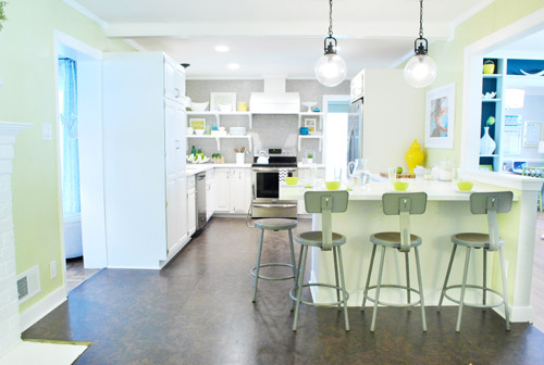
It was actually really nice how they tied into the stainless appliances, felt kind of geek-industrial, and even brought the gray color in the wall of penny tile over into the other side of the room. But after a nice long time of thinking it through and weighing our options, we decided… it’s time to paint them! It’s not that we don’t like how they look as-is as much as we think a new coat of paint could look infinitely better. From good to great if you will. So without further ado, our musings…
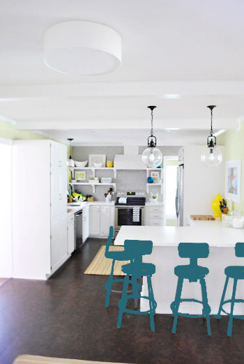
Our first thought was a dark teal color. Don’t mind our horribly photoshopped stool rendering (it’s not a very accurate portrayal at all, but in our brain we think we can almost picture it).
Why dark teal? Well, see the back of the built-ins in the adjoined dining room in this older shot of the room on the right?
Since the kitchen and the dining room are now open to each other, we just love seeing a sliver of that dark teal on the built-ins when we’re in there, so we thought bringing a bit more of that color in with the stools could be fun. Although it could be a little too matchy-matchy too, so we kept playing around with other options.
Like white, which is a little too… white for us. Haha. There’s just so much lightness in the cabinets and counters that although glossy white stools would look modern and clean, we think it’s just too flat for us.
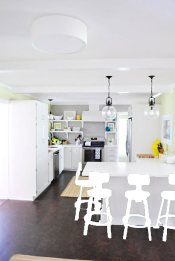
Next we tried ORB (oil-rubbed bronze), which would probably be an easy win. We worried it would blend in too much with our floor, but at least from this terrible rendering they look like they’d pop in front of the white cabinets/counter. And they’d balance the dark hardware on the pendant lights above (I also tried a dark charcoal gray but they didn’t look as good as the ORB rendering, so I figured that was the better option. But it’s not the most happy and exciting choice out there.
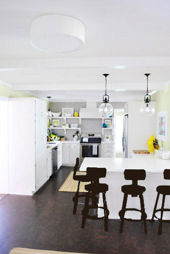
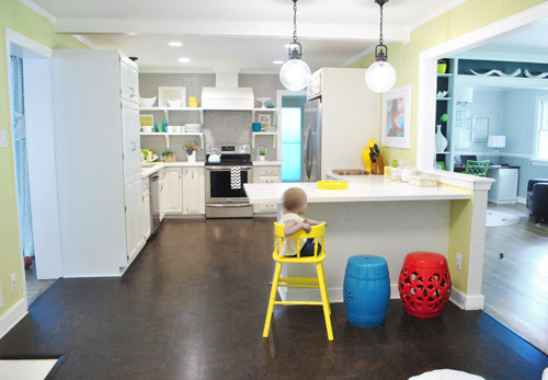
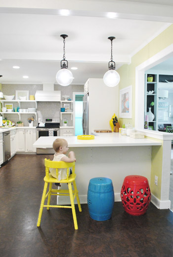
Then we tried yellow since we like the other random pops of yellow in the room – like that jar next to the fridge and that planter on the open shelves. But it looked crazy-scary. Might just be photoshop though, so I decided to bring Clara’s yellow highchair in and see how that looks in front of the peninsula (since surely it can’t look this nuts in real life).
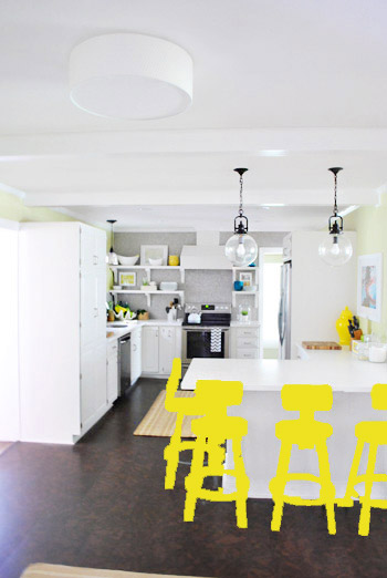
Sure enough, it looks pretty cute:
I also brought in a random HomeGoods/Joss&Main stools from other rooms (blue = HomeGoods, red = Joss&Main) just to see how those colors would look. We actually really liked all three of these color options. It’s fun to have a little pop of happy at the peninsula, right?
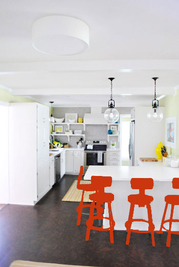
Of course the blue one looked awesome with the pops of blue on the open shelves, but this exercise actually got us seriously considering tomato red, since it’s not in many other places around the house (so it feels exciting and new). It would also pick up some of the red tones in our Lady Swimming print next to the fridge, which could be fun. But since the chairs wouldn’t be low-lying garden stools, and would be four metal stools with backs, in order to picture it, I bounced back to my good friend Photoshop.
Our only fear is that with the yellow-green walls, red or deep orange chairs are a little too McDonalds for our tastes (especially when viewed from the other side of the kitchen – looking back towards the fireplace nook, which has a lot more green paint going on than this view). So next we decided to give leaf green a try…
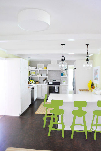
… and a deeper emerald color…
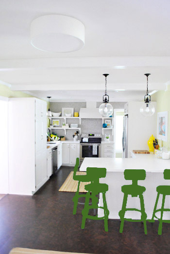
All of them could probably work, so they got logged as other alternatives. It was at this point that we realized that a number of things could work in our pretty neutral kitchen (white and gray and brown pretty much goes with everything), so it’s just going to come down to choosing whatever color we like best.
Next it was onto blue, where we tried a lighter teal color with a fair amount of gray in it:
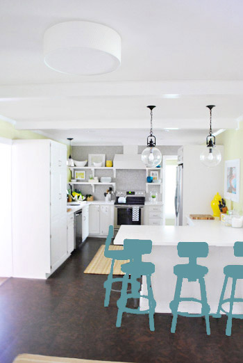
Of course these renderings aren’t very true to what things will really look like in real life with light bouncing around and not everything being the same flat shade – so something that looks the best here could totally read differently in real life. But the truth is that we love a room with a pop of color in the stools, like this, this, and this), and our minds change about what color we want to go with every day.
Oh and how funny is this? Right after I shot this picture…
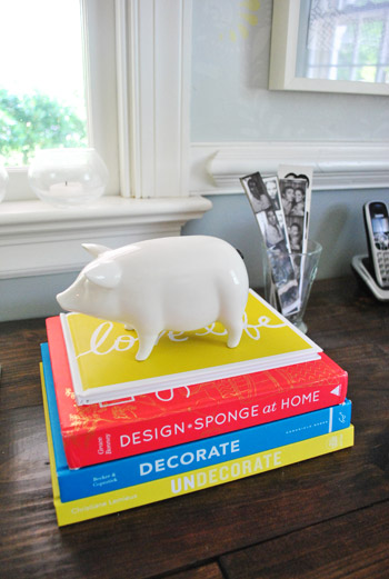
… I walked into the office and saw this stack of books…
Guess I’m just a die-hard fan of those colors. Haha. For accessories, potential stool colors, and beyond!
You know we’ll keep you posted when we make a final decision! Hopefully within the next week or two – because these renderings are getting us excited. Haha. And this little photoshop exercise was comforting because it helped us realize that there are any number of ways we could go instead of having to find the “one right color” like hunting for a needle in a haystack. I’m sure you guys will weigh in with your favorite stool colors in the meantime, right? Anyone else playing around in Photoshop or bringing items from other rooms to see how certain colors or shapes will work?

Pamela @ Pink Hammers & Sippy Cups says
I must say Ièm not partial to the blue stool colour, although I think a darker teal like the back of the built ins could work out great! I’m also really loving the emerald colour!
Jennifer says
I’m not really into yellow much, but I think yellow stools would look realllllllly good there!! Seems so happy and fun :)
Sarah says
My first instinct was the teal to match the bookcase. Then the ORB really grounded those lights and I liked that. My favorites though, have to be the light teal, followed by the lighter green. The yellow ties in nicely with other things in the room, but it seems a little predictable?
Anyway, re: earlier comments I saw, I enjoyed this post. I’m a long-time reader and occasionally a post will hit me as filler, but honestly I’m still happy to have something new to read. It’s got to be hard to come up with a new topic every day. I’m enjoying following your house-perfectifying for projects big and small :)
shana says
Yellow!!! But then I also love the other choices. Just adding my two cents in. Haha!
Ashley says
I like the blue of the stool. None of the renderings you all had seemed to exactly match that blue…but I really like how it pops with the kitchen colors!
Lesley says
My vote (not that we have votes, but that would be my kind of reality show!) is for the yellow or the teal. You have just the right amount of yellow on the open shelves to make those stools work so well in yellow. But I also liked the teal pulling the dining room together with the kitchen.
Megan says
Teal!!! I was thinking in the first picture of how cool it would be to bring some of that into your room. It’s a great color on the book shelves and also in your guest room. And you know that if you don’t like it, you can always repaint!
Lynelle says
My favorite: the lighter teal blue at the end. Good luck deciding!
N Shirley says
Ask Clara!
YoungHouseLove says
Haha- she says “all the colors! Like a zebra!” – whatever that means! Haha.
xo,
s
Melissa W. says
my vote would be the bright yellow!
Penni McNamara says
The ceramic table/planter color that was in the middle! That’s my vote!
(for what it’s worth…hahahahaha)
Keally says
I’m a big fan of the yellow. And I was totally on the same page as you when I first saw those yellow photoshop photos… whoa! A little much! But once you put Clara’s yellow chair in, I was sold. Looking forward to seeing your decision!
Meredith K A says
Why not paint them different colors? I thought the yellow/red/blue looked awesome together with the high chair & stools. You could paying the fourth one white, or repeat yellow…just a thought I had while reading!
YoungHouseLove says
Always another possibility for sure!!
xo,
s
Joanna says
Because this is clearly a democracy, I vote leaf green or grey-teal.
Gemma T says
My vote is for the lighter teal. It was a nice gentle pop and still toned with everything while not being ‘matchy matchy’
Keep up the inspirational blogs! Loving it all….
Kim says
Love the lighter teal! I think I like it because it kind of reminds me of your first kitchen’s wall color, so it would be like a little piece of your first kitchen in your second.
Gayle says
I prefer the chairs stay grey…or further tweak out to a better grey, and mess around with chair pads. I would like to see chair pads in a grey or white…maybe tone-on-tone stripes or other invisible print. I think coloring the whole chair looks like you’re trying to “go there” with color, but it ends up like you’ve tried too hard.
Finding cool summer vinyl picnic-table tablecloths this time of year for 5 bucks each would give you lots of “fabric” to experiment with for chair pads…and it’s washable. I say this because Target has some cool ones right now that go with your current color scheme.
I think your room is at capacity for these pops of color. Stop popping before it gets weird.
I think multiple colors for the chairs turns the vibe from fun to a DIY daycare on a dime. Don’t do it.
Take this constructively. I love you guys & your blogs!! I really need to speak up on this one.
Gayle
YoungHouseLove says
Haha thanks Gayle! As we mentioned in the comments we don’t think we’ll be going with more than one color for the stools, but after living with them for months we just think we’ll be happier with them painted! I’m sure every call we make for our house isn’t the same one that everyone else out there would make though! So some folks might not be into as many pops of color as we are! Haha. Heck, our first house was really neutral compared to this one, so we’re just having fun making this one feel happier (Clara brings out the happy-go-lucky-color-lover in us for sure).
xo,
s
Lisa says
I’m loving the yellow when you brought in Clara’s chair. I love a bright kitchen! I also like the green option but then I’m biased because I have pops of green throughout my cottage. Lisa
Georgia says
Personally, I like the teal, or the blue. Maybe you could do one colour for all the stools, with a contrasting colour for seat cushions or something….like teal seats and yellow seat pads. My experience is there is never a “perfect colouR” – that there are various shades and tones that will work in any given room, and that if you can visualize it, go for it. I agree that the red with all that yellow looks a little like a fast food place. But hey? What’s the worst that can happen. A can of spray paint isn’t that expensive. Do one in the colour you think you like and live with it for a day or so before doing the rest.
Bec says
I personally think that coral or burnt orange stools would look fab. Red is too Macca’s like you said, and maybe too…. cheap looking. But coral, is a bit softer, and would still give an amazing punch whilst complimenting your kitchen. go coral! :)
YoungHouseLove says
I do love coral! Would have to convince John (who thinks coral = pink, haha).
xo,
s
Kate says
I really liked the yellow or the teal, picking up on the accents already in the rooms, without introducing too many other “main” colors. I can see the appeal of the red too though!
Jen @ Domesticated Nomad says
I was thinking, “that kitchen is neutral enough that they could choose anything!” And then you said that. Great minds, and all that. :) For what it’s worth, I loved both greens. I thought they were both fun and unexpected, but still somewhat calm and all “pull up a chair and sit awhile” in feeling. Probably next in line for me was either the teal or the light blue with gray tones. Looking forward to seeing which way you go.
Jolene says
Wow -lots of votes. If you’re counting, mine are for yellow or blue. I’ve just sent you my version of a photoshopped rendering, hope it helps!
Dawn says
How about painting them all one color or just leaving the bottom silver. but then just painting a piece for example just the back rest – yellow, red, and blue. Love your ideas.
YoungHouseLove says
Another possibility for sure!
xo
s
Janna says
This post makes me think of the picture on this blog of painted bentwood chairs. I have a stack of them sitting in my basement that I’ve collected from goodwill, side of the road or friends tossing them out. Totally considering painting them all a different color for fun (it’s just paint!) but I can see it’s been suggested a few times already. Can’t wait to see what color you choose!
http://absolutelybeautifulthings.blogspot.com/2012/05/pretty.html
Laurel says
What about the legs dipped in a color? The yellow? And/or just the backs painted the matching teal with dip dyed legs?
Good luck! I am hopelessly addicted to your blog!
xo,
Laurel
YoungHouseLove says
Always another fun idea! Thanks to everyone for sharing!
xo,
s
Jenn says
I’m a long time reader and love your blog! I’m loving the yellow stools.
While looking at these pictures of all the color choices, I kept thinking the ceiling would look so great painted, maybe in a grayish color to complement the penny tile. And the beam feature could really stand out if left white or painted another color. Any plans to paint the ceiling in the kitchen?
YoungHouseLove says
We thought about it but the beams aren’t spaced evenly (there are more on the fireplace side of the room) so we’re not sure if it would highlight that!
xo,
s
Karen says
It’s so hard to tell from the photoshop colors. I would never have picked yellow, but it looks great with Clara’s stool. I would opt for light teal, but I am biased as I paint everything light teal. In Clara’ first picture, the way the light is hitting, I can see various shades of teal/grey in the office, to the left and at the end of the hall. Good luck, can’t wait to see what you pick.
gemma@thesweetestdigs says
I actually really like the stools as-is, but the colours are so much fun too!! It’ll be fun to pick. My vote is split between the darker teal and yellow :)
Kirralee says
How about a robin’s egg blue color???
YoungHouseLove says
Another possibility for sure!!
xo,
s
Marissa says
I don’t now if someone suggested it already, (wasn’t able to read through all the other 600+ comments), but how about painting all the stools white, but painting the necks of the stools a different color (blue/red/or yellow). That would add a bit of interest without being too much.
YoungHouseLove says
Definitely another way to go!
xo,
s
LeAnne Maready says
Today I was spray painting something (a wooden fish actually) and I used a color called LAGOON. It’s an amazing teal color. It was SO great I literally gasped and jumped up and down and clapped. I highly recommend it. Go get a can and try it on something small. I love the rendering of the teal barstools so much. My second favorite is the leaf green- makes me say “Ahhh”. How bout a fun printed cushion (leaf green- to tone down the stool color) on a teal stool?
YoungHouseLove says
Another possibility for sure! Can’t wait to see where we end up!
xo,
s
Disappointed says
The time spent writing this post would have been better spent completing the actual project. Really would have liked to see this (in much shorter version) at the beginning of the post “stool reveal” post – not as a standalone.
Then again, I also don’t think hanging a clipboard inside a kitchen cabinet is worthy of 14 pictures and an entire post.
Have you considered lumping smaller projects (like hanging a clipboard, spray painting a ceramic animal, etc) into one post at the end of the month instead?
YoungHouseLove says
Sorry you feel that way! This post has earned over 700 comments – the most of the week by far!! We’ve learned that one person’s favorite post is another person’s least favorite, so our goal is never to please everyone with each of the 2,500 posts we’ve written – that’s just impossible (more on that here). Some folks love the small/free/doable stuff (like the clipboard and this planning post) the very most!
xo,
s
Hannah says
Wait, let me get this straight. Someone is complaining about the content on YOUR blog which is FREE TO READ and is updated EVERY DAY (most days, twice a day). Wow.
Way to keep it classy Sherry – I love how you mentioned all the comments on this post. Why on earth would you stop posting things that so many people love?
Brynn says
Yes, way to stay classy YHL. I cannot even fathom why someone would post on a blog they don’t like. Just stop reading. Those of us who LOVE it will keep reading. Keep it up! The inspiration, the ideas the thought processes…its awesome!
Much Love
~Brynn
YoungHouseLove says
Aw, thanks guys!
xo,
s
Kristine says
I like either teal or yellow. You guys need to do a poll on this!
DJ Sherry says
My vote is for the leaf green, tho maybe a little muted – towards a softer leaf green, in the mood of the avocado grellow of the walls. But of course it needs to look good with the new (yet unknown) rug. Lighter teal would be choice 2. Which ver you choose, it will be more finished looking than the school grey…good luck!
Debbie C says
I’m for the first option in teal. The yellow is nice too. Just please don’t go for the rainbow look in red/yellow/blue…too preschool. :|
Evan says
I vote teal… Something in the range of your master bath accent colors and picking up on the stuff on the shelves by the stove. I took inspiration from your painted high chair for clara and did one in a teal for my daughter. LOVE it. Can’t wait to see what you choose.
Jeanne Wagner says
Why limit yourselves to just one color? My favorite picture was the one with Clara in her high chair and the red and blue items in the same frame. Looked like those colors belonged. But if you must choose, I vote for black actually. It seemed to tie everything in the room together and is the perfect neutral color. Instead of dragging the room down, it seemed to make it pop. IMHO
Deirdre says
I love love loved the leaf green! But I’m sure you guys will pick something fabulous, as you always do. :)
Juliana says
Light teal! It’s fun and cheery but not too loud.
Carrie says
My kitchen is the same color as yours and I have red accents (toaster, soap dispenser, dish drainer) and it works well.
But I really love the teal or the lighter blue.
Steph says
I’m honestly having a hard time deciding on which color is best. So many choices!!!
As for the goof balls with the negativity, J&S you didn’t get where you are by making bad posts! You clearly know what you’re doing, keep it up!!! Every post helps someone out there. Not everyone is looking to redo their whole house, some just want little projects! Sheesh!!!
Val says
I vote for painting the the stools a neutral color, (white, oil-rubbed bronze, or leave them gray), then sewing simple cushions or slip covers for the seats and backs. Like something that coordinates with the dining room curtain fabric? If you grow tired of the fabric or want to change colors with different seasons — easy to do. Furthermore, it wouldn’t require much yardage and therefore it’s cheap. Much more tiresome to repaint the entire stools what with all of their slender, curved surfaces if you end up not liking a bright paint color.
YoungHouseLove says
Always another way we could go! We’ll keep you guys posted!
xo,
s
Natalie says
I love the first one, the darker teal! I’m actually doing my kitchen in the exact same colours right now!
Natalie says
I also want to comment that I work in a medical laboratory, so the title of this post caught my interest right away. “Stool Musings…” Haha.
Emma says
Hey there, I know I’m late to the party and I also don’t have time to read all replies, so I don’t know if this has been suggested but what about ombre stools? keep them in all in the same color but different shades – i think this would look particularly effective in the teal! Looking forward to seeing what you actually do!
YoungHouseLove says
That’s something a few folks have mentioned, and it’s definitely another possiblity!
xo,
s
Rebecca says
I’m loving the bright blue from your 3rd inspiration kitchen link! That would look great in your kitchen!
lindsay says
I’m with lots of other commentators – pick a variety of colors you like and paint each stool a different one. Then you can move them around as you accessorize the kitchen with different things.
Allison says
I vote for Emerald green or the paler lime-ish green!
Cathy says
Love all the choices & can’t wait to see what you pick!
We just did a project and need a peacock blue/green spray paint. We looked all over and most stores just had royal blue colors or green colors. We were finally able to find what we needed at Wal-Mart: Rust-Oleum’s ‘Nite Tide’. If you go the dark teal route, that color would probably work for you too!
Heather @ What Does She Do All Day? says
I’m digging the yellow. I’m having a similar debate right now about what color to paint the antique Jenny Lind bed I just bought for my daughter’s big girl room. And I’m leaning toward yellow as well.