We always love crashing a well designed house to get some inspiration and steal some ideas. But we also know that homes aren’t the only place to look for decor inspiration. Which is why we decided to take you shopping with us for some pretty amazing and totally implementable at-home ideas. Allow us to introduce you to Clover.
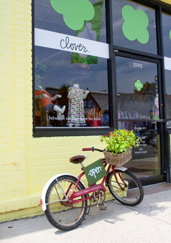
It’s an amazingly cool consignment shop for kids that just opened in Richmond’s Carytown district last month – and they gave us a sneak peek at the space before they unlocked the doors to the public. We scored the special treatment because the shop is a spin-off concept from our friend Lesley who opened the grown-up consignment version called Clementine years ago just across the street (both are now owned by two other fams). We also crashed her charming abode back in ’08, so we know she’s the real deal when it comes to having some serious style.
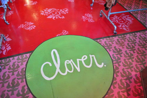
Oh, and you probably remember us mentioning Clover a few weeks ago in this giveaway because their floors sport the Sunny Goode paint treatment.
But the creative and inspiring decor doesn’t stop at those insanely amazing stenciled floors. Clover is full of playful DIY projects that are as adventurous as they are affordable – and it’s always good to remember that sometimes you just have to go for it to achieve that perma-smile-inducing look. It’s definitely not your typical kids clothing store:
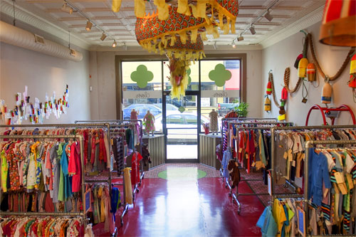
Let’s start with what you can’t miss when you walk in: the dragon. This colorful Chinese dragon greets you at the front and weaves its way all the way to the back of the store. They scored it at Pearl River Mart in NYC (a store that Sherry often reminisces about- I’ve never been, but it was on Design Star this season for their first challenge). After Lesley hung it she wondered if it would scare any kids, but luckily they all seem to love the playful and imagination-inducing addition to the space. Maybe it’s that cheerful yellow color or those furry pink lips that keep the scare-factor down?

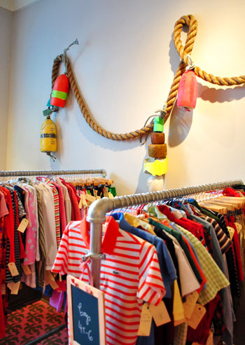
The front half of the store is split into boys’ clothes to your left and girls’ to your right. Each wall features an art installation – like buoys, which act as a colorful twist on the traditional nautical theme. The authentic buoys were a found on eBay for just $5.99 a pop (Lesley saved on shipping by making sure to order them all from the same vendor). The awesome 2″ thick braided rope also came from eBay – apparently it’s the same stuff you’ll find schoolkids climbing in gym class.
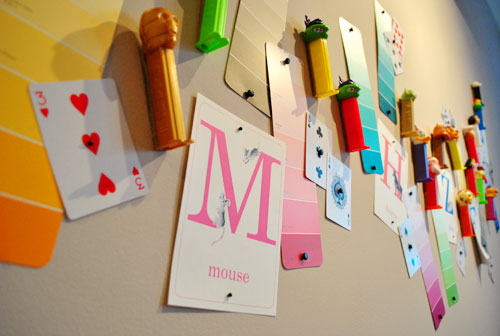
Over on the other side was a 3D collage that was strangely fascinating and beautiful at the same time. Lesley meticulously pinned and velcro’d flash cards, paint swatches, playing cards, and even Pez dispensers into a wave of bright colors that anchors the entire wall (scroll up to the second photo to see it from afar). Even though there’s no apparent theme to the items, it’s somehow inherently playful and fun – and weirdly hard to take your eyes off of! Kind of like Where’s Waldo without the guy in the striped shirt. And we love that she used free items (like paint swatches) and super affordable things (like playing cards- 52 for $1) to cover a lot of ground without breaking the bank.
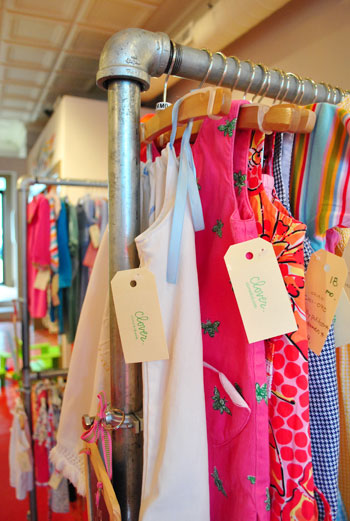
The wall art isn’t the only non-traditional element when it comes to the clothing areas. Even the racks themselves are a unique creation for Clover. They took metal plumbing pipes and had them fashioned into double- and single-level racks to house a slew of consigned clothing at the exact heights and lengths that they needed. We think it’s so cool that they didn’t go the expected route by defaulting to a basic wire rack. It adds just a glimmer of edge to this kids store, which keep things from veering off into the sugary-sweet territory.
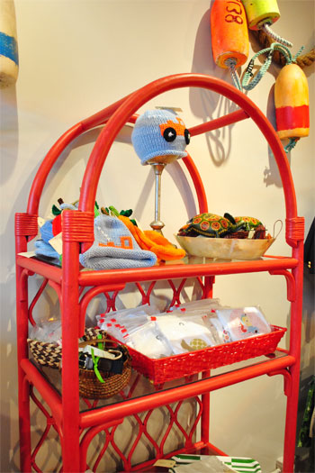
And speaking of shelving, to house some of the non-hanging items, Lesley scored two of these wicker and glass shelves on Craislist for $45 each, then painted them a bold watermelon color (leftover from the floor) to fit seamlessly into the space. Sherry was especially enamored with the chic criss-cross back:
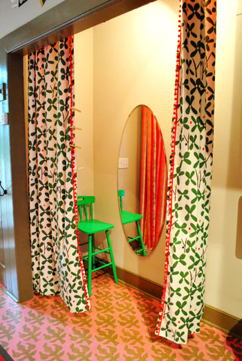
Back in the dressing area (little kids need to try stuff on too, right?) they converted a closet space into a private changing room with some clover-esque Ikea fabric ($8/yard) that they paired with a colorful backing (see the stripes reflected in the mirror?) and embellished with some red pom-pom trim. Lesley even loaned us some leftover fabric for one of Clara’s weekly photos. Score!
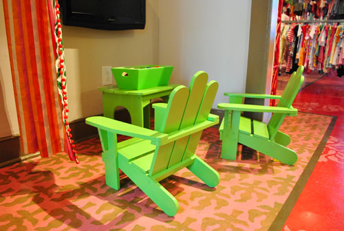
Next door to the dressing room is a little spot to entertain tiny shoppers, complete with two pint-sized chairs scored for $10 at a yard sale and painted a bright cloverly green (with already-owned paint). I picture this as the spot where exhausted baby husbands rest their feet while their baby wives try on outfit after outfit (at least there’s a nice little flat screen TV for watching Sportscenter Sponge Bob).
And of course there’s the spot where money is forked over. Clover opted for a simple teacher-style desk (which was scored at a local thrift store and painted black) to act as their check-out HQ, which is especially perfect for pre-teen purchasers who are just learning to pay for their own things.
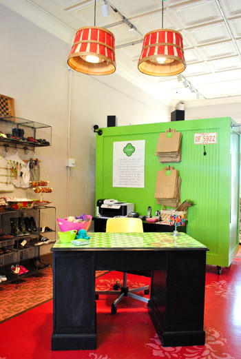
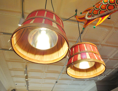
Above the desk hang two pendant lamps that Lesley actually fashioned out of $10 industrial lamps from Home Depot topped with red bushel baskets (the top of the lamps feature a ceramic resting point for the basket so they never threaten to overheat the woven buckets). So simple and smart, right? And the DIYed pendant lights fit right into the color scheme thanks to some red paint (applied by none other than Lesley herself).
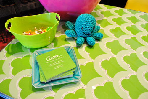
On the desk itself, they had a piece of glass cut to size and underneath it they laid some fun patterned fabric. But it’s not just any fabric, it’s custom Clover fabric that they had made by Spoonflower.com. We hadn’t seen any Spoonflower fabrics in person before Lesley’s, but we’d been in love with the concept for a while. Basically you can upload your own design (any design! the sky’s the limit!) and get it turned into custom fabric for as little as $16/yard. You can even check out a sample swatch before finalizing your order to make sure it’s perfect. We love unique and thoughtful touches like this- especially because Lesley only needed two yards of fabric and now has a desk that she literally “designed” to take Clover’s decor to the next level. Plus the desk was such a cheap thrift store find that she didn’t flinch when springing for the custom fabric to finish it off.
Last but not least, we’ll take all of you organization nuts ’round to the “employees only” part of the store where Leslie worked her magic again to beautifully arrange all of their extra inventory and supplies (despite it not really being directly visible to shoppers). They created an awesome workspace with butcher block counters (which they snagged on discount from Lumber Liquidators, who knew you could get a countertop there?). We love how clean and organized it all looks – and of course the fact that Lesley used more steel piping as fabric rods to close off some of the compartments below has us especially enamored.
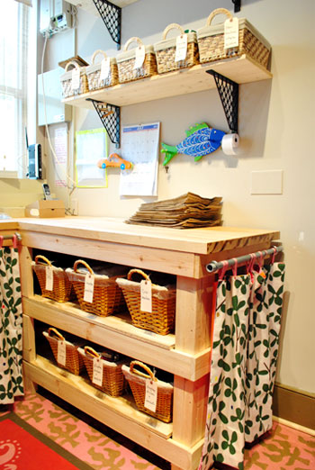
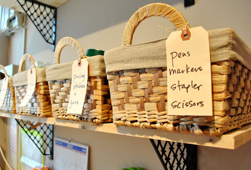
And how could we not share a close-up of the über-organized baskets with charming tag labels that pepper the space. If you can believe it, the baskets were from Walgreens of all places (small ones were 2 for $5, big ones were 2 for $10). Doesn’t it almost make you want to work at Clover – just so you can bask in the beautiful order of things?
So that’s our spin around all the inspiration that is Clover. We hope you guys spotted as many fresh ideas in there as we did… maybe even a few that you can adapt for your own home! If you’re here in Richmond you’ll totally have to swing by (they’re near the Galaxy Diner) to see it for yourself – especially if you’ve got little ones to clothe (or just entertain for a while). And a big thanks to Lesley, Lyn, Jill and all the other Clover-folk for letting us pop by to enjoy all the amazing DIY details.
Did you guys spot anything in particular that caught your eye? Let’s play the always entertaining what’s-your-favorite-part game. And feel free to share any retail stores in your area that also boast unique decor. Who knows, if it’s not too far from Central Virginia we may just swing on over…

Alice says
I love how colourful this shop is. How do you go about taking the pictures? Do you ask the store owner first? Do you take business cards with your blog address? Has anyone refused?
YoungHouseLove says
Hey Alice,
It usually depends on the store. In this case we asked our friend Lesley ahead of time (the one who designed the store) and she let us take photos before they officially opened their doors a few weeks ago. So in this case we were working right with the shop owner. In other cases – especially at big stores like Target or Ikea – we just snap away and so far no one has had an issue. The only instance we can think of where anyone has said anything was at a local store called Williams & Sherrill where an employee was curious what we were taking so many photos for. When we told him and gave him our site address he gave us the green light to keep going and ended up being really excited about the final post. So far we can’t think of anyone who has refused – phew!
-John
tammy says
love all the colors but especially how it is all kid friendly …nothing seems too “breakable” so mom’s don’t have to be on edge the whole time they are shopping.
Diana says
I have been rockin’ that clover fabric for a couple weeks now in my shared office with my hubby. I thought the clovers would give him good luck for his new website. The fabric is from Ikea and I got it on sale for $3.99/yard. I love the pom poms!
ANN says
That fun dragon is pricey, $1200! Yikes.
http://pearlriver.com/v2/FramesSearch.asp?search=dragon
YoungHouseLove says
Hey Ann,
The dragon was actually Lesley’s one big splurge. Thanks to saving a ton in other areas (thrift store furniture, Ikea fabric, eBay buoys and free paint swatch art, etc) it freed up a bit of the budget for something major that would really add interest to the entire store from the moment you walk into the door. We love that it snakes all the way to the back of the space, and it’s definitely a huge element that really makes the space!
xo,
s
Mairin says
This store looks amazing! Any idea who designed the website?-or was it an internal thing? The background patterns are so cute…Thank you!
YoungHouseLove says
No idea- here’s hoping Lesley drops in with some info!
xo,
s
Lesley G. says
Our website was designed by Scout Design, a local design duo. They also designed our website for our sister store Clementine (www.sweetclementine.com) and I can’t say enough about their creativity and spirit! Each time we have begun the process of building a site with them they have only had our logo to start with, which is just my handwriting. Not a lot of tangibles to use, but they really “get” us!
http://www.stateofscout.com
YoungHouseLove says
Thanks for stopping in with that info Lesley! Of course we love both site designs!
xo,
s
Handy Man, Crafty Woman says
wow! What great ideas for store decor. I love shopping in unique places like that.
sunny goode says
John and Sherry! HI!
I love THE POST- CLOVER is by far one of the MOST creative shops in town!! Lesley is amazing- I am going to try the make your own fabric site as soon as I get home!!
Thanks for such great info and pictures! you all are great bloggers:)
Sunny
kristen f davis | kfd designs says
reallllly cute! i’ve tried to get several clients to go for a sunny’s stencil, but haven’t been able to incorporate it into a project yet! maybe i’ll have to get one for something at my own house! anyway, the store is realllllly cute, and absolutely adore the watermelon-colored shelf! and the floors. and the dragon. and the pez dispensers on the wall. ok, can i live here?
YoungHouseLove says
Amazing right? We’re actually working one of Sunny’s stencils into our house any day now. Can’t wait!
xo,
s
Christiana says
What a neat store! Kudos to them for being an alternative to the big box chains.
Christy Q says
Thanks, Lesley for the reply!! I so wish I lived in the area instead of 6 hours away! I’m going to have to stop in and visit the next time I’m passing through Richmond on my way to Myrtle Beach! :)
Courtney McNelis says
I’ve been reading your blog for awhile but this is my 1st comment but I wanted to let you know that you made my day yesterday. We live in Richmond and are currently in the process of selling our home off Three Chopt Rd. Last summer, when I was pregnant w/ my 2nd son I had Sunny Goodtime Paints stencil/paint our foyer and kitchen floors. Last weekend we had an open house and someone commented that they didn’t like our “stenciled country floors”. I’m a young mom who loves decorating blogs and loves to decorate with a LOT of trail and error. So naturally my feelings were hurt b/c I love the floors. Until I saw your post and saw Clover’s floors and the same stencil that’s in my foyer! Hopefully we’ll have a buyer that will appreciate such beautiful floors or maybe I’ll “accidentally” leave a picture of Clover on the counter. Thanks again and love the blog!
YoungHouseLove says
Aw thanks Courtney! So glad to help. We definitely adore stenciled floors- in fact we plan to introduce them into our own house very soon. Stay tuned!!!
xo,
s
beth austin says
I love the organized back room! Where did they get those brackets for the shelves! I need some like those! They are unique and will be great in my office.
Sarah says
This is a way old post, so not sure if you’ll see this, but Pearl River sells online now! I LOVE that store. http://www.pearlriver.com
YoungHouseLove says
Love that!!
xo,
s