We recently shared how we Dryloked every surface of the basement to completely waterproof it (days of monsoon-ish rain have proved to be no match for our newly sealed basement- there’s not an ounce of moisture down there!) and painted the floor a nice rich chocolate color…
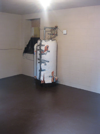
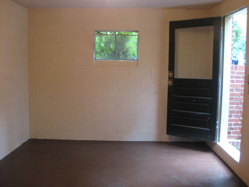
… and now we’re back to get to the fun stuff: floor planning and picking the right storage pieces. Of course we still have some small logistical projects to complete (cleaning up the hatch door that leads to the crawl space, rewrapping the water heater more neatly, building a divider to block the view of the water heater from the door, snagging a dehumidifier to keep moisture in check down there, etc) but we’ll get to those a bit later.
And for our floor planning sesh, we even got a little matherrific and whipped out some old school graph paper to create a to-scale drawing of the space, which really helped us pin down what we needed (and definitely helped us eliminate a bunch of things that we didn’t). In fact, John’s hands were cast in the starring role of “graph paper method explainer” in this video (watch it below or check it out on YouTube):
But for those of you at work who can’t exactly sit back and watch a quick flick about how we did all of our floor planning/storage-piece evaluating right now, we also remembered to snap a few photos of the process to detail how it all went down. First we descended into the basement with a measuring tape to take down the dimensions of the space (being careful to note exactly how far from the left wall the water heater is, where the windows are placed, etc). Then to whip up a little to-scale drawing all we did was decide that one square on the graph paper would be equal to 6″ and before we knew it we had a little sketch of the space that was completely accurate (just a lot smaller for obvious reasons). Then we used the same one-square-equals-a-half-foot method to sketch out little rectangles and squares to represent all of the Ikea storage systems that we were considering (their measurements were easily found online) which left us with a pile of confetti-esque shapes that looked a little something like this:
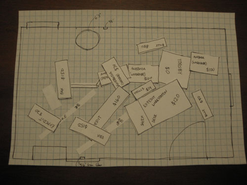
You might notice that we labeled each piece with its quirky Swedish name (for identification purposes) and the price (which also helped us evaluate which items would give us more bang for our buck and which were too rich for our blood). It was amazing how a slew of storage options that had our brains spinning suddenly became a lot easier to evaluate once we could compare their footprints and truly experiment with where we could put what. In fact, to knock a bunch of options out right away we quickly made a list of the items we hoped to store down there (seasonal decorations, bikes, sporting stuff, extra cords, wires, hoses, old yearbooks, etc) and then opted to sort our storage options ruthlessly to see which ones would accomplish that (and which ones wouldn’t really help the cause). On the left side we put the pieces that we thought would offer the most function, and on the right side we put pieces that certainly wouldn’t hurt, but might not be as fabulously efficient. Here’s how the split-em-up method worked out:
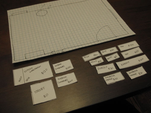
We easily identified that the Aneboda wardrobe was cheaper than the comparable Pax wardrobe but would still afford us the same amount of concealed storage (and we could snag two of them for $100 less than the cost of two Pax wardrobes). Then the decision was easy: Aneboda in, Pax out. We also decided that the Expedit Workstation would work overtime since it’s just $120 for a desk and an eight-slotted shelf that we can kit out with baskets and bins to store smaller objects in a somewhat organized way (thanks to all the compartments). It was definitely more of a plus for our space than the larger Expedit shelf without the desk (which was more expensive at $160 and didn’t provide a surface to set things down and sort through boxes like the Workstation did). We also realized that Billy bookcases wouldn’t be of much use to us because seeing them all sketched out to scale, we realized how little depth they offered (so we quickly deduced that we could store way less on such shallow shelves).
In short, evaluating things when they were all drawn out and comparing prices & shapes really helped our brain go from scrambled and uncertain to “hmm, we might just have a plan here.” Then we got to move our best contenders around on the actual floor plan to see what felt best where. Here’s the winning floor plan:
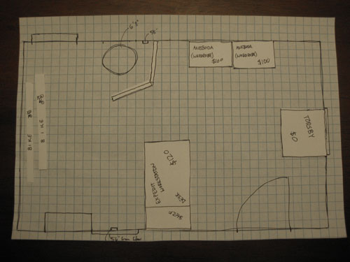
We love that it’s a combination of surfaces where we can set things down when we’re sifting through boxes to locate something, but there’s also tons of open and concealed storage that we can maximize without blowing the budget (since we already own the Torsby table we only need to purchase three large pieces from Ikea and we’re set!). We also really liked the dimension and visual separation that the Expedit Workstation’s peninsula created (which still allows for a 30″ wide passageway between the divider that we’ll be building to obscure the water heater).
But let’s back up. We definitely landed on a few less functional (and more spendy) floor plans first. Like this one which didn’t offer the added desk space of the Expedit Workstation but actually would have cost us more in the end. We also thought it looked really basic and bare (like someone with a gun told all the furniture to get up against the wall). It’s a perfect example of how spending more money doesn’t always mean you get a more complete look in the end…
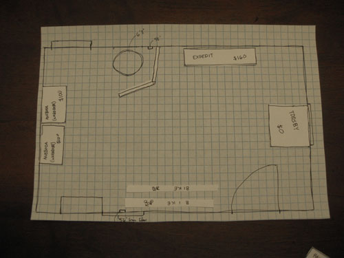
We also tried this plan, but again it would have been substantially more money and we liked placing our bikes on the left wall because we actually have an artsy little idea that we’d like to implement behind them (and if the larger wardrobes are on that wall instead, we’ll lose the opportunity to create a focal point that can be seen upon entry)…
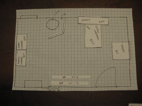
We also tried this arrangement but again liked the bikes on the opposite wall (this layout would also have been substantially more moolah than our winning floor plan):
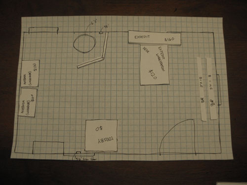
And lastly we tried this floor plan but everything felt a bit crowded (especially with the bikes shoved in between everything) and it was the most expensive solution yet. By a long shot.
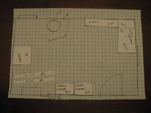
So that’s how we played around with little paper squares for about 30 minutes…
… to suss out the right combination of storage pieces for our little basement makeover (here’s the winning floor plan again to save you from all that scrolling):
Now our shopping list is pretty straightforward:
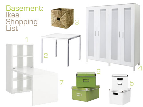
- Expedit shelf (included in the total Expedit Workstation) -$120
- Torsby table (already owned, so it’s free!)
- A woven basket or two – $17 each
- Two Aneboda wardrobes – $100 a pop
- A few white storage boxes – $12 for two
- And a few green storage boxes to keep things interesting – $12 for two
- Expedit desk (included in the Expedit Workstation) accounted for above
Grand total: Somewhere around $361. Not bad for a large 19′ x 13′ room full of storage (that was previously a bug graveyard). Especially when you consider that one armoire is usually around $500-$1000. And of course the floor plan could change once we have everything in the space, but it’s great to have that well-researched confident feeling that we’ve gained from our little graph paper experiment. You know how stepping into Ikea can be a bit overwhelming if you don’t have a serious plan? Now we have one. Oh and it bears mentioning that the above image isn’t a complete mood board as we plan to introduce art, lighting, other accessories, and DIY projects to round out the look. But it’s a great start for taking an utterly useless room that used to look like this…
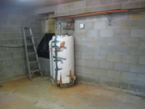
… and turning it into something totally efficient and polished. Stay tuned for more updates after we snag (and build- ugh!) all of our Ikea furniture. Fingers crossed we survive hours of allen wrenching! And while we’re on the subject of building Ikea furniture, do you guys have any favorite Ikea systems or pieces in your home (the Malm bed? the Lack shelf? the Expedit bookcase?). Do tell.
Want more floor planning fun? Check out the graph paper madness here and here over on All Things G&D.

Vonda says
I can’t wait to see the finished project! What a huge task. Reading about your projects keeps me motivated to tackle our projects — even when I’d rather be sitting on the couch relaxing! We’re working on our bathroom reno which I’ll totally have to send you before and after pics when it’s done! Last week y’all motivated us to clean out our garage and make room for some furniture we’ve had in storage for almost a year – ahh, savings of $60 a month. YES!
~Just love your sight. Barely go a day without checking out what your up to!
Debby says
Your planning method is awesome and what you have completed so far looks great. If you are avid bike riders you might want to try to keep the bikes closer to the door. Moving them from the back wall to the door looks like it could be a pain. I live in south Florida where there are no basements. I wish that I had one.
Julie K says
This is fun! These types of posts are the reason I read your blog. I love getting a sneak peak into your projects. :)
Viv says
I can’t say enough about Expedit. We used it instead of fancy custom shelving in our laundry room, my mom has a unit placed horizontally at her house, and my son has it all over his apartment. The choice of plastic storage boxes or boxes makes it even more versatile. I really like the new one with the work surface coming out of it.
Lisa says
I’ve got three of the Aneboda cabinets in natural wood finish (not sure whether that shape/color is made anymore) — I went with the cabinets rather than the wardrobes because you can put two of the cabinets together to look like a wardrobe (with doors opening from the middle), but then repurpose them separately (if necessary) to flank a sofa, for instance. Living in a Manhattan apartment, it’s all about finding things that will squeeze into small spaces. Of course, if you want to hang clothes, this would be hard to do in the shelving-only cabinet. But I once saw someone who’d installed metal holders for wine glasses under the top of his Aneboda cabinet, and was using the shelves for stemless glassware and liquor and wine bottles. With the door closed, no one would have known it was a bar.
YoungHouseLove says
That is so smart Lisa! You definitely did right by your space! We decided to go for two of the tall double wardrobes (which actually each open from the middle) because we have a few tall items like a long Christmas tree box that we plan to stand up in the wardrobe. But we definitely plan on maximizing every inch in both of those wardrobes with a series or storage systems. Stay tuned…
xo,
s
Mario Vespucci says
My wife really likes to re-arrange our furniture. It’s so tiring since we have to move the furniture around several times before it “feels right” for her.
I’ll check out planyourroom.com and googlesketchup. thanks for the post, and I always learn a lot from the comments.
J- says
My husband and I loved the Malm bed (It’s hard to find pieces we both like). One weekend while I was out of town he drove the 8 hr round trip to Seattle to get it. When we moved, however, we were quite happy to ditch it after stubbing our toes daily on the sideboards.
We’ve now opted for a standard frame and bed skirt sans headboard. Maybe the headboard will come… when we find one we both agree on.
maryellen8 says
I love this idea. I also wanted to share what I found on ballard design. It’s basically a ready made template with all kinds of furniture shapes. It kind of takes what you guys did above and does most of the work for you! Love the blog, you guys are the best!
http://www.ballarddesigns.com/By-Room/Bedroom/c/text/pdf/2010FloorplanGuide.pdf
YoungHouseLove says
Awesome! Thanks so much for sharing the link!
xo,
s
jessie says
just flipping through your backlog of amazing work. saw this and thought ‘works every time!’ i started graphing my room back home when my parents bought me huge furniture that wouldn’t fit in my 8×10 room. my dad swore it wouldn’t move any other way. but as a girl growing up i had to have a change! over the last 13 years i’ve moved it about 5 times because of this graph method. so there, dad! :)
Tsu Dho Nimh says
If more people did this, they would have a lot more fun decorating.
My mom taught me to graph floor plans. She had a folder of room outlines and furniture cutouts so we could quickly swap things and know they would fit.
Looking OK was another issue, but at least they fit.