You might notice a theme when it comes to posts like this and this and this and this. Making this house feel like ours seems to be just as much about stripping things down and removing stuff as it is about adding new furnishings and wall colors. Just like the old matted carpets in the sunroom and the bathroom of our old house had to go (along with the crocheted duck curtains, the wallpaper, some small doorways, a few bi-fold doors, and the linen closet door) we’re all about working with what we have. Which could mean altering things a little bit to help them fit more within our aesthetic instead of just junking them and starting from scratch. Which is why the granite backsplash around the bathroom sink (which happens to live in a nook on one wall of our bedroom) had to go.
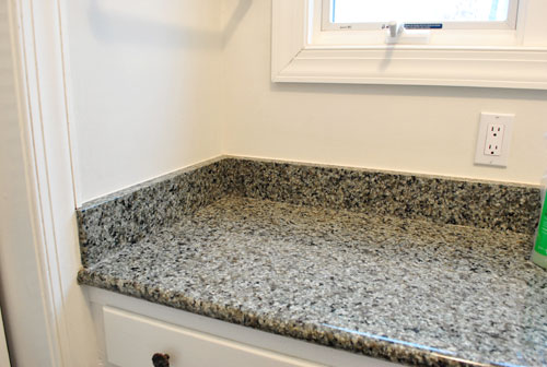
Wait, before you get all nervous, let me explain. We thought the backsplash made the sink scream “Look! I’m a sink! In the middle of the main bedroom!” And removing it might make it whisper “Hey. I’m a sink. But I look more like a piece of furniture because I’m slick like that.” We don’t actually mind the location of the sink, we just want to make it fit in more with the rest of the room instead of sticking out like a sore thumb. So this little project is step one of that process.
Thanks to some waterproofed caulk around the edge and some semi-gloss paint on the walls of that alcove, we won’t have any issues with splashing or water damage (our last house didn’t have a backsplash in either bathroom and the caulk and semi-gloss paint approach worked like a charm. I would even venture to say that the caulk & semi-gloss paint method took a licking and kept on ticking. Yes I just pulled out that hokey little rhyme. You’re welcome.
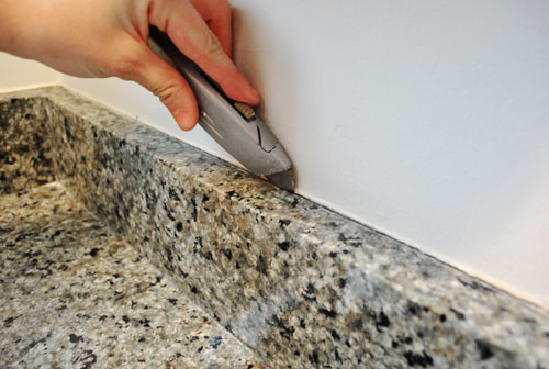
So here’s how it all went down. First I scored the clear silicone caulk by running a box cutter along the top of the backsplash:
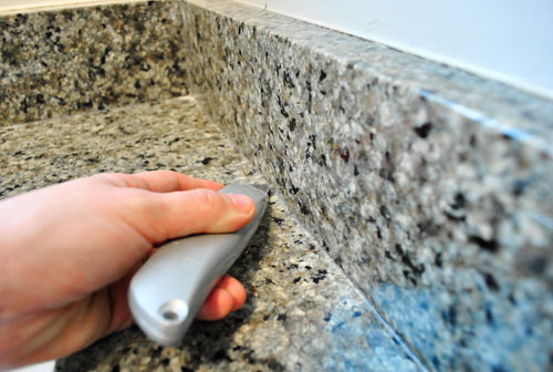
Then I scored the caulk between the counter and the backsplash using the same method:
Next I used a thin metal spackle knife to get in there behind the backsplash and the wall and pry it away slowly:
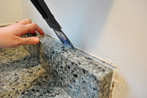
I was able to teeter (yes, that’s a technical term) each of the three backsplash pieces back and forth away from the wall and back again until they completely broke free of the wall and could be lifted out. Those suckers were heavy but I got ‘er done. In fact I’m pretty psyched that I was also able to do this whole project on my own while John was on Clara duty (she says with pride, while simultaneously patting herself on the back and brushing her shoulders off).
Wait. Did I mention I started it without talking to John first? I just wanted to see if removal was even possible and once I got into it there was no turning back. Or telling John what I was doing since the sink looked like this. I would have been in so much trouble (cue all the kids in class saying “ooooh” when the principal gets on the loud speaker and calls someone down to her office by name).
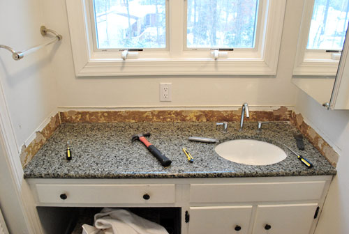
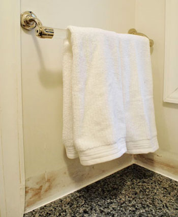
I wasn’t totally going rogue though. I knew he’d go for the backsplashless concept since we had chosen it for both of our previous bathroom overhauls in the old house. So I just crossed my fingers that I could strip things down and make them look a bit more presentable before he and Clara came in to see what I was up to. So here I am furiously scraping the silicone caulk off the surface of the granite counter with the same spackle knife I used to remove the backsplash pieces (it worked really well without scratching the granite at all):
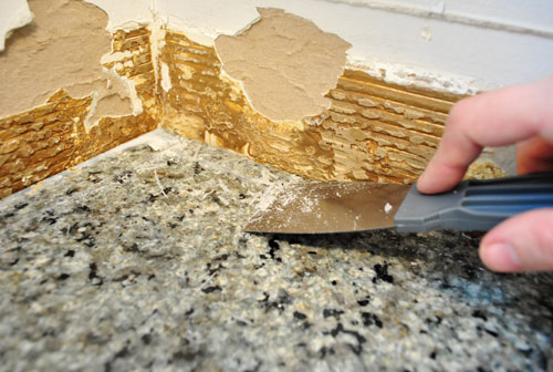
And here I am using the same trusty spackle knife to get in under all that nasty glue and flake it off to reveal a slightly roughed up (but much less gnarly and bumpy looking) piece of drywall:
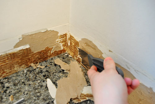
Here’s what it looked like when John came in to see what all the noise was about. Thank goodness it was a lot less grody looking once all that glue was scraped off. And he was, dare I say it, pleased (!) with the surprise project that I sprung on him. Whew.
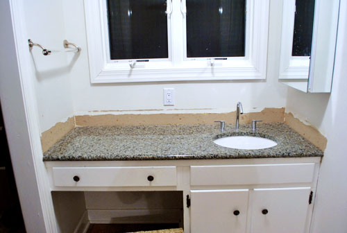
Then it was time to skim coat all the roughed up drywall so it would again look seamless like the rest of the wall. Some people would choose to mud the wall when skim coating, but I actually used some of the same lightweight Dap spackle that I mentioned in this post, which I was able to sand down to a totally smooth and even surface that looked seamless with the rest of the drywall (but remember, don’t sand until the spackle is totally dry). Then I used some white waterproof paintable caulk (I like the Dap door and window stuff) around the perimeter of the counter to fill and seal any tiny hairline cracks between the granite and the wall so no water could collect or drip back behind the counter or vanity.
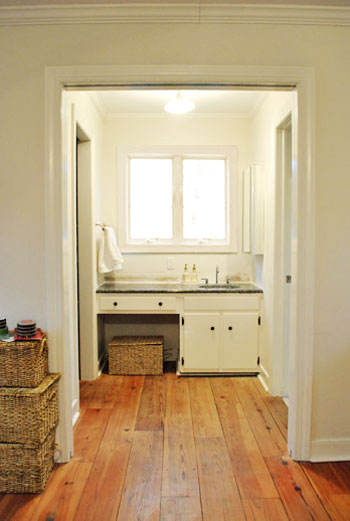
Here’s what she looks like now from afar (ignore the baskets and all the junk that we have yet to organize):
It’s not too bad when you compare her to her glory days (this next photo was taken when we first moved in, before removing the bi-fold doors and of course that backsplash).
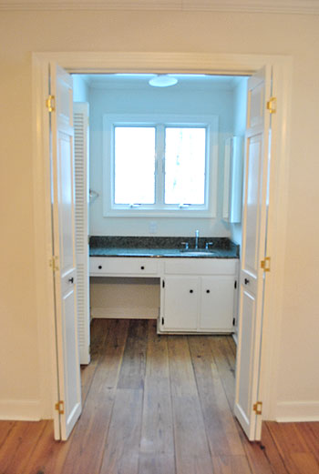
My apologies about the bad blue light, I’m still learning how to tell the Nikon who’s boss.
Anyway, I know the after pic above this one still might not look like much, but we’re psyched. We can picture how great some wipe-able semi-gloss paint will look on the walls of that little nook, and we have some other big plans for that area (to make it look even less bathroom-sink-ish). Oh and as for where those three slabs of granite that I removed will go, we’re sending them off to the Habitat For Humanity ReStore since someone else might be able to use ’em. You know in case they buy a house from someone who went crazy and stripped out their backsplash while the hubby was watching the baby and they’d now like to add it back in. Haha.

Brittany Kaye says
I wasn’t sure about this one… I just couldn’t see it. As always, I’m completely blown away by the difference it makes! I’m loving all your posts about the new house. Best of luck with all your remodeling.
Cat says
Dearest Sherry,
Please expect an angry phone call from my hubby when he comes home to find the kitchen backsplash gone… Just kidding!, but you’ve inspired me to go ahead and tackle it! We have that same 4″ backsplash slabs of granite in our kitchen and I’ve been dying to put tile in ever since we moved in…5 years ago. It does indeed give the room more breathing space. Thanks for the kick in the pants :)
Amanda says
The change looks great! We did the same thing in our guest bath. I’m confused about why you keep calling this a nook… Isn’t it just your master bath? Are you going to put new doors up? Maybe I’m confused and your bathroom is someplace else and this us just a random sink…
YoungHouseLove says
Hey Amanda,
Check out this floor plan for more info. The sink is attached to the bedroom and the toilet and shower are in another room to the right of it with doors. We’ve discussed adding pretty glass french doors waaaay down the line, but we like open living over doors that get in the way so we’re pretty sure we’ll be doorless for a while (and even if we get doors someday we’d keep them thrown open).
xo,
s
brandt @ New House on the Blog says
My goodness, my wife was just asking about this last night, and you guys go ahead and make a post about this today?
Are you reading my mind? WHAT AM I THINKING RIGHT NOW?!?!?!
Let me ask you this – first, it looks relatively easy to take off that granite backsplash – am I correct in that?
Second, what are the plans for those pieces of granite that you took off?
YoungHouseLove says
Hey Brandt,
1. Right now you’re thinking about Marshmallow Fluff (I took a shot in the dark there).
2. Yes, it was a pretty easy and straightforward project. The skim coating step (and sanding it smooth) was probably the “hardest” part but even that wasn’t too bad.
3. We’re sending them off to the ReStore so they can hopefully be reused by someone who wants them!
xo,
s
Kate says
Wow! Can’t believe something so small makes such a big difference! This is why I love you guys :) You think of things I never would!
bungalowbliss says
Looks awesome! Good thinkin’, girl!
Jordan (the2seasons) says
Love it! It is amazing how that changes the whole look of that area. Plus I am impressed you were able to conquer it all on your own without John knowing.
sarah @ perpetual blind date says
The two of you have this ability to make things look so much lighter and fresh! I would have never even thought about removing the backsplash… keep rockin the renovations
Stacey says
It looks amazing…such a huge difference. Really excited to watch that little space evolve. In our previous home we had a similar set-up and hung curtains between the 2 spaces so it felt less like a hotel and more like a master bedroom. Can’t wait to see what you guys come up with!!! Also…when you master the blue tint I’d love to hear any tips…my camera seems to have a mind of it’s own and my ability to adjust settings when trying to capture just about anything indoors is sloooow.
Ami @ beyondpeasandcarrots says
looks sooo much better!! Great work! Such a handy lady!
Ally @ ShabbyPrincess says
I’ve seen sinks like that in several of my friends homes and was surprised at how many had that. Nice job on removing the backsplash!
Amy says
I just wanted to be sure what I was looking at in your master bedroom- you guys keep saying that the sink is in the middle of your bedroom, when in actuality, it’s a bathroom. From every picture I look at, your bedroom looks pretty standard, and there’s a doorway leading to a bathroom. The vanity is the first thing you run into when you enter the bathroom, which is pretty normal. Am I not seeing this correctly? I’ve been feeling crazy that I haven’t understood the big “eye-sore” of the sink/vanity in the middle of the room. It’s not in the room- it’s in an actual bathroom.
It appears that you guys are incorporating the sink/vanity into the room even more by removing the bathroom doors and backsplash. There where doors in that doorway to mark the separation of the bedroom and bath.
I got the impression that you don’t want a sink/vanity in the middle of the room, but it looks that way now more than ever- please don’t take this the wrong way, but as a long time DIYer myself, I do not get the direction with this one~
YoungHouseLove says
Hey Amy,
Check out this floor plan for more info. The sink is attached to the bedroom (not in an actual bathroom) and the toilet and shower are in another room (the actual bathroom) to the right of it with doors. There are no doors leading to the sink and it’s in the same room as our bed (we face the sink when we’re in bed, in fact). The bi-fold doors were just making it feel like more of an awkward dark nook (and it’s not like we were going to close them and open them every time we went in and out) so they had to go. But of course we recognize that our choices for our house aren’t what everyone else would do- they’re just what float our boat!
xo,
s
Lindsey says
looks sooo much better, great job! question… how do you live without a mirror right above the sink (especially once the medicine cabinet is gone)? i’m sure you have something planned, but i was just curious :)
YoungHouseLove says
Hey Lindsey,
Ooh the mirror situation is very annoying indeed. We’re working on a solution right now though, so stay tuned…
xo,
s
Erika says
I can’t believe the difference! It looks more like a desk than a sink…much better! And I am in love with the wide plank floors, but I worry that in my own home, pug hair would collect in those equally wide spaces between the planks.
candace @ thecandace.com says
A perfect little project that makes a big impact! I am glad that you are working with what you have for now – it’s be fun watching the two of you go to town on this new house!
jamie says
I NEVER would’ve thought to do this, but WHAT A DIFFERENCE! WOWOWOWOWOWOW!
Emily says
Wow! Ok, I am so with everyone else. I would have never even thought… great job! And um yes, that looked super scary midway through!
Kim says
Looking good! What about adding some “feet” to that cabinet to make it look even less “built in”? We are going to do that in the kitchen when we paint the cabs.
YoungHouseLove says
Hey Kim,
That’s definitely something we could do! We have a bunch of things on our list so we can’t wait to share as we go!
xo,
s
Claire @ LTR says
I can’t get over how awesome the floor boards are in your bedroom. I know that wasn’t the topic of the post but everytime I see a picture from that angle looking lengthwise down the boards I swoon. I love the little change you made! I have no doubt that the finished product will be superbly awesome.
I also was laughing out loud at your post, in general. You’re a spunky one, Sherry.
Threadbndr says
You know, now that the backsplash is gone, my eyes go to right to the knobs and hinges on the undersink doors.
I can’t wait to see what happens next in that nook. (I agree that the medicine cabnite is weird looking, btw.)
Renee says
Removing granite?! Seems crazy, but it did make a big difference. Good call! Just wondering, do you still use the painters tape with caulk to get a straight line? I have yet to try it, but with 3 bathrooms to remodel I’m sure I’ll get the chance.
YoungHouseLove says
Hey Renee,
I didn’t use painters tape with my caulk job this time but it’s a great tool to use if you’re worried about uneven lines. I’m pretty caulk-handy these days so I smushed it all into the crack to smooth it out and now it looks nice and even.
xo,
s
Shannon says
Brilliant- and you’re so right- it looks more like furniture than a sink!
Laura says
I never would have thought to do that, but it is FANTASTIC! What a huge difference. When you decide to do a project like this do you just take a shot in the dark that it’ll look that much better or do you first “patch” it in a Photoshop like program to SEE how much difference it will make?
YoungHouseLove says
Hey Laura,
I’m too lazy for that. Haha. I usually just try to picture things without something (I’m a super visual person) and sometimes I’ll see an inspiration image (like a room with a stone topped vanity) and that will spark an idea (like, hey, if I take the backsplash off our sink will look more like that vanity).
xo,
s
Susanna says
(A) I love that you got that far before John came to investigate- renovation noise must be like white noise to you guys at this point (B) it looks awesome, totally like you slid a piece of furniture in there (C) I was quite impressed with the way all your technical terms rolled over your tongue (keyboard?) and couldn’t help but thing a cool role model you’ll be for Clara in that department. Well done all around!
Ann H. says
Looks GREAT! I’d switch out the medicine cabinet too – either put it on the other side (where the towel bar is now), or make it inset between the wall studs!
foo says
Girl power! Great job, Sherry.
I’m sure you both already have an idea of what to do for your vanity, but just in case you are still pondering a solution… my brother-in-law’s sister has a window over her vanity just like yours. She has two very cool slender swivel mirrors on either side of the window and when you turn them around they are medicine cabinets. It is such a great solution for that kind of space, I thought I’d share. don’t ask me where she got them. She’s an architect, so she most definitely is in the know. =)
YoungHouseLove says
We have an idea when it comes to that (we’re working on it now actually). Stay tuned!
xo,
s
Mary says
What a difference!! The sink is so much sleeker looking. Good call!
Jessica G. says
I’ll echo everyone else by saying Wow! At the beginning of the post I thought the backsplash seemed like such a minor thing, and perhaps you were being a little too nitpicky about it. But seeing the two pictures side by side… the “before” looked almost like a doctor’s office, and the “after” could be out of a Pottery Barn catalog. Good work!
Veronica says
Hi there. I have noticed in your last couple of posts you have talked about the color being off in your pictures. I am DSLR entusiast and thought I might offer up a simple tip as to how help you get great fairly accurate colors in camera. A grey card will help you with that. Like the one linked below. I am sure you can google around how to use it to set your white balance which will help get rid of the tints you have in your pictures. If you want you can email me and I would be happy to explain as well! It is just a bit cumbersome to type out here. I love your website and live vicariously through you guys while my hubby, new baby girl, and I (& our two dogs) are still apartment living. Someday : )
http://www.amazon.com/Lastolite-LL-LR1250-12-Inch-Ezybalance/dp/B0009QZDL6?&camp=212361&linkCode=wey&tag=thepig-20&creative=391825
YoungHouseLove says
Hey Veronica,
Thanks so much! We’re having fun trying to learn the ins and outs of the DSLR (it annoys me/fuels me to know that John’s much better at it than I am). We’ll def look into a gray card and check out that link!
xo,
s
Patti says
Love your determination to do it yourself! I’m a wimp when it comes to diy, I hate that I always defer to my hubs! Anyway, do you think you’ll use this as a vanity for yourself with a lighted mirror sitting on the counter, cute little cushioned stool and makeup and such in the drawer? It’s really a perfect spot for that.
YoungHouseLove says
Hey Patti,
I’m not much of a dressing table girl (heck I probably wear make-up once a month these days) but I’d love to make it feel more like a vanity or a dressing table than a sink- that’s for sure!
xo,
s
Meredith says
Those 4″ backsplashes are my pet peeve too! I had new granite installed in my kitchen and insisted it be “flat deck” (the technical term for no splash I understand) and they thought I was nutso. But it is SO MUCH BETTER! I also took off the side splashes in my bathroom where i could – we have cultured marble (yuck) counters in there and the back splash is molded to the top piece but the side is seperate. I yanked one out it my kids bathroom and it was a mess – took a lot longer than the 3 pieces you did. But I was glad I did it. Fo sho!!
Katie says
Okay, this looks great, and I’m really impressed by Sherry’s prowess. BUT I have to say that now I’m totally craving a Take It Away sandwich from the UVA corner(I’m sure John knows the place!).
D says
Yep, I likey!
lauryn says
I love this project! I think it looks very chic without the backsplash. And Im guessing youre going to do something fun with the hardware? :-)
YoungHouseLove says
Hey Lauryn,
Oh yes- that hardware has got to go!
xo,
s
Amy says
I checked out the floorplan and this looks similar to a home we owned in the past. I think the builder’s intention is for that entire area to be the bathroom/dressing area. There’s a closet on one side, more private area on the other (toilet/tub), and a shared vanity in the center. The doorway leading into the vanity area from your bedroom, is the bathroom doorway.
I like the room~ particularly now that I know there really isn’t an actual sink inside the room. When it was all first described, i expected to see a sink jutting out from the wall beside the bed~ lol
You guys like the open look (so do we), and you’ve removed lots of doors~ it’s great for an airy feel, but the down side is seeing everything at once. If we removed our closet doors and bathroom door, seeing the sink, our clothes, etc would take some getting used to~
Ginger says
Wow! I can’t believe what a difference that made. It looks miles better already!
Alisa says
I just followed your steps and took out our backsplash in the master bathroom in less than ten minutes! Our spackle knife is plastic and I broke it right away so I just used the crowbar and it worked like a charm :)
YoungHouseLove says
Hey Alisa,
WAHOOOOOO! How fun was it? Admit it. Demo is so much fun.
xo,
s
Laura says
Looks really great. I can already see such a difference! Much less bathroomy and more like a great little Hollywoodesque dressing area. I think a ghost chair would look really cool there. What do you think? What type of chair are you leaning toward?… or do you want to keep that info. for the big reveal?
YoungHouseLove says
Hey Laura,
Ooh a ghost chair would look awesome. We honestly have nothing planned in the chair dept yet (we have other changes on the agenda first) but we’re hoping the perfect chair or basket or something for that spot (at the perfect price) will find us one of these days…
xo,
s
Melissa says
Wow it does make a big difference! Great work.
charlotte says
Excuse me if you already answered this off-topic question…but I’m so curious to know! Did the previous owners know the house was going to be blog famous? If so, I wonder if they read the blog. I sooo would if I were the previous owner! And are you at all curious what is happening/changing at your “Skipper” house?…Ok, sorry that was two questions!
YoungHouseLove says
Hey Charlotte,
Yup, they didn’t read our blog before we put in an offer, but have been reading ever since, which is really cool. They seem to love following along! As for Skipper, we’re partially curious and partially happy to keep that house as it looked when we lived there in our memory. But mostly we’re so caught up in new house stuff that we forget all about our beloved first house! We’re so thoughtless.
xo,
s
svenandshae says
WoW! I’m super impressed Sherry! I would never ever think to remove that part of the backsplash. What a difference it makes!!
Alisa says
So fun! Demo is my favorite way to start the day!
Future Mama says
looks nice!!
http://expectingablessing.blogspot.com/
The Virginia House says
Amazing! I think it looks so much better already. makes it look cleaner and not so public bathroomish. Love it.
Sheila says
I think it’s a brilliant project, esp. if you continue and make it look even more like a furniture piece with paint, maybe legs, etc.
However, I’d agree, that your intention seems at odds with what you say (that you dislike it “in” the bedroom). We’d more likely expect you to build a wall to separate the bathroom, not incorporate it more into the bedroom.
YoungHouseLove says
Hey Sheila,
Maybe we’re didn’t explain that part well enough. The only reason we didn’t like the sink in the bedroom is because it looked so out of place! So our challenge to ourselves is to work with what we have and make it fit in- which is working really well so far. At least in our eyes. We’re all about easy open living, so instead of adding doors that we have to constantly open and close for access (or building an expensive wall) we like to try to adapt things in small and inexpensive ways so they might appeal a lot more to our aesthetic (without breaking the bank). We know that what we choose to do in our house isn’t always what everyone else would choose, it’s just what works for us. Hope that better explains our approach!
xo,
s
Kate says
Impressive! I have to say, over the past few projects that you’ve done, I’ve read the beginning of your post and thought “Why on earth would they do that?” and then by the end pics you’ve totally convinced me! Good thing I don’t have a house yet, but when I do, I’ll definitely be needing some YHL inspiration.
Marci says
Looks great without the back splash, and it never would have occurred to me to remove it. You guys have such great ideas.
Jill says
WOW! What a simple project with big results. I wouldn’t have thought it would look so streamlined without it.
Brooke Buckingham says
I’m really impressed! What a simple solution that actually does make a big impact! Bravo!
Katie says
How wide is the full vanity? Do you guys think you’d ever add a second sink into the left side?
YoungHouseLove says
Hey Katie,
We actually don’t fight over the single sink (we just brush our teeth in tandem) so for now we’re happy with just one. But it’s nice to know that there’s definitely room for a second sink if the need for one ever arose.
xo,
s