We’re about to hop on a plane back from Boston (which is thankfully not canceled, despite the snowy weather), so this post is up a little early for ya but your comments might not pop up for a little while. Anyway, we’ve debated potential colors for the walls in this hall bathroom from almost the day that we moved in. For a while we were on the deep blue train, but after putting that in the adjacent guest bedroom, we’ve been going back and forth between several other options. Dark? Light? Colorful? Muted?
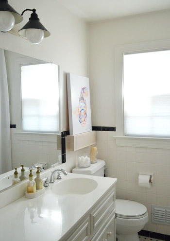
We finally found our focus when we put that bright fish painting on our whitewashed shelf. Suddenly we had a direction. Toned-down-but-not-completely-neutral walls with colorful accents (sort of like we’ve been doing throughout the rest of our house, but this time with a new undertone – plum). Yup, we went for it. Sherry flipped through our paint deck and plucked out Elephant Gray by Benjamin Moore (we went for a nice bathroom-friendly satin finish, and only needed a quart for the job). Like many of our walls, it was grayish – but unlike Moonshine, it had a warmer plummy undertone to it.
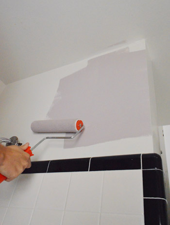
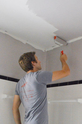
Just like we’ve done in our other bathrooms, we chose to paint the ceiling the same color as the walls. We find that in small rooms like these it actually makes the room feel bigger because the ceiling isn’t some jarring white plane and it all feels seamless and lofty. The pic below is a bit grainy because I had to zoom way in. My painting outfit involved just boxers and while maybe I should be flattered that Sherry thought that was worth sharing, I decided we should maintain some mystery in my relationship with you guys…
It wasn’t until we finished that we both stepped back and said “oh yeah, this kind of reminds us of Granny’s bathroom.” We were both so happy with how her bathroom makeover turned out, perhaps it was a subconscious inspiration. They look more similar in these photos than they do in person, since Granny’s “Hint of Violet” was lighter and felt more purple than gray while ours is definitely darker and more plummy (less pinky and pastel than Granny’s).
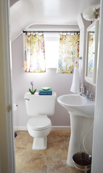
But either way, the idea of having a Granny-inspired bathroom in our own house is kind of awesome.
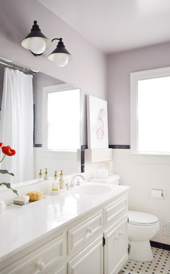
See how it pulls from the painting a bit, while providing a nice backdrop for the brighter oranges and blues – which we’ll definitely be bringing out a lot more with some crazy bold fabric that Sherry wants to use for a roman shade.
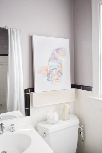
Here’s the other side of the room too. It’s nice that the soft and moody tone of the paint looks nice with some of the metal accents – like our iron horse head towel hook and the ORB light – to fit right in. But looking at these photos, it makes it painfully obvious how much we need to frame out that builder-bland mirror. Soon I hope!
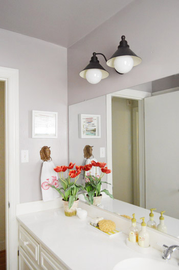
That’s probably next on our list. Well, that or making a roman shade. Sherry’s got fabric hanging around that she’s been dying to use so we’ll see who wins and gets ‘er done first. #maytheoddsbeeverinmyfavor

The best part about this latest update? That fact that we’re making the existing tile work. I was not excited at the idea of busting that stuff out and starting all over, and it’s in much better shape than the tile in our first house’s bathroom, for which we’re eternally grateful! You know we love to use what we’ve got. So thanks to just a quart of paint, the room definitely looks a lot more polished and welcoming than it did just a few days ago:

What are you guys painting? Are you psyched that we went with a plummy gray after dropping the word plum at least thirty times in the past two years since we moved in? I gotta say, I’m a dude and I love my plum bathroom. Just don’t call it purple. For some reason that’s not nearly as enticing…

Peg says
WOW! It looks fantastic. I swear you guys have some special gift for choosing the perfect shade of paint. If I had gone for that gray-plummy-ethereal-warm look I would have wound up with something way too bright. Seriously, kudos, I love it!
Allison @ Gold Stars Double Rainbows says
The elephant grey walls are a nice warm contrast to your (envy-seekingly) huge white countertop. I like the direction this is going.
Chana says
Hey! I’m actually going to be painting my bathroom today! We’re also painting it grey, though more of a greige. It’s Benjamin Moore’s Wish. Hopefully I’ll have pics of it up on my blog tonight. Have a great time at the book signing! I wish I could come to one, but my book should be arriving in the mail any day now, so that’s almost as exciting.
Jill says
Looks great guys! Have you thought about how/if you will paint the cabinet? Since you went for a nice muted lavendar on the walls, you could paint the vanity cabinet a dark navy or a nice shad of gray.
Looking forward to see how it turns out!
Jill
YoungHouseLove says
I love that idea but the room is small/tight (moreso than it looks in pics) so my only worry is it’ll feel crowded and the vanity will feel heavy (the white tile on the walls in and in the shower is nice and balanced with the white vanity for now). But who knows where we’ll end up!
xo
s
Holly says
Love it! It looks similar to my bedroom color (Behr Naturally Calm I think) which I have enjoyed for about 8 years so far. It’s a nice man friendly purple.
Ginny @ Goofy Monkeys says
Looks great! It’s amazing what a paint color switcheroo can do. The last room we painted was our daughter’s bedroom – and I totally wanted to do a color on the ceiling, but I chickened out! We are considering putting in some crown molding, and maybe I’ll pull the trigger then.
Karen F says
Love the new color! It makes everything look so crisp.
Lil says
I am excited to see what you do with the mirror. We’ve got one that needs some love too.
It’s amazing what a smidge of paint can do for a room.
Gabriella @ Our Life In Action says
I love it! It’s amazing, the grey actually makes the room look brighter.
I am trying to decide which grey I should paint my kitchen. Decisions! Decisions!
Debbie says
I think the Granny bathroom project is my favorite project that you’ve ever done (I think it had to do with Granny’s heartfelt reaction), so it’s awesome that you now have a daily reminder in your own house of that lovely project.
Judy says
Love that it is so neat! Supprised that you didn’t call it taking a hue from Ganny!! I love you guys and feel like you are part of my family. (Creepy I know)
YoungHouseLove says
Oh man, major fail on our part there!
-John
Kendra says
love it!! so warm! can you tell me what kind of bulbs you used in the light fixture above the sink…love the way the large bulbs look!
YoungHouseLove says
They were just energy efficient ones we found at Home Depot (we looked for the big ones since we hoped they’d look fun in the fixture. Hope it helps!
xo
s
Julia @ Chris Loves Julia says
Plum-tastic. :)
Sam says
Love the color with the tiles! When we bought our house we didn’t really notice that all the rooms but the living room were wall and ceiling painted the same color. It has been interesting as we have painted the rest of the house colors, as opposed to the neutral it was. We kept the taupe in the Master Bedroom ceiling but painted the walls a pretty royal/navy ish color. They go great together. the rest of the rooms we have taken their respective colors up and over.
I have been debating what to do with the master bath, thanks for the confidence boost about taking the color all the way up!
Christine says
I was hoping you would keep that tile! I would give my eyeteeth for it. It is so gorgeous. We have a tan/cream/brown/black thing going on in our hall bath and I can’t think what color to paint it at all. Unfortunately, it is the same time in our master bath and the kitchen, and I am struggling on what to paint those rooms as well. And quite frankly, we need to make it work!
But, less about me, and more about the room. I love the “plum” color. It is very soothing and a nice backdrop for your bright accessories! Great choice.
Michelle says
Hello! We have similar tile in our bathrooms (except for ours were green/black and yellow/black) so instead of ripping them out, we painted them and it worked out perfectly! We used Zinsser Primer and Rustoleum oil-based paint (white on the walls and gray on the floor). It’s incredible how much it changed the bathroom and how cheap it was!
YoungHouseLove says
Wow- that’s awesome!
xo
s
Angi says
Weird question–where did you guys get your handtowel? Love it and my husband loves cycling related stuff too!
YoungHouseLove says
That was actually from Joss and Main! It’s called a “dishtowel” but I figured it works just as well for hands in the bathroom. Haha!
xo
s
Megan says
Love the paint color! It makes your existing tile look even better and I’m digging the pops of orange!
Milly says
I love the color! It looks so pretty and soft without being girly.
I have read your posts about painting rooms and I know that you guys are so experienced you might notcover the floors anymore. I wondered for those of use who are just starting, how would you protect a space like the bathroom? There are counters, tubs, tiles…
Is it simply best to throw a tarp over the space and tape over the tiles? I wondered if I was missing something.
Hopefully NYC will see you soon!
YoungHouseLove says
Oh yes, you can toss down a tarp or tape a plastic drop cloth down or even just use big pieces of cardboard! Hope it helps!
xo
s
Tracey says
Love the soft hue. Funny, I was thnking that the mirror needed a frame around it and then read you thought the same thing.
I just replaced a huge bathroom mirror with two wood trimmed ones from Target. What a differences just swapping them out made. Just shows you, one little change can make a big impact. The bonus was they weren’t even that expensive.
Alyssa says
I love it!! It looks great with the tile, which I was wondering how you’d guys make that work, but alas, you need cease to amaze me (and your millions of other readers!) Can’t wait to see more.
Kim says
You’d think that after years of reading your blog I’d be used to these sorts of changes, but I am still constantly amazed by the magic of paint. I always think a room is beyond hope, but then you go and show me that a simple coat of paint can take a room from drab to fab!
YoungHouseLove says
Aw thanks Kim!
xo,
s
Aly Chilcott says
That’s almost the same color as my bathroom, except I decided to go for the one that was one shade darker. I’m loving the moody purple. I mean plum. :-) With my white wainscoting it looks a lot like your bathroom except I painted my vanity (previously minty green. Blech) a soft blue and I’m loving it. When we moved in there were pink and baby blue checker patterned tiles almost all the way up to the ceiling. With that minty green vanity and yellow floors and ceiling. Uch. I don’t miss that!
Laura says
What a difference a coat of paint makes! Love it! The plum walls look fantastic with the black and white tile.
Also, thanks for making the case for painting the ceiling; I never would have thought of that but am now filing the idea away for future reference.
Briana Jacobsen says
I love the color….but if you were to rip out that tile I would drive from Iowa to Richmond and put a stop to it! :) It is beautiful, I wish i was in my house!
YoungHouseLove says
Haha agreed!
xo,
s
Melanie says
I’m still beaming over meeting you guys last night. I don’t know why I expected anything different, but you really are exactly who you are in person, as you are on the blog. Just as friendly, just as funny, just as vivacious, and just as adorable!
I might have missed an update along the way, but is your Granny back with power and heat now?!
YoungHouseLove says
Aw thanks Melanie, you’re so sweet! We had so much fun last night. My grandma did get her power back! Hooray!!!
xo,
s
Stephanie says
Love it! I clicked over to the post about the light in the vanity and it doesn’t have those globe thingys over the bulbs. Where did you get those and how did you know they’d fit? Love the idea of a globe to cover teh bulb since the energy saving bulbs are sooo ugly!
YoungHouseLove says
Those are actually the bulbs themselves! They sell giant energy efficient ones like this for fixtures like this. Hope it helps!
xo,
s
Stephanie says
See, this is why you make the big bucks!
Lauren says
wow LOVE it! You guys are awesome.
Ericafpc (Erica Cottrill) says
We’re about to redecorate our master bath. Thanks for all of the inspiration. This is the first time on your blog and I love it! You really know how to show the process…
heather says
I’ve clearly been looking at our website site map for far too long today at work. I read the hashtag as “may the odds beever in my favor” and I thought “Beaver is spelled wrong…” then I re-read the sentence and was like “may the odds beaver in my favor?” and my brain was all “what do they mean? is that secret? is it referring to an old post? I’m so confused.” Then my synapses started working again and I realized what it actually said. All within about 5 seconds. Oh Lordy.
That said, nice color. It’s very similar to the color I’ve been planning on testing in our master bath down the line.
YoungHouseLove says
Hahahahahahahaha, hilarious!!
xo
s
Shawn Murphy says
Looks great – nice work as always! We are currently painting our kitchen a similar grey color. We’re also painting our semi-finished basement since we had to do some repairs after a pipe burst. It was the kick on the butt for us to actually paint that room from a bright orange (care of the previous owner) to what it will be soon – a turquoise-martha stewart-blue color. Jon even got me started on organizing my tools in that space and white pegboard will be going up along with a workbench attached to the wall. Looking forward to it.
Cassondra says
I love that paint color! Perfect choice to go with the existing tiles.
Morgen says
Trim, trim and more trim. Oh, and some cutting in with touch ups. Followed by more trim. Have I mentioned how much I love painting trim, heehee.
Kismet says
Lavender
Lynn @ Our Useful Hands says
The new bathroom color looks wonderful guys! I really like how the ceiling and walls just mesh and meld into this infinite space. I love how for purple to sound acceptable in Johns mind it has to be called a food instead. Plum. Same like when Michael wears his “pink” shirt. If you ask him it’s Salmon. Whatever you gotta tell yourself man… ;o)
My best, Lynn
*Our after party rest is officially over. Back to work and today we frame out our kitchen chalkboard and check that off the list.
YoungHouseLove says
Haha so true about food! Hilarious!
xo,
s
Ethne @ Wom-Mom says
This is amazing! Never would’ve picked it, so leave it to you guys to show me up. We are renting our house, but the landlord gutted it b4 we moved in and he painted my hubby’s bathroom a quirky lime green I also never woulda picked. I paired it with an Ikea black and white shower curtain & black towels & ORB/purple glass toothbrush holder and totally love it. A little Petersik inspiration! My bathroom is chocolate brown with white and maple. I love it too.
Martina says
Have you considered changing the knobs on the vanity to black (or your favorite ORB) so they pulling in a little more of the black in the tile work and light fixture?
YoungHouseLove says
Oh yes, new knobs are definitely on the agenda!
xo
s
AshleyS says
That fact that we’re making the existing tile work. I was not exited at the idea…” I think you mean to say excited!
YoungHouseLove says
Oh yes, all fixed! Thanks Ashley!
xo
s
She Ran.She Worked.She Conquered. says
I like your use of hashtagging (and hunger games reference all in one). Once you start it’s #addicting
YoungHouseLove says
Hahah! Seriously. #cantstop
xo
s
T. Y. Lee says
I love purpley-grays! They’re also great for little girls’ rooms, if the idea of painting walls pastel pink makes you want to gag. A purple-toned gray is also sophisticated enough to grow with your child, and I’m so glad that’s what I chose for my 4 yr. old girl’s room. In fact, I went with a smokey purple gray for the great room too, to kind of break up all the cold slate and wood furniture. I’m pretty sure there is NOTHING that clashes with it, NOTHING, ever.
Perfect color choice for that bathroom! I LOVE IT! Looks great with the tile, and kind of updates it, even though the tile is so classic. :)
Katie says
That color looks amazing. Suddenly everything pops! I’m currently painting our toy room. We started working on it nearly a whole year ago…yeah, I move slowly. It’s Behr Gentle Rain which is mainly gray, but looks slightly blu-ish in the right light.
Tiffany says
Ok, so I didn’t read the title of the post before I read the post (or maybe I did, and just didn’t realize it) but when I saw the second picture I immediately thought, “they just used that color on their grandma’s bathroom!!!”. And then you guys were like “oh yeah, this kind of reminds us of Granny’s bathroom.”. And I’m like “DUH! ME TOOOO!”. And then I saw the title as I was about to comment…and I’m like “Oh…”
Yeah, that’s really how the conversation went in my brain. But seriously, if you look at pics right next to each other of ya’lls (spellcheck says that’s not a word :-( ) bathroom and Granny’s, the color is identical – at least on my monitor it is. Could just be the editing or something. I just find it’s so funny that you guys didn’t go into choosing the color thinking that you were trying to channel Granny’s color.
P.S. When I first saw the color, I thought “meh, I’m not sure about this one”. But then when you took the after with all your current accessories and the tile…wow. I loved it. It’s one of those where I definitely wouldn’t have picked it, but love it once it’s all put together.
YoungHouseLove says
Hahah, so funny! It was so hilarious to us that it only dawned on us afterwards! If you pull the swatches they’re actually really different colors, so maybe we should shoot them next to each other- but they’re both in a bathroom and they both have plum/lavender undertones so it’s definitely a similarity!!
xo
s
Gretchen says
I want to frame out the mirror in our master bath, too – I’ll be looking forward to learning how to do that from a future post!
Missed the Wilton event because we were without power for a week, but hopefully I can make it to the SoHo event when that gets rescheduled. Good luck with all the travel!
YoungHouseLove says
Thanks Gretchen! We can’t wait to find out when that event is on for!
xo
s
Azure says
Nice! I’m sorry if someone else mentioned this already: I think you meant “excited” instead of “exited.”
YoungHouseLove says
Thanks Azure! All fixed!
xo
s
Heather Flint says
Looks great!!! It would be cool to either have the mirror frame painted black, or the window trim (like John liked in the most recent house crashing). Although I’m sure you guys already have something up your sleeve that will be amazing!!! Hope you guys have a safe flight home!!! :)
YoungHouseLove says
Oh yes, we’re itching to add some more black since it’s in the tile! Will keep you posted for sure…
xo
s
Ali says
LOVE that color!!! I might use that when we redo our kitchen.
Ruth says
Pleeeeease dont frame the mirror! Its such a nice and modern look! Well, I love it at least ;-)
The Wall-Color is great, I feel inspired by you once again (I already did my version of the paint swatch art and the butterflys in an IKEA frame, although it was different material hearts in my case)! Thanks
Carla says
Way the heck awesome. The plum comes through without being too plummy. Looks amazing.
So I have a question, and never can find my comments once I leave them, so I’m holding out hope for a blog post on this someday:
Have you ever noticed the abysmal selection of high-quality flannel sheets? Target and Walmart and elsewhere sell sheets that easily pill and become scratchy over time. LL Bean produces the best flannel I’ve ever had (luxurious, made in Portugal), but the color and pattern options are very country and hugely bland.
I’m on a budget, but feel that good sheets are a worthwhile investment. How can I sleep on something that’s wonderfully soft, non-pilling, and durable, but that’s also eyeball friendly? Do you know of any companies or stores that sell something like this? If you’ve ever had the pleasure of trying LL Bean’s high-end flannel, you’ll understand right away why Target’s flannel just doesn’t cut it.
I’d be so grateful if someday this can be addressed on your blog. Thank you!
YoungHouseLove says
Yes, I have noticed this!!!! Does anyone have the answer? We have yet to find something awesome without a giant price tag. Any and all tips are welcome!
xo
s
Wendy says
Try http://thecompanystore.com/. They have high quality flannel in lots of colors.
Mollie says
the company store! admittedly, i’ve never purchased the flannel there but have a couple down comforters that i am obsessed with. i have one that i now use as a blanket that my mom bought me in high school (10+ years ago) and i still use it!
they have good patterns too: http://www.thecompanystore.com/Flannel/sheets-flannel,default,sc.html
garnet hill has good patterns too: http://www.garnethill.com/bedding-bath/sheets/flannel-sheets/
no idea why i know this much about flannel!
YoungHouseLove says
Hah, I love it!
xo
s
Kaitlyn says
WOW! That made a huge transformation! It looks great. :)
Ashley@AttemptsAtDomestication says
I absolutely LOVE that color! I really want to do horizontal stripes in our downstairs half-bath with a color similar to this and white.
Can’t wait to see you guys tonight!!
YoungHouseLove says
Yay! So excited for tonight!
xo
s