We’re back with the after pics of our freshly painted built-ins. As we mentioned in the last post, we went with an inky blue color with hints of green called Dragonfly from Benjamin Moore’s Affinity line (color matched to Lowe’s No-VOC Olympic paint for the bambino). We only needed a quart, and since we used objects that we already owned on the shelves this entire built-in makeover only ran us $10.97. You can read more about how we planned the shelf placement here. Oh and here’s a poorly lit progress pic from last night, just for fun. Yes John’s shirt does say “Talk Nerdy To Me” on the back. I love it.
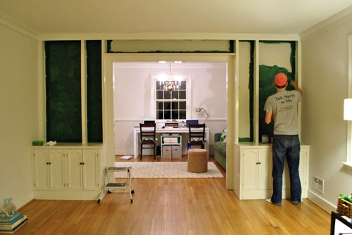
But here’s what you really care about. The bookcases all painted! Picture us twiddling our thumbs while we waited for them to fully dry so we could put the shelves back on and load them up.
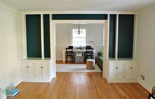
Of course by then it wasn’t as bright in our north facing room (hence the slight color variation from the last pic) but we LOVE it. It’s bold and high contrast and nothing that we would’ve have the guts to do in our last house.
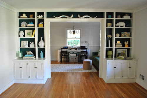
We’re enamored with the color because it’s super moody and it reads as greener or bluer or darker or lighter depending on the time of day and the angle that you glance at it.
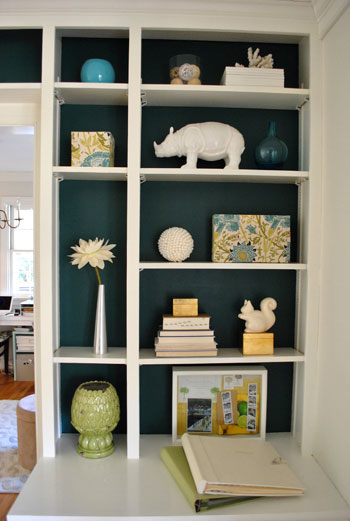
And of course all of my white ceramic animals (and other not-kid-friendly-so-I’m-glad-they-fit-up-there treasures) really pop against the saturated background color (which also makes the cabinets look crisper and whiter by comparison).
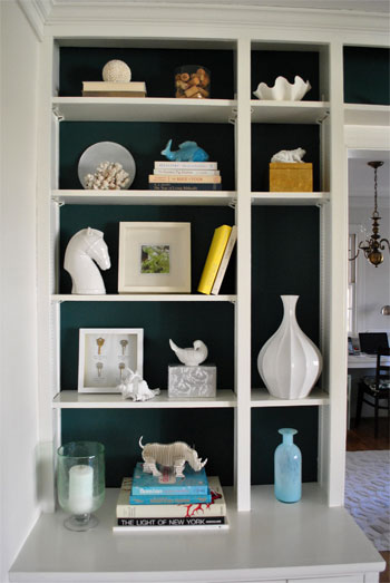
These two pics are probably the most true to life when it comes to the color (but of course how you see them really depends on your monitor):
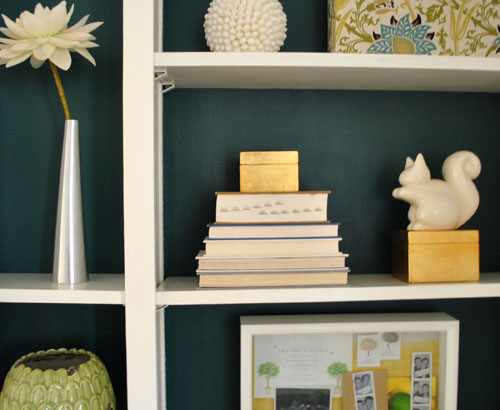

Mr. Rhino (and his ceramic twin on the other side) likey. And we do too. Especially for under $11. In fact we love the color so much that we plan to work it into other parts of the house when we can (you know, to try to keep our whole house color scheme cohesive but not too “yawn”). We’re thinking it might be the perfect color for the base of the future island that we’d love to someday add to our kitchen – and would even work on a bathroom vanity. Should be fun…
Psst- Learn how we made those two fabric covered boxes on the right side of the shelf here.

Erica @ Erica's Inspirations says
Looks great! It pops and looks sophisticated!
Lindsay says
I was skeptical after the last post but this is COOL. I love the drama! And it frames the view into the office so well.
Melissa @ Sassy Mommy says
Wow! They look amazing!!! Reading your comments makes me laugh/cry just a little bit. My son is now 2.5 years old. I remember the days when I went through three phases of decorating: 1. he is so little I could have Grandma’s finest china in front of him and he cannot get to it then 2. OMG- he’s walking (mine at 9 months) remove all items from 3 feet and down. to 3. Mommy can tell him no and he leaves it alone. I am in phase 3 right now. My new vase from Homegoods made it to the floor again :) Enjoy all the time phase two brings with your daughter- time flies!
Beth says
I am new to your website, my future sis-in-law introduced me to it over the weekend. Well now I will no longer get any work done . . . at work! I am dreaming about painting, priming,staining and sanding (things I have never done or thought I could ever do) all day long! What an amazing job you and your hubs do! Quite the inspiration. We are in the process of starting to look for our first home and your website has completely changed my thought process and criteria as to what we will be looking for. . . as far as considering the potential in the homes and the excitement of really putting the effort in to make your home YOUR home. Thank you!!!
Jen @ The Decor Scene says
O.M.G. GOOORRRGEOUS!!! I’m in love. I can’t wait to see the silvery grey on the walls too. This room is going to be so gorgeous when you are done with it. It is going to be such a great room to welcome your guests into when they come to visit. Sooooo jealous!!! Now I really have to figure out my entertainment center redo and see if it can be half as gorgeous as these built-ins. You guys must be so glad you step outside of your comfort zone with your new home. :D
Tanya says
LOVE it! Your pretty pieces look amazing against that moody colour. I’m such a fan of anything resembling teal, turquoise, blue-green . . .
~Tanya
dans-le-townhouse.blogspot.com
Jessica @ Decor Adventures says
Great color and I love knowing it can be matched to a low or no VOC paint.
By the way, I’m enjoying the real-time blogging too. Very natural feeling, and it’s fun seeing your updates when they happen! Now I know how long it should take me to paint the back of my shelves :-)
Zoryana says
That looks amazing! Great job!
Sue says
I moved to a new house on Dec 21st and my place looks like a warzone! How does your place look so great already?? Oh right…it’s your job!
Bravo to you both for getting it done. The shelves really look amazing!
Martha says
I am green with envy! The built-ins are fantastic and you’ve made them look even better. Although our house is 100 years old, we’re seriously lacking in built-ins. We’re hoping to add a few, so this post is quite inspiring. :-)
kaylan says
fabulous! what a difference a little color makes.
steph says
Love it!!
Stacey says
Mmmmmmmmm…delish! When I get home tonight I’m SOOOO gonna be scanning every room for the perfect place to use a moody color like that, with the same impact.
kyla says
Wooo Hoooo!!! I’m so excited to see some saturated color! How does it feel???
YoungHouseLove says
Hey Kyla,
It feels good! We were biting our nails for a bit while it dried but it was so worth the risk!
xo,
s
Giselle Medina says
Wow, this is something I didn’t think you guys would do, but I LOVE it. It makes all your goodies pop out. The color is gorgeous.
It looks like you are accomplishing your New Year’s Resolution early.
This is inspiring me to be more gutsy with color. I’ve been wanting to repaint an old chest of drawers a bright color, but always felt to shy to do it. I might pull out the paint brush this weekend.
Holly says
Love love LOVE the color!
Dina says
What a great color! I’m sooo jealous of your bookcases! Also, have you thought about getting an oval dining table? I know you’re trying to move away from the beachy style of your old house, but as soon as I saw the painted bookcases it popped into my head that an antique-looking white oval table, with oval-backed chairs, could look really sophisticated. You could even upholster the chairs in dark blue or silvery-grey, or a less matchy-matchy saturated color. But just a thought — you guys are the experts and I’m sure whatever you pick will look fantastic, I’m new to this whole decor thing (and newly obsessed, thanks to you two)!
YoungHouseLove says
Hey Dina,
Awesome suggestion! We’re actually thinking of a large round pedestal one, which would be an oval when we add the extension leaf (since we’ll need to find something that accommodates all of our crazy family members). Someday we hope to find the perfect one without emptying the ol’ bank account (they’re so expensive!).
xo,
s
Mary says
Wow! This looks absolutely beautiful.
Taylor says
So gorgeous! I need to practice my taping skills in hopes I’ll one day be to your caliber :) My bf and I painted the back of our bookshelf a turquoise-esque blue but the lines are not as crisp as I would like … we had lots of it dripping over the line, etc. May need to give it a second try! Any tips?
Thanks!
Taylor
http://www.trimmedandtaylored.blogspot.com
YoungHouseLove says
Hey Taylor,
Frog Tape is the way to go! It’s a lot more bleed resistant. And we always recommend peeling the tape as soon as you’re done with the last coat (even if the wall’s still wet) for the crispest line. Good luck!
xo,
s
Melody says
The more I look at it, the more I like it. It will be even better when the room is completed! Can’t wait to see it!
Mary C says
oh.my.gosh.
Sarah says
Hey guys! This is absolutely amazing! I’ve been waiting to see what you would do with your built-ins, and since you posted this morning, I’ve already gone to Home Depot and picked up a new color for the back of our built-in shelves! Cinnamon Stick by Glidden, should be interesting, yet bold – we want to “warm” up the living room a bit.
Anyway, wondering what paint finish you used? Thanks!
YoungHouseLove says
Hey Sarah,
We went with satin so it’s semi-wipeable but not too shiny. Hope it helps!
xo,
s
Caitlin @ Desert Domicile says
I have built-ins in my dining room that I never know what to do with! I painted the back “Chinchilla” by Martha Stewart and had great styling during Christmas but am stumped now that Christmas is over! Thanks for the inspiration :)
Meghan says
Love the color!!!
SHILOH SMITH says
I LOVE IT! wish i had some at my house that I could paint! lol Awesome job you guys!
Rhiannon says
Wow you guys it looks fabulous! You have officially inspired me to go bold!
Katherine says
That is seriously gorgeous! It definitely makes everything in there really pop. I bet you’re loving it too! Great job!
Stephanie says
It turned out awesome! Props to John for the brilliance of taking away a shelf, what a difference. So excited you guys are taking chances on bolder colours (I always seem to be drawn to them). Such an easy way to add a beautiful colour without painting four walls. Can’t wait to see what you come up with over time!
Ashley says
So slick! So sophisticated!
Leanne (For Health's Sake) says
Oh my gosh it looks SO great! I love the contrast! You two amaze me.
Lori H says
LOVE the color. So excited to see what you do as you branch out into more color.
Chelsea says
Where did you find that cute mini clam shell? Adorable! So since you’ve been talking gray…does this mean you’ve picked your shade and details are to come? I’m giddy!
YoungHouseLove says
Hey Chelsea,
We haven’t picked a shade yet but we’ll share it when we do. As for the mini clam shell it’s from a beach shop in Delaware- one of those ones on the boardwalk.
xo,
s
Kate says
It’s gorgeous! So funny how everything you guys owned seems to fit perfectly in each little cubby. Those cool horns especially. =)
rhiannon says
SO COOL. i love that you’re making bold color choices now. so much fun! you were hooked after doing clara’s first nursery, right?
i saw your comment to alyssa about an email plug and i thought i’d put in an official request for a “reply” button on other comments too. so we can respond to things you say, others say, etc. it would be a lot of fun!
YoungHouseLove says
Hey Rhiannon,
We’d love that too! Here’s hoping we can code it without crashing!
xo,
s
Shelley @ Calypso In the Country says
Love the blue! What a difference between that and just plain white. But I do love the white too. I was just in Pottery Barn today and a lot of their new furniture and accessories are white. I love it but most of my house is neutral colors. Although, I think I can phase some pieces in to keep things fresh.
Beth says
Love, love, love it!
Leslie C. says
!!!SWOON!!!!
I think you just introduced me to the color that will be an accent wall in my future craft room/office. The color scheme I have going in my house currently is a dark turquoise, greyish blues, and some greens.
-Actually, the chair pads that you have at your desk from world market is the same print on the runner that I have on my table and pretty much the inspiration for the colors in my house!
Do you think that color would work okay in a room with only one smallish window? If used as an accent wall, any suggestions on a color for the rest of the room? Most of the walls in our house are some shade of grey, maybe a lighter shade of grey with that color? Im so excited just thinking about it!! haha
Thanks for the awesome post, I am thrilled to see all of the future endevors that yall tackle.
YoungHouseLove says
Hey Leslie,
Since colors really look different depending on the lighting we’d just recommend bringing home the swatch to see if it looks too dark (you don’t want it to read as “black”) or really pretty as an accent wall. Good luck!
xo,
s
Kelli says
Ahhh…I die. This is a seriously gorgeous color! I’ve been trying to talk my husband into going this bold on our built-ins. I have to show this to him immediately!
karen says
love, love, love. We have a similar color in our home office (Lancaster Blue by the now discontinued Ralph Lauren). It looks great with the white Ikea shelves we hung.
Any plans for the cabinets below? (Sorry if someone already aasked this, I didn’t go through all 5 pages of comments)
YoungHouseLove says
Hey Karen,
New hardware is definitely in the cards soon. As for any other updates, maybe down the line…
xo,
s
Emily P. says
I noticed some of your horizontally stacked books are backwards? Is there a reason you did it this way? Bad titles? I’m in the process of setting up our built-ins and am wondering if the reverse book is something I should consider!
YoungHouseLove says
Hey Emily,
Some of them had bright bindings that seemed to bold and chaotic so we turned them around and it was instantly more serene looking. It’s a little trick we spotted in a Pottery Barn catalog a while back.
xo,
s
Audrey says
I love the color! I have been wanting to use a deep turquoise like this in my own house, but I’m not sure where yet. It’s beautiful!
RLB says
I have an emotional reaction to that color. Absolutely unique and gorgeous. It makes me want to touch it. I’m definitely going home and finding a place for that wonderful color.
Liz says
WOW I love it! How bold of you two! I would never even think to choose a colour like that, but I love the way it looks. Good job going out of your comfort zone. Can’t wait to see the finished room.
Michelle Wengert says
i’ve never met something tall, dark and handsome that i didn’t like, including these sleves!! i LOVE the contrast. well done!
Jen says
Oooh goodness this is just fantastic! Such a great color, it totally makes the most perfect statement. Love.
xo!
Jen
beth says
I’ve been pondering whether or not to paint the backs of my built ins and now I’m gonna do it!
Sarah @ The Strength of Faith says
I love it! It’s almost romantic in a way …
Ali says
What an incredible colour! Well done!!
Stacey says
This looks amazing! And I can just imagine how the way that color plays so beautifully off the sofa in the office…LOVE IT!
Amanda- Hip House Girl says
Wow, I really like that! What a great color. It’s neutral enough to not clash with all your stuff, but bold enough to be awesome. Well done.