We’re back with the after pics of our freshly painted built-ins. As we mentioned in the last post, we went with an inky blue color with hints of green called Dragonfly from Benjamin Moore’s Affinity line (color matched to Lowe’s No-VOC Olympic paint for the bambino). We only needed a quart, and since we used objects that we already owned on the shelves this entire built-in makeover only ran us $10.97. You can read more about how we planned the shelf placement here. Oh and here’s a poorly lit progress pic from last night, just for fun. Yes John’s shirt does say “Talk Nerdy To Me” on the back. I love it.
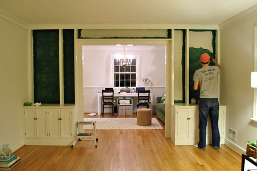
But here’s what you really care about. The bookcases all painted! Picture us twiddling our thumbs while we waited for them to fully dry so we could put the shelves back on and load them up.
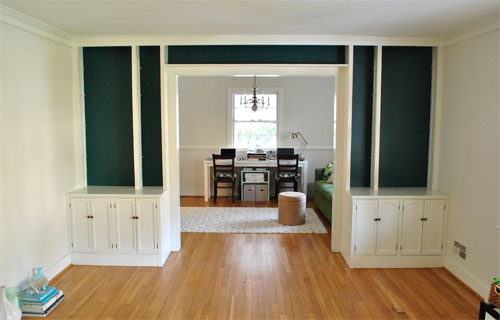
Of course by then it wasn’t as bright in our north facing room (hence the slight color variation from the last pic) but we LOVE it. It’s bold and high contrast and nothing that we would’ve have the guts to do in our last house.
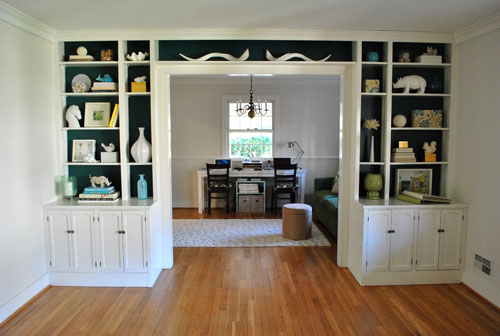
We’re enamored with the color because it’s super moody and it reads as greener or bluer or darker or lighter depending on the time of day and the angle that you glance at it.
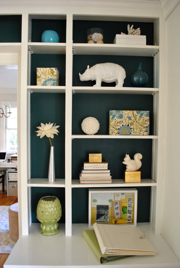
And of course all of my white ceramic animals (and other not-kid-friendly-so-I’m-glad-they-fit-up-there treasures) really pop against the saturated background color (which also makes the cabinets look crisper and whiter by comparison).
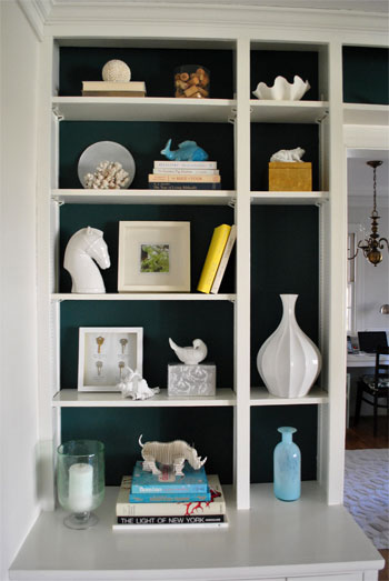
These two pics are probably the most true to life when it comes to the color (but of course how you see them really depends on your monitor):
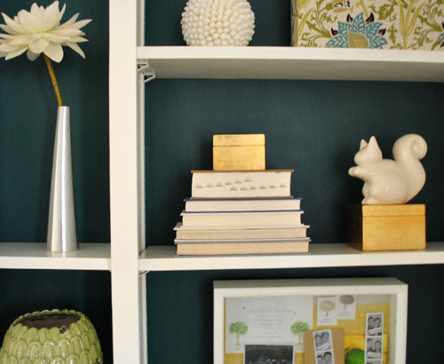

Mr. Rhino (and his ceramic twin on the other side) likey. And we do too. Especially for under $11. In fact we love the color so much that we plan to work it into other parts of the house when we can (you know, to try to keep our whole house color scheme cohesive but not too “yawn”). We’re thinking it might be the perfect color for the base of the future island that we’d love to someday add to our kitchen – and would even work on a bathroom vanity. Should be fun…
Psst- Learn how we made those two fabric covered boxes on the right side of the shelf here.

Ashley says
I love the pop of color! I also love all the great things you guys have to display.
candace @ thecandace.com says
I love the bolder new color – what a fun backdrop for all of your lovely little things!
Allison says
Looks so great! Definitely a bolder look and I’m loving it! The pic from this morning (before paint) looked wonderful too and reminded me of your old house. But this new bold stuff has me so excited to see what you tackle next!
amanda@reno366 says
LOVE IT!! I love that you are using color in your new house. Awesome!
mary W. says
Rockstars!
Seriously my favorite color combo yet! And totally carrying through with your new duvet color! Very inspiring!
Laura says
LOVE it! :)
Alison says
I love the after pictures you posted! I was wondering if you could give me more information on the paisley print squares you have on the shelves. Are they storage boxes? I love how it adds color and texture to the shelving unit!
YoungHouseLove says
Hey Alison,
Those are a fun little DIY project from a few months back. Here’s that link: https://www.younghouselove.com/2010/08/put-a-cork-in-it-2/
xo,
s
Melissa says
Wow! I have some similar built-ins but they do not look one fraction as stylish as these! What is the distance between your shelves? I seem to have a lot of space between mine and the objects don’t take up enough of the height. Your arrangement has such perfect proportions.
P.S. I am a new reader and can’t go a day without visiting! Oh, how I love your site… Anyway, my wedding day was also 7-7-07 so I was thrilled to read about your wedding! So fun!
YoungHouseLove says
Hey Melissa,
Ours are spaced about 13-14″ apart (give or take). The ones on the bottom are a bit taller and the ones on the top are a bit shorter. Hope it helps!
xo,
s
p.s. Love that we share a wedding date!
Livvy says
Love Mr. Squirrel! Can you share where he came from? Thanks…
YoungHouseLove says
He’s from West Elm a while back (a Christmas gift from the hubby, back when I only had one ceramic animal…)
xo,
s
Adrianne says
I adore the color you chose and the placement of all your precious goodies…the combo looks totally terrific! Not much money spent but what a difference it makes. Keep up the good work!
Mindy@FindingSilverLinings says
Awesome color choice. The contrast is perfect between Sherry’s white animals, the white shelving and the inky blue. It works really well with the light blues and greens that you guys love too. Some polished nickel hardware would look sweet.
Mindy
Anna Victoria says
I think it looks grand. I’m so happy your first big “bold color move” was a huge success. Congrats on the beautiful new house!
K says
I LOVE it! It makes the bookshelves look so much more modern. I had that color on my wall in my bedroom once upon a time, but it was way too much – too dark, too oppressive, even though I loved the color itself – the back of the bookshelves with all of the white accents is perfect!
Carolyn says
Gorgeous! How do you guys always get the right color?!? I have painted three rooms in my new all white house, and all of them are a little off…lol not to mention all the samples i’ve gone through!
R says
Looks great!
eileen marie says
Who knew a coat of paint could make SUCH a difference -I love them! They look so much more modern. I love the arrangement of your “objets d’arte,” but I can tell you right now, my husband would have that thing bulging exclusively with books. The only way I keep books off of our decorative shelves in the living room is by telling him they’re not load-bearing. Still books found their way up there…and fell…breaking one of my beloved & impossible to find C&B Gumdrop lamps. :( (in Merlot -got an extra, YHL readers??)
erin m. says
I love this look! I have a white bookshelf that I might just have to do this with!
jennie says
was at home depot this weekend looking for paint. picked navy for the bathroom and was yet undecided on a color for the back of my bookshelf, but you might have twisted my arm. thanks for the inspiration.
Darcy says
I love love love the colour of the built-ins!
eileen marie says
I wonder if one of the cabinets and it’s “top” wouldn’t work as a bar? I think that’d be a pretty cool use of space. (My husband just ordered the Domino decorating book for me, AND I gifted him a letterpress postcard from Etsy that reads…”Talk nerdy to me!” -b/c he is SUCH a nerd. I’d send you one if she still made them!)
YoungHouseLove says
Ooh that would be a fun idea once the room is a dining room Eileen Marie!
xo,
s
Ali says
I love it! You two are really shaking things up and it was a risk well worth taking! Way to go! Enjoy your newly decorated kid friendly way up high built ins! :)
~ Ali
Christine says
Yum! I think the shelves would look beautiful with glimmery, flickering votives for dinners and parties. And good for you for getting so much done so fast! You leave the average us in the dust!
Stacey S says
From your previous post I was expecting less of greenish tint, but WOW it looks great. I too share your affinity for ceramic animals and the bold color really shows off all their glory.
Blair says
Okay… Dumb question: I am a color matching novice, but I’m dying to do it. I love a Home Depot color, and I love Olympic’s no-VOC paint at Lowe’s. Can Lowe’s color match a color from Home Depot, or is it only possible with brands in the store?
YoungHouseLove says
Hey Blair,
Oh yes, any swatch can be scanned and matched. You can get paint that’s color matched to a photo of your dog’s hair! Anything that’s scannable (fabric, etc) is fair game!
xo,
s
Becca says
LOVE the change, simple but very dramatic! The color couldn’t be more perfect.
Kara says
Wow. I am so impressed! When I first moved into my house, everything was disgusting and dark and dirty, so I painted white-white-white. (well, cream-cream-cream). Now I’m starting to feel ready for color.. something to make it look a bit more finished. I’m so inspired by your project!! (But am I really ready to paint again? UGH!)
amyks says
Just love it, it looks so fantastic!
Marie-Journey to Body Zen says
I love the blue-ink color!
stephanie crochet says
built-ins are the BEST and yours are wonderful!!
i have a question for some advice: i’d love to have our bookshelves be more for display than just function, but my husband doesn’t want to put his books away; and while i’ve only got 5 must-reads out, he has over 20 and all his video games…in other words—please help!
YoungHouseLove says
Hey Stephanie,
We stashed all of our books in the cabinet below the built-ins so that’s an option. Or you can try stacking them in horizontal and vertical arrangements to break them up (and working in some decorative items) so it doesn’t look like a bunch of books in a row with no visual break. You can also slip some of them into baskets on the shelf so it doesn’t look as full- although I don’t know if your hubby would go for that if he wants them all out all the time. You just have to balance function with form so it works for the way your family lives. Hope it helps!
xo,
s
August says
LOVE that! Nice job!
Amy says
Love it! Congrats on your color jump!
Sarah @Newlywed and Decorating says
It looks so good! I’m so wishing I had built-ins in my house! Gorgeous!
ginnie says
I love the color choice you made and you’re right, all your white ceramics really pop against it.
Are you planning to change/keep the hardware on the doors?
YoungHouseLove says
Hey Ginnie,
Change! As soon as we get a moment that’s def. on the ol’ list!
xo,
s
christin says
I love the color! I love your blog! Thanks for sharing the fun projects!
Shannon says
It’s a slow moving process but I savor every moment of the just-moved-in decorating days. I’ll find myself having favorites spots and just staring at the one decorated corning, while the rest of my house is still in boxes. It’s motivating to get one spot looking perfect so you can move on to the rest.
Jessa says
This looks so great! It’s so fun to see you guys making yourself at home in the new house so soon and that color is fabulous! If only I had some built-ins…
Claire says
Have you guys used/heard anything about the no-VOC paint at Home Depot called Yolo Colorhouse? You had mentioned previously that only Lowe’s (out of the big box stores) had no-VOC, but we got a Home Depot GC for Christmas so I just wanted to check there and saw that they have a brand too. Any insight?
Love the new color on the built-ins!
YoungHouseLove says
We haven’t taken that for a spin yet (or heard anything about it) but we’ll have to check it out!
xo,
s
Christine B says
Love it! Makes me wish we had some built-ins at my house.
form2form.wordpress.com
Jess says
i am really in awe of how modern and stylish those built-ins look now, with just the removal of a couple shelves and the pretty background color! you never cease to amaze. loving your new house so far! :)
Jaime says
L-O-V-E IT!!! And what are those curly-cue thingies in the top center shelf? Antellope horns??
YoungHouseLove says
They’re ceramic horns from Pottery Barn a while back but John likes to call them “the mustache” – haha.
xo,
s
cody says
At first I read “inky” as “icky,” and I was really confused as to why you were both so excited for the finished product! I thought this was going to be a post about trying a few colors ;D.
I love the INKY selection. What a fun, neat choice. Excited to watch the progress!
Jo says
Um, gorgeous. I adore your new boldness!
Lonely Wife Project says
Dying!!
Maha says
Love the color! I want to use that in my house someday! The built-ins add a lot of interest to the room.
I wonder if the built-ins are too busy with stuff, especially when you get the furniture in the dining room. Fewer objects placed with more of that colored space would look more elegant, IMO.
Ann says
You need a “like” button, cuz I am really liking the color!!
Ann says
Oh, there’s the like button, I got so excited, I missed it!
Erin N. says
Gorgeous! I love the color. I was so skeptical of how the dark would turn out, but it’s amazing.
Jenny G. says
Oooooh, me likey!!! Between this bold paint color choice, your new West Elm duvet, and the real-time blogging, I am REALLY liking the direction this new young house is going!
And I totally think that John & Kreg should make some new clean-lined doors for the bottom there…
Ashley says
Similar question about paint-matching: I always thought you couldn’t color match an exact swatch of another brand – figured it was proprietary or something? I don’t know – do you just take the exact paint swatch to the counter and ask for a competitor’s brand? Thanks!
YoungHouseLove says
Hey Ashley,
We’ve never had a problem with it! I think the software is never 100% accurate (although it’s very very close) so the store probably argues that it’s not infringing on anything since it’s not the exact same formula and base color to start with, etc. So yes, we just take a swatch of anything to the counter (it could be a paint chip or a piece of fabric or a photo of your dog- they can pretty much match anything if it’s a flat scanable item). Hope it helps!
xo,
s
Amy says
The word that comes to mind is “dreamy!” I love the color and it looks fabulous against the back of the shelves. I love how the white ceramics pop!