Happy Martin Luther King Jr. Day, guys. We’re back with a fully finished bathroom paint & trim project (we mentioned our plan here last week, and you saw a sneak half-done peek of it in the house tour video on Friday). So here’s what it’s looking like now:
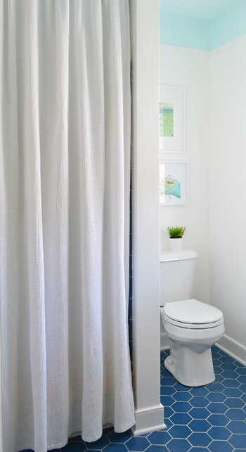
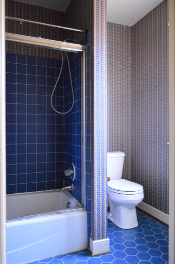
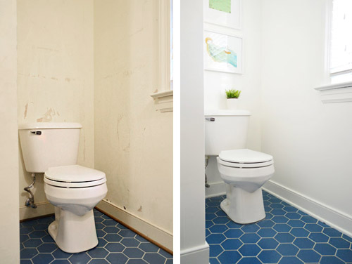
Which is a pretty stark contrast to what we started with. You might remember that we removed the glass shower doors pretty early on, but then we didn’t touch the room again until recently waging war on the wallpaper.
It’s a tough room to photograph due to all the doorways and nooks – especially when trying to get the ceiling and the floor in one shot. So forgive all of the super vertical crops and choppy shots. We hope they at least give you a sense of what the room looks like now.
As we mentioned in last week’s post, the thought behind the blue ceiling was to balance the floor. We’re actually charmed by the blue hex flooring, but we thought some up-high interest would be a nice counterpart. Heather’s bathroom (and this similarly blue-floored inspiration image) helped to guide our vision – especially the part about adding some simple architecture to create a transition between the colors.
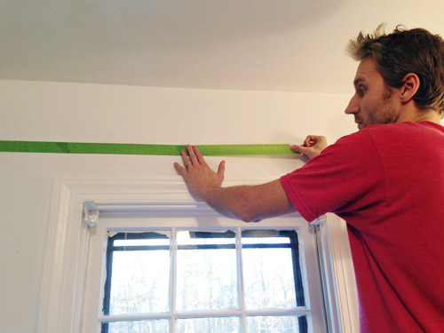
The first step was taping a horizontal border around the room where we wanted our blue color to start. We landed on about 8″ down from the ceiling, since it meant the border wouldn’t be interrupted by door or window trim but would still be substantial enough to look purposeful. I just held up my level and drew a pencil line along the wall… which then acted as my guide to apply painters tape. I wasn’t super meticulous at keeping my tape lines perfectly level since ultimately the paint edge would be hidden under the trim (so as long as it wasn’t majorly crooked, the trim would hide any small wavers or dips).
The next challenge was picking a paint color. We started off by doing some test swatches of colors we had on hand, like Nelson Blue (from our kitchen), Sylvan Mist (leftover from book projects), and Spirit In The Sky (a losing test pot from when we picked a front door color). Normally we’d go for subdued blues with a good amount of gray in them for the walls (like the two on the left) – kinda like a haint blue. But with the low bathroom lighting and the primary blue tiles on the floor, the grayed-out tones actually looked more gray than blue in here. Spirit In The Sky was exciting in a small swatch because it was bold and very obviously blue, but we worried that once it went around the whole room – and covered the entire ceiling – it would be too intense for us (paint tends to magnify itself from a small test swatch and looks a lot bolder when it’s all over the walls or ceiling). So you see how Sherry’s holding up another swatch?
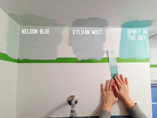
That’s Spring Mint (in an eggshell finish). Since nothing we had on hand was working, we decided to spring for a quart of a new color that was further from the blue-gray category, and more in the “pure blue” arena. Something like Spirit In The Sky, but a bit lighter and more subdued in intensity.
It took us two coats, but by that evening we had the blue border and ceiling that we were going for. As we peeled off the tape, we both wondered if we should leave it as is (i.e. forget adding molding). We decided it was definitely an option (especially if you’re someone who doesn’t have the time/money/tools to add it) but we wanted to take ours a step further. Mostly because we’re a little too in love with our nail-gun, and lattice strips are nice and inexpensive.
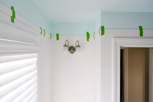
Speaking of lattice, we used the same pre-primed strips that we used for our last hallway’s board & batten. They’re super thin, light weight, and just 77¢ per foot from Home Depot. Sherry measured and cut the strips using our miter saw, and we taped them into place as she brought them up, just to keep track of how it looked and what walls were still incomplete. Despite all of the nooks and crannies in this bathroom, it took us under an hour to get everything cut and taped up… though it did involve about two dozen trips up and down the stairs between the two of us. Go quads!
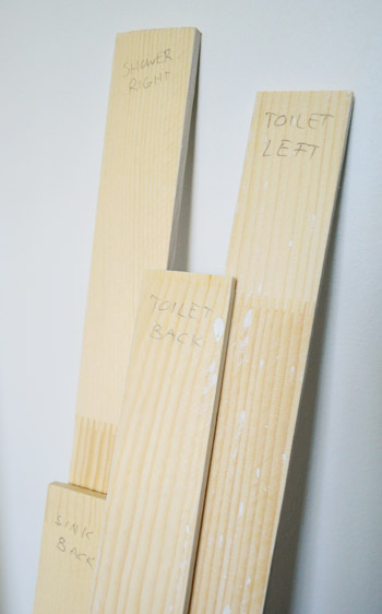
As we took them down to paint them, we labeled each one on the back so we knew exactly where they went when it was time to nail them into place. Many of the walls are similar in size, so we figured it would save us the frustration of putting the puzzle back together by trial-and-error.
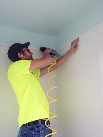
In addition to putting a coat of white (Simply White by Benjamin Moore) on the pre-primed slats, we also painted the walls the same color. Once that dried, we could finally attach the trim. This is one of those easier-with-two-people projects, so Sherry was with me holding things (the nail gun, the other end of the lattice strip, the level, etc) which made it go faster. We started with me nailing one end of our first strip with the nail gun (it was loaded with 1.25″ brad nails). Note the ear plugs, since in such a small space the sound of the gun was crazy loud.
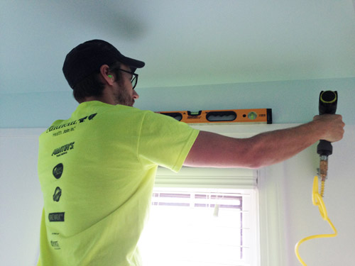
Then I held my level across it to make sure it was straight before handing the nail gun to Sherry so she could nail in the other end. This is a rigged photo since Sherry had to hop down to take this picture, but in real life it was a lot easier for her to hold the other end of the lattice up, and I’d check things with the level, say “good!”, and she’d fire a nail into her end. Then we could just continue around the room, making sure each piece lined up with the one before it.
Once we had all of the lattice hung, I went around the whole bottom edge with a bit of caulk, since our walls weren’t flat enough for them to looks seamless. I also used caulk to fill the tiny nail holes that we fired into the lattice on each end as we hung it. When the caulk dried, Sherry went over the trim with one more coat of paint – just on the front and under the bottom edge – to make sure it looked as crisp as the freshly painted wall.
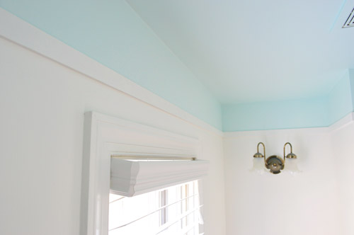
There are still lots of little tweaks that we’d like to do to this room for Phase 1 (see that light fixture above?) but so far we’re really happy with this slice of personality that we brought back into the space (you know, after ridding it of its wild wallpapered persona).
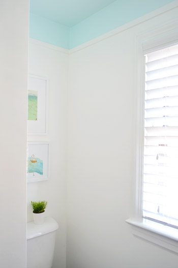
And I don’t want to ignore the power of the white paint in all of this too. Here’s the difference between our post-wallpaper-removal “gas station bathroom” look, and the post-paint after that we have going on now.
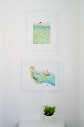
We also hung some art on the wall behind the toilet. These are prints we had from our last house (the top one is a page ripped from Real Simple magazine that hung in our guest bathroom, and the bottom one is a print by Sally at sadlyharmless.com that was given to us during one of our book tour stops last year and used to hang in our sunroom).
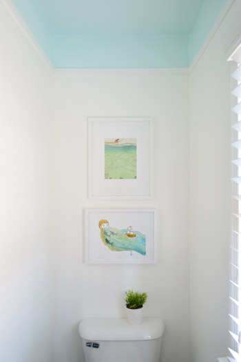
When we held them up together we initially worried they were a little too similar to be so close to each other, but decided just to work with what we have for now. The gradient of blues (the top print is a little lighter) actually seem to connect the lighter blue ceiling to the deeper blue floor in a nice subtle way.
At the end of the day, our entire bathroom update so far clocks in at a little over 50 bucks. Here’s the breakdown:
- Removing the glass shower doors (more on that here): $0
- Peeling the wallpaper (more on that here): $0
- Lattice trim from Home Depot: $25
- A quart of blue paint for the ceiling in “Spring Mint”: $30
- Shower curtain, white paint for the walls & trim, and art: $0 (we already had them)
- TOTAL: $55*
* If you don’t have a shower curtain, wall & trim paint, and art on hand, you might spend around $100 grabbing those.

We still have a few more inexpensive updates in mind for this room, but it’s already a lot nicer to walk into than the dark blue wallpapered space that we started with. What did you guys do this weekend? Any bathroom or trim projects in the works?
Psst- Last week we woke up to some surprise snow, and Clara really got into it.

Laurie says
I like what the new wall colors did to the tone of the tile too. It’s a bright, happy color. I really like that. It could be a lot of fun to design around.
Pati L. says
Hi!! The bathroom looks so awesome and I love that blue color. Great job! I don’t know if you answered this in previous comments, but I was wondering if and how you removed the frame for the old shower doors that were on the wall and tub. I have the same thing going on in my bathroom. (Curse those cheapy shower doors!!!) and I’m not sure what to do about the frame with out causing lots of damage to the walls and tub. For now it’s hidden by a shower curtain, but my brain still knows the frame is there!
YoungHouseLove says
Sure thing! Here’s that post for ya: https://www.younghouselove.com/2013/06/dont-eat-while-you-read-this/
xo
s
Emily @ Life on Food says
We are doing some trimming in the next few months. Glad to hear it is easy and cheap.
Desiree C. says
This looks really incredible! I just had to say that the technique you used by bringing the paint down onto the wall a bit gives it a coved-ceiling appearance, which is absolutely lovely! The bathroom looks exceptional and the budget is so impressive. Totes amazeballs!
YoungHouseLove says
Thanks so much Desiree!
xo
s
Mindy says
I’m so in love with this bathroom now! This is such an extreme before and after!
YoungHouseLove says
Thanks Mindy!
xo
s
Kat says
Looks so pretty! You may have already answered this, but could you please share the brand and color of that lovely blue paint? Thank you.
YoungHouseLove says
Sure! It’s Spring Mint by Benjamin Moore (we went with an eggshell finish and only needed a quart).
xo
s
Gnome Lover says
I love the ceiling. But I just want to request that you please, please, please never touch that awesome tile. It is so fab! And drool-worthy! I love the shape. The color. Love.
Jenni
YoungHouseLove says
Haha thanks Jenni! We actually are very charmed by the hex floor (not so much the dark blue square shower tiles though) but someday down the line we want to knock down the wall between our weird little sink nook and this extra small bathroom to make them one big room, so when that time comes we either have to locate some exact matching hex tile to extend it, or we’ll have to retile. But it’s most likely a few years down the road, so we get to soak up the sexy-hexy for a while ;)
xo
s
Lisa says
Wow! I love the look, but was wondering if you have any tips on painting around a toilet for a novice painter?
YoungHouseLove says
I like to use a short handled brush so I can just get back there as far as the eye can see.
xo
s
Priscila says
Wow, so amazing…I love de blue floor too!
Leslie says
Beautiful! Where did you get the extra long showr curtain? Thanks!
YoungHouseLove says
It’s from amazon.com a while back (I searched “extra long shower curtain” or “95 inch shower curtain” and it came up).
xo
s
Peggy McKee says
Why did you use flat lattice instead of molding?
Although I’m totally not a fan of dark blue tile, even I could live with it after the changes you’ve made! Congratulations. Peg M
YoungHouseLove says
Thanks Peggy! Since this is just a Phase 1 update (we’ll later be knocking down a wall and combining the sink nook and bathroom) we liked the lighter look and cost of lattice ($25 for the whole room vs. $100+ for thick molding). We also thought molding could look a little heavy for the small space (and it would have intersected with the light above the vanity as well, so lattice just worked better in this case).
xo
s
Laurel M. says
What a breath of fresh air! It’s lovely!
Melinda @Love Melinda says
What a great ceiling color! And what a transformation!
Joseph says
That room is looking great! Also, I love the little add on to the cost break down. That’s nice for anyone that doesn’t have supplies left over from other projects or things they moved from their last house.
Wendy says
What a great solution to the iffy tile you inherited! Looks great! Question: we bought the same nail gun/compressor set up you guys have after seeing it on your blog. We used it yesterday to put up a plank wall, and it was great…for the first 100 nails. Then it simply won’t fire. Any suggestions? Have you had any issues with yours? Sure would like to figure it out, it took 3 times as long to finish without it!
YoungHouseLove says
Oh no, that sounds like a dud! Maybe try bringing it back or calling some sort of number on the brochure if there’s a help line?
xo
s
JG says
That sounds about when the pressure would run down, if it wasn’t refilling. Is there a way to see and check the pressure (a gauge)? Ours’ has an auto setting to auto refill when pressure lowers.
Cassie says
I spent this weekend painting my soon to be craft room ceiling to floor. Painting the ceiling was super hard, you guys seem to do it so easily. I wonder if you could do a post on the best way to paint a ceiling. Maybe you already have. I tried to channel Sherry when cutting in, but it was no good, so I taped off the ceiling when I painted the walls. Which I painted Revere Pewter. Love it!
I love this concept for your bathroom. I may have to incorporate it into mine. You two are so creative.
YoungHouseLove says
Oh yeah, ceilings are a bear! We hate them! Haha! Sometimes I even tape off the top since I’m less steady handed up on a ladder. I like the idea of doing a post full of tips since we definitely have learned along the way. Thanks for the idea!
xo
s
Natalie says
Ooooh I love how you brought the blue down from the ceiling to the wall – so ethereal! You guys are so creative! :)
Erin says
I almost cried when I saw this post. My husband and I bought our first house a month ago and two of the bedrooms were painted like this (the previous owners painting skills were seriously lacking throughout the entire house, so they weren’t done well at all). One of the rooms was magenta the other blue and black. Last night we were both near tears as we realized two coats of primer and two coats of paint weren’t going to cut it. But I love it in your bathroom! so gorgeous! Maybe I can convince my husband to let me try it in our bathroom, ha! That’s not going to happen after we paint the ceilings a fifth time tonight.
Christina says
wow! I didn’t even register that there was a window in that room before-the wall paper was like a light vacuum! Very fresh feeling now!
Jenny says
All I can say is “Wow”. It never fails to amaze me what a difference a little paint can make. Having recently bought a house, it also makes me wonder sometimes if people who are selling houses don’t know just how easy it is to make simple changes that would bring them huge returns in their asking prices. If I saw your “old” bathroom, my first reaction would be to take $10K off the asking price, thinking it was a gut job and not knowing how much it would cost to change. You spent $55 and not it looks absolutely fine. Not everyone may love the blue hex tile, but now it’s much more appealing and something that can be lived with. Will you being doing the same grout treatment in the bathroom that you did in the foyer?
YoungHouseLove says
Thankfully this grout is in much better shape so I don’t have to drag my pregnant body across the floor in there!
xo
s
Karen says
I just have to comment too – that spring mint blue color is stuh-ning!!! Perfect for a bathroom.
Diana says
I love this look!! Might try it out somewhere in our next house.
jbhat says
What a fantastic plan you came up with. And wow, the transformation is really amazing. Yay!
jbhat
Liz says
Really, really, pretty. Such a huge impact. You are inspiring me to tackle my 1954 pink bathroom! Ever seen a nice, updated version of working-with-what-you’ve-got when you’ve got pink tile nose high all around? We just made everything else super white. Great job!!!!
YoungHouseLove says
Yes! We crashed an amazing house with a pink tile bathroom! If you search Lesley House Crash hopefully that post will come up!
xo
s
Kylha says
Hey guys,
Your bathroom looks amazing!! I can’t believe how much the white paint changes the whole look of that room. From making it look fresh and clean, compared to gas station dirty, to the fact that the tile not only looks a new AMAZING blue, but that it really POPS now! And I totally love the slightly lighter blue you went for- great choice.
Once again, thanks for the ideas, tutorials, and DIY fun.
Kylha
JG says
I wonder if you use that grout treatment on the shower tiles in a dark color (dark gray?) -if that would help de-emphasize the dated grid-ness of the tile and make it look better?
YoungHouseLove says
That’s a possibility!
xo
s
Abby says
I love this color! It is gorgeous and so perfect for a cute bathroom!
Abby
Thepreppycoxswain.blogspot.com
Shelley @ Green Eggs and Hamlet says
Bravo! I love the Spring Mint blue with the more royal blue floor and the lattice strip detail really finishes it nicely.
You guys are seriously selling me on these phase 1 updates (this bathroom, the nook with the stenciled floor, the kitchen). I think I’m going to have to do a phase 1 to our master bathroom while we save up for a gut job.
Meadows East says
That is quite the project! I love that you picked the bright blue color over the gray-er ones. It definitely brightens up the room!
kingsmom says
I actually (finally) finished removing the 30+ year old wallpaper from my master bath. I don’t know how you guys did it. I would have gone seriously mad if I had more rooms to complete. Lucky this is the only one. Now on to painting!
YoungHouseLove says
Good luck! And congrats on conquering the wallpaper!
xo
s
Penny Smith says
OK, at first glance I thought it was going to be a redesign guest! The hex tiles look great in there now!
Uhm… $30 for a QUSRT of paint? What the heck!
Penny Smith says
(I was so shocked I spelled it wrong.)
YoungHouseLove says
Haha, I know! Since I’m prego and wanted to help, we sprung for Ben Moore Natura (it’s no-voc, goes on like buttah, and we still have more than half the can left for other projects).
xo
s
Kyle says
I love this! We are in the middle of a huge project ( I feel like this has been the case since we moved in 7 months ago) We have tore everything apart in our master bathroom ( shower was leaking and had dry rot :( Anyways, we have a main floor bathroom that we also redone and added pot lights to! This idea would look great in that room! (Its a large bathroom but the wall color makes it feel awkward)
Did you guys put the lattice trim where the shower is?
If so, how are you protecting from moisture?
YoungHouseLove says
The wall above the shower has always just been painted in our last two houses, so we just did the lattice all the way around the room at that level and painted it. Should be fine since the part where the water comes down from (the spigot, etc) is all located lower where the tile is, so there’s just a wall above that stuff where the water doesn’t actually fall/touch.
xo
s
Jennifer says
LOVE this! The bathroom in our new-to-us house has a very similar colored blue tile and I’ve been having trouble figuring out how to paint the walls that wouldn’t look terrible with the tile until it can be switched out. I’ll definitely be presenting this idea to my husband.
Heather says
Looks so darn FAB!! I love the color! I even really really like the floors now!!
threadbndr says
I love the white and breezy blues. I also love the ‘lattice’. My bathroom has tall walls, and small floor footprint, so it sometimes has a rather ‘bottom of an elevator shaft’ feel to it. I think bringing the ceiling color down the wall and giving it a ‘stopping point’ for the eye will help a lot with that. Thanks for the inspiration.
This weekend was all about getting the dishwasher installed. This house has never had one (1920s construction), so there was wiring and plumbing and moving of base cabinets and Marine Corps style swearing (my son was helping with the install) when we rediscovered the fact that rubbing two pieces of wood together can create fire.
Be careful when using a hole saw with a Forstner bit when you are going through two layers of cabinet sides – once you are through the first layer, it will start rotating inside the bit against the stationary one you are drilling into – instant fire drill……..
But JC was on the ball, smelled the smoke, and the kitchen fire extinguisher was right there in the next base cabinet, we didn’t even set off the fire alarm.
YoungHouseLove says
Eeks! So glad you guys were ok!
xo
s
Bailey says
I love the idea of creating your own border at the top of the wall and bringing it into the ceiling. It looks gorgeous!
Bailey
http://akabailey.blogspot.com
YoungHouseLove says
Thanks Bailey!
xo
s
Stephanie says
I have to say I do love that floor! Having white walls really makes the floor so much better too!
Kelly says
LOVE IT!!!
Kelly says
Hit enter too soon. Wanted to say it adds so much height to the room.
YoungHouseLove says
Thanks Kelly!
xo
s
Jen says
Do you know the artist of your awesome Real Simple magazine art? I just recycled all my 2013 RS mags just a few weeks ago and I’m super bummed–I would have loved to copy your idea of using that page as some art for my house! I’m wondering if I could find the print elsewhere. Otherwise I’m paying a premium price for a back issue of Real Simple…
YoungHouseLove says
So sorry, I don’t. Anyone else recognize it for Jen?
xo
s
Jessie says
Just wondering where I can find your 2013 paint picks…I just love your blog…very inspiring! I think I may go pick up your book tomorrow!
YoungHouseLove says
Thanks Jessie! Here’s that link for ya: http://www.benjaminmoore.com/en-us/for-your-home/color-gallery#&ce_vm=2&ce_trd=YHL
xo
s
Jessie says
Thanks you!
Christina Ebbers says
So I painted my full bathroom a very similar blue color, Icing On The Cake by Benjamin Moore. Except I painted the entirety of the walls, and the ceiling. I am realizing now that doing something like this would be WAY BETTER. It is a pretty small, windowless room and while the color is light by nature it comes across as a little intense, and a little too much like baby blue which is not what I was going for.
I love white bathrooms but I was afraid this particular room would just feel lifeless and unfinished in white. But doing a treatment like this should avoid that. Hmmmm now I need to decide if I’m motivated enough to repaint, haha.
Photos of said bathroom if anyone’s curious: http://design-vox.com/2013/04/10/my-full-bathroom/
YoungHouseLove says
Good luck Christina!
xo
s
Lucinda says
I’m wondering if this look would work in reverse for a smaller bedroom with a low ceiling. My thought would be to do some sort of semi-moody grey-ish color and then drop the lighter ceiling color down like in this bathroom. Thoughts?
YoungHouseLove says
I think it would be awesome! Good luck!
xo
s
Kate @ Short & Sweets says
I’m sorry if I missed it in the post, but where did you find the Spring Mint? or, I guess, what brand is it?
Obviously, since I’m asking, I think it looks great! I’m having trouble convincing the husband that painting a ceiling is a good, not weird and terrible idea. Any hints?
YoungHouseLove says
It’s by Ben Moore. And as for convincing the hubs, usually what works for me is to show him photos of other inspiration rooms like that to help him picture it. And saying I’ll repaint the whole thing if it’s a bust, so it’s no skin off his back :)
xo
s
Kate @ Short & Sweets says
haha, thanks!
Dawn says
I’m trying to so the same in my bathroom- how did you cut the corners of the lattice? Are they angled or just joined?
YoungHouseLove says
They’re just joined (we didn’t miter the corners, we just made flat cuts that but up against each other and caulked and painted them for a clean look). Hope it helps!
xo
s