The console returns. Yes, the console is like Rocky and Batman movies. The sequels keep coming. Maybe instead of The Console Returns we should say “Console: The Final Chapter” or “The Console Strikes Again” or “I Still Know What You Did Last Console.” No? Fine. We’ll stick with The Console Returns.
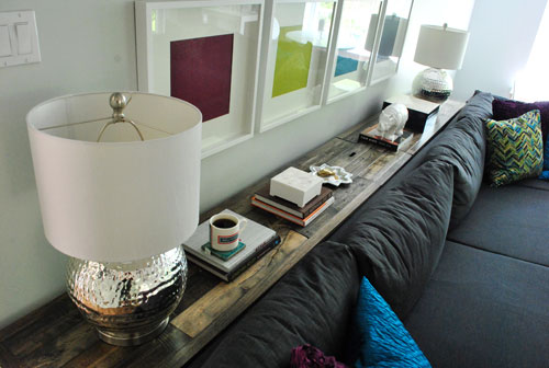
Yes, after many (many) posts about our big console build, this is the official finale. And this one is the most exciting for me because it’s all about the fun stuff I put on it. Haha. I’m deep, what can I say? I’m sure it’ll constantly change, but here’s what it looks like today:
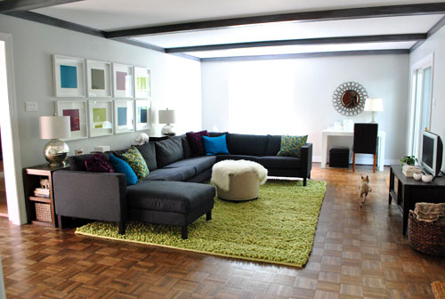
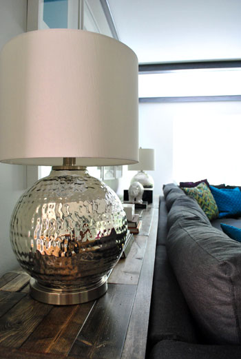
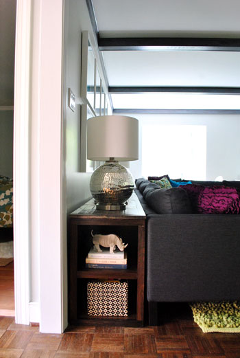
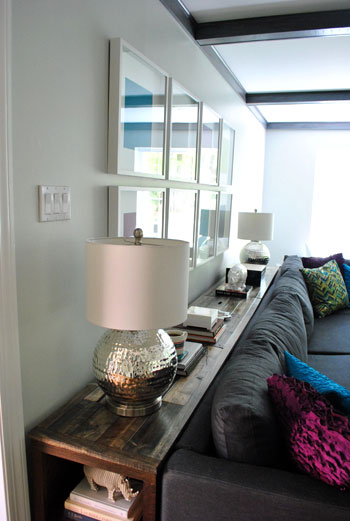
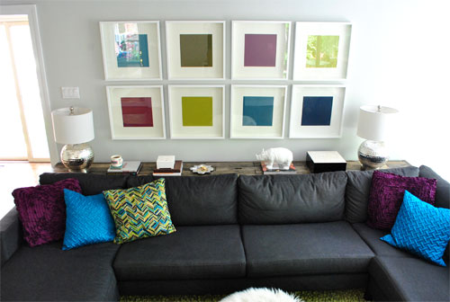
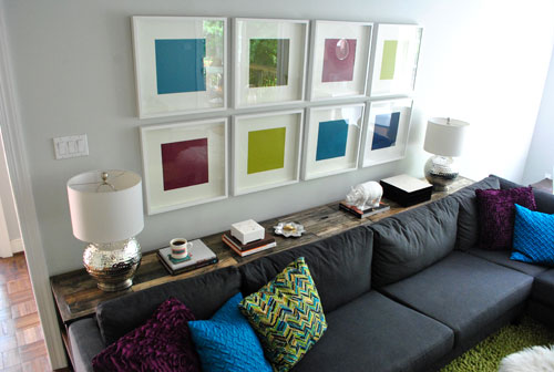
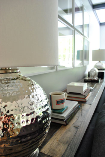
The lamps were more than we’ve ever spent on lamps (I have some sort of imaginary $50-a-pop maximum and these were $59 each) but from the moment I saw them at Marshall’s I couldn’t. walk. away. I even texted a picture of them to my friend Cat and she said “You’re a magpie, gotta have ’em if they’re shiny.” So I said to myself: “Self, what’s $18 extra bucks when it’s true lamp love?” It did help that they were marked down from $125 each.
We also picked up that big capiz-topped black lacquered box from HomeGoods (on clearance for $15, down from $36) because I knew it would be awesome for stashing nearly all of the clutter that seems to collect on the sofa (a few magazines, books, notebooks, pens, remotes, and even my brush and lotion). And the sleek glammy vibe worked with the blingy lamps to bring some modern chicness to our rustic ol’ console beast.
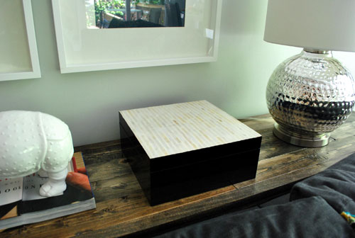
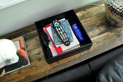
Other than that I just brought in some stuff that we already owned, from a few stacks of pretty hardcover books that I love to flip through (which are also functional thanks to a handy coaster that I stacked on top for my nightly cup of tea and the smaller white capiz box that’s secretly full of my smaller sofa essentials (lip gloss, vitamins, nail clippers, etc).
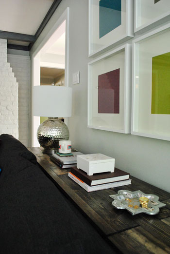
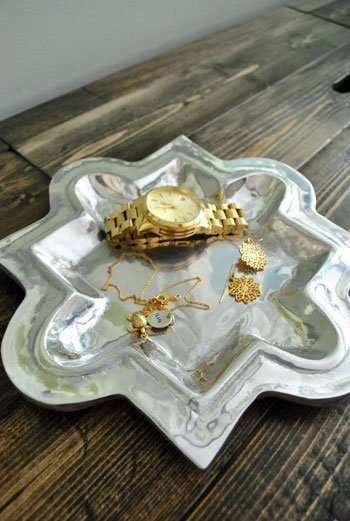
And this cute $3 thrifted quatrefoil tray is perfect for all of the jewelry that I like to remove as soon as I sink into my special spot on the sectional (the chaise in case you’re wondering).
And here’s what we have going on in those hidden baskets in the middle compartment. The left side is full of board games since this the room where we usually get our game on. And the basket on the right has a lesser used remote (for the DVD player) as well as some books that we got for Clara from the library (we try to keep them all together so we’re not looking everywhere for one last book on the day that they’re due).
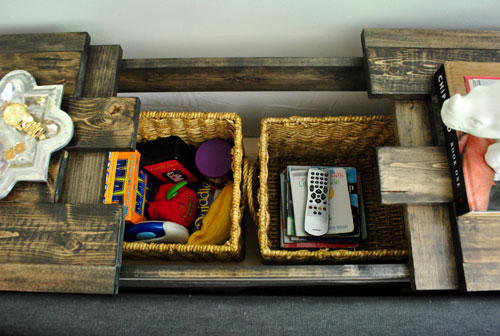
And of course we have a little ceramic animal action going on thanks to my old ZGallerie rhino friend. Probably just for a bit until Clara gets bigger and he becomes endangered. Then he’ll go live on the built-ins in the dining room again:
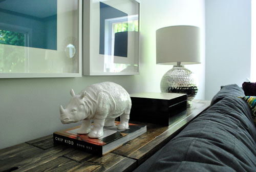
For some reason this shot kills me. The little ceramic rhino butt in the background gets me every time.
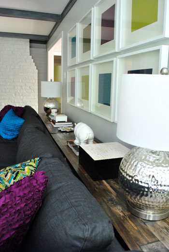
As for the bookshelf sides of the console, we found three of these $5 baskets at HomeGoods, so the one on the close side of the console on the bottom shelf is full of a bunch of Clara’s board books while the top shelf has some of our books and a fun little Cardboard Safari rhino going on.

… and two more baskets on the far side of the console have blocks and other small toys stashed inside.
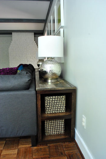
We’re sure everything that we have on/in the console table will be constantly changing. For example, once Clara’s a bit more mobile I don’t think my beloved ceramic rhino will get to live up there anymore. Unless I want him to meet an untimely end like my ceramic pooch.

Heck, she might even try to murder the cardboard rhino on that side shelf (so far, so good though) so we’re just going to play it by ear. We might decide that we’d like more empty space for putting stuff down on the top of the console (we have that big expanse in the center for a large bowl of chips or something, along with plenty of room for more coasters for drinks, but you never know if we’ll want even more). So it’ll be fun to tweak it and watch it evolve as the rest of the room comes together over the next year or two (still on the list: breezy curtains to add softness, a larger and more balanced looking media cabinet, etc).
And now for the weirdest video we’ve ever made. We were in sort of a quirky mood so we thought it would be hilarious to make a sexy stroking-the-console-video of the whole thing in action (we even throw open that middle compartment for ya to see how it opens and closes in “real time”). The music kills me. And the slow motion. Yup, we’re still laughing about it:
Strangest video you’ve ever seen. Am I right? Oh and we have one more pic for ya. At night it’s all sorts of magical in the living room now that we removed all the weird ceiling fans and that off-center corner pendant light and use the console table lamps along with the desk lamp to illuminate the room.
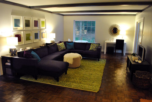
This photo doesn’t even do it justice, but in person it’s so cozy and glowey and charming. And we can only imagine how the right curtains and a bigger and more proportionate media cabinet will take this work-in-progress room a whole lot further. Someday…
Psst- Wanna flip back through the whole console building journey? Here’s the first post, the second post, the third post, the fourth post, and the fifth post.

Jillian says
I love the reflection of the trees in the top-right green frame (5th picture down). It looks like a painting rather than a solid piece of paper!
If you were to ever change out the art I think prints/paintings/pictures in the same color scheme as you have now with the solid paper would look awesome. I love black and white photos, but I think the color up there is fabulous.
Tanya says
I’m in love with this room! I never would have thought about wedging a table between the sofa and the wall, but it makes total sense to me now.
P.S. Those lamps had me practically drooling.
Elizabeth says
“The Console 4: This Time It’s Personal-ized”
YoungHouseLove says
Hahaha, love it.
xo,
s
Shinah says
Just want to say you guys and your blog are amazing. I always look forward to your posts and this one brought a huge smile to my face (sorely needed on a Monday morning). Keep it up – you are genuinely appreciated =)
e.p. says
Love it! This is exactly what I need in life since I always drop things behind the couch like my phone, the remote, my bookmark.
Andee says
I love the way things are turning out in your new home. These lamps by JCP are a smiliary option for blog stalkers like myself whom don’t have a Marshall’s or Home Goods nearby.
http://www3.jcpenney.com/jcp/X6.aspx?GrpTyp=PRD&ItemID=1a1298d&DeptID=71371&CatID=71774&SO=0&Ne=5+580+1031+8+1008+18+904+949&NOffset=2&N=4294953199&Nao=0&PSO=0&cmAMS_T=XGN3&cmAMS_C=MERCHA&cmAMS_Z=XGN3TOPOFRESULTS&CmCatId=70749|71774&mscssid=6af25fddc7898428e9fdfc9ea06ed8172xMnVNoV5aGoxMnVNoV5aGW200BB8574AB7F657DE81C7A2B47B0866770C1111514
Anna says
I love the console! Before accessories, I wasn’t sure how it was going to tie in to the really modern vibe of the room. I’m sold now though. Beautiful!
The video would only be more amazing with the addition of Burger popping out of the secret storage the minute you slowly pulled the lid up. :)
YoungHouseLove says
I wanted to put some peanut butter on the table and grab a shot of Burger licking it in slow motion but John thought that was too much. Haha. Prude!
xo,
s
Elizabeth says
LMAO!!!!
Lilly says
wow u guys are so funny with the video. But seriously big props to John on building that console. It’s pretty darn amazing n really profecional looking. U both must be very proud of it.
Care says
OMG that was hilarious!
Cate says
Okay, that is officially the strangest video ever. :-) I laughed so hard when the music started!
I LOVE the last photo of the living room all glowing and cozy. It looks like such a great place to hang out as a family.
Jenny says
I love the evening shot! It looks so cozy!
Rachel H. says
FAB.U.LOUS!!! That video is HIL.AR.I.OUS.!!!
Kate says
BEAUTIFUL! The console really looks fantastic. What a great job. I made a table once in woodwork class in High School but I now leave furniture making up to the pros/Ikea! The lamps are amazing and I am totally jealous. Im dreaming of re-do’ing my future house while Im living in my tiny 1ft square NY apartment.
simplyblythe says
oh my…this looks SO good. makes me want to spend the day at homegoods and marshall’s…must. have. self. control.
nice job!
Ryan says
Did you guys think about doing a hinge on the console to make it easier to open? Or would that not be possible with the 3 sections of it?
YoungHouseLove says
We did consider that but opted for something that lifted out because we worried about banging up the wall or the console itself with something that swung open and also thought we’d have better access to the whole storage area if we didn’t have to reach around the hinged door and could remove it instead.
xo,
s
Elizabeth says
You guys have the best luck finding boxes at HomeGoods. I look there all the time for things like this and never see anything. Boo. :-(
Kate S. says
Oh my word, that video had me snorting my cup of tea. Ridiculous, but hilarious.
Kati says
You seriously can work some magic! Losing the fans and the pendant light really make a huge difference. The room is long and a bit awkward with the patio door but you make it look completely balanced. I’d be all over your mood board and layout services if you brought them back!
Kristi @ Addicted 2 Decorating says
That looks fantastic!! Love the lamps. And I’m cracking up over that video. How in the world do y’all come up with stuff like that?! Your brains must work overtime. :-D
YoungHouseLove says
That was an 11pm idea. Haha. We were sitting on the sofa and I said “what if we got all bow-chicka-wow-wow and made a sexy console video” haha. At first John didn’t bite but I begged and he edited it that way. We were both dying by the end (and it was after midnight so we were all giggly anyway).
xo,
s
Claudia says
LOVE the lamps! The texture is just awesome. The console looks great, I wish I could say I’m going to make one just like it but it’s far beyond my skills, but it’s fricking AWESOME!
heyruthie says
love it. what i love most about it, is that althought it’s clearly been “collected,” your stuff all relates so well. example: the room was starting to look really square and angular (the wall art, Karl, parson’s desk, etc.) and now those round lamps completely balance that out, AND mimic the glitzy round mirror over the desk. everything seems to work together, and “mirror” and balance each other, etc.
QUESTION: how do you do that? is it all planned? did you know you wanted round and glitzy lamps? or were you open to whatever caught your eye? in other words, how much is planned, and how much is just going with your gut? i ask this, because sometimes my “gut” isn’t always right…..y’all have better “taste” than I do! Haha! hugs!
YoungHouseLove says
It’s absolutely 100% by accident. We just have a see-how-it-looks-and-course-correct-along-the-way approach. So if I got the lamps home and they looked crazy we just would have returned them and continued the search. Same for the accessories, I just brought things in and stepped back and removed what I hated and kept what I liked. I do tent to gravitate towards round blingy things though (the mirror, the lamps, and even the curved quatrefoil tray) so maybe subconsciously that helps? Haha.
xo,
s
heyruthie says
thank you, Sherry! very helpful. it means if i sometimes feel like im’ guessing, or just waiting for a really good deal or special item to “grab” me, I’m not way off…
Deanna says
My vote goes to “I know what you did last console.” :D
laxsupermom says
Love how you merchandised the giant console. The lamps are blingy perfection. I have imaginary lines drawn for specific items, too, and I would have had such a tough time crossing it. You know where you stare at it, pet it, wonder aloud if you should cross the line, argue with yourself a bit, put them in your cart and do two lamps around the store, then put them back on the shelf, call the hubs and text him a picture after doing 2 more laps around the store, see someone milling around near them, then throw yourself at them and finally make your way to the cashier. No? Just me, then?
How did I get off on this tangent? Love the capiz shell box and baskets, too. Thanks for sharing.
Lauren says
I love that Karl looks like he’s a deep purple in the night shot.
YoungHouseLove says
Haha, isn’t that swanky of him? For some reason it’s only in that pic (in real life he looks charcoal gray).
xo,
s
Jenny Walter says
I love the color of your living room and I am considering using it in my office. I’m sure the color is listed somewhere, but to save me time… can you refresh me again on the name of the color? Thanks!!
YoungHouseLove says
It’s Moonshine by Benjamin Moore color matched to Olympic No-VOC paint. Hope it helps!
xo,
s
Beth says
I have a random question: where are the cords for the lamps??
YoungHouseLove says
They slip behind the console table since there’s a smidge of room between the console and the wall thanks to the baseboards (and luckily we even have an outlet for them back there).
xo,
s
Sara says
Love. Love. Love. I really like the eclectic feel in here. I’m learning so much from your posts and responses to your readers’ comments! Do you think you will go modern or rustic or somewhere in between with the tv unit? Light to blend with the wall or dark?
YoungHouseLove says
I think we might go with the same rustic feel as the console table for the media cabinet just to add some balance and a bit more of that rustic vibe to the mostly modern room. Who knows where we’ll end up though…
xo,
s
SouthsideShellyP says
The room looks really great Sherry. Layer by layer, it is coming together. You two really inspire me. I have been in my house for 6 years and inert for most of that time until I discovered YHL. I read your blog daily and it motivates me to update, finish projects and exercise my creativity. Yesterday I sewed a shower curtain and made a window valance for my master bath. next weekend I am going to try painting stripes. Tally Ho!
Adam says
The console looks great, I especially love the evening photo with the lamps on!
Cara says
The room is really coming together. Looks great. Your video cracks me up.
Abby says
I can’t tell you how much I love that rustic wood with those glammy (is that a word?:) lamps! Beautiful work you two…as always. :)
Lori says
Y’all are so weird. And talented! I too have some (for me) crazy expensive grown up lamps…and they also totally make my room. (World Market…$60 each!) Keep up the good work…though I’d stick to interior design if I was you. Furniture porn isn’t a growth industry. :)
Amy says
It looks great! Related to your last photo, do you guys use CFL bulbs? Do you have a favorite kind? I can not for the life of me find ones that have a nice glowy color but aren’t dark yellow or pink- or green-tinged. (Ick!) Anyway I thought maybe you guys had an opinion on that.
Also, I now want a ceramic rhino. Rhino butt! Cute. :)
YoungHouseLove says
Yup, we use and love our CFLs. We always go with “warm white” ones (since they seem to have a nice not-too-blue-or-too-yellow glow). Hope it helps!
xo,
s
aimee says
Holy coziness, Batman! I love love the night-lighting. And those glamma-lamps. ps. yay–so happy to see the little Clara charm I sent on the jewelry dish! Awesome job in this room, you two!! :)
YoungHouseLove says
Oh Aimee I love that charm and wear it nearly every day. You’re such a sweetheart! I always tell Clara that “Aunt Aimee” made it. Haha.
xo,
s
Melissa's Heart and Home says
Wow! The lamps are fabulous! Those are my favorite thing you have done to your home so far. Worth every penny. That was a good deal. It all looks beautiful.
Warmly, ~Melissa
Dre says
that video was so MAGICAL… and I only felt awkward a little bit. :)
Casey says
Love, love love it! You guys are so good. And those lamps are metallic masterpieces. Great find!
maribel says
the video was hilarious..I love the slow mo of the secret compartment, the pushing aside of the books and dish was hilarious.
Lydia Pudel says
I LOVE these Lamps!
I really do and the rhino is great.
Good job on the console!
Lovely greetings…
http://pudel-design.blogspot.com/
Wom-mom Ethne says
I’m a jewelry taker-offer on the couch too. I usually lose the pieces in the couch and have to dig them out. This is a good idea. I’ll get my hubby to make a console now. ~Ethne
Kate says
LOVE that you turned “Sue the napkin” into a pillow. Awesome idea! It looks great on “Karl the sofa”… or is that your bed?? Your furniture names make me laugh!
YoungHouseLove says
Yup, Karl’s the sofa and Ed is the bed! Haha. As for the Sue pillows, we’ll be back with those details as soon as we can edit the pics and write the post!
xo,
s
Katrina says
Love those lamps!! I’ve seen one smaller versions of those lamps at our Marshall’s – they are so pretty in and shiney in person! love
leah says
It turned out really beautiful! I really love it. The room is really starting to look like a work of art. As always impressive!
holly says
that video made me cringe and smile at the same time… and made me slightly nervous.
Amanda Wells says
I’m in love with this room. And those lamps. And the rhino. And all of it. Great job!
http://www.amandadovewells.com/?p=250
Kel says
Fabulous. I love the whole room. I can’t wait to see what it looks like with curtains. Also- Best.Video.Ever.
Jen @ The Decor Scene says
Love it!!! It looks like it’s been there for awhile now. Fits right in the room now. :)
Meagen says
Speaking of the rug… I see that you have it tucked pretty far back underneath the sofa. What rule do you use for placing the rug in the room and having furniture on it? Front two legs need to sit on it? All legs need to sit on it? Never thought about it? We have an 8×10′ rug in our living room that I am forever-adjusting to make it look as if it covers more floor space and is centered in our Craftsman-home-symetrical room. You’ve left yours to have the wood floor walkway in front of the TV console as opposed to spreading the squishy love rug all the way to manually changing the channel. Thoughts?
YoungHouseLove says
Ah the rug placement. It’s definitely not in its final resting place so it’ll probably move around a bit (a few inches out, a few inches back, etc) until the media cabinet comes in and we hang curtains and the room starts to feel more balanced. Then we’ll just eye it to see where it looks best. There are lots of rug rules (only front two legs on it or all four legs on it, etc) but we always toss rules out the window and trust our eye. If we scooched the rug all the way under all the legs of the sofa we think it might look a little cramped and lopsided (too close to the left wall with lots of weird floor space in front of the TV) and if we scooched it out towards the TV more so it’s centered in the room it might look like too little of the sofa was actually on it enough (which helps ground the seating area), so we just recommend playing it by ear and trying things out to see what you like best!
xo,
s
Jas says
haha, that video is hilarious! I was skeptical about the console at first, but it looks great! I’m amazed that you build it yourself, and the money you saved!! It’s really inspiring.
Btw, have you seen these? They would be a great ‘nod’ to your original idea!
http://www.designboom.com/weblog/cat/8/view/13305/designboom-shop-new-product-palette-coasters.html
YoungHouseLove says
Oh my gosh those are hilarious!
xo,
s
Wrenaria says
Thanks for the giggles your video provided. :p
Your living room is coming along nicely.