The deed is done. Everyone on Team Paint The Mirror White (not to be confused with Team Edward, which I’m totally a member of) can rejoice. Our mirror above the sink went from this:
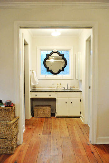
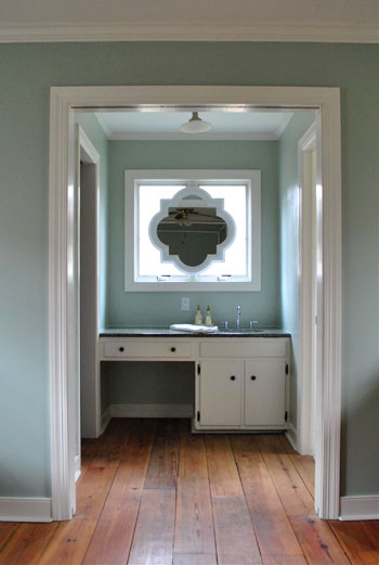
To this:
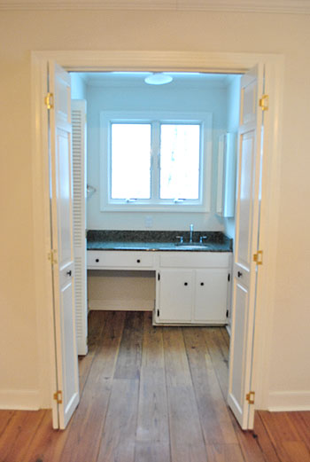
And I guess we should show how it originally looked when we moved in for the full before:
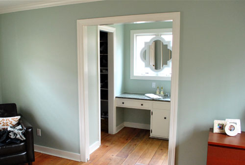
But back to the white paint choice. After much thought (and a decent amount of flip-flopping) we decided to go with our first instinct and paint the mirror white to match the trim. It definitely looks integrated and a bit less heavy, so the nook is now a little less look-at-me-right-now distinct (which is a good thing since we’re trying to make it blend in as opposed to stand out). Now it looks as if it’s always been there, and it’s not too high contrast to draw all attention to the sink nook.
So my apologies to all other teams (like: Leave It Black, Paint It Gray, Paint It Teal, Paint It Yellow, Paint It Gold, Paint The Molding Black, and Paint The Vanity Black). We definitely considered all possibilities and there’s certainly more than one way to skin this cat (gross expression, sorry). All of those options probably would have worked, but in the end it just had to come down to good old fashioned personal preference. And you know we love us some white…
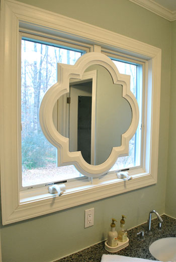
Speaking of white, here’s how we got the look: Behr’s Premium Plus Paint (the can of paint with primer & paint in one) in off-the-shelf white in a semi-gloss finish. I just brushed on four thin and even coats with a paint brush. I did this instead of spray priming and spray painting it (which we’d usually recommend, and would also work swimmingly) because the Behr primer/paint stuff is low-VOC and spray paint isn’t. Thankfully it worked like a charm. Oh and I used a straight razor to scrape the paint off the surface of the mirror for a nice clean result.
And for those who like contrast, don’t blow a gasket. Here’s what it looks like at night:
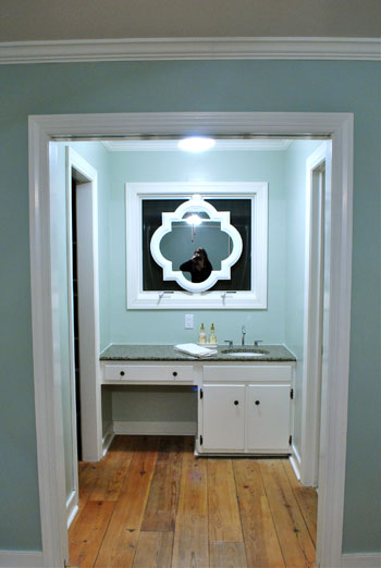
We actually LOVE that going with white was the bold choice at night since we spend a lot of not-day time in the bedroom, and the white frame totally pops out from that black background out the window for awesome at-night drama that we can enjoy before heading off to sleep. Back when it was black it practically disappeared at night.
And look, here I am:
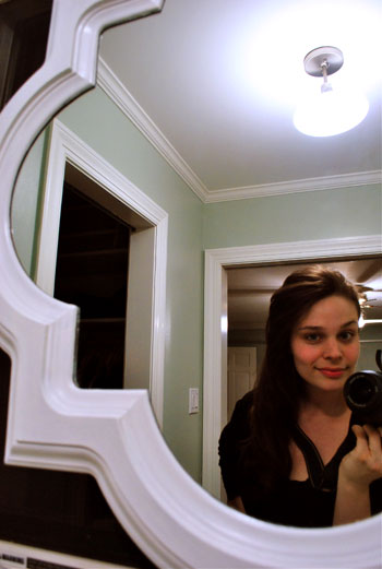
Stop the presses. My hair is down. Can you believe it? I know. Shocking stuff. After many many requests, there you have it. It’s like a ponytail but different. For actual video footage of me with my hair down (and a whole bunch of it’s-Friday giddiness) check out this Texas road trip video of yore. That trip was thebomb.com. For reals.
Oh and although there are a ton of Team Frost The Windows peeps out there, we’re leaving them bare for now. Just because we like looking out ’em when we’re tooth brushing in the morning. Sometimes we spot a robin or two at the bird feeder. Shucks, that’s quaint. So even though they look frosted in a few of the photos, they’re not.
And for those wondering what things look like from the neighbor’s perspective (it’s a side window), since we live on almost an acre of land, we’re pretty far apart apart. But here’s what it looks like during the day from about a fifth of the distance between our houses:

Yup, it’s invisible (most exterior windows are reflective during the day, and ours is no exception). We even took the shot above with the bathroom light on to hopefully highlight the silhouette but all you see are the sky and some tree branches reflecting on the window panes during the day.
And here’s what it looks like at night:
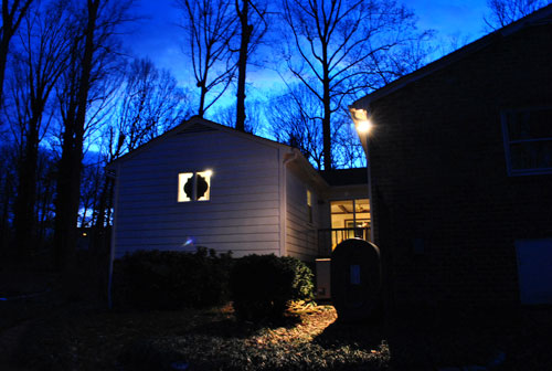
So not bad right? I mean, we have 99 curb appeals problems, but the mirror ain’t one. Yes, that’s a reference to 99 Problems by Jay Z. Because I’m gangsta like that.
Psst- Why Team Edward and not Jacob? Even though I’m from Jersey, tan juice-head body-builders have never been my type. As demonstrated by my tall, angular, and sometimes pale hubby. Does it make me insane to admit that the whole time I read Twilight, I actually pictured John as Edward? Remember this was before the world had been introduced to Robert Pattinson.
Psssssst- To everyone worried about if I could reach the buttons on the dryer, we updated that post with a pic of me in action. Go Team Five Foot Two Inches!

Jennifer says
LOVE it white!! And love the 99 problems reference at the bottom….hilarious:)
Laura says
The white looks so great!!! I think you made the right decision. I think it makes the window look very custom! That nook may end up being one of your favorite little spots in the house. Nice work!!!
Sheela says
This looks great! It really looks like a seamless piece now. Great work!
Kristin says
I am a crazy busy executive and mom of 2 little ones. Enjoying your blog is my guilty pleasure every day. I LOVE reading/watching your re-do adventures! And I’m so inspired by all of the creativity. I have to say I was not a fan of the mirror-over-window thing when the frame was black, but now that it’s white, and with the paint job, I LOVE IT. Gorgeous! (Your blog is a little dangerous b/c it makes me want to sneak out of work and go home and work on a home project! :) )
Paula says
LOVE the white– great choice!
Liz says
It looks great! I was on “team whatever-you-guys-decide-to-do-will-look-great,” but seeing it painted makes it looks like it’s really supposed to be there!
I know you say no on can see through your window, but having my bed directly across from a partially uncovered window would give me some serious performance anxiety.
Melissa says
you guys never cease to amaze me! It looks AMAZING!! It looks like it has always been that way! Love it!
TheCarolinaHousewife says
LOVE this! I was hoping Team Paint It White would win.
PS–You should wear your hair down everyday. Gorgeous :-)
Auto Insurance Quotes Compare Online says
That mirror is beautiful, looks much better in white, and the shape is really nice.
Ban Clothing says
I love that you painted it. When it was black I feel as though it distracted the eye so you couldn’t take in the whole room. It also blends so well with the window trim, it looks like it was there from day 1.
Elizabeth says
Forgive me if someone has mentioned this, but YIKES! I would be sooooo paranoid about creeps staring in at me if there was an open window aimed right at my bed like that! LOL!
Perhaps I should never have seen Amityville Horror, the original one…not the OMG HOW HOT IS RYAN REYNOLDS one.
Carissa says
Let’s get to the real star of this show: Sherry and her hair. Sherry, you are ridiculously pretty. You can tell John I said that, too.
YoungHouseLove says
Shucks Carissa. You’re making me blush. Maybe I’m Team Carissa now.
xo,
s
Edna says
LOVE IT! I think ya’ll made a great choice!
Sarah says
Can we just talk about how amazing your floors are in your master?!?!?! They looked great before, but the paint color has totally brought them into their own…loooove that they are wide slats. Love love love. Looking like a magazine already! xx
Amanda says
Just wanted to let you know that I was a team paint it grey and have now officially converted to team paint it white. Looks perfect!
Megan says
I was totally on team leave it black – wow was I wrong!! This looks so amazing, like it was built into the window.
Alison says
Wow! I was anti-mirror when it was still black, but the white has made me a believer! It looks 1000% better. Great job :)
Jennifer Stuart says
I was on team paint-it-white from the first picture I saw of the mirror. It turned out awesome! I love that it now looks like it’s part of the window frame. The shape looks so great in silhouette from the outside at night too.
I didn’t think it was possible, but I am even more addicted to the blog since you guys moved (especially since I’m house-hunting right now). Can’t wait to see what you do next!
kristin says
i’m glad you went with white, though i was curious what a gray would look like. love how unique it looks. night time is super fun, too!
i’m team edward, too- only because while reading the books, jacob was lame. edward was sort of stand-off-ish, but that seemed better than jacob’s puppy dog attitude to me. obviously, prior to the whole “turned into a werewolf” thing, but still- same guy from the beginning. AND he did that after bella and edward were who i was routing for. ya know.
Allison H. says
GREAT CHOICE! love the white!! looks great!
Karen P says
Loving the new look of the mirror! Quick question, did you have to scuff up the surface with sandpaper before painting?
YoungHouseLove says
Hey Karen,
It definitely wouldn’t have hurt but I didn’t, and it still went on nicely. Probably thanks to the built in primer.
xo,
s
Steph says
I, too, loved the black until I saw it in white. Looks fabulous and like it was always meant to be there!
michelle says
I’m on team mirror now!…(didn’t love it before but I didn’t have to…it’s not my bathroom!)
Way to go with your gut and stay true to who you all are!
Katie T says
haha, the picture with the dryer is so great… I was actually wondering about that. I also wondered about if you could see yourself in the new mirror because when I read the first post I thought that seems really high up. But luckly you posted a pic of you looking in the mirror and all my questions have been answered. I decided I must be a bad judge of scale or something lol. Love your blog!
JMJE says
I love it. I think you made the right choice. I am a ponytail girl too but you hair looks good down also!
Mary @ stylefyles says
Wow, this transformation is FANTASTIC! I was quiet when you first added the mirror to the window (while I admired your boldness, I have to admit, I wasn’t sold). But this is a deal breaker. I just love the way the white pops against the wall color. It looks fantastic day and night, but you’re right – it’s even more incredible at night (both from the inside and from outside).
Awesome job!
Sarah says
It looks great! I think the built-in look really adds to that “master suite” feeling.
As a side note, I for one love your “real time” blogging! Each small change you’ve made in this little nook has made a huge difference and it’s nice to see the slow transformation.
Ericka says
I was not too sure about the mirror in the window, but now that it’s painted white I think it looks absolutely gorgeous! You guys have a knack for this stuff! I guess that’s why you have a totally successful blog! :) Sherry, you look beautiful with your hair down, BTW.
Mindy@FindingSilverLinings says
I liked the mirror black, but I love it white. I’ve been trying to convert my wood loving husband into a white wood/trim lover too. Help! Your house looks so nice and crisp. Ours is turning into the wooden wonderland. It’s the constant debate:
http://fisilis.wordpress.com/2010/11/15/paint-it-white-whos-with-me/
xo
Mindy
Steph says
Love your hair down & the mirror. I’ve been wanting to remodel our bath & can’t wait to show my hubby how great yours looks! How do you come up with these great ideas? Can’t wait to see what you do next. I’m hoping your painting the vanity next. Maybe a shade or two darker than carolina inn club aqua? Thanks for the inspiration & doing what you do beautifully.
Jessica says
Just FYI – I know there were some questions/comments on a previous post about Lowe’s carrying all No-VOC paint or something to that effect…
I was in Lowes last night and just for fun asked someone if they could color match Valspar to Olympic No-VOC. The guy told me that he would do it for me but that they are not supposed to. He said he didn’t understand why anyone would want to do that either because all Valspar paint was literally no VOC and that Valspar was a much better paint in comparison. He said that Olympic paint might be .00000 VOC but Valspar if anything is .000001.
Just thought I’d mention that in case anyone wanted to know! :)
Megan says
This isn’t so much in reference to this post, but I thought it might be where it would be seen easiest!
We are currently refinishing a veneer dresser for our baby boy (#2!)’s room. We bought oil based primer based on your suggestions, and found it to be very very thick, to the point where it was like paste. Is this how it is supposed to be, or did we get a bum can?
YoungHouseLove says
It’s definitely thick stuff, but if you stir it up it might help. Try applying it super thinly (using a foam roller helps spread it out). Hope it helps!
xo,
s
melanie says
Much better. Love it!
Kayla says
Wow that looks awesome…it blends in with the whole room so nicely but while still adding some architectural interest!
Quick question… I’d like to paint our new bedroom grey… I think its calming and kind of “zen”… obviously there are so many shades so we’re planning on using your tape-em-up-and-see-how-they-look-in-different-lights method but I was wondering if you have any opinions off the bat about grey in a bedroom and whether to lean dark or light or if there are any favorite shades you know of in that color family…
YoungHouseLove says
Hey Kayla,
We’re still looking for grays that we love for our living room and dining room so we don’t have anything that we’ve settled on to recommend. Either light, medium, or dark gray would look really pretty in a bedroom so it’s all about picking whatever you like best. Maybe get some sample pots of paint to help you decide?
xo,
s
Lauren says
Hi there, I love your blog! Longtime lurker. Question for you, I noticed on the before/after shots shown that the molding above the entrance to the bathroom had a seam showing and after painting, the seam was gone. What did you use to fill the crack, and did you paint over it with white as well? We bought a condo earlier this year that has a few noticeable seams like that, and we want to fill it with something so it looked like one continuous piece of molding. The previous owners tried to fill some of the cracks with something and it just looks messy and incomplete.
YoungHouseLove says
Hey Lauren,
Good eye! We filled cracks in the molding with white paintable DAP caulk before painting the walls. We planned to paint the trim after caulking but it blended right in so we haven’t painted them yet. You can probably scrape out the old caulk with an exacto knife and recaulk more neatly. Good luck!
xo,
s
Jamie says
This room just gets prettier and prettier by the day…beautiful job! So inspiring!
beth says
I much prefer the white. I couldn’t picture how it would look but didn’t love it black. Love it in white! great job.
Marcia V. of Precious Style says
I thought the concept using the black mirror was nice, but painted white…fabulous!
Paula says
Very nice! And glad you cleared up the washer/dryer height question…cause I’m 5’2 and thinking about getting a stacked washer dryer and had actually already measured to see how high it would be!
Sarah Picking says
LOVE THE JAY-Z REFERENCE!! I totally listened to the Black Album (on which that song appears!) when priming and painting our bathroom the other weekend and it really helped the project go by fast!! And how ironic that its the “black” album and your mirror was black!? I’m such a geek–but gangsta geek :)
Carley says
I haven’t read through all the comments yet, but it looks like a piece of reflective art now that the frame blends so seamlessly with the molding. Love it!
Lilly says
It looks stunning now. It really looks like it was meant to be, good job u guys. I’m getting room envy,lol, just kidding it’s all good, I’m really happy for u guys.
Cathy says
I like it! I wasn’t sure about the mirror or color in the beginning, but white was definitely a good pick. Especially when you showed the nighttime shot.
PS – I’m also Team Ponytail.
Jess says
OK.. Slightly random, but someone else asked about your baskets so I guess this question is fitting…
Where do you store bath towels and trash can, etc?
YoungHouseLove says
Hey Jess,
Our towels hang on the interior side of bathroom door (extras are folded in our walk-in closet) and the trash can is next to the toilet (also in the bathroom).
xo,
s
Laura @ Starting Out Fit says
LOVE it!!
laura k. says
Love love the white framed mirror.
And love your hair down. You should have it down more often :)
Ali says
This is why you two are the PROFESSIONALS! :) I loved your mirror in a window idea. Seriously, if I ran into this issue at my house I would have been annoyed for years without a mirror (for putting on contacts and such) but, I never would have figured out a beautiful solution that made pragmatic sense and design sense! I love it! Way to go for researching and thinking outside the box! It is beautiful inside and out day and night!
PS Got to love living on a big lot! We’re on a 1/3 acre and love it! So many benefits!
~ Ali
Ali says
I really love that light in the bathroom! Fun and modern! Was it original or did you guys add that and I missed it!?!
Thanks!
~ Ali
YoungHouseLove says
It was here when we got here. It’s surprisingly modern right? We’re still itching to change it out for a showstopping chandelier or pendant over the sink, but we’re hoping to reuse it somewhere else in the house!
xo,
s
Karla @ {TheClassyWoman} says
Looks lovely in white! Have you guys thought about a little skirted piece of fabric where that empty space is (and wicker baskets once were) for storage?
There are so many things you could do with that area but I thought it would look a bit softer.
YoungHouseLove says
Hey Karla,
We definitely plan to address that little alcove and add balance. Not sure what we’ll settle on yet…
xo,
s
Anna says
The mirror looks great in white! Love it!