The deed is done. Everyone on Team Paint The Mirror White (not to be confused with Team Edward, which I’m totally a member of) can rejoice. Our mirror above the sink went from this:
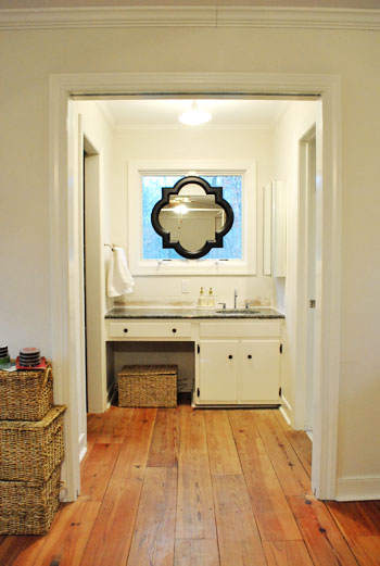
To this:
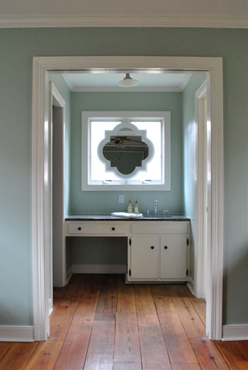
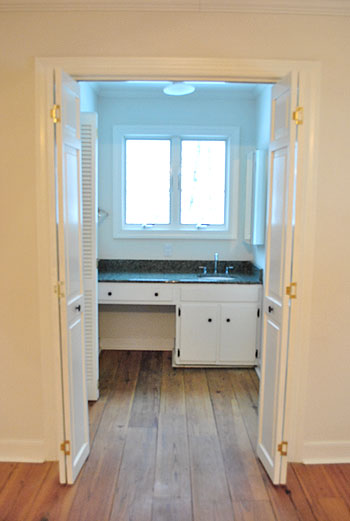
And I guess we should show how it originally looked when we moved in for the full before:
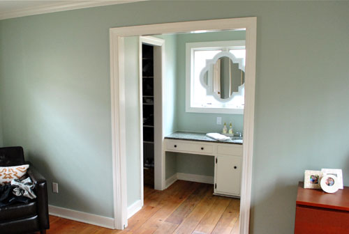
But back to the white paint choice. After much thought (and a decent amount of flip-flopping) we decided to go with our first instinct and paint the mirror white to match the trim. It definitely looks integrated and a bit less heavy, so the nook is now a little less look-at-me-right-now distinct (which is a good thing since we’re trying to make it blend in as opposed to stand out). Now it looks as if it’s always been there, and it’s not too high contrast to draw all attention to the sink nook.
So my apologies to all other teams (like: Leave It Black, Paint It Gray, Paint It Teal, Paint It Yellow, Paint It Gold, Paint The Molding Black, and Paint The Vanity Black). We definitely considered all possibilities and there’s certainly more than one way to skin this cat (gross expression, sorry). All of those options probably would have worked, but in the end it just had to come down to good old fashioned personal preference. And you know we love us some white…
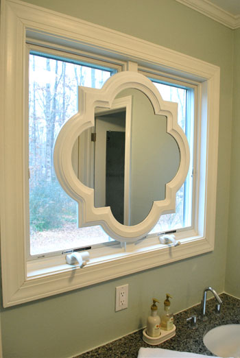
Speaking of white, here’s how we got the look: Behr’s Premium Plus Paint (the can of paint with primer & paint in one) in off-the-shelf white in a semi-gloss finish. I just brushed on four thin and even coats with a paint brush. I did this instead of spray priming and spray painting it (which we’d usually recommend, and would also work swimmingly) because the Behr primer/paint stuff is low-VOC and spray paint isn’t. Thankfully it worked like a charm. Oh and I used a straight razor to scrape the paint off the surface of the mirror for a nice clean result.
And for those who like contrast, don’t blow a gasket. Here’s what it looks like at night:
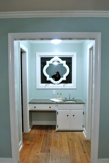
We actually LOVE that going with white was the bold choice at night since we spend a lot of not-day time in the bedroom, and the white frame totally pops out from that black background out the window for awesome at-night drama that we can enjoy before heading off to sleep. Back when it was black it practically disappeared at night.
And look, here I am:
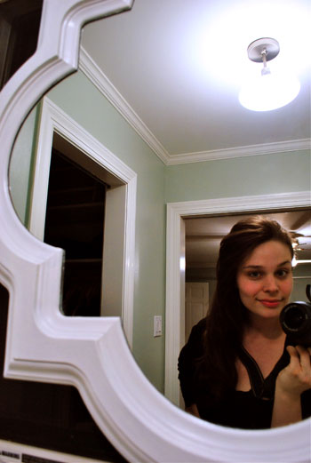
Stop the presses. My hair is down. Can you believe it? I know. Shocking stuff. After many many requests, there you have it. It’s like a ponytail but different. For actual video footage of me with my hair down (and a whole bunch of it’s-Friday giddiness) check out this Texas road trip video of yore. That trip was thebomb.com. For reals.
Oh and although there are a ton of Team Frost The Windows peeps out there, we’re leaving them bare for now. Just because we like looking out ’em when we’re tooth brushing in the morning. Sometimes we spot a robin or two at the bird feeder. Shucks, that’s quaint. So even though they look frosted in a few of the photos, they’re not.
And for those wondering what things look like from the neighbor’s perspective (it’s a side window), since we live on almost an acre of land, we’re pretty far apart apart. But here’s what it looks like during the day from about a fifth of the distance between our houses:

Yup, it’s invisible (most exterior windows are reflective during the day, and ours is no exception). We even took the shot above with the bathroom light on to hopefully highlight the silhouette but all you see are the sky and some tree branches reflecting on the window panes during the day.
And here’s what it looks like at night:
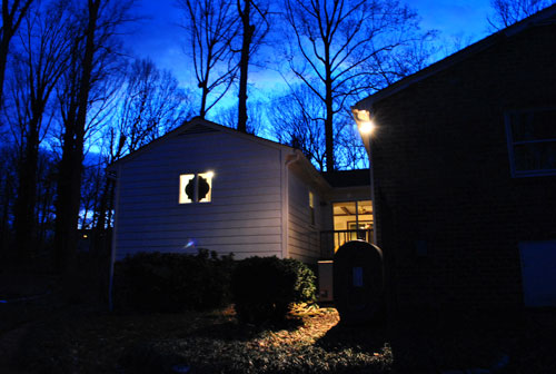
So not bad right? I mean, we have 99 curb appeals problems, but the mirror ain’t one. Yes, that’s a reference to 99 Problems by Jay Z. Because I’m gangsta like that.
Psst- Why Team Edward and not Jacob? Even though I’m from Jersey, tan juice-head body-builders have never been my type. As demonstrated by my tall, angular, and sometimes pale hubby. Does it make me insane to admit that the whole time I read Twilight, I actually pictured John as Edward? Remember this was before the world had been introduced to Robert Pattinson.
Psssssst- To everyone worried about if I could reach the buttons on the dryer, we updated that post with a pic of me in action. Go Team Five Foot Two Inches!

Amie says
Yeah Team White! I wasn’t a fan of the black, but I could see the potential there. It looks lovely!
Stacy says
first, dig the mirror white.
second, you are looking very angelina jolieish in that photo. except prettier because you look real.
Shannon says
I am really curious what curtains flanking the sides of that window/mirror would look like. It’s a crazy idea (almost as crazy as a mirror over a window) but it might just work. haha
Sharon says
The mirror looks amazing! I love it. Great work as always!
jaclyn says
i love it, very calming. definitely enjoying all that the new house is bringing your way. keep it up!
sarah says
I was really questioning you placing the mirror in the window but with it painted white it is great! I don’t’ know what I was thinking doubting you!
Ashley says
Sorry if this post is a bit O/T, but: Sherry, you’re starting to frighten me. I’m starting to think we were separated at birth. Just from the past few days:
1) I was Team White.
2) I am also Team Edward.
3) I also pictured my tall, skinny, pale husband while reading Twilight, and it’s probably the only reason I like it so much.
4) We look a LOT alike (and apparently, we both look like Angelina Jolie, since that’s what I get, too).
5)I never leave my hair down either, even though I insist on keeping it long.
6) I actually wondered, while reading the washer/dryer post yesterday, if I would be able to reach the top buttons, and your uber-helpful demonstration shows that I could, because we’re also apparently the same height.
7) My husband also calls me “pocket-sized,” although I personally prefer “travel-sized” and/or “fun-sized.”
So yeah. It’s kind of scary. :-)
YoungHouseLove says
Hey Ashley,
We’re practically sisters! I demand a photo. Can you link to one on Flickr or Shutterfly?
xo,
s
Lindsey says
Well I knew I would like the white mirror, but I had no idea how much of a dramatic difference it would make! It really looks GORGEOUS and so custom. Great choice! And I love the paint color you chose for the walls as well. Love your blog :)
LoriK says
The white mirror is better but for some reason I still prefer the “before painting” pics. There’s something about the light paint, the wicker baskets and the flooring that looks very casual-beachy and I like that combination. When I look at the new pitures, it’s like the top half of the room doesn’t go with the bottom. I think it’s because your new paint looks like a cool color tone and the floor looks like a warm color tone. Or maybe, it’s a clean, modern-feel vs. a more rustic feel on the floor. Are you planning on changing the floors? They are so beautiful as is but something more contemporary may be more fitting with your aesthetic.
YoungHouseLove says
Hey Lori,
We love how the cool wall color balances the warm hardwood floors and we also love the rustic meets modern look. It’s definitely a personal preference thing, but we think the wide plank floors add so much charm to some of the more modern objects in the room (like the mirror, the duvet, Ed the Bed, etc). We wouldn’t dream of replacing our bedroom floors!
xo,
s
Rachel says
When I first read you painted it white I thought, “Why??? It looked so good black.”
BUT low and behold it looks even better with the white trim.
Way to go guys!
I love looking at all of your home improvements… I’m getting lots of ideas for my own home:-)
Rachael says
That is SO cute that you picture John as Edward while reading the books. I love it!!
P.S. I’m Team White (that doesn’t sound good, does it??) as well as Team Edward!
~Rach
janet says
i’m sure you already considered it but i thought the mirror would have looked nice in a silver gray. the white looks great but just wondered if you had thought about it prior to choosing white. it’s probably in your previous posts so i’m sorry if i’m saying something that’s already been mentioned and considered. looks great though!
YoungHouseLove says
Hey Janet,
Yup, there was definitely a Team Silvery-Gray. And we considered it for a while (it was probably our second choice right behind white) but in the end we wanted it to look completely built in and integrated with the white trim.
xo,
s
Taylor says
I didn’t think I would like the white, but it is so much better! Great choice!
Crystal says
The white looks great! What a huge difference it makes! I love it! And yes, GO TEAM EDWARD! :)
Gayle says
I first disliked it completely. Then I was on Team White, and I see it turned out even better than what I had in my head. Good job!
Emmely says
I LOVE IT!!! Looks so much better like this and you are right, it really does look like it belongs in that window now :) Good job!!
Janette at The2Seasons says
Great improvement. Have you considered putting a decorative screen in front of the alcove, since you are not so thrilled with it? I can just see John cutting away with the power tools to make it happen.
YoungHouseLove says
Hey Janette,
Now that we like how it’s shaping up (we just stare at the mirror all the time) we wouldn’t want to block it off. We just wanted it to feel more cohesive and connected to the rest of the room. And now that there’s some paint on the walls and the mirror and the backsplash is down it feels a lot less odd and out of place. Whew.
xo,
s
Sher says
Looks beautiful!!! I would have gone white too….LOVE it!
Pam says
I was originally on Team Gray, but I think the white looks dynamite! The mirror is definitely more integrated, and I love the nighttime shots. Gorgeous!
On another note, you mentioned recently that the former owners of the house were not previously YHL readers, but they are now. Have you gotten any feedback from them on your updates?
YoungHouseLove says
Hey Pam,
We’re not sure how frequently they drop in on our blog, but they just mention that they’re excited to see us make the house ours and that they hope we love it. Of course we do! They seem really interested to see how the opening to the kitchen plan will go. And the double sided fireplace. Can’t wait!
xo,
s
Sarah says
I finished watching part of your Texas road trip video, and I LOVE you guys! I’ve been reading for a while, and Sherry, you are so incredibly beautiful! The video just totally showed your personality. You are so cute and happy. You’re smile is uber contagious, and I love your cute little laugh. I can tell you and John are so in love by the way you look at each other. You’re always saying how nerdy you are, but I think you’re just adorable!
Shunta says
that looks so good!! You guys have the magic touch when it comes to making a new house look like home so fast!
Sarah K says
It’s GORGEOUS! Great choice.
Rachel says
It looks great!
Ashley says
The only pics I have on Shutterfly at the moment are a few random wedding pics (never quite finished putting the site together…), but feel free to check ’em out! They’re linked on my name above. You also get to see the aforementioned tall, skinny, pale hubby, so that’s a bonus. :-D
As a disclaimer, there was about 2 hours worth of professional work put into that hair and makeup (which usually get about 10 minutes of decidedly unprofessional attention). I’ll have to find a more “everyday” pic…
YoungHouseLove says
Hey Ashley,
Wahoo! You’re such a sport. Thanks for the link to the pics. I don’t see it but I also don’t see it when people say I look like my mom (and apparently we’re twins). Your wedding looked pretty too!
xo,
s
Mona Alicia says
First, I am totally Team Edward, glad to know you are too! And second, I continue to be surprised by how y’all are transforming that little space. When I first read that y’all had some ideas to not make it look so bathroom-y I couldn’t imagine what they would be. But you’re pulling it off, it looks great!
Ashley says
Yay for short-ays! Phew, I bit my tongue, but now that I can add my 2 cents–LOVE the white! And before I even read the post I scrolled through, stopped dead in my tracks and said, “wha wha?, is that sherry with her hair down?” haha, really though, LOVE the way it’s shapin’ up (the bathroom that is, though your hair looks great either way too).
Katie says
I was a little curious of how this would look in the end, but it’s perfect! You guys did great! I would never have thought to do that just because it’s unconventional, but it works so well! Nice job!!
Megan says
Hey Sherry- Saw that someone posed about looking like you and something about Angelina Jolie… well- sorry but you are a spitting image (according to me anyway) for Rachel McAdams. I’m sure a trillion people have already mentioned that, but I think of it every time you post a picture of yourself.
And, I am so happy you painted that mirror white- looks fabulous.
Kari says
I apologize b/c I haven’t ready every single comment so maybe someone else has said the same thing…. but…. did you know that your mirror is a quatrefoil shape? It is one of the symbols of Phi Mu Fraternity (which is a sorority, but uses “frat” instead. oh well.)
Anyway. I LOVE IT. I have a quatrefoil ring, clock in my living room, mirror (smaller than yours) in my bedroom and I am looking into a cabinet from Pier 1 with the quatrefoil painted on it.
So, if you have any Phi Mu friends. They will totally appreciate it.
:)
YoungHouseLove says
Hey Kari,
I did know that shape was called a quatrefoil, but I had no idea that that the quatrefoil was a fraternity symbol. Best frat symbol ever. I’ve always loved it! I wonder what John’s fraternity symbol was. Hmm, off to ask him…
xo,
s
Laura says
How about putting a small dresser in that area to customize it. You could get your own sink and counter top to match whatever decor you like. It would definitely make the area look less like a bathroom area in your bedroom. Have you thought about that?
YoungHouseLove says
Hey Laura,
Yes, my mom actually did that in her house a lot (got cool antique tables and chests and made them sinks by topping them with stone slabs and adding plumbing.) But with a whole house full of projects (some big ones, like wall-knocking-down and kitchen upgrading) we’re working with what we have when it comes to that sink to save money. And we do love a challenge. Now that we’ve started we’re so excited to see where we can take it without just gutting it and replacing it! We have some big plans for upgrading the look of the vanity, so hopefully we can tackle that and share those pics soon…
xo,
s
Jacqueline says
AWESOME!!! I love the shape of the mirror and the white looks very fresh!!!
Sarah says
YAY!! Love the white on that mirror! I couldn’t pick a team, but I think the white is perfect :)
Also, great night shot from outside! Just beautiful!
Roshni says
You know, when I saw the seconf pic in the post, I actually thought you had painted it the same color as your bedroom walls! Miust be the camera!!
Btw, I totally agree with Sarah above!!
Jodie Shields says
LOVE it white! Looks like it was made to be part of the window. I agree, when I read your first post I went back and forth with the different possibilities in my head but love how it ended up!
Barb says
Sherry and John:
Bravo..It looks fabuloso!!! Love the white. Makes it look so clean and perfect. I can’t believe , yes I can, what a can of paint can do to a house. Keep up the good work….keep us informed….Rock On!! I LOVE TO PAINT!!
Did I mention to you that I think Baby Clara is absolutely adorable and quite loving the camera -time. She is so cute!!
Tiffany says
Love the mirror
XOXO,
http://outfitidentifier.com/
Lindsay says
LOVE IT!! But I don’t understand why people always give y’all ideas…I mean you are the ones who get paid to stay home and do this for a living because your ideas and instincts are so good while the rest of us have regular jobs or are stay at home moms…hellooooo people?! (said in my least snarky voice)
Lindsay says
Ok I’m starting to feel bad for saying that. I guess ideas and input can be a really good thing because it always helps to have another angle of looking at things. :)
Holly@Jax,FL says
Instead of frosting the window, you could use a tint that keeps people from seeing in and you still would be able to still see out
cynthia says
OH!!!! Yeah! Big Heart for the white:) I knew you fab! Folks were figure what works best for you:)
-Another Team Edward Girl:)
Natalie says
I can’t remember ever disagreeing with you and I’m a long-time reader. However, Team Edward? He’s probably the worst vampire in the history of vampires! He sparkles and acts like a girl.
Now, excuse me while I lock myself into a closet to escape the enraged members of Team Edward. :runs:
Pssst… I’m so happy you chose white! It looks great!
YoungHouseLove says
Hey Natalie,
I’m definitely on Team Edward over Jacob. But truth be told, I think the sexiest vampire (by farrrrr) is Alexander Skarsgard from True Blood.
xo,
s
Kim Sutcliffe says
I love it!!! It’s completely changed the overall look of the space! It amazes me how you guys come up with these ideas. Constant inspiration.
Kim
P.S. Definitely on team white!
Dorothea Lunt says
I love it 110%….. now that you painted it. If that was my bathroom, I would swap the ceiling light fixture for a crystal chandelier. Have a great weekend and looking forward to reading more posts.
YoungHouseLove says
Hey Dorothea,
Totally! We can’t wait to switch the fixture out for something swanky! We actually went shopping for one yesterday but it was a bust. Sad face.
xo,
s
deena says
More hair down!! So pretty!
ronda w says
Love the white on the mirror. All of your changes so far have been fun to watch. Good job youngsters!
Erica says
I am amazed at how you make things look like they were MEANT to be there. Like your old master with the “built ins” this is totally classic. It looked good black but it looks built in in white!
Gina @ Temporary Nest says
You know… I think any of the colors would have been amazing because what really is the standout is the silhouette. I think the white really works with the rest of the vanity and love it. But I think any of the other colors would be just as interesting because of the shape (which is apparently a quatrefoil!) Great job Yongsters!
jenny G. says
Awww, we’re totally on all the same teams! Team White, Team Edward, Team Don’t-Frost-the-Glass… Oh wait, I’m on Team 5’6″. Dang. Ah, well. I’ve got 99 problems, but reaching the top bar in my closet ain’t one. =)
I love the mirror painted white. I wanted to buy one before (with plans to paint it) and now I REALLY want to!
Kristen @ Just Live Simply says
yay! I was hoping for the white paint on the mirror trim! It looks more ‘you guys’!
Jessica @ Jess and the Elm City says
I think it looks kinda cool in the dark, yo!