The deed is done. Everyone on Team Paint The Mirror White (not to be confused with Team Edward, which I’m totally a member of) can rejoice. Our mirror above the sink went from this:
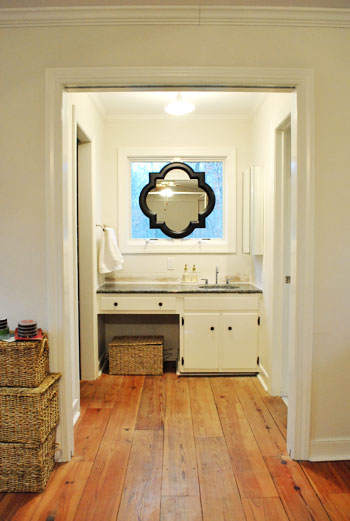
To this:
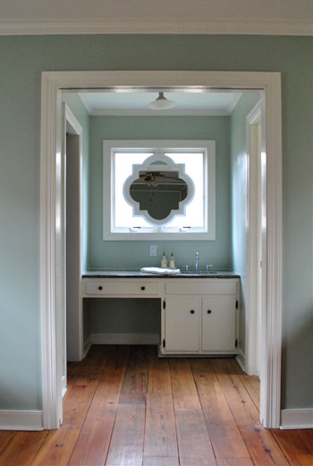
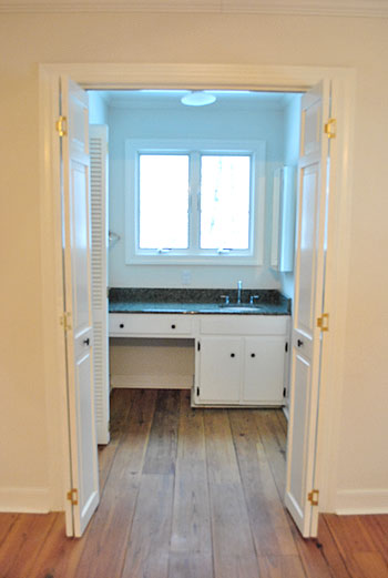
And I guess we should show how it originally looked when we moved in for the full before:
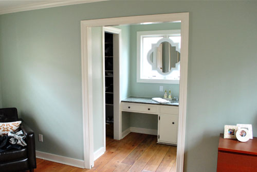
But back to the white paint choice. After much thought (and a decent amount of flip-flopping) we decided to go with our first instinct and paint the mirror white to match the trim. It definitely looks integrated and a bit less heavy, so the nook is now a little less look-at-me-right-now distinct (which is a good thing since we’re trying to make it blend in as opposed to stand out). Now it looks as if it’s always been there, and it’s not too high contrast to draw all attention to the sink nook.
So my apologies to all other teams (like: Leave It Black, Paint It Gray, Paint It Teal, Paint It Yellow, Paint It Gold, Paint The Molding Black, and Paint The Vanity Black). We definitely considered all possibilities and there’s certainly more than one way to skin this cat (gross expression, sorry). All of those options probably would have worked, but in the end it just had to come down to good old fashioned personal preference. And you know we love us some white…
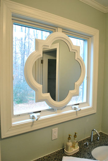
Speaking of white, here’s how we got the look: Behr’s Premium Plus Paint (the can of paint with primer & paint in one) in off-the-shelf white in a semi-gloss finish. I just brushed on four thin and even coats with a paint brush. I did this instead of spray priming and spray painting it (which we’d usually recommend, and would also work swimmingly) because the Behr primer/paint stuff is low-VOC and spray paint isn’t. Thankfully it worked like a charm. Oh and I used a straight razor to scrape the paint off the surface of the mirror for a nice clean result.
And for those who like contrast, don’t blow a gasket. Here’s what it looks like at night:
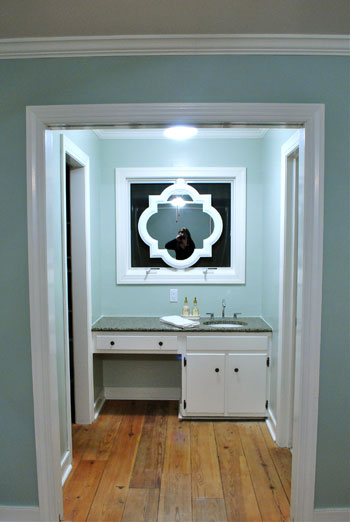
We actually LOVE that going with white was the bold choice at night since we spend a lot of not-day time in the bedroom, and the white frame totally pops out from that black background out the window for awesome at-night drama that we can enjoy before heading off to sleep. Back when it was black it practically disappeared at night.
And look, here I am:
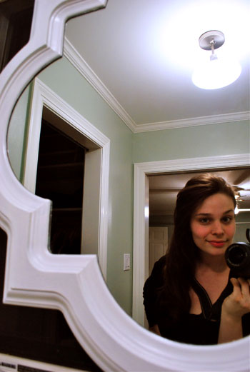
Stop the presses. My hair is down. Can you believe it? I know. Shocking stuff. After many many requests, there you have it. It’s like a ponytail but different. For actual video footage of me with my hair down (and a whole bunch of it’s-Friday giddiness) check out this Texas road trip video of yore. That trip was thebomb.com. For reals.
Oh and although there are a ton of Team Frost The Windows peeps out there, we’re leaving them bare for now. Just because we like looking out ’em when we’re tooth brushing in the morning. Sometimes we spot a robin or two at the bird feeder. Shucks, that’s quaint. So even though they look frosted in a few of the photos, they’re not.
And for those wondering what things look like from the neighbor’s perspective (it’s a side window), since we live on almost an acre of land, we’re pretty far apart apart. But here’s what it looks like during the day from about a fifth of the distance between our houses:

Yup, it’s invisible (most exterior windows are reflective during the day, and ours is no exception). We even took the shot above with the bathroom light on to hopefully highlight the silhouette but all you see are the sky and some tree branches reflecting on the window panes during the day.
And here’s what it looks like at night:
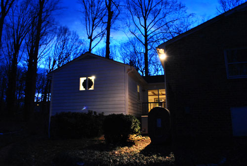
So not bad right? I mean, we have 99 curb appeals problems, but the mirror ain’t one. Yes, that’s a reference to 99 Problems by Jay Z. Because I’m gangsta like that.
Psst- Why Team Edward and not Jacob? Even though I’m from Jersey, tan juice-head body-builders have never been my type. As demonstrated by my tall, angular, and sometimes pale hubby. Does it make me insane to admit that the whole time I read Twilight, I actually pictured John as Edward? Remember this was before the world had been introduced to Robert Pattinson.
Psssssst- To everyone worried about if I could reach the buttons on the dryer, we updated that post with a pic of me in action. Go Team Five Foot Two Inches!

Cathy says
I figured as much, and if I didn’t need them for light and heat control during certain times of the year (not really a privacy issue), I’d do it exactly as you did, as I’d always rather get the look I want on the cheap. Thanks for answering, and keep on loving your house and enjoying the process!
Sara says
I am another reader who went from not loving the mirror in the window at the beginning of the week to being obsessed with it by the end of the week. Well done, as usual. Can’t wait to see what you decide for the cabinet. I envision a no sew skirt or DIY stool in a pattern that coordinates with the future curtains and the duvet.
Liesal says
After looking at it, I’m totally team white. I’ve always been team Edward though; that’s not ever going to change. :)
Tanya says
Painting the frame was definitely the right choice! It looks great. Much less bathroom-y overall.
~Tanya
dans-le-townhouse.blogspot.com
KrIstin from No Ordinary Cole says
I’m always so inspired by you! You make me want to paint all the old wooden knick knacks in my house! Thank you!
gina says
*gasp* team edward?!?! Ugh ;) Totally on team Jacob (hubs is mr. Tan muscles though so makes sense, right?) and on team paint the mirror anything but white, but that’s the beauty of personal preference! It looks great, though, very built-in and balances the white bed frame. So, definitely still on team stalk the blog because I can’t wait to see more more more! :)
Cheryl Balmas says
I thought it looked great black but I am completely blown away by the white. It just ties in so well with the window and trim and creates a seamless, warm, soothing, calm vibe for the room which is what you want in a bedroom, after all. Its great you seek input from others but your instincts are always right on. Go team Edward.
Dee says
That bathroom space is very awkward. Large wall-mounted swivel mirrors would have been a great option. Eventually you might want to get rid of that window, because energetically it really disrupts the flow in your bedroom suite and doesn’t feel healthy. For now enjoy that pretty white frame and the unique shape of the mirror. But long term you’ll want to install double sinks, get rid of that awkard/useless cutout where a padded stool usually goes, and make it look like a built-in shelving and sink area, similar to what’s in your living room with white-painted wood. A chandelier in that space would jazz it up for you. Best wishes.
Kate says
I’ve been holding off on comments lately so you would have one less to approve, but I just wanted to say I’m completely impressed that you guys are able to somehow pass over the really awful comments about how people tell you that you’re “doing it wrong”. Mad props to you guys for doing what you do despite all to often recommendations from the crazies
Oh and ps..I love the new bathroom look.
Bethany says
I totally love the mirror, and I’m really tempted to paint our bedroom the same color as yours! So pretty!!
Also, I wanted to let you know that Freshaire paint is being discontinued at Home Depot, and they’re clearancing it out at $10 a gallon! Both the paint and colorants are no VOC. I found out that they don’t color match, so you have to pick one of their colors (or just use plain white for trim). My HD only had semi-gloss in Base 1 and 2, but it might be worth giving your HD a call to see if they have any left if you’re interested!
Happy weekend!
YoungHouseLove says
Thanks for the tip Bethany! That’s a steal! We actually used Freshaire No-VOC paint for the trim in our last house (white semi-gloss). Loved it!
xo,
s
Karin says
I’ve got to be honest, I really hated the mirror at first, but now that it’s white, it looks AMAZING! You guys rock!
Londen @ Sixty-Fifth Avenue says
Hi guys! I have been reading all along but I just wanted to pop in and tell you how much I love your new casa and look forward to seeing all the fabulous changes…just like old times! Have a great weekend! Oh, and the mirror looks fantastic!!
Londen
Mindy says
I like how unique yet cohesive it is! I was on team white :) And yup, I’ve been bitten by the painting bug too… weeell… more like inspired vs. actually painting, buuut… i’ll get there. :) Can’t wait to see what’s next!
mandi says
You should frost that window behind the mirror- it would look fantastic! You can use the frosting film, but have you tried the frosting spray? It’s semi-permanent, meaning it is removeable only with alcohol, i believe. Anyhow, i think it would give a great backdrop to the mirror.
YoungHouseLove says
Hey Mandi,
Check out the reason we don’t want to frost the window right in this post (towards the bottom). Hope it helps!
xo,
s
Nicone says
The mirror looks great in white, and the wall colour complements it beautifully.
Sammy says
It looks great! I’m totally team paint-it-white (but team Aragorn, hehe. If I have to stay within twilight, it’ll be Jacob!)
Are the mirror and the outer window trim one level-ish?
Because then I think a bit trim/wood/whatever above and under the mirror (where the middle window trim is showing like in your 5th photo) would make the mirror look as if it were really part of the window. But it’s very nice this way, too…
YoungHouseLove says
Hey Sammy,
They’re pretty much the same depth for the most part. A friend of ours came over and didn’t believe the mirror wasn’t an architectural feature that was built with the house. Of course we were totally flattered – it was so nice to hear that even in person it looked integrated! Whew.
xo,
s
Blaine says
I admit, I was on team “Don’t Paint the frame”… but I am a happy convert upon seeing these photos. I still remain a member of Team Jacob… sorry.
:-)
Holly Austin says
Love what you guys have done with the mirror, it looks fabulous!
Jenny says
So I have a random question totally unrelated to this post! My husband are about to purchase a bed for our guest room. The room is short on space (it triples as guest room- office-sewing room, so there are already two desks and a bookshelf in it!), so we are considering a Daybed with a trundle (we need a trundle, as we usually have more than one guest visit at a time). We would consider a sofa bed except that they are so much more costly. So, my question- I am concerned that it will be awkward for two people to sleep in the daybed+trundle, since the daybed part of the bed will have three sides around it kind of “boxing” that person in. What do you guys think? Should we just bite the bullet and save for a sofa bed?
Thanks!
YoungHouseLove says
We are generally of the save-for-what-you-really-want camp. Because in the end sometimes it’s cheaper than getting something you don’t really love and hating it and upgrading later anyway. Maybe you can think about all your potential guests and their needs? For example we host 60+ year olds from time to time (the grandparents love seeing Clara) and they would both need a bed that’s a bit mire raised than a trundle. We also have semi high maintenance friends (you know who you are!) so we like to know that our guest situation works for everyone (and doesn’t leave certain people uncomfortable). Good luck!
xo,
s
Linn says
Hey guys!
I’m in the middle of giving our house a facelift, and I’m totally understanding how difficult it is for you to sift through everyone’s opinions! My hubby has his, and I have mine…and then there are the parents, the friends, the neighbors, the folks that I refer to at Home Hardward etc. etc. etc. We’re drowning in opinions! (Maybe not quite as many as you though, since we don’t have a national following.)
How are you dealing with all of the folks that are giving you opinions? There have been a few opinion-givers that have been offended when we haven’t done what they suggested. I don’t want to offend people, but I also don’t want to do what they’re telling us we ‘should’ do!
By the way, I love what you’ve done with that room-I love the colour of the walls, and I love the mirror!! (And I’m also glad that you’re doing what you guys want to do-don’t give in to peer pressure!)
Thanks! :)
YoungHouseLove says
Hey Linn,
Life is too short to do anything to YOUR home that you don’t completely want to do! Lots of people give us advice (in the nicest possible way) so we always try to thank that person sincerely and try to take a moment to appreciate that they’re coming from a good place and are honestly trying to help. But they hopefully understand that it’s not their house, so after sincerely thanking them and giving their suggestion all the time and consideration that it deserves (some ideas are terrible and get about ten seconds, others are amazing and get way more) we do what we want! Hope it helps!
xo,
s
j says
Are you pregnant? We havent seen your body lately…
Not a big mirror on window fan but white is better.
YoungHouseLove says
Hey J,
Scroll back two posts. Full body shot. Not prego! Not for a looong time, so feel free to abandon bump watch!
xo,
s
Amy says
I ain’t gonna lie, guys, I was thinking you lost your marbles. I did see your vision when you put it up, however the paint and the white trim made it look like it was meant to be that way. Nice work! I love it! I also love what a big difference taking that trim around the counter top/sink are made. Looks so much more clean cut and crisp.
Amy says
I meant I did NOT see your vision with this one before. Nice work.
Rosa @ flutterflutter says
Wow, that looks amazing!! I just spent the morning painting a wall in our master and I can’t wait to unveil before and afters this week! Great decision going white. Looks like it’s original to the house.
Ashley says
Not that I usually doubt you guys, because I don’t. BUUUUUUT this time I had mixed feelings of the first pics of the black mirror over the window. Lesson learned, never doubting you again!!! I LOVE how it turned out once you were all done. Extending the color from the bedroom and painting the mirror white looks FABulous!!
Clara says
First off, love your new bedroom. Those floors make me so jealous that I can’t even see straight when I read your blog. One question – why does the sink bother you guys so much. I recently purchased a new home that has the open concept master bath almost exactly like yours, except with double sinks. I did think it was a bit strange at first, but now we love it. Have you considered hanging some curtains or sheers to cover that opening if it bothers you so much (I know this may block some natural light in your room)? I really don’t think the layout is as weird as you think. It’s not a sink in the bedroom, it’s a sink in your open-concept master bedroom suite!
YoungHouseLove says
Hey Clara,
Well, now that we love our white mirror it’s amazing how the whole sink nook no longer bothers us. We’re actually starting to love it! We used to think it was weird because we were, uh, staring at a sink. From bed. Direct eye line. About eight feet from our feet was our sink. But now we love that it feels so integrated. And function-wise we really loooove that one of us can use the bathroom while the other person uses the sink.
xo,
s
Michelle says
lovely. No matter what you guys do its always lovely. Your blog is very inspiring keep up the great work.
Olivia says
I love this! Go Team Paint the Mirror White!
Laura *You Stir Me* says
oh it looks so great! I’m really digging the paint color more and more – it’s serene and but still makes an impact.
I have been home sick and finally watched Twilight and New Moon for the first time. I’m team Edward too – I live in Jersey and feel the same way about you do about the guys. I married a tall, slender palish guy myself so I may be biased too:)
And you should wear your hair down more often – gorgeous!
nikki says
Just flipping through my Lowe’s flyer and your mirror is in there for twenty bucks off! (Mind you I’m in Canada for its now 59 instead or 79…) but maybe yours in on sale too and you can cash in for the difference? (I’m watching extreme couponing for the first time as everyone was talking about it… it doesn’t work this way in Canada that’s for sure!) haha
YoungHouseLove says
Really?! Wow! We’ll have to check our local store and see if it’s discounted there! Wahoo! Thanks for the heads up.
xo,
s
Stephenie from Decorating Addiction says
OMG – I love it! I wasn’t a fan of the mirror before, but painting it white made all the difference – and I’m loving the color you chose for the walls. Oh and btw – I TOTALLY did the same thing when I read Twilight — imagined my husband as Edward . . . glad to hear I’m not the only one!
Anon says
Happened to see this while browsing Etsy and it reminded me of your mirror. Thought I would post it for you, in case you decide to repeat the motif elsewhere.
http://www.etsy.com/listing/65820831/moroccan-bubble-decal?ref=sr_gallery_27&ga_search_query=moroccan&ga_search_type=&ga_page=&order=&includes%5B0%5D=tags&includes%5B1%5D=title&filter%5B0%5D=handmade&filter%5B1%5D=housewares
Ana says
Now with the white paint on the mirror, it looks like a custom window, like something fancy you’d see Candice Olson pick out for a ton of money. And that’s a cool faucet you have on the sink. With just the few small changes you’ve made, the whole nook has a totally different feel.
Briony says
I think the mirror looks way better now. Oh and I’m a member of the 5’2 club too Sherry.
Camille says
OH. MY. HECK.
……..how i love your hair down! it’s like you’re waving buh-bye to the college-kid pony and saying hola to the hawt sophisticated mama! it’s amazing how changing up a look and keeping it fresh/interesting can apply to “us” (especially as women) and also our ever-evolving houses! great mirror, great hair!
LOVE it!
Alicia says
I love your new white mirrow, much better than black or any other color. A huge improvement to that room!
Sherry, I’m a ponytail girl too! Funny how your face changes when you wear a different hair-do!
(My english isn´t very good, so I look for some words in the dictionary, but don´t know if you use them…).
Rebecca says
Sherry–just wanted to let (in case you don’t already) that there’s a big Glidden paint sale going on at Home Depot till tomorrow…:)
YoungHouseLove says
Ooh- good to know! Thanks for the heads up!
xo,
s
Kim says
We have a long vanity in our master bath, with two sinks and medicine cabinets above each one (we actually use the storage in both). Between the medicine cabinets is a small window. There is great light on that side of the house, but we always keep the blinds (yes, yuck) closed because the neighbor is close on that side. Any ideas? The window with blinds is really NOT attractive. What to do with the window? And would you lose the medicine cabinets?
Thanks!
YoungHouseLove says
Hey Kim,
Why don’t you post a pic or two over on Facebook and lots of people can weigh in with ideas and suggestions? Hope it helps!
xo,
s
Christina Clarke says
OMGosh I just noticed you have Fruit and Passions Cucina hand soap and moisturizer on your bathroom counter. I love that stuff it’s awesome and smells great. What sent do you like best?
Laura T says
I have to say, I didn’t really like the mirror before. But kinda just chalked it up to the fact that I’m never going to like EVERYTHING you guys do; I do like most of the things you guys do though!! But now that it’s white it fits in so much better and I have to say I actually like it a lot :-)
Great job!!
Steph @ BirdHouse Family says
Glad you went for the white. Looks amazing!
anna says
Wasn’t sure if the white would look good – but I like it A LOT better!! Good call! It blends so well -it looks more airy now. What about the little black knobs?? Are you going to switch them up too?? You hair looks great down btw. :)
YoungHouseLove says
Hey Anna,
Yes definitely can’t wait to update the hardware (and a few other aspects of the vanity). Soon hopefully!
xo,
s
sara says
It looks like it’s supposed to be like that! Like a custom window. Cool
ginai says
Sherry,
Ok help me understand here… ((:
when U painted the mirror you didn’t tape it off first- just painted then scrapped off messy paint?
ALSO when I painted a WHITE mirror to BLACK you could SEE in the mirror parts BEHIND the lip of the surrounding moulding the other colour that U changed from to.. is yours like that also?
just curious as to how to ‘fix’ that?
thanks- love all yall do!
YoungHouseLove says
Hey Ginai,
Yup, no tape. That way we could scrunch the bristles of the brush as closely to the part where the mirror meets the frame to coat the inside part that reflects. Ours looks seamless thank goodness (no inner lip of black or anything) so maybe the key is not to tape so your brush can get into that crack. Good luck!
xo,
s
Shauna says
Loove it! I actually LOVED it black and thought if it was painted white it might take away from the dramatic effect, but even though it’s white it’s still the first thing my eyes focus on in the pictures! I think it looks gorgeous.
I love how you guys are so into working with what you have before going out and buying all new stuff. I mean yeah there are a million things in my house that would obviously look better if I just went out and replaced, but I don’t exactly have the money for that! So, it’s nice to follow along with you guys/do the upgrades that you’re doing rather than just read about you guys going out and replacing your entire house! More realstic that way :)
Basically my long winded way of saying you guys rock and bonus points for Sherry for one, Team Edward and two, being from NJ!! From one Jersey girl to another :)
Andrea says
Maybe you should try changing out your window-opener-thingys to ones that collapse so that they don’t protrude out over the counter.
Like this:
http://dailyhomerenotips.com/2009/03/21/energy-star-rated-windows-window-handles/
Bagley818 says
http://littlegreennotebook.blogspot.com/search?updated-max=2010-12-16T05%3A29%3A00-05%3A00&max-results=5
Check out Manhattan design guru who has the same (similar?) mirror.
YoungHouseLove says
Wow! Suddenly I feel like I should put my fancy pants on. Hehe.
xo,
s
Sarah says
LOVE the room color and the choice to paint the mirror white. Looks so great and was a really creative solution for that space.
Heather B says
I was secretly hoping you’d paint it white. It looks absolutely gorgeous!!! Can’t wait to see your next step!
Megan Carlisle says
I LOVE this nook now! It is starting to look like a part of the bedroom now. Like a dressing table that happens to have a sink in it, rather than an awkward extension of the bathroom. My only tiny issue is that now that everything looks so white and crisp – the black hardware sticks out like a sore thumb:( I am sure you guys have already thought about this. I only say something because I didn’t even NOTICE the hardware until the mirror was white.
YoungHouseLove says
Oh yeah that hardware has got to go! We’re just taking things one project at a time, so we’re not quite there yet. We have big plans for the vanity- from that hardware to some other updates! Hopefully we’ll get to tackle them soon…
xo,
s