Here we are, folks. After over a year of planning, second guessing ourselves, more planning, sweating, and filling our car with vases and egg chairs, we’ve reached the end of the Homearama Showhouse tour.
So in celebration of completing this whole-house marathon of sorts, we’re kicking off this post with a whole-house video tour. Nothing too high tech. Just me stumbling through the house:
Photo-wise, there are few rooms on each floor that we still haven’t shared/sourced for you. So let’s slide through the dining room, powder room, mudroom, guest room, guest bathroom, and the laundry room.
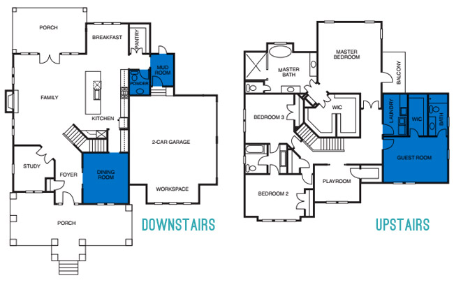
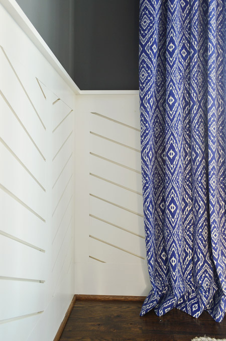
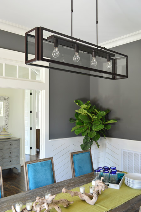
We love dark wall colors in a dining space, so for this room we chose Kendall Charcoal, which we balanced out with white trim and linear wainscoting that we had John the Carpenter build (you can read more on that – and what inspired it – here). Then we added in some color with everything from the chairs and the art to the curtains.
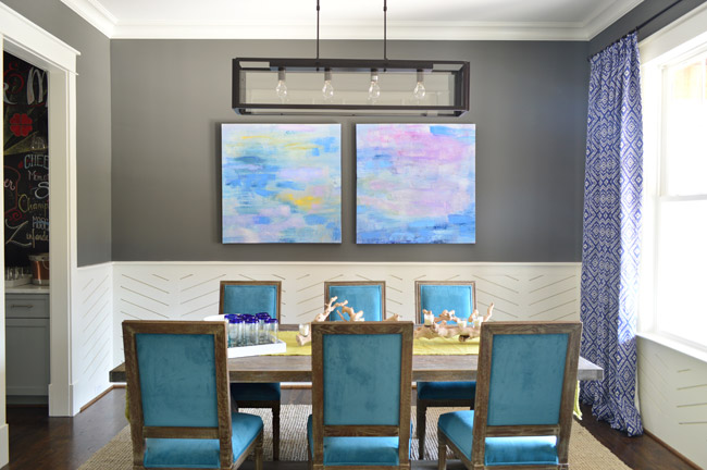
The peacock chairs were donated by World Market, the weathered trestle table was from Green Front Furniture, the art is from HomeGoods, and the rug is from West Elm.
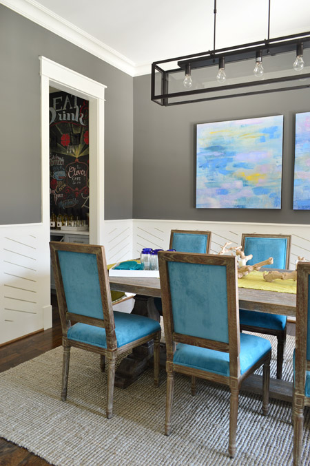
The curtains were made by U-Fab in this fabric.
The light fixture is from Shades of Light, the (slightly wrinkled) table runner and those blue rimmed glasses are from World Market, and the rest of the table decor is from HomeGoods.
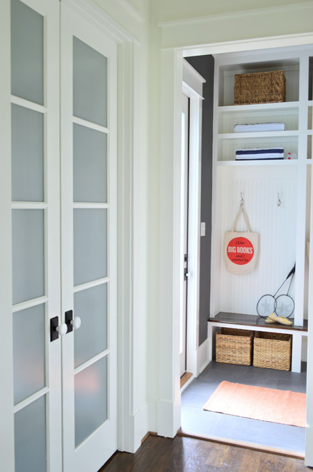
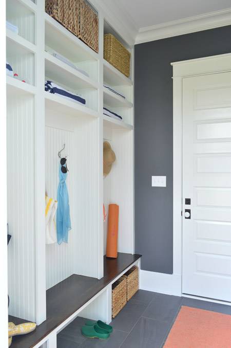
Let’s head over to the mudroom, which is beyond the pantry that we showed you in this post. The mudroom is painted Kendall Charcoal like the dining room, but again all of the white (this time from the built-ins and two big doors) helps to keep the room from feeling too dark.
We gave Carpenter John some direction – like the beadboard backs, the stained wood bench, etc – and then he executed everything. The prism light is from Shades of Light, the tile floor is from Mosaic, the floor runner is from HomeGoods, and the baskets and styling accessories are mostly ours, though the “I Like Big Books And I Cannot Lie” bag is from Fountain Bookstore.
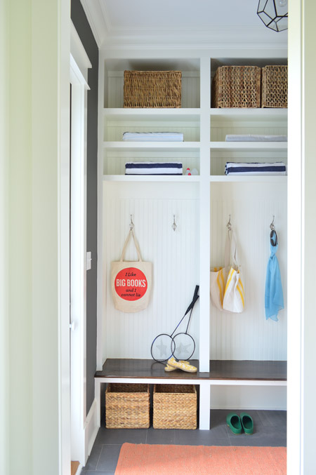
As shown in the video, the glass door on the left leads down to the back patio while the other door (shown below) goes out to the garage. We wish we had a few extra hours when it came to styling this room (we’re not loving the mismatched baskets and the not-very-full shelves) but we were scrambling like crazy in the end. Looking back, it’s kind of a miracle we didn’t just tape up a piece of paper that said “imagine this full of soccer gear, school stuff, and other fun family clutter.”
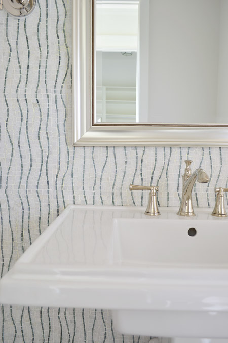
Across from the pantry is the half bathroom, which we thought would be interesting with a big back wall full of accent tile from the floor to the ceiling. The tile we landed on is called Snow White Seaweed Wave from Mosaic and the wave pattern was actually much more subtle in the sample that we saw, but the shipment of tile that we got featured a deeper accent color. Mosaic warned us that shipments could vary beforehand, but we didn’t end up minding the change. We think it’s one of those happy accidents that it turned out a little bolder since most people who see the house in person name this tile wall as one of their favorites.
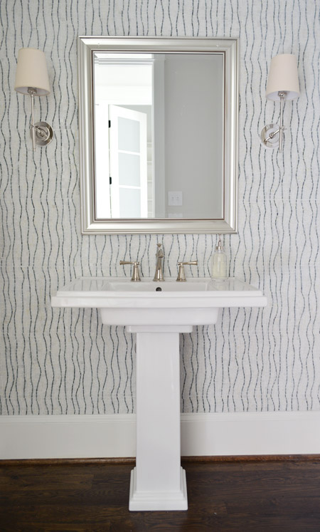
The pedestal is the Kohler Tresham (the same line as the toilets in the house), the faucet is Brizo Baliza in polished nicked, the mirror is from Target, and the sconces are from Shades of Light. Sherry wishes those lampshades were whiter like the trim/sink, but they don’t really bother me.
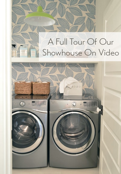
Heading upstairs, the laundry room is one of our favorite spaces thanks to the wallpaper along the back wall. It’s MissPrint’s Pebble Leaf, and it was donated by WallpaperDirect.
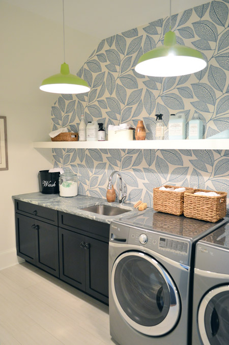
The lights are our farmhouse pendants from Shades of Light in a happy lime color. We thought a random pop of citrus would be fun since the room’s palette is otherwise pretty subdued with black, white, gray, and blue. The non-wallpapered walls are painted Steam by Benjamin Moore, which is just slightly warmer than the Simply White that we used everywhere else (it matched the back of the wallpaper better, so that wall didn’t look yellowed by comparison).
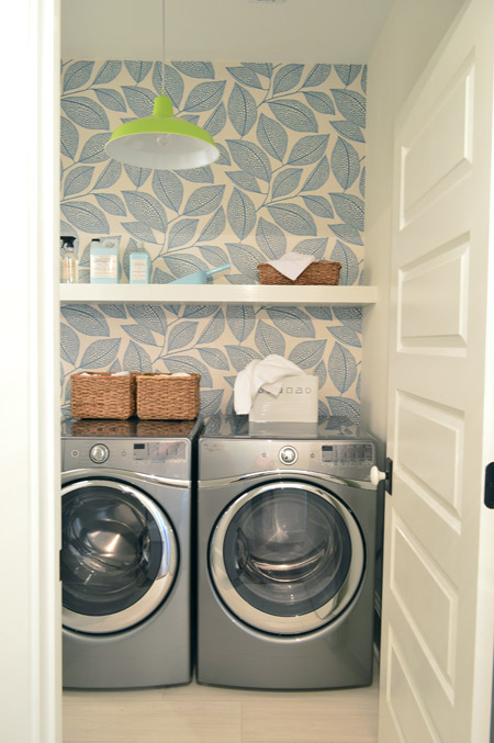
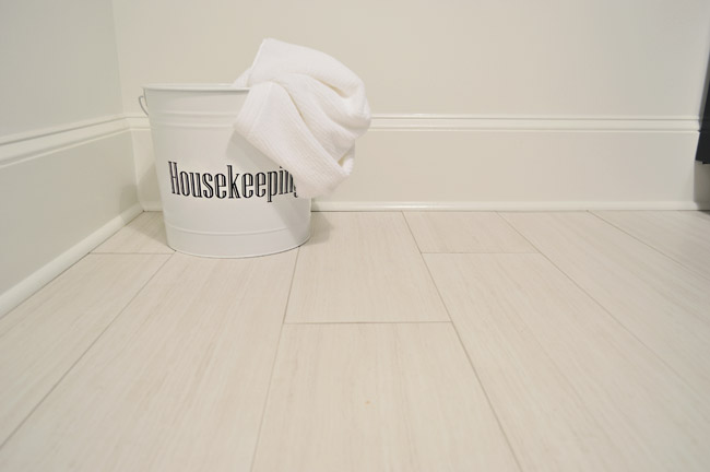
The floors are big 12 x 24″ tiles called Travertino White Field Sunrock found locally at Mosaic. Again, we choose some lighter elements to balance out some of the darker things in the room like the deep wood-toned cabinets and the steel gray appliances.
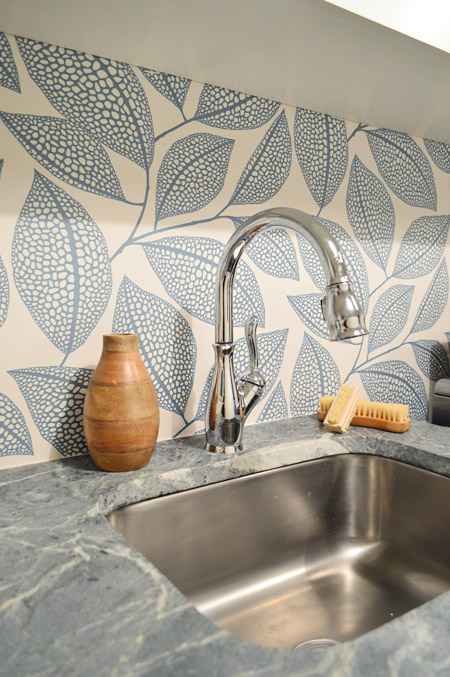
The counters are soapstone and, like the kitchen, we went with a nice deep stainless steel sink and a pull-down faucet (this ones is the Leland faucet from Delta). We’d love a work sink like this in our house (we’re always moving dishes to wash our paint brushes).
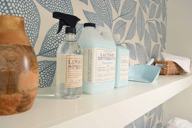
As we mentioned in this post, we made an 11th hour call to have the carpenters build a wall-to-wall floating shelf which does two things: it fills the visual void above the counters/appliances, and it also provides a lot of convenience and function since it can house everything from dust pans and laundry soap to baskets full of washcloths and other cleaning supplies. We tossed various things from HomeGoods and Target up there to demonstrate.
The other room at the top of the stairs is the guest bedroom, which Sherry and I both agree is “the one that got away.” It didn’t come together as well as we originally envisioned and we just didn’t have time to make those last-minute tweaks (finishing around 25 spaces in 2-3 weeks meant that getting to every last adjustment for every space was a pipe dream, so we just scrambled to do as many as we could). We don’t think it’s horrible or anything (a bunch of people who walked through even called out things like the curtains or the art as favorites) but we think with a few changes it would have been more our speed.
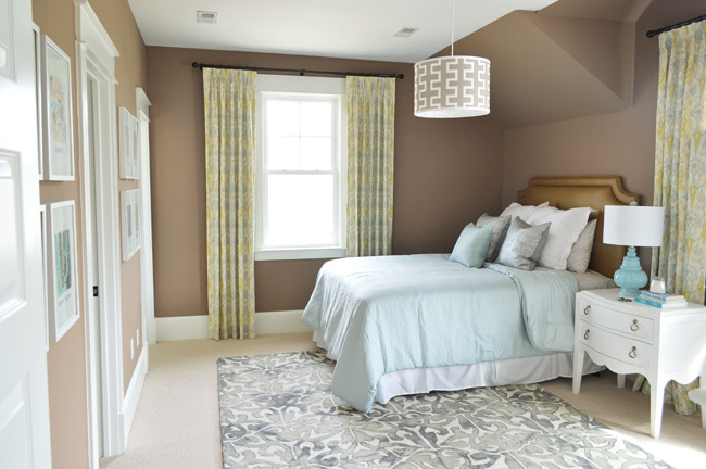
Our original idea was to bring in some warm tones just for some variety (we didn’t want the whole house vibe to feel too cool) but this room accidentally turned into the space where everything was brown. We picked the wall color from one that we liked using during book shoots (Taupe Fedora by Benjamin Moore) but when we finally got to load everything else into the space (a tan bedspread, a wood nightstand, etc, etc) it looked blah. So we switched up as much as we could, like white furnishings, lighter bedding, and colorful art in some crisp white frames – but we really think changing the wall color would have tied everything together if we had the time (maybe a light platinum or subtle gray-blue). Speaking of the art, you may recognize this calendar-turned-art from our old hallway.
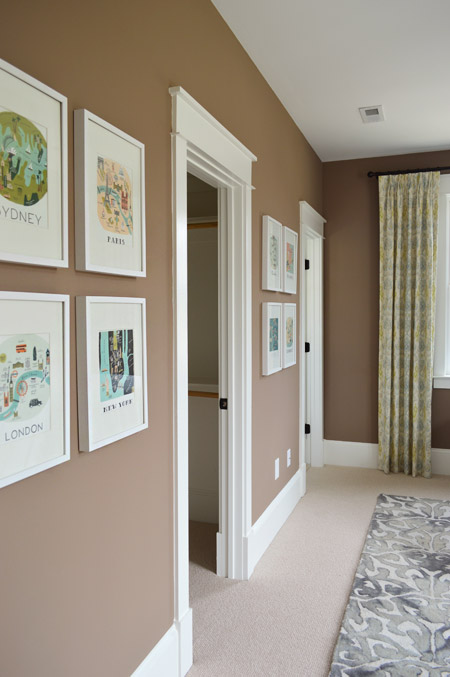
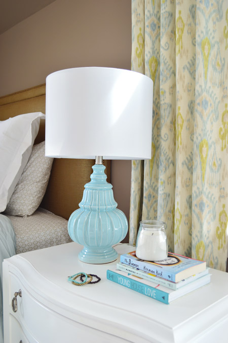
There are still elements in here that we really love – like the curtains from U-Fab, which are a more subdued colorway of the ikat curtains from our old dining room (which currently live in our guest room). The lamp is from HomeGoods and the nightstand is from Green Front Furniture.
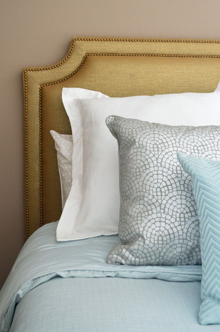
The queen-sized headboard is also from U-Fab and it’s another piece we love (once again that wall color worked against us and it just sort of blended in). It’s upholstered in a metallic fabric with gold nailhead trim (and it’s for sale too, if you’re interested!). The bedding is from Target, and the pillows are from HomeGoods.
On the opposite wall is a dresser from Green Front Furniture with a colorful armchair, which was a last-minute buy from World Market. The other last minute purchase was the patterned rug from HomeGoods, which made a HUGE difference in the room not feeling super bare. If only those walls were a different color, we think it would have come together a lot more.
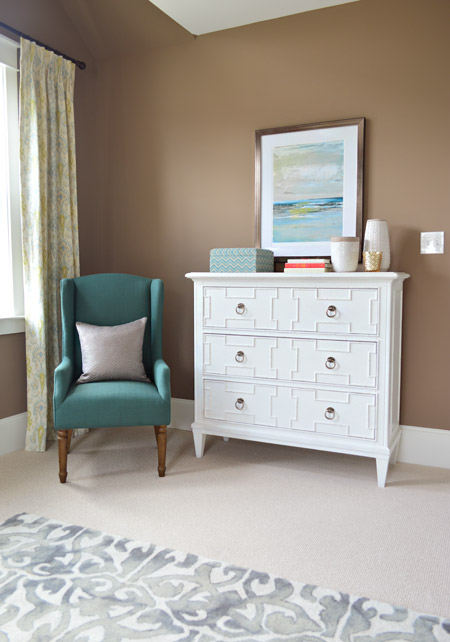
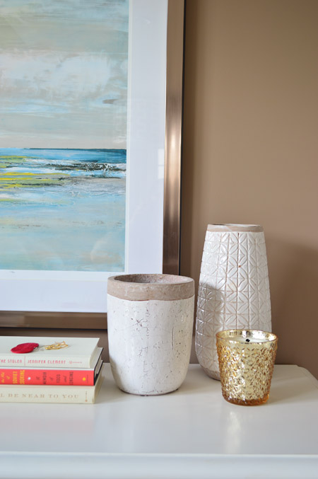
The art and vases were from HomeGoods and the gold candle was from Target.
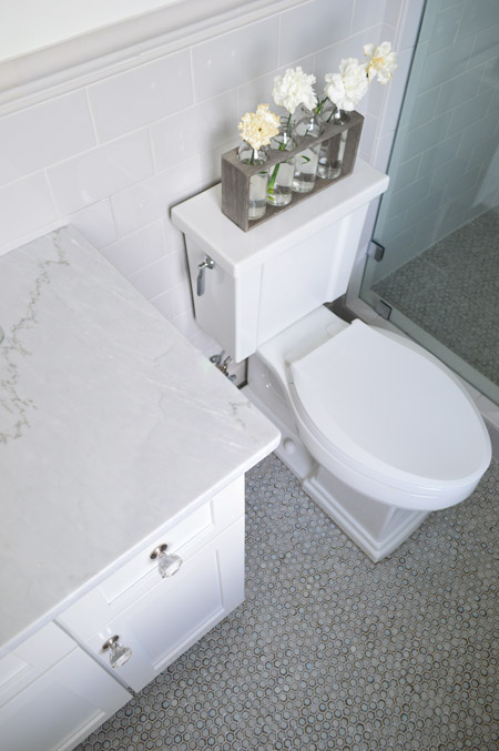
We were going for something simple, classic, and light for the guest bathroom (it’s not nearly as big as the ensuite bath off of the main bedroom) and we thought a little hint of “vintage” would be fun in here, so some of the details subtly nod in that direction.
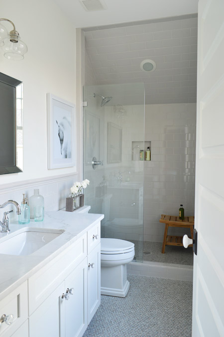
We went with a tile wainscot through the main part of the bathroom, using a family of tile from The Tile Shop called Imperial Ice Gray Gloss. It’s my favorite part of the bathroom – well, that and the bridge faucet from Brizo. The counters are classic carrera marble, the mirror is from Target, the light fixture is from Shades of Light and the bud vases on the toilet are from World Market.
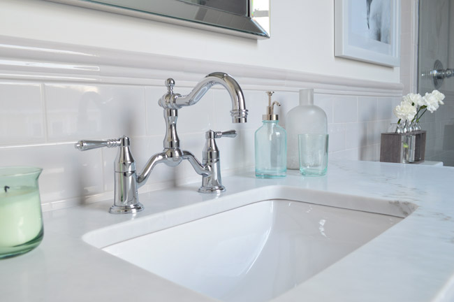
I’ve already proclaimed my love the the Tresham toilet, so instead I’ll draw your attention to the floor – which is the hex version of the penny tile we used in our last kitchen from The Tile Shop. We also added glass knobs to the cabinets (donated by Liberty Hardware) and a seamless glass shower door. It’s not an open shower – it has a door on the right that swings shut to seal the water in – that’s just hiding behind the bathroom door in that first photo.
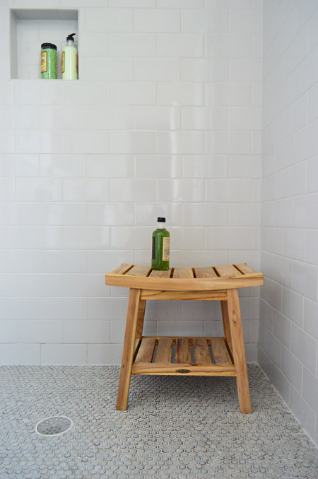
We were originally going to use the same tile in a different color in the shower, but decided that might be too jarring for such a cozy bathroom. So we continued the same stuff that we used on the wainscoted walls into the shower, which we really ended up loving once the clear shower door went in. The wood bench is from HomeGoods.
And so ends the tour of the showhouse. We’re planning to make a House Tour page with photos of each room, a rundown of sources, and the video tour all in one spot, but in the meantime you can peruse each of our previous showhouse posts here (they go all the way back to the beginning if you scroll back through them).
It was a huge honor to be invited to help with such a fun undertaking, and we’re extremely grateful for the opportunity to learn more than we could ever imagine about new construction, to work with amazing people who are like family to us now, and to be able to send our fee to Richmond’s Habitat For Humanity (you can read more about that here and here). And you know Sherry’s angling to house crash the future owners so we can share how the house works for a real family (you know as opposed to an imaginary one) so there’s always that to look forward to.
Psst – Wanna see more showhouse info & photos? Click here for Our Full Showhouse Tour, which includes final pictures of every room, the floor plan, budget info, a video walk-through, and a grid of shoppable showhouse furniture & accessories.

Mary | Lemon Grove Blog says
Oh, so sad to see these posts go … it sure was fun to dream a bit seeing all these amazing rooms! We just moved into a new house, so y’all have given me lots of inspiration for our new space! :)
natasha says
I’m sure I missed it somewhere, but can you tell me where that vase is from on top of the toilet in the guest bathroom! I love it (and love that bathroom)!
YoungHouseLove says
World Market.
xo
s
Diane says
What is the source for the Housekeeping bucket in the laundry area?
YoungHouseLove says
That’s from HomeGoods!
xo
s
Lauren says
I have wallpaper questions!
1) I am leary to try wallpaper because I am worried it will come out looking cheap or gawdy. Probably reminicsent of my peeling Little Mermaid wallpaper circa 1993. Do you have any tips on how to ensure it’s a chic choice? Is the trick in the pattern, the application, or both?
2) Do you ever have concerns about applying wallpaper in a room that may get more humid, like a laundry room or a bathroom? Do you apply it differently or worry about ripples and warping over time?
(Unrelated note: those peacock chairs are singing to me like Lionel Richie, and the answer is yes- it is you I am looking for)
YoungHouseLove says
Good questions! Some wallpaper is only zoned for certain rooms (made for bathrooms that get steamy, etc) and some special adhesives can help too. This one was ok for a laundry room but might have issues in a steamy bathroom from the shower/heat. I would also recommend either getting a pro to install it or learning all about it and maybe doing it with someone who has experience (like a friend or family member) so it looks great. That and choosing a pattern you love (the right scale, colors you adore, etc) probable help ensure it’s something you like for a while!
xo
s
Kati says
And if you are still not 100% confident, maybe make it an accent wall instead of a whole-room application.
Rene @thedomesticlady says
I cannot tell you how much I love this house! And I find when I do whole house projects like this there is always one room that I go back and say “what was I thinking?” Great job guys!
Rachel says
Love it all! Where is the pretty art in the dining room from?
YoungHouseLove says
It’s from HomeGoods. Just updated the post with that info for ya!
xo
s
Rachel says
So I looked at the only homegoods near me with no luck, I’m bummed!! I am in love with the colors in the art for our bonus room.. I know it’s a long shot but do you remember the brand/artist so I could google it? I’m having no luck with blue/purple abstract canvas search.. Haha :)
YoungHouseLove says
So sorry I don’t remember any brand name and I don’t think they’re signed or anything. One tip would be to go back maybe every few weeks (their stock seems to change a ton and new stuff comes in – especially art, lamps, planters, pillows, and mirrors).
xo
s
Amanda E. says
This is going to sound crazy, but I honestly LOVE the rooms you didn’t quite get all the way to… This is not a criticism, just my humble opinion, but I do prefer rooms with less going on and you guys are such awesome decorators that sometimes there’s just too much STUFF and whatnot, you know? I love the sweet, simple, even more basic rooms where a few focal points catch the eye but none whomp you over the head with intensity. ;-) That mudroom…I would kill for it. Probably not literally, though my kids have had a week from heck… ;-)
Karen McBride says
Morning! So jealous of the ‘City’ art in the guestroom. They’re selling the same prints in Canadian bookstores – at $45 a pop *whomp whomp whomp*
Kelly says
I believe that they deconstructed the Rifle Paper Co. Calendar! Much cheaper way to get exactly the same prints. It’s probably gone at indigo at this point… but in a 4-5 months the 2015 one will be out :)
bridget b. @623Designs says
Karen, I agree those prints *are* cute. You can find a similar, less expensive option online. I bought some for my house and blogged about them recently.
http://623designs.tumblr.com/post/85117614617/origins-art
Anele @ Success Along the Weigh says
Thanks SO much for sources for the wonderful items you picked out. I’m currently in the process of banging my head against the wall after looking at 14 sites for throw pillows and coming up with nothing (I’m willing to pay). So these distractions will help as I find a new piece of the remodel puzzle to focus on! :-)
Mary Beth says
John and Sherry, I think you`ve done a truly wonderful job. Considering the extensive resources that some of the other show home designers had, I think you came out right on the top of the heap. WELL DONE!
I have really enjoyed reading about the home and seeing all the work that went into it. I think that you have designed a gorgeous house, and I would live there in a heartbeat.
You have become such an inspiration to me as I`ve followed along over the last few years, I`m so happy I have come across your blog. I`ve gone from beige and brown everywhere to colours and a bright, beautiful home!
Thanks for sharing the show home journey – it`s gorgeous and you should be very proud! I will continue to work through my old house room by room and try to infuse it with the life and light that you guys have given me the courage to try.
:)
MB
http://www.hystericallyeverafter.com
YoungHouseLove says
Thanks so much MB!
xo
s
Margaret says
Just wondering, what colour would you have used in the guest room instead? Hypothetically, speaking obvs.
YoungHouseLove says
Just added that to the post. Maybe a light platinum color or a super soft blue-gray.
xo
s
Midnight says
Maybe I’m in the minority here but I’m glad the room escaped gray walls . There are too many gray-toned walls in this house and your own. Sorry for criticising but it is honestly starting to feel somewhat cold and boring . The guestroom is unexpectedly warm and welcoming.
Sarah @ Sarah's Daybook says
It is so beautiful, you guys. I can’t believe that you didn’t like the way the guest room turned out! I loved it! I had a little fan-girl moment with the calendar art when I was there. “Oooo this was in their old house! Soooo prettyyyy” You guys are so inspiring!!
Sarah
http://www.sarahsdaybook.wordpress.com
Katherine says
I actually really enjoyed seeing a warm wall color for a change! The guest room seems nice and cozy. I thought everything looked great.
Victoria says
Great tour! I’m sorry I couldn’t get down in May to see the loveliness in person.
So what color would have been your “fix” for the guest bedroom if you had the time?
YoungHouseLove says
Just added that to the post. Maybe a light platinum color or a super soft blue-gray.
xo
s
Jess says
I like the wainscoting in the dining room but it seems like it would be a dusting nightmare – did you guys notice any dust issues?
YoungHouseLove says
Thankfully a swiffer duster is like a little magnet (it has static electricity going for it) so that worked well!
xo
s
Rachael says
We had a wonderful time at Homearama. Our daughter, Desiree is a huge fan and is always sharing your blog ideas. It was an honor to vote for you and I hope you have every success. Blessings on your family!
YoungHouseLove says
Thanks so much Rachael!
xo
s
Dana@chocolateandsunshine says
Beautiful work. Don’t be so hard on yourself with the guest bedroom. OMG, didn’t you just have a baby?! I love decorating my home (often) and I could spend a month on one room, tweaking it. I’m also such a fan of the stores you featured, World Market, Target, HomeGoods. Love them all.
Johanna says
Would you have believed someone if ten years ago they told you one day you’d design such a beautiful house from the ground up? You guys did a phenomenal job…. You and the whole building crew of course :) the house is beyond gorgeous. I really couldn’t imagine cleaning it all though! Lol what is the square footage? I love the entire house, but that free standing tub in the master looks sooo relaxing! Especially for a 36 week preggo :) Awesome job guys :)
YoungHouseLove says
Thanks Johanna! We never could have guessed we’d do something like this – it was so much fun and such a learning curve! As for the square footage, it’s 3600 square feet. I like to think whoever buys this house either loves to clean or has hired help ;)
xo
s
Karelia says
Head’s up — the link to Fountain Bookstore goes to fountainbooks.com (unregistered domain) instead of fountainbookstore.com
Now I really want a “I Like Big Books and I Cannot Lie” tote bag!
YoungHouseLove says
Thanks Karelia! All fixed!
xo
s
Peggy says
Congratulations on the completion of this huge project!
The guest bedroom kinda took me by surprise. It’s a combination of colors I wouldn’t think would work, but it really looks good to me!
Farrah says
Beautiful! Sorry to pile on with another question–source for dining room art?
YoungHouseLove says
HomeGoods! Just updated the post with that info.
xo
s
Amy Maricle says
HI John and Sherry:
What a dreamy house. I love the pops of bright color on the walls, fun lighting, big art work, and the bathrooms! Great choices all around. the wall with the fireplace and Burger painting is one of my favorite spots too.
Thanks for all the inspiration!
Amy
Meredith says
Out of curiousity, what color would you like to paint the guest bedroom? I agree that I don’t love the brown in there, just wondering if you had a specific replacement in mind. (Color family, not particular paint swatch—I doubt you spent much time thinking about it!) :)
Meredith says
Gah, the comments weren’t updated when I wrote this! Sorry, I see the response now!
YoungHouseLove says
No worries at all!
xo
s
YoungHouseLove says
Just added that to the post. Maybe a light platinum color or a super soft blue-gray.
xo
s
Jessica @ SundayLoves.com says
The house is amazing. You really outdid yourselves. I’m actually planning on stealing some paint colours for our home as we’re redoing it now. So, thank you! LOL
Do you happen to have any specs around that floating shelf in the laundry? I’m wondering if custom is the way to go instead of some off the shelf solutions.
YoungHouseLove says
We just taped off the height we wanted, said wall to wall, and said “chunky!” so that’s what they came up with. Oh and it’s around 3-4″ thick and 10-12″ deep.
xo
s
Emily says
I have never been to homegoods and I’m planning to go this weekend when I happen to be traveling near a new-ish one for errands. I have a feeling that once I’m inside, I’m going to be very thankful that tomorrow is payday!
Mia says
You’re going to love it, prepare to fill up a cart (or two!). I still remember my first HomeGoods trip… oh the memories. Ours has a TJ Maxx attached (maybe they all do?) so I only let myself shop there every few months, otherwise I’d be broke.
Heather says
This house is beautiful! I am partial to the curtains in the guest bedroom only because we used the same fabric for my daughters curtains too! We made them last Sept. before she was born, so when I saw them in the picture I was like “AHH we kinda think alike!” And that wave tile in the half bathroom is so pretty! Great job!! :)
jeannette says
it’s interesting to see y’alls’ taste get bolder, starker, more refined. i blame it on sue the napkin.
congrats, this was an heroic gig, combined with the creation and production of master teddy. god bless, you all worked your tails off.
YoungHouseLove says
Aw, thanks Jeannette! That Sue is a troublemaker ;)
xo
s
Wendy says
I am a geek because I took a picture of the “Big Books” tote bag while we were oohing and ahhing over the house. :) Now I know where to get it!
Kudos to you and the team for a great house. It was so much fun to read your posts and see it all come to life. Homearama was a wonderful event with so much to see and be inspired by.
YoungHouseLove says
Thanks Wendy!
xo
s
Rachel says
Could you provide more information on the hardwood floors? I tried digging through old posts, but was coming up blank. We’re about to get quotes on floors for much of our house and I like the medium tone of the floors you chose.
Thanks! Hope you’re well and Teddy is getting sleep so you can sleep too!
YoungHouseLove says
Thanks Rachel! The floors are basic oak floors that were finished on-site in “Jacobean” (that’s the stain color).
xo
s
Lisa | Winter Heights says
That dining room is lovely! And I’m kinda obsessed with the laundry room…somehow you made laundry look fun to do. So stinkin cheerful. :))
Do you have a favorite space in the house?
YoungHouseLove says
I think it’s gotta be the front porch, the living room, the office, the breakfast nook, or the laundry room. Or the master! Ack, it changes all the time!
xo
s
Chasity says
What are you using to take the video? Are you just using your regular camera? I know you’ve talked about what kind of camera you use but could you remind me? I’m in the market for a nice camera and want one that also shoots good video. Also, THIS HOUSE IS AWESOME! You guys did such a great job and I wish I could just move in :)
YoungHouseLove says
It’s a Nikon D3200 (shoots film and video).
xo
s
Chasity says
Never mind – I searched the blog myself and found what I was looking for! Use the time you would have spent replying to my comment cuddling with Teddy and Clara instead.
StephanieG says
I’m thinking you need to change the name of the “room that got away” to “The Happy Accident”. Because I think it’s gorgeous!!! I love the brown with the lighter colors!! It MAY even be one of my favorite rooms you’ve done in that house, but I’m not sure if I can go as far to actually pick just one room as a favorite :) So sad to see these posts end!!
YoungHouseLove says
Aw thanks Stephanie! That’s so sweet of you to say.
xo
s
Suzanne @ Sorinkled Nest says
Gorgeous!!! You did an amazing job with that house. I’m in love with it!
Allison says
My husband and I actually drove in from Chicago and made a mini weekend vacation of seeing homearama and going to the Smithsonian air and space museum. I thought you did a great jib on the house. The “mistakes” you point out here definitely didn’t come through when seeing it in person for me. I loved the mudroom and didn’t think twice about the styling, and I loved the color in the guest room and the art and curtains you paired it with. great job you guys!
YoungHouseLove says
Thanks Allison! It’s awesome to hear that!
xo
s
Maggie says
Actually, I love the guest room and guest bathroom- the refined and sophisticated palette feels more like your first house, and why I started reading in the first place!
Are there any overhead recessed or track lighting in the house? Although all the sconces and pendants are beautiful, it seems like it might be a dark place to put in contacts or floss or put on makeup!
YoungHouseLove says
Yes, we have a bunch of recessed lights in the house! We had to walk through with the electrician and point to every spot we wanted a can light, a light switch, and a fixture box before the drywall went up. It was pretty intense!
xo
s
Aimee says
Oooh, speaking of ceiling lights and totally OT – how have y’all NOT jumped on the crown at Shades of Light for Clara’s room? I am much, much older than Clara and *I* want it! That thing is way cool for the princess inside. If only I had an actual junction box in my BR ceiling – le sigh. WHY do contractors build homes without BR ceiling light fixtures? So annoying.
YoungHouseLove says
That’s so cute isn’t it?! And I completely agree about the no junction boxes thing. None of the upstairs bedrooms have overhead lights!
xo
s
Caitlin says
My favorite room was this extra bedroom featured in the post!! LOVED the wall art the most, I told my husband, “it’s probably off etsy” but after reading this I see its from a calendar…do you know who the artist is? Also where is the rug from (I didn’t see that listed but had to skim here at work)?
Did you guys change the chairs in the dining room? I don’t remember seeing those for some reason…
YoungHouseLove says
It’s from Riffle Paper Company. We’re huge fans! As for the chairs in the dining room, for one of the preview shows we had placeholder ones that were neutral since we were still waiting on our blue ones to arrive. They came just in time for judging and the show! Whew!
xo
s
DeeJay says
Fantabulous!!!
Amanda says
I’m curious are you going to give us an update when the show house sells? Will the buyer have the option of keeping the furnishings and furniture? I’m nosy and want to know how much it’ll go for!
YoungHouseLove says
The furniture is mostly going to be donated or returned to vendors who loaned it to us, but there are a few pieces of art and other items that are available for purchase. The house is on the market for around $640 I think! Not sure if we’ll share the exact selling price out of respect for the buyer’s privacy, but that’s the range :)
xo
s
Carrie K says
You guys do an amazing job of finding deals and working with what you have. Was it ever jarring to choose things (like faucets, appliances, sinks and toilets) that are so high in price? Will you guys post on things that you learned in this process about building etc…?
The house looks amazing and you did an outstanding job, I’m curious about the thought process behind it all. :)
YoungHouseLove says
Thanks Carrie! The funny thing about fixtures that stay with the house (faucets, tile, carpet, hardwoods, etc) is that the builder would send us to a vendor and the vendor knew the budget (dictated by the builder) and we just picked things without even knowing the budget/price in most cases. Hardly anything in those showrooms was labeled (and the builder often got a discount) so we would just say “we like this carpet, is that in our budget?” Choosing so many things all at once was definitely a brain twister though! We second guessed ourselves a lot.
xo
s
Crystal says
You guys did a wonderful job! The guest bedroom looks great too so don’t worry about that paint color! My favs from this post are the powder bath’s tile (gorgeous!!!) and the dining room chairs.
Erin says
This is seriously me dream home!!! I am in love with everything about it!!! Perfection!! Amazing job guys!!!
Julia says
I was waiting for this post to comment on your house! I went to the show JUST to see your house! I live in SC but convinced my boyfriend, who lives in DC, that a road trip to Richmond would be the birthday present of the century so he agreed.
All the houses were beautiful but yours was the one that I could see myself living in. I loved all the colors, details, and the floor plan as well. But I loved even more, perhaps even in a creepy way, was to discover some of the details that only your readers would notice, such as the “Alice” in the girls bedroom, the lamp you made for your book, or, of course, the huge Burger portrait. I felt I was part of a ‘secret group’! (About Burger’s portrait, someone in the house commented out-loud, “Why a dog picture there??” and I couldn’t help but say, also out-loud, “Oh, that’s Burger, the designers’s dog.” The guy looked at me with a surprised look on his face and asked me, “Do you know them????” “Yup, I do.” A bit of a white lie but I felt like a superstar!!!)
So, to finish this super long comment, Thank you for all your hard work in creating a beautiful house and sharing the whole process with us!
YoungHouseLove says
You’re so sweet Julia! I love that story!
xo
s
Lisa says
I have to say, that guest bedroom is probably my favorite! That wall color is my favorite out of them all and I love the way the teals and accent colors you worked in go so well. I wouldn’t ever think of those combos!
Maleah says
I just love LOVE love the dining room. My favorite room in the house. I must say that the whole house is gorgeous and I would take it in a minute!
Do you think you will work with the home show styling a house again?
YoungHouseLove says
We had so much fun we definitely would consider it!
xo
s
Beth says
Sweet Mother of God this house is beautiful! I could eat off of the garage floor! Typical man though….he didn’t spend much time in the master closet. He should have stopped and paused so that we could just gaze at it. You did an amazing job! :)
audra says
I know you’ve said that some of the items from the homes are for sale. Where would one go to purchase them?
YoungHouseLove says
Some of the art is for sale by those artists and U-Fab is selling the headboard. A lot of other stuff will either be returned to vendors who loaned it to us or donated to the Habitat ReStore.
xo
s
Erin says
Love it!! Where is the set of vases on the toilet in the guest bathroom from? I love that!
YoungHouseLove says
World Market.
xo
s
Miranda says
In the past, you’ve given cost break-downs with your DIY stuff. Given that the show house is done and new construction (quite different from your norm!), is there any chance you could give us insight into new build costs. Say design, construction, framing out, finishes? I would love to see that! It would be so informative. Maybe you could even break-out those infographic skills! :o)
YoungHouseLove says
That would be really fun if we could get those from the builder! Not sure if he typically shares that stuff or thinks the future owner would mind that being public knowledge, but we’ll have to look into it!
xo
s
Tracy Stricker says
Hi
I love every room of the house but
I was wondering where did the picture “Love Thy Neighbor” came from ?
Thanks and great work as always.
YoungHouseLove says
That’s from HelpInk.com. They’re an awesome company with an amazing mission!
xo
s
Melanie says
I am awed by this gorgeous house!! I think it’s amazing how one’s perspective changes as your life changes (such as the transition between when you are single/newly married/ having younger children/having older children) and how that impacts the things you would want in a house. I think you made very thoughtful choices, and I feel your choices reflect how a growing family would want to live both when the kids are younger (having all the bedrooms on one level = win!) and when the kids are older (their own place space = mom and dad can entertain company on their own downstairs!!). I think this is a lovely project, I would absolutely want to live in this house!! It’s given me so many ideas for the next house we may buy someday (when our kids are much bigger, we live in a ranch with a finished basement for now, which is amazing, as there are two bedrooms and a 3/4 bath down there…but I imagine we will want something different as our children grow up). You guys really took risks (which I’m sure was scary!!) but I totally think they paid off. I love your blog so much! Congrats on this amazing achievement :)
YoungHouseLove says
Thanks so much Melanie!
xo
s
Tina says
I loved the “Big Books” totebag as well! :) Too funny.