Here we are, folks. After over a year of planning, second guessing ourselves, more planning, sweating, and filling our car with vases and egg chairs, we’ve reached the end of the Homearama Showhouse tour.
So in celebration of completing this whole-house marathon of sorts, we’re kicking off this post with a whole-house video tour. Nothing too high tech. Just me stumbling through the house:
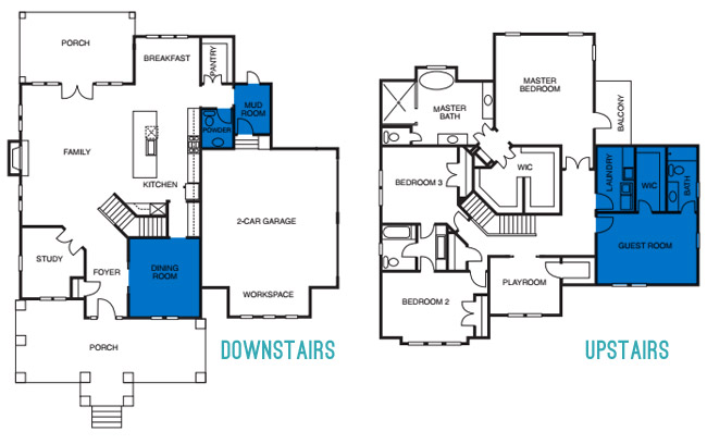
Photo-wise, there are few rooms on each floor that we still haven’t shared/sourced for you. So let’s slide through the dining room, powder room, mudroom, guest room, guest bathroom, and the laundry room.
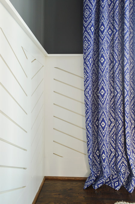
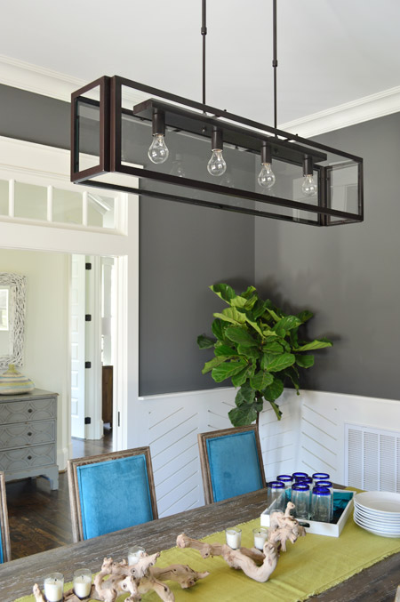
We love dark wall colors in a dining space, so for this room we chose Kendall Charcoal, which we balanced out with white trim and linear wainscoting that we had John the Carpenter build (you can read more on that – and what inspired it – here). Then we added in some color with everything from the chairs and the art to the curtains.
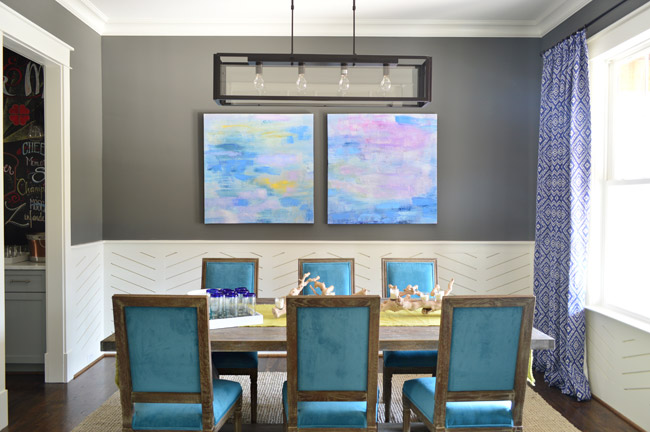
The peacock chairs were donated by World Market, the weathered trestle table was from Green Front Furniture, the art is from HomeGoods, and the rug is from West Elm.
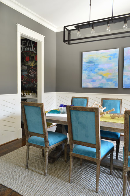
The curtains were made by U-Fab in this fabric.
The light fixture is from Shades of Light, the (slightly wrinkled) table runner and those blue rimmed glasses are from World Market, and the rest of the table decor is from HomeGoods.
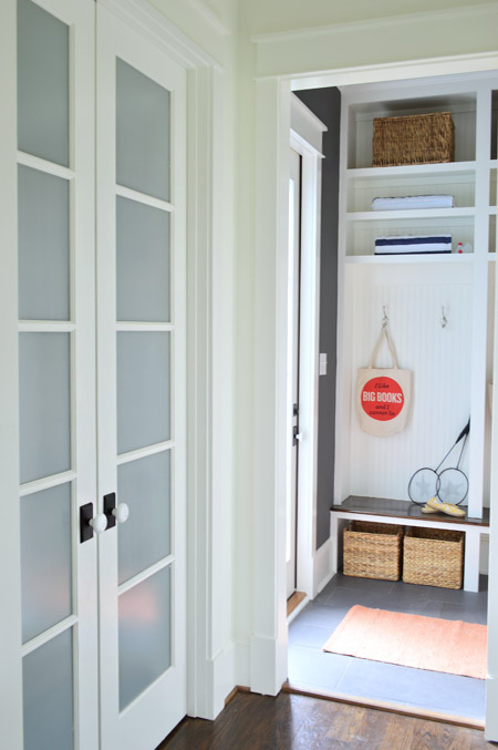
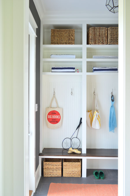
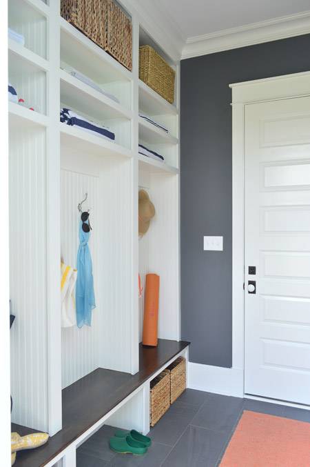
Let’s head over to the mudroom, which is beyond the pantry that we showed you in this post. The mudroom is painted Kendall Charcoal like the dining room, but again all of the white (this time from the built-ins and two big doors) helps to keep the room from feeling too dark.
We gave Carpenter John some direction – like the beadboard backs, the stained wood bench, etc – and then he executed everything. The prism light is from Shades of Light, the tile floor is from Mosaic, the floor runner is from HomeGoods, and the baskets and styling accessories are mostly ours, though the “I Like Big Books And I Cannot Lie” bag is from Fountain Bookstore.
As shown in the video, the glass door on the left leads down to the back patio while the other door (shown below) goes out to the garage. We wish we had a few extra hours when it came to styling this room (we’re not loving the mismatched baskets and the not-very-full shelves) but we were scrambling like crazy in the end. Looking back, it’s kind of a miracle we didn’t just tape up a piece of paper that said “imagine this full of soccer gear, school stuff, and other fun family clutter.”
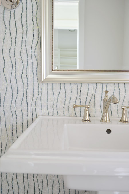
Across from the pantry is the half bathroom, which we thought would be interesting with a big back wall full of accent tile from the floor to the ceiling. The tile we landed on is called Snow White Seaweed Wave from Mosaic and the wave pattern was actually much more subtle in the sample that we saw, but the shipment of tile that we got featured a deeper accent color. Mosaic warned us that shipments could vary beforehand, but we didn’t end up minding the change. We think it’s one of those happy accidents that it turned out a little bolder since most people who see the house in person name this tile wall as one of their favorites.
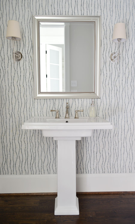
The pedestal is the Kohler Tresham (the same line as the toilets in the house), the faucet is Brizo Baliza in polished nicked, the mirror is from Target, and the sconces are from Shades of Light. Sherry wishes those lampshades were whiter like the trim/sink, but they don’t really bother me.
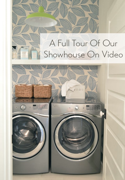
Heading upstairs, the laundry room is one of our favorite spaces thanks to the wallpaper along the back wall. It’s MissPrint’s Pebble Leaf, and it was donated by WallpaperDirect.
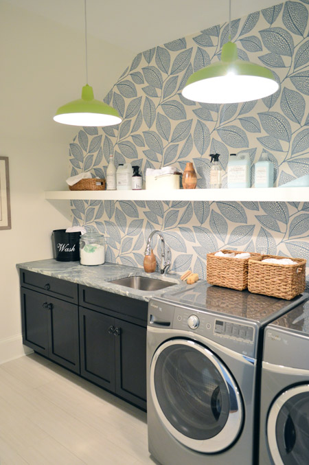
The lights are our farmhouse pendants from Shades of Light in a happy lime color. We thought a random pop of citrus would be fun since the room’s palette is otherwise pretty subdued with black, white, gray, and blue. The non-wallpapered walls are painted Steam by Benjamin Moore, which is just slightly warmer than the Simply White that we used everywhere else (it matched the back of the wallpaper better, so that wall didn’t look yellowed by comparison).
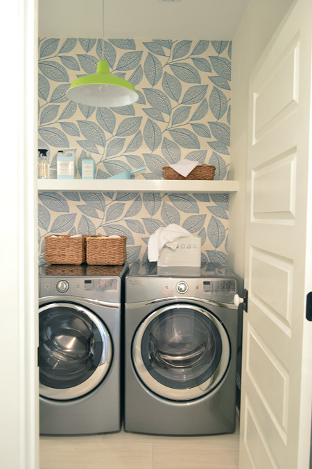
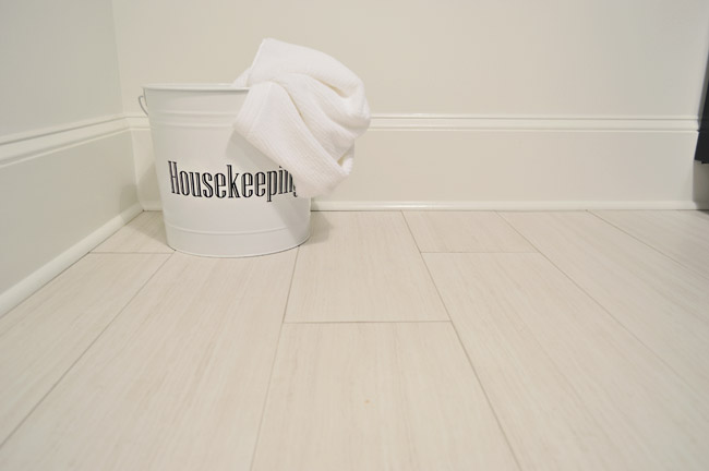
The floors are big 12 x 24″ tiles called Travertino White Field Sunrock found locally at Mosaic. Again, we choose some lighter elements to balance out some of the darker things in the room like the deep wood-toned cabinets and the steel gray appliances.
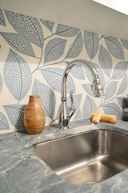
The counters are soapstone and, like the kitchen, we went with a nice deep stainless steel sink and a pull-down faucet (this ones is the Leland faucet from Delta). We’d love a work sink like this in our house (we’re always moving dishes to wash our paint brushes).
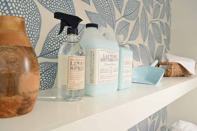
As we mentioned in this post, we made an 11th hour call to have the carpenters build a wall-to-wall floating shelf which does two things: it fills the visual void above the counters/appliances, and it also provides a lot of convenience and function since it can house everything from dust pans and laundry soap to baskets full of washcloths and other cleaning supplies. We tossed various things from HomeGoods and Target up there to demonstrate.
The other room at the top of the stairs is the guest bedroom, which Sherry and I both agree is “the one that got away.” It didn’t come together as well as we originally envisioned and we just didn’t have time to make those last-minute tweaks (finishing around 25 spaces in 2-3 weeks meant that getting to every last adjustment for every space was a pipe dream, so we just scrambled to do as many as we could). We don’t think it’s horrible or anything (a bunch of people who walked through even called out things like the curtains or the art as favorites) but we think with a few changes it would have been more our speed.
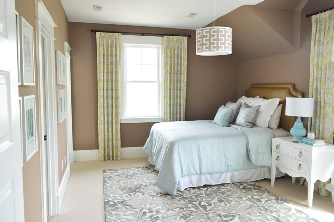
Our original idea was to bring in some warm tones just for some variety (we didn’t want the whole house vibe to feel too cool) but this room accidentally turned into the space where everything was brown. We picked the wall color from one that we liked using during book shoots (Taupe Fedora by Benjamin Moore) but when we finally got to load everything else into the space (a tan bedspread, a wood nightstand, etc, etc) it looked blah. So we switched up as much as we could, like white furnishings, lighter bedding, and colorful art in some crisp white frames – but we really think changing the wall color would have tied everything together if we had the time (maybe a light platinum or subtle gray-blue). Speaking of the art, you may recognize this calendar-turned-art from our old hallway.
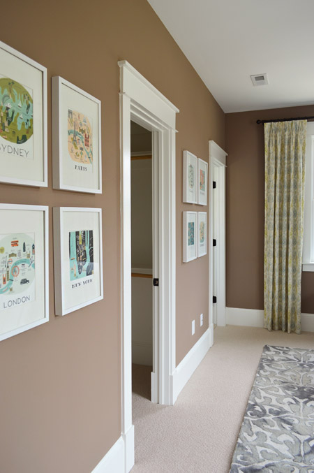
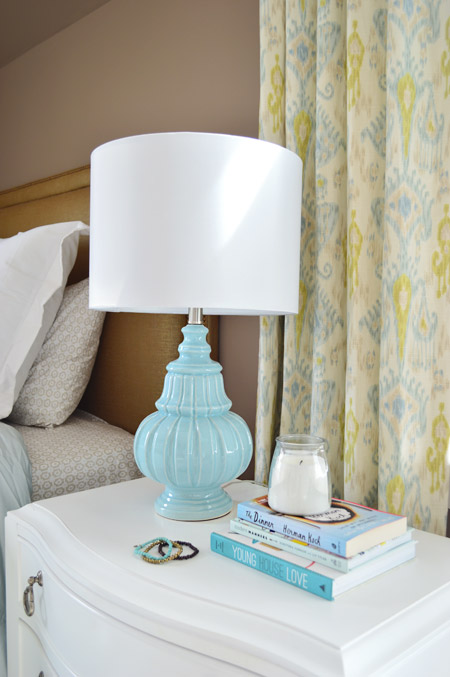
There are still elements in here that we really love – like the curtains from U-Fab, which are a more subdued colorway of the ikat curtains from our old dining room (which currently live in our guest room). The lamp is from HomeGoods and the nightstand is from Green Front Furniture.
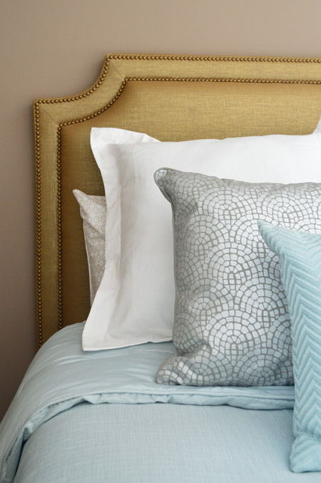
The queen-sized headboard is also from U-Fab and it’s another piece we love (once again that wall color worked against us and it just sort of blended in). It’s upholstered in a metallic fabric with gold nailhead trim (and it’s for sale too, if you’re interested!). The bedding is from Target, and the pillows are from HomeGoods.
On the opposite wall is a dresser from Green Front Furniture with a colorful armchair, which was a last-minute buy from World Market. The other last minute purchase was the patterned rug from HomeGoods, which made a HUGE difference in the room not feeling super bare. If only those walls were a different color, we think it would have come together a lot more.
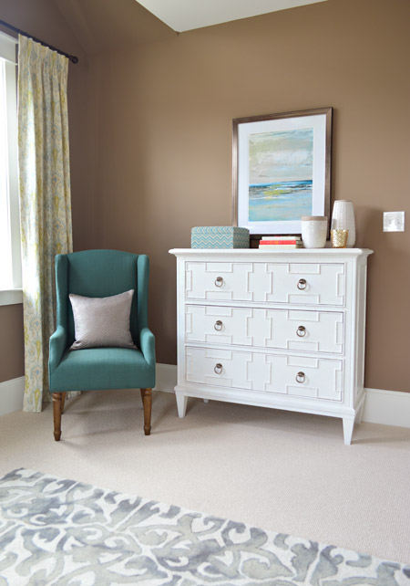
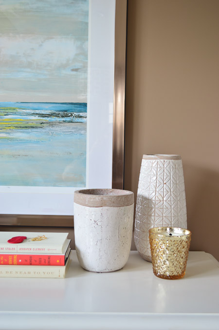
The art and vases were from HomeGoods and the gold candle was from Target.
We were going for something simple, classic, and light for the guest bathroom (it’s not nearly as big as the ensuite bath off of the main bedroom) and we thought a little hint of “vintage” would be fun in here, so some of the details subtly nod in that direction.
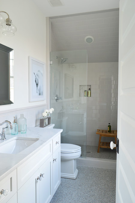
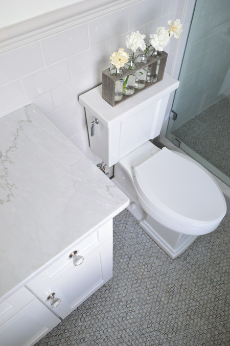
We went with a tile wainscot through the main part of the bathroom, using a family of tile from The Tile Shop called Imperial Ice Gray Gloss. It’s my favorite part of the bathroom – well, that and the bridge faucet from Brizo. The counters are classic carrera marble, the mirror is from Target, the light fixture is from Shades of Light and the bud vases on the toilet are from World Market.
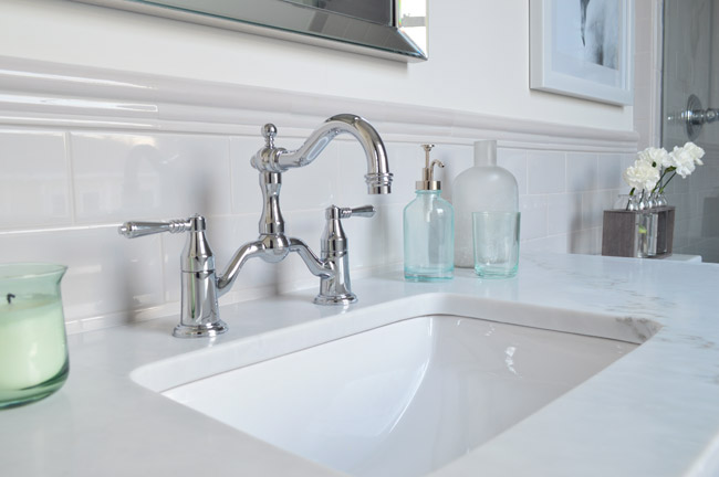
I’ve already proclaimed my love the the Tresham toilet, so instead I’ll draw your attention to the floor – which is the hex version of the penny tile we used in our last kitchen from The Tile Shop. We also added glass knobs to the cabinets (donated by Liberty Hardware) and a seamless glass shower door. It’s not an open shower – it has a door on the right that swings shut to seal the water in – that’s just hiding behind the bathroom door in that first photo.
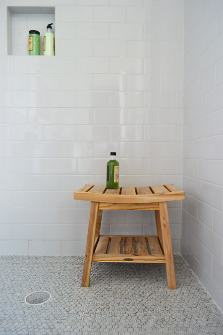
We were originally going to use the same tile in a different color in the shower, but decided that might be too jarring for such a cozy bathroom. So we continued the same stuff that we used on the wainscoted walls into the shower, which we really ended up loving once the clear shower door went in. The wood bench is from HomeGoods.
And so ends the tour of the showhouse. We’re planning to make a House Tour page with photos of each room, a rundown of sources, and the video tour all in one spot, but in the meantime you can peruse each of our previous showhouse posts here (they go all the way back to the beginning if you scroll back through them).
It was a huge honor to be invited to help with such a fun undertaking, and we’re extremely grateful for the opportunity to learn more than we could ever imagine about new construction, to work with amazing people who are like family to us now, and to be able to send our fee to Richmond’s Habitat For Humanity (you can read more about that here and here). And you know Sherry’s angling to house crash the future owners so we can share how the house works for a real family (you know as opposed to an imaginary one) so there’s always that to look forward to.
Psst – Wanna see more showhouse info & photos? Click here for Our Full Showhouse Tour, which includes final pictures of every room, the floor plan, budget info, a video walk-through, and a grid of shoppable showhouse furniture & accessories.

Caitlin says
I know you mentioned in the post that the mirror is from Target, is it the Porter mirror?
YoungHouseLove says
So sorry we’re not sure.
xo
s
Abby says
Such a beautiful home! What an accomplishment. I actually do like the taupe and light blue together in the guest room but see what you’re saying about some of the elements. And I am interested in the headboard!
YoungHouseLove says
Thanks Abby! We’ll email you the info :)
xo
s
Jenn L says
Loving the color scheme throughout the house! Where did you get that art over the toilet in the guest bath? I love it!
YoungHouseLove says
That’s from HomeGoods.
xo
s
Rachael says
Great job on the video. Loved see the whole thing all at once and it will be a very luck family who gets to live here!
Dana says
I know you mentioned this in a previous post, but I am obsessed with the glass globe light fixture in front of the fireplace. I know you had it custom finished in brass. I would love this fixture for my own home, but need it in brushed nickel (only standard in polished nickel or oil rubbed bronze). Any advice?
YoungHouseLove says
Maybe try calling Shades of Light to see if they have any options to change the finish? Good luck!
xo
s
Caitlin says
I called Shades of Lights about this a few weeks ago…they said call Decorators Outlet! Hope that helps :)
Annie says
It’s been so fun to oooh and ahhh at all the gorgeousness of this house. I loved that Stanton carpet so much I priced it-for install w/pad in a 400 sq ft room it was going to be almost $9,000.00. What?!? I clearly can’t keep up with the show-house-joneses, and am ready to get back to reality! :)
YoungHouseLove says
Eeks! The builder uses certain vendors for dozens of houses a year so he tends to get some hefty discounts. Maybe finding a local designer or builder to buy through would give you access to their “designer discount”?
xo
s
Katie says
The guestroom, dining room, and the two bathrooms (especially the guest bathroom) you showed today are my favorite work I’ve ever seen from you guys.
The dining room chairs, table and artwork are gorgeous, and they feel so balanced with the wainscoting and the light fixture.
In the guest room, I actually love the richness of the wall color. You can tell from the way it looks so different on the different walls in the photos that it’s a color that has a lot of depth and variation. I think you struck the right notes in playing it against light colors. I feel like you conquered the “pop of color” impulse by adding pops of paler tones like the lamp. I also love the more traditional furniture styles and balanced grid art groupings in this space, which ground the room and draw the eye away from the wonky ceiling line.
The only thing I might change in both spaces would be the curtains. In the dining room I might use another color way that was a green-blue tone rather than a purple-blue to match the chairs better. In the guest room, I love the fabric but might add a valence that goes up to ceiling height to make the walls seem taller.
YoungHouseLove says
Thanks so much Katie!
xo
s
kathyg says
Yep, building a house is pretty much a full time job – I’ve done it twice.
And please pardon me, but I don’t understand the references to squeezing it all in in the last few weeks? I had every room pinned – and/or with a binder of clippings – and had collected a ton of stuff (rugs, prints, bedding, etc) in my garage by the time the house was finished. Were you not allowed to collect stuff for the year prior as you were building?
YoungHouseLove says
Good question! We didn’t have unlimited space to store things beforehand, so we could collect some items but couldn’t load anything into the house until it was finished being dusty/worked on (which meant we only had a few weeks to fully furnish and accessorize it). We also had many items that couldn’t be delivered until the house was furniture ready, so rooms had to come together in hyperdrive for those last few weeks. Once we saw things in place of course we wanted to tweak things (planning is one thing, but seeing things in real life can change things!) and items like bookcases and built-ins needed tons of accessories which we didn’t have room to store beforehand. We did choose all the fixtures and most of the furniture ahead of time, so it was just the accessories and small changes (new chair or rug) that we filled in at the end once we could actually load things into rooms :)
xo
s
Jackie says
I understand not having unlimited storage space and I think most would be unwilling to appropriate sections of their house as temporary holding units for materials for months at a time… but it does seem as though you relied on having the rooms finished before beginning to source out the scope of items that were required. For example, baskets for the mudroom, towels for the bathrooms, proper desk/office accessories etc.
I don’t really understand why having to squeeze things and scramble last minute is the result of anything other than poor project managmenet when their was transparancy from the get-go about what phase and how much time would be allowed for accessorizing. Sorry if that comes across as snippy – I’m reading this while at work so this all seems relevant to issues with the management and execution of tasks.
Best,
Jackie
YoungHouseLove says
We were all told we’d have longer to fill our houses, but due to rain/snow delaying the building process we all got our houses later than planned. Every other designer was there late at night for those last few weeks as we all scrambled to finish in time. Each phase of the project is dedicated to different tasks, so you’re not off buying accessories in month 3 because that’s when you’re picking tile/flooring/fixtures, or mapping out where light switches go or what cabinet pulls to order. We never could have guessed that our house would win four awards (the most of any house in the show) so while there are definitely things we’d do differently looking back, we’re thrilled with the outcome.
xo
s
kathyg says
I’m sorry, I seriously did not mean to imply anything about your time management skills! Building is a tough tough job, which most can’t appreciate until they’ve been in the trenches. I KNOW what you went through. I DO wish there was a way you could have translated all the ins and out of building better on the blog – but…I do think if you would have complained/mentioned how timeconsuming/secondguessing/hairpulling/ it was, people wouldn’t have been kind – I know that from experience too – “oh yeah, poor you, building your dream home boohoo”. So it’s kind of a lonely experience in some ways too.
Back to where I started, I was really genuinely surprised that you didn’t have a huge stash like I did ready to load into the house as soon as possible. (I had an odd reaction, I didn’t want ANY of my old &*# in my NEW house!) LOL I simply cannot imagine having to think and shop for all that at the last minute. I would have gone insane! I had a housewarming two weeks after CofO, and it was a rough two weeks even with all my stash! So…sorry…I really DO sympathize.
Sarah Stirling says
I love these rooms! I wish I had a place to install the herringbone wainscoting!
Also– when are the pieces being donated to the ReStore?! Can’t wait to go and see what’s available!!
YoungHouseLove says
We’re not sure when or if it’ll be multiple shipments so we’ll let you guys know when it happens!
xo
s
Sarah Stirling says
I love these rooms! I wish I had a place to install the herringbone wainscoting!
Also– when are the pieces being donated to the ReStore?! Can’t wait to go and see what’s available!!
Thank you for all y’all do!!
YoungHouseLove says
We’re not sure yet but we’ll keep you guys posted!
xo
s
Caroline says
Amazing! I can’t even imagine making 1/3 of those decisions while I was pregnant. AHHH! The whole house is beautiful. And I really love the guest bedroom! Although I am a HUGE fan of grays (painted our whole last house gray), I love seeing tan too. Our new house was painted tan (the tannasaurus as I call it) before we moved in, so it’s stayed. I like seeing what others do with tan!
I have GOTTA know- what’s under the stair case? Is there a closet across from the butler’s pantry to fill that space?
YoungHouseLove says
We debated making a niche or small closet there but didn’t end up putting anything there (we worried it would make that space feel more cramped/enclosed.
xo
s
Aimee says
That would have been a great spot to stick in something totally unexpected – like the playhouse you keep talking about for Clara’s closet!
YoungHouseLove says
That would have been awesome!
xo
s
Reenie says
Absolutely beautiful…. well done. :)
Kari says
I am in love with the lamp in the guest bedroom; it is exactly what I have been looking for in my own! Do ya’ll remember how much it was/which Richmond HomeGoods you found it? I frequent the Short Pump HomeGoods store, but have yet to see it! You can bet I’ll now be including HomeGoods on today’s post-work errands :)
YoungHouseLove says
I think it was the Chesterfield one and it was $50 or so!
xo
s
Johanna D says
I LOVE that guest room. I think the brown walls are so cozy and every thing else is super fresh looking. I suppose your experience with it is why they say you should pick your wall color last.
Everything about the house is beautiful!!
SherryB says
THAT Dining Room!
Robin says
I loved this project of yours! From reading about planning, to seeing it get build and touring it in person! We dream of building our own house someday and a slightly smaller version of this would be our ideal home! Seeing the process was great for a newbie. I (sorta) joke to my husband that we’ll go with this builder or buy the plans and have this house in a few years!
Manda Wolf says
Looks great guys. I’m in love with the dining room chairs, those are awesome. And I have to say I really like the guest bedroom. For some reason with the floor and wall color it looks like a bedroom that could be in a rental. With everything you have done to it shows how nice a room can look just with furnishings, pictures, curtains, etc. I hope you get the chance to do something similar again. I think with everything you have learned next time would be easier on you and you would know where you can spend more time. Plus I like your guy’s style (clearly or I wouldn’t be here copying random things for my house) so this was like getting to see you do a whole house in a few months instead of years – and doing what you want not having to deal with silly walls that aren’t where you think they should be.
I had what I thought was an interesting idea if you guys don’t like feel free to ignore me. I would really like to see mood boards again. But a mood board challenge would be cool. So for example you put up a mood board give a deadline (i.e. a month) and then you could share pictures of your favorite rooms inspired by the mood board. It would be cool to see how an idea works across multiple spaces.
YoungHouseLove says
Thanks Manda! That sounds really fun!
xo
s
Alex says
I looooove the color in the guest room! It’s got enough light to carry it off and it makes it feel very warm and cozy. I can see how it’s maybe a little too warm to fit with the rest of the house, but I still love it and think it looks amazing as an isolated space. (Plus I’m always chilly in other people’s houses, so I’m sure I’d appreciate the warm vibes, heh.)
Amanda says
You guys did such a great job! It truly is great to see how far you’ve all come. I can’t get enough of the house! Is definitely take some inspiration whenever I do my house someday. I’m loving all of the blue. I’ve been loving blue of all forms in my apartment. It may be a sickness really. Haha
Stephanie says
The Kendall Charcoal paint color in the dining room, where is it from? Thank you
YoungHouseLove says
Ben Moore!
xo
s
Lelia Logan says
WOW! The Show House is beautiful! What an accomplishment. Please Please, Put your feet up and take a break and enjoy some well deserved rest. At least for a few minutes. Thank you for all your inspiration.
Stephanie says
Where is the paint from in the dining room, kendall charcoal? Thank you :)
YoungHouseLove says
It’s by Ben Moore.
xo
s
Lisa E says
Congratulations on such a wonderful accomplishment. We are our own worst critic, but you should be proud as the ENTIRE house is beautiful. As somebody else mentioned, you had less resources as the other designers, therefore it makes it even a bigger and better accomplishment. Then if you add to that, one very pregnant Sherry, wow! Honestly, you guys rock. I’ve said that several times before and will continue to do so. You continue to impress, especially with your generous heart in donating your fee and not taking freebies for your home. I don’t know you personally, but am old enough to be a parent to you two, so I hope I can get away with saying how proud I am of you!
YoungHouseLove says
You’re so sweet Lisa. Thanks so much!
xo
s
DebD says
I have subscribed to your blog for a few years now via EMAIL; however, I have not received any in my email for quite some time now. I just tried to resubscribe and it says my email is already subscribed. I have kept up with your entries over the last couple of weeks (months?) via Facebook links. (Hasn’t been in my spam box). Suggestions? Thanks. I love your posts as they remind me of my son & DIL in “Brookstone” near you!
YoungHouseLove says
A bunch of email providers changed code and it blocks all blog subscriptions, but we hear if you subscribe with a gmail address it works like a charm.
xo
s
Katie says
Looks wonderful! I absolutely love the colors you chose for the bedroom. Looks so comfy, inviting, and relaxing!The color for the mudroom is also one of my favorites!
Stacy Weiland says
I am so in love with this house. I really can’t think of anything I do not love about it. I am in love with outside and I adore the inside. The “I like BIG BOOKS and I cannot lie” bag is calling my name! You guys did such an excellent job on this house. It has given me so many ideas and is so inspiring. :)
Stacy says
How does the color of that hex tile in the guest bath read in real life? On the site it is very green, but in your photos it looks like more of a blue/grey color. I’ve been looking for a similar hex tile for my shower floor, and that gorgeous bathroom is so close to what I’ve been imagining for the room.
YoungHouseLove says
It’s a lot more gray than green in real life!
xo
s
Stephanie says
You mentioned the headboard in the guest room is for sale…what size bed is it? and do you know how much they are asking for it? Thanks!
YoungHouseLove says
I’ll email you that info when I get it :)
xo
s
Taurie says
How dark are these floors compared to the ones you installed in your own home? They look so dark and rich (I LOVE), but I’ve seen some commenters say that they love the medium tone of the floors!
Then again, maybe I just grew up in a family where everyone prefers super light flooring :)
YoungHouseLove says
I’d call them medium too (not ebony and not light oak). Pretty close to the ones in our first and current home. They seem to work really well for tons of traffic (the show had thousands of people coming through each week).
xo
s
Heather says
I have really enjoyed seeing all of the different rooms in the show house. After watching the video (nice job John) I had a few thoughts…
-I am a little surprised by my choice, but I think that the laundry room is my favorite. I love the wallpaper and it really brings a lot of life to a small, often forgotten room. But I also love the guest bathroom, all of the finishes look nice together and I would love it in my house!
-It is nice to have a unique or special light in a room, but it seems like you’ve gone overboard or missed the mark with having so many different ceiling lights and finished. And most of them have exposed bulbs, not sure how you two could work in there to decorate because those exposed bulbs blind me!
-And everything seems so much bigger and brighter in your pictures, it feels much smaller on the video – which is nice, it does not feel so empty and vast on the video.
-I really like the front and back porch, all of that wood is gorgeous! And the bedding in the master, love it.
-And most concerning to me is the bathrooms. Downstairs there is a half bath right next to where people eat. And upstairs the bathrooms are all inside bedrooms. This would be awful for a visitor that needs to use the restroom privately while eating a meal at the house! Or children that are over playing upstairs in the small playroom, they’ll have to go into a bedroom to go to the bathroom.
Kerrie says
Hey! Going to miss these posts, but glad they are on the internet forever! I wish the other homes had these types of posts because after I was done touring, I was trying to figure out which things I liked from each house the most, but they started to run together.
Who ended up winning the fan favorites vote? I don’t remember reading about it in previous posts.
YoungHouseLove says
Our house got People’s Choice, which completely blew our minds!
xo
s
Kate F. says
I haven’t been able to find any good info online about the White Moura marble used for the kitchen countertops. Can you provide any more insight into why you chose it over regular marble or another solid surface? Just curious b/c it looks great in pictures and I would like to know more.
YoungHouseLove says
We got it in the leathered finish with a protective seal since it’s supposed to be more durable (there have been a few big parties there with wine glasses all over the counters without a stain in sight!)
xo
s
Kate F. says
That’s good to hear. Thanks!
Kim says
I think it’s kind of funny that you mention not being in love with the guest bedroom because I think that it and the guest bath turned out the best! It’s refreshing to see a more sophisticated room in the space (never hurts to mix things up, right?).
However, I do have a problem with the fact that you both constantly mention that things were so hurried and rushed towards the end of the design. Didn’t you have well over a year to get plan, design, and shop? Realistically, I would think those last few weeks were primarily for styling and not purchasing items and decor. If I were another designer for this event, I would honestly be a little upset that you make it sound like you didn’t put much time into thinking about these things and threw it together at the end with whatever you could find at Target or Home Goods. Of course, Sherry was pregnant and you had a blog to write, but you could have planned things out with mood boards or something on the blog. Sure, hindsight is 20/20 but please don’t try to brush it off as a lack of time when it was a lack of direction and time management. I think it’s wonderful that you’ve done this, but you can tell by looking at the other homes that those designers spent a lot of time handpicking their decor and it’s incredibly rude and unprofessional to be so nonchalant about your lack of planning (for example, by joking about leaving a note for guests about the room’s styling). It’s one thing to “keep it real,” and I don’t mean to sound harsh, but this is your job. Shouldn’t you be putting your best foot forward?
YoungHouseLove says
We definitely gave all that we had to this project and every other designer was hustling at the end as well (we were all there late at night for those last few weeks as we scrambled to finish in time, which we heard from the more seasoned designers happens every year). Of course we made mood boards and planned a ton as we went (you can see those in previous showhouse posts) but didn’t get to load things into the house until a few weeks before our deadline once the construction was done (this comment has more info for you about that). We feel honored to have won four awards for our house (the most any house won in the entire show, which blows our mind) so we certainly poured a ton of thought and love into this project.
xo
s
Heather says
I whole-heartedly agree with you Kim. This could have made for some amazing blog content (as opposed to the lackluster posts the past few months) as you took us all along this new journey of yours. You could have focused on one area of the house each week and posted mood boards, told us what furnishings were planned for the space from the warehouse and which we donated, even had followers vote on accessories. This could have been a big win for the two of you and you dropped the ball.
YoungHouseLove says
I think if we did more showhouse posts some folks would have thought those were lackluster, and might say we were dragging things out and would have requested more our-house stuff or smaller and more approachable budget-friendly updates. Can’t win ’em all!
-John
Katie says
Whats more budget friendly than Target and Home Goods, which is where you “rushed” to get most of the accent pieces and decor items for the home, no? I was disappointed because I was excited/hopeful you would include lots of local items from more mom & pop type shops. You know etsy and local artists. You have a full storage room you could have kept these things in. I guess I just look to show homes for more inspiration that I couldn’t find at my local target. 100 different people…
Congrats on the awards!
YoungHouseLove says
We used lots of local art from Lesli DeVito (5 pieces), Lindsay Cowles (4 pieces), Bill Dickinson (6 pieces), and Silver Tree (2 pieces) as well as using handmade items from the Richmond Craft Mafia throughout the house and getting 4 pieces from Help Ink (a cool mom & pop shop who donates proceeds to charity). The majority of the furniture came from Green Front here in Virginia, and the cabinetry, light fixtures, shutters, and curtains were also all made locally. The chalk art in the butler’s pantry was also done by a local girl named Li. These were all sourced in previous posts for you, but maybe you missed them? You can also see this thread for others who are glad we didn’t do more showhouse posts.
-John
Molly says
I honestly can’t think of a single time that you guys have said “you’re right, we could have done this differently” – I agree with others that you poorly managed your time and you have a garage and storage room that you could have been collecting things in. I just wish the replies to these comments would have been more along the lines of “You’re right! We definitely realize now that we bit off more than we could chew. We didn’t manage our time as well as we had hoped but it was definitely a learning experience for us and we really admire designers who design houses from scratch on a regular basis. We’re still very proud of what we accomplished and love the results :)”
There’s no need to defend yourself as if you managed it perfectly and remind us that you won four awards. Two of those were outdoor awards (so really your builder won them) and people’s choice was won because of your readers. Instead of blaming a time crunch, just admit that you poorly planned the amount of time it would take to actually put the room together.
I’m sorry for being cruel. I just agree that this could have been a home run and you guys majorly dropped the ball. Mood boards, how to choose different features like tiles, fixtures, etc in new builds, what goes into new builds, DIYing more items for the home, etc etc.
Also confused why the dining room light fixture was never lowered?
YoungHouseLove says
Right in this post we mentioned many things we’d do differently, so I’m sorry if you feel like we’re claiming perfection. As you said, we’re very proud of what we accomplished- but we certainly could do better all around if we were to do it again. As for the fixture, it was lowered as much as it could be (nine foot ceilings).
-John
Sarah says
I agree with everyone else re: execution and being hurried – and some of it looks that way.
Also, it’s not that you haven’t said, “oh, we’d do this do differently” in your posts – you have – it’s that in response to comments you are *so* defensive and keep bringing up all of the awards as evidence of the amazing job you did, instead of reflecting upon the feedback that your faithful readers are giving you, and responding to it non-defensively. I think that everyone would appreciate it. Thanks!
YoungHouseLove says
Thanks Sarah, sorry to sound defensive. We certainly hear you guys and will have to work on that.
xo,
s
Laura says
You mentioned some mood boards. I don’t remember reading them and I think it would be awesome to look back and see how your vision began and evolved into the final product! Can you direct me to those posts? Thanks and thanks for sharing your work with all of us :)
YoungHouseLove says
Here ya go: https://www.younghouselove.com/2014/02/setting-the-mood/
xo
s
Liz says
I’m really trying to be helpful here, so bear with me! I think sometimes the tone of your replies to [less than glowing] comments come across as defensive and sometimes condescending and or arrogant (i.e. “we won awards,” implying the commenters are obviously wrong). I doubt you do it on purpose, but it’s so hard to get tone across properly in writing sometimes (which as copywriters I’m sure you know), as I’m trying very hard (probably unsuccessfully) not to sound critical right now! I’m sure it’s especially hard when you’re trying to quickly type a reply to someone who is being critical of something you’re very proud of! Anyway, what I’m trying to say is I think you sometimes inadvertently put off your readers with the tone of your replies to criticism. That’s all! Sorry if that came out badly!
Lisa says
I wholeheartedly agree with Liz and the rest. I honestly stopped reading comments most of the time, because your answers were so snippy sometimes. Also, for every mildly critical comment there were ten fangirl answers blindly defending you, even thoughh the commenter often had a good point. I still like your blog, but I was also underwhelmed by your posts and think especially because you donated your fee – which is great – you could have used the experience for a lot of more well thought-out blog fodder.
Lisa says
Also, in the post you linked to, there are exactly two mood boards to two rooms. That is not much for a whole house now, is it?
kim says
Thank you so much for doing the video! I have loved seeing the pictures of all the rooms, but the video tour really helped put in all in perspective and get a better feel of the space. You did a fantastic job! If I had to choose, I think the kids bathroom was my favorite.
Ro says
The laundry room is definitely my favorite. I might just have to wallpaper my closet with that beautiful paper! You guys did an excellent job. I only wish I had the same luck decorating my apartment.
Also, where did that laundry detergent come from? Google has come up with nothing!
YoungHouseLove says
That was HomeGoods!
xo
S
Jenny says
I think you’ve mentioned before that basements are not common in your area. However, it seems odd not to have one considering you have to go down stairs to get to the patio from the deck. Did you consider having a basement? Was it even an option?
YoungHouseLove says
The builder actually opted not to have one since it would have added a lot to the house’s price (it would be more square footage).
xo
s
Tara says
I believe basements (even finished ones) cannot count towards a house square footage.
YoungHouseLove says
In our area they do! Anything heated and cooled is square footage and to keep a house efficient almost every builder would heat/cool them.
xo
s
Jackie says
This is super interesting. Do ceiling fans count as heating/cooling. As in, did you decrease the square footage of your house when you converted the heated sun room into a covered deck? I never thought about any of this before!
Best,
Jackie
YoungHouseLove says
Nope it has to be air conditioning and heating through ductwork or some sort of window unit, so fans don’t count. Our sunroom was never cooled and did have a baseboard heater but it didn’t work so it wasn’t included in the square footage. When we finish the storage room upstairs our house will have more though!
xo
s
Jackie says
Thanks for the reply! That’s awesome you’ll be adding square footage. The return on the investment will be huge I’m sure!
Best,
Jackie
Lesley Lq says
Is this floor plan blue print for sale and what is the square footage? We plan on building in a few years.
YoungHouseLove says
Yes on biringerbuilders.com you can find it (a portion of the sale goes to Habitat). It’s around 3600 square feet.
xo
s
Stephanie says
I can’t over emphasize how much I love every last detail of this house. Gorgeous! Are you guys considering doing design work more often? Totally not my business, but you are so gifted at it.
YoungHouseLove says
Thanks so much Stephanie! We would definitely team up with John the Builder again! It’s really fun to do spaces beyond our house. It stretches us in new ways and teaches us stuff we can bring back to our house too!
xo
s
Dorothy says
The video really brought home what a HUGE project this was. The incredibly generous donation of your time and effort in putting this show house together is going to result in some other family (families) having a home to love and a stable place to raise THEIR kids. I am incredibly moved by how lovely & functional the house is, but also by all it represents.
BRAVO, YoungHouseLove!
YoungHouseLove says
Thanks so much Dorothy!
xo
s
Brandi says
Do you know the dimensions of the bathroom pictured?
YoungHouseLove says
If you search showhouse floor plan the post with the blueprints should come up (you can click to enlarge them and read room sizes there).
xo
s
Brenda says
I love it!! You guys did such a great job with this house. Even the small details like the decor totally make it awesome. I’m so in love with that duvet cover in the master bedroom.
What happens to all the furniture and decor once the house is sold? I thought I read at one point that nothing was included with the house unless the buyer wanted to purchase it. Are you guys keeping it to decorate future showhomes that you might do?
YoungHouseLove says
Thanks Brenda! The builder is keeping stuff he bought for future models and many items were loaned to us from vendors so they’ll go back. We also had some items donated that we’re sending to the Habitat ReStore.
xo
s
Erin says
Everything’s just stunning and so creative. You both did such a wonderful job, as you always do. Your awards for this house were well earned.
Lil says
Had you not said anything, I would have never known that the guest room (house for that matter) was anything short of perfect. I loved every minute/square inch of it…totally worth the drive from DETROIT.
The big question is…will you do it again next year?
p.s. I totally recognized the city calendar prints from the old house hallway…made me smile.
YoungHouseLove says
Thanks Lil! They’ve already started working on next year’s event while we’ve been in a Teddy fog, but we’d love to team up again someday!
xo
s
Claire says
It came together beautifully! My favorite is the master bath and the eat-in banquet!
I also loved that you all did plantation shutters. I can’t imagine how much it would cost for to cover all those windows. We did two windows and it was almost 2k. Of course one of the windows was a 5 panel bay: http://therunuphill.wordpress.com/2014/05/29/paper-shade-upgrade/
YoungHouseLove says
Those are gorgeous!
xo
s
krys72599 says
Two questions:
Is there a basement in the show house?
And how on earth do you choose patterned rugs and drapes/curtains that don’t match? I struggle so much that I’ve found my easy answer is “no window treatments at all.”
None, for the win!
Where I’m forced to, I use sheers just because I’m so unsure of mixing patterns…
YoungHouseLove says
Nope, there’s no basement (one of the seven houses had one but ours didn’t) and as for mixing patterns, my tip is to keep the scale different (like a smaller scale pattern on the curtains and a bigger one on the rug so they don’t compete as much as two things with the same scale).
xo
s
Va Native says
Love the World Market chair! In your photos, it looks medium blue, but online it’s described (and looks) medium teal. Which is the better description – I need a medium blue chair!
YoungHouseLove says
They’re sort of a medium blue with a subtle teal undertone. Not half green by any means, but not just blue either. Maybe check them out in the store if you can?
xo
s
Nichole says
I absolutely adore every square inch of this home! As a local Richmonder, can you give us any idea of what items and when exactly they will be showing up at Re-Store? If not, I’m glad to stalk their aisles every day after I leave work!
YoungHouseLove says
We’re not sure when (or if there will be multiple shipments) but we’ll post a little note when we know more!
xo
s
Abigail Delphenich says
I was wondering if you would do a post on building a house from start to finish. The things you learned, the things you did right and the things you would do different. The whole process of starting from scratch and building a house is fascinating to me and you guys do such a good job or explaining the process of things. Thanks for a great blog, I can’t wait to read it every morning!
YoungHouseLove says
Thanks Abigail! That would be a fun post!
xo
s
Ashley says
Love the house!! Curious how wide the hardwood floors are? Also, couldn’t find the source for the grey table in foyer under the whitewashed mirror. Thanks!!
YoungHouseLove says
I think they were 4 1/4″ floor planks and that foyer chest is from Green Front here in Virginia.
xo
s
Libby says
AMAZING job. The only thing I wondered about was the linear wainscoting in the dining room. It’s very cool to look at, but wouldn’t it be a dust trap? How would one clean it? Vacuum?
YoungHouseLove says
A Swiffer Duster worked! It’s like a magnet thanks to all that static electricity.
xo
s