Here we are, folks. After over a year of planning, second guessing ourselves, more planning, sweating, and filling our car with vases and egg chairs, we’ve reached the end of the Homearama Showhouse tour.
So in celebration of completing this whole-house marathon of sorts, we’re kicking off this post with a whole-house video tour. Nothing too high tech. Just me stumbling through the house:
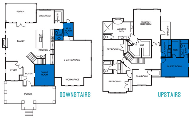
Photo-wise, there are few rooms on each floor that we still haven’t shared/sourced for you. So let’s slide through the dining room, powder room, mudroom, guest room, guest bathroom, and the laundry room.
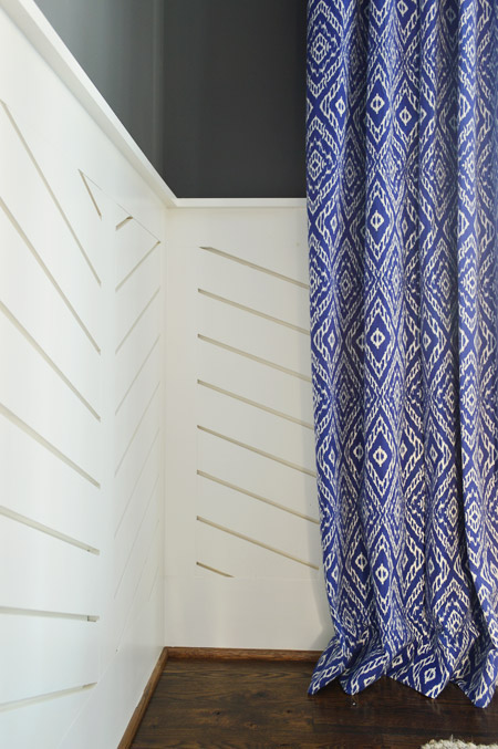
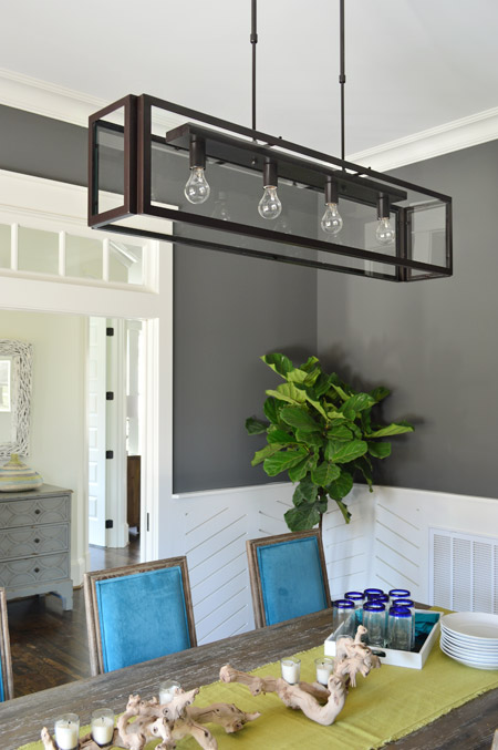
We love dark wall colors in a dining space, so for this room we chose Kendall Charcoal, which we balanced out with white trim and linear wainscoting that we had John the Carpenter build (you can read more on that – and what inspired it – here). Then we added in some color with everything from the chairs and the art to the curtains.
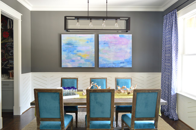
The peacock chairs were donated by World Market, the weathered trestle table was from Green Front Furniture, the art is from HomeGoods, and the rug is from West Elm.
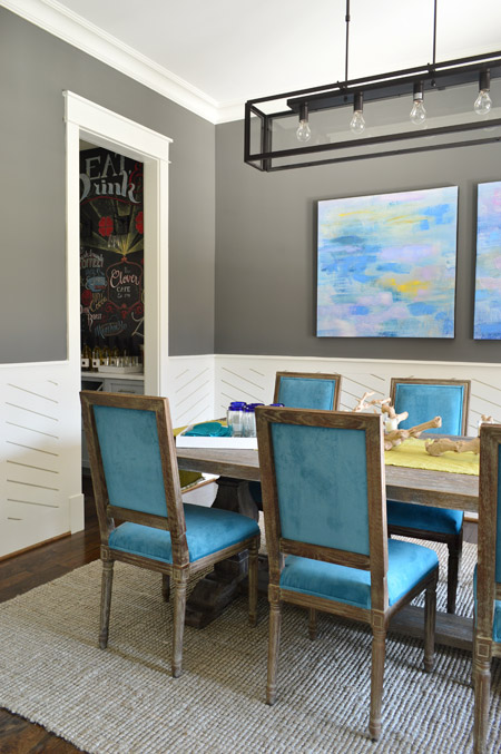
The curtains were made by U-Fab in this fabric.
The light fixture is from Shades of Light, the (slightly wrinkled) table runner and those blue rimmed glasses are from World Market, and the rest of the table decor is from HomeGoods.
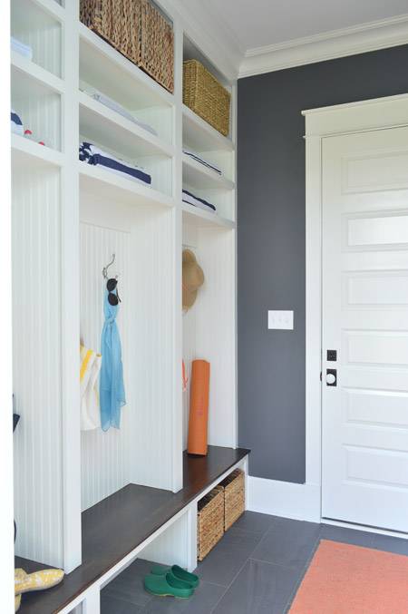
Let’s head over to the mudroom, which is beyond the pantry that we showed you in this post. The mudroom is painted Kendall Charcoal like the dining room, but again all of the white (this time from the built-ins and two big doors) helps to keep the room from feeling too dark.
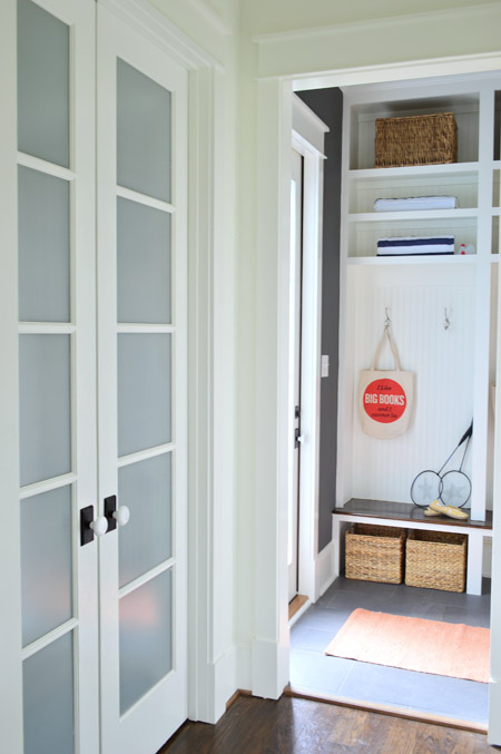
We gave Carpenter John some direction – like the beadboard backs, the stained wood bench, etc – and then he executed everything. The prism light is from Shades of Light, the tile floor is from Mosaic, the floor runner is from HomeGoods, and the baskets and styling accessories are mostly ours, though the “I Like Big Books And I Cannot Lie” bag is from Fountain Bookstore.
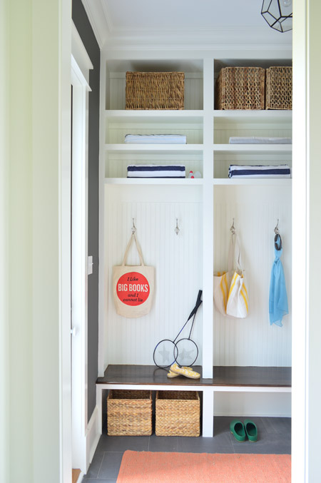
As shown in the video, the glass door on the left leads down to the back patio while the other door (shown below) goes out to the garage. We wish we had a few extra hours when it came to styling this room (we’re not loving the mismatched baskets and the not-very-full shelves) but we were scrambling like crazy in the end. Looking back, it’s kind of a miracle we didn’t just tape up a piece of paper that said “imagine this full of soccer gear, school stuff, and other fun family clutter.”
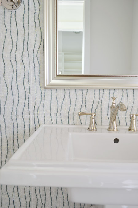
Across from the pantry is the half bathroom, which we thought would be interesting with a big back wall full of accent tile from the floor to the ceiling. The tile we landed on is called Snow White Seaweed Wave from Mosaic and the wave pattern was actually much more subtle in the sample that we saw, but the shipment of tile that we got featured a deeper accent color. Mosaic warned us that shipments could vary beforehand, but we didn’t end up minding the change. We think it’s one of those happy accidents that it turned out a little bolder since most people who see the house in person name this tile wall as one of their favorites.
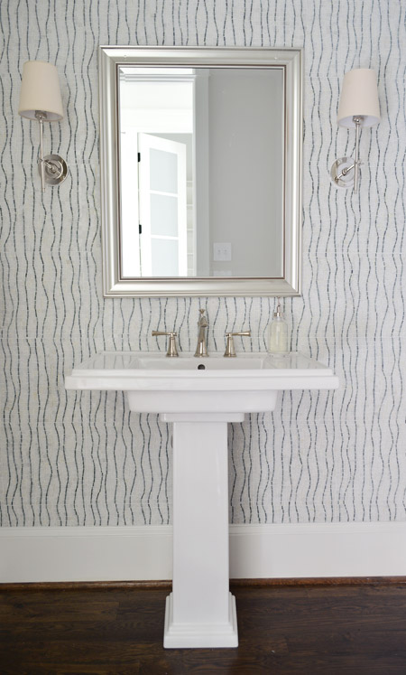
The pedestal is the Kohler Tresham (the same line as the toilets in the house), the faucet is Brizo Baliza in polished nicked, the mirror is from Target, and the sconces are from Shades of Light. Sherry wishes those lampshades were whiter like the trim/sink, but they don’t really bother me.
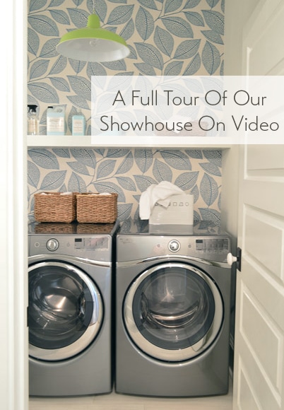
Heading upstairs, the laundry room is one of our favorite spaces thanks to the wallpaper along the back wall. It’s MissPrint’s Pebble Leaf, and it was donated by WallpaperDirect.
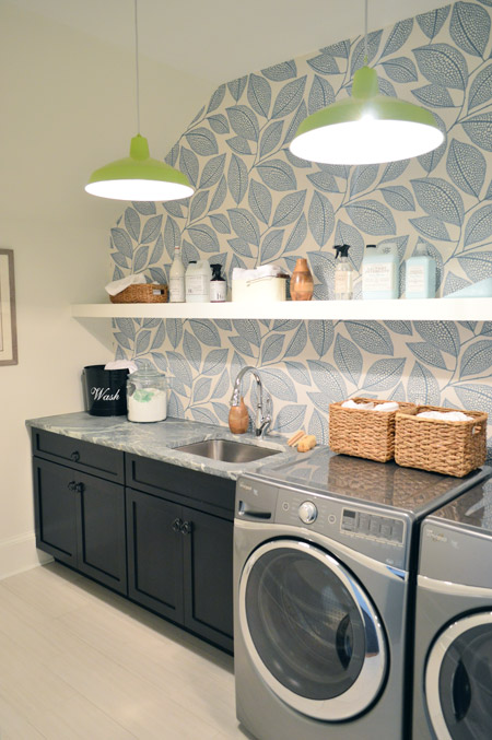
The lights are our farmhouse pendants from Shades of Light in a happy lime color. We thought a random pop of citrus would be fun since the room’s palette is otherwise pretty subdued with black, white, gray, and blue. The non-wallpapered walls are painted Steam by Benjamin Moore, which is just slightly warmer than the Simply White that we used everywhere else (it matched the back of the wallpaper better, so that wall didn’t look yellowed by comparison).
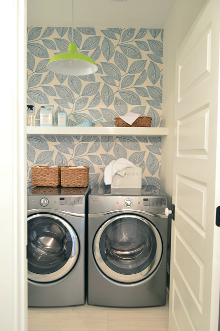
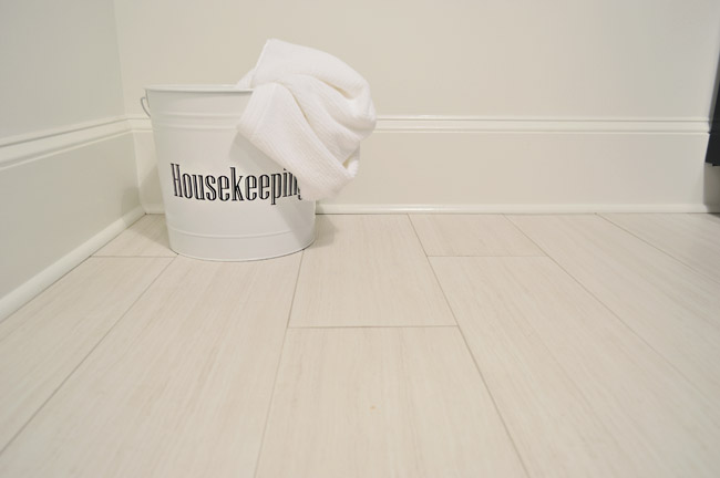
The floors are big 12 x 24″ tiles called Travertino White Field Sunrock found locally at Mosaic. Again, we choose some lighter elements to balance out some of the darker things in the room like the deep wood-toned cabinets and the steel gray appliances.
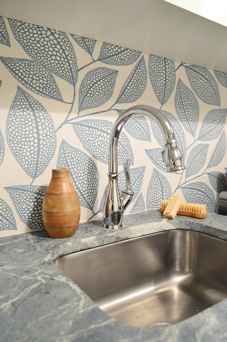
The counters are soapstone and, like the kitchen, we went with a nice deep stainless steel sink and a pull-down faucet (this ones is the Leland faucet from Delta). We’d love a work sink like this in our house (we’re always moving dishes to wash our paint brushes).
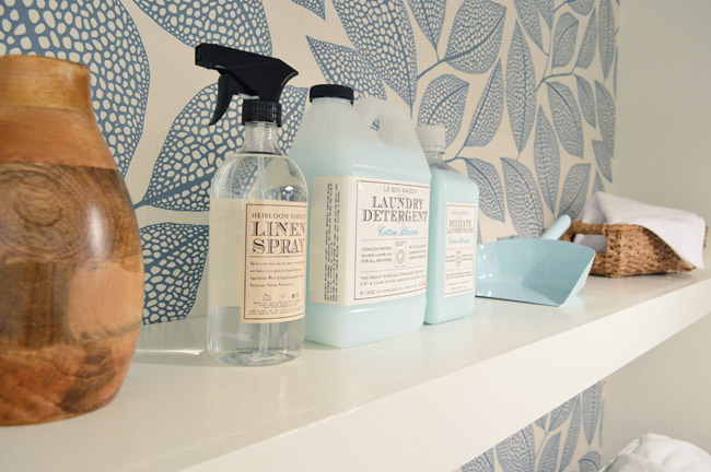
As we mentioned in this post, we made an 11th hour call to have the carpenters build a wall-to-wall floating shelf which does two things: it fills the visual void above the counters/appliances, and it also provides a lot of convenience and function since it can house everything from dust pans and laundry soap to baskets full of washcloths and other cleaning supplies. We tossed various things from HomeGoods and Target up there to demonstrate.
The other room at the top of the stairs is the guest bedroom, which Sherry and I both agree is “the one that got away.” It didn’t come together as well as we originally envisioned and we just didn’t have time to make those last-minute tweaks (finishing around 25 spaces in 2-3 weeks meant that getting to every last adjustment for every space was a pipe dream, so we just scrambled to do as many as we could). We don’t think it’s horrible or anything (a bunch of people who walked through even called out things like the curtains or the art as favorites) but we think with a few changes it would have been more our speed.
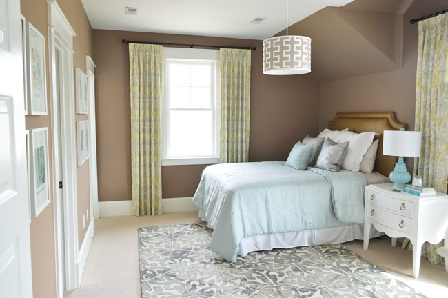
Our original idea was to bring in some warm tones just for some variety (we didn’t want the whole house vibe to feel too cool) but this room accidentally turned into the space where everything was brown. We picked the wall color from one that we liked using during book shoots (Taupe Fedora by Benjamin Moore) but when we finally got to load everything else into the space (a tan bedspread, a wood nightstand, etc, etc) it looked blah. So we switched up as much as we could, like white furnishings, lighter bedding, and colorful art in some crisp white frames – but we really think changing the wall color would have tied everything together if we had the time (maybe a light platinum or subtle gray-blue). Speaking of the art, you may recognize this calendar-turned-art from our old hallway.
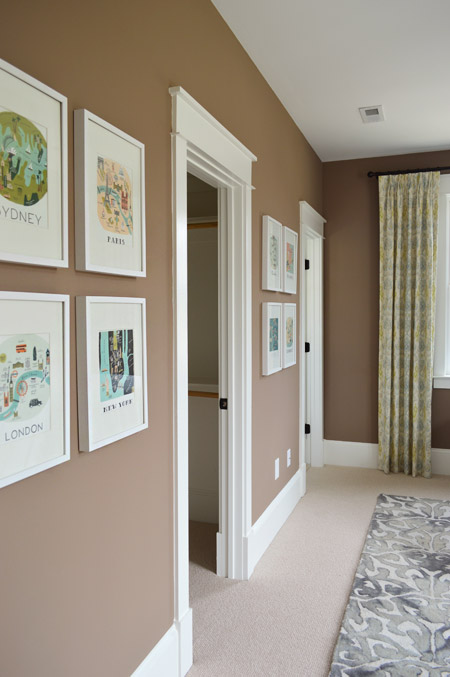
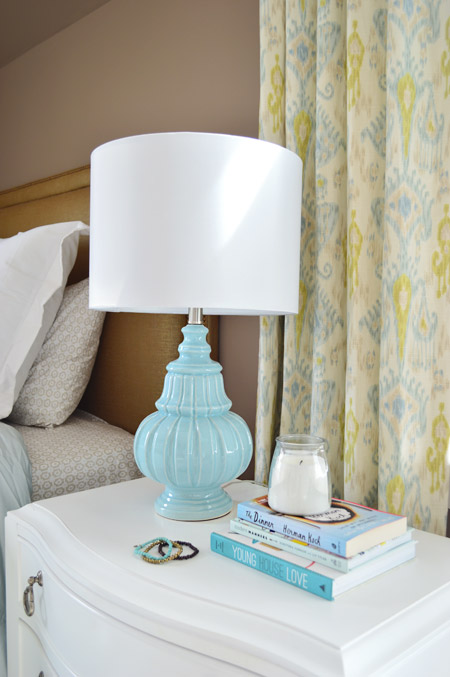
There are still elements in here that we really love – like the curtains from U-Fab, which are a more subdued colorway of the ikat curtains from our old dining room (which currently live in our guest room). The lamp is from HomeGoods and the nightstand is from Green Front Furniture.
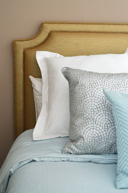
The queen-sized headboard is also from U-Fab and it’s another piece we love (once again that wall color worked against us and it just sort of blended in). It’s upholstered in a metallic fabric with gold nailhead trim (and it’s for sale too, if you’re interested!). The bedding is from Target, and the pillows are from HomeGoods.
On the opposite wall is a dresser from Green Front Furniture with a colorful armchair, which was a last-minute buy from World Market. The other last minute purchase was the patterned rug from HomeGoods, which made a HUGE difference in the room not feeling super bare. If only those walls were a different color, we think it would have come together a lot more.
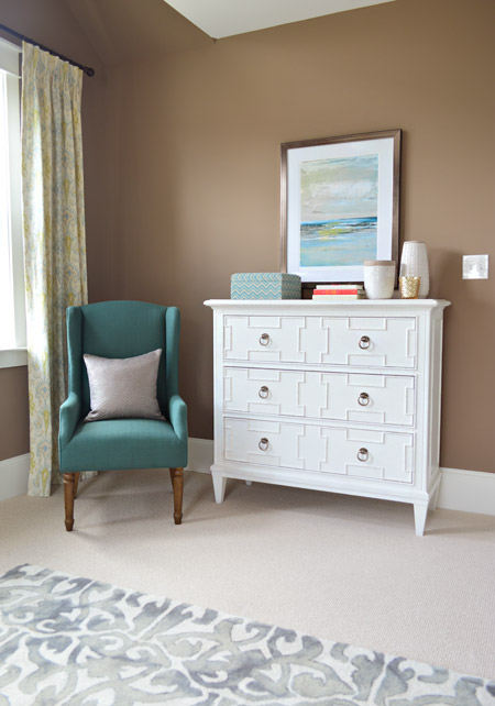
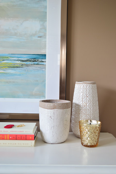
The art and vases were from HomeGoods and the gold candle was from Target.
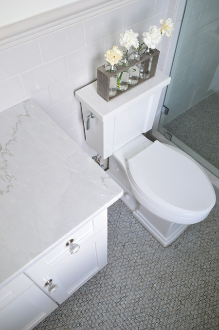
We were going for something simple, classic, and light for the guest bathroom (it’s not nearly as big as the ensuite bath off of the main bedroom) and we thought a little hint of “vintage” would be fun in here, so some of the details subtly nod in that direction.
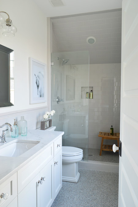
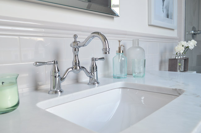
We went with a tile wainscot through the main part of the bathroom, using a family of tile from The Tile Shop called Imperial Ice Gray Gloss. It’s my favorite part of the bathroom – well, that and the bridge faucet from Brizo. The counters are classic carrera marble, the mirror is from Target, the light fixture is from Shades of Light and the bud vases on the toilet are from World Market.
I’ve already proclaimed my love the the Tresham toilet, so instead I’ll draw your attention to the floor – which is the hex version of the penny tile we used in our last kitchen from The Tile Shop. We also added glass knobs to the cabinets (donated by Liberty Hardware) and a seamless glass shower door. It’s not an open shower – it has a door on the right that swings shut to seal the water in – that’s just hiding behind the bathroom door in that first photo.
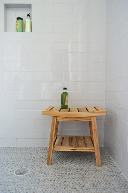
We were originally going to use the same tile in a different color in the shower, but decided that might be too jarring for such a cozy bathroom. So we continued the same stuff that we used on the wainscoted walls into the shower, which we really ended up loving once the clear shower door went in. The wood bench is from HomeGoods.
And so ends the tour of the showhouse. We’re planning to make a House Tour page with photos of each room, a rundown of sources, and the video tour all in one spot, but in the meantime you can peruse each of our previous showhouse posts here (they go all the way back to the beginning if you scroll back through them).
It was a huge honor to be invited to help with such a fun undertaking, and we’re extremely grateful for the opportunity to learn more than we could ever imagine about new construction, to work with amazing people who are like family to us now, and to be able to send our fee to Richmond’s Habitat For Humanity (you can read more about that here and here). And you know Sherry’s angling to house crash the future owners so we can share how the house works for a real family (you know as opposed to an imaginary one) so there’s always that to look forward to.
Psst – Wanna see more showhouse info & photos? Click here for Our Full Showhouse Tour, which includes final pictures of every room, the floor plan, budget info, a video walk-through, and a grid of shoppable showhouse furniture & accessories.

Jenny G. says
It’s just gorgeous. Is it hard to be done? Don’t you just want to move in?! I do!
YoungHouseLove says
I think after we got that video we felt a lot of closure. Like “we have the memory forever now.” I’m really excited for the future family to move in and enjoy the house (I’m the weirdo who thinks the house is lonely when it’s empty). We do want to have one last gathering with the builder and his awesome team. Maybe a s’more roast out back?!
xo
s
TheNewLeff says
May I put in a request for a post on how to achieve the trim above the doorways?? I feel like it is a great modern nod to the craftsmen style. Thanks!
YoungHouseLove says
You’re not the only one to ask that! We’d love to share those details.
xo
s
Arlene says
Everything looks great!
Have you thought about possibly adding the show house under your House Tour tab at the top? I know its not technically your house, but I think it would be awesome to have it included in there, you both worked so hard!
YoungHouseLove says
Yes we’d love to! Hopefully in the next week or two.
xo
s
Kristie says
Wow, for being “the one that got away,” I desperately want to live in that guest bedroom.
SherryB says
You guys should be so proud – just amazing. And HELLO?! Can you say DINING ROOM CHAIRS?!? Following you guys on this little home-o-rama journey has really been a pleasure. I just know that you’ll be invited to participate again next year!
Amy says
I would have been interested to see more of the process behind some of the design decisions in the show house. It seems you may have missed an opportunity to show us a little more in the beginning. Could have been interesting to see some of the options you may have considered room by room. Was it supposed to be kept under wraps so it was more of a surprise?
YoungHouseLove says
We were allowed to share as much as we liked! We tried to chronicle everything from changing the floor plan, picking finishes, various stages of construction, choosing every knob/light switch/fixture box, making mood boards, shopping for furniture and tile, making over thrift store finds, etc. I do think that for a fair amount of the process we were focused more on completing each task by the deadline, which meant we might not have been able to document it as thoroughly :)
xo
s
Amy says
As a long time reader… I just noticed over the past year that the show house (until recently) was not mentioned often. I can recall a handful of mood boards but not on every room. I just thought it would be fun to see your creative planning over a longer period of time. I am also curious because it seemed like such a scramble to purchase ALL the accessories – what happened between the paint color choice and the final few weeks? This is the sort of info your readers are interested in!
I saw you mention in other comments that you couldn’t purchase items in advance due to lack of storage… But at the same time it seems like you had multiple empty storage spaces in your own house. Or you could have rented a storage unit maybe? Of course there are always last minute tweaks in every project but since we can’t see anything between the beginning stages and the last minute scramble all your posts regarding the show house I feel like there is something missing.
YoungHouseLove says
That definitely could have been fun to cover! Maybe the next time we do a project like this we can include more of that. Now that we’ve done this once we have a better idea of how to approach it and document it.
xo,
s
Jennifer Laura says
read this post over on Em Henderson’s blog today,
http://stylebyemilyhenderson.com/blog/behind-the-scenes-at-eh-designs/
even pro designers scramble in the end to make everything perfect. As a designer myself, sometimes planning on paper isn’t the same as once a room comes all together, MANY tweaks need to be made. :)
Lisa says
Emily Henderson is NOT a pro designer.
Laura says
Can you tell me where the white mirror is from? The one you see that hangs over the dresser at the top of the stairs.
Love the show house. You guys did an amazing job.
YoungHouseLove says
That’s from Green Front.
xo
s
Tara says
I don’t see this pic?
YoungHouseLove says
It’s in the video :)
xo
s
Iryna says
Wow! The finishes are really nice! What a beautiful house!
Kathleen W. says
The house is gorgeous, I would move into it in a heartbeat. Big congrats on everything !
Mia Sorensen says
Wow. I wish I could pick up this house and move it to Colorado. It’s so perfect on so many levels! You had me at linear wainscoting! Can’t wait to see what you guys are up to next!
Phoebe says
Love the house! Do you have any details on the baseboards throughout the house? Currently planning to update ours in our first house and I love the look of these ones! Thanks!
YoungHouseLove says
Oh man we vaguely remember choosing that profile but don’t have specific details other than our builder added it and the baseboards are around 5″ tall I think.
xo
s
Joanna @ TheNestbook says
I love this house! You guys did such an amazing job with it… Especially considering the time crunch. Do you think you’ll try to add any of the elements from this house into your own home over time?
YoungHouseLove says
We definitely love a lot of things for our own home (certain color palettes, built in systems, really nice art and curtains) so we’d love to draw from those going forward!
xo
s
Tara says
I personally quite like the guest bedroom! I’ve just renovated my bathroom, funny enough, in a very similar way to the guest bathroom you’ve shown here (gray mosaic tile on the floor also carried into the shower, white marble counter, subway tile used for shower and wainscoting on the wall, etc).
I have a question about your frameless glass shower door in the guest bathroom! I notice the glass panel is only secured on the bottom and left side – how sturdy/stable is that panel? I am looking to install the same thing and have heard different opinions on the stability of those panels and that they should have extra stability added (through either a rod to the ceiling, a rod perpendicular to the wall, or a frame across the top). Do you happen to know the width of the shower and that panel itself?
Thanks very much.
YoungHouseLove says
So sorry I don’t! A company called Interiors 2k here in Richmond installed it if that helps.
xo
s
Tara says
Thanks. You guys didn’t touch the glass at all? Is it the width of a regular tub and is the door half the size?
YoungHouseLove says
You can see it better in the video if that helps (both sides of it in the closed position). We just don’t know enough about glass shower door stability to tell you what to do in your space (for example we don’t know if that tub is standard because the builder sent the measurements to the vendor so it could be extra long).
xo
s
Maggie says
I love the dresser you got from Greenfront. Would you mind sharing the manufacturer and style name of it? Thank you so much
YoungHouseLove says
So sorry it wasn’t marked with that info. Anyone know?
xo
s
Rebecca says
Ok – serious props to you both. I love the house so much I might have to buy it and relocate my family and my business’s Richmond and move in. So beautiful. A big pat on the back and congrats from PA!
kathyg says
P.S. I got a Martha Stewart pet product popup this morning.
YoungHouseLove says
Thanks!
xo
s
Andrea says
Where is the art from in the brown guest room above the white dresser? Thanks!
YoungHouseLove says
That’s from HomeGoods.
xo
s
Linda says
OMG when I first read the title “The End of the Show,” I thought you guys were announcing that you were ending the blog! I was so relieved that’s not the case! Not sure if anyone else thought that or just me (I don’t have time to read all the comments before the end of my lunch break). Whew!
Tara says
Hi. What is the paint color in the guest bathroom? Thanks
YoungHouseLove says
It’s Taupe Fedora by Ben Moore.
xo
s
Tara says
Hi, guest bathroom? Not bedroom :) Thanks
YoungHouseLove says
Sorry! That’s Simply White by Ben Moore.
xo
s
Lily says
I love everything you’ve done here but the peacock chairs are really the most fabulous things ever!
x Lily
http://whilemyboyfriendsaway.blogspot.com/
Diana says
I think of what you shared today that guest bath is my favorite! This whole house is amazing!
Nichole K says
I love grey/cool wall colors that I see on blogs, but in “real life” I tend to prefer warmer tones. So…I really like the dark tan you chose for the guest room! It almost looks like caramel on the walls. So cozy and comforting, yet fresh looking with all of the white/lighter accents in the furniture, rug, art, etc. I agree that the headboard could have contrasted more (and it’s such a pretty headboard!) but I lurve the guestroom.
Congrats on finishing this HUGE project while growing it’s human twin, Teddy, at the same time. :)
Nichole K says
*its. Doh!
renee @ savoring life through the lens says
wow! wow! WOW!! it’s BEAUTIFUL!! i literally had happy tears in my eyes because it’s SO beautiful!! what an amazing job!! i need to hire you both to come in do my dream home one day!! for real!!! i just love it all!!! WOW!!!
Lee Ann says
I especially love the wall tile in the powder room and the floor tile in the laundry room! The entire house is wonderful. I’m tagging lots of stuff for my own home reno to-do/wish list!
Melissa says
Am I the only one who had a mini heart attack when this post title showed up in my blog feed? The End of the Show… I thought you guys were announcing that you were quitting the blog or something and I was so sad and confused. I’m glad that’s not the case. The show house is beautiful.
Linda says
You’re not the only one, I thought that too!!!!!
Gill says
You guys are amazing! Those dining room chairs are gorgeous, and I’m loving the wallpaper in the laundry room! Talk about a dream house!
Sammi @Sammi Sunshine says
I want to live here! Those peacock chairs are incredible, and the Pebble Leaf wallpaper is amazing. We have a little toilet area that I want to do something cool with the walls, and now I have another idea!
Nicole @ Liberty Belles says
great video, really made the floor plan and flow more evident than the (super detailed but still slightly fragmented) posts about each room. what a fantastic house! whoever buys it sure is lucky :)
Kristy says
The floor plan for this home is fantastic. Exactly what we are looking for in our current home search!! You guys did an amazing job with this home.
G says
Great recap of the show house! We made it over for the last weekend of Homearama (of all the houses, our kid loved the bounce house the most, ha!) and it was so much fun to see the show house in person, after reading about it on the blog!
I have a question, though. In retrospect, how did you feel about all of your light fixtures having exposed light bulbs? Maybe it’s just personal taste thing, but I was really put off by the glaring light coming from every room (except the girls room, that drum shade was the only non-exposed light bulb in the house, right?). I felt like everywhere I looked I had to avert my gaze or else I would be staring directly into a bright naked light bulb, and by the end of touring the house I literally had a headache. And this was in the middle of a sunny afternoon, so I can’t imagine how harsh it would look at night. I feel like the glare and intense shadows in every room detracted from the rest of the decor, and made it hard to see anything else. I loved SO much of the house, but the lighting really didn’t work for me.
We have a really cool glass light fixture in our hallway, and in it we have one of those retro Edison light bulbs, which you can look at directly without hurting your eyes, and looks (in my opinion) really cool. Did you all think of using something similar?
YoungHouseLove says
We have a ton of exposed bulbs in our own house (here and in our last house) so I think it’s partially personal preference and also has to do with bulb type and wattage as well. For the show they were clear and bright, but if we moved in and it was harsh we would go for lower wattage (Edison, frosted, warm white – there are lots of softer options).
xo
s
jenn says
Wow, this is just gorgeous! You guys should be SO proud of yourselves. I would love, love, LOVE to live in this house. Way to go, guys! xo ~Jenn http://www.twobytwomom.com
Amy Neiberline says
Beautiful! Job well done!
Marianne says
Thanks for the tour, John. It helped me to really see how it all fits together (even though I had seen the floorplan before.) I love it. All of it. I wish I could pick my favorite part, but I can’t. Maybe the double vanities in the master bath? maybe the peacock blue dining chairs and how they tie into the office wall? maybe the whole front porch? maybe the breakfast nook? I would never be able to decide. You guys must be exhausted, but great job! Now, you can put your thoughts again to your own home (but I bet it was fun using another person’s budget~ dream!)
Ansley says
I’m sorry, but I just can’t say enough how much I love y’all and all your designs!!! I was thinking how thrilled I’d be to buy this house…but at the same time I might get a little bored since I’m always striving to decorate as well as you!
Stephanie says
I absolutely love the house! You guys did an amazing job! I’d move in in a heartbeat.
At first when John walked into the main areas I didn’t think it was super huge, but then you say it’s 3600 square feet, and the upstairs seemed to go on and on and on. I guess even though you say the kitchen island is 11 feet long and objectively I know that, pictures and the video still don’t do justice to how massive that living room/kitchen open area actually is.
Sarah says
Kind of love the guest room wall color. So warm and inviting, yet modern. Would love to figure out how to accessorize for that color, rather than changing the paint to fit the furnishings (though I love those too).
Megan says
Soooooooo nice. What a wonderful final post! Thank you!!!
I agree with Sherry on the sconces (either bright white or a deeper accent similar to the tile)… but big whoop, it’s still amazingly beautiful from top to bottom. As for the guest room, it totally caught my eye as the most cozy room in the house. I think the issue was trying to style it in a way to make it blend with the rest of the house (which I get). My preference would’ve been some rustic wood or espresso accents vs the blues and whites. I think the whole blue/grey/white thing is getting a bit overdone. I realize brown is no longer trendy, but people tend to forget how nice tone-on-tone and subtle layering looks with an earthy color! :-)
Jessica Bradley says
I posted on your Facebook wall at some point raving about how much fun we had at the show. I wanted to follow up and let you know I’ve been purchasing some of the items I saw in the house! I bought the Pinecone hill bedding from the master and west elm coffee table that was in front of the fire place! I have plans to purchase a few other items (in the budget for next month! ;) ). I hope the sponsors who donated realize all the free advertising they are getting!! The house provided a lot of inspiration for me so…thanks again!!
YoungHouseLove says
You’re so sweet! I love that!
xo
s
Christine says
This may seem like a silly question but I was wondering where you got the house/floor plant that is displayed in the dining room as well as the living room? love it! Is it real?
YoungHouseLove says
Those are real! They’re called Fiddle Leaf Figs and these came from a local place called Great Big Greenhouse.
xo
s
Oriahe says
It’s been fun to peek into the show house from afar but i’m super tacky and would like to know how much money total Habitat for Humanity raised as a result of the show. I think it’s great ya’ll donated your fee but i’m curious what their bottom line is. Like i said…. I’m tacky.
And, in all honesty, this being a fundraiser for Habitat sort of rubs me the wrong way. I think it would be more in line with their goal to host a home show of small, environmentally friendly homes that use great design to make small spaces work. I don’t like the idea of selling tickets to see how the top 10% get to live. 3600sqft is a big house and $640K is WAY outside my budget…and i’m a nurse so i’m bouncing around in the middle class. By it’s very nature, this sort of house is a resource succubus.
I think it’s great ya’ll chipped in and donated your fee. I just feel a bit at odds with Habitat for Humanity for using this sort of thing to raise money.
YoungHouseLove says
We’d love to share how much was raised for Habitat when we hear the final tally! This show is put on each year (or every other year) and they chose a different charity to benefit each time, so Habitat was the one this year.
xo
s
Lauren says
Oriahe, I agree it is a bit ridiculous to call this a fundraiser for Habitat. It is a giant promotion for the builders, the local homebuilders’ association, this new subdivision, and the vendors that supplied the fixtures, hardware, etc, and a portion of the ticket sales goes to Habitat. There is nothing inherently wrong with the builders et al promoting their businesses, tut it is silly to pretend that they are not getting just as much be fit from this as the charity they partner with.
Aimee says
With the aging population in the US and all the baby boomers retiring one after the other, it would be nice for Habitat for Humanity (or anyone) to put together affordable senior communties that actually have space and decent amenities. Tower blocks of 500 sq ft 1 BR *apartments* with no room to move and no laundry room, built-ins, or storage (people have stuff, for Pete’s sake) is just not the way to keep going on that. It seems the choices are limited to either that or expensive patio homes, and there’s nothing in the middle. It’s absurd that the owners of these places don’t take into consideration that minimum wage was $1.90/hr in the 70s and a lot of retirees just don’t have the money for the nicer option, so they get warehoused in shoeboxes the size of an average LR when they can no longer properly maintain a home. I’d like to see the British concept of terrace houses – but 1-storied, as some people can’t do stairs – in the 700-800 sq ft range, with that in-house laundry, a guest room, somewhere to actually sit at a table for a civilized meal, built-in storage and desk ready to go for electronics, and parking right outside the front door rather than hiking a football field to a poorly-planned parking lot. With universal design applied throughout, naturally. Besides giving people a crack at home ownership, there should also be giving older people a crack at a decent rental property.
It’s ironic that Oriahe mentions the top 10%. My parents began building a 4 BR, 2.5 bath, 2-story Colonial house, with attached 2.5 car garage, back the 70s. It was 1000 sq ft smaller than the show house, but the total cost of it (plus its half-acre lot) was $40K, not $640K. It’s absolutely insane that what was once considered a middle-class home is now out of reach of a middle-class income! This house would’ve been around $50K back then. Crazy.
Christine says
I, for one, can’t believe you got this done in a year that you moved, were pregnant, had a Target line come out, and kept on track with your own home renovation! I am very glad you didn’t post tons of weekly mood boards about the show house. While it is beautiful to see, I personally read your blog for what you do for your own home, where finances and price points ARE an issue. I always enjoy show houses, but I also know that it doesn’t come close to how one plans for their own home and their own resources. So, while I appreciate your generous and kind response to those critical of your show house planning process, I am grateful that you didn’t inundate us with only show house stuff. Well done, guys! And, totally off topic – on a personal level, so happy for you to have pulled back to focus on your family with a more reasonable schedule, but I have to (selfishly) admit, I hate not having juicy posts each weekday and that I am forgetting more often than not to check in these days, but tickled that when I do, I can pick right back up where y’all left off!
YoungHouseLove says
Aw thanks Christine!
xo
s
Brittany says
I couldn’t have said it better.
Natalie says
I have loved touring your Homearama house! The Laundry Room is MY FAVORITE!!! It makes me actually want to work in that room…. and since laundry and I are frequent aquaintences, I am very tempted to make my laundry room as stunning as this home’s. You guys really do a great job!
Krystle @ Color Transformed Family says
What an awesome opportunity to get to select finishes and furniture for such a beautiful home. Too bad the homeowners can’t just move in and keep all that furniture.
Samantha @ Fabulous Fabris says
Love the tile in the half bath!
And I actually really like the guest bedroom :)
Overall an AMAZING job on the house! What a fun project.
Jen says
Amazing! Are you guys donating the stuff we see in the show house that was taken from your house?
YoungHouseLove says
We just loaned that out so we’ll be taking that stuff back home, but there are donated items from West Elm, HomeGoods, and World Market along with a few other places that will be hitting the ReStore.
xo
s
Erin says
Thanks so much for sharing a video of the Home Show house. It has been so much fun following along with your progress from start to finish. Job well done! What a beautiful and happy home it will make for someone!
We are about to embark on a bathroom reno and I love the penny tile you chose for the upstairs bathroom floor. I would like to use the same in our bathroom. Since the grout makes up a good percentage of the floor due to the size and shape of the tiles, how difficult will it be to keep clean. I would think the grout, even sealed grout, would be hard to keep looking fresh and clean since dirty mop water is likely to settle in the lines. Thanks for your feedback!
YoungHouseLove says
We had white grout in our first house’s only full bathroom (in the shower to the ceiling) which we all used everyday and it was sealed and I never scrubbed it! No mildew or any stains occurred at all! The sealer was awesome. They also make better grout these days with additives that help make it more durable, so I’d look into that too!
xo
s
Sydney says
You two have COMPLETELY outdone yourselves! Every inch of the house is beautiful. You guys are SO creative and innovative I can’t wait to try some of your tricks! So happy for you guys and your beautiful family!
Jenna Miller says
I’ve never seen a prettier laundry room!
Gin says
Love the house! Just wondering if you have a list there main furniture pieces are from- in particular the sofa, matching chair and foot stool! Thank all the way from Australia!
YoungHouseLove says
Those are all from Green Front Furniture here in VA!
xo
s
Kelli says
I love the exterior and the gold accordion pendants. Now if only I didn’t live in student housing and could imagine a house someday. The show house is one of my very favorite projects of yours. Can you tell us any story or insight behind the name? Where did The Clove come from. Did you get to name it?
YoungHouseLove says
Thanks Kelli! The builder always names his plans after shrubs or flowers, so we thought Clover was fun because it’s lucky and it has the word “love” in the middle :)
xo
s