Here we are, folks. After over a year of planning, second guessing ourselves, more planning, sweating, and filling our car with vases and egg chairs, we’ve reached the end of the Homearama Showhouse tour.
So in celebration of completing this whole-house marathon of sorts, we’re kicking off this post with a whole-house video tour. Nothing too high tech. Just me stumbling through the house:
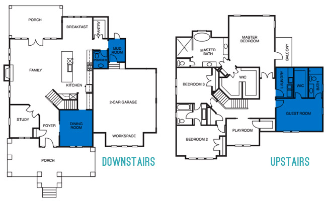
Photo-wise, there are few rooms on each floor that we still haven’t shared/sourced for you. So let’s slide through the dining room, powder room, mudroom, guest room, guest bathroom, and the laundry room.
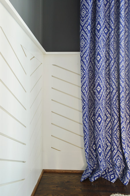
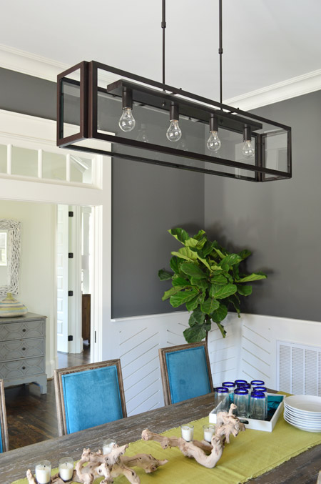
We love dark wall colors in a dining space, so for this room we chose Kendall Charcoal, which we balanced out with white trim and linear wainscoting that we had John the Carpenter build (you can read more on that – and what inspired it – here). Then we added in some color with everything from the chairs and the art to the curtains.
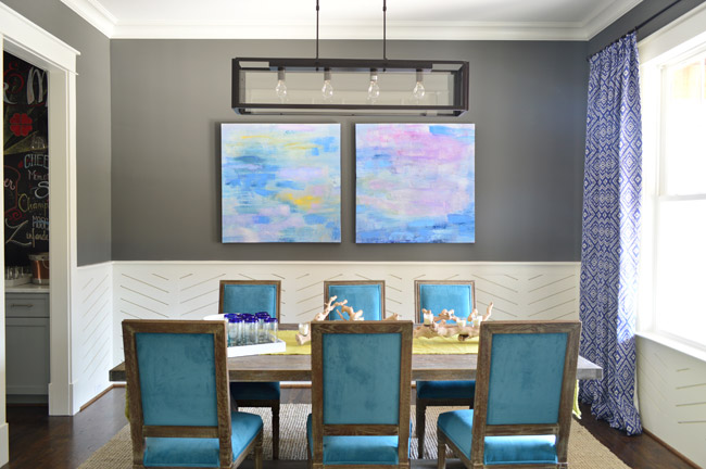
The peacock chairs were donated by World Market, the weathered trestle table was from Green Front Furniture, the art is from HomeGoods, and the rug is from West Elm.
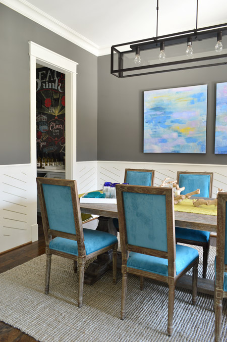
The curtains were made by U-Fab in this fabric.
The light fixture is from Shades of Light, the (slightly wrinkled) table runner and those blue rimmed glasses are from World Market, and the rest of the table decor is from HomeGoods.
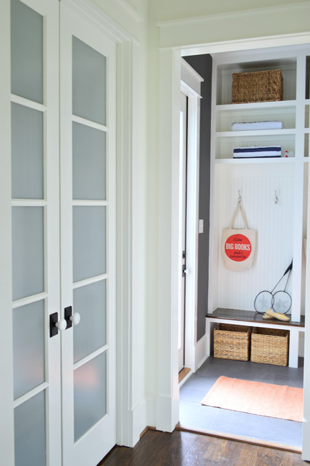
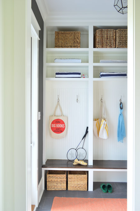
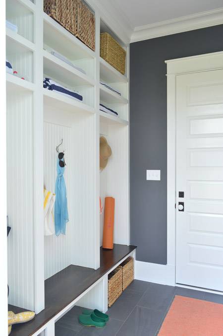
Let’s head over to the mudroom, which is beyond the pantry that we showed you in this post. The mudroom is painted Kendall Charcoal like the dining room, but again all of the white (this time from the built-ins and two big doors) helps to keep the room from feeling too dark.
We gave Carpenter John some direction – like the beadboard backs, the stained wood bench, etc – and then he executed everything. The prism light is from Shades of Light, the tile floor is from Mosaic, the floor runner is from HomeGoods, and the baskets and styling accessories are mostly ours, though the “I Like Big Books And I Cannot Lie” bag is from Fountain Bookstore.
As shown in the video, the glass door on the left leads down to the back patio while the other door (shown below) goes out to the garage. We wish we had a few extra hours when it came to styling this room (we’re not loving the mismatched baskets and the not-very-full shelves) but we were scrambling like crazy in the end. Looking back, it’s kind of a miracle we didn’t just tape up a piece of paper that said “imagine this full of soccer gear, school stuff, and other fun family clutter.”
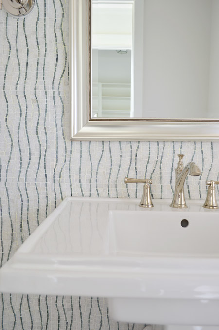
Across from the pantry is the half bathroom, which we thought would be interesting with a big back wall full of accent tile from the floor to the ceiling. The tile we landed on is called Snow White Seaweed Wave from Mosaic and the wave pattern was actually much more subtle in the sample that we saw, but the shipment of tile that we got featured a deeper accent color. Mosaic warned us that shipments could vary beforehand, but we didn’t end up minding the change. We think it’s one of those happy accidents that it turned out a little bolder since most people who see the house in person name this tile wall as one of their favorites.
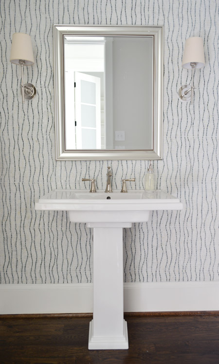
The pedestal is the Kohler Tresham (the same line as the toilets in the house), the faucet is Brizo Baliza in polished nicked, the mirror is from Target, and the sconces are from Shades of Light. Sherry wishes those lampshades were whiter like the trim/sink, but they don’t really bother me.
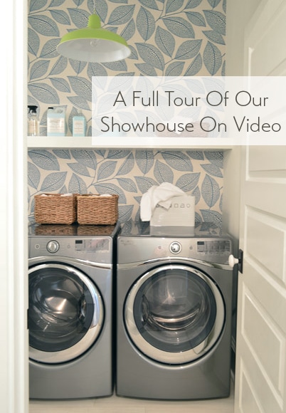
Heading upstairs, the laundry room is one of our favorite spaces thanks to the wallpaper along the back wall. It’s MissPrint’s Pebble Leaf, and it was donated by WallpaperDirect.
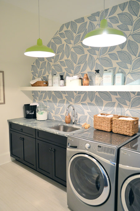
The lights are our farmhouse pendants from Shades of Light in a happy lime color. We thought a random pop of citrus would be fun since the room’s palette is otherwise pretty subdued with black, white, gray, and blue. The non-wallpapered walls are painted Steam by Benjamin Moore, which is just slightly warmer than the Simply White that we used everywhere else (it matched the back of the wallpaper better, so that wall didn’t look yellowed by comparison).
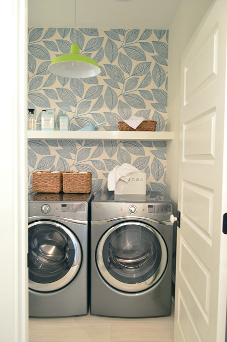
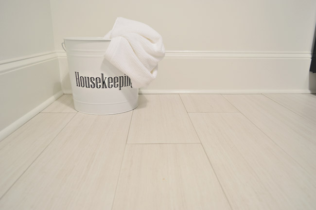
The floors are big 12 x 24″ tiles called Travertino White Field Sunrock found locally at Mosaic. Again, we choose some lighter elements to balance out some of the darker things in the room like the deep wood-toned cabinets and the steel gray appliances.
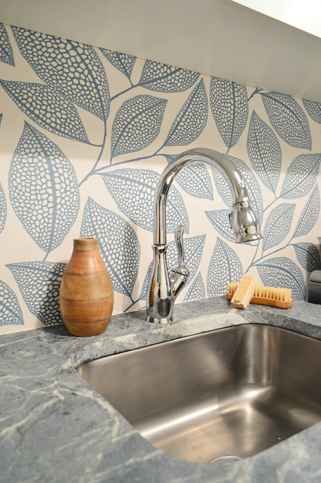
The counters are soapstone and, like the kitchen, we went with a nice deep stainless steel sink and a pull-down faucet (this ones is the Leland faucet from Delta). We’d love a work sink like this in our house (we’re always moving dishes to wash our paint brushes).
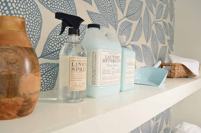
As we mentioned in this post, we made an 11th hour call to have the carpenters build a wall-to-wall floating shelf which does two things: it fills the visual void above the counters/appliances, and it also provides a lot of convenience and function since it can house everything from dust pans and laundry soap to baskets full of washcloths and other cleaning supplies. We tossed various things from HomeGoods and Target up there to demonstrate.
The other room at the top of the stairs is the guest bedroom, which Sherry and I both agree is “the one that got away.” It didn’t come together as well as we originally envisioned and we just didn’t have time to make those last-minute tweaks (finishing around 25 spaces in 2-3 weeks meant that getting to every last adjustment for every space was a pipe dream, so we just scrambled to do as many as we could). We don’t think it’s horrible or anything (a bunch of people who walked through even called out things like the curtains or the art as favorites) but we think with a few changes it would have been more our speed.
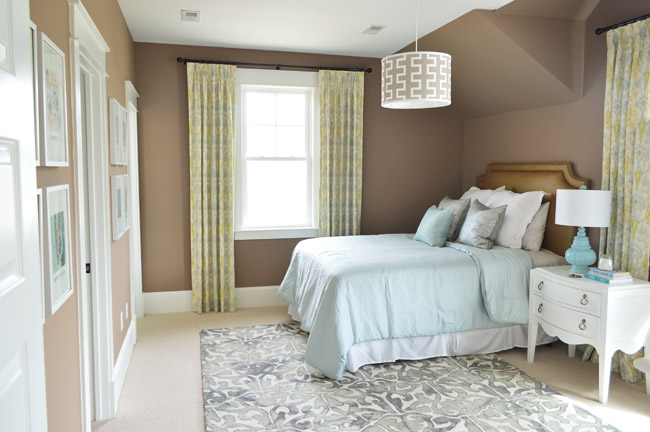
Our original idea was to bring in some warm tones just for some variety (we didn’t want the whole house vibe to feel too cool) but this room accidentally turned into the space where everything was brown. We picked the wall color from one that we liked using during book shoots (Taupe Fedora by Benjamin Moore) but when we finally got to load everything else into the space (a tan bedspread, a wood nightstand, etc, etc) it looked blah. So we switched up as much as we could, like white furnishings, lighter bedding, and colorful art in some crisp white frames – but we really think changing the wall color would have tied everything together if we had the time (maybe a light platinum or subtle gray-blue). Speaking of the art, you may recognize this calendar-turned-art from our old hallway.
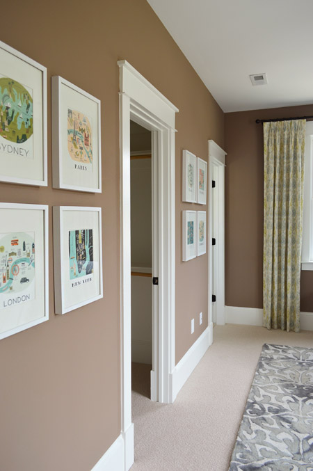
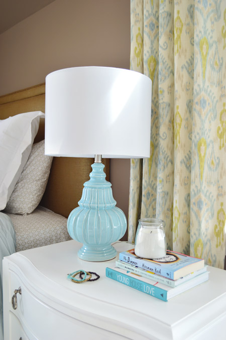
There are still elements in here that we really love – like the curtains from U-Fab, which are a more subdued colorway of the ikat curtains from our old dining room (which currently live in our guest room). The lamp is from HomeGoods and the nightstand is from Green Front Furniture.
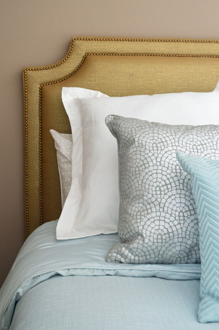
The queen-sized headboard is also from U-Fab and it’s another piece we love (once again that wall color worked against us and it just sort of blended in). It’s upholstered in a metallic fabric with gold nailhead trim (and it’s for sale too, if you’re interested!). The bedding is from Target, and the pillows are from HomeGoods.
On the opposite wall is a dresser from Green Front Furniture with a colorful armchair, which was a last-minute buy from World Market. The other last minute purchase was the patterned rug from HomeGoods, which made a HUGE difference in the room not feeling super bare. If only those walls were a different color, we think it would have come together a lot more.
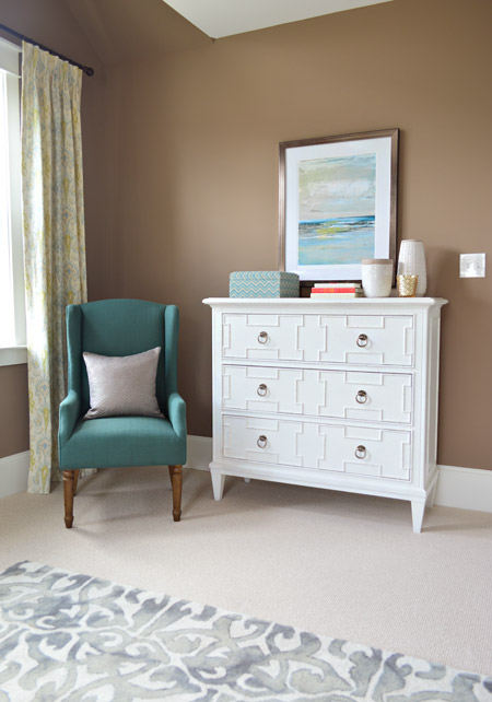
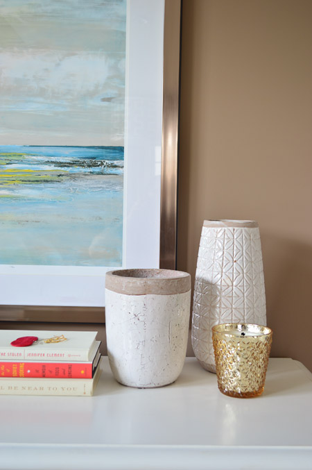
The art and vases were from HomeGoods and the gold candle was from Target.
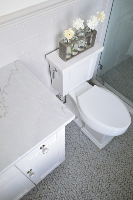
We were going for something simple, classic, and light for the guest bathroom (it’s not nearly as big as the ensuite bath off of the main bedroom) and we thought a little hint of “vintage” would be fun in here, so some of the details subtly nod in that direction.
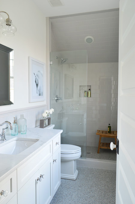
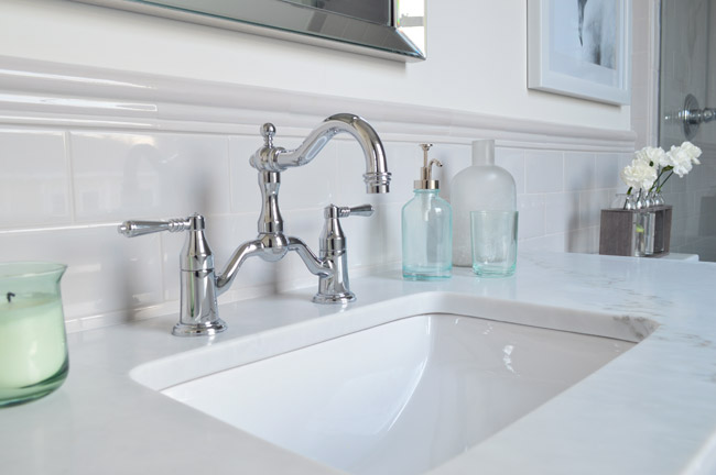
We went with a tile wainscot through the main part of the bathroom, using a family of tile from The Tile Shop called Imperial Ice Gray Gloss. It’s my favorite part of the bathroom – well, that and the bridge faucet from Brizo. The counters are classic carrera marble, the mirror is from Target, the light fixture is from Shades of Light and the bud vases on the toilet are from World Market.
I’ve already proclaimed my love the the Tresham toilet, so instead I’ll draw your attention to the floor – which is the hex version of the penny tile we used in our last kitchen from The Tile Shop. We also added glass knobs to the cabinets (donated by Liberty Hardware) and a seamless glass shower door. It’s not an open shower – it has a door on the right that swings shut to seal the water in – that’s just hiding behind the bathroom door in that first photo.
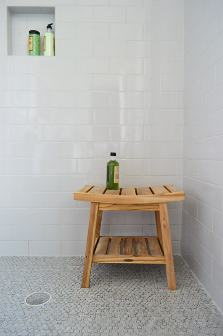
We were originally going to use the same tile in a different color in the shower, but decided that might be too jarring for such a cozy bathroom. So we continued the same stuff that we used on the wainscoted walls into the shower, which we really ended up loving once the clear shower door went in. The wood bench is from HomeGoods.
And so ends the tour of the showhouse. We’re planning to make a House Tour page with photos of each room, a rundown of sources, and the video tour all in one spot, but in the meantime you can peruse each of our previous showhouse posts here (they go all the way back to the beginning if you scroll back through them).
It was a huge honor to be invited to help with such a fun undertaking, and we’re extremely grateful for the opportunity to learn more than we could ever imagine about new construction, to work with amazing people who are like family to us now, and to be able to send our fee to Richmond’s Habitat For Humanity (you can read more about that here and here). And you know Sherry’s angling to house crash the future owners so we can share how the house works for a real family (you know as opposed to an imaginary one) so there’s always that to look forward to.
Psst – Wanna see more showhouse info & photos? Click here for Our Full Showhouse Tour, which includes final pictures of every room, the floor plan, budget info, a video walk-through, and a grid of shoppable showhouse furniture & accessories.

Rachel says
I love that headboard!!! Where is the best place to get bedskirts like that? Also i have cream linen is it better to get a matching bedskirt or just stick with white? thank you!
YoungHouseLove says
I think either cream or white can work as long as you have that color in other places of the room (it looks nice and layered that way). We got the bedskirt at Target.
xo
s
Dani says
That has been fun. We’ve been building a house so it’s been good to watch your progress as well – we get our keys next week so the journey is finished for us too!
YoungHouseLove says
So exciting. Congrats Dani!
xo
s
Lainey says
I love this house too. The blues are so awesome all the way thru. Question, I noticed you left them a copy of your YHL book, did you sign it and/or write a little note to the new owners? I don’t know how these things work – does someone buy the house all done w/ everything in it like that?
YoungHouseLove says
Thanks Lainey! We hid a few nods to YHL (our book, some “home love” art, some YHL letters, etc) throughout the house as little winks to anyone walking through who reads our blog. A lot of items in the house were loaned from vendors or artists so they’ll be returned, other items that were donated will be sent to the Habitat ReStore and some things the builder bought will be used in future models. There are some things the new owners can buy (certain furnishings and art) if they’d like though.
xo
s
Stephanie says
Dear Sweet P’s,
Love and support from Iowa! Those of us who have worked in the building and design industry totally get what this project was like for you in terms of “time management.” Some folks need to remember that the only practically perfect person is Mary Poppins!
xo
Stephanie/Des Moines
Briseidy says
this is a dream home! excelent, amazing job! thanks for sharing!
Margaret says
Did you provide a source for the rug in the guest room? It is very pretty.
YoungHouseLove says
Thanks! That’s from HomeGoods.
xo
s
Kristin Hunt says
I would love to see a video of one of you getting into and out of that breakfast nook. It looks impossible?
Kati says
Sounds like with this last final video “End of the Show” they probably won’t be going back, save for stuff and s’mores… I LURRRRRV that breakfast nook!
Kelsey says
Beautiful house! Do you guys use a special wide angle lens on your camera to take these pictures of the rooms? If so, do you like it, and would you mind letting me know what it is?
YoungHouseLove says
We just used the stock lens on our Nikon D3200.
xo
s
Carol says
We took a side trip to Magnolia Green on our way from N.J. to Smith Mountain Lake, just to check out the Homearama. Had a great time and your house was even more impressive in person! Saw you all as we were heading into the tent to exit and would have loved to “talk shop”, but you were already talking with someone else. Our first home was a big time fixer upper. After that project, we decided to build a home with our 12 &10 year olds assisting. 13 years later we decided to do it again and your blog was referenced several times along the way. Thanks for all the tips & tricks! By the way, Teddy was adorable – I peeked at him as we passed by!
YoungHouseLove says
Aw thanks Carol! Sorry we didn’t get to chat.
xo
s
Kathy says
Hey guys! I had a question about the guest bath floor- the link you posted to the tile shows it in the color Moss but it looked much blue-er/gray-er in person. What color was that? It’s EXACTLY what I want for my bathroom floor. :) Thanks so much! We visited the Homearama and everyone in my group agreed that your house was our favorite. Wish I could just move right in!
YoungHouseLove says
Thanks Kathy! Although the tile is called moss it’s very gray in person so I’d say how it photographed in this post is true to life.
xo
s
Jennifer Laura says
I can’t believe you never showed pictures of that console moment of the other side of the living room with the double lamps, that has to be the best part of the house! Should have been the entry IMO :) Great job you guys, pictures clearly don’t do it justice as it looked so much more amazing in the video.
Michelle says
You guys did such a great job on this house. It is beautiful! It is frustrating to read people accusing you of “dropping the ball.” The last-minute crunch/ adrenaline rush is a part of every big project, in my life anyway.
Sri says
Congratulations on an incredible job. I have thoroughly enjoyed following along this project, and seeing it come together. The plan for the house is really thoughtfully designed, with modern needs accounted for – but it’s the way you’ve decorated it that turned a great big house into a home. I have taken away lots of ideas that I will tuck away for my next home. Thanks for being willing to share the journey with us!
Laurie gilmer says
I know you noted where you got the white dresser in the guest room, but do you know the brand of it? Thanks!
YoungHouseLove says
So sorry, we don’t. Anyone recognize it?
xo
s
Cosima says
You guys, i LOVE this house! If I didn’t live so far away (Germany) I would love to see it. I think what you did is simply amazing. I still live at home with my parents but when I’m going to move out (Let’s hope soon) I will definitely get all my inspiration from your blog. I love reading it so much and I feel like over the past few years I really got to know you. Thank you for making my day a little bit better every day! Lots of love from Cologne, Germany
Emily @ Life on Food says
I am loving the laundry room more and more. The wallpaper and floating shelf! It all came together so well. Did I miss the floors in the mudroom? Where were they from? I was thinking of something similar for our front entrance and mudroom. I am torn about the darker color showing so much of the “mud” coming in even though I love the look.
YoungHouseLove says
Those floors are from Mosaic here in Richmond. Here’s that link for you.
xo
s
Nicky says
I saw how you snuck the Young House Love book onto the dresser in the guest room – very slick!
Judith says
Hi Sherry and John,
Really, you guys did an amazing job. I am in total awe! :)
I am trying hard to decide which spaces I like best, because everything is just so so pretty! I must mention the patio area, the kitchen and butlers pantry, the dining room, the master; heck, I even love the guest room! I too would have gone with another wall colour (stepped into the brown trap myself several times, so I swore I’ll never do that again), but the room itself is so great and warm and cute – I am willing to be the future owners guest any time! :)
Seriously guys, I hope you are darn proud of yourselves, because you really did a fantastic job!
Picture me doing an admiring bow in front of you! :)
Kind regards from Germany,
Judith
YoungHouseLove says
Thanks so much Judith!
xo
s
Allison says
This is one of the closest house layouts to what I would build myself. I’ve been looking for years!! Sure, there would be a few tweaks, but I love all the storage space and the master! I will definitely refer to this when we build our house! Maybe make it a little more older home feeling (like a farmhouse with more reclaimed stuff and antiques), but I love it! Great job!
Allison says
And love all the thoughtful built-ins and nooks!
Joseph@littlehouseblue says
This bathroom had my favorite tile in the whole show (My wife’s favorite was the tile in the shared bath with the green cabinets). I love hex penny tile already and something about the way the grey was sort of irregular, sort of darkened around the edges without exactly having a border, made them really pop without looking too busy. Great choice.
Megan @ Our Pinteresting Family says
You both did a phenomenal job! This house is stunning and it really looks like any family could just move right in.
Brittany M says
Beautiful choices! I especially love all the tile work…. It’s stunning!
Jennifer says
The house looks gorgeous… Love the gray cabinets (color??), and I really love the white door knobs with the dark plate!! Where can I find those?
YoungHouseLove says
Those doorknobs were through a local vendor called Interiors 2k and the kitchen cabinet color is custom (by the local fabricator) but it’s close to Ben Moore’s Timber Wolf Gray.
xo
s
Caitlin says
There is one area of the home I don’t think I have seen you guys post photographs of yet- the upstairs hallway. I remember when my husband and I were walking through the house, I commented to him about how much I loved the light fixtures in the hallway. Would you mind sharing the source for those light fixtures?
Thank you!!!
YoungHouseLove says
Thanks! Those are from Shades of Light.
xo
s
Jillian L says
Hey guys, this is random, but I spotted one of your Target hexagon knobs on this Houzz DIY- fun!
http://www.houzz.com/ideabooks/27138006?utm_source=Houzz&utm_campaign=u509&utm_medium=email&utm_content=gallery19
YoungHouseLove says
Love that! Thanks for sharing the link.
xo
s
Cate M says
I absolutely love the show house, you all did an incredible job. Speaking of incredible, I’m in love with the gold headboard!! How can I buy it?
YoungHouseLove says
Thanks Cate! We’ll email you the info.
xo
s
Rosie S says
What a great flow the house has! And pretty details that I could ‘see’ better in the video. Congrats on a job VERY, VERY well done! :)
Jessica M says
Oh my goodness, this house is BEAUTIFUL. I liked it in pictures but the video really brought it to life. I watched it with my niece and she was mesmerized. She kept saying, “I want to live there!” and when she saw the girls room, she said, “That’s where I’ll sleep!” She also said, “THERE’S SO MANY BATHROOMS!” Ha! Kudos to you guys on a WONDERFUL job. Someone is going to be very lucky to get to call that place home!
YoungHouseLove says
That’s so sweet! Love her reaction!
xo
s
Ashley says
Sher-dog… when I saw the title of this post, I thought for SURE you’d make a reference to the Boyz II Men song “End of the Road,” and maybe we’d be treated to a performance in the video tour. [http://www.youtube.com/watch?v=ptr0YwJi5bM] “Ohhhh, it’s the enddddddd offff the showwwwwwwwwwww… still I can’tttttttttt lettttttttt gooooooooo… it’s unnatural… you belong to me… I belong to YOUUUUUUUUU!!!!!!!!” hahaha
YoungHouseLove says
Perfection. I love you.
xo
s
Jill P says
Hi Guys:
Great Job! I live in Michigan and couldn’t / didn’t make it to the show but enjoyed all the pics and updates.
Anyway, I love Love LOVE the wavy tile in the powder room. I followed the link for the source, but still just don’t “get” what they are. I’ve installed tons of tiles, but its hard to tell from the 1 pic. Are they horizontal 4×6’s with a common wavy pattern? I’ve never seen anything like that and am looking to lift your idea for a similar bathroom.
Again, great job all around!
YoungHouseLove says
They’re big squares of tile (around 12″ x 12″) that you install as they’re back on mesh (like how you install sheets of penny tile). They’re sort of like sheets of small mosaic tiles.
xo
s
Theresa says
Holy cow I drooled and drooled for this whole tour (it was way better than the professional one; thanks Jon!)
Seriously though; amazing. I wish I could ever afford a house like this. I really disliked the sink in the boy/girl shared bathroom. That mirror would be so dirty all of the time since it went all the way to the vanity and the nobs actually came out of the mirror. Would be awesome for adults but I can imagine 2 kids just trashing it every single day..
Meg B says
I am sorry if this question has been asked but I am at work and started to sift through the 300+ comments to find the answer but the task is a bit daunting for the time I have. Anyway, I love the dining table from Green Front Furniture but when I look at their website it appears they source from other vendors. I am wondering if you know the original manufacturer of the table? Chances are it is still far beyond my budget but a girl can dream can’t she?
I just love all of your projects and can’t wait to see what is in store for you guys next.
~Meg
YoungHouseLove says
You’re so sweet Meg! I’m afraid we don’t know that info, but if anyone recognizes it I hope they post a link or info for you.
xo
s
Linda says
This is the most incredibly beautiful house. If you weren’t confident in your talents with decorating before, this should seal the deal! I can see the growth in your style and I just love it! I expect this will really establish you both as designers (WAY MORE than bloggers) as you set the tone for your own style. Look forward to following your careers! Wish you could design my house which is such a mishmash of things I like, just can’t seem to pull them together. Maybe if I study your design house more, I can figure it out!
Hemma says
Re the listing price of the house and final sale price: this is a public record and not a secret. Anybody can find any house’s sale price if you have the address. One of the resources you can use is Zillow.
Btw fab job designing this house!!
Marinela says
Awesome job guys and congrats on the awards!
I am painting my house and found a lot of inspiration on your blog, thank you some much! I like your choice of Simply White walls, ceiling and moldings in the living/kitchen/breakfast area with lots of accent colors and want to do the same in my living/kitchen/breakfast area, which has less natural light. I also noticed that you used Simply White on ceiling with Steam on the walls (because of the wallpaper) in the laundry room and I am wondering if this paint colors combo is also an option for me: like Simply White moldings and Steam on walls and ceiling, or Simply White ceiling and moldings and Steam on walls. I think this might help the moldings pop a little bit more, but I’m not sure of the overall effect. I am also installing light colored prefinished oak floors and that probably will affect the perception too. What do you guys think? Thank you in advance for your suggestion!
YoungHouseLove says
I think it could be great! Might be worth grabbing a test pot of each one just to make sure they read nicely in your light (basically you don’t want one to make the other one look dingy). Good luck!
xo
s
Megan Z says
I love the house! I have dreams about the tile in all the bathrooms. Where is the nightstand in the guest room from and the dresser on the landing?
Thanks!!
YoungHouseLove says
Those are both from Green Front here in VA.
xo
s
Lindsey says
It’s an amazing house! Simply beautiful. You guys worked really hard on it and it shows! I really enjoyed reading all your updates through the entire process. Thank you for sharing with us!!! I’m just sorry I could not make it up to see the show.
Have a good weekend.
Katie says
I LOVED those dining room curtains! And the tile wall in that bathroom too! My mom and I were trying to figure out if they were big tiles since no way someone would want to create that by hand. I took her to Richmond (we’re from Annapolis) for her birthday and we hit Homearama and The Boathouse (at your suggestion) for her birthday dinner. We had a great time and your house was my favorite!
YoungHouseLove says
Aw thanks Katie! That tile came in sheets that were around 12″ x 12″ like penny tile (backed on that mesh stuff for easier laying). So glad you got to enjoy The Boathouse too!
xo
s
Tabitha says
What are the dimensions (i.e. footprint) of the shower in the guest bath? The house looks fabulous! It is a job well done.
YoungHouseLove says
Someone else asked that and we wish we knew! It’s significantly smaller than the one in the master. Maybe around 4.5 or 5′ wide and 3′ deep. Just a guess!
xo
s
Karin says
Can you still do drive bys of the show houses or is it a gated community? Wonder if some are sold yet?
YoungHouseLove says
I don’t believe any are sold yet but many have strong interest and some negotiating going on. You can definitely drive around the cul de sac to see them all. No gates.
xo
s
Kate says
Gorgeous!!
Dee Ann says
Beautifully done!! Where is the rug from in the guest bedroom that I don’t think got away at all?! Is it done in shades of gray?
Thanks much!
YoungHouseLove says
Thanks Dee Ann! It’s sort of a mix of oatmeal tones and grays (so it works with the carpet which is somewhat tan-ish) and its from HomeGoods.
xo
s
Maureen says
Beautiful – beautiful – beautiful!
Love the white and black doorknobs. Where can I get them?
YoungHouseLove says
They’re from Interiors 2k (a local vendor in Richmond that the builder uses).
xo
s
Kelsey Crowe says
The book “The Dinner” is AWESOMEEEEEE.
Mia says
Oh this video was so much fun, I watched it 3 times! You know even with all the great pics it was hard to visualize the layout of the house (at least for me haha) and now I can truly see how it all came together. Well done guys, you should be really proud:)
Daphne says
Where is the soap pump in the guest bathroom from? I loooove the vintage feel and need some for my home!! Y’all did a phenomenal job on the whole house! I agree that the guest room should’ve been a grey or blue grey color. It just doesn’t flow with the linens or the rest of the house.
YoungHouseLove says
Thanks! That was from Target.
xo
s
Sonia says
Hi,
Looks great! We are embarking on a Master renovation and we love the look of the hex penny tile. The link you provided goes to a sea moss color hex tile. It looks more gray in the pictures. Can you confirm the color hex tile you used and the grout? Thanks so much!
YoungHouseLove says
Yes it’s called moss but it’s a lot grayer in person. Same thing for the Penny tile of the same name (we used that in our last kitchen and there was no green in it at all).
xo
s
Malorie says
I love this house! As a French girl, I have to say that your homes are quite different over there in the USA (first of all, you can never find a furnished house here in Europe… a showhouse would also be empty I guess), but this home is soo sweet and it looks so confortable… I would be ready to move in and wouldn’t change a single thing :)
(well, maybe switch the Burger painting for a picture of my cat… but he doesn’t have to know this!)
this is really gorgeous, you did such a great job!
KL says
Nice, but do you ever consider adding a few live plants to the areas? It looks cold with all knick knacks and furniture. Live plants are good for the air,bring a pop color and warms up the space
YoungHouseLove says
Yes we love live plants! We had three big fiddle leaf figs in the office, dining room, and the living room along with smaller house plants in the master, master bath, and the master closet. Wish we had more though!
xo
s
Lisa E says
Thanx so much for sharing this video. I have enjoyed the journey through photos, but this really brings it to life for those of us who couldn’t make it to see it in person. Beautifully done!