Here we are, folks. After over a year of planning, second guessing ourselves, more planning, sweating, and filling our car with vases and egg chairs, we’ve reached the end of the Homearama Showhouse tour.
So in celebration of completing this whole-house marathon of sorts, we’re kicking off this post with a whole-house video tour. Nothing too high tech. Just me stumbling through the house:
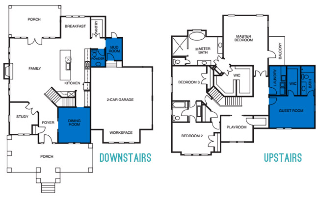
Photo-wise, there are few rooms on each floor that we still haven’t shared/sourced for you. So let’s slide through the dining room, powder room, mudroom, guest room, guest bathroom, and the laundry room.
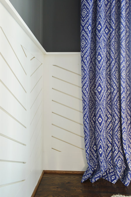
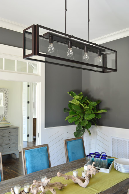
We love dark wall colors in a dining space, so for this room we chose Kendall Charcoal, which we balanced out with white trim and linear wainscoting that we had John the Carpenter build (you can read more on that – and what inspired it – here). Then we added in some color with everything from the chairs and the art to the curtains.
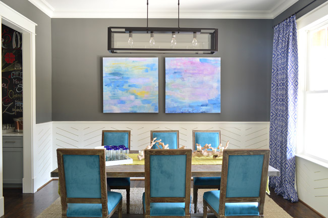
The peacock chairs were donated by World Market, the weathered trestle table was from Green Front Furniture, the art is from HomeGoods, and the rug is from West Elm.
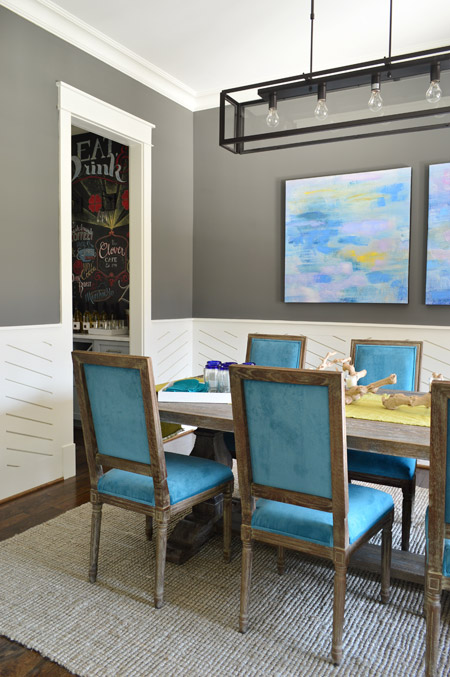
The curtains were made by U-Fab in this fabric.
The light fixture is from Shades of Light, the (slightly wrinkled) table runner and those blue rimmed glasses are from World Market, and the rest of the table decor is from HomeGoods.
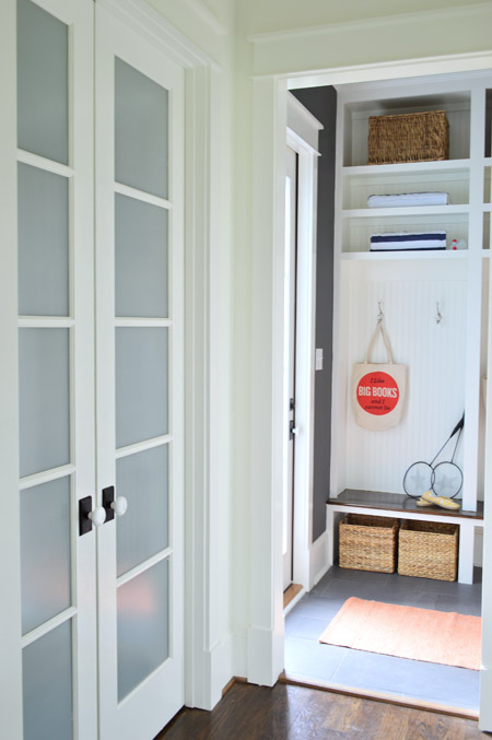
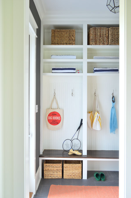
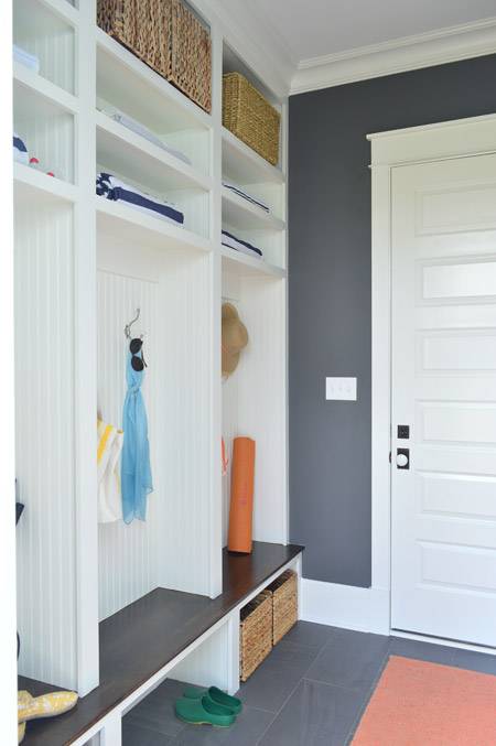
Let’s head over to the mudroom, which is beyond the pantry that we showed you in this post. The mudroom is painted Kendall Charcoal like the dining room, but again all of the white (this time from the built-ins and two big doors) helps to keep the room from feeling too dark.
We gave Carpenter John some direction – like the beadboard backs, the stained wood bench, etc – and then he executed everything. The prism light is from Shades of Light, the tile floor is from Mosaic, the floor runner is from HomeGoods, and the baskets and styling accessories are mostly ours, though the “I Like Big Books And I Cannot Lie” bag is from Fountain Bookstore.
As shown in the video, the glass door on the left leads down to the back patio while the other door (shown below) goes out to the garage. We wish we had a few extra hours when it came to styling this room (we’re not loving the mismatched baskets and the not-very-full shelves) but we were scrambling like crazy in the end. Looking back, it’s kind of a miracle we didn’t just tape up a piece of paper that said “imagine this full of soccer gear, school stuff, and other fun family clutter.”
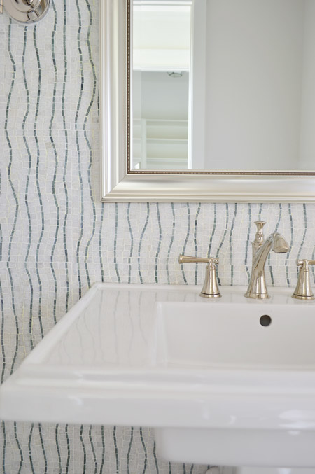
Across from the pantry is the half bathroom, which we thought would be interesting with a big back wall full of accent tile from the floor to the ceiling. The tile we landed on is called Snow White Seaweed Wave from Mosaic and the wave pattern was actually much more subtle in the sample that we saw, but the shipment of tile that we got featured a deeper accent color. Mosaic warned us that shipments could vary beforehand, but we didn’t end up minding the change. We think it’s one of those happy accidents that it turned out a little bolder since most people who see the house in person name this tile wall as one of their favorites.
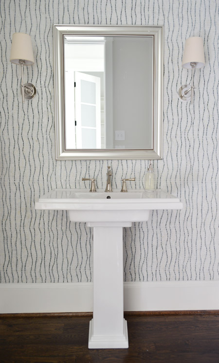
The pedestal is the Kohler Tresham (the same line as the toilets in the house), the faucet is Brizo Baliza in polished nicked, the mirror is from Target, and the sconces are from Shades of Light. Sherry wishes those lampshades were whiter like the trim/sink, but they don’t really bother me.
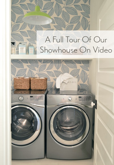
Heading upstairs, the laundry room is one of our favorite spaces thanks to the wallpaper along the back wall. It’s MissPrint’s Pebble Leaf, and it was donated by WallpaperDirect.
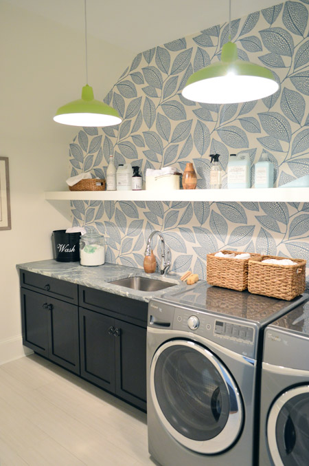
The lights are our farmhouse pendants from Shades of Light in a happy lime color. We thought a random pop of citrus would be fun since the room’s palette is otherwise pretty subdued with black, white, gray, and blue. The non-wallpapered walls are painted Steam by Benjamin Moore, which is just slightly warmer than the Simply White that we used everywhere else (it matched the back of the wallpaper better, so that wall didn’t look yellowed by comparison).
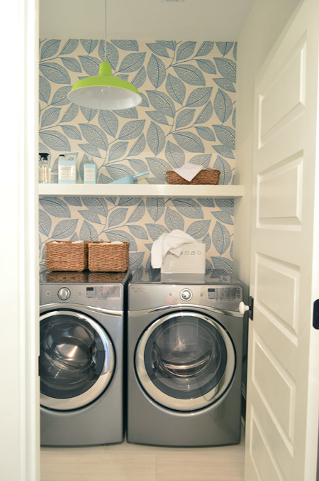
The floors are big 12 x 24″ tiles called Travertino White Field Sunrock found locally at Mosaic. Again, we choose some lighter elements to balance out some of the darker things in the room like the deep wood-toned cabinets and the steel gray appliances.
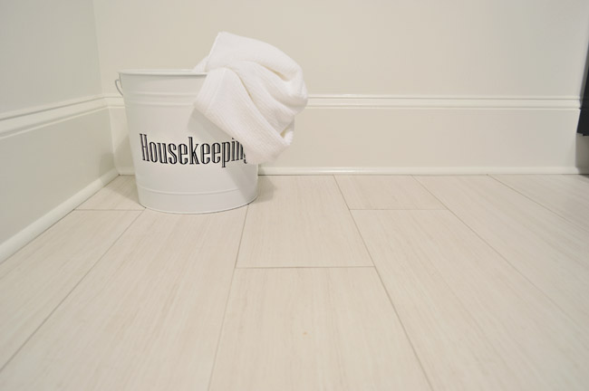
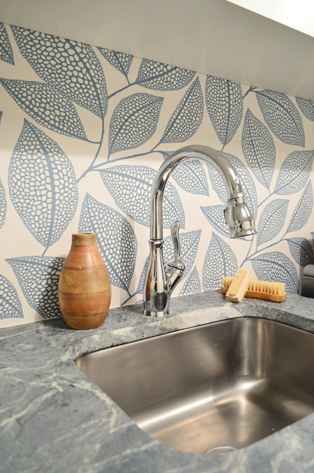
The counters are soapstone and, like the kitchen, we went with a nice deep stainless steel sink and a pull-down faucet (this ones is the Leland faucet from Delta). We’d love a work sink like this in our house (we’re always moving dishes to wash our paint brushes).
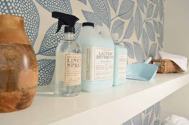
As we mentioned in this post, we made an 11th hour call to have the carpenters build a wall-to-wall floating shelf which does two things: it fills the visual void above the counters/appliances, and it also provides a lot of convenience and function since it can house everything from dust pans and laundry soap to baskets full of washcloths and other cleaning supplies. We tossed various things from HomeGoods and Target up there to demonstrate.
The other room at the top of the stairs is the guest bedroom, which Sherry and I both agree is “the one that got away.” It didn’t come together as well as we originally envisioned and we just didn’t have time to make those last-minute tweaks (finishing around 25 spaces in 2-3 weeks meant that getting to every last adjustment for every space was a pipe dream, so we just scrambled to do as many as we could). We don’t think it’s horrible or anything (a bunch of people who walked through even called out things like the curtains or the art as favorites) but we think with a few changes it would have been more our speed.
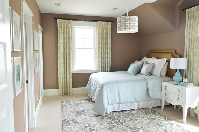
Our original idea was to bring in some warm tones just for some variety (we didn’t want the whole house vibe to feel too cool) but this room accidentally turned into the space where everything was brown. We picked the wall color from one that we liked using during book shoots (Taupe Fedora by Benjamin Moore) but when we finally got to load everything else into the space (a tan bedspread, a wood nightstand, etc, etc) it looked blah. So we switched up as much as we could, like white furnishings, lighter bedding, and colorful art in some crisp white frames – but we really think changing the wall color would have tied everything together if we had the time (maybe a light platinum or subtle gray-blue). Speaking of the art, you may recognize this calendar-turned-art from our old hallway.
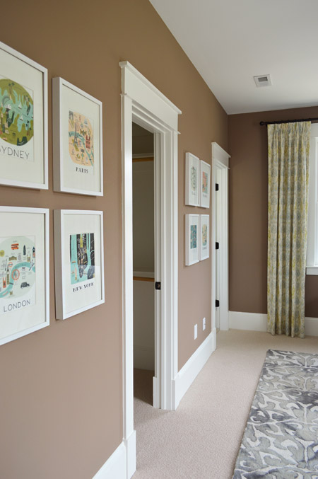
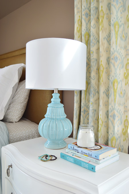
There are still elements in here that we really love – like the curtains from U-Fab, which are a more subdued colorway of the ikat curtains from our old dining room (which currently live in our guest room). The lamp is from HomeGoods and the nightstand is from Green Front Furniture.
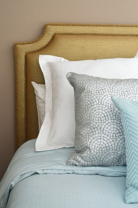
The queen-sized headboard is also from U-Fab and it’s another piece we love (once again that wall color worked against us and it just sort of blended in). It’s upholstered in a metallic fabric with gold nailhead trim (and it’s for sale too, if you’re interested!). The bedding is from Target, and the pillows are from HomeGoods.
On the opposite wall is a dresser from Green Front Furniture with a colorful armchair, which was a last-minute buy from World Market. The other last minute purchase was the patterned rug from HomeGoods, which made a HUGE difference in the room not feeling super bare. If only those walls were a different color, we think it would have come together a lot more.
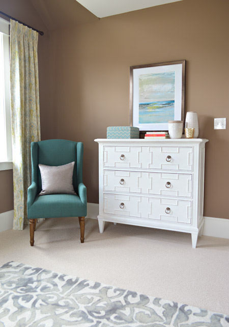
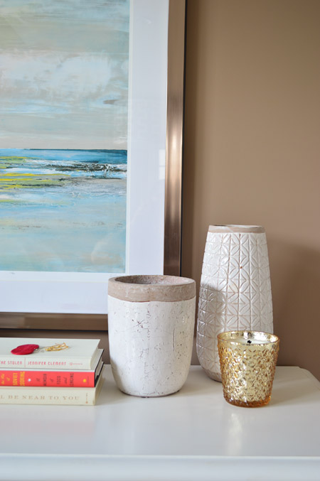
The art and vases were from HomeGoods and the gold candle was from Target.
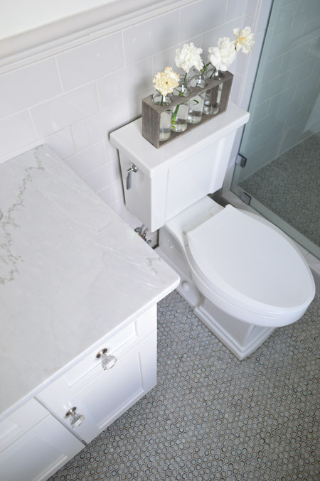
We were going for something simple, classic, and light for the guest bathroom (it’s not nearly as big as the ensuite bath off of the main bedroom) and we thought a little hint of “vintage” would be fun in here, so some of the details subtly nod in that direction.
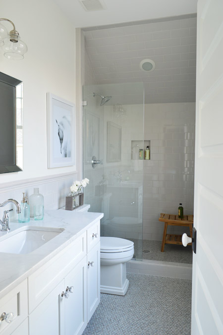
We went with a tile wainscot through the main part of the bathroom, using a family of tile from The Tile Shop called Imperial Ice Gray Gloss. It’s my favorite part of the bathroom – well, that and the bridge faucet from Brizo. The counters are classic carrera marble, the mirror is from Target, the light fixture is from Shades of Light and the bud vases on the toilet are from World Market.
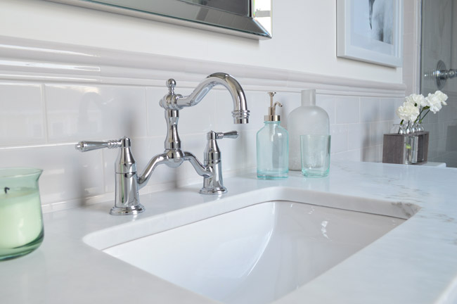
I’ve already proclaimed my love the the Tresham toilet, so instead I’ll draw your attention to the floor – which is the hex version of the penny tile we used in our last kitchen from The Tile Shop. We also added glass knobs to the cabinets (donated by Liberty Hardware) and a seamless glass shower door. It’s not an open shower – it has a door on the right that swings shut to seal the water in – that’s just hiding behind the bathroom door in that first photo.
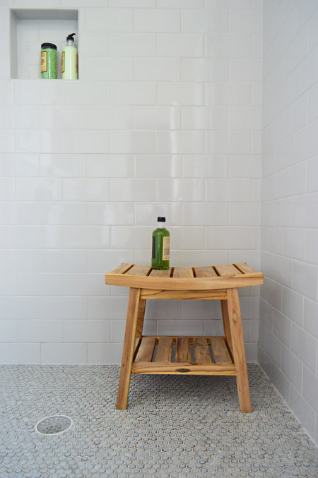
We were originally going to use the same tile in a different color in the shower, but decided that might be too jarring for such a cozy bathroom. So we continued the same stuff that we used on the wainscoted walls into the shower, which we really ended up loving once the clear shower door went in. The wood bench is from HomeGoods.
And so ends the tour of the showhouse. We’re planning to make a House Tour page with photos of each room, a rundown of sources, and the video tour all in one spot, but in the meantime you can peruse each of our previous showhouse posts here (they go all the way back to the beginning if you scroll back through them).
It was a huge honor to be invited to help with such a fun undertaking, and we’re extremely grateful for the opportunity to learn more than we could ever imagine about new construction, to work with amazing people who are like family to us now, and to be able to send our fee to Richmond’s Habitat For Humanity (you can read more about that here and here). And you know Sherry’s angling to house crash the future owners so we can share how the house works for a real family (you know as opposed to an imaginary one) so there’s always that to look forward to.
Psst – Wanna see more showhouse info & photos? Click here for Our Full Showhouse Tour, which includes final pictures of every room, the floor plan, budget info, a video walk-through, and a grid of shoppable showhouse furniture & accessories.

Aimee says
The heck with the house – I just want to cut out all those great big closets and the pantry, and bring them home! Soooo. much. storage. space. Would cheerfully kill for that.
That navy is the best color in the house. Love dark, bold colors on walls, so I’m not liking the neutral trend. I prefer neutral furnishings and pulling accessories from the wall color. If I see one. more. makeover. with grey and white stripes or chevrons painted on an accent wall, I think I’ll scream. Shades of grey seems to be everyone’s go-to colors these days and almost every blogger’s house looks the same. So happy when I come across a room where they weren’t afraid to do something different!
Tonya says
Love, love, love! Love all of the artwork, too!
Kristen says
Hi! You probably have a billion offers for that gold headboard by now and it is most likely sold… But I have to try.
I would love to know your price and if it can be shipped western PA. Love it! Thanks
YoungHouseLove says
We’ll email you the info Kristen!
xo
s
rashi says
Hey what a lovely job u guys! Would love to have a move in ready house like that.
Also, not sure if use mentioned this- Whats the size of the Dining room and where is that exact dining table and chairs from.
We have a 11 by 12 room and hard to find a table for it.
Thnaking you…
YoungHouseLove says
Thanks Rashi! That room is 12′ x 13.4′ and the dining table is from Green Front and the chairs are from World Market.
xo
s
Ellen says
Where is the mustache tote bag from? I love it!
YoungHouseLove says
That’s from Target.
xo
s
Claire @ Claire K Creations says
Wow you guys! You’ve done such an amazing job! It’s my dream house down to the pot sitting in the stove!
Drew says
I thought wallpaper was a no-no in this day and age, but this looks great. Congratulations. This is wonderful and inspiring.
Brandi Farrah says
I am absolutely in love with this house….everything ground up!! I would literally purchase this home site unseen, if I lived in your area. The architect on this house was simply genius, if I say so myself. John and Sherry you both are beyond extraordinary and so talented. Every design detail was so methodically planned out and it shows! I hope you both are very proud of yourselves because your family, friends and fans are extremely proud of your accomplishments! xoxo
YoungHouseLove says
Thanks so much!
xo
s
Linda says
I enjoyed seeing your beautiful Homearama house. Where did you get the metal letters that stood on the desk in the study and on the dresser in a bedroom? They may have been made of tin.
YoungHouseLove says
They’re from a cool local shop in Richmond called Modern Artifacts. I think if you call they can ship orders :)
xo
s
Nicola says
As a long time lurker, I thought I should make a comment eventually! What a gorgeous house and how clever you both are – the person who ends up living here will be very lucky indeed!
Kristi says
Holy crap, J and S!!!! Each room and detail is stunning! You did an amazing job!
Emily, Our house now a home says
this is a gorgeous home. I you guys should be very proud of it! I love the board and batten in the fining room that is at an angle. So creative and different. The wall paper was great in the room too. In love with so much, I may or may not be stealing a few ideas…. probably ;)
Callum Johnson says
I was really surprised by the look of the bordered light bulbs. Last week I visited my cousin and his wife had arranged their light bulbs exactly the same way! I didn’t expect to see it anywhere else. It’s cool though. Brilliant idea actually.
Staci Langford says
What is your source for pillows you use in the home show house? (Specifically the navy pillows on the porch?)
YoungHouseLove says
The navy and red and blue ones on the porch were from Lowe’s and the navy and white striped one is from Green Front (the bolster shaped ones are Target).
xo
s
Aaron says
Possible source for the blue soap dispenser in the guest bath?
Thank you!
YoungHouseLove says
That’s from Target.
xo
s
eileen marie says
Really superb job on the show house guys!! And I get what you’re saying about the guest room (the wall color does make it a tad hard for that gorgeous custom headboard to steal the show), but it is nice to see some warm colors for a change too. Truly the room is lovely. As an aside, WHEN on Earth did John develop such a southern twang lol?
Kate says
Any idea where the furniture will be donated to? Habitat? I’m local….
YoungHouseLove says
The Habitat ReStore here in Richmond will be getting it (it’s off of Chamberlayne) but we’re not sure when or if it’ll be delivered over a few shipments. Will keep you posted!
xo
s
Sophia says
Hi there, I LoVE this house. Can you come decorate mine now;)?? I was wondering where you purchased the “home” and “love” art in the upstairs hallway. I think I have the perfect place for it in my house:) I’m sorry if you’ve already posted the answer, I couldn’t find it in the comments. thanks so much
Sophia
YoungHouseLove says
Thanks Sophia! That’s from Ikea.
xo
s
Tanya says
Fun fact: I kept reading Carpenter John as John Carpenter and that just made your posts unintentionally creepy in a hilarious way. :P Love the show house. I got so much inspiration from it for my own. :)
Allison says
Wow, I’m impressed by the lovely blue wallpaper in the laundry room. I would not have imagined such a busy pattern would work well, but I love it !!! :)
Julie says
I am wondering how high the dining room chandelier is from the table and how high the ceilings are. It looks pretty high. I found a beautifal chandy on craigslist but I’m afraid it will hang too high in my 9′ ceiling dining room. (it has 2 metal rods and 2 wires that support the light so not easily adjustable like a chain.) Seeing how high this one is hung makes me think maybe I can make it work…
YoungHouseLove says
The ceilings downstairs at the showhouse are 10′ (they’re 9′ upstairs) so that dining room chandelier was lowered as much as it would go and was still a good distance from the table. We’re not out there to measure it for you, but our best guess might be around 4-5 feet? If you use art to bridge the gap it might help!
xo
s
Launa says
I’m sure you’ve answered this but I can’t find it…can you share where that black and white horse print is from in the bathroom? I love it! And those chairs in the dining room, love it!
YoungHouseLove says
Thanks Laura! It’s from HomeGoods.
xo
s
jeanette says
hey guys, I just want you to know that I follow your blog like no other. and we are currently building a house that will have many inspirations from this show house, including a hale navy island! if you’re ever in belleville ontario you should come check it out!
YoungHouseLove says
Thanks so much Jeanette! We’d love to!
xo
s
Susan Winters says
Very, very nice work. You two have evolved a calm and loving style over the years that this house showcases beautifully. Well done. ????
Susan Winters says
Don’t know where the question marks came from. Ignore them. ????????????
YoungHouseLove says
Haha! Thanks Susan!
xo
s
Marta Walter says
…. this is INSANELY beautiful. I don’t know of its just me, but those vintage stickers on the bottles in the bathrooms are a great touch! Very classy.
Jasmine says
I love that guest bathroom, especially the shower area! I noticed there’s no door that swings open. Do you know how the contractors determined where the shower head would go and how big the glass wall needed to be so as to not get water outside the shower? This is the first time I’ve seen this look with a smaller shower area.
YoungHouseLove says
There’s actually a door there, it’s just open in the photograph – but if you watch the video you can see it closed :)
xo
s
Meredith says
Hey John & Sherry! Question about the flooring in the guest room…it looks like you layered a rug on top of carpet. I’ve been considering doing this in my apartment, because I have the generic cheap beige carpet that just is blah and would love to add some color/pattern with a rug. Do you have any recommendations for a type of rug that works well on top of carpet, thick/thin, rug pad underneath so it doesn’t bunch? Have you ever done this in your home? Trying to remember all the rooms I’ve seen in your own home but can’t think of one off the top of my head…any advice would be super appreciated! You guys rock btw, LOVE how the showhouse turned out :)
YoungHouseLove says
We have always had hardwood flooring in our homes (except for tile bathrooms) so we never did rug layers at home but we totally would have if we had carpeting! I think whatever looks good is my only “rule” – haha! If it has a tone of the carpet in it (like this guest room does) that can tie it into the room easily, but even if it doesn’t sometimes a flat weave is nice too.
xo
s
Kristin says
What size are the subway tiles in the guest bath? I just ordered some 4″x8″ for a similar size bathroom and am thinking the 3″x6″ might have been better. The house is so beautiful. Thanks!
YoungHouseLove says
Thanks Kristin! They’re 3 x 6″ standard ones. Good luck with your project!
xo
s
Amanda says
This is a few weeks late – but you guys are amazing!!! I love this house, your blog and everything you do ;)
I do have one question. Is it possible to put all of your home show posts in one spot (like under projects)? I love going over them again and again and also using them as a reference point for decorating etc.
Your loving reader,
Amanda
YoungHouseLove says
Done! Here ya go, Amanda: https://www.younghouselove.com/photo-gallery-2/our-showhouse/
xo,
s
Alice says
Hi YHL, you sourced the silver half bath mirror from Target but I am having difficulty pinpointing the exact one. Can you link to it? Thanks!
YoungHouseLove says
So sorry, we can’t seem to find it online, but it was in the mirror aisle in stores a few months ago. Hope it helps!
xo
s
Dorothy Stanford says
Looks perfect! It’s awesome, pretty sad we won’t see any more :(
Cheers and keep on being great!