The guest bath = so much cuter. That sweet little space reminds me that even small seemingly “stuck” spaces can shine with a few easy upgrades, like fresh paint, a new window treatment, some art, and a few mixed and matched accessories. Sometimes it’s fun to embrace an old feature like vintage yellow tile (complete with a floor that looks like a scrabble board) instead of hammer-drilling it out of there. So stick a fork in this baby… for around $50, she’s a whole lot easier on the eyes.
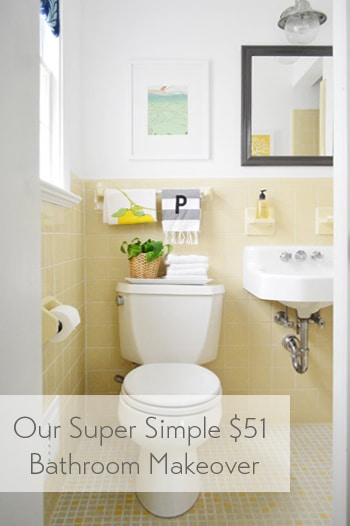
The room has this casual Anthropologie-ish vibe now, which isn’t usually something I’m very good at pulling off – so all the credit goes to the items that were already there (like the original white sink and that sweet 60’s tile). And it definitely didn’t hurt to add some art and a few accessories to fill the voids. Here’s a before shot taken from the same doorway about a week after we moved into our house:
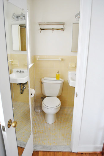
Thank goodness the I-can-see-my-full-body-while-I’m-on-the-toilet mirror is gone, eh?
It’s a tiny room, so please excuse my lack of diverse and all-encompassing shots. The print hanging over the toilet is just a page I tore out of the September issue of Real Simple last year (I keep a flat tupperware box under the bed in the guest room full of “someday art” – so I sifted through it and thought the colors – and the water/fishing thing – was cute for a bathroom). The frame is from Target and came with the mat for $22.
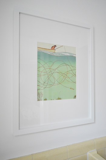
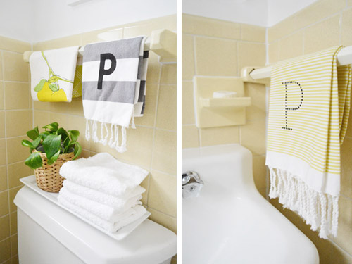
I like how the softer white frame and art works with the deeper mirror and light fixture. Instead of competing and feeling busy, the art falls back and the charcoal mirror over the sink (which I painted Silhouette by Benjamin Moore) says “look I’m the focal point.” Both of the P hand towels are from West Elm (from two different readers at book signings, which was such a fun surprise). And that lemon tea towel is also from someone at a signing. So glad we found a spot for them :)
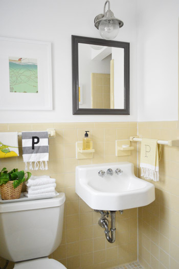
Dag guest bathroom, why you gotta be so sweet? Here’s where I’ll insert John’s terrible third grade joke about how you have to have two monogrammed P towels in a bathroom because that’s where the pee pee goes. Please forgive him.
And for those requesting a shot of the shower opening, it’s a crazy-tight room, so this is the best I could muster. But you can see the art that hangs across from the mirror a little better. That’s just an old fabric remnant (from U-Fab last year) that I slapped in a frame.
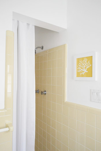
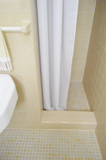
I like that it relates to the brighter yellow tiles in the floor as well as the pops of yellow in the guest room. And here’s a shot of the bottom of the shower, so you can see how that tile lip keeps the curtain from encroaching on the sink. And because it’s polyester (just like a typical fabric shower curtain liner) we just wash it to keep it clean. So far, so good (it’s been in use for 6 months).
This is the view from the guest room, which is nice and tied in, thanks to everything from the blue window shade and the turkish towel on the door (don’t they look cute next to the polka dot curtains?).
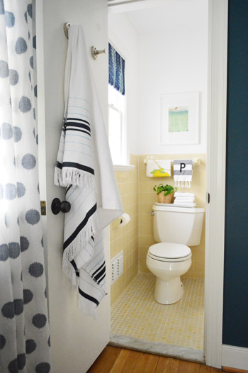
It’s so funny how an old yellow bathroom that used to feel like “the weird room” in our house suddenly fits right in.
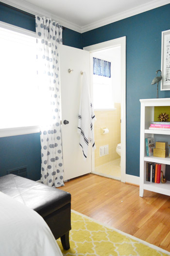
Here’s what we did in there to snap it into shape:
painted the walls, trim, and ceiling(we did that here)frosted the window for privacy(we did that here)made a window treatment with a bold fabric remnant(we did that here)painted the frame of the mirror so it stands out morehung some art over the toilet and across from the mirrorwent accessory happy
How you like me now, list? Yeah, that’s what I thought.
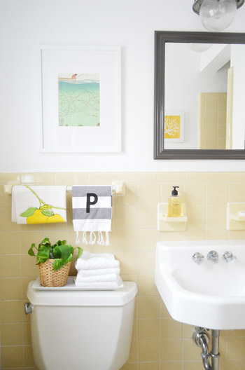
And here’s our budget breakdown:
- fresh white paint for the walls, ceiling, and trim (all Decorators White by Benjamin Moore): $25 (for a quart)
- paint for the mirror (Silhouette by Benjamin Moore): $0 (already owned)
- art for above the toilet: $22 (frame: Target, art: a free page torn from Real Simple)
- coral fabric art that you see in the mirror: $0 (yellow coral fabric remnant + frame we already had)
- fabric remnant for the window treatment: $4 (from U-Fab by Iman)
- frosting film for the window: $0 (already owned from other projects like this)
- hand towels, plant, bath towel, and soap: $0 (all already owned)
- TOTAL SPENT: $51 (it would probably be around $70 total if you didn’t already have mirror paint, hand towels, & frosting film)
And that’s why I love accessorizing. The end.
Psst- Wanna know where we got something in our house or what paint color we used? Just click on this button:


Megan @ Rappsody in Rooms says
Oh my! I am so in love with this delightfully yellow bathroom! So cute. The accessorizing really ups the ante and definitely pulls the room together. Adorable!
Christine says
I love this, partly because I am so over the gut rehab of baths and kitchens! We are house hunting and I’m weary of every bath and kitchen looking like a brand new condo, you know?
Shauna says
Wow, I love it! We’re moving soon, and now I almost want to hunt down a home with vintage tile like that, which I never thought I would say before! The small additions you made make it so charming!
YoungHouseLove says
Aw thanks Shauna!
xo
s
Kristy says
I love it! And I am SO GLAD you kept the yellow tile – it has so much character and really is charming. I would have been sad if you just got rid of all that to start fresh. There’s something to be said for embracing the age of your house and rolling with some of the quirkier things that come with a house that has some history :)
angela says
did you get that framw recently at target? i want a whole bunch!!! or did you get it online?
YoungHouseLove says
Yes, it was just this past week, right in that framing aisle. I loved that it came with the mat!
xo
s
angela says
Thanks! Do you know what size it is?
YoungHouseLove says
It’s 15 x 19″
xo
s
Megan says
It looks great! So much fresher. I think if it was me, the one upgrade I would do would be to add a pedastal sink. It would keep the vintage charm while hiding the pipes and upgrading the faucet and knobs.
Lindsey says
Love it – very inspiring for my bathroom. Thanks for showing me how to work with vintage! It’s easy to visualize ’cause we have the same color tile. When in doubt, go with white!
Lilly says
This turned out so cute! You don’t mention it in this post, but I’ve seen you write a few times before about how you sell salvaged pieces from a remodel or purchases you decided against on Craig’s List. Have you ever done a post on tips and tricks for that, what your process is or how you’ve gotten what you wanted from negotiations on CL? I just started reading your blog about a year ago (whyyyyy?! so dumb of me…) so apologies if this is something that you’ve covered that I’m behind on! Thank you!
YoungHouseLove says
Aw thanks Lilly! Here’s a post that I hope helps: https://www.younghouselove.com/2012/11/this-is-how-we-craigslist/
xo
s
ashley @ sunnysideshlee.com says
I love it – I that work with what ya got motif. Very nice! And how cute are those towels?! It drives me nuts – so I’m sure it drives you nuts that the towel rack is off center from the toilet, though. But how awesome is that overhead lamp?! Swooon!
YoungHouseLove says
Yes, that off-center towel rod bugged me so much, but after hanging the art and adding cute towels and the plant I realized that I hardly notice it anymore. Now it’s so much better than it was when it was naked. Haha!
xo
s
jenn aka the picky girl says
Crazy as it sounds, this is one of my favorite spaces. I love that you worked with what you have, and honestly, the navy and the initial towels and plant just *make* this space. Looks fantastic.
YoungHouseLove says
Aw thanks Jenn!
xo
s
christina @ homemade ocean says
I fell in love with those towels at your book signing! We actually have plans for them in our new bathroom too!!!
Reenie says
Love it… and am so glad you ketp the yellow tile :)
Leslie says
I also have an authentic “mid-century” bathroom (yellow and mint green tile, green tub, original fixtures)… yet yours looks so much cooler. I guess I know what I’ll be working on this weekend :)
YoungHouseLove says
Good luck Leslie!
xo
s
Wendy says
Looks great. You didn’t mention the light fixture change out. Where did you find that great metallic one?
YoungHouseLove says
That was something we did a while back (and it took a few tries, haha!). Here’s that post for ya: https://www.younghouselove.com/2011/07/a-not-so-quick-fix/
xo
s
Brandi says
Such a bright sunny spot! I love your free artwork! Great job, guys!!
Molly@TheNestingGame says
Looks so cute! I love the simple color scheme. But I’m thinking, what about making a skirt for the sink?
Jenny has some great examples and a tutorial:
http://littlegreennotebook.blogspot.com/2010/02/no-sew-pedestal-sink-skirt.html
YoungHouseLove says
We actually considered a skirt, but in such a small space we worried it would touch your leg when you sit on the toilet (eeks!) so leaving the sink open and floating seems like a nice feature in such a tiny room :)
xo
s
Pamela says
Firefox 20.0: “Family Blog” is now gone from the header, but “Forums” is up there. Both appear in the “Short Cuts” sidebar. Safari 6.0.4: “Forums” and “Family Bog” appear in both header and sidebar.
YoungHouseLove says
Thanks Pamela! We’ll do our best to get Firefox 20.0 working like Safari 6.0.4!
xo
s
Erika says
Looks very summer and fresh! I have one question….do you not use a rug when stepping out of the shower? Tile is very slippery when wet or you just throw the dirty clothes on the floor and use it as rug when stepping out of the shower?
Just keepin it real with my question that’s all
YoungHouseLove says
I just toss a white fluffy hand towel on the floor when guests come. It’s just like a white mat (and not slippery or anything) but I’d love to find a fluffy square mat that fits the floor perfectly! Still looking!
xo
s
Tia says
Do you have any suggestions for how to keep the grout clean on that floor? I have the same tiny tiles and love the look, hate the cleaning. I have tried everything but I can’t get the traveled areas to be the bright white that the untraveled areas are.
YoungHouseLove says
I’ve used this heavier duty method once on our first bathroom: get 40% peroxide at a beauty supply store and let a thin layer of it soak in on the floor overnight and then scrub the heck out of things in the morning. It might not work on all tile though (ex: glass, marble, granite, travertine) and might actually damage it though, so I’d just use this for old ceramic or porcelain tile. Then once you’ve scrubbed it clean be sure to seal the grout. That helps so much (we clean grout once very thoroughly and then seal it and it’s good for a year or more without any more scrubbing!).
xo
s
Tia says
thanks so much!
Brittney Everett says
You could always do something like this: http://pinterest.com/pin/48484133460826774/ with your bathroom sink to give it character!
YoungHouseLove says
Ooh that’s cute! I think since it’s a tiny room we like how it floats to keep things open. But I love the idea of using old legs to add character to something!
xo
s
Karen Q. says
Wow what a transformation! It looks fab-u-lous! Love the Real Simple artwork and fabric swatch made artwork- what a great idea. The colors are perfect to compliment the yellow tiles- it’s got this soft feel to it and totally goes with the vibe of the bedroom! I’m diggin’!
No P’s on our potty but we do have some Q’s, being our last name and all. :)
YoungHouseLove says
Hah, so I’ll mind my Ps and you mind your Qs!
xo
s
heather says
Normally I have a reaction and then I compose it for comments, but forget it today. Ahem:
“That looks *bleeping* fantastic! How on earth did she make a yellow bathroom look so *bleeping* good?!”
At least one of the two of us is keeping it classy, Sherry.
YoungHouseLove says
Haha, thanks Heather!
xo
s
AP says
I absolutely love that y’all kept the bathroom tile the same and made it your own with all of the personal touches. It’s great to see that it’s still possible to ‘work with what you got’ when so many people go to extremes to change rooms up. And, it still screams YHL. As always, you guys rock my socks off :)
YoungHouseLove says
Aw thanks AP!
xo
s
Kate says
OMG, I am in love. I think it’s just because it has this effortlessly cute charm to it. High fives all around!
Theresa says
Very swanky. Have you given any thought to a sink skirt? Very easy to sew/no sew and you use velcro to attach it around the three sides. I did this when we were selling my parents house and the realtor and others commented on how the colors in the skirt tied the whole bath together.
YoungHouseLove says
We actually considered a skirt, but in such a small space we worried it would touch your leg when you sit on the toilet (eeks!) so leaving the sink open and floating seems like a nice feature in such a tiny room :)
xo
s
Sarah G. says
The PeePee joke is exactly where I went when I saw the doubled up monograms. Maybe only one towel in a pale yellow bathroom would be better. I don’t know. I’m just saying there is a third grader in all of us! :p (used the “p” emoticon just to stick to our theme!) see, I can’t help it! In all seriousness, so glad you kept the tile!
YoungHouseLove says
Haha!
xo
s
Shannon says
Oooh how nice! I am loving the yellow! So fun! If you’re willing to spend a little more on the room down the road (which bravo for your $50 upgrade!) a new shower head and knobs would look great too! :)
Shannon
YoungHouseLove says
Oh yes, I’d love to upgrade those!
xo
s
Ade@fortheloveofpainting says
Cute…I actually love the vintage tile and those P towels are a fun touch!
Courtney says
Hi! I love your blog.
I was wondering if you knew where you purchased the lamp above the mirror. That would look perfect in our powder room!
Thanks!
YoungHouseLove says
Oh yes, here’s that post for you: https://www.younghouselove.com/2011/07/a-not-so-quick-fix/
xo
s
Lil says
Love. I love the light fixture (wouldn’t have thought to use an outdoor light). I also like the way you hung the shower curtain…we just remodeled a bathroom that had the same style shower opening. Oh! the “Real Simple” art…clever people! I knew there was a reason I keep piles of old magazines laying around. ;) Thanks as always for the inspiration.
Jayme @ Keeping Up With Myself says
Sherry you are a genius! The tupperware container for future art? Here I’ve been stuffing things in folders and praying they don’t get ruined or crinkled (they always do!) or even worse, keeping the entire magazine and forgetting why I was keeping it and tossing it! I’m off to Target to grab myself a box for under the bed!
YoungHouseLove says
Aw, thanks Jayme! I have tried all sorts of things (accordion folders, etc) but it seems to give them more room and keep them from getting crushed :)
xo
s
becca says
I don’t mean to be a jerk (you guys are awesome), but $25+$22+$4=$51 not $49.
YoungHouseLove says
Haha! Thanks Becca! I can make magazine art, but I can’t add!
xo
s
Kristin F says
So cute! I’d actually kill for the yellow tile at this point. We have the same set up in our main bath, only our tile is GREEN. Not a nice sage-y green, or even celery green. But some strange non-existent in nature green that was only used in homes between 1950 and 1965. I wish I could embrace it, I’ve got the palest of blue walls, white shower curtain, and blue and teal towels but all I ever see when I go in there is GREEN on the walls, and GREEN scrabble board on the floor. Cannot wait to reglaze it or tear it out and put up beadboard. Hopefully this summer!
Kristina Strain says
Good job guys! Love that it only cost you $49, and that you worked with what you had. I love the layered blues, the towels, and the new curtains. The only thing that doesn’t work for me is the mirror– I might’ve gone with rounded wood frame there, maybe the sort of mirror that came off an old antique dresser– something to soften the mad geometry of all that tile and other right angles. Oh, and it would tie into that sweet little basket. Of course, that’s just me, just thought chiming in might give you another idea for down the line.
Ashley@AttemptsAtDomestication says
Super cute! I love that you guys worked with what you had and made it cute!
J says
so so SO happy you all kept the tile (I’ve secretly been cheering it on ever since you first talked about a remodel of the bathroom). The accents are perfect!
Now I want to come live in that room – you all need to start taking reservations :)
YoungHouseLove says
Haha, step right up! Now vacant.
xo
s
Haley says
Looks great! I laughed out loud at the PP joke.
I’ve been tearing out some National Geographic pictures that I intend to hang as art.
Stephanie@ Simply Swider says
Awww…it’s so sweet! I really love the art. We had almost the exact same tile in our hall bath except it was all teal including a teal tub and sink (can you tell our house was built in 1960?) I would’ve loved to work around it like you did but unfortunatly some of the tile was starting to crack. Be glad you did have to rip it out! We found out the hard way that the wall tile was put on with 3 inches of concrete on top of a metal mesh. It took forever to get down and covered our house in dust for weeks.
YoungHouseLove says
Oh gosh, we know all about that metal mesh since it was in our first house’s bathroom. That was a toughie! So glad you lived to tell the tale!
xo
s
Annie says
Looks great! I have a similar blue bathroom in my basement and think the tile is sweet, too, but not sure what to do with it. Inspiration from YHL, yet again! Thanks, guys! Fingers crossed it’ll look as cute as yours!
Stephanie says
Love, love, love! That painted mirror makes a huge difference (I honestly couldn’t see one in before pics!), the accessories are fresh and fabulous, and the blues tie it in so well with the guest bedroom!
Quick ? on accessorizing in guest and hall baths…we have one of each and a bit more counter/shelf space than your guest bath. What in the world do you accessorize with for? Framed pics mean people staring back at you, books imply you should stay in there for a while, and you can only have so many candles! Thoughts or suggestions?
YoungHouseLove says
Great question! Hmm, in our hall bathroom there are some peeks of what we have on the counter in a few of the photos: https://www.younghouselove.com/2012/11/pink-orange-for-da-bean/
I love the color that the faux tulips add and a pretty dish or tray of bath-y things (like a natural sponge and pretty packaged soaps) is fun! We also have done glass containers of cotton balls and q-tips :)
xo
s
Jessica S. says
Haha, oh yes I’ve framed ‘art’ from Real Simple. We’re selling our house and I had to quickly swap out our wedding photo on the wall for something less personal. The page I chose from the magazine was a silhouette of a giant scary-looking black bird sitting in a tiny dead tree (I was in a rush and it’s all I could find). My husband said it was the creepiest thing he’d ever seen.
James Booker says
I LOVE your tiles :)
and the little ‘splashes’ of colour really make the room pop :)
Chrissy says
Are you keeping the marble in the doorway?
YoungHouseLove says
We’d love to switch it out for a wood transition!
xo
s
Deborah says
unrelated, but: did you guys refinish the hardwood floors in your house before you moved in?
YoungHouseLove says
We didn’t but oh how I wish we did! It’s so much harder after everything is in, but sadly we had to move out of our old house and into our new house all in the same day (it’s called a “domino closing” so we literally had all of our stuff in a moving truck and had to drive it here and unload it the minute we got the keys.
xo
s
Alba says
Love this! Gives me inspiration for our new flat- main bathroom has awful 1990’s orange tile which we can’t rip out as its rented. I’m on the hunt for accessories to tone the orange down! :)
RJ says
Regarding the photography issues in a small room….have you thought about buying (or renting) a wide angle or fish-eye lens? My son (a photographer) rented two of these type lenses for a trip and his pictures are amazing. If you’re unsure of what lens you would like, rent one or two at lens rental.com (not a plug!) and have a fun weekend taking photos!
YoungHouseLove says
Thanks RJ! We thought about a fisheye lens for a little while but realized the skewed edges (you know how they look bubbled?) might feel “artificial” since they make things curve at the edge of the photos (we always notice realtor listings with super fish-eye lenses and it feels like not-real-life or something, haha). But we definitely would love to invest in a wider angle lens when we have the money :)
xo
s
heather says
What lens do you guys have? The kit 18-55mm? Just curious.
YoungHouseLove says
Yes we have the stock lens that came on our Nikon D3200 and a nifty 50 (which we usually just use for Clara and Burger pics) :)
xo
s
Cassidy says
This is where you go to “p.” Tee hee!
YoungHouseLove says
Haha, it’s true!
xo
s
Adrienne says
The bathroom looks great. I agree with many ,loved how you kept the tile. Just out of curiosity and if you could would you change the location of the towel racks?
YoungHouseLove says
If only we could! Heck yes!
xo
s
Cindy_FearlessDIY says
I love how it turned out! I especially like how the mirror really pops now and adds a bit of ‘dark’ (in a good way lol) to go with the lighter elements. Great job, you guys!
Jenna says
I am in wonder of the sparkling white grout. I would eat off that floor! (ok maybe that’s taking it a bit far…) We have a similar yellow tile bathroom but the grout is in awful shape. Any advice on how to clean it or regrout with something whiter? It looks perpetually dirty and grosses me out!
YoungHouseLove says
Aw thanks Jenna! Let’s have a picnic in there. Haha. As for cleaning grout, I’ve used this heavier duty method once on our first bathroom: get 40% peroxide at a beauty supply store and let a thin layer of it soak in on the floor overnight and then scrub the heck out of things in the morning. It might not work on all tile though (ex: glass, marble, granite, travertine) and might actually damage it though, so I’d just use this for old ceramic or porcelain tile. Then once you’ve scrubbed it clean be sure to seal the grout. That helps so much (we clean grout once very thoroughly and then seal it and it’s good for a year or more without any more scrubbing!).
xo
s