The guest bath = so much cuter. That sweet little space reminds me that even small seemingly “stuck” spaces can shine with a few easy upgrades, like fresh paint, a new window treatment, some art, and a few mixed and matched accessories. Sometimes it’s fun to embrace an old feature like vintage yellow tile (complete with a floor that looks like a scrabble board) instead of hammer-drilling it out of there. So stick a fork in this baby… for around $50, she’s a whole lot easier on the eyes.
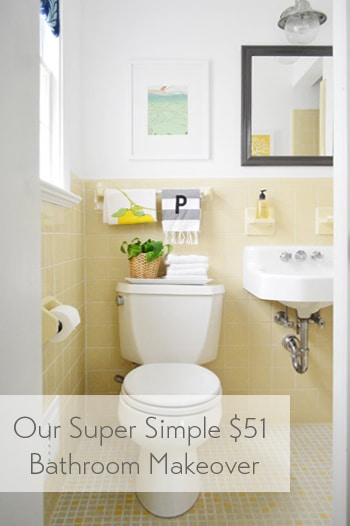
The room has this casual Anthropologie-ish vibe now, which isn’t usually something I’m very good at pulling off – so all the credit goes to the items that were already there (like the original white sink and that sweet 60’s tile). And it definitely didn’t hurt to add some art and a few accessories to fill the voids. Here’s a before shot taken from the same doorway about a week after we moved into our house:
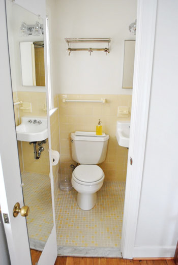
Thank goodness the I-can-see-my-full-body-while-I’m-on-the-toilet mirror is gone, eh?
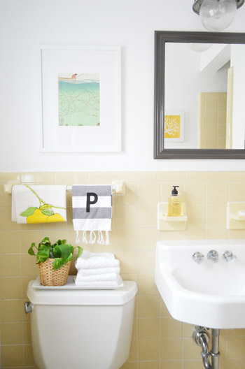
It’s a tiny room, so please excuse my lack of diverse and all-encompassing shots. The print hanging over the toilet is just a page I tore out of the September issue of Real Simple last year (I keep a flat tupperware box under the bed in the guest room full of “someday art” – so I sifted through it and thought the colors – and the water/fishing thing – was cute for a bathroom). The frame is from Target and came with the mat for $22.
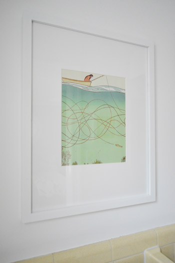
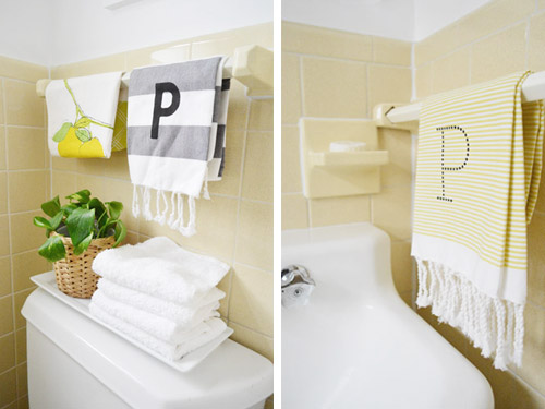
I like how the softer white frame and art works with the deeper mirror and light fixture. Instead of competing and feeling busy, the art falls back and the charcoal mirror over the sink (which I painted Silhouette by Benjamin Moore) says “look I’m the focal point.” Both of the P hand towels are from West Elm (from two different readers at book signings, which was such a fun surprise). And that lemon tea towel is also from someone at a signing. So glad we found a spot for them :)
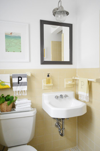
Dag guest bathroom, why you gotta be so sweet? Here’s where I’ll insert John’s terrible third grade joke about how you have to have two monogrammed P towels in a bathroom because that’s where the pee pee goes. Please forgive him.
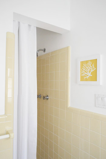
And for those requesting a shot of the shower opening, it’s a crazy-tight room, so this is the best I could muster. But you can see the art that hangs across from the mirror a little better. That’s just an old fabric remnant (from U-Fab last year) that I slapped in a frame.
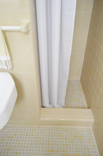
I like that it relates to the brighter yellow tiles in the floor as well as the pops of yellow in the guest room. And here’s a shot of the bottom of the shower, so you can see how that tile lip keeps the curtain from encroaching on the sink. And because it’s polyester (just like a typical fabric shower curtain liner) we just wash it to keep it clean. So far, so good (it’s been in use for 6 months).
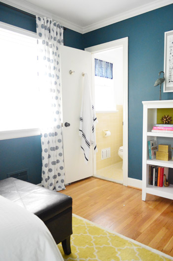
This is the view from the guest room, which is nice and tied in, thanks to everything from the blue window shade and the turkish towel on the door (don’t they look cute next to the polka dot curtains?).
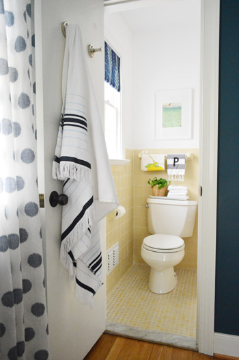
It’s so funny how an old yellow bathroom that used to feel like “the weird room” in our house suddenly fits right in.
Here’s what we did in there to snap it into shape:
painted the walls, trim, and ceiling(we did that here)frosted the window for privacy(we did that here)made a window treatment with a bold fabric remnant(we did that here)painted the frame of the mirror so it stands out morehung some art over the toilet and across from the mirrorwent accessory happy
How you like me now, list? Yeah, that’s what I thought.
And here’s our budget breakdown:
- fresh white paint for the walls, ceiling, and trim (all Decorators White by Benjamin Moore): $25 (for a quart)
- paint for the mirror (Silhouette by Benjamin Moore): $0 (already owned)
- art for above the toilet: $22 (frame: Target, art: a free page torn from Real Simple)
- coral fabric art that you see in the mirror: $0 (yellow coral fabric remnant + frame we already had)
- fabric remnant for the window treatment: $4 (from U-Fab by Iman)
- frosting film for the window: $0 (already owned from other projects like this)
- hand towels, plant, bath towel, and soap: $0 (all already owned)
- TOTAL SPENT: $51 (it would probably be around $70 total if you didn’t already have mirror paint, hand towels, & frosting film)
And that’s why I love accessorizing. The end.
Psst- Wanna know where we got something in our house or what paint color we used? Just click on this button:


Lisa says
Very nice! Even your soap matches–Dang you’re good!
YoungHouseLove says
Haha! Thankfully most soap is yellow so that was an easy one ;)
xo
s
Meagan {Green Motherhood} says
So cute! I love the floors! Glad y’all worked with what you had and saved that yellow!
We actually had a vintage pink bathroom in our old house that looked much fresher after I put a subtle green on the walls.
http://www.thegreenmother.com/2011/01/little-weekend-project.html
We ended up having to gut it later when we turned it into a full bath, though. Plus, the pink wasn’t in the best condition.
http://www.thegreenmother.com/2011/05/under-construction.html
I love seeing what ther people do with those vintage tiles and colors!
YoungHouseLove says
So fun to see the phases like that!
xo
s
Kay says
This is so impressive–you had to work within some pretty strict design constraints and it absolutely works!
I also love the picture with the view from the bedroom. On its own, the bathroom is really bright and fresh but the contrast of the dark blue and the light yellow and white is really striking.
YoungHouseLove says
Aw thanks Kay!
xo
s
Deborah says
Same here re not being able to refinish the hardwood floors before moving in. That being the case, have you done a post about the judicious use of lots of area rugs? Deciding on size? Layering? Angling? Best source?
YoungHouseLove says
We did a post about getting our first home’s floors refinished after we lived there a while (it was a rough week or so, but looked amazing in the end!). So I think the money and time you’ll put into hiding floors you hate might end up being better spent just refinishing (lots of large rugs aren’t cheap, and you’ll love new floors after you have them done, even if it’s a dusty mess!)
xo
s
Kathy says
So, OKL has this bee ribbon today!… thought of you!
https://www.onekingslane.com/product/21325/1314402
YoungHouseLove says
So cute!
xo
s
Lana says
Love, love, LOVE this little bathroom. I’ve been crossing my fingers that you guys would keep the yellow! The touches you guys added make it perfectly modern- Anthropologie indeed!
Ashli @ The Sweat Revolution says
What a difference $51 can make! I love it, and I love the “Anthropologie-ish” vibe :D
That Turkish towel is awesome!
Jessy F. says
The guest room & bath are now my favorite rooms! Keep up the good work!
Carla says
I love that you “worked with what you got”. It is beautiful. I worked on our guest area last year and have two thoughts. One, I think most guests appreciate a space in the bathroom for their own toiletries, cosmetics etc… and so I wonder if at some point you might need to replace that lovely magazine art with a shelf/cabinet. Two, although I agree the full-length mirror needed to come off the bathroom door, I think most guests also appreciate one to check their appearance – and wonder if one would work on the inside of that room’s closet door. How you tied the bed and bath together is fresh and charming.
YoungHouseLove says
Great tips Carla!
xo
s
heatherly says
Another third grader here…all I could think of when you said you used accessories to fill the voids was, “hee-hee, she said VOIDS!” :-)
Great job on the yellow bathroom. We had one like that for years and tried to just work with it. Yours came out wayyy better!
YoungHouseLove says
Haha!
xo
s
Christie says
As a renter, I love when I read blogs with improvements I could actually make in my house. The little bathroom has tons of charm. Dare to be different and the results are unique. With your decorating skills, the results are even better than if it was all brand new.
Its kind of like how I see white sofas on every other home blog, so the blogs that change it up with a darker color (like your great sofa) or even leather really catch my eye.
Tara says
So one of the suggested posts at the bottom was “6 Sex Positions that Double…” I’m trying to figure out which words cued that automated ad. Embrace? Vibe? How you like me now? ;)
Tara says
And in case it wasn’t obvious, I mostly thought you’d want to know that non-home ads are popping up! Also I was trying to be funning. Probably not succeeding. But still trying.
YoungHouseLove says
Haha, I totally got that. You’re hilarious to guess vibe. Haha!
xo
s
YoungHouseLove says
Oh my gosh I tried to block that yesterday, I can’t believe it’s back! Apparently those show differently for every person, so I don’t see it. Thanks for alerting me so I can get rid of it again!
xo
s
caitlin says
looks great! any advice on painting a mirror!? i just primed and painted bathroom cabinet and vanity and feel like i should have just tried to freehand the mirror with a short handled brush instead of painters tape. I am by no means a perfectionst and it looks OOOOKK but i’m curious now how i could have done a better job!
YoungHouseLove says
I actually just used an angled brush and didn’t tape it off, so I got a small amount of paint on the mirror but I used a straight razor to remove it afterwards. That’s a nice easy way to clean things up!
xo
s
Christie says
PS … just read people’s suggestions for a sink skirt and wanted to say I LOVE the wall sink just like it is. So cool and unassuming and vintage.
YoungHouseLove says
Aw thanks Christie!
xo
s
Autumn Beach says
Yes! What she said!
Carla says
Boy, that’s a lot of P in that little bathroom. :)
YoungHouseLove says
Haha! That’s where the P goes…
xo
s
Lauren says
Looks soooo great you guys! What a difference a few simple changes makes. I’m really glad that you left the tile…I think it gives it so much charm and character. I never thought of tearing out magazine pages to use as art…what a great and easy idea! Kudos to John on the “p” “p” joke! ;)
Amanda says
I love this upgrade so much. I wish my bathroom had cute vintage tile so I could make it look cute. But it doesn’t have any tile and I rent so I don’t know if I would want to “invest” in putting tile in somewhere I won’t be forever.
Lindsey says
maybe you know this, but the “young house life” blog link has been pushed off the side and is not visible (at least in my browser–safari). the header bar stops at “forum”.
YoungHouseLove says
Thanks Lindsey! Check out the first line of this post for a quick fix for that :)
xo
s
Stephanie says
Love what you have done with the guest bath! I have a similar bathroom at home that’s been troubling me…you’ve inspired me to get on it. Thinking a sink skirt might be one way to make my wall mounted sink look a bit less institutional.
Thanks for always motivating me!
Mrs Patty says
Call me crazy, but this has to be one of my favorite rooms in your new house. I’m such a big fan of these tiled bathrooms- they are very common where I live. Those tiles are built to stick:). The accessories you used to modernize the space is just simply amazing. What a transformation!
YoungHouseLove says
Aw thanks Mrs Patty!
xo
s
logan says
Looks great! Do you guys do anything special with the art you frame for the bathrooms? I’ve always wondered, with the steam from the shower, if it was necessary to do anything different? or if you ever noticed the extra moisture doing anything to your artwork in the bathroom. For some reason, I’ve always been hesitant to put artwork in the bathroom, and I’m not even sure why! :)
YoungHouseLove says
I didn’t do anything special other than use a frame that felt sealed up (new, has a mat, has glass that isn’t loose, etc). This method has worked ok for us in the past, although I’d never frame any prints/art that’s of value in a bathroom just in case the moisture over time started to hurt it.
xo
s
logan says
thanks!
Anna in Ohio says
Looks great! I love that tile on the floor. It reminds me of a multi-colored corn cob. In…the good way. LOL
Megan says
Okay, I’m going to be honest. I kind of thought y’all were crazy keeping the yellow tile everywhere but now it looks great! It is amazing when some accesorizing can do!
YoungHouseLove says
Aw shucks, thanks Megan!
xo
s
Leah says
As a frequent guest in other people’s bathrooms, I really, really appreciate the extra towels you have. I always feel guilty wiping my hands on a host’s bath towel. I love bathrooms with obvious hand towels.
Tara says
I think this might be my favourite room of your house! The retro tile, sink, and shower are so fantastic! I love the character they add. It drives me insane when people gut rooms that still have a lot of life in them, without considering at all what’s working in the room and what’s not. So much waste, and for what? They usually end up looking generic.
Great job!
PS – long time reader, first time commenter. “U smell like a fart” made me lol.
YoungHouseLove says
Haha, thanks Tara!
xo
s
KLL says
I have the EXACT same page from Real Simple in a binder of ‘someday’ art.
Now that I’ve seen it framed here, I’m convinced I was right to pull it out and I need to get it out of that binder pronto.
YoungHouseLove says
I love it! I wonder how many people saved that!
xo
s
Nichole says
I HATE to be the grammar police, but right before John’s awesome pee pee joke, should that say “Dang” guest bathroom……?
YoungHouseLove says
That’s the Jersey girl in me. We used to say “dag!” – it’s like dang, almost exactly, but no N. Haha!
xo
s
Nichole says
Oh, gotcha. Since I’m from the south, I’d probably say dadgummit. Haha!
YoungHouseLove says
Haha!
xo
s
Annie says
Seriously, what a great way to cost effectively change out art work! I never thought of that!! Totally what I’m going to do! I don’t change out house art once I put it up because I can’t justify the cost of new art just because I “felt like something different!” Thank you!!!! :)
Koliti says
Hello Lemon-Drop! What a nice cheery spruce-up :)
I love that you put your own spin on a yellow-tiled bathroom that was in great condition.
And I love the look of the exposed chrome pipe underneath the sink.
I enjoy your use a little paint, fabric, art, and switch out the lighting transformations. Totally uplifts your space.
Linda says
Hi Sherry, Love this post, especially because I am on the fence about our good-in-shape old tile. But in our case what bothers us are the amount of towel racks in there, there are 5 in total – FIVE!
I just wanted to see why you decided to keep your towel racks? I have never tried removing the racks but I’m betting they would damage tile, but I found a nearly close match at the tile shop the other day so I’m not sure if I should just do away with the racks and replace them with new tiles.
YoungHouseLove says
This is why! https://www.younghouselove.com/2011/03/sometimes-i-go-crazy/ Haha! Sometimes they’re over the tile but in our case they were embedded in it and it was much messier than I thought! So unless it’s a place you can cover with window trim like we used, it might be hard to remove them unless you have perfect matching tiles :)
xo
s
Ruth E.G. says
we have the same sink original to our 1940 house – however ours is not doing so well. the finish is coming off and the fixture leaks – and it’s difficult to replace a faucet that is “wall”mounted and not the standard “top” mounted.
A bathroom remodel might be in the works as we now have two full baths after our last remodel.
Kate says
Hey – hope this hasn’t already been answered. I tried to scroll through the comments. Did you guys clean or regrout the grout in the bathroom? How did you get it to look so darn white? We have had a grout restoration specialist out to look at our dingy black and white tile and grout from the 1950s and it will cost a few hundred dollars to have it done professionally. Did you spruce it up yourselves?
YoungHouseLove says
We have a tip if you scroll back through the comments :)
xo
s
Amy K says
Love this and as a michigan fan, the color combo is spot on.
Ever thought of stenciling on a few of the tiles? Or doing some kind of scrabble tile art on the walls to tie into the floor?
YoungHouseLove says
That’s another fun way to go for sure!
xo
s
jenn says
this is actually super charming and adorable. when you first moved in i admit i was excited for you to gut the yellow tiles and was up until 2 minutes ago. i couldn’t see the potential in the bathroom but the yellow is really cute and doesn’t seem as dated when you spruce it up a bit.
Melissa says
We have a bathroom with this same color tile! Thanks for helping me with some color options!!
Chaney says
I’ve been known to tear sheets out of the anthropologie catalog to frame. I used some of their Christmas catalog pages on our gallery wall to make it a little more seasonal! Talk about cheap art!
YoungHouseLove says
So cute!
xo
s
Lee says
I did a double-take when I saw that framed art over the toilet – I framed the exact same Real Simple page last fall for a gallery wall! Great minds think alike :)
We are renting out our house as a vacation rental (long story) and I needed to depersonalize our gallery wall of family pics. I swapped out the pictures for a bunch of magazine pages, fabric scraps, images I found online and printed at home, and even a cool patterned box that a candle came in.
It made me smile to see this same “art” in your house!
YoungHouseLove says
That’s so funny! I love it!
xo
s
Andrea says
Love so much! It looks like a bathroom from a magazine, and definitely has an Anthro vibe going. High five!
Sara S says
Super cute – love it! I didn’t see the shower curtain on your budget breakdown, though.
YoungHouseLove says
Oh yes, we did that about 6 months ago, so we didn’t include it. We also changed out the light about a year ago, so those two things were done before this little update :)
xo
s
SJ says
Love all the fun personal touches! Have you thought about adding a skirt or something below the sink to hide the exposed pipes? Just a thought! I bet you could wip up something quick with your mad sewing skillz! :)
YoungHouseLove says
Oh yes, if you scroll back through the comments I explained why we prefer the floating sink and were scared that adding a skirt would touch people when they sit on the toilet since it’s so tight in there. But they’re really cute in slightly larger bathrooms :)
xo
s
Pam the Goatherd says
I’m so glad to find that I’m not the only person who pulls pages out of magazines and stores them away for “someday” art!
Tatyana says
Great bathroom! I am curious – how do you feel about the door opening to a toilet? I realize it is what you inherited but if you could do it all over again, would you switch the toilet and the sink? (I’m asking because we are about to remodel our bathroom and I can’t decide if opening up a door to a toilet is very copacetic in the bathroom design world…apparently when you walk into the room, you are 1st supposed to see something that gives the wow effect (sink/mirror or a spectacular view of the outside, not a toilet)). What do you guys think?
YoungHouseLove says
Hmm, that’s a good question! I think if I could wiggle my nose and move things I’d put the sink in front of the door so you see that instead of the toilet, but it’s also cute to see the art over the toilet instead of seeing the mirror (watching yourself walk in, etc) so it’s not too bad this way :)
xo
s
Emc says
Very adorable! If possible, I’d suggest crediting the illustrator from the Real Simple tearsheet (or other tearsheets in the future).
Many illustrators sell prints online (even of their commercial work), and while those aren’t free like magazine pages, linking to their site is a nice gesture. Plus, prints often have a range of sizes and better paper quality.
Free is good, but promoting an artist is good as well :)
YoungHouseLove says
Oh yes, I would love to credit the artist! Does anyone know who it is? I looked on the page and the back and there was no info (although I was glad to see the month the mag came out to hopefully help others hunt it down if they have it in their pile) but there was no artist info on that page. I will have to remember to check the back of the mag to see if there’s a credit there and use a post-it to label them in my tupperware bin when I rip them out. We love sending artists work, and it’s awesome when they offer prints along with doing commercial illustrations :)
xo
s
Mallory says
We have the same blue and white striped hand towels! Love the bathroom. It looks adorable!
caroline craig says
I absolutely love it- it’s so charming yet playful!
Karen says
I love what you’ve done with that yellow tile. I have almost the identical space you do, but instead of a pedestal sink it’s an oak vanity. Would you paint it? Or leave it? I painted the walls above the tile a really like gray (Sherwin Williams On the Rocks) and thought about painting the vanity black, but I just don’t know! What would John and Sherry do??
YoungHouseLove says
Hmm, I think I’d either gel stain the vanity dark mocha (so it’s not too orange with the yellow tile) or I’d paint it either white or even the same soft yellow as the tile. That could be so cute!
xo
s
Necole @seriouslysassymama says
I dig that bathroom floor.
Elisa @ What the Vita says
Very cute! I really like the hooks on your door but couldn’t find in the comments or in your post where you go them. We’ve been looking for something similar for our bathroom! Thanks.
YoungHouseLove says
Those actually came with the house, they were just on the front of the door when the mirror was on the back of it (so we moved them). My guess would be Restoration Hardware since some other bathroom shelves and things were from there (in our master).
xo
s
Katy @ RICE says
I love it! I’m so glad you kept the original tiles. I think it’s so cute and cheery! You have some lucky guests that get to stay in that room and attached bathroom! I’m always taking magazine pages out and I love the idea of putting them in a box for someday art. Simple and smart!
(by the way- I love the forum.. I think it’s so fun to connect with others. And from what I’ve seen, it seems that everyone is very kind and encouraging!)
I just finished giving our bathrooms makeovers (and it only took 1.5 years! ha) Can I show you? http://ricedesignblog.com/2013/04/24/side-by-side/
YoungHouseLove says
Wahoo! Looks awesome Katy! And I’m so glad people are being kind and encouraging over on the forums. Wahoo! It’s so much fun to see you guys making friends and spreading the DIY love!
xo
s
Melissa@TheHappierHomemaker says
It looks great! So bright and cheery, and the yellow is great with the blue paint in the guest room! And I LOVE that you used a magazine page for the art-awesome!