The guest bath = so much cuter. That sweet little space reminds me that even small seemingly “stuck” spaces can shine with a few easy upgrades, like fresh paint, a new window treatment, some art, and a few mixed and matched accessories. Sometimes it’s fun to embrace an old feature like vintage yellow tile (complete with a floor that looks like a scrabble board) instead of hammer-drilling it out of there. So stick a fork in this baby… for around $50, she’s a whole lot easier on the eyes.
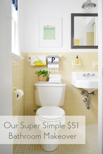
The room has this casual Anthropologie-ish vibe now, which isn’t usually something I’m very good at pulling off – so all the credit goes to the items that were already there (like the original white sink and that sweet 60’s tile). And it definitely didn’t hurt to add some art and a few accessories to fill the voids. Here’s a before shot taken from the same doorway about a week after we moved into our house:
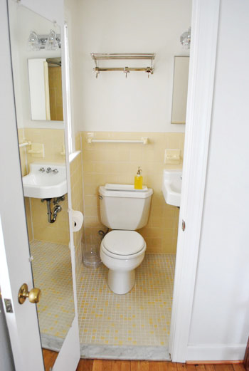
Thank goodness the I-can-see-my-full-body-while-I’m-on-the-toilet mirror is gone, eh?
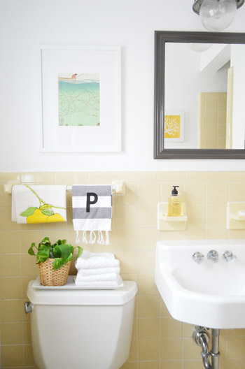
It’s a tiny room, so please excuse my lack of diverse and all-encompassing shots. The print hanging over the toilet is just a page I tore out of the September issue of Real Simple last year (I keep a flat tupperware box under the bed in the guest room full of “someday art” – so I sifted through it and thought the colors – and the water/fishing thing – was cute for a bathroom). The frame is from Target and came with the mat for $22.
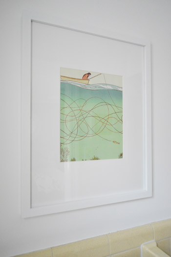
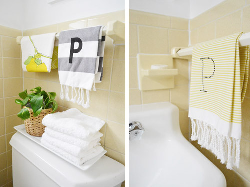
I like how the softer white frame and art works with the deeper mirror and light fixture. Instead of competing and feeling busy, the art falls back and the charcoal mirror over the sink (which I painted Silhouette by Benjamin Moore) says “look I’m the focal point.” Both of the P hand towels are from West Elm (from two different readers at book signings, which was such a fun surprise). And that lemon tea towel is also from someone at a signing. So glad we found a spot for them :)
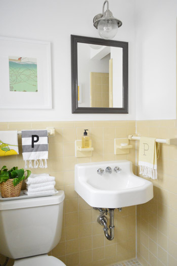
Dag guest bathroom, why you gotta be so sweet? Here’s where I’ll insert John’s terrible third grade joke about how you have to have two monogrammed P towels in a bathroom because that’s where the pee pee goes. Please forgive him.
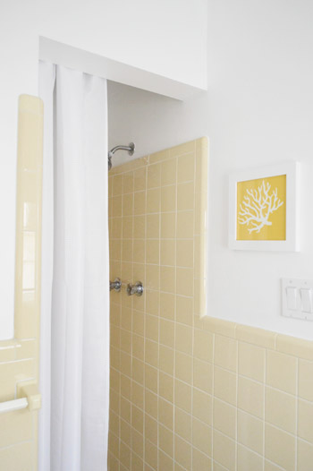
And for those requesting a shot of the shower opening, it’s a crazy-tight room, so this is the best I could muster. But you can see the art that hangs across from the mirror a little better. That’s just an old fabric remnant (from U-Fab last year) that I slapped in a frame.
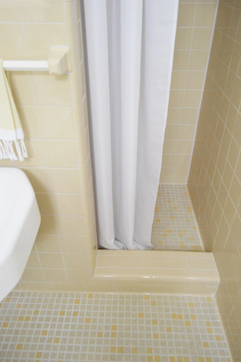
I like that it relates to the brighter yellow tiles in the floor as well as the pops of yellow in the guest room. And here’s a shot of the bottom of the shower, so you can see how that tile lip keeps the curtain from encroaching on the sink. And because it’s polyester (just like a typical fabric shower curtain liner) we just wash it to keep it clean. So far, so good (it’s been in use for 6 months).
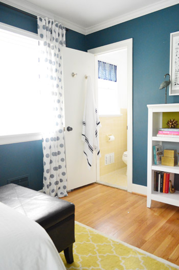
This is the view from the guest room, which is nice and tied in, thanks to everything from the blue window shade and the turkish towel on the door (don’t they look cute next to the polka dot curtains?).
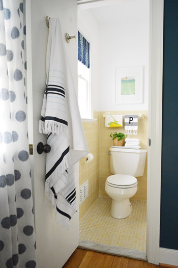
It’s so funny how an old yellow bathroom that used to feel like “the weird room” in our house suddenly fits right in.
Here’s what we did in there to snap it into shape:
painted the walls, trim, and ceiling(we did that here)frosted the window for privacy(we did that here)made a window treatment with a bold fabric remnant(we did that here)painted the frame of the mirror so it stands out morehung some art over the toilet and across from the mirrorwent accessory happy
How you like me now, list? Yeah, that’s what I thought.
And here’s our budget breakdown:
- fresh white paint for the walls, ceiling, and trim (all Decorators White by Benjamin Moore): $25 (for a quart)
- paint for the mirror (Silhouette by Benjamin Moore): $0 (already owned)
- art for above the toilet: $22 (frame: Target, art: a free page torn from Real Simple)
- coral fabric art that you see in the mirror: $0 (yellow coral fabric remnant + frame we already had)
- fabric remnant for the window treatment: $4 (from U-Fab by Iman)
- frosting film for the window: $0 (already owned from other projects like this)
- hand towels, plant, bath towel, and soap: $0 (all already owned)
- TOTAL SPENT: $51 (it would probably be around $70 total if you didn’t already have mirror paint, hand towels, & frosting film)
And that’s why I love accessorizing. The end.
Psst- Wanna know where we got something in our house or what paint color we used? Just click on this button:


Cher says
I love the idea of a “someday art” box! Right now, I wrap stuff I like with saran wrap and tape it to the wall and “live” with it until I know I like where it is, but there is plenty of Someday art hoarded away. I’ve got a super low platform bed, but I could probably shove a low-profile container under it. Does yours have a lid? I’m wondering about dust…
YoungHouseLove says
Yes, it has a lid which is really helpful! It’s just one of those under-bed tupperware bins with a snap on lid. It’s nice and shallow and perfect for art :)
xo
s
Dawn says
Looks great, guys! Love the crispness of all the colors. All you need to do is fold the toilet tissue in a point (ie: hotels)and consider it done!
YoungHouseLove says
Haha, how did I forget that?!
xo
s
Kerrie says
I love the changes to the bathroom! The yellow tile looks so much better now! :) Have you considered painting the bottom part of the sink either the dark or light colors in the curtain to bring that color somewhere else in the room? I pinned this a while back and LOVE the idea! http://pinterest.com/pin/42362052717342141/
YoungHouseLove says
Oh yes I love that! I wish you saw more under the sink, but unless you’re down low you usually don’t see under the sink’s lip :)
xo
s
Monique says
Love this!! Along with nearly everything you guys do :) What about painting the soap holders and the towel bar arm thingys white as well? So they pop out from the yellow and make the yellow more.. yellow! The soap things look more drabby yellow then the pretty tile. But I love it none the less and would probably find unlimited ridiculous excuses to use the bathroom!!
YoungHouseLove says
That would be cute!
xo
s
Tiffany H. says
Oh my goodness. I couldn’t stop laughing at John’s “pee pee” joke. Seriously funny! Great job on turning a negative into a positive, guys. It looks super cute.
Jeanna says
Thank you for the hints on how to see the new link in your header! Cleared out my cache, but no go. Found out I needed to update Windows, and now it’s all good :) I love the updates in your guest bath, it’s so cute! I’m glad you chose to keep the tile……… so many people would have chosen to just rip it out, and there goes all the character. I really hate it when people upgrade their homes, and they end up with such a cold, sterile space that looks just like a dozen others. Good job!
YoungHouseLove says
So glad it’s working now Jeanna! Thanks for the upgrading Windows tip! So helpful!
xo
s
Jessica says
Looks great! Where/why did you move the teardrop vases that you had above the light switches? I loved those! : )
YoungHouseLove says
We realized after showering in there a few times that they stuck out too much in a small room to be functional (we just felt like we were seconds from shattering them when we dried off from the shower) so they came down, but I can’t wait to find the perfect spot for them :)
xo
s
Mary says
What a cute mini makeover, you really pulled it off! I am faced with a similiar dilemma. My bathroom has a pink bathtub, light blue tiled walls, and a blue-grey tiled floor! After 5 years in my house I still haven’t been able to figure out how to pull the room together! Any ideas?
YoungHouseLove says
Sounds cute! I’d use lots and lots of white to spa it up since there’s already color in the tile. And pretty things like a plant and some fringed hand towels could finish it off along with some nice art and maybe a new light fixture or curtain.
xo
s
Sarah K. says
I’m using Chrome version 26 and I can’t see the Family Blog link anymore.
LOVE the yellow tile, I’m glad you stuck with it!
YoungHouseLove says
Did you clear your browser’s cache? We hear that has been working so we hope that’ll do it for ya!
xo
s
Gene says
So I need to know where that light fixture is from. My wife and I just bought a new home and we have a mint green version of this bathroom so this post is great!
YoungHouseLove says
Here ya go: https://www.younghouselove.com/2011/07/a-not-so-quick-fix/
xo
s
Michele from IL says
The colors look great together. And I appreciated John’s P towel joke. :)
Nicole @ Liberty Belles says
umm looks awesome! wish I could do such great things with $51!
Nancy says
Our old poor house has the same kind the upstairs half bath, but I fashioned a floor length skirt to hide the pipes and attached it with velcro around the sink.
LOVE the yellow tile floor!
Camilla says
Wow, I am really impressed by this makeover, you guys! All your work around the house is great but I especially love this one. It’s so great when you can use what you already have and realize how cute it actually is when you add the right elements! So often we just want to tear out everything and make it NEW, but new isn’t always better. That tile is in amazing condition (they sure don’t make ’em like they used to) and is such a cute buttery yellow color! Your little pops of color (the blue curtain, the art, the mirror frame) just make the tile look so much better. Congrats!
YoungHouseLove says
Aw thanks so much Camilla!
xo
s
Stephanie says
Looks great! The industrial light fixture is my favorite part…thanks for the link!
YoungHouseLove says
Sure thing!
xo
s
Mia says
I’m having a little bit of a rough day, and I laughed out loud at that third grade joke. Thanks, John! I needed that.
Also, where did you get the light fixture over the mirror, or was it already there?
YoungHouseLove says
Here’s that post for ya: https://www.younghouselove.com/2011/07/a-not-so-quick-fix/
xo
s
Raven says
Totally adorable! I am loving all your solutions for lighting above bathroom mirrors!
qs777 says
Looks great! I’m so glad you worked with the tile. I wish our house had some great vintage tile – I wouldn’t even mind if it was the pink/black tile.
I am so glad you remarked about what John said about the “P” towels. I must admit I was thinking the same thing before I read what you wrote. In my (and John’s) defense, anyone with younger kids knows that that is normally a big topic of discussion. :)
YoungHouseLove says
Haha!
xo
s
Myrna says
The Family Blog is not in my header. Where can I find it?
YoungHouseLove says
Just check out the first line of this post for that info. Hopefully clearing your browser’s cache will bring it back. Also if you have old Windows, updating them should make it pop up too :)
xo
s
Missy says
You may have told us this before but I can’t remember. Does the shower have its own light fixture?
YoungHouseLove says
It does have one in the shower, which is nice and convenient since it’s so closed off in there :)
xo
s
amy says
darling! you have motivated me up off the couch and into the bathrooms to ‘jazz’ them up for a weekend of company!
lori says
Yellow is my favorite color…just makes me happy. I luv it. It makes me want a yellow bathroom for my own. So so so adorable! Great inspiration for “working with what you got”
Sydnie F. says
Such an inspiring update guys! It looks great! Have you thought about doing a little skirt on the sink to hide the plumbing hardware? Like in a textured white or a simple stripe? They can be really cute in a tiny, older space.
YoungHouseLove says
Oh yes you can scroll back through the comments for our thoughts on that :)
xo
s
Frannie says
I was SO hoping you would paint it grey around the mirror! I don’t know why but I absolutely adore grey & yellow (the soft ones). So lovely!
Jess @ Crunchy Hot Mama says
AHHH my towel made it in there-yay :) That bathroom looks fabulous and I love John’s pee pee reference! You guys always make it look so easy to just slap things you have lying around in some nook or cranny. I hope to channel your techniques when I get older ;)
PS-did you mean ‘Dang’ not ‘Dag guest bathroom, why you gotta be so sweet??’
YoungHouseLove says
Haha, thanks Jess! We love that towel! And as for dag, I think that’s a NJ-ism. We used to say “dag!” – it’s basically the same thing as dang, but you usually say it all slow and long, like daaaaaag! – haha!
xo
s
Meg M. says
And in Texas, where I’m originally from, “dag nab it” was often used instead of “gosh darn it” or another not-nice-to-post phrase.
YoungHouseLove says
Haha!
xo
s
Jess @ Crunchy Hot Mama says
Ok, that’s twice that I thought you had a typo and it was lingo over my head! I promise I’ll stop because I clearly have no idea of your East coast slang ;)
YoungHouseLove says
Haha! No worries at all! I always appreciate typo help, and more often than not they’re misspellings and not weird nobody-has-heard-of-it lingo :)
xo
s
Bethany says
I’ve ripped pages out of Real Simple since 2007 and I keep them in sheet protectors inside a 3-ring binder. Divided into sections- 1) I WANT NOW (to be purchased as funds allow), 2) Cool beauty tricks or fashion choices to keep in mind, 3) Organizational tips and tricks for the home, 4) Decorating and home design inspiration (where I also have a few “possible artwork” sheets), 5) Recipies to try when time allows and when children cooperate! PS- bathroom looks snazzy!!
YoungHouseLove says
I love that! Being organized by category is great!
xo
s
Stephanie says
I love it so much! The mirror is perfect and it makes me want to frame and paint the mirror in our master bath!
I also am really diggin the light! : )
Elizabeth @ Real Inspired says
It looks so great! Hopefully I can get my old tiled bathroom to look as good!
Heather says
I love it! And I love that you have a box of “someday art” I’m going to steal that idea!
Suzy says
Hi, your Forums link is not showing up on my screen. I’m running Mozilla Firefox version 20.0 on an iMac. I cleared cache/cookies/history but it still didn’t show up. :(
YoungHouseLove says
Hmm, anyone else having this issue? What if you look on our sidebar under “shortcuts” – do you see the link there? Maybe just use that until it pops up on the header for ya?
xo
s
Andrea says
Love this airy look, though I was sad about the chocolate and blue shower curtain at first, namely because I have the same one! Matches my original 1960’s blue tile bathroom so I’ll probably keep for a while, but have to admit Target had some really pretty new ones… maybe I’ll rotate!
YoungHouseLove says
Aw, I loved the pattern and color on that one, it was just too short when we wanted to raise the rod :)
xo
s
Sarah says
I totally saved those same pictures from Real Simple to frame! My husband and I were really into those prints when we saw them. Hopefully we’ll find a place to put them soon.
Aimée says
Is it weird that I now want a yellow tiled bathroom? So sunny and cheerful – really glad you found a way to make it work!
sally G says
I thought you guys were going to go navy on the mirror framed, but you faked me out with the gray and it’s even better than I ever imagined. I love it!
Jenna says
Love love LOVE the P towels!! I always love how little changes can totally transform a room. I also love the idea of framing pages from magazines….I’ve going to go dig through my stack!!
Jenna
Ashley @ Any Lovely Thing says
Wow! What a great little transformation. I especially love the magazine art. It perfectly ties in.
xo,
Ashley
Audrey says
I am thrilled that you’re rocking the yellow tile. If it’s in good shape, I think it’s worth it (fiscally and environmentally) to try to make it work. You guys did a great job :)
YoungHouseLove says
Thanks Audrey!
xo
s
Katie @ Suburban Fervor says
I am in love with the fact that you kept the yellow tiles! Having an older home means it’s going to come with some character and charm and it makes me sad when we “modernize” instead of “accentuate” what makes our homes unique.
Amanda says
I’m SO GLAD you guys were able to upgrade without losing the original vintage tile and sink. It brings so much character to the room that wouldn’t have been there if you completely gutted it and redid it.
I mean you can keep the sink and use vintage-esque tiles and still have an adorable guest bath, but this one’s got so much quirky, happiness going for it. And humor. Love a room with some humor in it!
YoungHouseLove says
Aw thanks Amanda!
xo
s
Petite Peltier says
So cute. We moved into a rental a couple of years ago with bubble gum pink tiles on floors and walls. At first I was a little stumped but then I just went with the flow and I love it. It has that adorable vintage charm that you can never fully replicate in a remodel.
Lauren Nicole says
I like that you guys did this on the cheap, but I don’t get the window curtain. Everything else looks great, but I can’t figure out that curtain. I’m going to assume it’s lovely in person but that without being able to see all of the angles at the same time I am missing something in the photographs.
Very inspiring anyway! Thanks for sharing!
Jeanne Garrison says
Thanks for inspiring me. Maybe it is not so bad to have an old fashioned pink, green and white tiled bathroom. Will go home and look at it with fresh eyes.
Miss Riss says
WOW!!!!! It went from I-think-I’ll-wear-bath-slippers-while-I-shower-in this-one to I-shall-dance-naked-and-sing-happy-songs-and-never-come-out-of-this-shower-room. I love it!
YoungHouseLove says
Haha, comment of the day! You made me spew water everywhere.
xo
s
Amy says
Is the artwork affected at all by shower steam? I’m nervous to add art to the bathroom, because I’m afraid it could get water/steam damage…?
YoungHouseLove says
We haven’t noticed any issues when we hang art in the bathroom but I definitely wouldn’t hang anything valuable or especially meaningful in case over the years it get steamed up and ripples or something :)
xo
s
Lynn says
looks great! just wondering if you thought about a sink skirt to hide the plumbing?
YoungHouseLove says
Oh yes, you can scroll back in the comments for our thoughts on that :)
xo
s
Jenn says
I think you should stop calling it The Guest Bath and call it The Burger Bath. It’s yellow, it’s tiny and it’s fresh!
YoungHouseLove says
Haha, done!
xo
s
JC says
I don’t know why, but for the past month or so, none of your posts have been showing up with any photos (even when I visit this page). I assume that there ARE photos with this post, right? It’s been pretty confusing.
YoungHouseLove says
Oh yes, we haven’t changed anything about how we share photos so perhaps on your computer there’s a pop-up blocker or some virus software blocking them (like Norton or McAffee?). If you’re at work your office could have just blocked the place that hosts our photos too. Hope it helps!
xo
s
Stephanie says
I love how you guys embraced the tile! You’re lucky with the yellow color. Avocado green might have been a little tougher ;) It’s old meets new and totally chic! And also, i’m loving how you guys deck out your toilets! Seriously….if anybody could make a toilet cute, it’s you two. Where did you find the white tray? I’ve been looking for one of those forever.
YoungHouseLove says
Haha, thanks Stephanie! That’s from Target years ago. It was actually on our last house’s toilet too!
xo
s
Meg M. says
It’s funny, I’ve loved this bathroom from the start, but was in agreement that it needed some love. I am so happy y’all made the vintage tile work! It looks amazing!
YoungHouseLove says
Thanks Meg!
xo
s
Katie says
Looks so good Sherry and John! Love that you guys are using what you have! I rent so can’t do any big changes (painting etc) so constantly have to work around colours I don’t particularly love or would chose for myself. I did manage to turn our bathroom into something I love too though (you can look at it here if you want :D http://tinyurl.com/c688zfc)
PS. Love you guys, totally had a dream where I got to hang out with you and Sherry told me all these nice things about how it was okay to be single haha!
YoungHouseLove says
SO charming! I love it. And it’s totally cool to be single, haha!
xo
s