The guest bath = so much cuter. That sweet little space reminds me that even small seemingly “stuck” spaces can shine with a few easy upgrades, like fresh paint, a new window treatment, some art, and a few mixed and matched accessories. Sometimes it’s fun to embrace an old feature like vintage yellow tile (complete with a floor that looks like a scrabble board) instead of hammer-drilling it out of there. So stick a fork in this baby… for around $50, she’s a whole lot easier on the eyes.
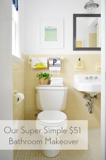
The room has this casual Anthropologie-ish vibe now, which isn’t usually something I’m very good at pulling off – so all the credit goes to the items that were already there (like the original white sink and that sweet 60’s tile). And it definitely didn’t hurt to add some art and a few accessories to fill the voids. Here’s a before shot taken from the same doorway about a week after we moved into our house:
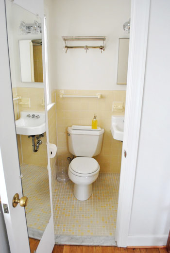
Thank goodness the I-can-see-my-full-body-while-I’m-on-the-toilet mirror is gone, eh?
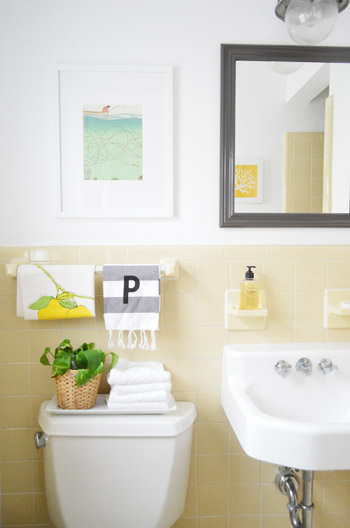
It’s a tiny room, so please excuse my lack of diverse and all-encompassing shots. The print hanging over the toilet is just a page I tore out of the September issue of Real Simple last year (I keep a flat tupperware box under the bed in the guest room full of “someday art” – so I sifted through it and thought the colors – and the water/fishing thing – was cute for a bathroom). The frame is from Target and came with the mat for $22.
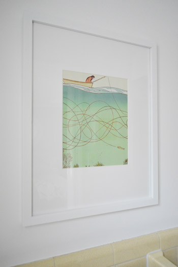
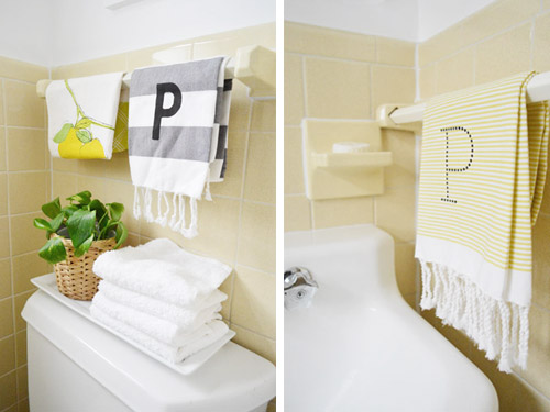
I like how the softer white frame and art works with the deeper mirror and light fixture. Instead of competing and feeling busy, the art falls back and the charcoal mirror over the sink (which I painted Silhouette by Benjamin Moore) says “look I’m the focal point.” Both of the P hand towels are from West Elm (from two different readers at book signings, which was such a fun surprise). And that lemon tea towel is also from someone at a signing. So glad we found a spot for them :)
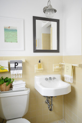
Dag guest bathroom, why you gotta be so sweet? Here’s where I’ll insert John’s terrible third grade joke about how you have to have two monogrammed P towels in a bathroom because that’s where the pee pee goes. Please forgive him.
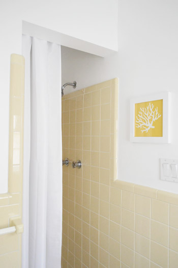
And for those requesting a shot of the shower opening, it’s a crazy-tight room, so this is the best I could muster. But you can see the art that hangs across from the mirror a little better. That’s just an old fabric remnant (from U-Fab last year) that I slapped in a frame.
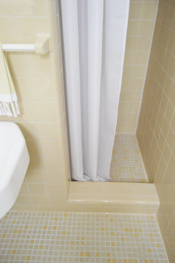
I like that it relates to the brighter yellow tiles in the floor as well as the pops of yellow in the guest room. And here’s a shot of the bottom of the shower, so you can see how that tile lip keeps the curtain from encroaching on the sink. And because it’s polyester (just like a typical fabric shower curtain liner) we just wash it to keep it clean. So far, so good (it’s been in use for 6 months).
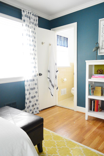
This is the view from the guest room, which is nice and tied in, thanks to everything from the blue window shade and the turkish towel on the door (don’t they look cute next to the polka dot curtains?).
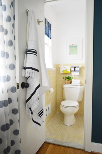
It’s so funny how an old yellow bathroom that used to feel like “the weird room” in our house suddenly fits right in.
Here’s what we did in there to snap it into shape:
painted the walls, trim, and ceiling(we did that here)frosted the window for privacy(we did that here)made a window treatment with a bold fabric remnant(we did that here)painted the frame of the mirror so it stands out morehung some art over the toilet and across from the mirrorwent accessory happy
How you like me now, list? Yeah, that’s what I thought.
And here’s our budget breakdown:
- fresh white paint for the walls, ceiling, and trim (all Decorators White by Benjamin Moore): $25 (for a quart)
- paint for the mirror (Silhouette by Benjamin Moore): $0 (already owned)
- art for above the toilet: $22 (frame: Target, art: a free page torn from Real Simple)
- coral fabric art that you see in the mirror: $0 (yellow coral fabric remnant + frame we already had)
- fabric remnant for the window treatment: $4 (from U-Fab by Iman)
- frosting film for the window: $0 (already owned from other projects like this)
- hand towels, plant, bath towel, and soap: $0 (all already owned)
- TOTAL SPENT: $51 (it would probably be around $70 total if you didn’t already have mirror paint, hand towels, & frosting film)
And that’s why I love accessorizing. The end.
Psst- Wanna know where we got something in our house or what paint color we used? Just click on this button:


bella says
speaking of weird last name stuff, my fiancees last name is dick, which means dick where you live and fat where i live. horrriiiible last name, worst thing is i am not even kidding :( the names origin lies in dickicht by the way which simply means thicket in german.
YoungHouseLove says
Aw well, peter is sort of a slang term for what your fiancee’s last name means here, so that’s kinda funny to us (if you add “sik” after it, it rhymes).
xo
s
Teri Cettina says
Silly little paint question, but do you guys TSP or otherwise clean your walls before you repaint? It’s an annoying extra step, but I’ve always wondered if it’s important. Your take?
YoungHouseLove says
We just wipe down any obvious cobwebs with a damp cloth and we’re off to the races.
xo
s
Lauren says
So, I feel weird asking about your shower, but… won’t having the shower curtain placed so high make it awfully dark for the shower-er, since the stall is so small and enclosed? Or is there a light in there? I do love the way it looks from the outside though. And sorry if I’m repeating a question buried somewhere in the 30 gajillion comments.
YoungHouseLove says
There’s a light in there! We’re so happy to have it, because even without a curtain it’s pretty closed off and dark without the light :)
xo
s
Krista says
So cute! I love that you kept the original wall and floor tile and made it work. Too often people feel the need to gut and replace instead of making what they have work for them. On another note, what would you guys recommend for a window IN the bathtub? Our own ’60s ranch has an original window directly over the tub. This probably worked great 50 years ago, but at some point a shower was installed as well. Right now we’ve got a vinyl shade that we pull down during showers. When it gets moldy, I take it off and scrub it with bleach. Not ideal but it’s better than rotting the wood window frame. I’m guessing we’ll have to brick it up someday, but we’d prefer not to as the daylight really helps brighten up the small room.
YoungHouseLove says
I would totally frost it! You’ll get light coming in but privacy :)
xo
s
Jamie Howe says
I have a sink like this in my house (actually 2 – one in my home and my home away from home little cottage) and always toyed with the idea of some sort of skirt to hide the exposed pipe. Did you consider that? If you do it would love to see the DIY!!!! :)
YoungHouseLove says
Oh yes, you can scroll back through the comments for that info :)
xo
s
Natalie says
How cute and cheerful – I love it! :)
Aubrey says
ugh. you make it look so effortless! I wish I could get my bathroom to look like that.
Jessica says
I love how it turned out! But I’m wondering…does it bug you that the towel bar over the toilet isn’t centered? The room looks so great but that would drive me crazy! :-)
YoungHouseLove says
When it was naked it really bugged me, but now that there’s art and towels and a plant and everything it’s not as noticeable, so I think it’s a fair trade to get to keep the cute tile :)
xo
s
Julie says
What? You took out the mirror on the door? Who doesn’t want to stare at themselves while sitting on the toilet? lol And I kinda want to go play Scrabble on your bathroom floor now.
YoungHouseLove says
Hahah! Here’s John demonstrating just how awesome that mirror was… http://images.younghouselove.com.s3.amazonaws.com/2011/01/GuestMirros-John-on-John.jpg
xo
s
Kate Craig says
I always struggle with centering things over the toilet or centering them in the space! So I was really interested to see what you did, especially with the towel bar being centered in the space. Do you center art over the toilet as a rule, or is that just what worked in this room?
YoungHouseLove says
We have just learned always to eye things! I think sometimes the “rules” don’t really work in person since there can be a million factors going on. In this case we just held it centered over the towel bar and the toilet and it was much more balanced looking centered on our toilet :)
xo
s
keisha says
It looks great! Plus, I love that you frame pages from magazines. That illustration makes a great piece of art.
Kelly says
It looks super cute! You are inspiring me to finally do something to our bathroom to make it more us…except ours doesn’t have cute vintage tile, it’s more early 90’s, eek.
Racheal says
I love this! If it was pink… It’s exactly the same as our little bathroom with vintage tile! Thanks for the ideas!
Btw… I just found your blog and love it! I’m in RVA too :)
YoungHouseLove says
Aw thanks Rachel! Hope we bump into you around town sometime!
xo
s
Meghan Lindsay says
Seriously adorable. And I LOVE that you guys chose to work with the original tile!
Holly says
Love the bathroom..so cute! I LoVe the fact that you kept the tile…and didn’t bust it out. Great job!
Melissa S. says
I love your retro bathroom. I’d take one like it in a minute. Great art idea too!
Susan says
It does look nicely spiffed up-but I’d do the mirror in that BLUE that’s in the faux shade and goes more with the guest room in general and carry that color also into the mat in the frame over the toilet. Just a thought…
Rachel says
Will now be spending days looking through my back issues of RS for art. They have such cute graphics/pictures sometimes, but I never thought to actually frame it!
Jasmine says
Love the sweet yellow bath update. I was thinking a charcoal rug on the floor would pop and speak to the frame…but my fav part is Sherry saying ‘eh’. Perhaps the brief stop in Canada rubbed off a wee bit? :)
Linda says
I’m so glad you didn’t do away with the yellow tile. I think it is so unique and nice. You really made it sing, of course. But I’m so glad you didn’t ripit out and put in something trendy.
Petra says
Painting the mirror frame dark blue would tie nicely to the bathroom mini window treatment as well dark blue in the guest bedroom and yellow tiles.
YoungHouseLove says
We thought about that too but landed on the charcoal color (we didn’t want dark teal overload in the bathroom since it’s on every wall of the bedroom and the shade in the bathroom is already that color). So we let the shade be our “nod” to the bedroom walls and brought in some dark charcoal for the mirror, which ties into the P on the towel (and looks great with yellow) :)
xo
s
Cara says
Ahhh, this gives me hope for the 1992 tile border in the kids’ bathroom in the house we just bought! ‘As I sit on my THRONE as the Prince of Belair!’
Anna, Sydney says
Somewhat unrelated… I’ve been wondering a lot lately about rolling vs spraying paint. Noticed the Bowers lately have been doing a lot of spraying while you guys roll. Would you by any chance know if there are any rules for when you can do what? And if it’s entirely by choice, would you mind sharing why you picked rolling? That might be an entire post all by itself?
As always, love your work.
YoungHouseLove says
It’s entirely by choice! They own a sprayer (an investment we haven’t made, but if we had one we’d be much more apt to use it I think!). In general, spraying a large area (like a big dining room with tons of trim and board & batten) is a huge time saver, but when you use a sprayer you have to carefully tape everything off that you don’t want to spray (floors, tile, etc) and you also have to clean the sprayer when you’re done. Therefore in a smaller space or a room that would take forever to tape off, you’d probably be faster with a brush and a roller – but if you have a giant room full of wood beams and floors and wainscoting or something, spraying can save you days of time! I think we’d definitely invest in a sprayer if we had a room like that!
xo
s
Anna, Sydney says
Thanks so much guys for your reply!
Rachel says
Love it. Just saw Censational Girls post about bathroom with your link holla holla..and I got to thinking wonder what your bathroom sink would look like skirted with some modern funky fabric or even neutral with texture? I think amazing!! Do it, do it, do it!
YoungHouseLove says
We actually considered that but worried it would touch the person’s leg who was sitting on the toilet (eww!) – it really is such a small room we think the floating feature of the small sink is a nice space saver and helps it feel open :)
xo
s
Kel says
Wowsers, what a difference!!! whoever would have thought those yellow tiles could look so good. Love your work xx
Ali B. says
You guys have gotten to be such great photographers! I don’t know which of you took that last shot in this post, but it totally looks like something out of a West Elm catalog. You rock!
YoungHouseLove says
Aw thanks Ali! That was just with our stock lens, we just tried to get really straight on :)
xo
s
Ashlee says
All the little touches make it look so cheery! I’m totally jealous. We have an older house too, but our bathrooms are blue and pink. And I’m talking BLUE, blue floors, tile walls, sink, toilet, shower.. with a lovely blue fish printed wallpaper…
Kate says
I wish you could tell me what to do with our main-floor bath! We moved into our house in September and both bathrooms are straight out of the 1950s, when the house was built. The downstairs bath is covered in forest-green tile with pink accent tiles, and the floor is the old-school tiny pink tiles. Sink: A horrible cabinet sink that was added later. (No nice white pedestal sink for us, alas.) I don’t know WHAT to do with the paint color and accents. Eventually we’ll probably have all the tile glazed white but we can’t do it yet! Your bathroom looks great.
YoungHouseLove says
Aw thanks Kate! There’s a sweet pink & green bathroom in this house crashing post that I love! Maybe try adding lots of white and charming accessories like she did? Hope it helps!
https://www.younghouselove.com/2012/11/house-crashing-lesley-jeff/
xo
s
Taya says
Love it! I just got some new inspiration for our little bathroom fix up plan!
YoungHouseLove says
So glad :)
xo
s
Brittany says
Looks great!!! We are working on our master bathroom after living with it half done for a year.:-)
MyDesignGuide says
Our designers say ‘Clean and fresh! Great job”.
Kara says
I noticed that you typically do not use bath mats around toilets, sinks and showers. Is there a reason for this?
YoungHouseLove says
We usually just toss down a hand towel to act as a bath mat (it’s not any more slippery than a bath mat is) but we’d love to find a cute little fluffy square bath mat for someone to step out onto from the shower eventually. I don’t think John and I like the ones that go around toilets though, they just seem icky like they’re full of germs or something since they’re touching the bowl, haha!
xo
s
julie g. says
Please publish the post for today! I have to work but I keep going back and hitting refresh. I won’t be able to concentrate until I know what you’re up to!
YoungHouseLove says
Haha, it’s up! Sometimes it takes a second for your computer to cache it (so you don’t see it) but if you go to our Facebook page and click that link it’ll bring you there :)
xo
s
Angell says
Yellow has never been one of my favorite colors, but you guys make it ROCK! I know you have probably mentioned it in past posts, but where do you find your delicious rugs? I need one for our nursery!
YoungHouseLove says
The yellow one in our guest room is from Pottery Barn on clearance a few years ago, the green geometric one in our living room is from Joss & Main, and the blue and gray one in our bedroom is from a local decorating outlet :)
xo
s
Brianne says
I love the light fixture above the mirror! I have been looking for one like that for quite sometime. Where did you find it?
YoungHouseLove says
That was from Home Depot two years ago :)
xo
s
Deb says
So cute and I love that vintage yellow tile! Just a suggestion from someone looking from the outside in….the white frames get lost on the white wall, I might distress them a bit with a rubbed on yellow or blue paint just to highlight them and still not compete with the mirror. Also, I would hang both P towels on the rod above the toilet and place a usable towel next to the sink…the two p’s would look cute in their contrasting prints and remember the design “rule, always group a collection together to give it impact. Either way, the room is adorable.
Angel says
Alright, you win. I was skeptical but I love it!
YoungHouseLove says
Haha, thanks Angel!
xo
s
Tasneem says
OH MY! I seriously think this is my favorite bathroom in the house now. I have always love love loved the floor in there, but I didn’t think the rest stood a chance.
BUT…..now, the accessories (that were fippin’ FREE since you had most of them on hand) totally “make” the bathroom. Whoa, what a difference simple accessories can make. I am inspired to show some love to my yellow 50’s bathroom too now!!!
Love it guys. As always thanks for sharing it all with us.
Here’s to my new favorite bathroom in your house! : )
YoungHouseLove says
Thanks Tasneem!
xo
s
Robyn says
So fresh and pretty! Way to work with what you’ve got, it turned out super cute:)
Lee says
Gotta say i have one JUST LIKE IT! Really! LOVE WHAT YOU DID!
My sink is beside the window and the toilet where your sink is…even have that cute single stall shower! Mine has white tile with itsy bitsy black specks.
Your floor and entire room is so much cleaner!
Working on a mini remod too :)
Lee says
WOW! i looked again how clean your tiles is. Did you regrout the tile.
If you just cleaned it can you please tell me what solution you used and what tools?
Can u tell me that color in the bedroom? I’ve been looking at navy blue for the living room recessed walls but love that blue of your bedroom looks like it has a little green in it.
YoungHouseLove says
We actually didn’t since it was clean when we moved in! But I’ve used this heavier duty method once on our first bathroom: get 40% peroxide at a beauty supply store and let a thin layer of it soak in on the floor overnight and then scrub the heck out of things in the morning. It might not work on all tile though (ex: glass, marble, granite, travertine) and might actually damage it though, so I’d just use this for old ceramic or porcelain tile. Then once you’ve scrubbed it clean be sure to seal the grout. That helps so much (we clean grout once very thoroughly and then seal it and it’s good for a year or more without any more scrubbing!). As for that color in the guest room, it’s Plumage by Martha Stewart :)
xo
s
Lisa says
Love this! I also love the monogrammed P’s, particularly because my last name also starts with P!
Pam says
I love this! This type of project is what attracted me to your blog years ago. The yellow is timeless to me and I hoped you wouldn’t just rip it out and add to the landfill. You’re so lucky to have it in such great condition to start with. My early 70’s tiles are all cracking :( The colors are tragically dated but I’ve been able to live with them for 22 years now. Congrats on another great project.
Jennybethw says
This looks wonderful! I have a question about the artwork hanging in the bathroom. Do you ever find that the humidity from steamy showers ever fogs up the inside of the frame? I have a beautiful photo of a beach in Morocco and I’m a little terrified to put it in a frame and hang it in my bathroom. Thoughts(other than, “lame question!”)?
YoungHouseLove says
We haven’t noticed any issues when we hang art in the bathroom but I definitely wouldn’t hang anything valuable or especially meaningful in case over the years it get steamed up and ripples or something :)
xo
s
Jo-Anne says
Gee thanks YHL. Just looked through the latest edition of Real Simple and found the picture of a cute pink flower (Burt’s Bees ad) to frame and put in my “pink room”.
YoungHouseLove says
So glad :)
xo
s
katy says
Sorry, I haven’t read the whole article, just took a look at the pics. I really like the lemon yellow colored tiles. Just a suggestion, but you could really bring some more life into that cute lil bathroom with the awesome horizontal stripes you painted in your previous house powder room. Perhaps bringing the navy color in the bedroom, or soft grey/yellow color combo? Although the white really brightens up the yellow. Before you consider a major tile remodel, just a fun pattern paint job could do wonders to that cute space. Personally, my favorite combination is lemon and lime. So cheery and bright!
YoungHouseLove says
Oh yes, I’m sure some subtle stripes could be fun too!
xo
s
Jackie says
I love your update! We have a mint green bathroom and an identical blue bathroom in our house built in the 50’s. I love them both! The grout on your floor looks so white! Was it ever re-grouted?
I enjoy your blog so much!
YoungHouseLove says
It’s so white! I think it was either regrouted before we moved in or bleached somehow!
xo
s
Jas says
Yayy, my lemon towel made it onto the blog!! Totally made my day when I saw that during a looong day at work!
YoungHouseLove says
Wahoo! You’re so sweet Jas, we love the towel. Thanks again for coming our to meet us :)
xo
s
P Ryan says
Looks great, but try making a “sink skirt” for the sink. use velcro to attach to the sink. It would give you the opportunity to add another fabric and then you have hidden storage under the sink.
Michelle says
Ha!Ha! I love the pee pee joke!! Thanks for the chuckle. It looks great!!! It ties into the guest room so well. I am still working on accessorizing my bathrooms. Bits at a time.