Surprise! We painted the guest bathroom this weekend! The walls, the trim, and even the ceiling. And double surprise: we went with a fresh clean coat of white (Decorator’s White by Benjamin Moore). Bet you didn’t see that coming…
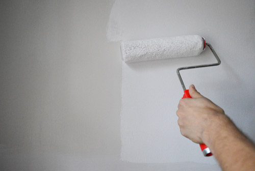
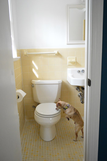
Why’d we go white? Well the old paint was dingy (see the difference in the pic above?), but we’ve decided to embrace the yellow tile instead of yanking it all out gut-job style or painting or reglazing it. It’s completely original 60’s tile that’s in great shape – and the color is happy and cute so we’ve decided it’s charming. Especially with our fresh white (albeit bare for now) walls – which will allow us to bring in some personality and color in other ways without overwhelming the small space.
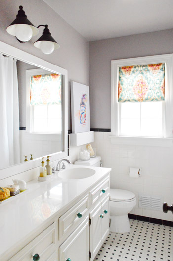
Our hall bathroom sports original tile as well, but we were able to crisp it up and bring in some fun accessories so it flows with the rest of our house…
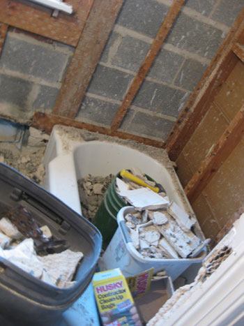
… so we decided to give that the ol’ college try in here before bringing in the demolition hammer, a la this…
Oh and we raised the shower rod to ceiling height and added an extra long 95″ waffle weave curtain (from target.com) about six months ago that hides inside the shower now (this is the view from inside the shower, so the rod is 100% invisible from the main part of the bathroom). It was weird to see the lower bar hanging down around 4″ below the doorway that leads to the shower.
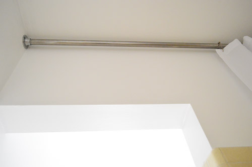
I wish I could have shot a better picture of the other side of the shower doorway so you could get a better idea, but the room’s just too tiny. I’d have to be out the window to get the right angle…
Speaking of the window, we finally frosted it (using leftover frosting film and this method) which is nice because it lets in all the light, but doesn’t let anyone standing on the deck creepily spy on you.
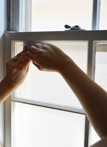
If you want to see how to frost your own bathroom window, we documented this process in a different space on video – you can watch it below or here on YouTube.
Between the freshly painted walls and the glowing frosted windows, it’s definitely feeling crisper and less murky in here already.
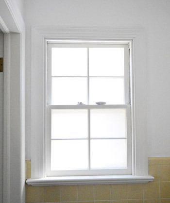
After my little frost-job I dug out this fabric remnant from over a year ago (originally from U-Fab here in Richmond and made by Iman) to make a sweet little no-sew shade. After nixing a faux roman shade like this one I made for the kitchen (not enough fabric) and considering a simpler version like this one from the hall bath, I decided to go with something closer to the latter, but with a twist. So I dragged out my materials (a tape measure, some iron-on hem tape, a scrap piece of wood, and my staple gun) and got to work…
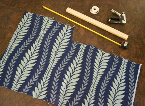
I measured the window width (23″), cut my scrap wood about a 1/4″ shy of that size, and cut my fabric to 25″ wide and as long as I could make it (which ended up being 30″) so I could hem it on both sides and at the bottom to end up with a 23″ x 29″ shade. See how the wood is a smidge thinner than the hemmed fabric? That’s so you don’t see it poking out on the sides.
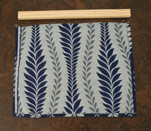
Then I stapled the top of the fabric to the scrap piece of wood (centering the wood so the fabric was slightly longer on both sides) and screwed through it from below three times to hold it into the window.
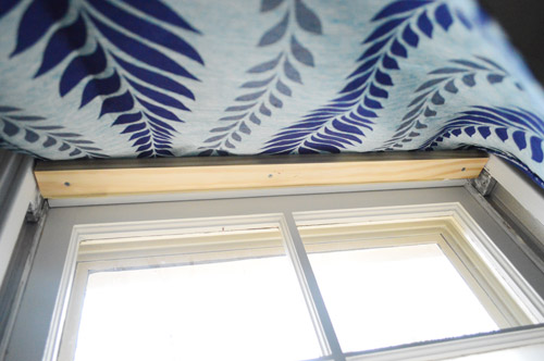
Voila!
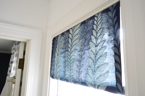
I opted for a cute little rolled look at the bottom thanks to a smaller piece of scrap wood (old shoe molding) that I cut to be a teeny bit wider than 23″ – that way I could roll the fabric around the molding and shove it into place so it held itself between the sides of the window, sort of like a tension rod.
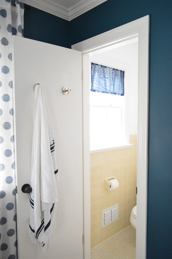
Here’s the view from out in the guest room. I love how the fabric works with the polka dot curtains in there. Not too matchy, but compatible and layered. It’s also nice to see the dark teal color from the bedroom walls carried into the bathroom, so it feels less like a random yellow box without any relation to the adjoining room.
It feels good to cross a few things off the list in there, but there’s still more on the agenda.
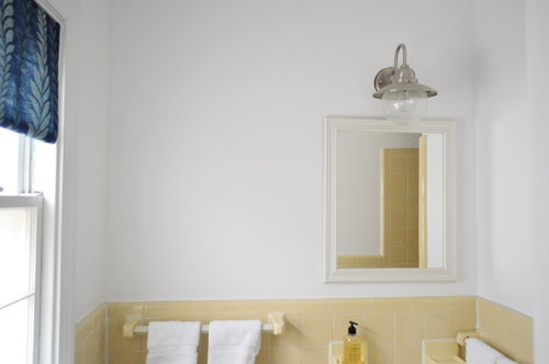
We think three more simple upgrades will make all the difference, so here’s the plan.
paint the wallsfrost the window for privacymake a window treatment with a bold fabric remnant- paint the frame of the mirror so it stands out against the white wall
- hang some art over the toilet
- go accessory happy (if Lesley made her pink tiled bathroom cute with the right stuff, there’s hope for this old room yet)
Is anyone else embracing something old? Any painting going on? Shade-making? Did anyone else watch the Atlanta Housewives reunion and laugh at how many times they said “throwing shade”? I gotta start working that in.
Psst- See how we upgraded the light fixture almost two years ago here.

Kaycee says
I am so glad you’ve decided to keep the original tile! You’re absolutely right, it is so charming and happy. I can’t wait to see what comes next, keep up the good work!
YoungHouseLove says
Aw thanks Kaycee!
xo
s
Paige @ Little Nostalgia says
Whew! I was hoping you’d hang onto those tiles. Love them. Our house was built in 1970, but the bathroom was totally renovated by the previous owners, so no awesome tile for us. Womp, womp. :-(
YoungHouseLove says
Aw man! Yeah, since they’re in such good shape and we’re so happy with how the hall bathroom came out, we definitely can’t wait to see where we end up in here :)
xo
s
Diana T. says
We also have a yellow-tiled bathroom that we decided to work with, but our house was built in ’71, so it’s less buttery-yellow and more goldenrod. We used sort of a brown/gray paint color and some light teal accents to make it look much more purposeful. Can’t wait to see what you guys do for art!
YoungHouseLove says
Sounds pretty!
xo
s
Anele @ Success Along the Weigh says
You’re right, I didn’t see that coming! I thought the next shade lighter blue than in the guest room or something along those lines. I’m sure it will all look awesome when you tie it all together!
I had to laugh at Burger…did you close his “water bowl?”
YoungHouseLove says
Haha, he was so funny! I totally think he wanted to get into the picture. So he was like “oh you’re shooting this room? I’ll just sniff around for a second. CHEEESSE!”
xo
s
Brit @ House Updated says
Love the window treatment! You guys always do such a great job of mixing fabrics and colors – such an inspiration!
Kate says
Love where you’re going with this! I bet a skirt around that sink would look real cute too!
YoungHouseLove says
I thought about that but it’s such a tight space the skirt might brush against the toilet – gross! So we’re going for the more open look in the hopes that it doesn’t close things in – or get toilet germs on fabric. Haha!
xo
s
Amy says
Can’t wait to see what else you do!
And painting. Oh painting. Our house is going on the market TODAY and good thing because I am sick to death of painting! (We like bright colors and are moving rather unexpectedly, so I had to do a lot of neutralizing. My husband is already working in another city, so this was all up to me! While raising a 3 yo and working FT. Ugh!)
YoungHouseLove says
Oh man, best of luck with everything Amy! Hopefully all that painting will pay off!
xo
s
A says
We are in the same position! We live in an area that was specifically developed for retired couples and us “youngins” are having to go all neutral because they apparently don’t care for blues. I’ve developed a claw from all the painting the past week..I feel your pain, Amy!
Janelle @ Two Cups of Happy says
Ou, I like!! It definitely looks happier now – if a bathroom can look happy… Haha. And I like the mini valance/blind. Just enough pattern for a mini bathroom.
kelsey says
Love that you are embracing the yellow! The fresh walls are lovely!
I don’t have any experience with funky tile myself, but I used to babysit for a lady who had this exact yellow tile in one bathroom, the infamous pink tile in another bathroom AND a green tile in the last bathroom! Yikes!
Wendy @ New Moms Talk says
We embraced the old this weekend by finding about $25 worth of baby toys at our local thrift store fore 50 cents. We’ll be combining them with something new that we’re making for our girl that will save us a bunch more $$!
YoungHouseLove says
That’s awesome!
xo
s
Kristen | Popcorn on the Stove says
We’re renting so most everything we do requires ’embracing the old’. Thankfully, there are a lot of great details that we get to work with and we’re allowed to paint (so that very much helps).
PS – I’m sort of a fan of the yellow tiles in the bathroom (mostly the flooring) because it’s so unexpected. Glad you’re keeping it for now!
YoungHouseLove says
Yes, the flooring is my favorite! They look like little yellow scrabble tiles!
xo
s
Caroline (the DIY nurse) says
I absolutely love that you’re leaving the tile! And with the navy walls it just helps it pop from that angle. Can’t wait to see the accessories!!
Emma (Broke Ass Home) says
It’s amazing what a coat of crisp white does to a room. I was so anti-white because of how dirty it can get but I’ve decided it just needs to be in places where dogs/husbands won’t rub against it when they walk. We did some non-painting this weekend by refurbishing one of the original windows to our house. I’m peached about how it turned out. http://www.brokeasshome.com/2013/04/open-window.html
Great job!
YoungHouseLove says
Congrats Emma! Looks great!
xo
s
Jess @ Little House. Big Heart. says
I’m so glad you’re embracing the original character of your home! We’d love to be able to do the same with ours, but it’s just beyond all hope.
I can’t wait to see more updates (and I’m still in love with Lesley’s entire home)!
Jenna says
I love white walls, especially in a small bathroom! We just painted the walls in our basement bathroom white and I can’t believe how much cleaner it looks in there! ://www.twoohtwoseven.com/2013/04/from-mellow-yellow-to-bright-white.html
Oh and we painted our whole main floor on Saturday… Yeah, we’ve been doing a lot of painting recently (and I love it).
YoungHouseLove says
Woah, you’ve been busy!
xo
s
Emily says
Yay gues bathrooms! I just did something similar a couple weeks ago. The tile is this weird rental-home off-white and the walls were white so it looked pretty bad. I used some tan paint that I bought for a different project and voila! The tan paint makes the tiles look brighter. I also put a coat of poly on the vanity to spruce it up and installed new hardware.
Still need to do another coat of paint and accessorize with teal! Can’t wait to send in pics :)
Can’t believe how well the white works in yours. Who knew?
Annabel Vita says
Aw, love how fresh everything looks with a clean lick of paint and that bright white curtain!
I frosted out bedroom window last week using lace and cornstarch and I’m in love with it http://www.annabelvita.com/2013/04/18/lace-window-treatment-with-cornflour/
YoungHouseLove says
So pretty! Love it!!
xo
s
LisaR @ Who Stole My Baby? says
I really like when I see posts that leave the original tile in place and work around it. I like it because when we buy a house, I’m going to be waay too chicken to touch any tile, so it’s nice to know that you can mostly make stuff work if you want to.
YoungHouseLove says
Haha!
xo
s
Emma says
Nice! Related question – are those the original windows? I can’t tell because they are in good shape but they have the old-ish window latch. I live in a 1959 rancher and am in the market for windows myself. Mine old windows are in very bad shape and have ugly screens and storm windows behind them. Yuck!
YoungHouseLove says
Yes, many of the windows in our house are original (the ones in the addition are newer) but they’re in good shape so we’re happy to keep them (the ones in our first house were drafty and terrible so we replaced them, which was well worth it in energy savings!).
xo
s
Emma says
Lucky you! I need to replace minze. Your windows really do look great so it’s nice that you can keep them :)
Megan @ Rappsody in Rooms says
Yay for the yellow tile survival!! I love love love that color! It’s amazing what some white paint will do. I also love how it flows with the actual bedroom. So cute!
Kate | This Wandering Life says
The white walls just MAKE the yellow tile! I didn’t get it until now- I luuuuuuurve the yellow tile (normally yellow is one of my faves- and true it is now, too!) Good, good, good job.
YoungHouseLove says
Aw thanks Kate :)
xo
s
Julia @ Chris Loves Julia says
Bravo!! I love blue and yellow together! They work so well and that fresh white is such a great start. We thought we seriously hated the tile on our laundry room floor–but after refreshing the grout and embracing it–we actually like it now.
http://www.chrislovesjulia.com/2012/10/laundry-roomhalf-bath-before-and-afters.html
YoungHouseLove says
Looks so cute!
xo
s
Gabriella @ Our Life In Action says
I love it. Totally love how the curtains pull from the colour of the guest bedroom. I need to do the same thing with the windows in our bathroom….so afraid I am going to screw it up. Oh well, you never know unless you try right? HAPPY MONDAY!
YoungHouseLove says
Amen! Trial and error built this house. Haha! Happy Monday to you!
xo
s
Elizabeth says
It’s looking fabulous! I agree with the choice to keep that original tile. It’s so cheery feeling. We’re soon closing on a new (larger) house which was built in 1967 and we will only be the second owners! While we plan to do a lot of remodeling, there are a few original elements I’d like to keep. I love mixing the old and new. :)
YoungHouseLove says
Aw thanks Elizabeth!
xo
s
Ashli @ The Sweat Revolution says
We’re about to start renovating our tiny, dark (it has no window!) downstairs bathroom for my parents who are visiting from Australia in a couple of months! I can’t wait to see how yours turns out!
Enas S says
I loved the frosted window and shade so much, I’ve done it in our bathrooms as well. I’ve even removed the cheap mini blinds from my office and frosted the window as well. I taped off a diamond design on the window first. So there is still a lot of light coming through. Love you guys!
YoungHouseLove says
Sounds so pretty!
xo
s
Cara says
I have a 1970’s ranch with very similar light blue tile in the hall bathroom. It’s also my 5-yr. old son’s bathroom, so I decided to go with it, at least for now! Am so glad I did. It’s rocked out in cheerful colors, and it’s one of the happiest rooms in the house. :)
Cara D says
The yellow tile looks cute. I am getting ready to paint my master bedroom white. I am a little nervous as we have no white walls in our home. The are all eithe rtaupe or a bright/dark color such as orange, turquoise, re d or brown. Do you think the Benjamin Moore paint is worth the price tag? We usually use Behr but I am curious about the Benjamin Moore.
YoungHouseLove says
Yes! We used to use Behr, then Glidden, then Olympic and then we tried Benjamin Moore. Totally different world! It’s more money, but it calls for way fewer coats (ex: painting brick with Glidden = 5 coats, painting brick with BM = 2 coats). It’s hard to go back once you’ve tried it :)
xo
s
Cara D says
Thanks, Now I wish I would have tried it for my kitchen. I painted dark turquoise over dark red. It took 2 coats of primer and 3 coats of valspar. With all the trim work and 10 foot ceilings = way too long.
Vicki R says
Embracing something old??? That would be my husband! :)
YoungHouseLove says
Hahaha!
xo
s
Alison says
too funny!
Megan says
we have a pinkish and brown completely tiled huge bathroom. There is no hope for it! I wish we had some wall to paint or something to change it up in there. The brown makes it so dark. The worst part is the tile is in excellent shape (put in in 1941) that we can’t see ripping it out and spending all the $ when it’s perfect, just ugly! I love your yellow tile!
Kiera says
Looks good. You can always have the tile glazed white too if you ever give up on the yellow. I don’t think its too expensive. We had our tub reglazed in the museum district before selling our house and he could have done the tile too. We opted to keep the original blue but he had a book of reglazed tile pictures (mostly from bathrooms like yours) and it looked amazing; I hadn;t realized that you could do that instead of re-tiling.
YoungHouseLove says
Oh yes, we considered reglazing (we reglazed our tub in our first house) but we think the yellow tile is cute and in good condition so we’d love to try embracing it before we spray it white or something with a little less “character” :)
xo
s
Alison says
DIFFERENT STROKES FOR DIFFERENT FOLKS. You have alot of patience and class Sherry.
Renee says
I’d have preferred going a step further and lining the curtain/remnant. At some point if you want a grown-up design style, you’re going to have to learn to sew! It finishes items much more nicely.
YoungHouseLove says
I think we like to see light filter through a shade so it doesn’t look heavy and opaque, but that’s definitely a personal preference thing. All of the curtains in our first house & current house have been unlined without any issue (it’s an old tree-riddled neighborhood, so most of our property is in full shade). I actually can sew though – not perfectly, but here’s a quilt and some curtains I made :)
xo,
s
Casey says
I’m confused as to how your property is actually in “full shade” when whenever you guys post pictures that are completely blown out, you blame it on all the sun pouring in from every window… Seems like you really can’t be in full shade while still having that problem… Weird.
YoungHouseLove says
Unless the sun’s down and it’s dark windows tend to get blown out on film, whether your house is in the middle if a field or under the shade of a bunch of old oaks. It’s just how they photograph. Anyone else wanna explain this better for Casey? It’s like how photographers prefer to shoot portraits in late afternoon when the sun goes down a bit but the pics still look super bright :)
xo,
s
kim says
I’m with you Renee. Even a simple tension rod and a hem would have improved this, left minimal (or no) damage to the casing, and allows for a quick change when you decide to get a real curtain/shade!!
How much could a tension rod be?
YoungHouseLove says
There’s no doubt in my mind that some folks would use what they have and others would drive to the store and buy a tension rod :)
xo,
s
Emily says
I paid 2.50 for a curtain rod at Lowe’s. I used it in my kitchen and sewed up a little curtain for it. Quick and easy.
Heather S. says
My house is shaded in the front and on one side due to two large trees and all of my pictures in the room that is shaded by the trees are dark even when taking pictures when the sun is out and at the ‘best time to photograph.’ No windows in my house get blown out except those that get lots of light so I’m not sure I agree with the ‘Unless the sun’s down and it’s dark windows get blown out on film, whether your house is in the middle if a field or under the shade of a bunch of old oaks’ comment Sherry made.
YoungHouseLove says
Hmm maybe it’s a direction your house is facing thing? You’re sure your windows don’t get blown out in pics even if the room looks dark? That’s what I mean. Windows look white and glowing in the day when we take pics, even on cloudy days (the room might look dark but the windows are always bright white and blown out). Maybe it depends on the camera? We use a DSLR :)
xo,
s
MissPinkKate says
I’ll agree that making a proper curtain, with a loop and a rod, would be much more “grown-up” and stylish than fabric nailed to a piece of wood.
Jennifer Laura says
I have to agree- you can barely see the pattern because of the light coming through- would look great with a liner!
ReneeW says
I have to agree with Renee (nice name, btw!) that a tailored curtain would make the room look more polished. I felt the same way about the curtain in the hall bath. Lining the curtain with cheap fabric (I often used fitted sheets) will certainly improve the overall appearance.
jenn says
it’s almost as if sherry came into your own home and put this in your bathroom without your knowledge. i don’t understand why you’re all so upset she did something different than you would have. it’s a tiny guest bathroom with a window the size of my head, it hardly matters.
personally i wouldn’t go out and buy a 14$ tension rod for a tiny ass window in a bathroom but that’s just me call me lazy or cheap. i really doubt they care how their tiny bathroom window looks from the outside and so what if it fades it probably cost them 4$
Heather W. says
Please don’t come for Sherry unless she sends for you…;)
Linda says
Thank you Jenn!!! Seriously, what’s with all the criticism? It’s their house! And it’s the guest bathroom–not necessarily an area where they want to spend a time of time and energy making things look perfectly polished. I know for me sometimes, I do something I like, knowing that maybe later I might go back and make it better (or maybe I’ll never get to it), but that way it’s a start. There are also ways to make suggestions without acting like John and Sherry don’t have grown-up design. I love their blog and their house, even though there are things I might have done differently in my house. But that’s what makes design interesting–who wants it all to be the same?
Autumn Beach says
The way in which Sherry chose to design the shade is the very essence of why we love Young House Love! If I wanted to read some stuffy design blog, I’m sure there are plenty out there who would in fact line their shade and actually sew it. But guess what…I love that Sherry didn’t! I love that it’s simple and inexpensive and that she used what she had AND, most of all, that it looks great! That’s why I read this blog. And I’m a little surprised that anybody who CAN’T appreciate those things would even bother.
YoungHouseLove says
Aw thanks guys :)
xo
s
Beth says
It looks great! Small change, nice impact. Our full bath has the exact same floor, except we have brown and almond tiles :( What on earth do you do with brown floor and countertops!?!? Thanks for being a constant source of inspiration for my fiance and I, keep up the great work!
YoungHouseLove says
Hmm, I would scroll through Pinterest and Google images and see what you can find that’s inspiring! I’m sure there are some stylish folks who miraculously made it work! Hope it helps :)
xo
s
jeannette says
brown goes with turquoise, leaf green, lavenderish hot pink, hot pink, white, marigold yellow, vermillion, scarlet, black, jade green, pink, lime green, teal, cream of smoked pumpkin, gold, silver, indigo…..
i know this from looking at this one wonderful book:
http://www.amazon.com/Exotic-Floral-Patterns-Color-Plate/dp/B005E815KW/ref=sr_1_2?s=books&ie=UTF8&qid=1366642711&sr=1-2&keywords=e.a.+seguy+exotic+floral+patterns+in+color
Cheryl says
Use grayish versions of blue/green or green/blue with brown and almond
(think sand and water). Imagine “refreshing” and lean away from “mud” (also sand and water). There will be a shade of purple that works ( gravel road in twilight) but this would be harder to get right.
sara says
Totally charming and happy yellow tile! The fabric and little curtain you made goes really nicely!
Harmony_G says
I’m so happy to see you keep the old tile. I see it as such a waste to demo before trying to make it work and the old tile is just so funky and fun. I have an odd flecked white and pink bathroom and then a white and seafoam green bathroom and i love them bloth (Though i wish the tubs were bigger…). I cant wait to see what you do next. :)
caroline says
wow! great job. i love old tile like that, and unfortunately my bathroom tile is the early 90’s not hip or fun retro – but the poorly done hard to make cute retro. how i wish i had that beautiful yellow bathroom!
Alyson says
I just tore out a teal/green bathroom JUST like yours last week. EXHAUSTING, but totally worth it. Thought of you guys the whole time (and how you would have probably done things different because you’re much better DIY-ers!!)
YoungHouseLove says
Haha, congrats on all that work Alyson!
xo
s
Michelle says
I agree that the tile is cozy and charming! Glad that you decided to keep it!
I think that adding some blackout fabric to line the shade would help its pattern and colours pop even when light is streaming through the window.
Mary says
Ooh, I love it! Our house came with a 1972 light lime green bathtub. Our realtor assured us that we could re-enamel it to something more neutral. I personally love the green and have just embraced it by painting the walls grey (instead of the light aquamarine that came with the house) and buying a green and grey shower curtain. It’s definitely become one of my favorite rooms in our house thanks to its quirks.
Katie says
I have a clone of this bathroom in my apartment, except in baby blue (and unfortunately with gross tile.)
When I was fixing it up, 2 things made a huge difference:
1. New faucet that’s a little more modern and graceful (and less squatty). I got a “wall mount” type and it works, plus it makes the bathroom look a million years newer without taking away the “charm” of the old style sink.
2. Sink skirt. I thought I would hate this bc my style is a little more mid century modern and this seems old fashioned, but I basically just taped (yep, guilty) some crisp white fabric to the bottom inside rim of the sink with a fake little pleat in the front. Turns out I looks a million times better to have the ugly pipes hidden, plus you can hide the extra TP there too (no storage in the bathroom), so I ended up sold on the sink skirt.
(Oh, and the 3rd thing that made a huge difference with such old tile was recaulking EVERYTHING, but you guys are definitely already hip to the caulk!)
YoungHouseLove says
Love those ideas!
xo
s
EugenieStreet says
It looks really nice and bright, good contrast with the teal!
It’s great when one can keep the tile as is. For my 3 boys, the pink was really too much, so we painted the tile with a special paint. http://eugeniestreet.wordpress.com/2013/04/22/before-after-a-bathroom-for-3-boys/
NYer says
The white paint really freshens it! I totally thought you were going to knock out the wall into the shower and make it an all-glass enclosure; did I dream that up or is it not feasible? (I love the yellow tile, especially the floor.)
YoungHouseLove says
Would love that! It would be 1K or so just for that update though, but we definitely considered it!
xo,
s
Ariane says
Mmmm … little effort … BIG.IMPACT ! Good job ! On a side note, I shall tell you, as a French native, that you need to write “voilà” and “à la …” Take care !
YoungHouseLove says
Haha thanks Ariane!
xo,
s
Kate @ Magic City Thistle says
I love the colour combination you chose – gives me hope for our bathroom. Though I don’t know there’s anyway to tie in baby poop walls and faded cream linoleum!
Melanie says
Loving those curtains!
Traci says
Looks great so far! How lucky that you had already pulled yellow into the guest room before you decided to keep the tile. Or was that intentional? :)
Question, have you had success in the past with repainting or reglazing tiles or tubs? We have a lovely 50’s bathroom with brown tile/tub/sink/toilet that I just don’t think we can make work. We are thinking painting the tile could be a nice option to live with before we are ready to gut!
YoungHouseLove says
We just like yellow and has that rug and pillows so that was luck! As for reglazing, we did the rug in our first house and were very happy with it :)
xo,
s
Abigail says
Love a fresh white bathroom!! We did our windowless bathroom and my husband swore I changed the power of the lightbulb too :)
Idea: have you considered a larger mirror? I’m picturing something that would come down just a bit over the tile (maybe oval) to soften the lines. Just a thought! Nothing wrong with the mirror you’ve got, that’s for sure, it just (from the pictures) looks like you could go bigger for balance.
Can’t wait to see what you do in there next :)
YoungHouseLove says
Ooh that would be fun too!
xo,
s
Lauren says
maybe add a mirror that would cover most of that wall.
Ashley@AttemptsAtDomestication says
I didn’t realize how much visibility frosting the window blocked without blocking the light! I may need to try this stuff out… is it easy to remove if my husband hates it? Haha ;)
YoungHouseLove says
Yes you can spray it down and peel it off I think :)
xo,
s
Jaclyn says
http://pinterest.com/pin/163677767679961751/
Sherry, have you seen these?? They reminded me of you!
YoungHouseLove says
So cute!
xo,
s