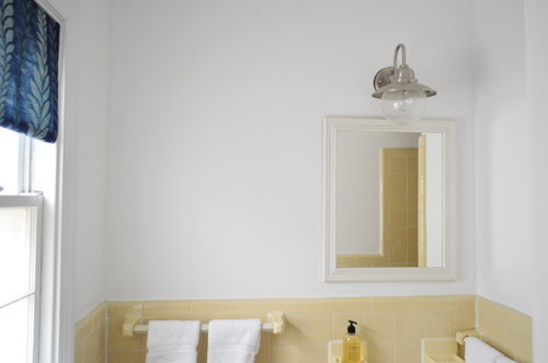
Surprise! We painted the guest bathroom this weekend! The walls, the trim, and even the ceiling. And double surprise: we went with a fresh clean coat of white (Decorator’s White by Benjamin Moore). Bet you didn’t see that coming…
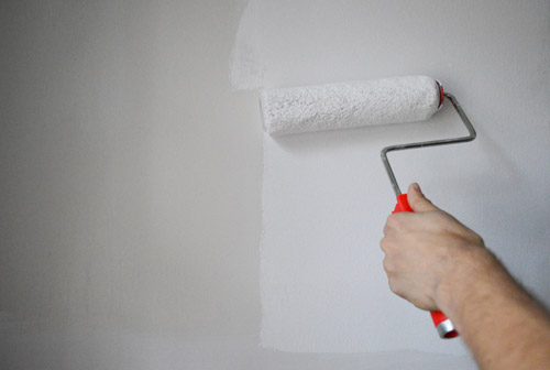
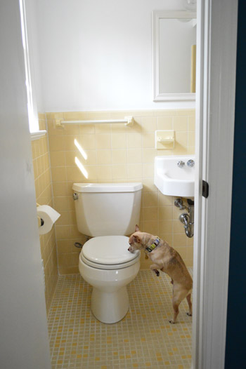
Why’d we go white? Well the old paint was dingy (see the difference in the pic above?), but we’ve decided to embrace the yellow tile instead of yanking it all out gut-job style or painting or reglazing it. It’s completely original 60’s tile that’s in great shape – and the color is happy and cute so we’ve decided it’s charming. Especially with our fresh white (albeit bare for now) walls – which will allow us to bring in some personality and color in other ways without overwhelming the small space.
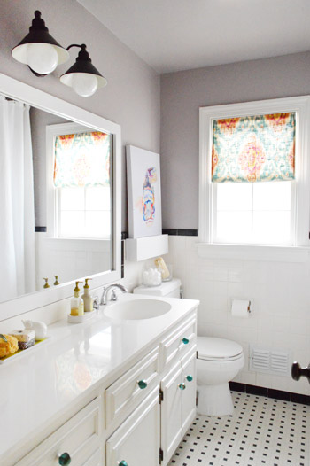
Our hall bathroom sports original tile as well, but we were able to crisp it up and bring in some fun accessories so it flows with the rest of our house…
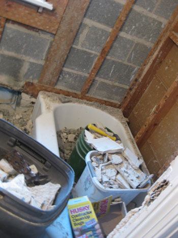
… so we decided to give that the ol’ college try in here before bringing in the demolition hammer, a la this…
Oh and we raised the shower rod to ceiling height and added an extra long 95″ waffle weave curtain (from target.com) about six months ago that hides inside the shower now (this is the view from inside the shower, so the rod is 100% invisible from the main part of the bathroom). It was weird to see the lower bar hanging down around 4″ below the doorway that leads to the shower.
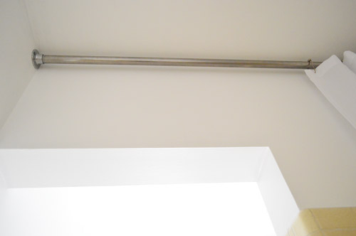
I wish I could have shot a better picture of the other side of the shower doorway so you could get a better idea, but the room’s just too tiny. I’d have to be out the window to get the right angle…
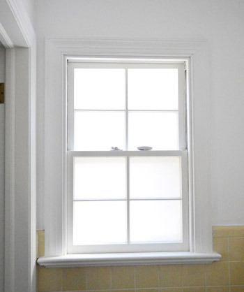
Speaking of the window, we finally frosted it (using leftover frosting film and this method) which is nice because it lets in all the light, but doesn’t let anyone standing on the deck creepily spy on you.
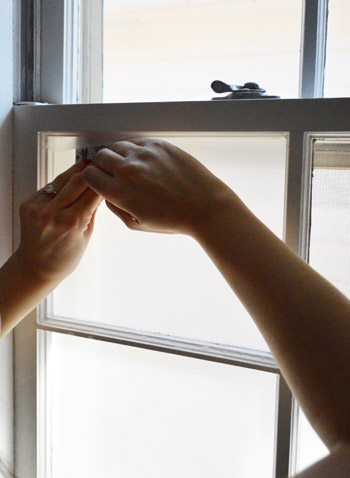
If you want to see how to frost your own bathroom window, we documented this process in a different space on video – you can watch it below or here on YouTube.
Between the freshly painted walls and the glowing frosted windows, it’s definitely feeling crisper and less murky in here already.
After my little frost-job I dug out this fabric remnant from over a year ago (originally from U-Fab here in Richmond and made by Iman) to make a sweet little no-sew shade. After nixing a faux roman shade like this one I made for the kitchen (not enough fabric) and considering a simpler version like this one from the hall bath, I decided to go with something closer to the latter, but with a twist. So I dragged out my materials (a tape measure, some iron-on hem tape, a scrap piece of wood, and my staple gun) and got to work…
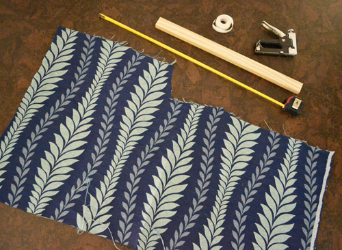
I measured the window width (23″), cut my scrap wood about a 1/4″ shy of that size, and cut my fabric to 25″ wide and as long as I could make it (which ended up being 30″) so I could hem it on both sides and at the bottom to end up with a 23″ x 29″ shade. See how the wood is a smidge thinner than the hemmed fabric? That’s so you don’t see it poking out on the sides.
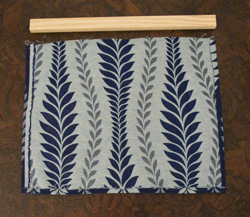
Then I stapled the top of the fabric to the scrap piece of wood (centering the wood so the fabric was slightly longer on both sides) and screwed through it from below three times to hold it into the window.
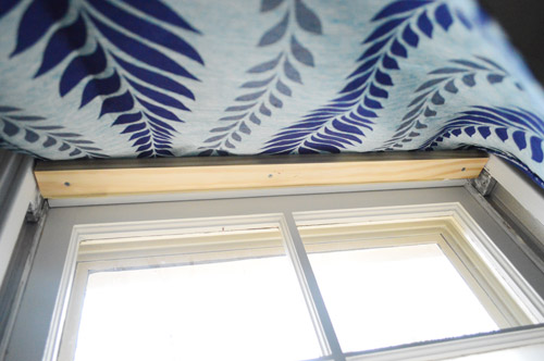
Voila!
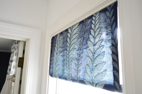
I opted for a cute little rolled look at the bottom thanks to a smaller piece of scrap wood (old shoe molding) that I cut to be a teeny bit wider than 23″ – that way I could roll the fabric around the molding and shove it into place so it held itself between the sides of the window, sort of like a tension rod.
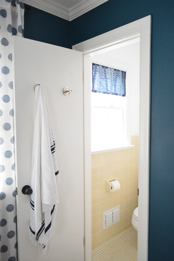
Here’s the view from out in the guest room. I love how the fabric works with the polka dot curtains in there. Not too matchy, but compatible and layered. It’s also nice to see the dark teal color from the bedroom walls carried into the bathroom, so it feels less like a random yellow box without any relation to the adjoining room.
It feels good to cross a few things off the list in there, but there’s still more on the agenda.
We think three more simple upgrades will make all the difference, so here’s the plan.
paint the wallsfrost the window for privacymake a window treatment with a bold fabric remnant- paint the frame of the mirror so it stands out against the white wall
- hang some art over the toilet
- go accessory happy (if Lesley made her pink tiled bathroom cute with the right stuff, there’s hope for this old room yet)
Is anyone else embracing something old? Any painting going on? Shade-making? Did anyone else watch the Atlanta Housewives reunion and laugh at how many times they said “throwing shade”? I gotta start working that in.
Psst- See how we upgraded the light fixture almost two years ago here.

Kristen says
Love the color and will look great with a few accessories. I think your vintage yellows tile is awesome and am glad you embraced it.
Susan says
Way to go- I actually love the yellow. And I forgot that the guest room had its own bathroom- that’s so nice. This guest room (although not mentioned a ton on the blog) is my favorite room you guys have ever done. And I stand by that. I just love the colors!
I have an original 50s pink tiled bathroom that I have just embraced- accessorized with white and I don’t hate it!
Katharine says
My house was built in 1905, the bathroom was updated in the 1950s. I love all of the odds and ends of the house, and want to respect the history. The bathroom sports yellow tile that cover go about 3/4 way up the wall. It’s rounded out with a pink bathtub and sink. Everything is in perfect condition and while it’s not my first choice, I’m going to work with it. I’ve been exploring some gray & yellow combos, which I think look awesome. One of these days I’ll actually get around to painting the walls!
Erin H. says
I have had a crush on this print for a while. I could definitely see it in a grouping above the toilet or on the other side of the mirror.
https://www.etsy.com/listing/64902849/five-whales-stacked-archival-print?ref=sr_gallery_12&ga_search_query=whale&ga_view_type=gallery&ga_ship_to=US&ga_search_type=handmade&ga_facet=handmade%2Fartwhale
P.S. I just noticed that the end of the link says Fartwhale and laughed harder than a 27 year old woman should laugh at a fart reference.
YoungHouseLove says
Haha, I love that art!
xo,
s
Alyssa says
Hi guys, I decided to use my Spring Break (I’m a professor) to DIY update our bathroom along with my mother-in-law. We replaced horrible fluorescent lighting with recessed lights, added moulding trim, hardware, and paint to the laminate countertops, redid the grimy caulking, framed out the mirror and added fresh accessories. We followed several of your tutorials. Thanks so much for the inspiration and advice! The old tile and countertop don’t bother me at all anymore! Makes me wish I had a blog so I could share some brag photos!
YoungHouseLove says
Wahoo! Sounds awesome! Congrats!
xo,
s
audra says
Aww it’s a happy little bathroom! I think we had the same idea this weekend. I managed to finally paint our downstairs bathroom yesterday! I told my hubby yesterday morning that we’re going to Lowe’s to get paint and he had no choice in the color (happy wife, happy life right?!) It’s not the best paint job (still have to touch up the trim), but I am in love with the color. I chose Farow and Ball “Hague Blue” color matched to Valspar. It’s only taken me 6 years to paint. 2 rooms down, too many to go!
Sara says
I think you made a good call! I empraced some very similar beige 70’s tile by regrouting, installing a fabulous marimeko shower curtain that complements the tile perfectly, and an oversized french museum poster that I found a goodwill for $5 dollars. I like my bathroom better than the one that we gutted!
YoungHouseLove says
Aw that’s so sweet!
xo,
s
christina @ homemade ocean says
I actually have always had a crush on that yellow tile so I am so happy you are keeping it!!!
jeannette says
yellow and navy, very pretty. and leslie’s bathroom (pink and grey and green and white!) is one of the top house crash re-does.
yellow is good. it tickles me how people pick and choose among the mid-century modern trends, generally rejecting the pastel bath.
Theresa says
So, for the window treatment…just shove it in place? Love the technical building jargon. :) (the bathroom looks pretty good, too)
YoungHouseLove says
Haha, just give it a good shove!
xo,
s
NancyY says
Here is a steamy question (ha!). What is the ventilation like in that bathroom? Since it is a guest bedroom it isn’t as big a deal but just wondered if you felt compelled to go high gloss because of steam from the shower. While we’re talking finishes, did you use high gloss in the main bathroom or something else? Just curious how you decide on a finish as they relate to the specific ventilation of each bathroom.
YoungHouseLove says
There’s no exhaust fan in there but it doesn’t seem to get very steamy. We don’t have one in our main bathroom or hall bath either but our first house really needed one so I think it depends on the room.
xo,
s
Crystal @ 29 Rue house says
I love the crisp white! Your tile does look like it is great shape – I would definitely keep it too.
I finally used iron-on hem tape for the first time to make curtains for our daughter’s room. I also for the first time decided to go with non-floor length curtains. Although aestically it isn’t my first choice, it does give us more room to keep things since we can use all that space under the window now.
http://29ruehouse.blogspot.com/2013/04/no-sew-floral-curtains.html
YoungHouseLove says
So sweet!
xo,
s
Margaret says
I’m so glad you’re leaving the tile intact. We have a pink and turquoise vintage bathroom and the tile isn’t in mint shape, but it’s not bad for its age. I love it!
Can I offer some constructive criticism? I think your window treatments would look a whole lot better if you lined them. I am currently figuring out how to make some curtains for my kitchen, including faux roman shades, but I am going to line them and sew them (none of the zillion no sew looks out there looked like quality to me). It’s a pity because it’s very sweet fabric but it would look a lot nicer if it were lined.
YoungHouseLove says
Thanks for the tip!
xo,
s
Shannon says
Too funny! I literally painted my master bedroom 3 times this weekend.. yes THREE times. I’m nuts! :)
http://fabulouslyvintage.blogspot.com/2013/04/i-painted-our-bedroom-3-times-this.html
Glad I wasn’t the only one painting something. :) So glad you’re keeping the yellow tile!
Shannon
Crystal @ 29 Rue House says
I love the crisp white and your tile really is in great shape. So much cleaner/nicer looking than our old stuff but we’ve only got 1.5 bath so they’ve been well-loved.
I just hemmed up some curtains using the iron-on stuff for the first time. It was super easy but I probably wouldn’t use it on such flowy fabric again (which I think could also be tricky to sew). I went with short curtains since I had just enough fabric for that and so that we’ll have more usable wall space (all the wall under the windows) for our daughter’s toys/table etc…
http://29ruehouse.blogspot.com/2013/04/no-sew-floral-curtains.html
Crystal @ 29 Rue House says
Oh sorry for the duplicate comment—I thought my first one got lost in internet space.
YoungHouseLove says
No worries at all!
xo,
s
Julie M. says
Very excited to see how you decorate this room! We have the same yellow tile, but we also have a yellow toilet and tub. My husband calls it the Egg Room. Ha! I’ve softened it with aquas and blues, and really like now.
Kierstin says
I love what you’re doing. It really does “crisp” it up in there, and I think it’s great that you’re trying to use the existing tile, because that tile was meant to last forever. They don’t make and install it now like they did back then. The navy blue “curtain” is a perfect contrast with the buttery yellow. I could see the frame of the mirror also being navy, and then you could tie it in with a shower curtain… Looking forward to seeing what you do next. Good luck!
julianna says
Glad to see you’re keeping that great tile. I was wondering why you always use wood screwed into the window frame for your faux window treatments. If you use a cheap tension rod, it would give you the ability to wash the fabric periodically.
YoungHouseLove says
We like the flush look of the treatment stemming from the window frame like all other shades that would be screwed in (so no light perks over it like it would with a tension rod). But it’s definitely a personal preference thing :)
xo,
s
Stephanie Phillips says
Oh oh oh, I want to share my bathroom! We’re updating our (only full) bath right now and working with the 1950’s tile. We replaced the sink with an updated vanity, hung a homemade shower curtain at ceiling height, painted, replaced the shower fixtures with updated ones, reglazed the tub, and now I’m just waiting for my custom floating shelves to come in! I’m SO HAPPY with how it turned out. Here’s my pinterest link, since I don’t blog: http://pinterest.com/pin/169096160981316066/. There’s more in there if you were to look around.
Thanks for the inspiration!!
YoungHouseLove says
Looks gorgeous!
xo,
s
Melyssa says
Thank you for not ripping out the yellow tile!!! I am a huge fan of Nicole Curtis (Rehab Addict) and it pains me when people decide to rip out original house features just because. You two are wonderful and are so right about going fresh and white. I almost never like white walls (too many dorm rooms and apartments, I suppose) but the white looks fab with all the grout line and the floor.
Gina says
I love it! Absolutely on board with keeping (and embracing!) the yellow! Its adorable. I love what you’ve already done to spruce it up. No sense making a giant project out of something that works the way it is. All’s it needs is the old Petersik magic!
Allison says
I love the yellow, blue, and white. Such classic colors together, and they go so well with the adjoining room! Also, I asked you guys a question several months ago about whether to hide or leave out the TV, and you were so kind to answer, and gave such good advice. Just wanted to say thank you!
YoungHouseLove says
Aw you’re so sweet Allison!
xo,
s
Amy says
I was wondering if you have blinds up in your house? I love natural sun light coming through, but at night I have to have some privacy. Just wondering since I never see any pictures with blinds, lol. Oh and I love that you kept the yellow tile!
Amy
YoungHouseLove says
Oh yes all of our bedrooms have white faux wood blinds that we close each night for privacy and to block light. We love that you can layer curtains right over them :)
xo,
s
Emily says
I love how cute you have made the bathroom look even with the old yellow tile. The white walls really help the tile add a sunny look to the bathroom. Painting the mirror will really add a pop to the room! We replaced our mirror in our bathroom and painted the walls and what a difference it made! I’m really beginning to love the difference a nice mirror can make in a room!
http://emilyandtylerglover.wordpress.com/2013/02/28/bathroom-remodeling-time/
YoungHouseLove says
Love that!
xo,
s
Jeanna says
Yea, so glad you kept the yellow tile :) The new extra long white shower curtain makes it seems spa like………… love that!
Amelia R. says
The ultimate Earth Day makeover: using something you already have, that’s cute and in perfect condition. And by the way, that cobalt blue shade looks AMAZING with the sunny yellow tile and the clean, white paint. Looking good!
As for the mirror: maybe wider trim would look good? I dunno; just throwing that out there.
YoungHouseLove says
That’s a fun idea too!
xo,
s
Amy @ a new old house says
Those little changes made such a big difference! I’m really -liking your yellow tile! We had to make a green tub work in our kids’ bathroom… but it’s amazing how these things can be toned down with a little thought!
http://new1790house.blogspot.com/2012/10/bathroom-reveal.html
YoungHouseLove says
So cute!
xo,
s
Sara says
Where do you buy your long shower curtains? I can’t seem to find anything longer than 72″ where I live!
YoungHouseLove says
Target.com :)
xo,
s
leanne says
also, if you find one you like on etsy, most sellers will gladly increase the length for a nominal fee. this dramatically increases your available options!
after hours of not being able to find the curtain i wanted in the length i wanted online, i asked a seller to make her black and white ticking curtain in 96″ instead of the traditional 72″. i think it was maybe $15 more. i received an amazingly well-crafted curtain, the quality is superb, and i couldn’t be happier.
YoungHouseLove says
Great tip!
xo,
s
Meredith says
What is the navy color?! I love it. I have been searching for the perfect color and I think this might be it. Thanks!
YoungHouseLove says
It’s a dark teal color in real life, but it’s Plumage by Martha Stewart :)
xo,
s
Meg Sluyter says
I love the yellow tile, glad you guys kept it too. That could be cause yellow’s my favorite color but it does look great in there. I took an old toy kitchen (my kids have fully destroyed over time) and gave it a new life with some paint and a top coat this time (to make it harder to be destroyed by my girls this time). I’ve been painting for the better part of 2 weeks now and would rather not see a paint brush for a while now :). Can’t wait to see this little bathroom all finished up.
Cole says
Can you show us a pic of how the shower curtain looks on the outside!? I’d love to see how it falls from the outside looking in. Also, do you put a liner when you hang 95″ curtains? Just wondering. Thanks guys for all the great ideas! Also, can’t find the curtain on target website :( Womp womps!
YoungHouseLove says
Oh no! It was there a few weeks ago, many check back?! Also is love a pic of the curtain from the outside but it’s a tiny room. Will try again next post for you :)
xo,
s
Connie says
I always thought that bathroom was charming and secretly hoped you wouldn’t tear out the tile, especially since it appears to be in such excellent condition. I never would have thought of white for the walls, but it’s perfect! Window treatment is “right on”, too! Can’t wait to see the next stage for that room.
YoungHouseLove says
Thanks Connie!
xo,
s
michelle says
Love that you’re keeping the tile! We have the same tile but its pukey pinky tanish. Sad face. I think lining that curtain would really help show off the pattern. As it is now, too much light showing thru it.
YoungHouseLove says
I’d definitely consider lining it if it bothers us down the line, but for now the light glowing from behind it keeps things airy instead if feeling heavy. Who knows where we’ll end up though :)
xo,
s
Henna | HENNA BLOSSOM BLOG says
I love how you’ve made that yellow tile work. It looks nice and fresh with the white walls and bright patterned window treatment.
We painted a bathroom this weekend too! Or well, the husband did. But I told him what color! ;) ha.
Cheers for productive weekends!
LMN says
I’m sorry if anyone else has already asked this…Is is dark in the shower when you use the curtain from floor to ceiling? We don’t have a light in the ceiling directly over the shower, so I’m nervous about hanging a super high curtain…? Thank you!
YoungHouseLove says
We have a ceiling light in there so it’s nice and bright, but light dies travel though white curtains so maybe give it a try and see if it works for you?
xo,
s
leanne says
i love that you are embracing the yellow tile – i was so hoping you would make it work and not tear it out!
obviously, it’s your house and you have to live with it, and i’m sure any remodel you guys tackled would have been amazing, but i just adore that little cheery bathroom. makes me smile whenever it’s featured!
Ashley W. says
I’m so glad you decided to keep the tile! I’ve been team tile from the beginning. I thought the real and the yellow went so well together anyway, so why not? I’m excited to see how it comes together!
Jennifer says
Luckily you didn’t have to gut this bathroom like the last one! I love the decor touches you added though, where do I find Window Frosting that doesn’t come in a Gingerbread House set?
YoungHouseLove says
Home Depot sells nice rolls of it.
xo,
s
Jenny G. says
So glad you kept the original tile! I pined for a house with a fun original bathroom, but that didn’t happen when we finally found our home. It just breaks my heart when I see people rip out great bathrooms on all of those TV shows to make them ‘better’. What I wouldn’t do for a pink, green or yellow bathroom!
Linda says
Love the yellow, and so glad you kept it! Love the curtain too! Question–would you ever consider replacing the sink with a pedestal sink? I always worry with wall mounted sinks that I’ll knock them off or something, but maybe that’s just my weird phobia! :-)
YoungHouseLove says
We love pedestal sinks! This guy’s really cute and original though so we love him too, and in such a small space something floating is nice and airy :)
xo,
s
Bekah says
Nice job! I love when people opt to save that awesome 60’s tile. I know for some people it is not their cup of tea, but I love it!
I have been slowly chipping away layers of old paneling and carpet in this house to embrace the original fixtures – like these cool door plates that had been painted a bajillion times.
http://www.countrymousetales.com/2013/04/restoring-character.html
No literally. A BAJILLION.
Renee says
I looked up the fabric you used because I liked it and would love to get some for a chair cushion, but the only blue/indigo fabric in Iman I could find had dark blue and a more medium blue. Yours looks more like dark blue/white. Is this from your editing and you making it look lighter, or is there another Zahra Leaf fabric color that I can’t find?
YoungHouseLove says
Hmm ours us reading really true to life in the pics, but I only know of one color way with blue. Anyone have more info for Renee?
xo,
s
Meg M. says
It’s looking great! I am so very happy that you left your original tile! So many people gut without a second thought and then install something that really does not compliment the style of the remainder of the house.
In our case, embracing the old (which I love, if you couldn’t already determine) meant bringing the old back in as new. At some point, probably around the early 90s, another owner of our 1950s home decided to re-tile the bathroom floor and part of the walls. They left the original counter top and part of the original shower surround, but busted out the top half of the surround to add new and non-matching (also non-coordinating) tiles. I will never understand that. Anyhow, it left us unable to save the charming original parts. So now that we’re renovating the bathroom we’re taking it back to what an original 50s bathroom would look like with a few updates. In the end it will be period appropriate, with a crispness and beauty that could go up against any modern bathroom.
Can’t wait to see what’s up next in your bathroom! A while back y’all posted something (it may have been a reader redesign) in which a bathroom very similar to yours had undergone a transformation, namely a large piece of glass had been installed to replace the wall dividing the shower from the room. It wasn’t on your list, but it would be awesome if you were able to salvage the old tile and at the same time open the room up with a glass wall.
YoungHouseLove says
Oh man that would be amazing.
xo,
s
Katie says
We also have some photobombing cats, I swear they do it on purpose. Love the original yellow tiles glad you’re keeping them!
I do like a white room with colourful accents, good job because every room in our flat is painted white
xx
cjm says
Oooh, bathroom redo! I just started on our half bath. And I’m in the middle of painting our front door navy (totally re-read your posts about your doors). But the real reason I’m commenting is that yesterday I bought ORB spray paint for the first time. Now I’m wandering around looking for more things to ORB. I think you know who I blame for this addiction. :)
YoungHouseLove says
Haha!
xo,
s
theresa says
Great decision to keep the old tile – the yellow is so sweet and charming! Bonus: no cement/tile/plaster/ clean-up!! The bathroom is on it’s way to adorable!!
lindsey says
This. Is. Awesome. We just bought our house and it was built 1962. Your bathroom tile matches ours exactly (wish I could attach a pic for ya). We’re not sure what we’re doing (if we’re embracing/not embracing), but in the interim it is great to see what we can do with it for now (paint!). :)
A says
I don’t line my curtains either. We live in a really shaded area and whenever I do line them, we lose a good amount of light (even when the lining is lightweight) so it’s not worth it to us. We do have black outs that we clip to my daughters curtains to help with nap time. The color hasn’t faded in any of the rooms and I’ve received a ton of compliments on them. If you use a high quality fabric and finish them properly, then they don’t look bad like some people are suggesting. I just saw a lot of people comment on the lining and wanted to throw my experience out there :)
YoungHouseLove says
That’s good to hear A!
xo,
s
Jenn says
The building my major was housed in at college had these fun BRIGHT pink tiles (not that powder pink, ya know?) and stalls in the girls’ basement bathrooms that was probably circa late 60s to early 70s. I had never seen bright pink before. I was so sad when they finally raised enough funding to demo that building and begin a new one.
Angela says
I love how the curtain, the guest room’s walls, and the other curtain match playfully together. You guys have excellent vision. I love watching it unfold.