We’re back with pics of our hallway that we “wallpapered with frames” for lack of a better description. We think it created some pretty quick dimension and interest that’s sure to be fun for the whole family. Literally. We love that we can work in drawings by Clara, class pictures, and photos of favorite vacations for the whole family to enjoy.
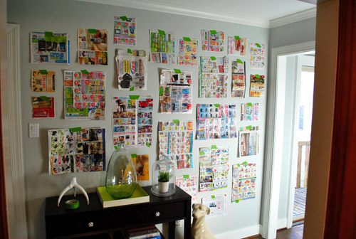
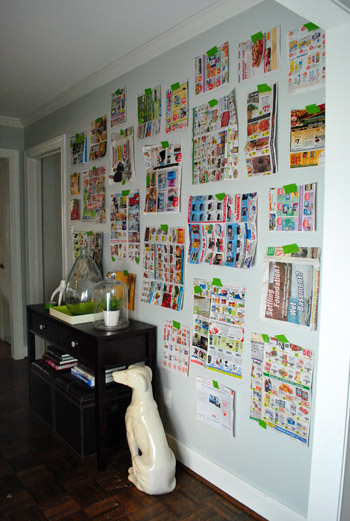
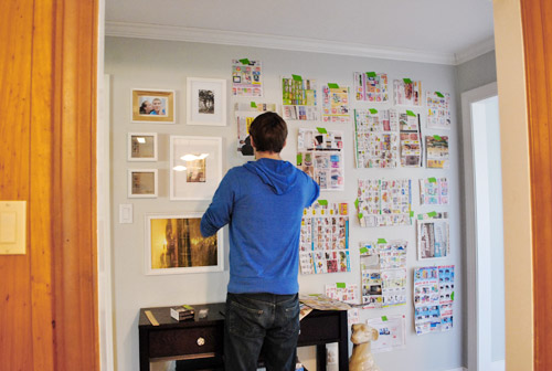
As for how we did it, you saw how I cut out little newspaper templates for all of the frames that we already owned (we actually had a lot of them from various arrangements in our first house, seen here, and even had a few unused ones snagged on sale a while back that were begging for some action). So we just taped up all of our pre-cut templates with a few of the larger ones staggered in the middle (to ground things) and built things out from there, placing most of the smaller frames around the perimeter for some subtle balance. We shifted things around a little, stepped back, went back in and moved stuff around, and stepped back to look at everything again. This happened about ten times with smaller and smaller tweaks until we decided we liked it. But we still wanted to sleep on it and study it one more time the next morning before breaking out the hammer (hence this post about that first phase of the project).
Yesterday we mentioned that The Washington Post scooped us by sharing this shot of our frame-riddled hallway here:
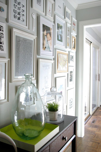
We try to stay as real-time as possible, but we also like to take a ton of after pics and write a big wordy post for ya, so it can take a few days from project completion to post publishing. If only we had a live camera feed going 24/7. Just kidding, my nightmare is to get caught picking a wedgie on camera. It’s why I never auditioned for the Real World (side tangent: John actually sent in an audition tape once when he was 19).
Anyway, so when we woke up the next day and agreed that we still liked the proposed frame placement, it was time to lay out all of our frames on the floor of the dining room in the same arrangement, just to check if some of the actual frames conflicted (since all we were looking at on the wall were their outlines and not their actual styles). Of course we ignored the art since most of it would be switched out anyway.
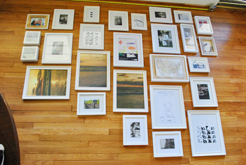
The frames all looked just fine together, so we decided to bite the bullet and grab the hammer. It was hangin’ time (here’s where a lot of MC Hammer was sung). Since our newspaper templates were still up on the wall, it was actually really easy to hang stuff. We just measured how far down from the edge of the frame that our wire, hook, or other hanging device was and just marked a centered “x” right on each template (the horizontal line is the measured center of the template, and the x below it is the spot where the nail should actually go to catch the wire or hook so the frame hangs in the right place).
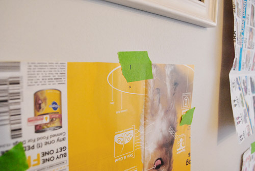
Then we just hammered directly into the “x” in the template…
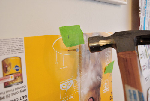
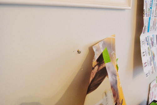
… and pulled the template off the wall to reveal a lone nail waiting for a frame (even though it looks like a jacked up hole, that’s just a tiny bit of paper caught above the nail that we easily removed with a finger flick).
We slowly worked our way around the wall using this method. It probably took an hour or so.
Sadly our old plaster walls don’t work with 3M Command hooks or velcro alone (since that’s always an easy way to create a frame collage without making any holes) but we do plan to add heavy duty Command velcro to the lower frames that may be within Clara’s reach when she starts toddling around. She’s a pretty docile girl who definitely seems to listen when we ask her to be gentle (when petting Burger for example) so our plan is to sweetly request that she be nice to the frames and “look with her eyes” and we might even try the “you can only touch them with one finger” technique that an awesome varsity mom shared with us a few days ago (she said it actually works!). But of course if we think those few low frames ever start to pose a safety hazard, or even just become too high maintenance for the way we live, we’ll definitely just get rid of them until the bean is a little older. Clara first!
But back to our process. After following our templates and hanging every frame we stepped back for a little look-see and frowned. Somehow they seemed a little tighter in the top right corner (which we actually really liked) and a bit too loosey goosey everywhere else…
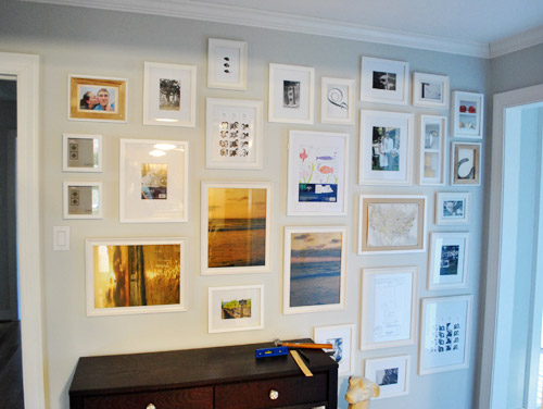
… so we adjusted some of the frames on the left and added in a few little “filler” items to get the same full look that we had on the top right corner going on everywhere else.
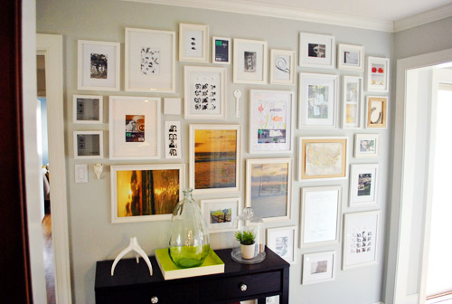
So yes, there are probably ten extra holes in the walls hiding behind those frames from fine tuning them an inch one way or the other. Our bad. But they’re all out of sight so we’re at peace with it. They can just be our little secret. Oops, I just told The Interweb.
Once everything was hung we scavenger hunted the house to find things to display (since many of the existing items in the frames were horizontal images that were now hanging vertically or the frames were completely empty to begin with since we hadn’t used a few of them yet). Which puts the cost of the entire frame wall plus all of the “art” that you see (since that was also already owned) at 100% f-r-e-e. Except for this cool $16 frame from Target that we splurged on because we adored it’s “special capabilities” to store and easily showcase lots of kid art. We love that we don’t have to take it off the walls to change things out. Come on Clara, don’t you feel like drawing mommy a picture or two?
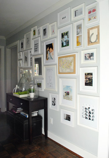
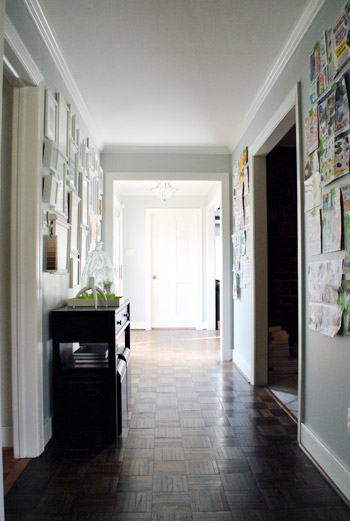
So this is our current arrangement with all of the just-for-now stuff that we found around the house. First here’s the view from the kitchen (which is why we placed the console table there, so it looks centered through the doorway:
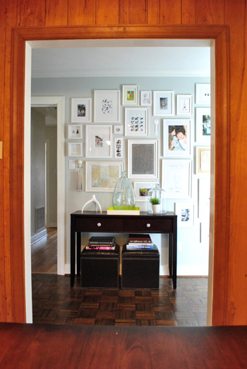
And here are a bunch of other angles:
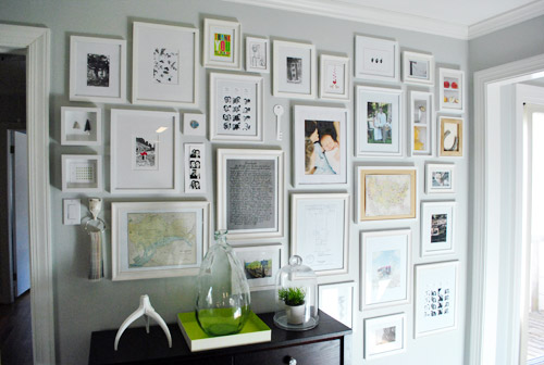
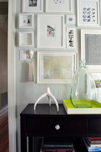
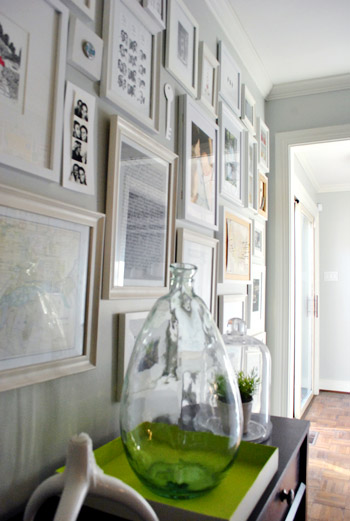
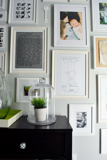
From an old Banana Republic ad with a llama (or is it an alpaca?) carrying sweaters…
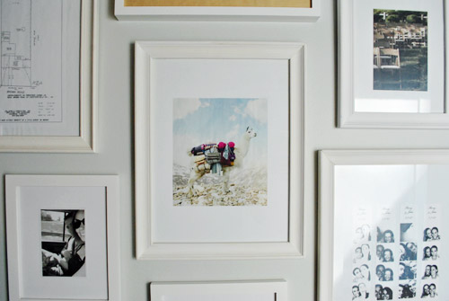
… to a vintage milk cap that we found at our first house glued to a small square canvas…
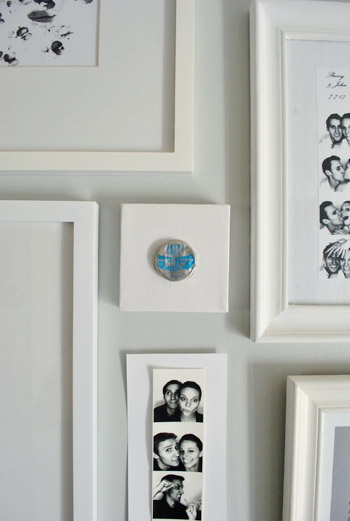
….and a white paper key that I cut out of card stock (which I hope to replace with a DIYed ceramic-looking one)…

… it’s definitely a smorgasbord. And there are probably way too many photostrips, but they’ll do for now.
We’re actually planning a post later with more detailed shots of various items and directions for making your own stuff, like an arrowhead shadowbox for example. Or a long skinny wooden pinboard (still have to make that, for now we have a placeholder piece of card stock with a photostrip taped to it). We also thought it would be fun to take a picture of the wall every few months just to see what comes and goes (new Clara art? updated family pics?) and what always stays (the sketch of our first house’s lot? a favorite photobooth strip of the whole fam?).
We anticipate that at least 25% of the wall will be changing pretty regularly as new things steal our hearts – like a particularly good (or bad) fortune cookie fortune and Will Bower’s first birthday invitation. You know, the important stuff. We definitely feel like this gallery will be the most personal, eclectic, and fun display spot in the house. So while I’ve already asked for some awesome art prints for my birthday (which is this Saturday- woot!) we also want to frame everyday objects that hold meaning to us. From Clara scribbles to little love notes and even particularly funny greeting cards with chihuahuas on the front.
In short: We are so in love with the whole hallway frame gallery. It took a spot that was just a way to get from A to B and made it feel like a bonafide destination. We both keep finding ourselves being drawn to that wall like magnets, just standing there gazing at all the frames. Even Clara loves to stare at it. Ah gallery wall. How can you make us so happy? We’re nerds.
And surprise. We’re so enamored that we’re planning to “wallpaper” the other two walls on the other side of the hallway with frames too.
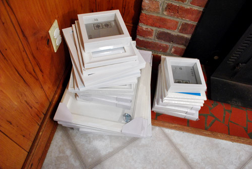
Here’s the pile that we grabbed from Ikea (feast your eyes on that pretty shattered fireplace tile).
Should be good times.
Psst- We announced this week’s giveaway winners. Click here to see if you’re one of them.

Beverley says
The gallery wall looks fantastic. I saw it in the background of the article and couldn’t wait to see the post. Before my daughter was old enough to actually draw I let her loose with large sheets of white kraft paper and 100% washable finger paints. I stripped her down to her diaper, poured out a few circles paint and let her go to town. When all was said and done, we were able to cut out various sections of her “art” to frame. Since she ended up crawling and walking during the process, we even had some neat hand/foot prints to frame for her grandparents. Just a thought :)
Lindsay says
I have to know… what is the one frame in the middle-ish holding? The one that is all text?
YoungHouseLove says
Scroll back for that info. It’s a really cool story!
xo,
s
Lindsay says
I just saw it right after I posted the question! So very neat! I love it when people are awesome.
YoungHouseLove says
I know right? He left and we were like “the handyman got us a housewarming gift that he made himself?” Awesome.
xo,
s
Melissa says
That looks fantastic!!
Heather says
I had (key word – past tense) always sort of despised walls of photos. I always pictures old 70’s photos up a stairway that are dusty and are cluttered.
You guys have proved to me that it isn’t a wall of frames that bother me, it’s a wall of badly hung, badly designed, ugly frames that bother me, because I immediately thought your wall looked super nice!
Awesome possum guys.
Katie says
You guys should try the ook picture hooks for the next portion of your gallery hall. They’re available at home depot. When I purchased my last home the owners left some behind… I will never use a nail again! They are so much easier to adjust because they make a teeny tiny hole that doesn’t need to be filled. I use them for my gallery wall and have been able to tweak it to put new frames or objects so much more easily. I don’t work for ook or anything – it’s just a product I’ve found that is so worth every penny I’ve spent on them – especially for a gallery wall!!
YoungHouseLove says
Ooh those sound awesome. I wonder if they’ll work for plaster walls though since Command hooks/velcro don’t. We’ll have to check them out!
xo,
s
Joy says
Great tip for deciding where to place frames – the X was the best idea. Love your picture wall (and the hints of more to come).
– Joy
Becky says
Awesome!!! This is my favorite thing that you’ve done in the house so far. It looks soooo cool, love it!!
jamie says
I am SO in love with your wall! My husband and I are moving this summer and have been discussing doing something similar to this at our new place. I’m a big fan of personalized art and as a photography minor in college, I have thousands of photos. I am officially inspired! right click… print… add to inspiration noteboork!
Patty says
Looks Fabulous!
I especially like the key!
Andrea B says
I love everything about this. Bravo!
Emily says
I’ve got a similar project going on right now, but in a stairwell. And like you, I haven’t written about it yet even though it’s been a work-in-progress for a few weeks :) Yours look wonderful, I love how cozy frame-overload can make a hallway or small space feel. Congrats on the wonderful WP feature – I read every word (at work).
Diana Lewis says
how would it look to put just one black frame to make a connection with the dark table and add a little bit of a surprise?
YoungHouseLove says
Ooh that could be really fun!
xo,
s
Vanessa says
Wow, your new wall looks stunning! Great job on it! :) I can’t wait to see the other walls!!
Greetings from Germany!
Vanessa @ {nifty thrifty things}
Emily A says
Y’all did such an awesome job at this! I love gallery walls but in my mind I always pictured it with black frames, but the white frames look so clean and crisp. I love it! I wanna see more please:)
Amy says
Have you guys changed anything on your feed lately? I haven’t received a post in my Google Reader from you since March 11th.
YoungHouseLove says
Sometimes it gets randomly quirky for people, so we always just recommend unsubscribing and resubscribing, which usually resets things. So sorry for the trouble!
xo,
s
Blaine says
Absolutely stunning… STUNNING! Wow. This is my absolute most favorite thing you’ve ever done on here. WOW!
Ok, I think that’s enough gushing.
Sayward says
This looks fantastic! I love displaying cards, invitations, found items, etc. This way they get much more attention than they would sitting in a shelved scrap book or memory box. I can’t wait to see how you fill these frames for Christmas, Halloween, and other holidays!
P.S. I hope you make it to Will’s birthday party. He’s so cute and I love Katie’s blog.
Jessica G. says
This looks fantastic! I especially love the objects you interspersed with the picture frames… they give the gallery some more texture and interest. (Plus I totally didn’t realize that the key was a paper cut-out till you said it.)
You mentioned 3M Command hooks and I was wondering if you have some experience with them. My bathroom walls are floor-to-ceiling tile and I’m really hesitant to drill into them, but I’d like to hang some framed art. Are the hooks really that strong? I’m so afraid of things coming crashing down in the middle of the night!
YoungHouseLove says
They’re awesome if you aren’t hanging anything too heavy. Maybe check out the package to see if they have a weight limit? We’ve used them to hold up lighter frames on drywall (just not crumbly old plaster). Hope it helps!
xo,
s
Beth@Just{Heart{It says
Oh my gosh, that’s so funny that you have that Banana Republic llama framed! I cut the same picture out of a magazine for the same purpose!! :-)
I’m surprised that you’re using such colorful newspaper to mark out your frame grid – it seems so distracting to me. I’d never be able to get past it to “see” what the actual frames would look like. I think I’d need to use something less busy.
And kudos to you for how you sweetly let everyone know you’re considering Clara’s safety – just for all the paranoids out there who can’t stay out of your biznis. I NEVER child-proofed my house for my kids. Instead, I house-proofed THEM. No DOES mean no to a child if you’re serious about it. She won’t touch those frames if you train her not to.
megan e says
Glad I’m not alone with the Banana Republic llama love! I framed it a few months ago for my sister, who has shared with me an amusement for clothed llamas since the Gap did a billboard campaign of llamas wearing scarves. My only hope is that it catches on and elevates to “I can haz chezzburger” status!
YoungHouseLove says
Haha it’s true. There’s a lotta llama love going on. Go llamas.
xo,
s
Danielle says
I love the gallery.
I once tried to do a similar wall in our house and as dumb as it sounds, it never occured to me to tape up paper templates. I just kept hammering nails into the wall until I got them right. Thanks for the tip.
Amber says
Thank you for the inspiration! I am excited to see how the hallway looks when the other side is “framed”.
Curious – In one of the Washington Post pics it looks like the pendant you painted turquoise is back to clear glass. Did you decide you didnt like it or is it a different pendant?
YoungHouseLove says
We actually had to wipe it down since the blue paint was giving that corner a weird blue tint in photos. Thank goodness it was easily reversible!
xo,
s
Carrie says
Amazing, amazing, amazing! Totally going to steal it!!! LOVE.
Heidi M. says
Easily in my top five of YHL Projects… this is so cool looking, you guys! You always know how to take an idea and make it totally personal. I can’t wait to try this on a big empty wall we have in our house. Thanks for the inspiration!
Amy B says
Love it! And I love how you guys & Katie are always linking to each other blogs… y’all are too funny =) Oooo! Maybe it’s time for a little collaboration… a Petersik/Bower Productions DIY mega-site! Once you all get settled, of course. Only in my dreams until then ;)
YoungHouseLove says
Haha, we do love to make strange and awkward videos whenever we’re together. Haha.
xo,
s
Karen says
It looks great! Much less busy than I thought it would.
Val says
I’ve done this in my stairway and it has definitely become one of my favorite spots in the whole house! I just love adding/switching out fav pics. The only difference is I used black and white photos with black frames. I figured if I ever get around to switching the paint color I might change all those frames to white :). Hugs!
Julie says
I have the exact same thing in my hallway!
Julie says
Love it! I just got done hanging about 5 or 6 in a similar way in our nursery, but they ALWAYS look crooked to me and make me crazy – how do you guys fight that?
YoungHouseLove says
We just sort of play around with it until it looks ok. It’s probably not perfect, but as long as things look semi parallel to each other it seems to help. Also I find that white frames seem to be less obvious if they’re not perfectly straight since they’re generally lower contrast. Hope it helps!
xo,
s
Carrie says
Love, love, love! Are those paint swatches? And is that a floor plan underneath the photo of you three? Congratulations on the book and happy birthday!
YoungHouseLove says
Yup, that’s a set of swatch cards that I made with a binder ring and a hole punch. And yes, that’s a sketch of our first house’s lot under the pic of us. We love it! At the top it says “house is old” as a description. Too funny.
xo,
s
Barb says
O HAPPY DAY (tomorrow, that is!)!!! Hope your birthday is spent with family and friends and that you enjoy every minute of it. You deserve the best!
Love, love, love the frames on the wall. BRILLIANT!
Are you going to be the big 3-0? You sweet young thing.
Once again, enjoy this birthday. It is a “right of passage”……right?
B.
YoungHouseLove says
I’m gonna be 29. Wahoo! The age that everyone thinks you’re lying when you say it. Haha. Since people joke about being perpetually 29. But I still get IDed at rated R movies so I’m ok with it. Haha.
xo,
s
Krysta @ Domestic for Dummies says
As far as decorating, this is my favorite thing you guys have done. I freaking love it!!
Jess says
Sooo jealous… I can’t wait to have my own house so I can do something like this.. Also just an idea with the kid drawings frame you should get a second frame so you can have one landscape and one portrait just incase you get a pic in the different layout.. :)
YoungHouseLove says
Very very good idea. Why didn’t we think of that?
xo,
s
Carly says
The gallery looks great, I love it! I’m in the midst of redoing my home office and am slowly putting it back together as I find things I like. I’m thinking the wall above my work station would be a great place for something like this, although it might distract me from getting any actual work done. Thanks for the inspiration!
Libby says
Wish I could have seen the smile on your face as you typed “art” in quotation marks. Next time – use caps! :)
Lauren says
This is probably my favorite project you’ve done in the new house. I LOVE it!!
Rachel T says
Fantastic! When are you coming to MY house???? :)
Tiffany says
Love it. This is the best example I’ve seen so far.
Sadie says
Absolutely stunning! I feel like Pottery Barn will be knocking on your door anytime to feature your home in their next catalogue! I can see it now!
[email protected] says
Love it!!! A tip for little hands… I substitute plexiglass in frames that pose a hazard to our little ones. Especially low hanging frames and those in doorways that could be hit by a wayward elbow – learned the last one the hard way.
YoungHouseLove says
Great tip! Thanks.
xo,
s
karen says
I love this project sooooo much!!
Your “art” which is FABULOUS…has inspired me!
Now i need to find a spot!
Are those frames that have more of the beveled edges from Ikea also?
YoungHouseLove says
Yes, many of them are from Ikea and I think a few might be from Target. But Ikea has some modern ones and more traditional ones, which look awesome when you mix them!
xo,
s
Lindsay says
You guys always have a surprise up your sleeve! Excited to see the other walls too, and I love the story of your contracter handwriting that poem for you. It is lovely!
laura says
I absolutely LOVE it! Now I feel less nerdy for saving an old Dwell Magizine with sweet flower pictures in an advertisement! I always thought…someday they would look good in a frame. :)
ErinEvelyn says
The whole post …… gallery hallway = triple lovliness!
That final pic……. kitchen hearth of shattered tile = eek!
;)
YoungHouseLove says
Haha, yeah. How quickly the eye candy comes to a halt. Haha.
xo,
s
Katie K says
I love it, I wish I had the perfect place for something like this in my house but I just can’t think of anywhere it would work.
Betty says
I will definitely use templates next time I try to hang frames. Looks great!
Sarah says
Love it! Great job. Happy Birthday Sherry! My birthday is also this Saturday. Have a wonderful day…
Donita says
That wall is amazing. I love it, and WANT MY OWN HOUSE, so I can do that. ;-)
Love the paint swatches hanging on the hook, caught my eye right away. The little details. ;-)
That poem story is so sweet. What a nice guy!
The SURPRISE walls, WILL LOOK GREAT!!!! I LOVE your home!!!
Robin @ Our Semi Organic Life says
Hyou thought about doing all black frames instead of all white ones? I suppose it’s easier since you already have them but all black ones sometimes make a bigger statement – if you’re into that kinda thing.
YoungHouseLove says
We’re suckers for white frames (especially since we have a million of them already), but we love how black frames look too. All dramatic and bold!
xo,
s
Alison says
Looks awesome! Hopefully this will inspire me to do my own gallery wall that I’ve been planning for ages. I agree, you will have some great Clara art to put up. My daughter started doing some great “modern art” (finger painting, paint drops, scribbles) at daycare when she turned one – we have a lot displayed (she’s just about to turn 1 1/2). I give props to her teachers for picking great colors for her to use.
Melody says
I love the idea of doing the other side of the hall too! It’s going to be striking! And I feel inspired by how you’ll frame anything with meaning. How it doesn’t have to be a photo or an art print.
Kiran says
Ahh… I love this transformation. Perfect gallery to showcase timeless photos :)