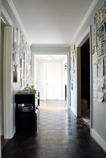
We’re back with pics of our hallway that we “wallpapered with frames” for lack of a better description. We think it created some pretty quick dimension and interest that’s sure to be fun for the whole family. Literally. We love that we can work in drawings by Clara, class pictures, and photos of favorite vacations for the whole family to enjoy.
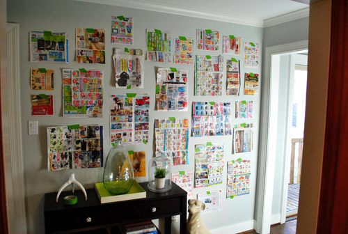
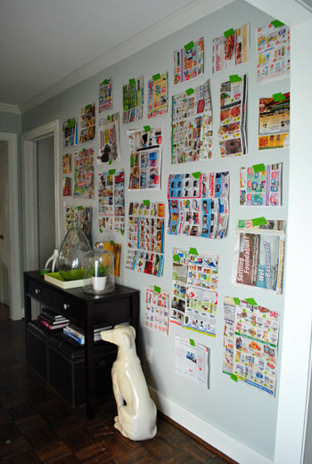
As for how we did it, you saw how I cut out little newspaper templates for all of the frames that we already owned (we actually had a lot of them from various arrangements in our first house, seen here, and even had a few unused ones snagged on sale a while back that were begging for some action). So we just taped up all of our pre-cut templates with a few of the larger ones staggered in the middle (to ground things) and built things out from there, placing most of the smaller frames around the perimeter for some subtle balance. We shifted things around a little, stepped back, went back in and moved stuff around, and stepped back to look at everything again. This happened about ten times with smaller and smaller tweaks until we decided we liked it. But we still wanted to sleep on it and study it one more time the next morning before breaking out the hammer (hence this post about that first phase of the project).
Yesterday we mentioned that The Washington Post scooped us by sharing this shot of our frame-riddled hallway here:
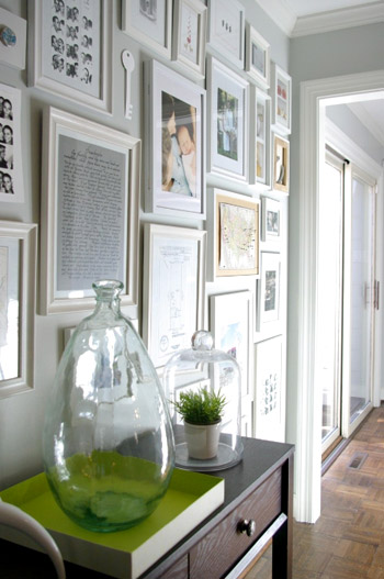
We try to stay as real-time as possible, but we also like to take a ton of after pics and write a big wordy post for ya, so it can take a few days from project completion to post publishing. If only we had a live camera feed going 24/7. Just kidding, my nightmare is to get caught picking a wedgie on camera. It’s why I never auditioned for the Real World (side tangent: John actually sent in an audition tape once when he was 19).
Anyway, so when we woke up the next day and agreed that we still liked the proposed frame placement, it was time to lay out all of our frames on the floor of the dining room in the same arrangement, just to check if some of the actual frames conflicted (since all we were looking at on the wall were their outlines and not their actual styles). Of course we ignored the art since most of it would be switched out anyway.
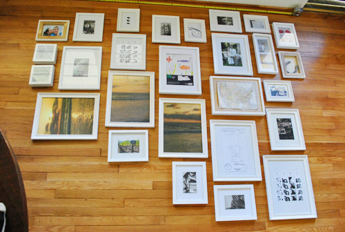
The frames all looked just fine together, so we decided to bite the bullet and grab the hammer. It was hangin’ time (here’s where a lot of MC Hammer was sung). Since our newspaper templates were still up on the wall, it was actually really easy to hang stuff. We just measured how far down from the edge of the frame that our wire, hook, or other hanging device was and just marked a centered “x” right on each template (the horizontal line is the measured center of the template, and the x below it is the spot where the nail should actually go to catch the wire or hook so the frame hangs in the right place).
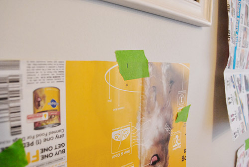
Then we just hammered directly into the “x” in the template…
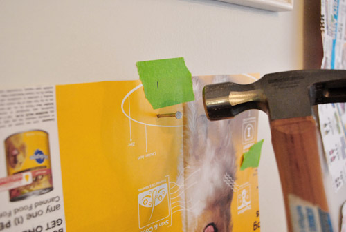
… and pulled the template off the wall to reveal a lone nail waiting for a frame (even though it looks like a jacked up hole, that’s just a tiny bit of paper caught above the nail that we easily removed with a finger flick).
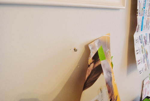
We slowly worked our way around the wall using this method. It probably took an hour or so.
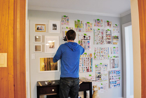
Sadly our old plaster walls don’t work with 3M Command hooks or velcro alone (since that’s always an easy way to create a frame collage without making any holes) but we do plan to add heavy duty Command velcro to the lower frames that may be within Clara’s reach when she starts toddling around. She’s a pretty docile girl who definitely seems to listen when we ask her to be gentle (when petting Burger for example) so our plan is to sweetly request that she be nice to the frames and “look with her eyes” and we might even try the “you can only touch them with one finger” technique that an awesome varsity mom shared with us a few days ago (she said it actually works!). But of course if we think those few low frames ever start to pose a safety hazard, or even just become too high maintenance for the way we live, we’ll definitely just get rid of them until the bean is a little older. Clara first!
But back to our process. After following our templates and hanging every frame we stepped back for a little look-see and frowned. Somehow they seemed a little tighter in the top right corner (which we actually really liked) and a bit too loosey goosey everywhere else…
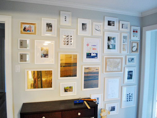
… so we adjusted some of the frames on the left and added in a few little “filler” items to get the same full look that we had on the top right corner going on everywhere else.
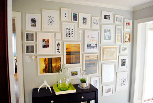
So yes, there are probably ten extra holes in the walls hiding behind those frames from fine tuning them an inch one way or the other. Our bad. But they’re all out of sight so we’re at peace with it. They can just be our little secret. Oops, I just told The Interweb.
Once everything was hung we scavenger hunted the house to find things to display (since many of the existing items in the frames were horizontal images that were now hanging vertically or the frames were completely empty to begin with since we hadn’t used a few of them yet). Which puts the cost of the entire frame wall plus all of the “art” that you see (since that was also already owned) at 100% f-r-e-e. Except for this cool $16 frame from Target that we splurged on because we adored it’s “special capabilities” to store and easily showcase lots of kid art. We love that we don’t have to take it off the walls to change things out. Come on Clara, don’t you feel like drawing mommy a picture or two?
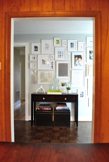
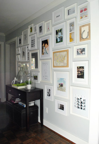
So this is our current arrangement with all of the just-for-now stuff that we found around the house. First here’s the view from the kitchen (which is why we placed the console table there, so it looks centered through the doorway:
And here are a bunch of other angles:
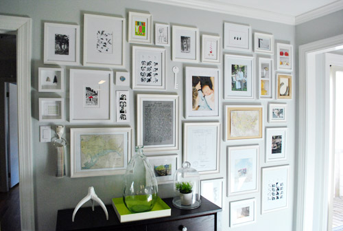
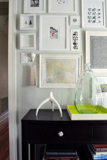
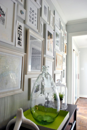
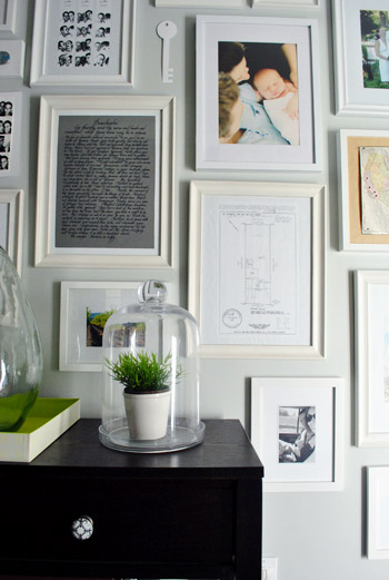
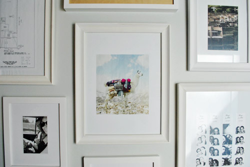
From an old Banana Republic ad with a llama (or is it an alpaca?) carrying sweaters…
… to a vintage milk cap that we found at our first house glued to a small square canvas…
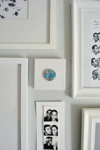
….and a white paper key that I cut out of card stock (which I hope to replace with a DIYed ceramic-looking one)…

… it’s definitely a smorgasbord. And there are probably way too many photostrips, but they’ll do for now.
We’re actually planning a post later with more detailed shots of various items and directions for making your own stuff, like an arrowhead shadowbox for example. Or a long skinny wooden pinboard (still have to make that, for now we have a placeholder piece of card stock with a photostrip taped to it). We also thought it would be fun to take a picture of the wall every few months just to see what comes and goes (new Clara art? updated family pics?) and what always stays (the sketch of our first house’s lot? a favorite photobooth strip of the whole fam?).
We anticipate that at least 25% of the wall will be changing pretty regularly as new things steal our hearts – like a particularly good (or bad) fortune cookie fortune and Will Bower’s first birthday invitation. You know, the important stuff. We definitely feel like this gallery will be the most personal, eclectic, and fun display spot in the house. So while I’ve already asked for some awesome art prints for my birthday (which is this Saturday- woot!) we also want to frame everyday objects that hold meaning to us. From Clara scribbles to little love notes and even particularly funny greeting cards with chihuahuas on the front.
In short: We are so in love with the whole hallway frame gallery. It took a spot that was just a way to get from A to B and made it feel like a bonafide destination. We both keep finding ourselves being drawn to that wall like magnets, just standing there gazing at all the frames. Even Clara loves to stare at it. Ah gallery wall. How can you make us so happy? We’re nerds.
And surprise. We’re so enamored that we’re planning to “wallpaper” the other two walls on the other side of the hallway with frames too.
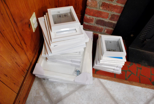
Here’s the pile that we grabbed from Ikea (feast your eyes on that pretty shattered fireplace tile).
Should be good times.
Psst- We announced this week’s giveaway winners. Click here to see if you’re one of them.

Shelley @ Single Stone Studios says
I’m loving the artsy vibe you guys are getting with all this color!! So fun to watch the evelution and really excited to see what you do with that paneling we see in the foregorund looking through the doorway to the new frames!
haley says
I absolutely love this type of collage. I tried to create something similar in our hallway above a chair rail molding. But, it just seems to look too busy. Any tips for avoiding that?
Also – I have a 1 1/2 year old and I am struggling with editing what pictures I choose to hang – there are SO many that I love! Do you two have a system for that?
Thanks!
YoungHouseLove says
It’s hard to pick the pictures that we love most, so maybe try rotating them? Or choosing a certain color scheme to start with (blues and greens and whites) and then switching with the seasons (red and orange stuff in the fall, etc?). As for making things look less busy, maybe try bigger frames with airier spacing so it’s not dense and heavy. You also want to cut down on contrast if it’s feeling busy, so maybe do white frames on a light colored wall as opposed to dark ones on a light wall? The look is more subtle and less bold. Hope it helps!
xo,
s
Kayta says
Really, love you blog and this post.
Except (and because I feel like we’re buds, lol) that glass vase on the tray is WAY out of proportion.
But I promise I like everything else. :)
YoungHouseLove says
Haha, no worries. I admit that I have an odd attraction to crazy huge things! I actually have a probably-too-big object in nearly every room. Like our giant light fixture in the bedroom or our huge round table in the dining room.
xo,
s
Suzanne says
I like a big modern object in a room to break up things and let the eye rest. The same way that black can do for a room that’s floating, a large piece can make a room or area feel grounded.
Priscilla says
LOVE it! :)
Monika says
The wall of frames is definitely my favorite part of your new house! (so far…) The other side is going to look amazing, I’m very excited. Have a nice weekend!
Jennifer says
Happy engagement day!!! March 18th! Don’t freak out, I’m not a creep. I just know this because it is the same day my fiance proposed. Love your blog. We have a contract on a short sale and it’s been nothing but short! It’s a ranch home that can use lots of updating and we can’t wait to get in and start with all of your ideas!
YoungHouseLove says
That’s so cute of you to remember. I didn’t even remember! But now I’m gonna go act sweet to John and remind him of the significance of this day so he thinks I’m suave like that. Haha.
xo,
s
Kate says
I love the wall and can’t wait to see it with frames on the other side too!
And….I realllllly don’t want to pull a “Bob” on you, but those frames are not architecture.
I think it’s art :) haha
YoungHouseLove says
Haha, ok they add interest and some subtle 3D shapes that add some fun to a long flat wall. Dimension! That’s the word I was looking for. Haha. Off to sub that in for ya.
xo,
s
Harinee says
LOL at “pull a bob”..
Ali says
Uh-oh, I think “pulling a Bob” will quickly become part of your blog vernacular. Bernacular? Can I get Friday Points for creating words???
YoungHouseLove says
Everyone gets ten Friday points just because it’s Friday! Wahoo- it’s 80 degrees here!
xo,
s
Kate says
Saweet. Thanks for changing it. You’re da bomb :)
It’s 80 degrees where I am too. Loving it!
Jen @ zeelah says
It looks great! I love how the light switch gets camouflaged into the art too. I can’t wait to see the other walls too!
Corri says
The wall looks really great! And it’s a llama that you’ve got on display – they have banana shaped ears (and outweigh alpacas by a good 100 lbs) … Now you’re good to go with petting zoo identification! :D
And now I have the Llama Song stuck in my head for the day. Thanks! ;)
YoungHouseLove says
Love it. I may never have known the answer to that question. So thanks!!!
xo,
s
Wendy says
If you’ve already answered this, just ignore me, I won’t be offended, but how do you go about buying frames? I guess you just buy whatever you like, then fit to the size? I tend to do it backwards (find the art or item, then try to find the frame) and that seems to be so challenging at time. Also, I know you’ve mentioned a couple of places where you buy frames. Do you always use the same criteria? I want to do a wall like this in my house, but I’m thinking of taking a more eclectic approach and using different types of frames vs. making them match. I’m just having a hard time finding frames I like anywhere that don’t cost a fortune. I so wish I had an IKEA close by.
YoungHouseLove says
We do it all different ways. If I get a print or find some treasure that I want to hang I might choose the frame based on the size of the art. Or I might have a room with a certain amount of space above the sofa for example, so I’ll figure out what size frame I need and then add art of that size after hanging it. We get a lot of our frames from Ikea but Target has some ok prices too, and Michael’s also has sales from time to time. And you can’t forget thrift stores and garage sales! You can get them for $1 and spray paint them if they’re some crazy color! Good luck!
xo,
s
Jacqueline says
Beautiful! I can’t wait to read more about the individual pieces filling these frames. I apologize if this has already been asked, but I don’t have time to read through the comments today to check. Can you recommend some inexpensive sources for frames? A gallery wall like this has been in my inspiration folder for quite some time but I’m having trouble acquiring an adequate number of frames. Our local thrift shops leave a lot to be desired and I think I’ve hit my personal limit for IKEA/Target frames. Thank you!
YoungHouseLove says
Oh man, I was going to say there are three places that we get our frames: Target, Ikea, and thrift stores/garage sales. Maybe try craft stores like Michael’s? Good luck!
xo,
s
Kirsten says
Well, now you’ve done it. You’ve won me over to the-wall-filled-with-pics look. My grandma always had that in her house with dark frames that were ALWAYS crooked–lol. But THIS. Oh, I love this. And since I am MOST incompetent and knowing where to put pics, this is also oh-so-helpful!!! And I just happen to be going to IKEA this weekend–destiny? I think so!
Jennifer says
Looks absolutely amazing — and totally makes the off-centeredness of the table work in that space! Bravo!!
I only quickly scanned the comments, so apologies if this has already been suggested — have you ever tried OOK hooks? My husband’s a professional photographer and we have his photos hanging all over our house. Since the gallery changes pretty frequently, I use OOK hooks because they leave only the TINIEST hole, but can hold a significant amount of weight. (They’re also perfect for avoiding jacked-up holes. Whether or not paper is involved.) :-)
YoungHouseLove says
You’re the second one to recommend them! We’ll have to check them out!
xo,
s
Bobbie Brown says
Ohhh! I LOOOOOOOOOOOOOOOVE IT!
Jen says
I love, love, love this idea. I was going to go the “board and batten on the bottom half of my wall and family gallery on the top route”, but now I am thinking this is much cheaper (because like you I already have a million frames, I just have to spray them white!) and I love it even more!!
Great ideas as usual :)
Tamisha says
I like it, but think I would love it if the frames were lined up at the top. The random nature of that line makes me a bit edgy, that or I’ve had too much caffiene today. Or, I’m just a controlling freak. We’ve been hanging pictures too, a year and a half AFTER we moved in. And I’ve had several items professionally framed. Can’t wait to pick them up!
YoungHouseLove says
Haha, that’s too funny because I had to force myself to vary the frame height at the top because my type-A self wanted them to be perfectly straight – but since they slope down on that one side to balance the console they looked better a little staggered up top since the sides and bottom weren’t in a perfect line. But I like how you think! Haha.
xo,
s
Clare says
Omg I loove it! Youve inspired me to do this – now I just have to figure out where in my tiny house this would look good!
Mellissa says
I love this wall! I’ve always wondered how to do such a collage of frames. Thanks for sharing. You’re the best!
Lillian says
You guys are by far my favorite blog!! I check daily and get so excited to watch what you do in your home! LOVE!!
I was a nanny for a family 2 years ago and I learned a great way to teach children to be “hands-off”! The mother is an interior decorator, so she was constantly going to amazing places with her 3 daughters. The girls were all well behaved, but the youngest (just under 2 years) was loved getting her adorable little mitts on anything and everything. Her mom would just say “Emmy, store hands!” Emmy would immediately fold her arms behind her back and grin. “Store hands” could be used in the home too to avoid disasters and keep the little one out of trouble.
Hope this helps! Keep up the amazing, inspiring work!
Tiffany says
Love that hallway
XOXO,
http://outfitidentifier.com/
Allison says
This looks awesome! I’ve done picture collages before, but there’s something about this fully covered wall that is just stunning! Can’t wait to see it done to the other side of the hall too. What a great place to get to display a bunch of random pieces you’re loving at the moment but don’t have to be married to for life!
QS says
Looks great! I was so looking forward to this post. I have a bunch of frames that I have been waiting to use in our hallway. I also got a fake plant at Ikea last week! I got one that looks more like a succulent and my husband couldn’t tell. Love that as I kill everything! Love the key idea – maybe you could use the key from your old house and new house. Great job!
YoungHouseLove says
Ooh that would be fun, to make a big version of our old house key with white clay or something!
xo,
s
Alicia M says
The finished product looks AWESOME!! So cool that you can switch things out and adjust as you go. I wish I had a nice chunk of hallway wall to do this at home!
You guys are always a great inspiration! :)
LindseyR says
you.kick.butt.with.art.galleries.love.love.love.
Cat says
It looks great! My Grammy actually had a hallway like this in her house that lead from the kitchen to the bedrooms and she decorated it just like that. She covered the walls in pictures of my dad and aunt from childhood and then the other walls were covered with pictures of the grandkids, at least one for each year. It was so fun to stare at all the old pictures and compare who looked like who.
Robin @ Our Semi Organic Life says
mine too! I think everyone’s grandma does this!
Liz says
I love this! Thanks for sharing the step-by-step. I also am a big planner and like to have everything figured out before I tackle a big project like this. You make me feel brave enough to start a picture wall of my very own!
Dre says
Oh, I luuuuuuuurve it and you’re so brave! I suffer from a not-so-known case of frame-o-phobia as seen here: http://futuredukes.blogspot.com/2010/12/frame-o-phobia.html
But I’m dying to do a gallery wall, I just need to find the courage!
YoungHouseLove says
Haha, you can do it! Just use paper templates to gain some confidence. Clean white ones won’t look as crazy as our newspaper ones and you can picture things before nailing it all in. Good luck!
xo,
s
debbie w says
I love the collage look and especially like doing it all over on the other wall is a good idea.
Since you post so much about Burger….have you read any of the SkippyJohn Jones children’s books….the chi. thinks he’s a cat. Pretty funny stuff….if you have not read any of them…check them out.
YoungHouseLove says
Yes they’re hysterical! Love them!
xo,
s
kelsey says
i love a wall of frames! and i love that you mixed in some other stuff like the key. a friend sent me to vintage letters in my kids initials and those are mixed in my hallway of frames, i love it! i also love that you took them to the floor, so fun!! the house is looking so good – as always i love your blog!
Natalie says
This looks amazing!!! Well done, you two! :)
Marti says
B.E.A.U.T.I.F.U.L. Love it. Who knew a photo hallway could look so classy?! I’m totally heisting this idea for my future (whenever that may be) home hallway. Thank you for the inspiration.
p.s. Did I mention I love your photo wall?
Natalie says
P.S. I saw that someone mentioned they thought the large vase was “out of proportion”. Well, I couldn’t DISagree more! I think that since the collage takes up so much space, the best thing for the console was to add a large piece. So well done again! :)
Jocelyn Stott says
THIS LOOKS SO GOOD! I love everything about it. Great idea!
Sheryl J says
They look great! Now I wish that I had a more traditional layout instead of an semi-open layout in my house. But I can just daydream about yours!
Jessie says
I just had to say that younghouselove is my favorite blog to read right now! Your family is adorable and I love the DIY/thrifting spirit. My husband and I are the same way. Looking forward to reading more ;)
Lennon's Mommy says
I love all the creative and crafty things you two come up with! the wall looks super good! I have alot of the same frames filled sitting im my closet and lots of empty walls! Cant wait to create a master piece of my own!!
Katie @ Newcomb Home says
Sorry if you’ve already answered this but do you guys find coupons for your IKEA frames? I went there but (although very reasonably priced), to buy a bunch of them hurt the wallet too much. Just curious if you have any tricks!
Love the gallery wall!
YoungHouseLove says
Sometimes they have frame sales (or whole store sales) so that helps. We also generally like to get a few at a time so it doesn’t shock the wallet as much (in the case of the pile at the bottom of this post I had a birthday gift card from John’s fam, haha). You might want to check thrift stores too (sometimes they have new ikea and target frames for a buck or less). Good luck!
xo,
s
Stephanie says
Fantastic! I’m especially looking forward to the DIY key?
Any thoughts on securing frames in CA (earthquake country)? I know there are earthquake safe hooks, but they seem a bit much for little piddly frames, especially if we were putting up a whole bunch of frames like this. Maybe nails and then a whole bunch of command strips around the perimeter?
YoungHouseLove says
Yes that’s totally what we’d do, the heavy duty command strips or velcro on top of a nail or two. Good luck!
xo,
s
Amanda says
I used to work as a disaster preparedness specialist in CA. Just use closed hooks so the frame can’t bounce off the hook. It does not need to be a special earthquake hook. It is also a good idea to not hang anything heavy over your couch or bed. Better safe than sorry!
YoungHouseLove says
So smart! Never thought of closed hooks. Thanks for sharing!
xo,
s
the 7msn ranch says
You even made Hallmark’s Shoebox blog today!
http://www.shoeboxblog.com/?p=24185
YoungHouseLove says
Woah, off to check it out!
xo,
s
Krithiga says
Looks great! Quick question I have really narrow pathway and am not sure whether frames is the way to go since there is no place to stand back and look…any ideas..?
probably should link a pic to show how narrow it is..but was hoping either you or one of the readers would throw some ideas my way!
YoungHouseLove says
Feel free to upload a pic on Facebook for advice from everyone! Or you can just try spacing frames out a bit so they’re not too heavy or cluttered looking. Like one long gallery looking arrangement that’s less hodge podge. Hope it helps!
xo,
s
Jill says
This is amazing! I love the quanity and the layout! Well done!
Elle says
Looks awesome! I’m inspired!
Tiffany says
This may be my favorite project of yours so far, and that is saying something.
Is the print above the map from Art Shark Designs? I love her stuff.
http://www.etsy.com/listing/63391130/richmond-love-gocco-art-print
(Sorry if this has been asked already. I didn’t have a chance to read all the comments.)
YoungHouseLove says
Yes! Love it so much! She’s an awesome artist! And for anyone in other areas, she doesn’t just do Richmond prints!
xo,
s
Lise says
Yay frame wall. We love ours. My one beef with it is keeping everything straight. With a single nail hole they are always coming crooked. Any tips?
YoungHouseLove says
There are little hooks that look like zigzag crocodile teeth that you can hammer into the back of most frames and they’re the best for keeping them straight (just rest the nail on the middle “tooth” and you’re good). You can also use velcro or 3M strips. Hope it helps!
xo,
s
Rikki says
I can see Clara constantly pulling on those bottom frames when she’s a few months older/walking.
YoungHouseLove says
Check the post for our Clara safe plan. Safety first! Haha.
xo,
s
Libby says
LOVE! that the ceramic pig and paint deck made it on to the wall. Standing in front of the paint chips at Home Depot inspired my latest project without buying a single can of paint! Would love to snag a deck to keep at home. Can’t wait to see the finished hallway, guys!
http://bluesielou.wordpress.com/2011/03/18/its-friday-which-means-monday-is-right-around-the-corner/
Emily says
In loooove with your gallery wall, perfection!
middleschoolteacher says
I love the look of collage frames on your wall! The best part is that it doesn’t look dense or cluttered. I have used art for walls in the past but I love using personalized art and choosing things close to your heart.
You might of answered this already..but how do you size pictures for the Ikea frames. Most of the frames come in odd sizes such as 9X9. Do you order bigger pictures then cut them? Or do you have a simple way of fitting pictures to that size. Thanks for any tips! :)
YoungHouseLove says
We’re big fans of making art to fit (check out our Projects page for ideas) or even getting prints from Etsy or Goodwill and just trimming them or cropping them to fit. You can add a bigger mat if they’re too small too. Good luck!
xo,
s
Stephanie says
Love the frame layout. I probably missed this somewhere, but what’s the paint color in your hallway? Love that too.
Stephanie says
Disregard the question I just sent; I found the post… MOONSHINE!!
Love your blog. Keep up the great work.