We’re back with pics of our hallway that we “wallpapered with frames” for lack of a better description. We think it created some pretty quick dimension and interest that’s sure to be fun for the whole family. Literally. We love that we can work in drawings by Clara, class pictures, and photos of favorite vacations for the whole family to enjoy.
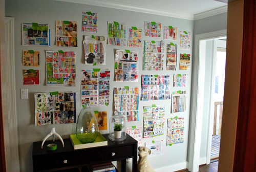
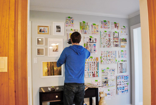
As for how we did it, you saw how I cut out little newspaper templates for all of the frames that we already owned (we actually had a lot of them from various arrangements in our first house, seen here, and even had a few unused ones snagged on sale a while back that were begging for some action). So we just taped up all of our pre-cut templates with a few of the larger ones staggered in the middle (to ground things) and built things out from there, placing most of the smaller frames around the perimeter for some subtle balance. We shifted things around a little, stepped back, went back in and moved stuff around, and stepped back to look at everything again. This happened about ten times with smaller and smaller tweaks until we decided we liked it. But we still wanted to sleep on it and study it one more time the next morning before breaking out the hammer (hence this post about that first phase of the project).
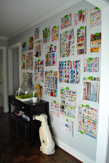
Yesterday we mentioned that The Washington Post scooped us by sharing this shot of our frame-riddled hallway here:
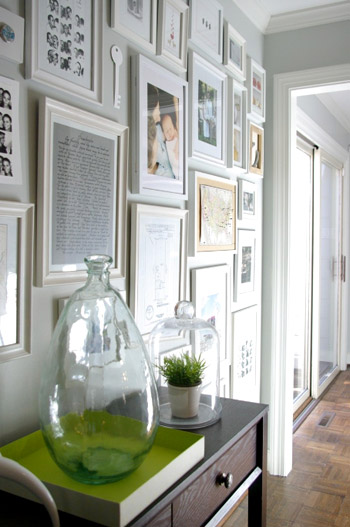
We try to stay as real-time as possible, but we also like to take a ton of after pics and write a big wordy post for ya, so it can take a few days from project completion to post publishing. If only we had a live camera feed going 24/7. Just kidding, my nightmare is to get caught picking a wedgie on camera. It’s why I never auditioned for the Real World (side tangent: John actually sent in an audition tape once when he was 19).
Anyway, so when we woke up the next day and agreed that we still liked the proposed frame placement, it was time to lay out all of our frames on the floor of the dining room in the same arrangement, just to check if some of the actual frames conflicted (since all we were looking at on the wall were their outlines and not their actual styles). Of course we ignored the art since most of it would be switched out anyway.
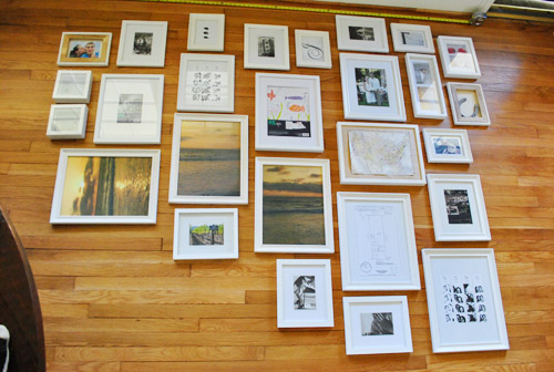
The frames all looked just fine together, so we decided to bite the bullet and grab the hammer. It was hangin’ time (here’s where a lot of MC Hammer was sung). Since our newspaper templates were still up on the wall, it was actually really easy to hang stuff. We just measured how far down from the edge of the frame that our wire, hook, or other hanging device was and just marked a centered “x” right on each template (the horizontal line is the measured center of the template, and the x below it is the spot where the nail should actually go to catch the wire or hook so the frame hangs in the right place).
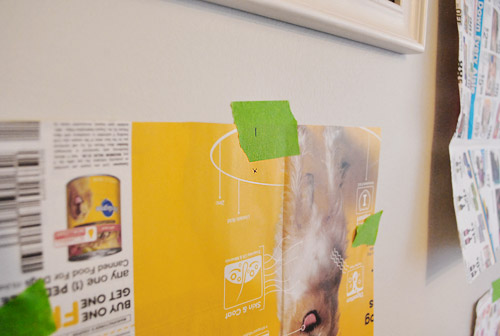
Then we just hammered directly into the “x” in the template…
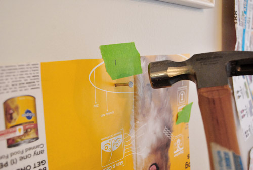
… and pulled the template off the wall to reveal a lone nail waiting for a frame (even though it looks like a jacked up hole, that’s just a tiny bit of paper caught above the nail that we easily removed with a finger flick).
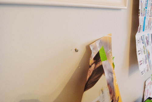
We slowly worked our way around the wall using this method. It probably took an hour or so.
Sadly our old plaster walls don’t work with 3M Command hooks or velcro alone (since that’s always an easy way to create a frame collage without making any holes) but we do plan to add heavy duty Command velcro to the lower frames that may be within Clara’s reach when she starts toddling around. She’s a pretty docile girl who definitely seems to listen when we ask her to be gentle (when petting Burger for example) so our plan is to sweetly request that she be nice to the frames and “look with her eyes” and we might even try the “you can only touch them with one finger” technique that an awesome varsity mom shared with us a few days ago (she said it actually works!). But of course if we think those few low frames ever start to pose a safety hazard, or even just become too high maintenance for the way we live, we’ll definitely just get rid of them until the bean is a little older. Clara first!
But back to our process. After following our templates and hanging every frame we stepped back for a little look-see and frowned. Somehow they seemed a little tighter in the top right corner (which we actually really liked) and a bit too loosey goosey everywhere else…
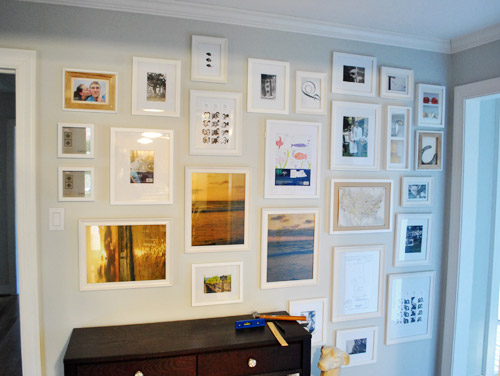
… so we adjusted some of the frames on the left and added in a few little “filler” items to get the same full look that we had on the top right corner going on everywhere else.
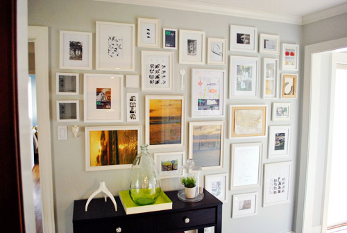
So yes, there are probably ten extra holes in the walls hiding behind those frames from fine tuning them an inch one way or the other. Our bad. But they’re all out of sight so we’re at peace with it. They can just be our little secret. Oops, I just told The Interweb.
Once everything was hung we scavenger hunted the house to find things to display (since many of the existing items in the frames were horizontal images that were now hanging vertically or the frames were completely empty to begin with since we hadn’t used a few of them yet). Which puts the cost of the entire frame wall plus all of the “art” that you see (since that was also already owned) at 100% f-r-e-e. Except for this cool $16 frame from Target that we splurged on because we adored it’s “special capabilities” to store and easily showcase lots of kid art. We love that we don’t have to take it off the walls to change things out. Come on Clara, don’t you feel like drawing mommy a picture or two?
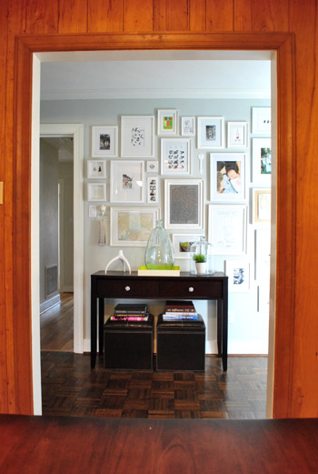
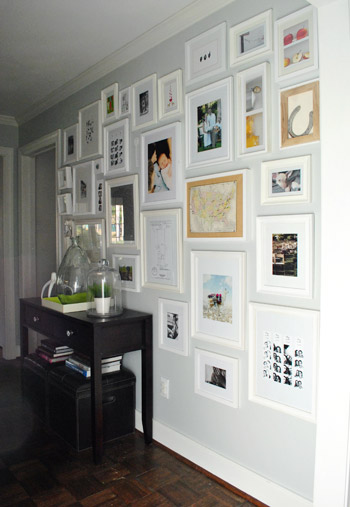
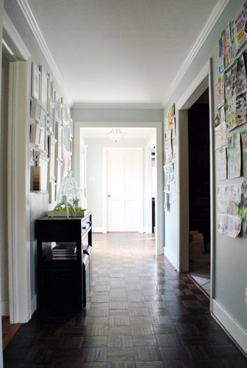
So this is our current arrangement with all of the just-for-now stuff that we found around the house. First here’s the view from the kitchen (which is why we placed the console table there, so it looks centered through the doorway:
And here are a bunch of other angles:
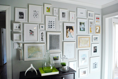
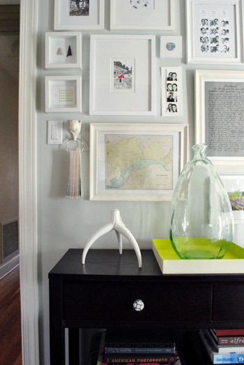
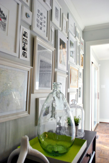
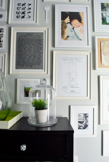
From an old Banana Republic ad with a llama (or is it an alpaca?) carrying sweaters…
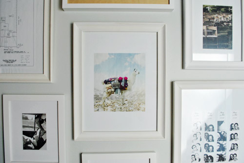
… to a vintage milk cap that we found at our first house glued to a small square canvas…
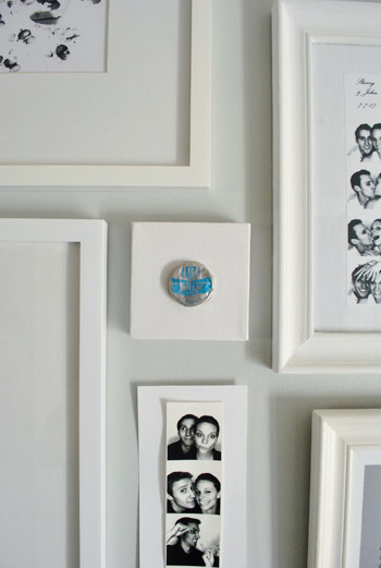
….and a white paper key that I cut out of card stock (which I hope to replace with a DIYed ceramic-looking one)…

… it’s definitely a smorgasbord. And there are probably way too many photostrips, but they’ll do for now.
We’re actually planning a post later with more detailed shots of various items and directions for making your own stuff, like an arrowhead shadowbox for example. Or a long skinny wooden pinboard (still have to make that, for now we have a placeholder piece of card stock with a photostrip taped to it). We also thought it would be fun to take a picture of the wall every few months just to see what comes and goes (new Clara art? updated family pics?) and what always stays (the sketch of our first house’s lot? a favorite photobooth strip of the whole fam?).
We anticipate that at least 25% of the wall will be changing pretty regularly as new things steal our hearts – like a particularly good (or bad) fortune cookie fortune and Will Bower’s first birthday invitation. You know, the important stuff. We definitely feel like this gallery will be the most personal, eclectic, and fun display spot in the house. So while I’ve already asked for some awesome art prints for my birthday (which is this Saturday- woot!) we also want to frame everyday objects that hold meaning to us. From Clara scribbles to little love notes and even particularly funny greeting cards with chihuahuas on the front.
In short: We are so in love with the whole hallway frame gallery. It took a spot that was just a way to get from A to B and made it feel like a bonafide destination. We both keep finding ourselves being drawn to that wall like magnets, just standing there gazing at all the frames. Even Clara loves to stare at it. Ah gallery wall. How can you make us so happy? We’re nerds.
And surprise. We’re so enamored that we’re planning to “wallpaper” the other two walls on the other side of the hallway with frames too.
Here’s the pile that we grabbed from Ikea (feast your eyes on that pretty shattered fireplace tile).
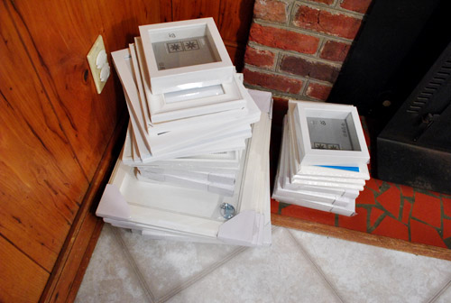
Should be good times.
Psst- We announced this week’s giveaway winners. Click here to see if you’re one of them.

Mary-Kate says
This is by far my favorite thing you have done so far in your new house! I love the clean lines, coordinating frames, and the interest that art has–both the individual pieces, and the display as a whole.
My mom has tons of photographs and portraits of her family, some dating quite far back. Growing up, she used to display the portaits of her distant ancestors on the piano. When I was really young and we had friends or family over, I would always make a point of saying, “Yeah, that’s where my mom puts dead people’s pictures.” Terrible, I know!
Anyway, the point of that is to say that someday, when I inherit all of that memorabilia (pictures, family trees, battle certificates from the revolutionary and civil wars), I now have a very inspirational and meaningful way to display all of those artifacts that make up my family’s history–so thank you for your inspiration! And if my children are as reverent as I was, I’m sure they’ll call it the “I see dead people” wall… ;-)
mike @ the lil house that could says
John isn’t wearing a hat in that picture. THE 2012 END OF THE WORLD RUMORS ARE TRUE!?~@~!!
YoungHouseLove says
Mwahahaha. Hilarious.
xo,
s
Kana says
It looks amazing!! I really want to do this in my house too but I tried to imagine it on my walls and all I could think about was the dust that all the frames would accumulate and how I would NEVER clean them. hahaha!! I may still attempt it though :)
Amy says
Ha, I auditioned for Real World too! How totally 90’s of us.
Amanda says
It’s totally a llama!
I own one…I can spot ’em a mile away ;0)
YoungHouseLove says
Amazing!!! My llama says hi to your real llama.
xo,
s
Jessica says
Seriously RUNNING out the door to buy an entire cartloads of frames!!! Guess I’ll be on the mix n match side of the fence, only because I’ll be able to get THAT faster! LOVE IT! And I’m for a chevron runner, too!
- Sarah :-) says
It looks great! I actually thought about the spacing issue when you first posted the “newspaper” version the other day. But figured it was just the angle or something. Glad you got-er-done in the end! ;-)
PS: About that jacked-up hole… how horrible is it that my first reaction was: “…That’s what she said”
YoungHouseLove says
Haha, you got me.
xo,
s
ka says
awesome
Jane says
This looks SOOO great! I love the idea of using newspapers to space everything out–I am totally going to try that. And congrats on your feature in the newspaper! :)
Meggin says
I love how this turned out! Do you remember where you found the oversized glass jug? I’ve had my eye out for something similar and can’t seem to find it. Thanks, and congrats to you on your article!!
YoungHouseLove says
Ours was from ZGallerie a while back, but we see them at TJ Maxx and HomeGoods and Marshall’s a lot. Hope it helps!
xo,
s
Jessica says
Guys, that wall looks absolutely beautiful! I started one in my apartment but we have a looong way to go. I only have 4 large frames with b&w pictures of our family but I want to add so many more!
Thank you so much for sharing your amazing ideas. I always come here for inspiration and instructions!
Tracy says
LOVE it!!!!
Lois says
What an incredible photo gallery! I sat and stared at it for a very long time dreaming of having it in my own home! I’m so glad you guys are going to do it on both sides of the hallway! It’s going to be a really fun place for your company to see all of your treasured moments! Really loved this post!
Maureen says
I love the wall!! My sister and I are visiting Italy in two weeks and I’m planning a minaturized version with pictures of us, the Tuscan countryside, train tickets, etc. I’m so excited. Also love the video of Clara at the end. She is so adorable and puts a smile on my face.
Brandi says
This looks so beautiful! Kind of like the hallway in one of my favorite movies, “Something’s Gotta Give.” I love how you added other things on there besides frames.
Kristie says
Since everything in Casa Petersik garners a nickname, may I suggest “Harvey Wallbanger” for the hallway gallery? Or simply, “Harvey” for close, personal friends. :)
YoungHouseLove says
Hahah, sold. Harvey is our new best friend.
xo,
s
Sheena says
Wow! This turned out soo amazing! I love all the personal touches. Since all the craze of social networks it seems like no one prints pictures anymore :( That’s why I think this is just FANTASTIC! Making the home feel more like home again!!!
Kevin says
This is so helpful! I saw a wall with several pictures that I wanted to recreate here http://www.aliceindesignland.com/blog/inside-look-sarah-wandering.html but was lost about how to go about doing it. Your tutorial will definitely come in handy.
anne says
Are all the frames the same shade of white? And the mats, too? are they all from IKEA? Look fantastic!
YoungHouseLove says
They’re a smorgasbord of frames from Ikea and Target and they’re actually in varying tones of white (along with the mats) but it looks sort of layered and intentional since it’s not like there’s one bright one that stands out, they’re all just sort of subtly varied. Hope it helps!
xo,
s
Kristina says
I’m enjoying your introduction of color in your new house! Your lack of it in the previous house was the “thing” that turned me off. I know….to each their own regarding color…..but this architect is thrilled to see you finally using some. I’ll be back to this blog more often than I was previsouly because of it!
Emily V. says
I love it! You guys have inspired me to do it in my house.
Ann Meehan says
I love how the pictures conform around the console table. It makes it look so customized and like the table is part of the arrangement! This is definitely a project I want to try!
Vivian says
Congratulations on the fantastic stories on the Post, so well deserved.
On your gallery wall, are the frames generally equidistant from each other (an oxymoron, but it was the word of the day on my calendar, had to use it!)? I’d love to start one but I would like it to grow organically (and honestly I am too impatient to do the newspaper/planning thing) and add as I go. Your expert advice is much appreciated!
YoungHouseLove says
Yeah, we tried to keep things as consistent as possible without going crazy, but it’s pretty close when you eye it (didn’t break out a ruler or anything, but we filled things in when they looked too airy on one side so there wasn’t a corner that looked more cramped than the rest). Hope it helps!
xo,
s
Andrea says
This is my favorite thing ever! It looks amazing! I was just thinking about attempting something like this on a wall also, and this has given me the push! Love all the different sizes and the variety of art and pictures. Looks fantastic! :) Great job, as always!
Johanna says
I am SO in love with this! Favorite thing you’ve done in your new home yet! This is totally inspired me to search my house for a place to do a gallery wall too- something I’ve always wanted. Awesome. Can’t wait for more.
Carrie says
LOVE this!! I’m always saving random ephemera, but it sadly sits in boxes. This inspires me to display some of it! Aaaaand I’m going to be at Ikea this wknd…definitely adding white frames to my shopping list. :)
Btw, happy birthday, Sherry! And happy engagement anniversary! Honestly, I only remembered that bc after reading your engagement story some time ago, I realized that it’s the same day as my and my husband’s engagement anniversary (or pretty close). Random, I know. :) Have a great wknd!
YoungHouseLove says
Aw thanks! Happy engagement anniversary to you too!
xo,
s
amy says
this looks so, so good. i like that you “tightened” it up, and with such fun fillers! what a beautiful wall of loveliness.
Caitlin @ Desert Domicile says
So pretty!!! Makes me want to fill the long wall in my hallway with frames :)
By the way: happy early birthday Sherry!
Nicole says
That looks A-MAZING!
Sara D says
Sort of not related to this post, but I found this cool new iPhone app (if ya’ll have iPhones) that shows you how colors look on different surfaces and immediately thought…this is a cool tool for YHL! I haven’t tried it so I can’t speak to how well it works, but it seems like a cool idea…and of course nothing you can’t do with your awesome photoshop skills…but perhaps on-the-go? http://techcrunch.com/2011/03/17/pixelate-2-0/
(I’m not affiliated with techcrunch if that’s important…just read their blog and thought of you guys when I saw this entry)
YoungHouseLove says
Love it! Off to check it out!
xo,
s
Jennifer says
First, LOVE the gallery – knew I would! Second, I just had to comment about your birthday being on Saturday, Sherry, because that’s also my son’s 9th birthday. If I didn’t already think you were cool before, I would now because you must be awesome if you get to be his “birthday buddy”! :) I hope you have a great day!
YoungHouseLove says
Haha, love it! Happy b-day to your little man!
xo,
s
Janet says
Love it! I’m dying to know what the writing on the silver paper is. A poem? A story?
I just found your site last week and I’m so glad that I stumbled across it through work. So much fun!
YoungHouseLove says
That’s actually an amazing story! We were legally obligated to hire a licensed contractor to do a few little tweaks on our old house after the buyer’s home inspection (they wouldn’t let us DIY them, boo!) but he was such a nice man and he was actually the same licensed contractor who did the work on our new house since the previous owners here hired him as well (they were the ones who recommended him to us). After a bunch of meetings with him as he fixed a few things at our old house and our new one he stopped by to give us a housewarming gift! And it was this poem that he had hand written himself (he’s also a calligrapher!). What an amazing guy.
xo,
s
Katie S. says
Looks fantastic! I’ve been collecting frames from thrift stores for a while in order to do something like this. Mine will be a bit more vintage looking, since I’ve been picking out older ornate frames. However, the cohesion will come from spraypainting them all silver to match. Then I plan to put in pictures of my travels from Europe and hang them above my headboard. Thanks for the great idea of the clippings to figure out placement; that is sure to save me a lot of time! =)
Samantha @ Mama Notes says
this sounds like SUCH a good idea!!
melissa says
I KNEW there was a reason I liked you/this blog so much… we share the same birthday!!! Happy Birthday Sherry! :)
p.s. You know how it’s so cool when you share your birthday with someone famous? Like, “Yeah, I have the same birthday as Lady Gaga…nooo big deal!!” Now I’m telling people that I share a birthday with Sherry from Young House Love. Yep, you’re on that level. :)
YoungHouseLove says
Haha, I love it! March 19th b-day gals unite!
xo,
s
Cori says
So beautiful. And how lucky are you guys to have such a wide hallway! I’m adding that to the growing list of what to look for in our next house.
Eileen says
I love it!! It looks fantastic! What did you guys do with all of your “thankful” papers from Thanksgiving? Have you thought about displaying those somehow? Oh – and I L-O-V-E love the green rug!
YoungHouseLove says
They’re still in the thankful jar, which is tucked away in our cabinets under the dining room built-ins but we’re dying to break them out somehow. Framing some favorites is a great idea!
xo,
s
Carolann says
Just wanted to say happy birthday to you, Sherry! Mine is tomorrow, too….but that’s not the only reason for the well wishes ;) BTW, I still get carded and asked if I get the student discount even though I’m nine years ahead of you…maybe 3/19 is a sort of fountain of youth! Ah, one can dream :)
YoungHouseLove says
Wahoo! I like that theory A LOT. We can dream together. Haha. Happy birthday girl!
xo,
s
Kristin says
Loveee at first sight! This look ah-maze-ing. =)
Jessica says
So flippin cool! And happy birthday!
Melissa says
Happy almost birthday!
Love the gallery walls. Back in the day I bought three giganticus frames from Ikea and then had many many photos printed and cropped at 4×4″. Then I got to fill the frames with all the photos, it was nice to walk by and see something funny or a family member or an animal. I’m a big fan of variety art.
Kari says
Love it and you! I have been collecting a bunch of frames to spray paint black and hang with black and white pictures going up our staircase. I wasn’t sure how I’d get them up on the wall perfectly, but now I know the trick! Thanks!!!
DEBRA SHATTO says
Looks good. One way to get frames stuffed is to take state maps of your travels or that mean something to you and crumple them up, straighten them out and then give them a tea bath or mark a special spot with a trinket and frame it. Or rip up the maps and make a collage with tickets, showbills, etc and frame. Or menus from favorite or memorable restaurants. Or…..Deb
YoungHouseLove says
Cute! Love it.
xo,
s
Mandy says
OMG I love this!! You guys always amaze me, and have now forced me to finally do my hallway that I have been putting off fo-eva’ (like, almost a year since we moved in…). Thanks for giving me a fun weekend project, and your templates are genious!
Natalie says
Hey Guys, did you include that special note you found behind the bathroom mirror? I LOVED that post, thought that was so special, and was amazed you found it so soon after moving in…
This is such a great idea, I LOVED one of the previous “house crashing” posts where she included the thermostat in the mix.. how clever.
of course, I love everything about what you do..
from the old show “absolutely fabulous”… that’s what I think of you guys…
AB-FAB!!
~nat
YoungHouseLove says
We took lots of photos of that note but we actually slipped it right back where we found it because we wanted someone else to find it in 100 years!
xoxo,
s
Jane says
You inspired me to do the same at our house which has many empty walls right now. But I have to say, I kinda prefer the first arrangement you did, before you included the small little frames to “fill” the gaps. Well, I am only seeing through the photos you posted, I am sure you have a better view in person.
Amber says
Love the wall guys it looks awesome! And I must say that whole idea about one finger, totally works! My husband grew up with that rule, and still to this day if we are in a store that hosts a ton of breakable things, I will sometimes see out of the corner of my eye the hubby touch something with one finger, so cute and endearing. HIs momma taught him well. :)
YoungHouseLove says
Haha, that’s so cute. Seriously. I’m melting.
xo,
s
Danielle says
Do you think it would be too “overwhelming” to do a large collection like this in more than one area of the house? I have wanted to do this for a long time but can’t decide which wall to choose.
YoungHouseLove says
Nah, just take it one step at a time! Make some paper templates in each area and you might realize that one works better than the other and if you like how it looks in both places go for it! We have a big wall of frames in Clara’s room too!
xo,
s
Beth@Just{Heart}It says
Do you have a link to that one, or haven’t you shown it to us yet?
YoungHouseLove says
Sure, here are some pics of her room with her frame wall for ya (you can always see the rooms of our house by clicking the House Tour tab at the top of the page). Hope it helps!
xo,
s
B says
Hey there! Any way that you could let me know the dimensions of the wall? It looks to be about the same as mine but I would love to know for sure. LOVE LOVE LOVE this. Thanks!!!
YoungHouseLove says
The wall is 92″ wide (and about 8′ tall). Hope it helps!
xo,
s
Beth@Just{Heart}It says
I think you know you made the big time when you get scooped!
YoungHouseLove says
Haha, The Post is just too fast for us little people. Haha.
xo,
s
Beth@Just{Heart}It says
Duh, thanks. I should’ve known to look there myself instead of giving you more work to do.
Do you always use white frames?
YoungHouseLove says
No worries! We know it’s sometimes hard to find things with all of our archives to search through! As for frames, we just have a thing for white ones. We have a few wood ones, but always seem drawn to the white ones, maybe because we also love crisp white trim?
xo,
s
Linda says
Wow this looks amazing! Great job!
Our new house has a quite long and narrow hallway. Would something like this be suitable or do you think it will make the hallway seems even more narrow?
Do you have any ideas?
xx Lin
YoungHouseLove says
We’d definitely try taping up plain white paper templates to see how it feels (bright newspaper ones might throw you off by looking too busy). You might be surprised at how you can get away with something sweet. even in a long narrow hallway- as long as you keep it sort of airy and maybe not use as many frames hung as densely. Hope it helps!
xo,
s
Linda says
Thanks so much Sherry! We will definitely try it out!
xx Lin