We’re back with pics of our hallway that we “wallpapered with frames” for lack of a better description. We think it created some pretty quick dimension and interest that’s sure to be fun for the whole family. Literally. We love that we can work in drawings by Clara, class pictures, and photos of favorite vacations for the whole family to enjoy.
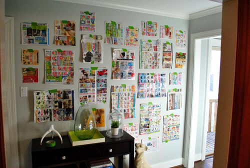
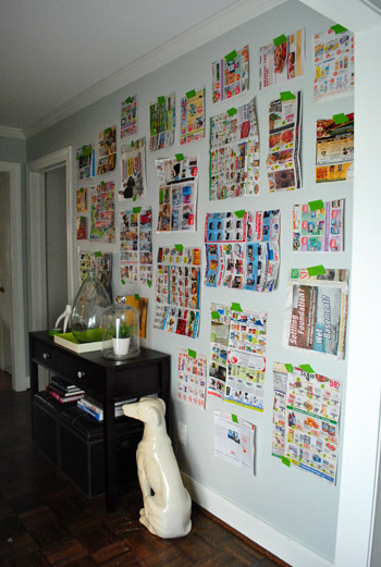
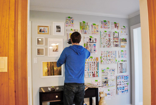
As for how we did it, you saw how I cut out little newspaper templates for all of the frames that we already owned (we actually had a lot of them from various arrangements in our first house, seen here, and even had a few unused ones snagged on sale a while back that were begging for some action). So we just taped up all of our pre-cut templates with a few of the larger ones staggered in the middle (to ground things) and built things out from there, placing most of the smaller frames around the perimeter for some subtle balance. We shifted things around a little, stepped back, went back in and moved stuff around, and stepped back to look at everything again. This happened about ten times with smaller and smaller tweaks until we decided we liked it. But we still wanted to sleep on it and study it one more time the next morning before breaking out the hammer (hence this post about that first phase of the project).
Yesterday we mentioned that The Washington Post scooped us by sharing this shot of our frame-riddled hallway here:
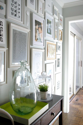
We try to stay as real-time as possible, but we also like to take a ton of after pics and write a big wordy post for ya, so it can take a few days from project completion to post publishing. If only we had a live camera feed going 24/7. Just kidding, my nightmare is to get caught picking a wedgie on camera. It’s why I never auditioned for the Real World (side tangent: John actually sent in an audition tape once when he was 19).
Anyway, so when we woke up the next day and agreed that we still liked the proposed frame placement, it was time to lay out all of our frames on the floor of the dining room in the same arrangement, just to check if some of the actual frames conflicted (since all we were looking at on the wall were their outlines and not their actual styles). Of course we ignored the art since most of it would be switched out anyway.
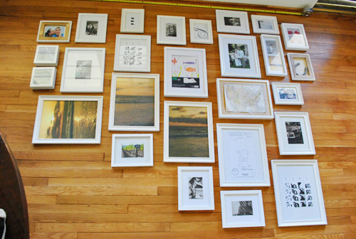
The frames all looked just fine together, so we decided to bite the bullet and grab the hammer. It was hangin’ time (here’s where a lot of MC Hammer was sung). Since our newspaper templates were still up on the wall, it was actually really easy to hang stuff. We just measured how far down from the edge of the frame that our wire, hook, or other hanging device was and just marked a centered “x” right on each template (the horizontal line is the measured center of the template, and the x below it is the spot where the nail should actually go to catch the wire or hook so the frame hangs in the right place).
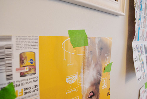
Then we just hammered directly into the “x” in the template…
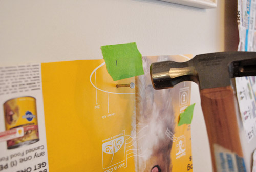
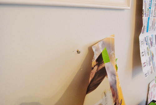
… and pulled the template off the wall to reveal a lone nail waiting for a frame (even though it looks like a jacked up hole, that’s just a tiny bit of paper caught above the nail that we easily removed with a finger flick).
We slowly worked our way around the wall using this method. It probably took an hour or so.
Sadly our old plaster walls don’t work with 3M Command hooks or velcro alone (since that’s always an easy way to create a frame collage without making any holes) but we do plan to add heavy duty Command velcro to the lower frames that may be within Clara’s reach when she starts toddling around. She’s a pretty docile girl who definitely seems to listen when we ask her to be gentle (when petting Burger for example) so our plan is to sweetly request that she be nice to the frames and “look with her eyes” and we might even try the “you can only touch them with one finger” technique that an awesome varsity mom shared with us a few days ago (she said it actually works!). But of course if we think those few low frames ever start to pose a safety hazard, or even just become too high maintenance for the way we live, we’ll definitely just get rid of them until the bean is a little older. Clara first!
But back to our process. After following our templates and hanging every frame we stepped back for a little look-see and frowned. Somehow they seemed a little tighter in the top right corner (which we actually really liked) and a bit too loosey goosey everywhere else…
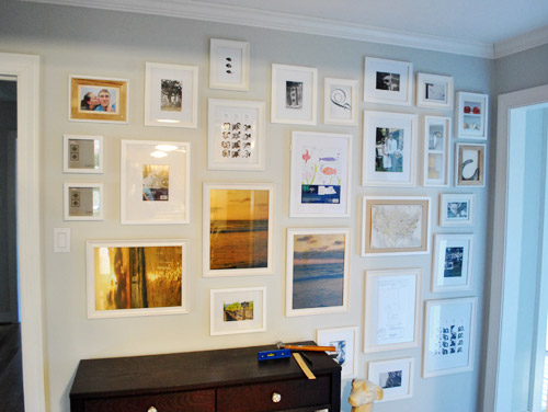
… so we adjusted some of the frames on the left and added in a few little “filler” items to get the same full look that we had on the top right corner going on everywhere else.
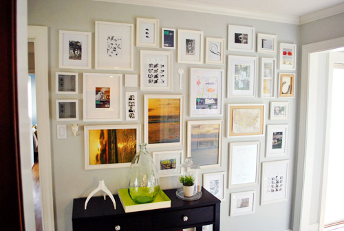
So yes, there are probably ten extra holes in the walls hiding behind those frames from fine tuning them an inch one way or the other. Our bad. But they’re all out of sight so we’re at peace with it. They can just be our little secret. Oops, I just told The Interweb.
Once everything was hung we scavenger hunted the house to find things to display (since many of the existing items in the frames were horizontal images that were now hanging vertically or the frames were completely empty to begin with since we hadn’t used a few of them yet). Which puts the cost of the entire frame wall plus all of the “art” that you see (since that was also already owned) at 100% f-r-e-e. Except for this cool $16 frame from Target that we splurged on because we adored it’s “special capabilities” to store and easily showcase lots of kid art. We love that we don’t have to take it off the walls to change things out. Come on Clara, don’t you feel like drawing mommy a picture or two?
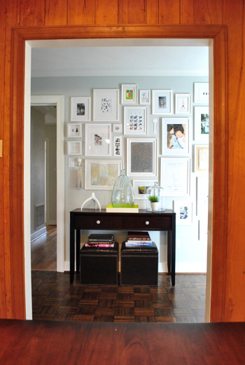
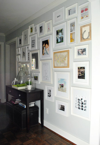
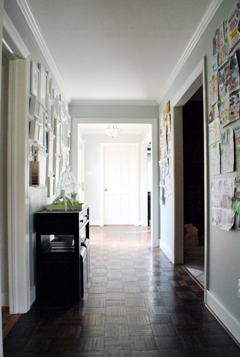
So this is our current arrangement with all of the just-for-now stuff that we found around the house. First here’s the view from the kitchen (which is why we placed the console table there, so it looks centered through the doorway:
And here are a bunch of other angles:
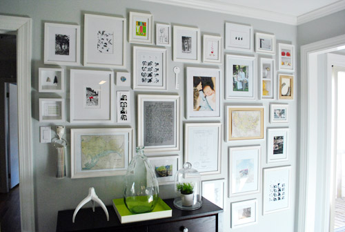
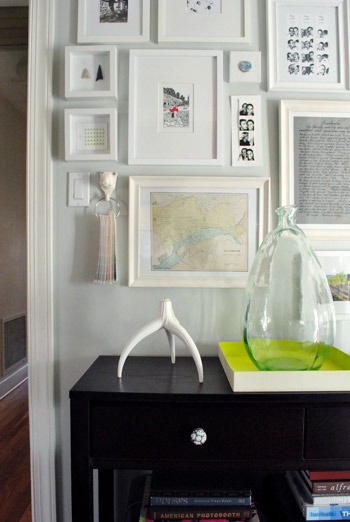
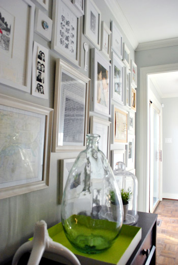
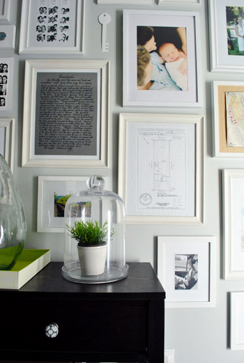
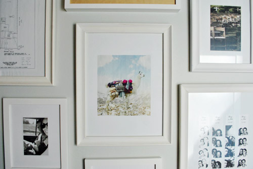
From an old Banana Republic ad with a llama (or is it an alpaca?) carrying sweaters…
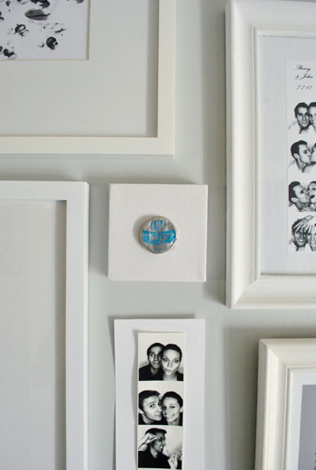
… to a vintage milk cap that we found at our first house glued to a small square canvas…
….and a white paper key that I cut out of card stock (which I hope to replace with a DIYed ceramic-looking one)…

… it’s definitely a smorgasbord. And there are probably way too many photostrips, but they’ll do for now.
We’re actually planning a post later with more detailed shots of various items and directions for making your own stuff, like an arrowhead shadowbox for example. Or a long skinny wooden pinboard (still have to make that, for now we have a placeholder piece of card stock with a photostrip taped to it). We also thought it would be fun to take a picture of the wall every few months just to see what comes and goes (new Clara art? updated family pics?) and what always stays (the sketch of our first house’s lot? a favorite photobooth strip of the whole fam?).
We anticipate that at least 25% of the wall will be changing pretty regularly as new things steal our hearts – like a particularly good (or bad) fortune cookie fortune and Will Bower’s first birthday invitation. You know, the important stuff. We definitely feel like this gallery will be the most personal, eclectic, and fun display spot in the house. So while I’ve already asked for some awesome art prints for my birthday (which is this Saturday- woot!) we also want to frame everyday objects that hold meaning to us. From Clara scribbles to little love notes and even particularly funny greeting cards with chihuahuas on the front.
In short: We are so in love with the whole hallway frame gallery. It took a spot that was just a way to get from A to B and made it feel like a bonafide destination. We both keep finding ourselves being drawn to that wall like magnets, just standing there gazing at all the frames. Even Clara loves to stare at it. Ah gallery wall. How can you make us so happy? We’re nerds.
And surprise. We’re so enamored that we’re planning to “wallpaper” the other two walls on the other side of the hallway with frames too.
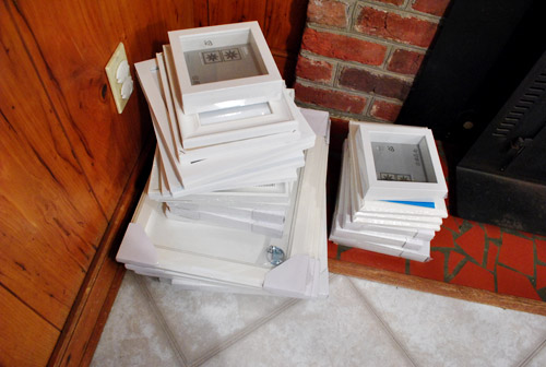
Here’s the pile that we grabbed from Ikea (feast your eyes on that pretty shattered fireplace tile).
Should be good times.
Psst- We announced this week’s giveaway winners. Click here to see if you’re one of them.

Andrea | HomageStyle.com says
Love that you have your paint chip deck hanging on your photo wall!
Like a trusted family member!
Lindsay says
A little of topic, but my windows are 59″ x 59″. Do you still recommend hanging curtains high & wide? That’s what I was planning to do, but thought I’d see what you guys thought! Thanks!
YoungHouseLove says
Oh yeah, just giving them a little bit of air should look nice and proportionate. Hope it helps!
xo,
s
Lindsay says
Such a quick reply for a Saturday! Thanks so much. :) Oh, and happy belated birthday!
Liliana says
Yesterday Sherry mentioned today was her birthday and I just wanted to wish her a Happy Birthday! Hope your day is full of fun surprises!
~ L.
YoungHouseLove says
Thanks so much Liliana!
xo,
s
Lisa Elliott Grose says
Love it. Love it. Love it. It looks like you paid a prestigious decorating firm something close to your first-born to achieve that look. It’s fantastic.
Best regards,
Lisa
Chrystal says
I love this idea! And I love that you plan to do the other walls as well. :)
I think your idea to do how to posts about some of the items you have haning is a great idea.
When we buy our first house I think I will take some inspiration from this DIY project. :)
Nicole says
Looks great! What color paint did you use on the walls?
YoungHouseLove says
Hey Nicole,
It’s Moonshine by Benjamin Moore (color matched to Olympic’s No-VOC paint). Hope it helps!
xo,
s
Kellee says
Loving the walls! I have looked and am not finding what color your hallway is painted. Is it the same as your living room? Love the color! Oh, and the aweseom gallery too. ;)
YoungHouseLove says
Yup, it’s also Moonshine by Benjamin Moore color matched to Olympic’s No-VOC paint.
xo,
s
Carol N. says
Love what you guys have been doing in the house. The rug looks great (but it isn’t for someone with a cat who throws up hair balls like me) and the hallway is spectacular! And happy birthday Sherry! Can’t wait to see what decorating goodies you got this year.
Jessie says
Happy Birthday, Sherry!!!!
wendy says
You guys have an amazing eye for this stuff! I actually copied the placement of the frames in the entry of your old place becasue I just seem to make a mess of this stuff.
SO….a few things:
1. What color is that hall? I love love love it and even thought I just painted my living room last summer, i am thinking that I just found the new color!
2. You guys have to check out this etsy site…they have SO many amazing pillows…you will love it! http://www.etsy.com/shop/TheHomeCentric?ref=seller_info
3. We live in a 70’s era home and cant hang with those strips either…must be just the era.
4. Sorry…I know you have a life but what is the sketch of in the frame between the lovely poem and BR-llama ad?
ok…thats it. thanks!
YoungHouseLove says
Aw thanks Wendy!
1. It’s Moonshine by Benjamin Moore (color matched to Olympic’s No-VOC paint).
2. Love that site! Thanks so much for the link.
3. That’s too funny- totally must just be plaster from that era!
4. That’s actually the sketch of our first house’s lot (that we inherited at closing). We love that under “Descriptions” at the top it just says three words: “house is old.” Haha.
xo,
s
LauraC says
Happy Birthday Sherry! Are you a prime number, same as John now? ;-)
YoungHouseLove says
Yup! We’re both prime! And Clara is neither a prime number nor a composite number. How’s that for math geekiness? Can you tell my dad called and was chatting about numbers with me today? Haha.
xo,
s
jane andreassen says
So, in two years everyone in your family (err… the human members) will be prime! You thought you were geeks. Top that. :)
YoungHouseLove says
Wahoo! Exciting! Haha. Love it.
xo,
s
LauraC says
Oh wow, Jane, I just checked my comment and read yours and you rock! Sigh, I don’t like to be beaten in the math nerdiness department. Gotta work on it! Sherry, love your comment too! :-)
RJ says
What a fabulous wall! Love the “filled-in” look, and slightly jealous of your nice wide hallway! My hallways isn’t wide enough for a wall of frames, but I’ve started something similar in my kitchen.
kelly says
i really love that. that is one of my dreams when we own our own home and can fill the wall with nail holes. i have been loving the command velcro hangers though, that has given me a lot more license for hanging. i love all the personal things in the collage!!!
Meaghan says
I just stumbled upon your blog and I LOVE it!! I am constantly redecorating and changing up my house as well. You have so many wonderful ideas, I look forward to every post. Thanks!
natalia says
ahahah I’m sorry but how often do you see a horse-lamp?
Sherry I immediately thought of you when I saw this.
http://www.stumbleupon.com/su/32qtnz/designwar.net/page.php%253Fal%253Dmoooi_showroom_in_london
hugs & kisses
natalia
YoungHouseLove says
Holwy cow- er, horse! Amazing.
xo,
s
Risa says
I would LOVE to have a wall like this in the house but my lovely hubby is a bit of a perfectionist when it comes to hanging multiple frames. ‘It’s not STRAIGHT!’ haha. Thanks for the awesome tip! I’ll show him the pictures to him -‘See?! It’s so easy!’
Risa says
wow, lotsa typos mean i need to get to bed. *i’ll show him the pictures.
Nicole says
We have a picture wall in our living room that I absolutely love and have been thinking of doing another one in our bedroom. Seeing your beautiful effort confirms that is exactly what I want to do. Nicolex
Paula M. says
This is really helpful, thanks!
In the months ahead, after a wall retexturing and paint job, I’m going to be hanging an assortment of artwork and small mirrors and other things on one wall above a couple my stereo equipment and a couple of bookcases (flanking the stereo), and I’ve been wondering what’d be the easiest way to get the grouping right without a lot of drama or extra, errant nail holes.
I also saw on David Bromstad’s Color Splash recently where they did a nice effect with a wall of different shaped/sized mirrors, and they laid it all out on the floor first so they could experiment with the grouping.
So I figured I’d start off with a combo of those 2 techniques: his floor grouping and also your paper-template-on-wall grouping, and eyeball both those arrangements before I get out the hammer and nails.
jess says
Love this wall! Glad it’s not just me that manages to put a few extra holes in the wall when doing this sort of thing.
When doing my wall, I found it easy to measure each frame and then draw it to scale in inDesign (you could do this in Photoshop too, i’m sure). It was much easier to move them around on screen than on the floor. Also – to keep it looking neat, I made the space between each of the frames the same… and quite close together.
Hope these tips come in handy!
YoungHouseLove says
Awesome tip!
xo,
s
Kathryn says
WOW! This is knock your socks off WOW. I don’t know why, but my favorite part is your little piggy with the paint chips on him. Sherry, I share your affinity for ceramic animals ;) The whole thing looks so amazing, that takes some serious skill!
Abby says
What color are the walls in the hallway? I am sure you have mentioned it before. They look slightly blue/green, which is what I want for my bedroom.
Abby says
Never mind I see you wrote it above!
Kate says
The fireplace picture reminded me of a YHL moment I recently had. My fiance and I are looking to buy our first house and we found a great one with an ugly dark and outdated fireplace. I immediately said we could paint it to give it a fresh and more updated look. He was unsure so I pulled up YHL and showed him examples of the painted brick at your first house. He immediately agreed. Thanks for the inspiration (and the proof that outdated fireplaces are not a deal-breaker)!
Casey says
Some vintage keys you could spray-paint:
http://www.potterybarn.com/products/vintage-keys-set/?pkey=call-home-accessories
YoungHouseLove says
Love those!
xo,
s
jane andreassen says
I was admiring the the organic silhouette of the top row of pictures, when I took a look at the entire silhouette. Did you purposely make a very very subtle heart shape?? Intended or not, I love it!
YoungHouseLove says
Haha, totally unintended! But it’s sweet now that you point it out. Gotta love happy accidents!
xo,
s
Amy says
Hey– i’m in LOVE with your frames..it seems like an incredible solution to walls that I can’t paint. Do you have any suggestions as to where to get cheap frames? I know ikea is a good place to check, but anywhere else?
Thanks!
amy
YoungHouseLove says
Definitely try thrift stores and garage sales- you can get ten for $10 sometimes! Also Target has some good sales from time to time. Good luck!
xo,
s
andrea p says
I love the gallery wall!
I was wondering if you spray painted all your white frames so they are the same shade of white? Or do you have variation in whites? I noticed that the different ikea frame styles all have different white colours (ribba, versum, etc)…
YoungHouseLove says
They’re all different variations. It just looks nice and layered and nothing really sticks out. Hope it helps!
xo,
s
Rachael Ensom says
LOVE it!!!
Julie Ball says
I didn’t read any other comments but you can totally have Clara make artwork now! Put her in her hairchair with white (or black!) paper and choose for her, coordinates-with-your-stuff finger paint & let her go!! I did this for Father’s Day presents for my husband when our kids were < 1 (little math reference for John).
Seriously! Try it:)
YoungHouseLove says
Sounds like fun! Will do!
xo,
s
Kalyn says
Looks absolutely awesome! Exactly what I have been envisioning for our new house :) Can’t wait to do it, thanks for the how-to! Happy belated birthday, Sherry!
Amanda says
Hey guys! Love the look of the hallway. Just wanted to let you know in regards to the key Sherry made to hang with the pics, I know she mentioned maybe finding one eventually and painting it. Anyways, I was browsing JCPenny’s home section and they have a set of 10 vintage keys for $24.99. Can’t beat that! Thought I would let you know!
YoungHouseLove says
Thanks so much for the heads up!
xo,
s
Con says
I’m a new follower of your blog — found you through the WP story last week. Love the white frame gallery in the hallway — I usually use black frames — do you think it would be just as effective?
YoungHouseLove says
Sure! It’ll look dramatic and gorgeous. Good luck!
xo,
s
MelissaOklahoma says
Looks fantastic! Can’t wait to do this myself someday. (First on the list is to find home and second is to purchase!) I’d really love to see more detailed photos of what you have in frames.
brandi says
We were so inspired, we already got a frame collage going on our living room wall. It was exactly what we needed. The paper template and measuring tips worked wonders! Thanks!
YoungHouseLove says
Wow! You got ‘er done fast! Congrats.
xo,
s
Kel says
Love love love it! I want one!
Samm says
Ok, it’s official… I’m in love with you people! (in a totally non creepy way)… You guys are such an awesome inspiration to young DIYers and I’m freakishly obsessed with all of your ideas… I’m even warming up to white ceramic animals!
This last post about your hallway and putting sized newspaper up to measure and play with patterns is genius. Love love love it!
I read your blog every morning when I log in at work and it’s my new favorite part of day! My fiancé and I are looking for our first place and love to see what can be done with a house that ” needs a little love”.
Keep up the great work and thank you for all your awesome ideas!
Samm in Dallas
YoungHouseLove says
Aw thanks so much Samm! Good luck with the hunt for your first place!
xo,
s
Heidi says
John & Sherry –
I LOVE your blog. I am but a poor college student who lives in an apartment with lots of decorating restrictions but I was so inspired by you guys that I’m trying a blog of my own (http://fromheidi.tumblr.com/). I would love some blogging tips if you ever have the time!
Heidi
YoungHouseLove says
Congrats on your new blog baby! Our best tip is just to blog about what you love so your enthusiasm is impossible to miss. That way it’ll never feel like work and your adventures will be infectious and authentic. Have fun and happy blogging!
xo,
s
eileen marie says
In the final photo, are the glossy square frames (balanced on top) the RIBBA frame from IKEA as well? (I am looking for something similar, but am absolutely dreading the trek out to the Swedish giant. At least my sister lives out that way I guess.)
YoungHouseLove says
Yup we think those are Ribba but we’re not 100% sure. They were $5 in the frame section, hopefully you’ll recognize them right away when you see them!
xo,
s
Abby says
AMAZING! I’ve been avoiding putting up my black and white old photo set since we moved in as I always muck it up – I just put up the construction paper version today. GENIUS idea – I am so psyched!!! Thank you!
Whitney says
I absolutely love your website, and your photo wall and decorating tips have definitely inspired me to take decorating our home into my hands. Thanks so much for all of the tips and ideas! Thanks to you, my husband and I are making a photo wall with black Ikea frames :)
Andee says
Have you seen this?
Someone is using your old living room photo to sell their rug on Washington DC Craigslist:
http://washingtondc.craigslist.org/doc/fuo/2276890596.html
YoungHouseLove says
No way! Off to check it out. I bet that it’ll go quick- everyone loves that rug. Us included!
xo,
s
Anna says
Love it. Congratulations on both the collage hallway and the Washington Post piece! I remember visiting the Holocaust Museum in Washington, DC and walking through a multiple-stories-high hallway covered with framed photos of people and families (who didn’t survive). Even with that grim experience, it was incredibly powerful and somehow wonderful to see all of those people, lives, and experiences in one place. Powerful in an extremely positive way. Your hallway give me that same feeling – that pause in what would otherwise be a passage to something else. I love it!
Valerie @ be.love.create says
Sherry and John, I have been following your blog for quite some time and finally decided to comment and say thanks for always being so genuine, funny and inspirational. I thoroughly enjoy reading your blog!
(tim)me says
This post came just in time for me.
I am planning to hang a bunch of IKEA Ribba frames in my living room, and the newspaper cutout trick will be very useful.
I have to say I drew all my inspiration, for my arrangement, by your blog. So, the least I can do is thank you.
Silke says
You guys inspired me to try out something similar with a plain, boring looking wall in my apartment.
Your wall looks wonderful ! You did well, yet again.
I hope this comment gets published, because everytime I try to reply on a post, something goes wrong…
Happy first day of Spring to you three !
Greetings from Belgium,
Silke
Rosemary says
The “one finger” rule works! When my nephew comes over to my very un-childproofed house, we’ve used it in the past. It’s saved the Christmas tree and the ficus!
Verna says
Hi! The hallway looks awesome!! My question is, how do you plan on keeping your daughter from messing with the bottom pictures? My son is into everything, now that he can walk, and I’ve had to empty all of the bookshelves within his reach. Thanks!
YoungHouseLove says
Just check out the post for that info (we actually addressed that since Clara is priority number one!). Hope it helps.
xo,
s
Verna says
Sorry! My pregnancy brain must be affecting my reading skills also! ; ) Good idea though!
YoungHouseLove says
No worries! We know we use a whole lotta words. Haha.
xo,
s
Christina J says
Looks awesome!!! Clara’s hand and foot prints would look awesome in one of those frames!
Par says
This wall looks fab!!! very nice – please put your baby center profile picture up in the wall – its a really great one!
About filling the other 2 walls with frames…. I don’t know about that (will that look like too many frames in one place?) But am sure you will deliberate over it and then decide if thats the way to go or not!
Par says
Maybe 2 larger pieces of art on the other 2 walls?! Or one large piece on one and 2/3 pieces on the other? Just so that they are different from the gallery wall on the left….
YoungHouseLove says
Thanks for the suggestion, but we love the idea of “wallpapering” the other sides too. We already have paper templates taped up (like you see in the picture on the bottom) and we think it’ll look awesome! Especially since our hallway is extra wide (over 5′) and we’re using white frames which are lower contrast than brown or black ones. Time will tell though!
xo,
s
Sarah M. says
It looks phenomenal!! My husband and I are saving for our first house and I am totally inspired! I love coming here for new ideas!
Megan says
I’m LOVING your new “HALL OF FRAME” as I like to call it. Trying to figure out where in my house I can incorporate this concept!