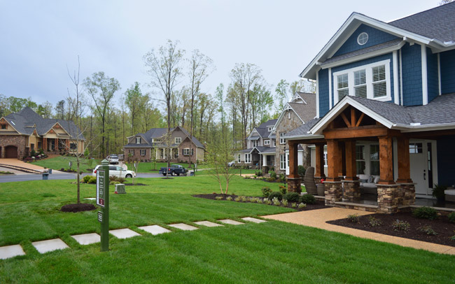
Happy May and, well, Happy Opening Day of Homearama! Yep, our showhouse is officially open to the public as of today, along with the six others in the show. Deepbreathsdeepbreaths.
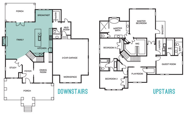
Since we last showed you the office, butler’s pantry, and main bedroom (along with the en-suite bathroom & closet) and then took a pause to have a baby, let’s pick back up in the main living spaces of the house: the living room & the kitchen – which you can see from the floor plan below are both pretty big zones on the first floor.
The walls in both the living room and the kitchen are Simply White, and then we layered in some colorful paint/textiles/art/accessories (like a navy fireplace column, a kitchen island in the same color, a breakfast nook full of colorful accessories, some bold art in both spaces, and a colorful rug and pillows, etc).
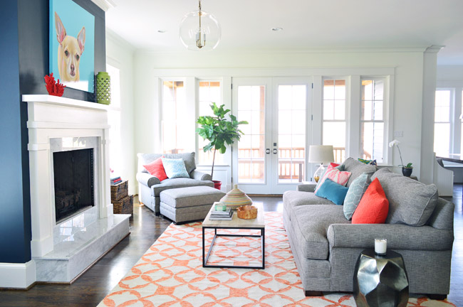
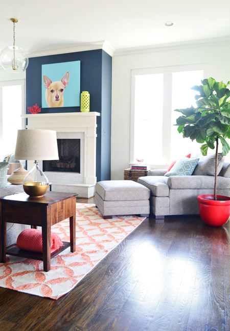
We had always wanted the fireplace to be the focal point of the living room, so we went with Hale Navy by Benjamin Moore to anchor that wall. And our awesome friend Lesli Devito painted a big portrait of Burger to bring a little cheekiness to the space (the TV will most likely hang there when the real family moves in, we just couldn’t resist an ode to Burger for fun during the show).
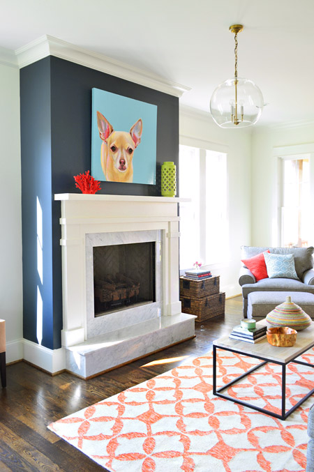
The coffee table and 9 x 12′ rug are both from West Elm, and that colorful basket is a HomeGoods find. The gray sofa, chair, and ottoman are from Green Front Furniture – it’s this model in the “smoke” color.
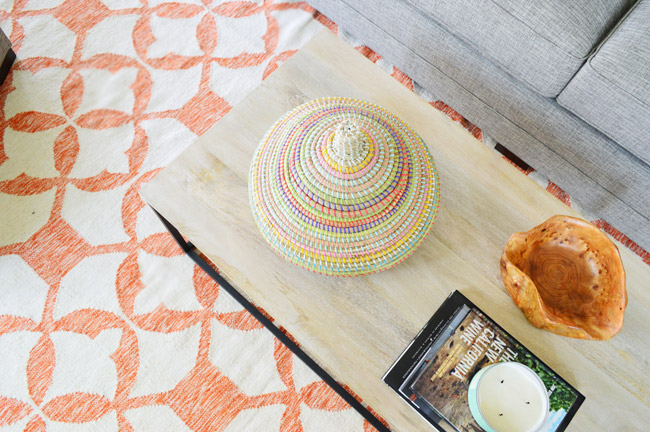
We selected the white wood mantle and marble surround/hearth through a local company and yes, the fact that the gas fireplace turns on with the flick of a switch on the side of the fireplace makes us crazy jealous. Updating our own fireplace may have climbed up our priority list after seeing how nice that is…
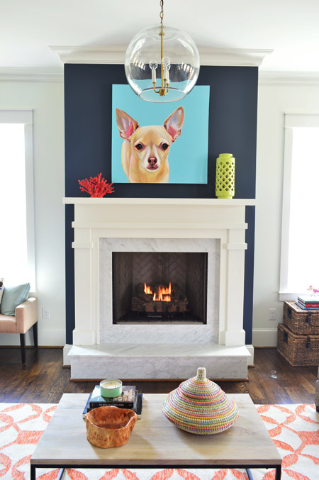
Here’s the view looking from the french doors that lead out to the back porch. In retrospect, we wish we placed the fixture box for that glass pendant light so it would be centered over the coffee table, but we chose electrical placements three months before furniture so it ended up a bit closer to the fireplace than we’d like (thankfully that’s a pretty simple thing to remedy after the show). This entire exercise has been one giant learning experience for us, and it’s amazing how many minute decisions (it feels like there were at least 1,000 of them) add up to one finished home.
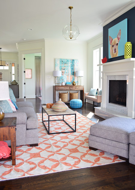
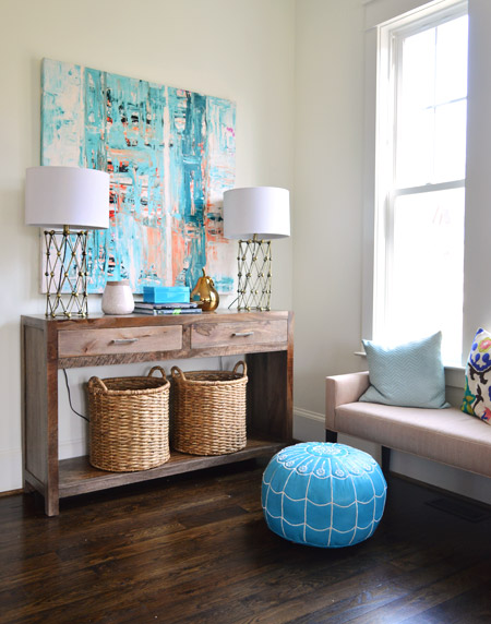
Back in the corner you can see this console, which was a HomeGoods score – as were the lamps – and the baskets on the bottom are from Target. The large scale art is on loan from Lindsay Cowles (it’s for sale, btw!), and the bench under the window is also from Green Front. The blue pouf is ours (bought on Joss & Main a while back and stolen from our own house in the name of filling up this one for the show). We took these photos before all of the white custom shutters got installed throughout the house, which really finish off each room.
The side table was a last minute buy from World Market and the gold-based lamp was a project from our book (once again stolen from our house in those final make-it-work hours). That red planter for the fiddle leaf fig is from Lowes.
The living room light fixture was one of the last pieces we selected, since we were having trouble finding something that didn’t compete with the gold accordion lights in the adjoined kitchen (filling up this house in a matter of weeks made it nerve-wracking whenever we couldn’t find something and the clock was ticking down). It wasn’t until we saw the Clear Glass Chandelier hung up in the bathroom off of the main bedroom that we realized another one would look great down here, but instead of using silver hardware like the one in the bathroom, our friends a the Decorating Outlet were able to modify one to include gold hardware so it tied into the kitchen pendants.
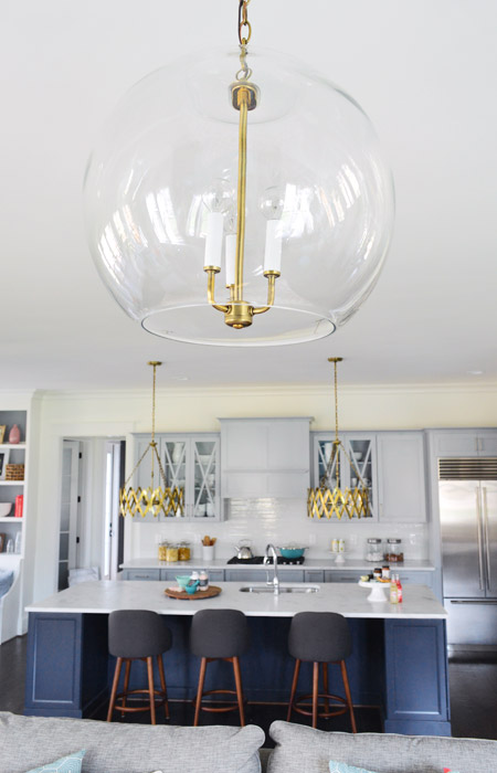
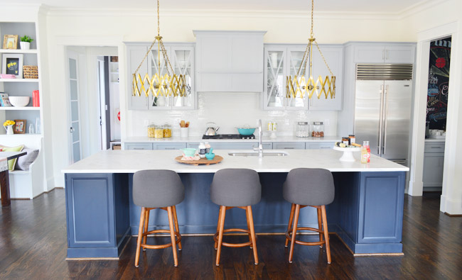
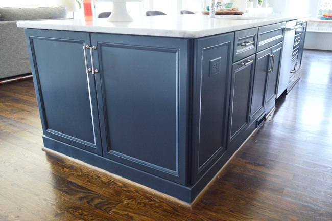
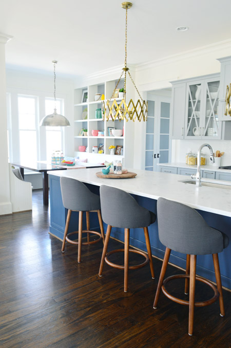
Let’s move into the kitchen, some of which you’ve seen before (in this post) but I’ll call things out again, just so the sources are all in one place. The cabinets are from a local shop called Affinity. Most are in a stock gray color they offer (which is similar to Benjamin Moore’s Gray Timber Wolf) and the island is painted Hale Navy like the fireplace column on the other side of the room.
Two questions that came up a few times when we last shared the kitchen were:
1. Why is the quarter round around the island wood toned instead of painted? That’s just a standard thing the builder does with oak floors since it tends to hide dust and scuffs more (we think it’s regional since all of our houses in Richmond have also had wood quarter round) but he’s happy to paint it if a buyer prefers that look.
2. Why don’t the cabinets go to the ceiling? Some other homes in the show with 9′ kitchens have ceiling-height cabinets, but our first floor has 10′ ceilings, and cabinets that go all the way up to that height are pretty unusual (the builder said most of his buyers don’t want to pay the upcharge to gain such tall cabinetry – although his carpentry team is happy to build some sweet upper storage to bridge the gap if a certain buyer is interested in that upgrade).
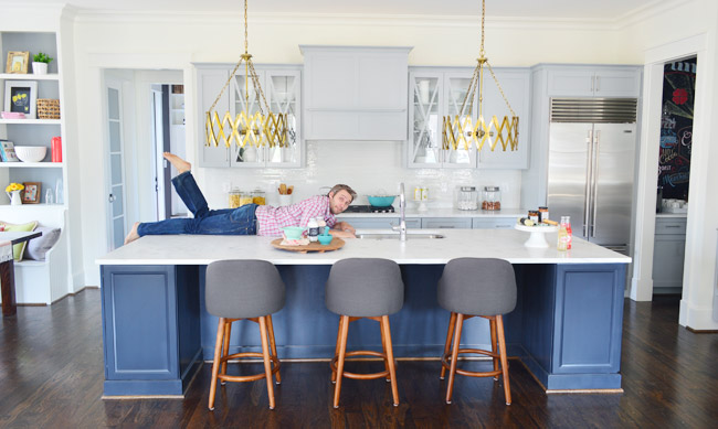
One other funny thing we heard a few times when we met people at a little pre-show party at the house to honor the builder was “oh my gosh on your blog this kitchen looked about half the size – it’s huge!” – so while I had our tripod set up I threw my body atop the counter as a reference point (you know, as any normal person would). The island is over 11ft long, so my six foot frame has plenty of room to sprawl out. Just in case you and a few friends want to take a nap up there.
The stools are from West Elm, the gold accordion lights are from Shades of Light, the Wolf/Sub-Zero appliances are through a local company called Cline, and the cabinet pulls are from Liberty Hardware.
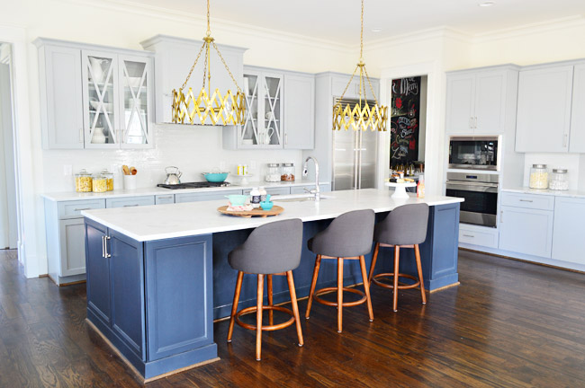
The counters are a White Moura marble that’s leathered (so it’s not a glossy, smooth finish) that we got through a local place called Eternal Stoneworks. To keep the glass cabinets from looking too busy, we just filled them with some white dishware from Target and HomeGoods.
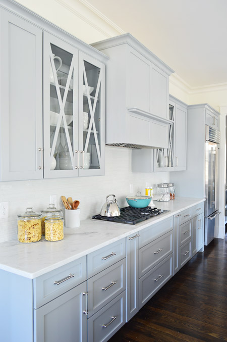
One thing we never really got into with you guys was how we worked with Affinity to design the cabinet layout. We knew deep drawer-bases seem to be more coveted than cabinets with deep shelves since they pull out for easier access, and the experts at Affinity also suggested ways to take advantage of narrow spaces – like a roll-out spice rack and a vertical cookie-sheet organizer.
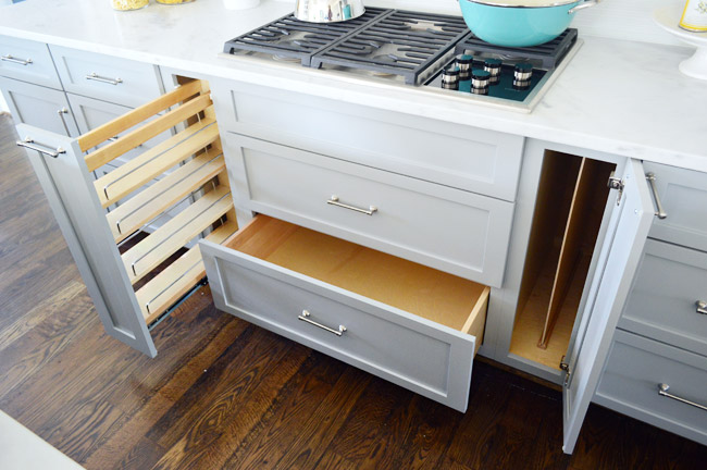
But perhaps my favorite storage areas in this whole kitchen are the big 30″ x 18″ cabinets on either end of the island. We used them a lot for stashing things out of the cleaning crew’s way and they were awesome. The island also houses the dishwasher, a roll-out double trash can cabinet, and tons of other storage spaces.
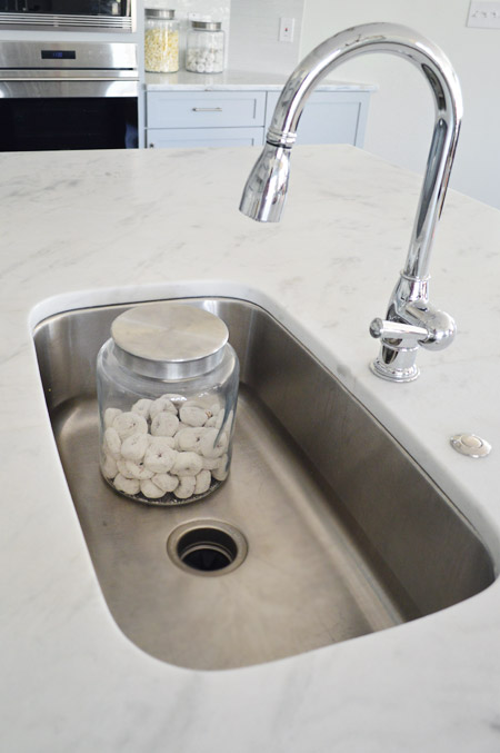
For the sink and faucet, we wanted something clean and functional. We went with this classic looking faucet and the deepest single sink the stone company offered. It’s 30″ wide and 10″ deep, which means it’s deep enough to hide a few canisters of donuts… you know, like if that’s the only thing handy you have on hand to show the scale.
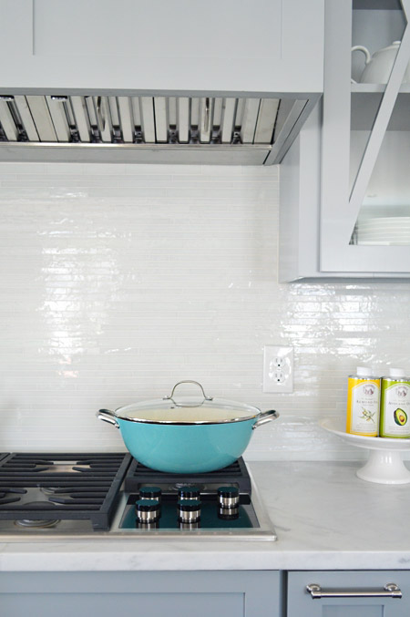
The backsplash brings some nice polish to the space, it’s called white blend waterfall glass tile from a local company called Mosaic. The aqua pan was from World Market and the oil cans and cake stand were from HomeGoods.
Looking to the left of the kitchen is the breakfast nook, which we turned into a built-in banquette. You can also see the frosted double-doors that house the walk-in pantry, which we’ll get to in a minute.
We wanted to do something a bit bolder than your average table-and-chairs for the breakfast nook, so we worked with the builder’s carpenter (also named John) to construct floor-to-ceiling bookcases on either side and include a wraparound bench. The nice thing about the shelves is that when you stand on the banquette you can easily access everything (even that top shelf) so unlike ceiling-height kitchen cabinets (which would necessitate some sort of ladder), these are pretty easy to clean/reach by comparison.
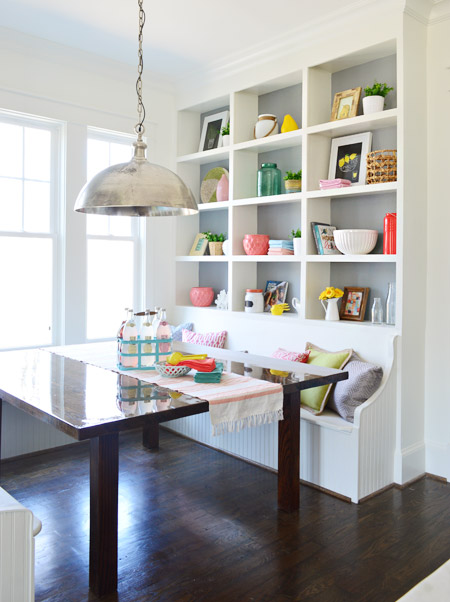
In addition to being a cozy space for family to gather, we pictured it almost being a casual spin on a china cabinet in a way. Instead of housing all of your fine china behind glass, you could display your everyday kitchenware, cookbooks, and framed art/photos in a less fussy setting.
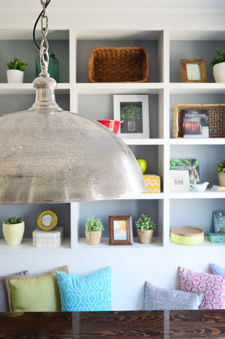
The backs are painted Timber Wolf Gray to mimic the gray on the nearby cabinets. A big thanks to my sister (who works at Random House) and our publisher at Artisan who were able to provide some pretty cookbooks for us to use. Oh, and after we took these photos we had the show’s resident seamstress make some cushions for the bench. They’re deep gray like the backs of the stools at the island, so they tie in nicely.
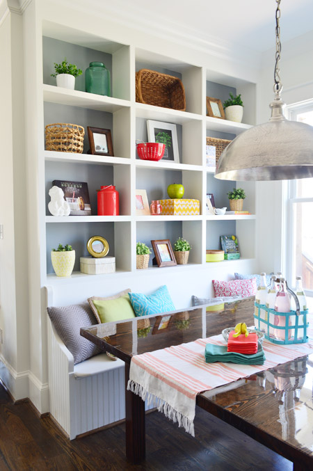
The light fixture is the Large Simple Dome from Shades of Light, and we thought it referenced all the stainless steel and silver finishes in the kitchen (like the appliances, cabinet hardware, faucet, sink, etc) without going too crazy with gold everywhere. Our take on mixing metals is that as long as each finish occurs a few times throughout the space, it looks intentional and layered – so one fixture or finish isn’t the odd man out.
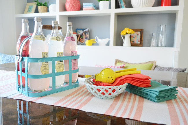
We considered setting the table more formally to emphasize how many people can fit around it, but opted instead for a more casual spread. The beverage container is from HomeGoods, the ceramic basket is from Target, and the napkins are from World Market along with the lemon squeezer.
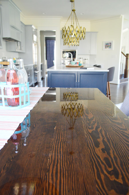
The table itself was a custom build by John the Carpenter. It’s 5′ deep by 6′ wide, so it’s definitely not a size you can find in stock in most places – but we needed it to fit the nook exactly. We were initially going to get one built by a local timber company, but after two trips out there and a flurry of emails it turned out to be out of our budget. But we love how this one turned out, especially the stain color (we used the same tone as the hardwood floors – Jacobean) and the glossy bar coat on the top.
And here’s the pantry. The shelving was built by John the Builder’s carpentry team and they made sure the frosted french doors we selected didn’t interfere with any of the storage or block the hallway flow (by choosing short double doors instead of one large door, and having them open into a recessed area before the pantry shelving begins, they don’t block anything that could be stored in the pantry or block the hallway flow from the mudroom). The glass prism flushmount light is from Shades of Light, and it’s also in the nearby hallway and mudroom.
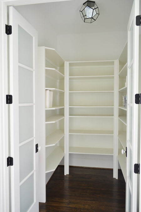
We realized that it was hard to tell scale from the photo above, so we snapped another picture with me for reference. It’s definitely on the generously sized side of things.
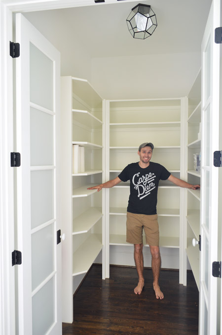
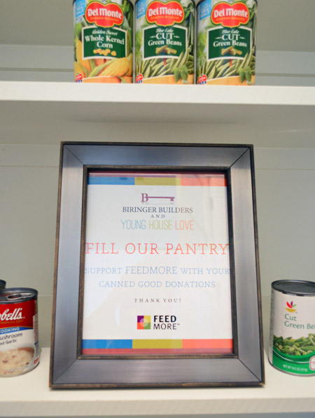
We chose not to “style” the pantry and took your suggestions to turn the room into a collection space for donated canned goods. So if you’re coming to Homearama, feel free to bring a canned good or two to benefit FeedMore (it’s our region’s hunger-relief charity organization). And if you don’t want to lug cans in your purse through the homes, you can also drop your donations off at the show’s front entrance / ticket counter.
We’re trying not to overload you guys with too much showhouse stuff all in a row, so we think we’ll just do one weekly update among other home/family stuff that’s going on in our house for the next few weeks. We also got to tour all six of the other showhouses yesterday, so we’re excited to share those with you guys in the form of a House Crashing post. Hopefully next week if we can get it together.
Psst – Wanna see more showhouse info & photos? Click here for Our Full Showhouse Tour, which includes final pictures of every room, the floor plan, budget info, a video walk-through, and shoppable showhouse furniture & accessories.

Mary Beth says
This is amaaaaaazing you guys have left NO detail untouched. (Love John on the counter, by the way.. lol)
I am impressed and INSPIRED as always…
My meager reno will continue over here… haha.
I will never give up!
xoMB
http://www.hystericallyeverafter.com
Mary | Lemon Grove Blog says
Oh man!! These photos are absolutely stunning! That kitchen is giving me some major inspiration for our new space (closing in a week! EEE!) :D
Cassi says
Psst… The Homearama link doesn’t work :(
YoungHouseLove says
Thanks Cassi! All fixed.
xo
s
Starr @ The Kiefer Cottage says
That pantry is bigger than our bathroom!
Love the kitchen. The colors are beautiful.
Gabrielle C. says
That Island is bigger than my bathroom! Lol.
Robin says
I think the island is bigger than my kitchen!!
Lisa | Truelu.com says
Ya know, I love this refreshing use of color as the world seems to being going more and more neutral (black, white, wood–although, I do love that too).
Well done! I just can’t believe you guys did all this, AND your house, AND all the while having a new little guy. It’s beautiful.
Laura @ Rather Square says
The kitchen is amazing – I’m glad you provided a shot of John on the island for scale, I didn’t realize how large it really was! And what a cool idea to ask for canned goods for donation in the pantry – nice touch.
Leigh Anne says
Seriously, you guys rock my socks. And those accordian pendants make my heart go pitter-pat every time I see them. I need those in my life.
silke says
ow em gee that kitchen island is indeed HUGE!!
It is unbelievably awesome what you did with the house.
Well done, I say. Well done.
Heather says
Oh my gosh, this is so gorgeous! We’re going to the show this weekend & I can’t wait to drool over it in person!
Cassi says
It all looks fantastic guys! I LOVE the navy wall in the living room and that tweed couch is awesome – it’s so Mad Men! Your hard work totally paid off! I even think the exterior of you guys’ house is the cutest, love the Craftsman style.
Jessica Hill says
Thanks for the (hilarious) sprawling John photo so we can see how really huge that kitchen is!
Sam | winterblooms says
Gosh, I think you just about built/designed my dream kitchen right there! And thank you so much for the scale photos, it definitely helped in visualizing everything.
I’m a little curious – in your second house I remember you posted about briefly contemplating banquette style dining when you were re-doing the kitchen – did that factor in at all when you were incorporating it here?
Everything looks so great! I can’t wait to see the rest of it!
YoungHouseLove says
I think in our kitchen we realized it just wasn’t the right spot for a banquette (it would have been floating in the middle of the room and sort of cut off the view of the fireplace) but this layout had that awesome nook which just screamed “banquette” to us. We knew sticking a table and chairs in there would have worked, but couldn’t resist something more custom and built-in, especially with such an amazing team to help us execute it.
xo
s
kari says
I love the house-it is beautiful! Can you please tell me the name of the wood floors in the kitchen? I tried to search archives, but could not find it.
Thank you!
YoungHouseLove says
They’re basic oak hardwoods that were stained and sealed on site in Jacobean (that’s the color).
xo
s
Lauren Joyce says
You have the most amazing ability to make a brand new house look like a beautifully loved home. So amazing. That photo of John will also have me laughing all morning. I feel it needs the caption “Draw me like one of your French girls” (like Rose in Titanic).
YoungHouseLove says
Haha!
xo
s
Jonia says
Hahaha I couldn’t have said it better!! Way awesome job on the house!
Donna says
Ha hah, that would be the perfect caption! I love John’s pose, and it did really help to illustrate the size of the kitchen. I love the kitchen stools most of all.
Katie G says
It is beautiful! That kitchen has the wheels spinning in my head, and you were right–the scale was hard to see but John laying on the counter showed how huge it is!
Also, just because I think you’d want to know, the link in the first sentence says “Homerama” instead of “Homearama.”
YoungHouseLove says
Thanks Katie! Fixed!
xo
s
Erin E. says
Where is the other smaller blackish/gray side table from?
YoungHouseLove says
That faceted one on the side of the sofa is from HomeGoods. It’s actually sort of a deep metallic gold color. Hard to tell in the pics.
xo
s
Jessica Anderson says
Love that kitchen! I am planning my new kitchen and really want to be able to put the sink in the island. What is the width of the island in the show house? How much counter behind the sink is enough? Thanks!
YoungHouseLove says
I think the island is either 3 or 4′ deep. I can’t remember! Next time we’re there we’ll have to measure.
xo
s
Aimee says
You need a minimum of 32″ for a wheelchair to get past, so I think the rule of thumb is a minimum of 36″ between island and counters. Which seems kind of tight to me if you have a wheelchair-bound household member and really need to implement universal design. As I get older I think of stuff like this – but will it work with a disability? Because, let’s face it, we all get old and most of us will get arthritic; it’s why people get rid of 2-story homes and move into ranches. Putting in chair lifts or an elevator is really expensive stuff, especially in older homes with narrow staircases.
Jessie says
Thanks for all the hard work….I’ll move in now;)
Catherine says
Hahaha. I cannot stop giggling. The island is enormous! John looks like he is a doll in a (really glam) dollhouse! :-)
Britt says
Looks great guys! But, won’t the living room light fixture interfere with the view of the TV if it’s mounted over the fireplace?
YoungHouseLove says
Thankfully since it doesn’t interfere with the art (when you’re sitting on the sofa or even standing at the island in the kitchen it’s easy to see all of the Burger painting) the TV should remain unobstructed. The light only looks like it blocks the art from that side shot but you’d have to be on a ladder for that to happen (since you look up at the mantel from the sofa or the kitchen while standing, the light is well above the art from that angle). The light could also easily be raised on its chain if a giant TV was introduced :)
xo
s
Christine says
I love all of the pops of color! When you look at the lines of everything you picked, it is all very classic and traditional, but you’ve put so many fun twists on everything. I REALLY want to redo my fireplace now… though I could just be nesting. I’ve pinned it all like crazy on my house boards!
Allen says
Colorful pillow on the bench by the console: want! Where did you find it?!?
YoungHouseLove says
That’s ours stolen from home! Haha! HomeGoods a while back ;)
xo
s
heather says
Looks great! I really like the wood stain on the front of the house.. do you happen to know what color stain it was? We are building too and these decisions are killing me!
YoungHouseLove says
I think it’s called Cedar Tone or something by Sikkens. Hope it helps!
xo
s
Danielle says
Gorgeous!! I was so excited to finally see that kitchen nook – love it! My husband’s still working on ours and I can’t wait til it’s finished!
Sheila says
Gorgeous! We can’t wait to see it live! Coming down from Baltimore and making a weekend out of it for Mother’s Day with my 8 year old daughter.
Janelle @ Two Cups of Happy says
Looks so good! I love the pantry donation idea. So smart!
Amy B. says
Very fun space in a fun risky YHL style. Curious about the choice for kitchen counters. Marble is a soft stone, easily etched and over time pits with acids like tomato or lemon juice. And you went with a leather finish that is certainly more porous than polished… It seems like a design decision, but not a very functional one for anyone who likes to cook. It surely will require sealing at least once a year and great care not to destroy it. Thoughts?
YoungHouseLove says
We actually covered that here! The kitchen experts told us it’s more durable than polished marble (it stains a lot less easily since it can be sealed with something stronger and more protective along with having more texture to hide things than shiny stone does, which emphasizes every imperfection). We hosted a 50+ person party with wine glasses and food laid out all over that island and nothing etched or stained! It was an awesome test drive :)
xo
s
Amy says
We actually have Carrara marble in our kitchen in a shiny finish and I wish it were flat. It has held up just fine over 4 years with tons of use. We were told it can be sanded & refinished to remove imperfections. I think this marble is a beautiful, timeless choice that looks amazing with the soft gray cabinets.
Jen says
I actually think that part of the charm of marble is that it DOES get a patina over time and shows that the kitchen is used (and loved).
Kaye Whorley says
We have leathered marble on our huge peninsular. Been in the house since October and have had several parties and grands that visit regularly, everything comes off of it much better than regular marble and no permanent stains so far. I would highly recommend it, there is nothing more timeless than marble!
cathy v says
Looks fabulous! Love the style and the colors you chose to work with. Of course, Burger steals the show(house)! Pun intended.
Meredith says
The John-posing-for-scale was very helpful; I had NO IDEA how big that kitchen was! My entire house is 785 square feet (and I love every inch of it), so the size of the pantry/island/everything blows my mind. When I think about cleaning that huge house, though, I’m okay with everything in my house being half that size. :)
Megan says
My husband and I are driving down to Richmond this weekend to go to the Homearama as part of our “babymoon”!I am so excited to see the house in person because the pics are amazing!
Ally says
Well done. That pantry is the same size as my kitchen!! The pops of red are great. I’m intrigued by the exhaust fan over the stove. We just replaced ours, so I’ve seen quite a few recently, but not one like that.
Annette says
I want to live in this house. Seriously. That breakfast nook would make an awesome homeschool area. Can the entire house be shipped to San Diego? ;)
Lindsay says
Will you do a post with photos all around the exterior? The house looks gorgeous and beautifully landscaped!
YoungHouseLove says
Fo sho! We can’t wait. The outside is our favorite part.
xo
s
Heidi says
Jaw, meet floor. Seriously, everything is absolutely stunning. And, I love, love, love the Burger print. Where are you guys going to hang that in your house once the show house is sold?
http://jax-and-jewels.blogspot.com
YoungHouseLove says
Ha! I keep saying we’ll have to buy that painting… but where will he go…?
xo
s
Bailey says
Dining room! or on the wall that the staircase is on!
YoungHouseLove says
I love the dining room idea. Love it.
xo
s
Lauren says
Love this! What color did you guys use for the trim? I assumed simply white but it looks different than the wall color in simply white. Maybe the finish is different?
YoungHouseLove says
Yup, it’s Simply White in semi-gloss instead of eggshell :)
xo
s
Joan says
And now I want to move in. Seriously awesome house – the builder and carpenter seem amazing and the design touches are gorgeous.Too bad a move from DC to Richmond isn’t in the cards. :)
If ya’ll want to reconsider offering design services, I’ll be your first customer. You know, in between fixing your own house, running a blog, and focusing on a newborn. Ha.
Great job!
Sarah says
Everything looks so fantastic! Great work! Something I’ve been wondering: with so many people walking through for the show, how do they ensure none of your fun accessories and small items also “walk away”?
YoungHouseLove says
There are people in the house who keep an eye on that. We hear it’s usually not an issue, which is nice!
xo
s
Lesley says
I have so much love for this house. The layout and so many of the finishes are exactly what I would choose for my dream home!
Katie says
I almost couldn’t finish looking at this post because it is giving me such extreme envy!!!! This is 100% my dream home. Holy cow. I can’t stand it. Seriously. I’m kind of dying a little bit right now. Incredible job, you guys!! Now…when can I move in? I wish!!!
erin says
The space looks great, but I wonder about the functionality of it all. If one was to actually mount a TV above the fireplace, wouldn’t it give you a bit of a neck ache? I guess you could move the couch further back. And while I do love the look of the breakfast nook, I wonder if buyers will be put off/intimidates by the shelves. Those are a lot of shelves to style and clean! Not to mention the table- if someone ever wanted to replace the table it would be a major undertaking to find one to fit such a big space. Cleaning/wiping down such a big table would be a bit difficuly too and require and require climbing all over the benches. Maybe the pictures don’t tell the whole picture?
YoungHouseLove says
There are already a few interested parties in the house, so we’re grateful certain families think it could work for them, but I’m sure some folks would prefer a smaller table or might put the TV somewhere else (or move the couch) or want fewer shelves. One of the selling features of our second house for us was a wall of ceiling height built-ins in the dining room, so we love them – but everyone has different “wants” on their house hunting lists :)
xo
s
Cathy C. says
I found your listing!!
http://www.realtor.com/realestateandhomes-detail/7812-Rock-Cress-Dr_Moseley_VA_23120_M66810-56428?row=1&source=web
Bernard Little says
This looks awesome. Great job to the both of you. Just out of curiosity, why only three stools in the kitchen? I have browesed so many home improvement sites, blogs about decorating, etc., and always see only three stools. Is that all that will fit comfortably? Or is this the norm?
YoungHouseLove says
We got four stools from West Elm but they looked a little cramped, so we did three. Thanks to the nearby breakfast nook (with seating for a ton of people) we thought the counter would just be casual, like for homework or one or two friends who came over to chat while you cook.
xo
s
Sarah @ Sarah's Daybook says
Ahhhhh. I want to live there sooooooooooooo badly. That breakfast nook is making me drool. Everything looks so well made and so well thought out! You guys are the best.
Sorry if you said this, but are you guys going to be at the event? I would love to see you (again!). If you can’t because of Teddy and Clara, I will personally pay for a babysitter/ I would would watch them. For free. Hah. Just kidding. But actually. :) They are too cute!
Sarah
http://www.sarahsdaybook.wordpress.com
YoungHouseLove says
Haha, thanks Sarah! We’ll be there the last weekend we think, but just passing through since Teddy likes to eat all the time.
xo
s
Jazmin says
LOOOOOOOOVVVVVVEEEE! and can I say, I love that Burger is always included in things! I’m that way with my dog, and I love that you love him after kids. I have friends who sort of forget about their pets, after babies :( Love the navy wall, and the gold lights in the kitchen! pinning the heck out of this!
Will you be showing us the other houses?
Jazmin
YoungHouseLove says
Yes, we hope to House Crash them for you guys next week.
xo
s
Leslie says
That is my dream home! It’s like you two are in my head or something! Everything is absolutely amazing and I am waiting with baited breath to see what other beautiful rooms you have in store. Just freaking fabulous!
Isabel says
Looks so nice, can’t say enough how much I love that navy blue and the color palette in general. I love bold and bright! Thanks John for posing for scale, especially the pantry, you’d never guess how big it is from the pics. Hopefully I will get to appreciate it in person :)
Shannon says
I absolutely love this house. I’m so glad you included John on the island because I really had no idea how big it was-wow!! I really wish I could do the tour. Better yet- live here! But I think I would need more bedrooms. :(
Amy says
Who is the builder and which design is this? I love this house. We’re in the process of trying to find a house plan to build and I think this one has surpassed the one we were originally looking at!
YoungHouseLove says
The builder is John Waters of Biringer Builders (can’t say enough good things about him – we love him like family after working with him on this) and the plan is called The Clover. It’s available for purchase (with a percentage going to Habitat) on biringerbuilders.com.
xo
s
Lindsey says
What ended up being the price of the house? At our Homearama, they give you price and sqft when you walk in. Just curious since Im not anywhere near Richmond :o)
YoungHouseLove says
The price changed a little as things went on (appraisals and prices of other houses in the show affected the price of this one) but I think it’s around $639,000?
xo
s
Amanda says
Can I express how jealous I am of this?? I live near San Jose CA, and my ugly (but improving thanks to this blog) 1,000 sq ft house goes for more than that…can I switch??? I think the kitchen counter is bigger then one of my bedrooms, no joke. :(
jaclyn says
I LOVE this house so much!! You guys are superstars!
Are there real estate listings for these homes anywhere? I’d love to see the nitty gritty details for the properties!
YoungHouseLove says
I’m not sure if they’re technically listed or not (I know the realtors are casually showing them to interested parties though).
xo
s
jaclyn says
I found the listing online. Holy moly!
Evelina says
I am in awe. Everything is so perfect. Can’t wait to see the other spaces!