Happy May and, well, Happy Opening Day of Homearama! Yep, our showhouse is officially open to the public as of today, along with the six others in the show. Deepbreathsdeepbreaths.
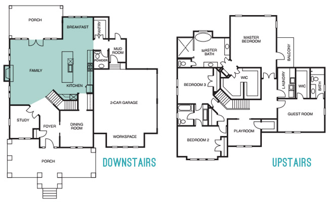
Since we last showed you the office, butler’s pantry, and main bedroom (along with the en-suite bathroom & closet) and then took a pause to have a baby, let’s pick back up in the main living spaces of the house: the living room & the kitchen – which you can see from the floor plan below are both pretty big zones on the first floor.
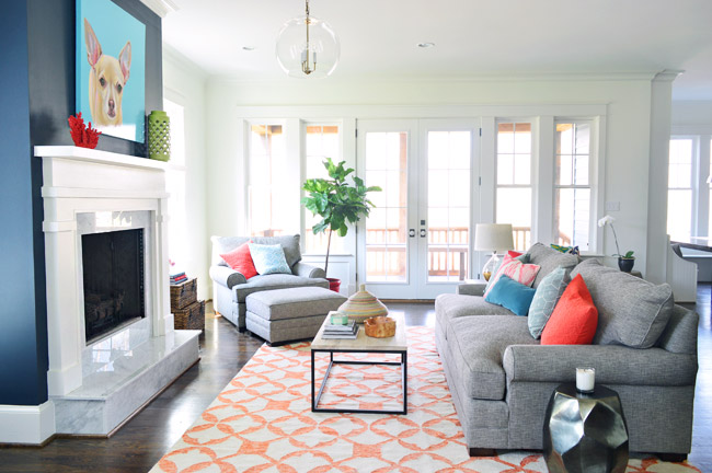
The walls in both the living room and the kitchen are Simply White, and then we layered in some colorful paint/textiles/art/accessories (like a navy fireplace column, a kitchen island in the same color, a breakfast nook full of colorful accessories, some bold art in both spaces, and a colorful rug and pillows, etc).
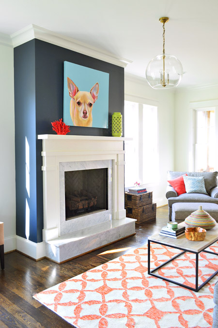
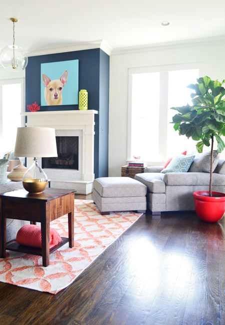
We had always wanted the fireplace to be the focal point of the living room, so we went with Hale Navy by Benjamin Moore to anchor that wall. And our awesome friend Lesli Devito painted a big portrait of Burger to bring a little cheekiness to the space (the TV will most likely hang there when the real family moves in, we just couldn’t resist an ode to Burger for fun during the show).
The coffee table and 9 x 12′ rug are both from West Elm, and that colorful basket is a HomeGoods find. The gray sofa, chair, and ottoman are from Green Front Furniture – it’s this model in the “smoke” color.
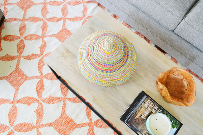
We selected the white wood mantle and marble surround/hearth through a local company and yes, the fact that the gas fireplace turns on with the flick of a switch on the side of the fireplace makes us crazy jealous. Updating our own fireplace may have climbed up our priority list after seeing how nice that is…
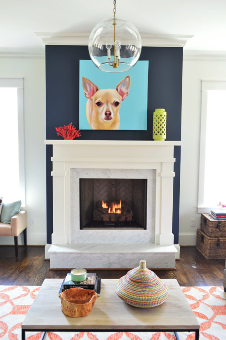
Here’s the view looking from the french doors that lead out to the back porch. In retrospect, we wish we placed the fixture box for that glass pendant light so it would be centered over the coffee table, but we chose electrical placements three months before furniture so it ended up a bit closer to the fireplace than we’d like (thankfully that’s a pretty simple thing to remedy after the show). This entire exercise has been one giant learning experience for us, and it’s amazing how many minute decisions (it feels like there were at least 1,000 of them) add up to one finished home.
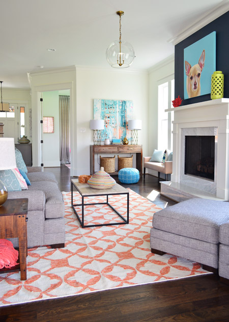
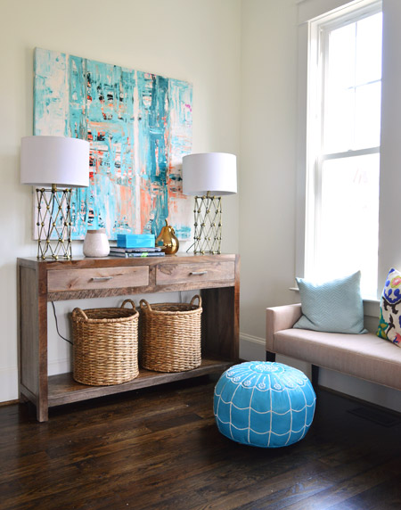
Back in the corner you can see this console, which was a HomeGoods score – as were the lamps – and the baskets on the bottom are from Target. The large scale art is on loan from Lindsay Cowles (it’s for sale, btw!), and the bench under the window is also from Green Front. The blue pouf is ours (bought on Joss & Main a while back and stolen from our own house in the name of filling up this one for the show). We took these photos before all of the white custom shutters got installed throughout the house, which really finish off each room.
The side table was a last minute buy from World Market and the gold-based lamp was a project from our book (once again stolen from our house in those final make-it-work hours). That red planter for the fiddle leaf fig is from Lowes.
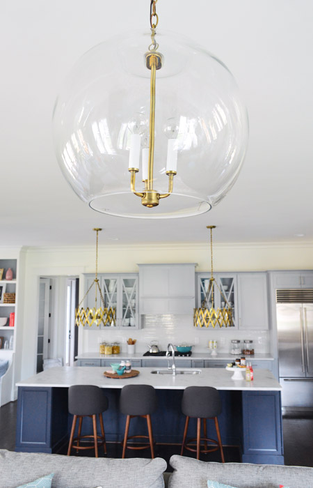
The living room light fixture was one of the last pieces we selected, since we were having trouble finding something that didn’t compete with the gold accordion lights in the adjoined kitchen (filling up this house in a matter of weeks made it nerve-wracking whenever we couldn’t find something and the clock was ticking down). It wasn’t until we saw the Clear Glass Chandelier hung up in the bathroom off of the main bedroom that we realized another one would look great down here, but instead of using silver hardware like the one in the bathroom, our friends a the Decorating Outlet were able to modify one to include gold hardware so it tied into the kitchen pendants.
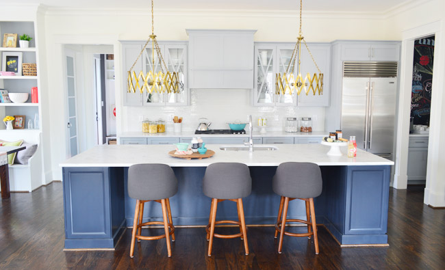
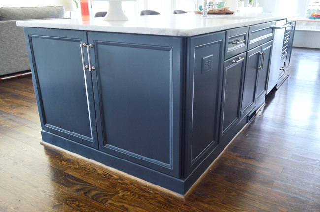
Let’s move into the kitchen, some of which you’ve seen before (in this post) but I’ll call things out again, just so the sources are all in one place. The cabinets are from a local shop called Affinity. Most are in a stock gray color they offer (which is similar to Benjamin Moore’s Gray Timber Wolf) and the island is painted Hale Navy like the fireplace column on the other side of the room.
Two questions that came up a few times when we last shared the kitchen were:
1. Why is the quarter round around the island wood toned instead of painted? That’s just a standard thing the builder does with oak floors since it tends to hide dust and scuffs more (we think it’s regional since all of our houses in Richmond have also had wood quarter round) but he’s happy to paint it if a buyer prefers that look.
2. Why don’t the cabinets go to the ceiling? Some other homes in the show with 9′ kitchens have ceiling-height cabinets, but our first floor has 10′ ceilings, and cabinets that go all the way up to that height are pretty unusual (the builder said most of his buyers don’t want to pay the upcharge to gain such tall cabinetry – although his carpentry team is happy to build some sweet upper storage to bridge the gap if a certain buyer is interested in that upgrade).
One other funny thing we heard a few times when we met people at a little pre-show party at the house to honor the builder was “oh my gosh on your blog this kitchen looked about half the size – it’s huge!” – so while I had our tripod set up I threw my body atop the counter as a reference point (you know, as any normal person would). The island is over 11ft long, so my six foot frame has plenty of room to sprawl out. Just in case you and a few friends want to take a nap up there.
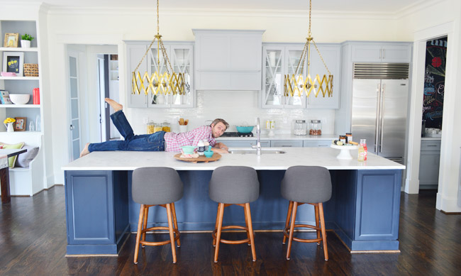
The stools are from West Elm, the gold accordion lights are from Shades of Light, the Wolf/Sub-Zero appliances are through a local company called Cline, and the cabinet pulls are from Liberty Hardware.
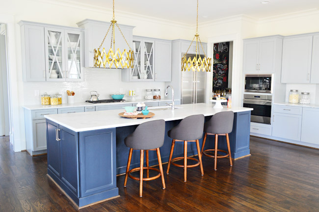
The counters are a White Moura marble that’s leathered (so it’s not a glossy, smooth finish) that we got through a local place called Eternal Stoneworks. To keep the glass cabinets from looking too busy, we just filled them with some white dishware from Target and HomeGoods.
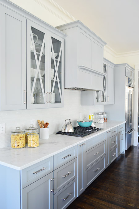
One thing we never really got into with you guys was how we worked with Affinity to design the cabinet layout. We knew deep drawer-bases seem to be more coveted than cabinets with deep shelves since they pull out for easier access, and the experts at Affinity also suggested ways to take advantage of narrow spaces – like a roll-out spice rack and a vertical cookie-sheet organizer.
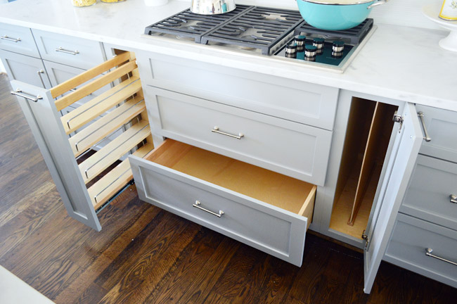
But perhaps my favorite storage areas in this whole kitchen are the big 30″ x 18″ cabinets on either end of the island. We used them a lot for stashing things out of the cleaning crew’s way and they were awesome. The island also houses the dishwasher, a roll-out double trash can cabinet, and tons of other storage spaces.
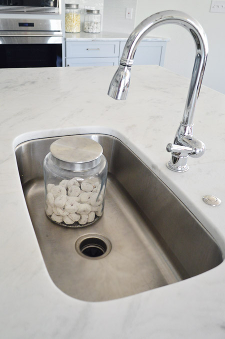
For the sink and faucet, we wanted something clean and functional. We went with this classic looking faucet and the deepest single sink the stone company offered. It’s 30″ wide and 10″ deep, which means it’s deep enough to hide a few canisters of donuts… you know, like if that’s the only thing handy you have on hand to show the scale.
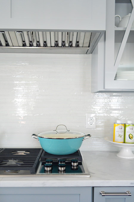
The backsplash brings some nice polish to the space, it’s called white blend waterfall glass tile from a local company called Mosaic. The aqua pan was from World Market and the oil cans and cake stand were from HomeGoods.
Looking to the left of the kitchen is the breakfast nook, which we turned into a built-in banquette. You can also see the frosted double-doors that house the walk-in pantry, which we’ll get to in a minute.
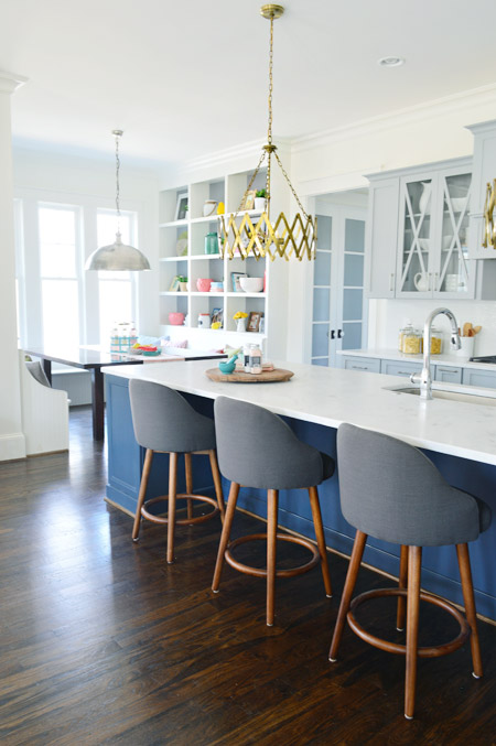
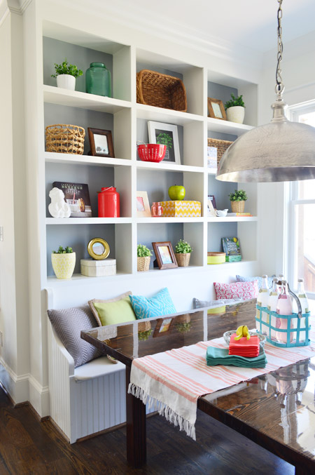
We wanted to do something a bit bolder than your average table-and-chairs for the breakfast nook, so we worked with the builder’s carpenter (also named John) to construct floor-to-ceiling bookcases on either side and include a wraparound bench. The nice thing about the shelves is that when you stand on the banquette you can easily access everything (even that top shelf) so unlike ceiling-height kitchen cabinets (which would necessitate some sort of ladder), these are pretty easy to clean/reach by comparison.
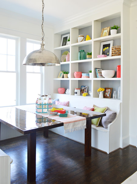
In addition to being a cozy space for family to gather, we pictured it almost being a casual spin on a china cabinet in a way. Instead of housing all of your fine china behind glass, you could display your everyday kitchenware, cookbooks, and framed art/photos in a less fussy setting.
The backs are painted Timber Wolf Gray to mimic the gray on the nearby cabinets. A big thanks to my sister (who works at Random House) and our publisher at Artisan who were able to provide some pretty cookbooks for us to use. Oh, and after we took these photos we had the show’s resident seamstress make some cushions for the bench. They’re deep gray like the backs of the stools at the island, so they tie in nicely.
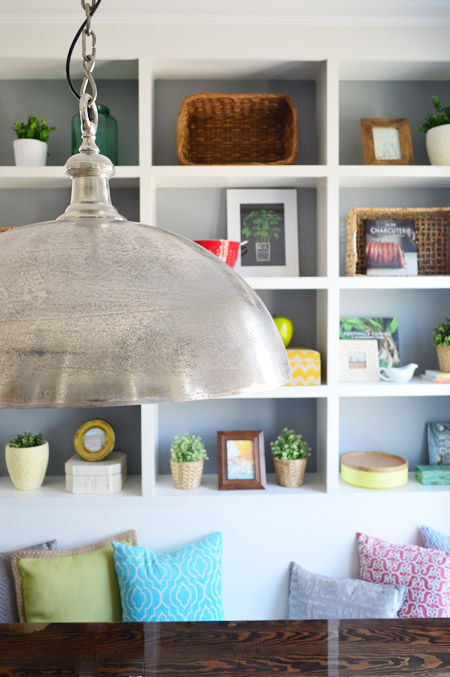
The light fixture is the Large Simple Dome from Shades of Light, and we thought it referenced all the stainless steel and silver finishes in the kitchen (like the appliances, cabinet hardware, faucet, sink, etc) without going too crazy with gold everywhere. Our take on mixing metals is that as long as each finish occurs a few times throughout the space, it looks intentional and layered – so one fixture or finish isn’t the odd man out.
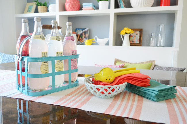
We considered setting the table more formally to emphasize how many people can fit around it, but opted instead for a more casual spread. The beverage container is from HomeGoods, the ceramic basket is from Target, and the napkins are from World Market along with the lemon squeezer.
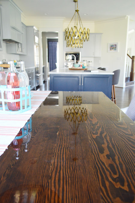
The table itself was a custom build by John the Carpenter. It’s 5′ deep by 6′ wide, so it’s definitely not a size you can find in stock in most places – but we needed it to fit the nook exactly. We were initially going to get one built by a local timber company, but after two trips out there and a flurry of emails it turned out to be out of our budget. But we love how this one turned out, especially the stain color (we used the same tone as the hardwood floors – Jacobean) and the glossy bar coat on the top.
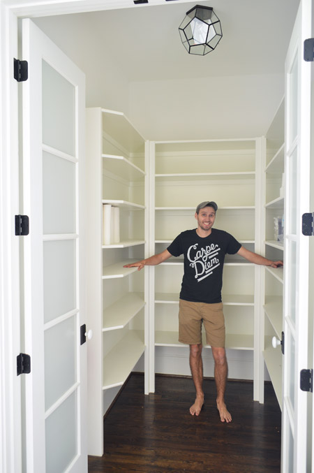
And here’s the pantry. The shelving was built by John the Builder’s carpentry team and they made sure the frosted french doors we selected didn’t interfere with any of the storage or block the hallway flow (by choosing short double doors instead of one large door, and having them open into a recessed area before the pantry shelving begins, they don’t block anything that could be stored in the pantry or block the hallway flow from the mudroom). The glass prism flushmount light is from Shades of Light, and it’s also in the nearby hallway and mudroom.
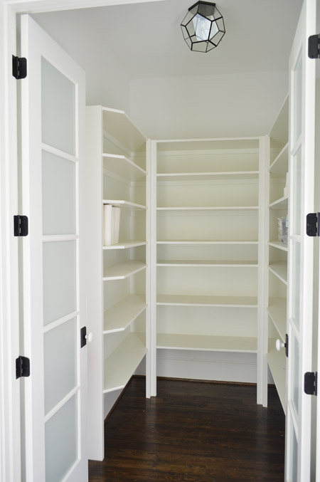
We realized that it was hard to tell scale from the photo above, so we snapped another picture with me for reference. It’s definitely on the generously sized side of things.
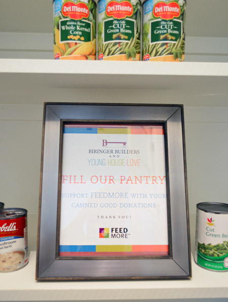
We chose not to “style” the pantry and took your suggestions to turn the room into a collection space for donated canned goods. So if you’re coming to Homearama, feel free to bring a canned good or two to benefit FeedMore (it’s our region’s hunger-relief charity organization). And if you don’t want to lug cans in your purse through the homes, you can also drop your donations off at the show’s front entrance / ticket counter.
We’re trying not to overload you guys with too much showhouse stuff all in a row, so we think we’ll just do one weekly update among other home/family stuff that’s going on in our house for the next few weeks. We also got to tour all six of the other showhouses yesterday, so we’re excited to share those with you guys in the form of a House Crashing post. Hopefully next week if we can get it together.
Psst – Wanna see more showhouse info & photos? Click here for Our Full Showhouse Tour, which includes final pictures of every room, the floor plan, budget info, a video walk-through, and shoppable showhouse furniture & accessories.

Shellie says
Love it! FYI- I got a talking ad from your page today. I couldn’t even find the actual ad doing it but it was for the USPS. I don’t ever remember you guys having those auto-play voice ads so I thought I’d give you a heads up!
YoungHouseLove says
AGH! Thanks Shellie – we HATE those and they’re never allowed. Someone must have snuck some code in there without us knowing it. Thanks for the tip.
xo
s
Caitlin says
I LOVE the Shades of Light globe in the living room! Do you know if they will be offering it in the gold now? If not, they should and they should add it to your line! My husband and I are driving down from Maryland on Saturday and I can’t wait to see everything in person! I have made him study your book all week so he knows how amazing it is that we get to see a house that you designed :) (Sorry for all the exclamation points. I’m that excited!)
YoungHouseLove says
I hope they start making it in gold! They saw it at a party we threw, so maybe that helped convince them ;)
xo
s
Kristina says
Gorgeous house…when can I move in? Wish I could come see it in person. I love the gold lights over the kitchen island but I almost wish there was only one over the sink. The two make it hard to see the beautiful glass front cabinets.
Susan Riggs says
Great job! I really love so much about this house. I wish I could visit it in person, alas I am in California, so that won’t happen. So thanks for all the pictures and info. Speaking of info, did I remember you saying that some of the display items would be for sale after the show? If so, is that only locally?
Thanks again, and cog rats again on your new little one, he is so beautiful!
YoungHouseLove says
Yes, I think it’s only locally (folks have to pick them up).
xo
s
Susan says
Thanks for the update, the locals will be very happy!
Ashley says
It’s so awesome to get to follow this house and see how beautiful it turned out! You did an amazing job. Do any of the other home’s have blogs also? or is there a way to view the other homes online for people that live 1,000 miles away? I’d love to see more of those houses too!
YoungHouseLove says
We’re going to House Crash them all for you – next week we hope!
xo
s
Stacy says
I love how you guys style that living room with all the different wood tones and color elements. It looks so polished and well put together. When I try to bring in different wood tones everything just looks messy. Your use of accessories really brings the whole room together. And those built ins in the kitchen really make the entire space flow.
Ashton says
If I win the lottery before this house is sold, I will be moving for sure!! I love it soooo much!!
Sarah M says
I’m loving the peeks at the showhouse! I clicked through to the Homearama site and love that their summary says “Each home is professionally decorated by trendsetting designers, such as Young House Love.” You guys are the headliners!
I just have to gush a little – I’ve never been super at “styling” my house, but after months of reading your blog, I’m making little changes. I found a cute round capiz tray at HomeGoods for my end table to corral a frame, tissue box, and coasters… It looks so much more intentional and less cluttered…. You guys are awesome! Thanks for all the inspiration! Good luck finding a balance between your love of DIY, sharing that with your readers, but having plenty of quality family time. As a working mom to a 2yo and 4yo I know, no matter your profession, that is always the constant balancing act!!
Cait says
GORGEOUS! I really love the way that house looks, and that kitchen! I never realized how huge it was and now I covet it pretty hard ;) Congrats on all you’ve done
Marie says
Hi! I have been trying to see if you’ve won any of the design awards for Homerama. So, any win?
YoungHouseLove says
AHHHHH! We won three. Can’t even believe it. Can’t wait to blog about those :)
xo
s
katie {deranchification} says
That is awesome — congrats!! Can’t wait to read about it :)
Darcy says
CONGRATS!!! That is soo amazing! Can’t wait to hear all about it!!
You two are such ROCKSTARS!!!
Alexa says
I really love the color combinations. The blues and corals and beadboard make it feel very soothing in there, like being at a beach house. I’m also in love with your Home Goods basket! Probably a one of a kind!
Crystal says
Are those mini-donuts or regular size? ;)
Where to start? So many things I love! You guys did such an awesome job and the scale pictures really give some serious perspective on the size of this place! I love the food donation idea.
katie {deranchification} says
Wow! Yeah, I had no idea how spacious all of that was from the original pics! That pantry is almost the size of our kitchen!!
As always, I love everything y’all picked! I wouldn’t be surprised if the buyer tries to negotiate for all of the furnishings and decorative touches y’all staged with!!
Christy says
I love the house and the breakfast nook. I would love something like that for our family of 8 if we had the right space. I didn’t realize the size of the island until I saw John on it – great idea for scale.
One question – where did that brown bowl (is it wood) come from on the coffee table? I absolutely love it.
YoungHouseLove says
Isn’t that pretty?! HomeGoods! I grabbed it so fast I gave it whiplash.
xo
s
ana conceicao says
I was looking at the homorama website and am having a hard time understanding the hours of operation. Is there a set time for each day? Could you please post them on your blog if you don’t mind… love the house!!!!!! Can’t wait to see it! New baby is so cute, enjoy your time with the family!!
YoungHouseLove says
On the bottom right of this page it has show hours. http://magnoliagreen.com/Homearama.php?registration_location_id=20972 I think it’s 12-4 for the most part.
xo
s
betty says
fyi, sherry, my tickets say: May 1st – May 18th, 2014
Thursday – Sunday, 11am – 6pm
YoungHouseLove says
Thanks Betty!
xo
s
Corinne says
I love the picture of John on the kitchen island! I was definitely thinking, oh yes, that’s a good-sized kitchen and then the picture with John pops up and I was in SHOCK. That kitchen is huge! Wow.
Great looking house! I wish I lived closer and could come see it in person!
Kaija says
Please DO try to overload us guys with too much showhouse stuff all in a row!!! I can’t wait to see more!
Do you have the color scheme summary in a post somewhere?
About the height of the kitchen cabinets… it’s hard to tell from the photos but does it not look odd with the banquette build-ins going all the way up? Did you not accessorize the top of the cabinets on purpose? Seems like such a delicious spot to add a thing or two?
Love that red planter!!!
YoungHouseLove says
Thanks Kaija! We’ve just been sharing the paint colors as we go (the walls, counters, cabinets, fireplace column & island colors are in this post). As for the built-ins, thankfully since other things in the room go up to the ceiling (like the fireplace column) that nook seem to make sense going all the way up as well (that little enclave looks so polished that way). We aren’t really top-of-cabinet decorators (maybe since you’d have to get up there and dust things?) but some people love displaying stuff up there!
xo
s
Reenie says
Absolutely Beautiful. I love all the colorful accessories.
…”(the TV will most likely hang there when the real family moves in,…” ~ ~ I hope not. I’ve never been a fan of the TV above the fireplace…. to me, it takes away from the fireplace and is too high for the TV. ~ ~ just my opinion ~ ~ ;)
JessB says
I don’t know, John…you might have missed your calling as a model!! :) Love seeing all the nitty gritty details with the house and can’t wait to see the other houses. Hope all is well with Teddy! The newborn stage is a crazy one. Perhaps a post on how the transition from one to two has been? It was really tough for me.
YoungHouseLove says
Oh man, little dude didn’t want to sleep last night. We are still definitely in that adjustment period, but we’re so smitten. Two is wonderful and overwhelming all at the same time.
xo
s
Ann Marie @ Twice Lovely says
The banquet space with the shelf built-ins is really my favorite thing ever!
Dawn says
Great job! Everything looks wonderful. And that kitchen IS huge – it turned John into a Lilliputian!
Cathy Ropiski says
You all did an awesome job on this show house! Love the colors and designs you chose! Many thanks for sharing with us! Wish I lived closer so I could see the home in person. Will continue to enjoy your photos!
Audrey says
My daughters and I are actually volunteering this Saturday to help our local Habitat for Humanity. We are going to try to get some more local students to come and help.
YoungHouseLove says
That’s so awesome Audrey!
xo
s
Emily F. says
Love it! Definitely love the pull out spice rack. We have one in our kitchen, though it’s in the upper cabinets, and it is so convenient. We actually went with custom built cabinets and I couldn’t be happier. We met a wonderful carpenter during our “stage 1” kitchen remodel; just adding a dishwasher which turned into having to retrofit some existing cabinets and filling a small 6 inch gap which is where we put our original pull out spice rack.
When we did our stage 2 remodel (tearing off the whole back of the house and adding 600 sq. ft.), we went back to our carpenter and we were able to put in the kitchen of our dreams for likely less than we would have spent at Lowe’s, with every cabinet layout chosen by us! Custom stained and solid birch to boot. It was a really amazing process. Now I can never, ever move! Just a reminder to not count out custom built because you think it’ll cost too much.
Elizabeth says
There is no way you guys could overload us! We eat this up like candy :)
Kylie Helm says
It.is.incredible. I do not even have words! I don’t know how someone could buy it undecorated, it’s PERFECTION!
XO,
Kylie
Katrina says
I love the family room – so colorful and full of natural light!
One random question – where does the gold base light plug in? Did you have outlets installed in the floor? We are in desperate need of lights on our end tables (our couch is floating in the room), but the nearest outlets are on the walls and the cords would be tripping hazards.
YoungHouseLove says
That just floats there and the plug goes under the couch. We didn’t want the builder to add a real floor outlet for that lamp in case a buyer wants to configure things differently, so he’s waiting until there’s a buyer to tell him where they want one (he’s also going to add one to the office for the floating desk on an as-wanted basis, depending on the buyer’s preference).
xo,
s
Andrea says
So Exciting! wish I lived remotely close so I could come see all the homes in person. Love all the colors!
jessi says
I am so in love with this house! Now, if I could only convince my husband to move. ;) Seriously though, you inspired my bestie and me… we are making a weekend trip to Richmond to experience Homearama and the general Richmond area. It’s a first for both of us. Can’t wait! So glad you made those “have-to” lists for visiting Richmond. :)
Carmen says
What time does the home show open each day?
YoungHouseLove says
This page has show hours for ya: http://magnoliagreen.com/Homearama.php?registration_location_id=20972
xo
s
lSusan says
Fantastic job… have forwarded to friends. Love the floor plan and how you utilized the space and your choice of colors. Especially loved the backsplash in the kitchen and have made note. Good luck and I’m looking forward to the upcoming posts!!!
Shar says
Wow! Wish I lived a few states closer to see it all in person. Pinning like crazy! I especially love the chalkboard/bar area. Looking forward to the deets on the lights in that area, as I really want to “borrow” that idea for my coffee area. Great job guys, especially with all the stuff you had going on at the same time. You are amazing!
Jennifer says
I noticed the island outlet and face plate are painted blue. Im just wondering how that works. I’d like to blend some of my outlets in with the wall/cabinet color.
YoungHouseLove says
I believe they’re paintable ones so they can be blended into things like islands or painted built-ins.
xo
s
Aimee says
I’ve painted old outlets before. What I did was give them a coat of brush-on clear sealer first, using a craft sponge brush. Then paint will then adhere to it without bubbling or peeling later. You don’t need no steenking fancy paintable stuff ;-) I have discovered you can paint over just about anything as long as you seal it well first.
SherryB says
You GUYS! Seriously!? The Showhouse end result is Uh-mazing. (Sherry, did you feel like you gave birth twice?) You guys really have a knack for this, and I am SO HAPPY for your success. So proud of you both, you’d think I was related.
~SB
sarah m. dorsey says
Such a stunning space!! You guys rocked it! I’m obsessed with the pendants in the kitchen!!
Adrienne says
BWHAHA I love that you jumped up on that counter for us…and actually so glad you did, it was A LOT bigger than I had expected. You guys are so fun. Great job!
Lynne says
The shot of John on the counter just killed me! He looks tiny! The front of the house looks absolutely amazing – I love the wood porch columns and the blue color together. And judging from what I can see of the other houses in the background, yours is hands down the best!
Aimee says
Question: why is all the concrete in the ‘hood beige?
If I bought that house the first thing I’d do would be rip out those concrete blocks down the front lawn. Don’t nobody want to stand there an hour with a weed whacker cutting the grass between those! I remember my grandfather getting so irritated at his house with that, he used to pay me .50 (big money for a little kid) to do it for him. He also had the kind of driveway with grass growing down the middle of it, so doubly irksome.
YoungHouseLove says
That’s a large natural stone path that leads to the door from the street (you can mow right over them – no weedwacker required), so there’s no beige concrete going on. Must just be the pic (we have an outdoor tour post with pics and video in the hopper for ya that might help).
xo
s
anna whiston-donaldson says
I am DROOLING! What an amazing space! I want to move in, pronto! GREAT JOB!
Stardancer says
The kitchen is gorgeous–the colors, the layout–but I almost cried with joy when I saw the pull-out spice rack and cookie sheet storage. As someone who had to buy a pair of wardrobes to get all of her cookie sheets off the dining table, I can say that setup is truly inspiring.
Also, I love that John choose to show scale not by standing next to or behind the island, but by throwing himself bodily across it. “Look at our beautiful paint colors! Look at the sophisticated lighting choices! Look at the designer on the island!”
Aimee says
Homearama ought to use that pic for an ad.
“Look! There’s a 6-ft dude laying on this sucker! Our houses are humungous!”
Karly says
What a great room! You guys killed it, that kitchen is rad. Well done!
Aimee says
I like the kitchen. Normally not a blue fan EXCEPT for really dark blues. Also like that grey is becoming a standard kitchen cabinet choice, because wood tones would’ve killed the blue impact and white would’ve made it pop TOO much. Though it might’ve worked with white seeing as it’s grounded lower to the floor.
I like the shelving the banquette provides – at first all I could do was drool and go “Oh, man, think of all the paperbacks I could cram in there!” and then I thought again and went “Wait a sec, that’s a kitchen, stashing paperbacks in there is just weird”.
But I grew up in a house with a banquette, so not a fan of those at all. It’s the kids who get the brushburned behinds scooting in those things! Ours was vinyl-covered to prevent sloppage. Adding cushions was a good idea, but I hope they’re Scothguarded to the max because cushions that size wouldn’t fit in a washer.
Abby says
Hey guys! Love the room and I LOVE the rug. We’ve been looking for a rug with an orange pattern for our boys’ room, and I love this one. My one question is it is cozy? They’ll be spending a lot of time on it, and wondering if you would recommend it for that?
YoungHouseLove says
It’s a flat weave rug, like the ones we have in Teddy’s room and our bedroom, which work out really nicely. We think they’re cozy (not as plush as a thick wool rug, but not as rough as jute) but some people prefer something thicker (like a tufted wool rug). Hope it helps!
xo
s
Aimee says
I can’t believe orange is hip again. I was hoping, as a kid of the 70s, that it would NEVER make a comeback! We had orange shag carpet in every. single. room. except the bathrooms and kitchen (which had avocado green carpet!). An orange countertop in the 1/2 bath. Orange couches in the family room. Orange-striped and patterned chairs in the LR. Orange has irreparably seared my retinas.
Melanie M says
That kitchen… it’s just… I’m tingly all over it’s so perfect.
ashley @ sunnysideshlee.com says
this house is beautiful! i love what you guys have done to it!
Lucylu says
“(the TV will most likely hang there when the real family moves in…”
Why is there a giant hanging light in front of where the TV will go? Obviously the next owner will have to remove the light if they put the TV there.
YoungHouseLove says
From the vantage point of the sofa that light is waaay above the art (it only blocks the art if you’re eye level with the light – but you’d never be that high from the sofa or even while standing at the island in the kitchen- where the whole painting is also visible). The light can also be raised on the chain to be higher if someone wants to go that route :)
xo
s
Heather Marks says
Would it be appropriate to publish a final ‘total cost’ of the showhouse? You guys are so great at breaking down financials, but SO many of the pieces (which all look amazing together) are pretty high-ended (stools, lighting, etc). Also I’m curious how the financing worked with buying all the dishes, lamps, pillows, furniture, etc which may be returned – along with the cost of the build, of course! It must have been so much fun to not worry about the budget and just go crazy! Great job, guys!
YoungHouseLove says
We’re not sure we can even tally something like that since so many things are borrowed, donated, etc – but the budget we had broke down to around $500 per space (and then we hustled to get donations to fill things out since that could just be the price of a rug or a bed).
xo
s
Jess says
Wow, the show house looks great! We love the kitchen backsplash and we’re thinking of using that for our own kitchen. My husband and I are driving this Saturday from Baltimore to attend. We can’t wait to see the house in person!
Meg says
What’s not to love? Truly outstanding job! I adore it all, especially the kitchen nook. I would never want to leave!
Christina says
Congrats! Everything in the house is gorgeous, but the pantry actually made me giggle out loud when I saw it. We live in a very old home and use a teeny tiny shelf on the basement stairs to stash stored food. I would cry with excitement if I got to stock that pantry!
Erin says
You guys did an amazing job! Love, love it! And love the layout, too. What a great house. xoxo E
Ro says
#1- over the border obsessed with every piece of this. This is essentially my dream house, though I’d be content to just live in the pantry.
#2- of ALL the special and personal touches my number one favorite is spying your book on the nook shelf! PERFECT!