Happy May and, well, Happy Opening Day of Homearama! Yep, our showhouse is officially open to the public as of today, along with the six others in the show. Deepbreathsdeepbreaths.
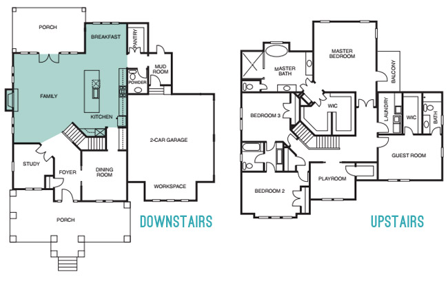
Since we last showed you the office, butler’s pantry, and main bedroom (along with the en-suite bathroom & closet) and then took a pause to have a baby, let’s pick back up in the main living spaces of the house: the living room & the kitchen – which you can see from the floor plan below are both pretty big zones on the first floor.
The walls in both the living room and the kitchen are Simply White, and then we layered in some colorful paint/textiles/art/accessories (like a navy fireplace column, a kitchen island in the same color, a breakfast nook full of colorful accessories, some bold art in both spaces, and a colorful rug and pillows, etc).
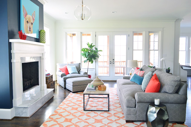
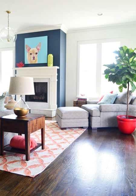
We had always wanted the fireplace to be the focal point of the living room, so we went with Hale Navy by Benjamin Moore to anchor that wall. And our awesome friend Lesli Devito painted a big portrait of Burger to bring a little cheekiness to the space (the TV will most likely hang there when the real family moves in, we just couldn’t resist an ode to Burger for fun during the show).
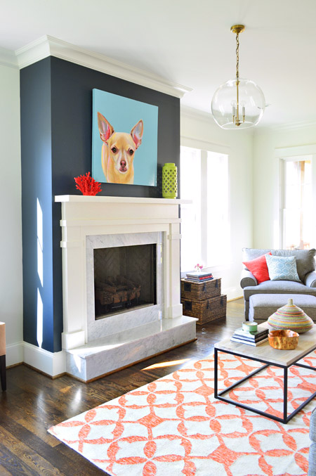
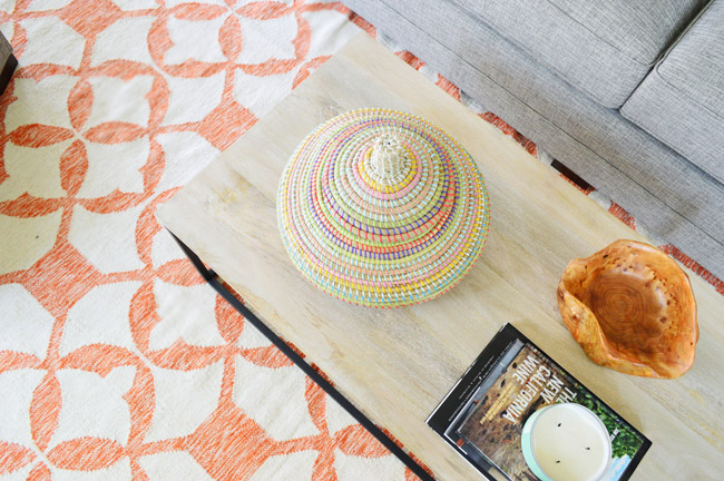
The coffee table and 9 x 12′ rug are both from West Elm, and that colorful basket is a HomeGoods find. The gray sofa, chair, and ottoman are from Green Front Furniture – it’s this model in the “smoke” color.
We selected the white wood mantle and marble surround/hearth through a local company and yes, the fact that the gas fireplace turns on with the flick of a switch on the side of the fireplace makes us crazy jealous. Updating our own fireplace may have climbed up our priority list after seeing how nice that is…
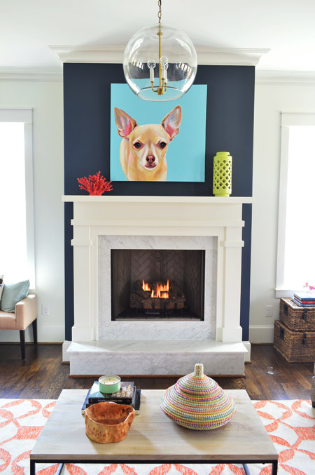
Here’s the view looking from the french doors that lead out to the back porch. In retrospect, we wish we placed the fixture box for that glass pendant light so it would be centered over the coffee table, but we chose electrical placements three months before furniture so it ended up a bit closer to the fireplace than we’d like (thankfully that’s a pretty simple thing to remedy after the show). This entire exercise has been one giant learning experience for us, and it’s amazing how many minute decisions (it feels like there were at least 1,000 of them) add up to one finished home.
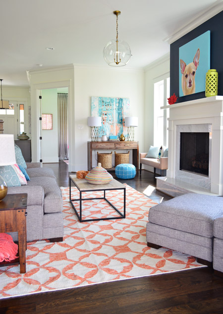
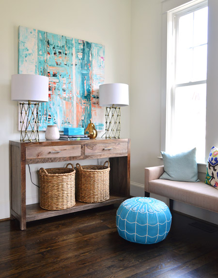
Back in the corner you can see this console, which was a HomeGoods score – as were the lamps – and the baskets on the bottom are from Target. The large scale art is on loan from Lindsay Cowles (it’s for sale, btw!), and the bench under the window is also from Green Front. The blue pouf is ours (bought on Joss & Main a while back and stolen from our own house in the name of filling up this one for the show). We took these photos before all of the white custom shutters got installed throughout the house, which really finish off each room.
The side table was a last minute buy from World Market and the gold-based lamp was a project from our book (once again stolen from our house in those final make-it-work hours). That red planter for the fiddle leaf fig is from Lowes.
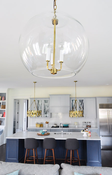
The living room light fixture was one of the last pieces we selected, since we were having trouble finding something that didn’t compete with the gold accordion lights in the adjoined kitchen (filling up this house in a matter of weeks made it nerve-wracking whenever we couldn’t find something and the clock was ticking down). It wasn’t until we saw the Clear Glass Chandelier hung up in the bathroom off of the main bedroom that we realized another one would look great down here, but instead of using silver hardware like the one in the bathroom, our friends a the Decorating Outlet were able to modify one to include gold hardware so it tied into the kitchen pendants.
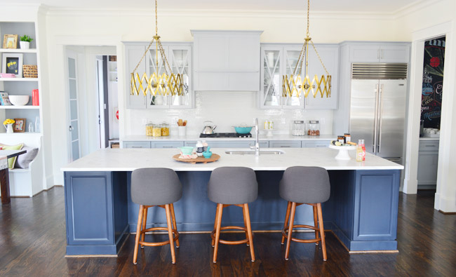
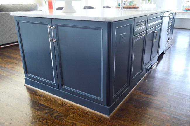
Let’s move into the kitchen, some of which you’ve seen before (in this post) but I’ll call things out again, just so the sources are all in one place. The cabinets are from a local shop called Affinity. Most are in a stock gray color they offer (which is similar to Benjamin Moore’s Gray Timber Wolf) and the island is painted Hale Navy like the fireplace column on the other side of the room.
Two questions that came up a few times when we last shared the kitchen were:
1. Why is the quarter round around the island wood toned instead of painted? That’s just a standard thing the builder does with oak floors since it tends to hide dust and scuffs more (we think it’s regional since all of our houses in Richmond have also had wood quarter round) but he’s happy to paint it if a buyer prefers that look.
2. Why don’t the cabinets go to the ceiling? Some other homes in the show with 9′ kitchens have ceiling-height cabinets, but our first floor has 10′ ceilings, and cabinets that go all the way up to that height are pretty unusual (the builder said most of his buyers don’t want to pay the upcharge to gain such tall cabinetry – although his carpentry team is happy to build some sweet upper storage to bridge the gap if a certain buyer is interested in that upgrade).
One other funny thing we heard a few times when we met people at a little pre-show party at the house to honor the builder was “oh my gosh on your blog this kitchen looked about half the size – it’s huge!” – so while I had our tripod set up I threw my body atop the counter as a reference point (you know, as any normal person would). The island is over 11ft long, so my six foot frame has plenty of room to sprawl out. Just in case you and a few friends want to take a nap up there.
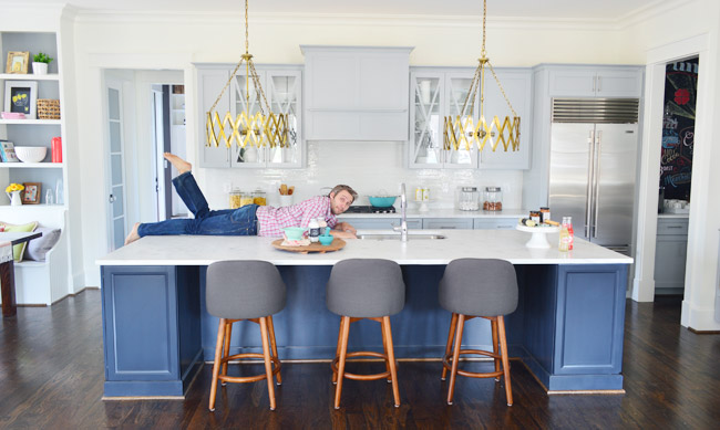
The stools are from West Elm, the gold accordion lights are from Shades of Light, the Wolf/Sub-Zero appliances are through a local company called Cline, and the cabinet pulls are from Liberty Hardware.
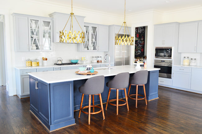
The counters are a White Moura marble that’s leathered (so it’s not a glossy, smooth finish) that we got through a local place called Eternal Stoneworks. To keep the glass cabinets from looking too busy, we just filled them with some white dishware from Target and HomeGoods.
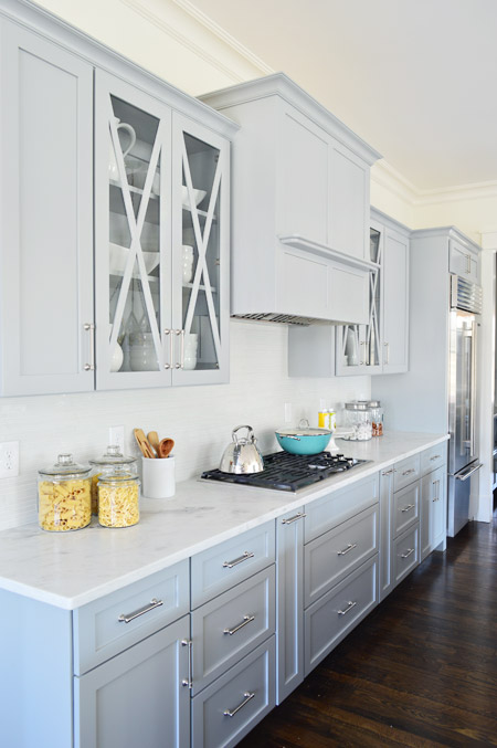
One thing we never really got into with you guys was how we worked with Affinity to design the cabinet layout. We knew deep drawer-bases seem to be more coveted than cabinets with deep shelves since they pull out for easier access, and the experts at Affinity also suggested ways to take advantage of narrow spaces – like a roll-out spice rack and a vertical cookie-sheet organizer.
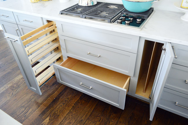
But perhaps my favorite storage areas in this whole kitchen are the big 30″ x 18″ cabinets on either end of the island. We used them a lot for stashing things out of the cleaning crew’s way and they were awesome. The island also houses the dishwasher, a roll-out double trash can cabinet, and tons of other storage spaces.
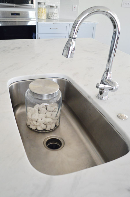
For the sink and faucet, we wanted something clean and functional. We went with this classic looking faucet and the deepest single sink the stone company offered. It’s 30″ wide and 10″ deep, which means it’s deep enough to hide a few canisters of donuts… you know, like if that’s the only thing handy you have on hand to show the scale.
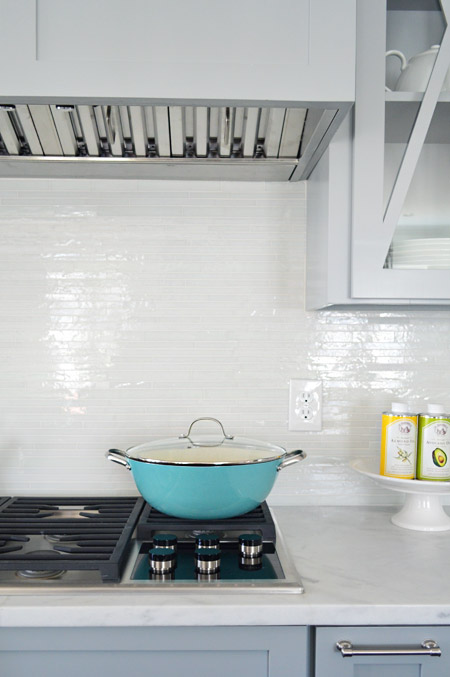
The backsplash brings some nice polish to the space, it’s called white blend waterfall glass tile from a local company called Mosaic. The aqua pan was from World Market and the oil cans and cake stand were from HomeGoods.
Looking to the left of the kitchen is the breakfast nook, which we turned into a built-in banquette. You can also see the frosted double-doors that house the walk-in pantry, which we’ll get to in a minute.
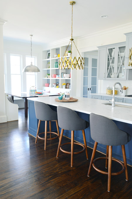
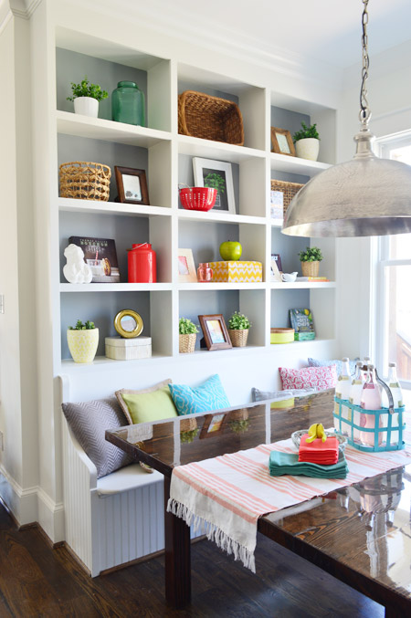
We wanted to do something a bit bolder than your average table-and-chairs for the breakfast nook, so we worked with the builder’s carpenter (also named John) to construct floor-to-ceiling bookcases on either side and include a wraparound bench. The nice thing about the shelves is that when you stand on the banquette you can easily access everything (even that top shelf) so unlike ceiling-height kitchen cabinets (which would necessitate some sort of ladder), these are pretty easy to clean/reach by comparison.
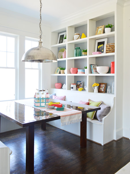
In addition to being a cozy space for family to gather, we pictured it almost being a casual spin on a china cabinet in a way. Instead of housing all of your fine china behind glass, you could display your everyday kitchenware, cookbooks, and framed art/photos in a less fussy setting.
The backs are painted Timber Wolf Gray to mimic the gray on the nearby cabinets. A big thanks to my sister (who works at Random House) and our publisher at Artisan who were able to provide some pretty cookbooks for us to use. Oh, and after we took these photos we had the show’s resident seamstress make some cushions for the bench. They’re deep gray like the backs of the stools at the island, so they tie in nicely.
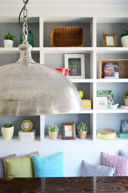
The light fixture is the Large Simple Dome from Shades of Light, and we thought it referenced all the stainless steel and silver finishes in the kitchen (like the appliances, cabinet hardware, faucet, sink, etc) without going too crazy with gold everywhere. Our take on mixing metals is that as long as each finish occurs a few times throughout the space, it looks intentional and layered – so one fixture or finish isn’t the odd man out.
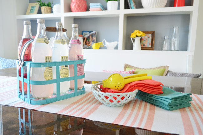
We considered setting the table more formally to emphasize how many people can fit around it, but opted instead for a more casual spread. The beverage container is from HomeGoods, the ceramic basket is from Target, and the napkins are from World Market along with the lemon squeezer.
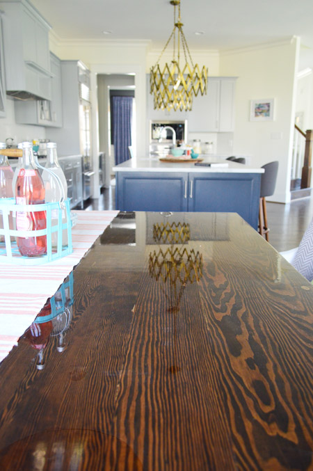
The table itself was a custom build by John the Carpenter. It’s 5′ deep by 6′ wide, so it’s definitely not a size you can find in stock in most places – but we needed it to fit the nook exactly. We were initially going to get one built by a local timber company, but after two trips out there and a flurry of emails it turned out to be out of our budget. But we love how this one turned out, especially the stain color (we used the same tone as the hardwood floors – Jacobean) and the glossy bar coat on the top.
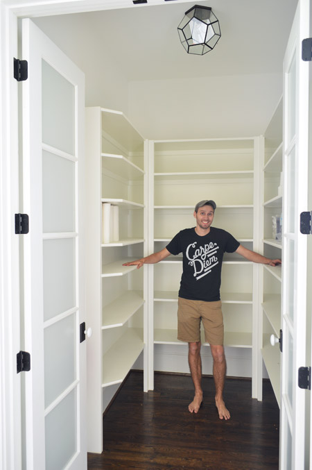
And here’s the pantry. The shelving was built by John the Builder’s carpentry team and they made sure the frosted french doors we selected didn’t interfere with any of the storage or block the hallway flow (by choosing short double doors instead of one large door, and having them open into a recessed area before the pantry shelving begins, they don’t block anything that could be stored in the pantry or block the hallway flow from the mudroom). The glass prism flushmount light is from Shades of Light, and it’s also in the nearby hallway and mudroom.
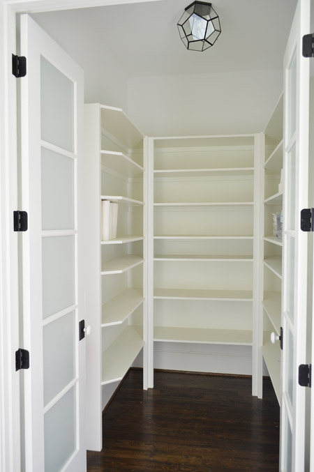
We realized that it was hard to tell scale from the photo above, so we snapped another picture with me for reference. It’s definitely on the generously sized side of things.
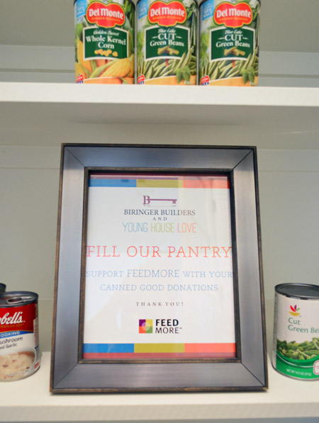
We chose not to “style” the pantry and took your suggestions to turn the room into a collection space for donated canned goods. So if you’re coming to Homearama, feel free to bring a canned good or two to benefit FeedMore (it’s our region’s hunger-relief charity organization). And if you don’t want to lug cans in your purse through the homes, you can also drop your donations off at the show’s front entrance / ticket counter.
We’re trying not to overload you guys with too much showhouse stuff all in a row, so we think we’ll just do one weekly update among other home/family stuff that’s going on in our house for the next few weeks. We also got to tour all six of the other showhouses yesterday, so we’re excited to share those with you guys in the form of a House Crashing post. Hopefully next week if we can get it together.
Psst – Wanna see more showhouse info & photos? Click here for Our Full Showhouse Tour, which includes final pictures of every room, the floor plan, budget info, a video walk-through, and shoppable showhouse furniture & accessories.

Trudy says
Hey folks. Genius design and decorating! LOVE it all, especially those bold gold light fixtures over the island. Brave, different, and spectacular!
Meredith says
My mom and I are going to Homearama this weekend. Seriously pumped! She doesn’t know that we are going to see a house that rockstars built (at least in my mind that is what y’all are!).
Leslie @ Oh, the Fun of It says
The breakfast nook is beautiful! That beverage container has me planning a possible trip to HomeGoods… you’ve done a great job!
Amber Arnold says
I want to live in this house! Of course, it is over 1000 miles away and way out of our price range, I’m sure. Everything looks amazing! Modern, but still warm and inviting, and it feels very livable!
Sue says
Great choice of colours and materials. Looks like a Sarah Richardson kitchen with the cabinetry and placement of the range hood, island, etc.
Just wondering about crumbs under the gigantic table? How would one sweep under there?
YoungHouseLove says
I would use that extender hose on the vacuum I think. The table only has four legs so you could sweep around them with a broom or mop I’d think. The house has been cleaned a bunch of times since the table went in (there was a big party at the house a few weeks back) so they’re getting it squeaky clean somehow. I can ask the cleaning team what method they’re using for ya!
xo
s
Erin says
Saw a comment above about you saying you’re still not getting sleep at night because of cute little Teddy. I don’t have kids, so don’t know if it works, but a friend of mine told me she learned this little trick from another mother: put the baby in a warm bath and gently massage up and down his back. Then wrap him up and breastfeed on one side, back into the warm bath water with more gentle back massage, into his little oneie/jammies, breastfeed on the other side, then put him to bed. My friend said it worked and she successfully used it for all three of her kids when they were babies to get them to sleep soundly through the night.
YoungHouseLove says
Thanks Erin! Some nights are better than others, so this is a good back pocket trick ;)
xo
s
Aimee says
Can’t give a baby an immersion bath until the umbilical cord stump falls off.
For some weird reason I saved my first kid’s stump, but not the 2nd one’s. I’m quite sure that when I’m demised one of them is going to find it and think it’s some weird dried-up really old dead bug or something :-D
Roxine says
Hands down my favorite space is the breakfast nook. I’ve always wanted something just like that. And I love the Stock the Pantry food drive. Congrats on a great job on this home!
Betsy says
Love, love, love!
Two questions for you:
1)Who did the blinds/shutters? I’m local and moving in to a new house this month and looking for plantation shutters – these seem a little different.
2)Do you already know what will be for sale in the house? I’m high tailing it over there as soon as I get a chance to check things out again! :) Hopefully tomorrow!
YoungHouseLove says
A Shade Above did the plantation shutters (they’re an awesome small family business – we loved working with them). As for the furniture sale, we aren’t sure how that’s going to be run, but our house isn’t included I don’t think. The builder bought a lot of the furniture borrowed from Green Front and many other items will go back to vendors or will be donated to Habitat (we’ll let you know when those hit the ReStore :)
xo
s
Aimee says
I bet those vendors won’t take a penny off the price for them having been used elsewhere and then restocked, either. Years ago when I worked in a now-defunct bookstore chain, the booksellers were permitted to check out books like it was a library. As long as you didn’t crack the spines and returned them clean, they went right back on the shelf at full price. Great for us, but as a customer, I might be a little miffed if I knew I was paying full retail for a used book!
Jenny says
So impressive, guys! I especially love the bar finish on that table — I’m trying to figure out how/where we could incorporate that in our house someday — and the way the whole breakfast nook came out with all the shelving. It would be so fun to put kid art at the back of several of those spaces.
And the home price — wow, living in a neighborhood of crazy high-priced homes in Washington, DC near a decent school, that price just seems insane for what they’ll be getting. A fixer-upper around here costs so much more than that!
Jenny says
Oh yeah, meant to say I love the pantry stocking drive. And am waiting for that breakfast nook light fixture to go on sale for, say, $500 off. ;)
Tiffany @ A Touch of Grace says
Oh my word that pantry! I want to grab my sleeping bag and pillow and spend some time in there. I hear hearts breaking around the blogosphere for that space.
You all did an amazing job. The house feels homey, not stuffy, which I love. I wish your builder had a location on the West Coast because he would definitely be top of my list to build our next home!
Andrea says
Gorgeous space!
I absolutely love the idea of having folks bring in canned food items rather than styling the pantry.
Leah says
Love the Feed My Pantry tie in!
Aimee says
Maybe you should’ve added something about not donating out-of-date food. Food pantries are not allowed to hand it out and it just goes in the trash. Some people seem to use food drives for cleaning out their own pantries of stuff that may be inedible or dangerous. When my kids were in Cub Scouts, it was so disappointing to sort through a big haul only to have to dispose of a lot of it. Nobody wants a jar of beets that is 5 yrs old!
YoungHouseLove says
Thanks for the tip!
xo
s
Jamie says
WOW! Looks amazing! The home has such a cozy/family friendly/bright/cheerful feel to it. My favorite part is the eat-in nook in the kitchen – such a great spot for family time!
Emily @ Life on Food says
I am still in love with the eat in nook and bookcases. I cannot wait to see the other spaces complete and the other homes. I wish I lived closer so I could check them out in person.
Tammy says
Sorry to sound so hipster, but can I say AMAZEBALLS!!!!! Wow Guys! Love every bit of it!
monika says
That picture of John, sprawled on the island with foot popped, is priceless. It was a great idea, though, because it does show just how huge this place is. That kitchen is begging for a party! You guys did a wonderful job; I only wish I could be disciplined enough to live that sparsely decorated a life.
Taylor says
The house looks so great!!! I scanned the comments quickly before asking but wanted to know what the name/brand of the navy paint on the wall behind the Burger painting was please.
thank you and I cant wait to see the rest!
Taylor
ps. I totally LOL’d at John on the counter :) then I thought “paint me like one of your French girls”
Taylor says
never mind, I need to read more carefully! Hale Navy, got it :)
So excited for the rest of the house!
YoungHouseLove says
It’s Hale Navy by Ben Moore.
xo
s
Misty says
Oh I wish I was closer so I could see this in person! I don’t think I would ever leave! It is beautiful! Love everything about it, can’t wait to see more!
Speaking of more, I don’t think anyone would complain about more baby pics….;)
Casie says
Just left Homearama! It’s my favorite event for new homes. You guys did an exceptional job. As an agent it’s so refreshing to see something different. Master bathroom is unreal!!!!!
YoungHouseLove says
Thanks so much Casie! You’re so sweet!
xo
s
Marci says
Looks AMAZING!!! I wish I could move in, as is.
One question – I live in the tri-state area and everybody I know has a family room and living room (and sometimes a playroom/bonus room, etc). I noticed that in this house and your previous house that you were happy enough with just a living room (although you have bonus rooms upstairs but they don’t seem as vital to you as they seem in this neck of the woods… is that a personal preference or is it just the thing in Virginia? I live in a split level so typically, when we have company (and its similar at other houses) the grownups congregate in the living/dining/kitchen area and the kids congregate in the family room. For those with a family room attached to the kitchen, the kids typically end up in a basement playroom/bedrooms/living room. Just curious how it flows in your home(s).
YoungHouseLove says
That’s so funny! We didn’t even notice the lack of a formal living room in this home plan, but it was drawn up by the architect and builder so we didn’t influence that! Maybe it’s that some new homes have more open kitchen and living rooms along with more separated spaces like dining rooms and offices so another living space isn’t as necessary to some buyers? I think a few other homes in the show have more formal entertaining spaces along with a more casual family room, so they’re not gone, they might just be in one in every two houses?
xo
s
Wangu @ pineconeshelf says
Oh wow.. I love the show house. I wish I would be around to come. I love the living room, love burger’s painting, the lamps and the light fixtures in the kitchen..
You guys are always an inspiration. I’m a newbie in this and you guys inspire me a lot
Koliti says
I wish I could go to Richmond to soak up all of your gorgeous creativity in your show house.
And what I am really wanting now is a “Hunky Men of DIY Blogs” calendar! If there’s not enough guys for each month then John should just pose for all of them. Hey! You could include a calendar with your next book!!!
YoungHouseLove says
Hilarious!
xo
s
Aimee says
Katie Bower has enough boys to fill up 4 months :-P
Elizabeth says
I am in love with EVERYTHING! Wishing I could fly out from Arizona just to see it in person! You guys are awesome and have given me so much inspiration!!
Kathleen says
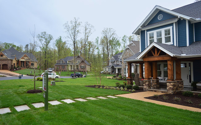
The front of the house looks great guys! The front yard is so welcoming. I love that living room rug too. Good choice. Congratulations!
Jill says
You guys have done a FANTASTIC job with this house. I love, love, love the style and colors and design. It continues to give me lots of inspiration for decorating and styling my own house. I hope you feel immense pride!
Courtney says
Jacobean looks beautiful, but as someone who works for a luxury custom home builder it is not ideal if you have kids or pets because it will show every spec of dust,crumbs, fur, etc. I’m so thankful my employer gave me that tidbit of advice before we purchased our last house because I was drooling over dark stained hardwoods.
Aimee says
When my kids were little, we lived in a townhouse that had its original 1940s dark-stained hardwoods, and you’re spot on. Swiffer hadn’t been invented yet, so it was an old-school rag mop and endless cans of Endust on a daily basis. or else. This home seems like it was designed to accommodate a family with a few kids, and at the high asking price, maybe they’ll be able to afford a cleaning service!
Heather says
Thank you for putting in that picture of John on the counter to show the scale of the kitchen! It made me laugh (my co-workers think I’m crazy) but it really shows how HUGE that room is, and I didn’t get that from your earlier photos. I think the house looks incredible- you guys did an amazing job.
Rebecca M says
What are the dimensions of the painting by Lindsey? Do you have a rule of thumb for how big a piece of artwork should be behind a console table in an entryway? The house looks fabulous and I wish I could live there/have you both as my interior designers!
YoungHouseLove says
I would just go for something that’s not as wide as the console (might look top heavy if it is) but not too small looking up there. I’d guess her print is around 40″ or so wide/tall.
xo
s
Jackie says
Do u know by chance how much the couches run? I love them!!!
YoungHouseLove says
I think it was around $1200 from Green Front for the sofa?
xo
s
Aimee says
That’s actually not too bad. That’s what I paid for my sofa 14 yrs ago! Wish I could find another just like it as it’s showing its age, but everything seems skewed to the 50s lately and I’m more of a traditionalist who likes fat rolled arms, nailheads, and visible wood.
Mary says
Love this post! I found so many great ideas that can be incorporated into my own rooms. Well done, guys! Can’t wait for the house crashing of the other homes.
Jennifer I says
I want a John the Carpenter, please!
Samantha @ Fabulous Fabris says
Fabulous! I like how your house sticks out so much more than the others on the street.
Absolutely love that coral rug <3
Amanda says
oh my goodness, I want to move in! it’s gorgeous.
Michelle @ A Healthy Mrs says
What a beautiful home!
Mica says
This is gorgeous. I have pinned every photo of the kitchen as we are building a new house and determining a kitchen layout. I think I found it! I love the big island. My question…what size is the walkway between the island and the cabinets?
YoungHouseLove says
We’re not there to measure but I’d guess around 5′? Here’s a floor plan that might help: http://images.younghouselove.com.s3.amazonaws.com/2013/09/FloorPlans-1-Final-LARGE.jpg
xo
s
Lesley | Artsy Forager says
I’m loving seeing every detail and hearing about your thought process behind all of your choices. Just had to comment and let you know how much I appreciate your including the artists whose work you’ve used in your sources. A couple of artists I know and love had their work used in a VERY high profile show house and have not been acknowledged hardly at all ( one artist’s work is even being used as part of the logo without any credit ). It’s a huge pet peeve of mine, so just wanted to give you a thumbs up!! PS– Love Lesli Devito’s work!
Allison says
How many square feet is the downstairs? Upstairs? Do you have room dimensions you can provide? (Or maybe that was already provided in an older post and I missed it…)
YoungHouseLove says
The house is around 3500 square feet total, and this is a floor plan we shared a while back:
http://images.younghouselove.com.s3.amazonaws.com/2013/09/FloorPlans-1-Final-LARGE.jpg
For more info you can buy the plan from biringerbuilders.com with a portion of sales going to Habitat :)
xo
s
J.R. Baldwin (@thejulieview) says
Just bought your book as we prepare to move into our next rental… new reader, and just want to say a big THANK YOU! For all your do, write and inspire. This show house is awesome. Hope you’re enjoying your family time with the newest edition!
YoungHouseLove says
Thanks J.R.!
xo
s
Chelsea @ Chelsea Eats Treats says
Wow guys, you totally outdid yourselves. Everything looks awesome!! I can definitely tell how hard you worked on this. I also did NOT realize how big the kitchen was until you posted that pic of John laying on the island. WOWWWW!!!!
Corrie says
I love this house! You did an amazing job. You guys inspired me to paint the front room and side room of my house in the Hale Navy. I just asked my husband I what he thought of me painting our fireplace wall in the same color as an accent wall and he said “why not?”. Your fireplace wall has now given me the ump to paint it! Thanks! I can’t wait :)
YoungHouseLove says
Love that! Send pics!
xo
s
Marissa C says
What was used for the bar top coat on the kitchen table? I’ve been pondering doing that as an island covering
YoungHouseLove says
I think it was called Parks Super Glaze Pour On Epoxy.
xo
s
John says
The Richmond paper has a two dollar discount coupon to the show.
YoungHouseLove says
Thanks John!
xo
s
Sarah says
Love that sofa and chair—are these things for sale once the show is over?
YoungHouseLove says
The builder recently purchased them from Green Front since he plans to use them in future models, so they’re unfortunately not for sale afterwards.
xo
s
Christina says
Congrats Guys! Question?? Do you know what type of wood was used for the front porch area and posts? We are getting ready to build and I LOVE them!
YoungHouseLove says
That was from a local lumberyard that our builder found. The beams are 12″ by 12″ if that helps, and they’re sealed with Cedar stain by Sikkens.
xo
s
Sarah says
Literally drooling over that backsplash! Love!!!!!!!!!!!!!
Pixie Ronn says
This is so amazing, I would love to one day have a home exactly like this! You did a brilliant job!
http://pixieronn.blogspot.co.uk/
Sarah W. says
It’s crazy how different it looks with a person there for scale (both the kitchen and pantry)!
I absolutely love that you did the food bank donation thing for the pantry. I just so happen to be working today on organizing a food drive in my office because I just read that this time of year is when all the holiday donations start to dry up. So glad you always look for opportunities for social responsibility.
Aimee says
Yes, poor folks only eat at Thanksgiving, Christmas, and Easter/s. Food banks really hurt when there’s no big holiday approaching, so that’s most of the time. They have a hard time putting together the grocery bags they hand out (they have a formula that calculates the number of people in the household) with a good balance of different foods to meet nutritional needs, and who wants to eat canned soup in the summer? They get A LOT of canned soup and saltines for some reason. Mix up your donations creatively, people!
Lauren says
Is there a plugin on the floor behind the couch for that lamp to plug into? We are building and have a similar design for the kitchen/living room layout. The house is beautiful! I love the risks you took with colour on the island, and have to figure out if I have the same guts to do it in my own kitchen.
YoungHouseLove says
The cord just goes under the couch for the show (it doesn’t actually plug in) because we didn’t want the builder to add a real floor outlet for that lamp in case a buyer wants to configure things differently. So he’s waiting until there’s a buyer to tell him where they want one (he’s also going to add one to the office for the floating desk on an as-wanted basis, depending on the buyer’s preference).
xo,
s
Sarah says
Excuse me while I DIE over here in Oklahoma. You. Guys. The house just gets more and more amazing. Can I PLEASE live there?! Love your style and thoughtfulness in creating this home. Some lucky duck will be so happy to live there!
Christine says
Hey, we are coming tomorrow to Homerama! Will be so fun!