Happy May and, well, Happy Opening Day of Homearama! Yep, our showhouse is officially open to the public as of today, along with the six others in the show. Deepbreathsdeepbreaths.
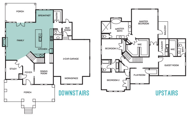
Since we last showed you the office, butler’s pantry, and main bedroom (along with the en-suite bathroom & closet) and then took a pause to have a baby, let’s pick back up in the main living spaces of the house: the living room & the kitchen – which you can see from the floor plan below are both pretty big zones on the first floor.
The walls in both the living room and the kitchen are Simply White, and then we layered in some colorful paint/textiles/art/accessories (like a navy fireplace column, a kitchen island in the same color, a breakfast nook full of colorful accessories, some bold art in both spaces, and a colorful rug and pillows, etc).
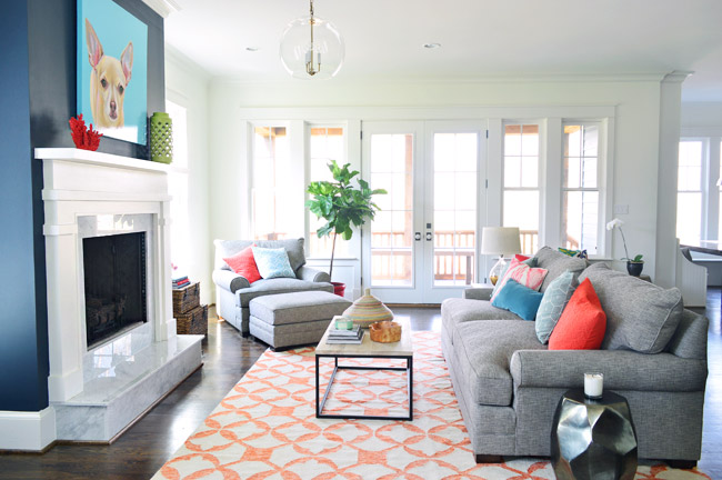
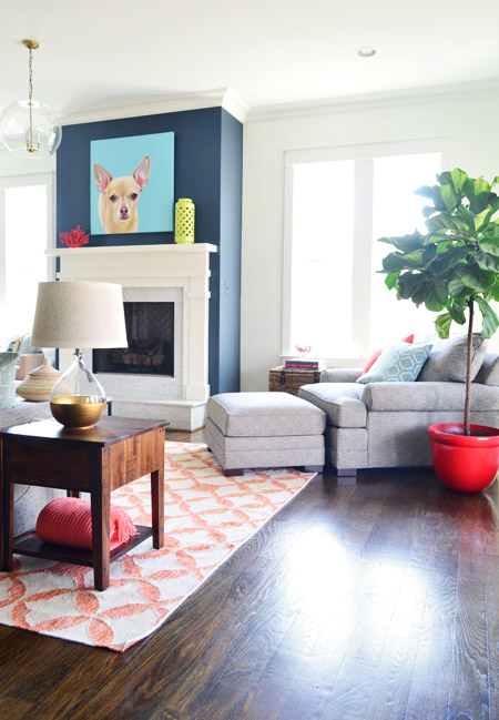
We had always wanted the fireplace to be the focal point of the living room, so we went with Hale Navy by Benjamin Moore to anchor that wall. And our awesome friend Lesli Devito painted a big portrait of Burger to bring a little cheekiness to the space (the TV will most likely hang there when the real family moves in, we just couldn’t resist an ode to Burger for fun during the show).
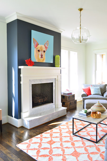
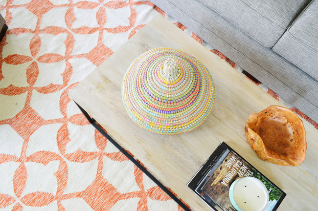
The coffee table and 9 x 12′ rug are both from West Elm, and that colorful basket is a HomeGoods find. The gray sofa, chair, and ottoman are from Green Front Furniture – it’s this model in the “smoke” color.
We selected the white wood mantle and marble surround/hearth through a local company and yes, the fact that the gas fireplace turns on with the flick of a switch on the side of the fireplace makes us crazy jealous. Updating our own fireplace may have climbed up our priority list after seeing how nice that is…
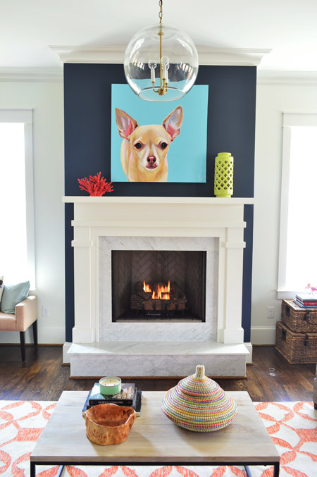
Here’s the view looking from the french doors that lead out to the back porch. In retrospect, we wish we placed the fixture box for that glass pendant light so it would be centered over the coffee table, but we chose electrical placements three months before furniture so it ended up a bit closer to the fireplace than we’d like (thankfully that’s a pretty simple thing to remedy after the show). This entire exercise has been one giant learning experience for us, and it’s amazing how many minute decisions (it feels like there were at least 1,000 of them) add up to one finished home.
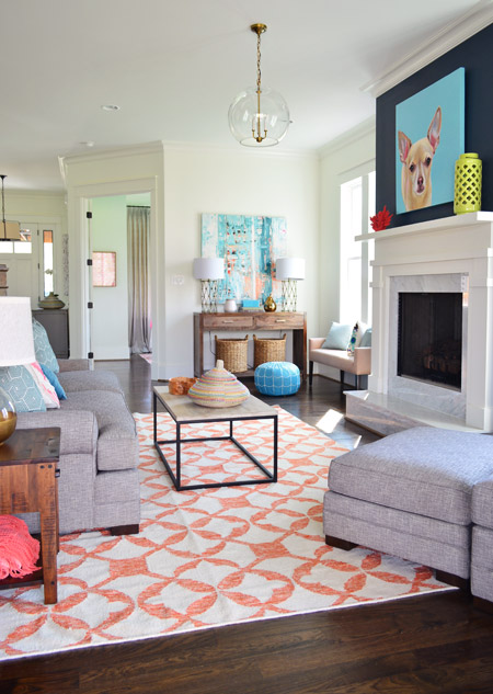
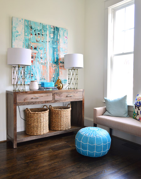
Back in the corner you can see this console, which was a HomeGoods score – as were the lamps – and the baskets on the bottom are from Target. The large scale art is on loan from Lindsay Cowles (it’s for sale, btw!), and the bench under the window is also from Green Front. The blue pouf is ours (bought on Joss & Main a while back and stolen from our own house in the name of filling up this one for the show). We took these photos before all of the white custom shutters got installed throughout the house, which really finish off each room.
The side table was a last minute buy from World Market and the gold-based lamp was a project from our book (once again stolen from our house in those final make-it-work hours). That red planter for the fiddle leaf fig is from Lowes.
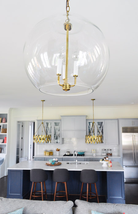
The living room light fixture was one of the last pieces we selected, since we were having trouble finding something that didn’t compete with the gold accordion lights in the adjoined kitchen (filling up this house in a matter of weeks made it nerve-wracking whenever we couldn’t find something and the clock was ticking down). It wasn’t until we saw the Clear Glass Chandelier hung up in the bathroom off of the main bedroom that we realized another one would look great down here, but instead of using silver hardware like the one in the bathroom, our friends a the Decorating Outlet were able to modify one to include gold hardware so it tied into the kitchen pendants.
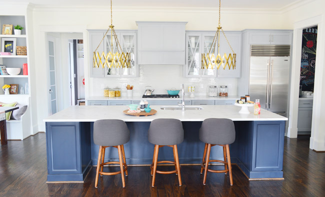
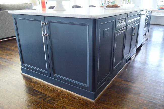
Let’s move into the kitchen, some of which you’ve seen before (in this post) but I’ll call things out again, just so the sources are all in one place. The cabinets are from a local shop called Affinity. Most are in a stock gray color they offer (which is similar to Benjamin Moore’s Gray Timber Wolf) and the island is painted Hale Navy like the fireplace column on the other side of the room.
Two questions that came up a few times when we last shared the kitchen were:
1. Why is the quarter round around the island wood toned instead of painted? That’s just a standard thing the builder does with oak floors since it tends to hide dust and scuffs more (we think it’s regional since all of our houses in Richmond have also had wood quarter round) but he’s happy to paint it if a buyer prefers that look.
2. Why don’t the cabinets go to the ceiling? Some other homes in the show with 9′ kitchens have ceiling-height cabinets, but our first floor has 10′ ceilings, and cabinets that go all the way up to that height are pretty unusual (the builder said most of his buyers don’t want to pay the upcharge to gain such tall cabinetry – although his carpentry team is happy to build some sweet upper storage to bridge the gap if a certain buyer is interested in that upgrade).
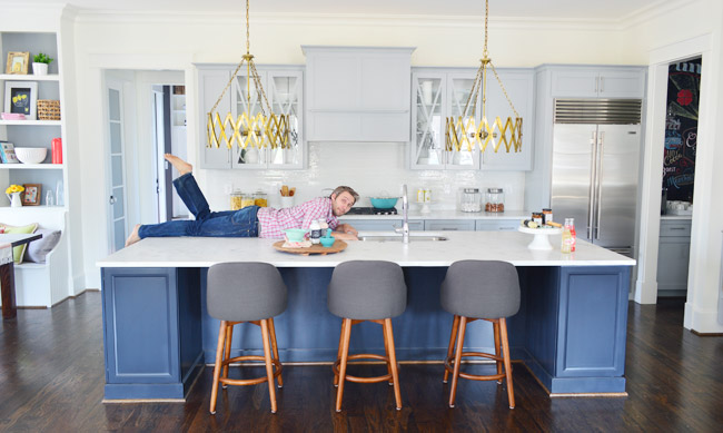
One other funny thing we heard a few times when we met people at a little pre-show party at the house to honor the builder was “oh my gosh on your blog this kitchen looked about half the size – it’s huge!” – so while I had our tripod set up I threw my body atop the counter as a reference point (you know, as any normal person would). The island is over 11ft long, so my six foot frame has plenty of room to sprawl out. Just in case you and a few friends want to take a nap up there.
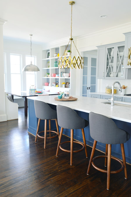
The stools are from West Elm, the gold accordion lights are from Shades of Light, the Wolf/Sub-Zero appliances are through a local company called Cline, and the cabinet pulls are from Liberty Hardware.
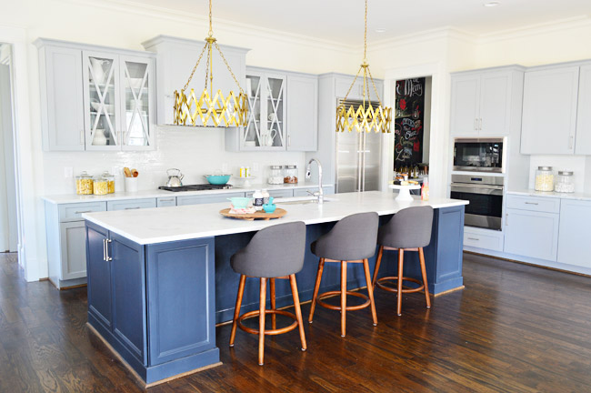
The counters are a White Moura marble that’s leathered (so it’s not a glossy, smooth finish) that we got through a local place called Eternal Stoneworks. To keep the glass cabinets from looking too busy, we just filled them with some white dishware from Target and HomeGoods.
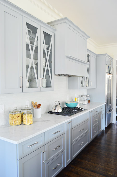
One thing we never really got into with you guys was how we worked with Affinity to design the cabinet layout. We knew deep drawer-bases seem to be more coveted than cabinets with deep shelves since they pull out for easier access, and the experts at Affinity also suggested ways to take advantage of narrow spaces – like a roll-out spice rack and a vertical cookie-sheet organizer.
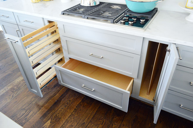
But perhaps my favorite storage areas in this whole kitchen are the big 30″ x 18″ cabinets on either end of the island. We used them a lot for stashing things out of the cleaning crew’s way and they were awesome. The island also houses the dishwasher, a roll-out double trash can cabinet, and tons of other storage spaces.
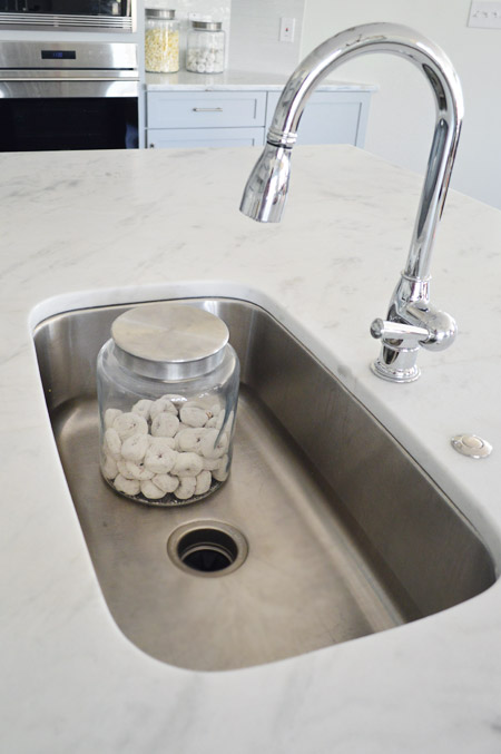
For the sink and faucet, we wanted something clean and functional. We went with this classic looking faucet and the deepest single sink the stone company offered. It’s 30″ wide and 10″ deep, which means it’s deep enough to hide a few canisters of donuts… you know, like if that’s the only thing handy you have on hand to show the scale.
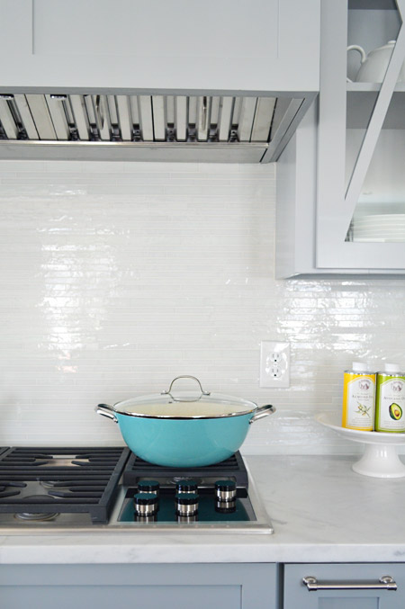
The backsplash brings some nice polish to the space, it’s called white blend waterfall glass tile from a local company called Mosaic. The aqua pan was from World Market and the oil cans and cake stand were from HomeGoods.
Looking to the left of the kitchen is the breakfast nook, which we turned into a built-in banquette. You can also see the frosted double-doors that house the walk-in pantry, which we’ll get to in a minute.
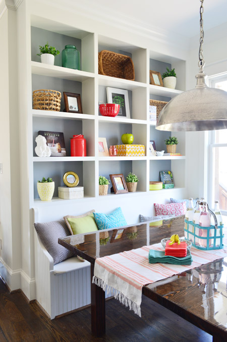
We wanted to do something a bit bolder than your average table-and-chairs for the breakfast nook, so we worked with the builder’s carpenter (also named John) to construct floor-to-ceiling bookcases on either side and include a wraparound bench. The nice thing about the shelves is that when you stand on the banquette you can easily access everything (even that top shelf) so unlike ceiling-height kitchen cabinets (which would necessitate some sort of ladder), these are pretty easy to clean/reach by comparison.
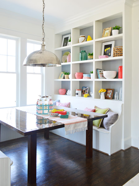
In addition to being a cozy space for family to gather, we pictured it almost being a casual spin on a china cabinet in a way. Instead of housing all of your fine china behind glass, you could display your everyday kitchenware, cookbooks, and framed art/photos in a less fussy setting.
The backs are painted Timber Wolf Gray to mimic the gray on the nearby cabinets. A big thanks to my sister (who works at Random House) and our publisher at Artisan who were able to provide some pretty cookbooks for us to use. Oh, and after we took these photos we had the show’s resident seamstress make some cushions for the bench. They’re deep gray like the backs of the stools at the island, so they tie in nicely.
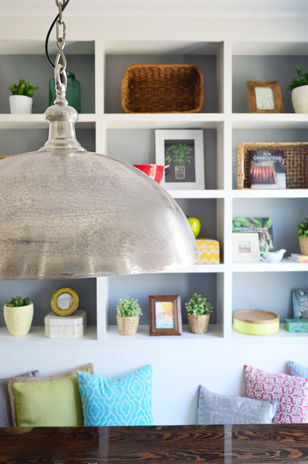
The light fixture is the Large Simple Dome from Shades of Light, and we thought it referenced all the stainless steel and silver finishes in the kitchen (like the appliances, cabinet hardware, faucet, sink, etc) without going too crazy with gold everywhere. Our take on mixing metals is that as long as each finish occurs a few times throughout the space, it looks intentional and layered – so one fixture or finish isn’t the odd man out.
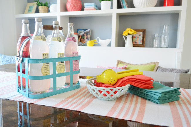
We considered setting the table more formally to emphasize how many people can fit around it, but opted instead for a more casual spread. The beverage container is from HomeGoods, the ceramic basket is from Target, and the napkins are from World Market along with the lemon squeezer.
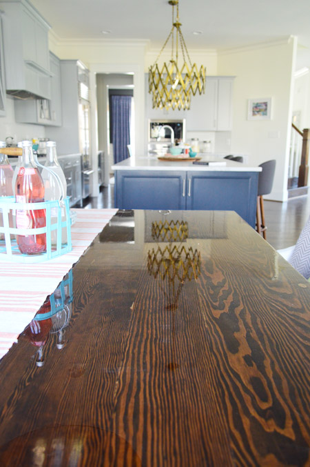
The table itself was a custom build by John the Carpenter. It’s 5′ deep by 6′ wide, so it’s definitely not a size you can find in stock in most places – but we needed it to fit the nook exactly. We were initially going to get one built by a local timber company, but after two trips out there and a flurry of emails it turned out to be out of our budget. But we love how this one turned out, especially the stain color (we used the same tone as the hardwood floors – Jacobean) and the glossy bar coat on the top.
And here’s the pantry. The shelving was built by John the Builder’s carpentry team and they made sure the frosted french doors we selected didn’t interfere with any of the storage or block the hallway flow (by choosing short double doors instead of one large door, and having them open into a recessed area before the pantry shelving begins, they don’t block anything that could be stored in the pantry or block the hallway flow from the mudroom). The glass prism flushmount light is from Shades of Light, and it’s also in the nearby hallway and mudroom.
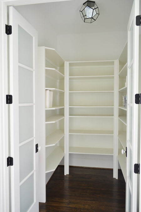
We realized that it was hard to tell scale from the photo above, so we snapped another picture with me for reference. It’s definitely on the generously sized side of things.
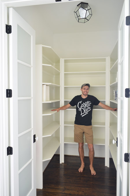
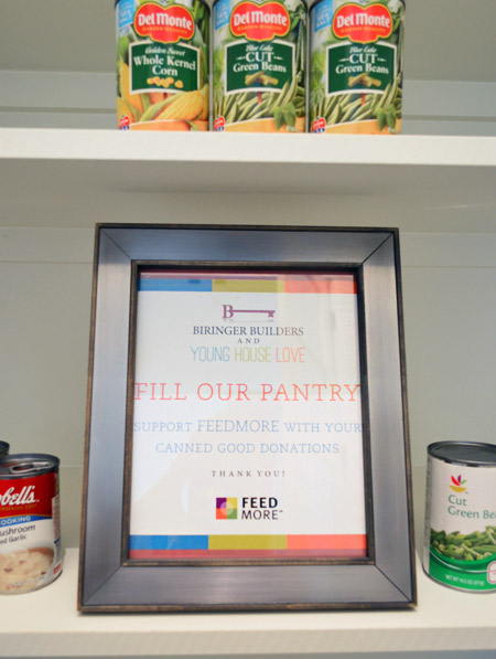
We chose not to “style” the pantry and took your suggestions to turn the room into a collection space for donated canned goods. So if you’re coming to Homearama, feel free to bring a canned good or two to benefit FeedMore (it’s our region’s hunger-relief charity organization). And if you don’t want to lug cans in your purse through the homes, you can also drop your donations off at the show’s front entrance / ticket counter.
We’re trying not to overload you guys with too much showhouse stuff all in a row, so we think we’ll just do one weekly update among other home/family stuff that’s going on in our house for the next few weeks. We also got to tour all six of the other showhouses yesterday, so we’re excited to share those with you guys in the form of a House Crashing post. Hopefully next week if we can get it together.
Psst – Wanna see more showhouse info & photos? Click here for Our Full Showhouse Tour, which includes final pictures of every room, the floor plan, budget info, a video walk-through, and shoppable showhouse furniture & accessories.

ren says
I’m dying to know where that insanely wonderful basket on the coffee table in the living room is from. I. must. have.
YoungHouseLove says
HomeGoods. Isn’t it cute? I loved it so much I bought three of them (in different color combos).
xo
s
CaitlinHTP says
I love all these posts! You guys did SUCH a good job. I wish my pantry looked like that, and I love the eat-in kitchen space.
Christine says
We are coming tomorrow, Saturday! Looking forward to the bluesgrass and brews!
Joseph says
Wow, the length of that island really doesn’t sink in until, you know, there’s a six foot tall person laying on it. Haha It really is massive.
If you don’t mind me asking, where did you get the hat you’re wearing in the pantry picture? I noticed it on another post (the nursery built-ins maybe) and felt too awkward to ask but I’m looking for some new head gear and most hats are either too baseball or too trucker.
YoungHouseLove says
That’s from Gap a long time ago. It’s sort of flannel-ish.
-John
Joseph says
Ah, I was afraid you’d say it was an older purchase. Oh well. Yeah, it looked sort of like wool or something. Flannel-ish makes sense.
Val says
Great work! I would have been so overwhelmed with decorating an entire house. It is fun to see the skills you have acquired over the years.
This is a bit off topic, but the latest episode of Parks and Recreation reminded me of you, Sherry. Leslie Nope is star struck and it is hilarious.
YoungHouseLove says
So funny! It’s sitting on our DVR, so I can’t wait to watch it now.
xo
s
Kristen O. says
Well done! I would move into that house in a minute… providing that someone would buy it for me. (Hehehe) Seriously thought; your entire team has done such an incredible job with everything. It looks like a house that has quality craftsmanship and a lot of love. Some family is going to have a wonderful life in the home that you have created. Bravo!
jbhat says
So many gorgeous ideas here! I love absolutely everything about everything. The color palette is just so soft and pretty and modern and fresh and young….omg, you guys. Well done!
jbhat
Jolene says
So great! The “scale” pictures were a wonderful idea – that IS one huge island!
Aimee @ Irresistible Pets says
The house is gorgeous! I especially LOVE that painting of Burger! I need to get one for my Chuy!! We already have a Great Wall of Chuy gallery going up our staircase!!
Marie says
Oooo someone your updated the “about us” box….parents of TWO kids and one moody chiuawa. (I’m lazy and don’t know how to spell chuwawa and speller checker doesn’t know what I’m trying to say-sorry!)
Aimee says
Ha ha! John ought to configure that into spellcheck!
Kate says
LOVE every bit of it! Would you mind sharing where the table runner in the dining room is from?
YoungHouseLove says
HomeGoods!
xo
s
Renee says
I love your show house. My husband and I are traveling to Richmond for the last weekend of Homeramma, and I can’t wait! We are currently building our own home, and the drywall will be starting next week. I know we are going to get so many awesome ideas for our own house from this trip! SOOOO EXCITED!!!
Lindsay says
I continue to drool.
Hillary says
I am in love with that breakfast nook. I’m going to have to haul my two kids down there (from DC) to see it in person!
holly andler says
lovely home! i can’t find info on these amazing hardwood floors anywhere. did i miss it in another post?
YoungHouseLove says
They’re just basic oak hardwoods with Jacobean stain on them.
xo
s
deb says
So glad you added the pics with John in them – I also thought the kitchen was small until I saw him lying the countertop! Also really helped to see how big the pantry is. You had mentioned it in previous post(s), but it really helps to have a frame of reference! Stunning place…you guys should be incredibly proud of yourselves!
deb says
…should say “on” the countertop :)
Erin says
Oh my goodness I love it! Especially the kitchen cabinets and breakfast nook. Wondering if you ever thought about leaving room (and adding an outlet) in the pantry to put a freezer instead of putting the freezer in the garage/basement where most people have it?
YoungHouseLove says
That’s really smart!
xo
s
Heather says
I would love to know more about how to do that gorgeous glossy bar coat on the breakfast nook table, when you have time please!
YoungHouseLove says
I think it was called Parks Super Glaze Pour On Epoxy.
xo
s
Cherri says
Do you happen to know the bar finish that John the carpenter used on the nook table?
YoungHouseLove says
I think it was called Parks Super Glaze Pour On Epoxy.
xo
s
Emily @ Love, Pasta and a Tool BeltBelt says
Oh my gosh I love it! It looks so amazing. I love those floors! Hopefully one day my living room and kitchen will get there, it’s a work in progress but we are loving working on it! You guys are such an inspiration!
http://lovepastatoolbelt.com/2014/01/living-room/
lulu says
Beautiful place <3
Catherine says
You did such a fantastic job on this space. Really. Excellent work. I love the layout of this home too! I just love it all! Lucky people who get to live here!
Ana Silva says
The outside of the house looks great! I love that your house is one of the most colorful ones in the shot above. Love all the ideas.
Erin C says
When it rains it pours…amiright or amiright?! You sure have a lot going on these days and of course Clara’s birthday is next weekend right? My twins 3rd birthday party will be the 10th as well. They just grow up so fast!
The show house looks fantastic, I wish I lived closer to be able to see them all. Looking forward to your house crashing posts!
Amana says
I’m really loving this. Wondering if you guys were thinking about possibly adding the showhouse to your “home tour” tab up top? I love these long detailed posts, but in the future it might be nice to just look back at the basics in a “home tour” version.
YoungHouseLove says
Yes, we’d love to do that with pics, sources and even a video walk-through when we’ve shared it all and have time to put that page together :)
xo
s
Katie says
And I would like to add my own request that the floor plan image be added to each other the House Tours! It would be nice to have it in one post and to not have to have them separately. :-)
YoungHouseLove says
Thanks for the suggestion! I’ll try to get that taken care of for you when I can!
xo
s
Rosie S says
Love it all….especially the mix of light fixtures, I need to get braver and mix it up from our builder’s basic. Also love dark floors, for us, they are worth the little extra dust mopping! Can’t wait to see more!
liz@craftbaby says
Whats the wall color? Is it pure white? We have a kind of light tan and I’m thinking something a little more white would be nice. Thanks!!!
YoungHouseLove says
It’s Simply White by Ben Moore.
xo
s
liz@craftbaby says
PS looks AMAZING and is now my livingroom inspiration!!
Fiona @ Jacakadaw says
I have loved going on this journey with you guys. The way you have thought through this home, envisioned the end result and pulled it all together has been wonderful. Seeing the end result and how you have decorated and styled is giving me some major inspiration … and a little envy that I can’t access some of the USA stores from here in Australia. But the thing I love the most is that you’ve used the same sources as you do for your own home … Target, World Market, Home Goods and so on. I love that it shows how everything doesn’t have to come from a high priced design store to achieve a beautiful, fun and inspiring result. Thanks for being brave enough to take on this journey and then share it with the world!
Elisha says
In fashion news love John’s shirt where is it from?
YoungHouseLove says
It’s from Fab.com
xo
s
danielle says
what happened to slowing down? ;-)
Kodi says
So much of this house is how I’d like my dream house to look! Pinning for future inspiration. Thanks for sharing!
Erica M says
Love the breakfast nook area! The shelves and wrap bench look great and seem like a really cozy comfy family oriented space! Also thumbs up on the food panty donations :)
Jodi says
Sweet mother of design. THIS. IS. STUNNING!!!!!!!! Congrats on this AND the baby AND making the hard decision to cut back on the blog. You guys truly are inspirational in many, MANY ways.
Jerrika says
Where di you get those cute colored colanders?
The mint one in the kitchen and the red one on the shelves in the banquette?
YoungHouseLove says
They were both from World Market.
xo
s
Cat says
Well, well done. I look forward to your future reflection (I feel quite sure you have it planned already!) on the massive difference between decorating an entire house all at once, as professional decorators do, and decorating a home in a deliberate, paced, years-long process (as the rest of us do). We just bought and gut-remodeled a house; decorating is underway but I just can’t “see” the whole thing in one go. I have to place one or two pieces and see how they look before deciding on the next…
Deb says
Wow!! What a great house!! And congratulations on the 3 awards!! I can’t imagine the work, phone calls, emails, and running around, that went into gathering all of the furniture, etc. that turned that house into a home. Just thinking about what you have accomplished in this past year makes me tired!! Hope you are relaxing and enjoying some down time. You’ve more than earned it.
Belinda says
Wow! It’s so so stunning. You guys are incredible!!
The photo of John on the bench is hilarious. In the scale I had in my head John would have reached to the other side of the sink.
I’m feeling like I need to make a trip to Richmond to visit Homearama, (but that may be a little extravagant coming from Australia).
Monica says
Seriously, I would purchase the house just for the pantry alone… LOVE IT.. and the island.. and the breakfast nook, and kitchen… and we have not seen the whole thing yet!
Wish I lived there.
Brandi says
I absolutely love how you have put the house together. The kitchen and and floor plan just flow perfectly. Not to be negative, I’m not a huge fan of the gold chandelier’s/ light fixtures above the island in the kitchen. Please don’t be upset that I am being honest. QaaaaZ
Linke5 says
I live in the neighborhood of your show home and we purchased our Homearama tickets today. I cannot wait to see it! You all have done an amazing job, especially as busy as you are as parents of beautiful young children!
Jenna Linke
Alison says
I am really curious to hear more about the plantation shutters… how did you wind up deciding to use them throughout the house? Were they donated? (I know from recent personal experience that they’re a huge expense!!) Personally I LOVE shutters and think they’re a great option for people/families with allergies, but honestly was kind of surprised to see them in your show house since I’ve never seen them in any of your own houses… did your builder suggest them? They look gorgeous and I love how you incorporated the curtains with them!
YoungHouseLove says
They actually are something the builder likes to do in a lot of his homes (and an expense he paid for). We don’t usually have the budget for them in our own homes but we have done white faux wood blinds in many rooms in our first, second, and current house (we sprung for them in every upstairs room for privacy/light blocking after we moved in) so we definitely like the clean look of white slats to control light and add privacy :)
xo
s
Whitney says
The house is beautiful! I love the style that you’ve picked. I cannot imagine the amount of work this took to plan, since it takes me about 30 hours in Homegoods to decide on one item ;) Also, I lol’d at the pic of John on the island, but it totally is true how it helped scale it for us.
Aimee says
I hear ya. Drove past Home Goods and saw a banner announcing they had remodeled, so I thought I’d nip in just to scope it out. Yeah, three hours later… I scored a HUGE mercury glass pillar candlestick – this sucker must be over a foot high! – in clearance, and I wish it had had some sibs. Couldn’t find a candle to fit it unless I was willing to pay out the nose, though. But it still looks awesome on its own. And oh, that leftover Christmas stuff – I need more Christmas stuff like I need a hole in the head as I already have 5 giant Rubbermaids, but this cute little shelf thingy that had the O in Noel as a jingle bell was too adorbs to pass up. And there were cute little stacking antique map faux suitcases! Yes, please! It’s so hard to decide what to leave behind in there once you come back to reality and realize you have a cart full of stuff you really can’t afford right now, or I so would’ve had the purple velvet slipper chair with the nailhead trim, too. Home Goods is like retail therapy torture!
catherine says
I’m not a frequent commenter, but I am a faithful reader. What you all have done with this showhouse is AMAZING! Please don’t worry about overloading us (well, at least me) with showhouse posts.
Don’t get me wrong; I love the methodical, practical (and still gorgeous) updates from your own house. It’s just fun seeing what you come up with in this space, too!
Sandy says
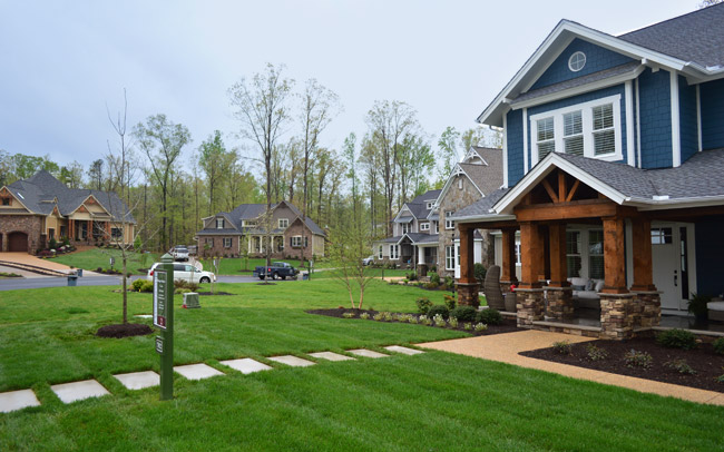
The house turned out absolutely stunning! Great job you guys! That first photo of the outside with the other houses in the background really shows it off well. Seems they all chose rather neutral, typical exteriors and yours just pops. And I’m still enamored with those kitchen light fixtures! I think they are my favorite thing in the whole house. So many great details throughout though.
Cassie Dearborn says
Thanks so much for the detailed blow by blow. I really appreciate that you sourced everything, and that you take the time to link up so much!
Looks great!
brianne says
i want to see more!!! so pretty
Rachel says
Love the colors throughout especially the navy accent wall!! Also, been looking for a table runner like the one with the fringes you have on the kitchen nook table…where is that from??
YoungHouseLove says
That’s from HomeGoods.
xo
s
Tamara @ ProvidentHomeDesign says
I know I’ve said it before but I can’t say it enough YOU GUYS ROCKED IT–every single detail! I’m just SO impressed! I hope to be able to do a Parade of Homes (thats what they call it here) home someday. i am curious to know what percent of the process was fun and what percent was stressful for you?
YoungHouseLove says
Oh man at any given point that changed (some days it was all stress and some days it was all fun). We are so grateful for the opportunity and all that we learned. It truly was a crash course and we love our team so much. They’re like family to us now.
xo
s
Diana says
I LOVE absolutely everything I’ve seen here. I think my favorite parts today are (what I think of) as two little reading areas in that family room – the two chairs near windows. Just screaming for some sun and a good book.