Happy May and, well, Happy Opening Day of Homearama! Yep, our showhouse is officially open to the public as of today, along with the six others in the show. Deepbreathsdeepbreaths.
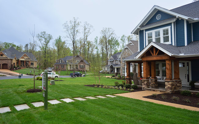
Since we last showed you the office, butler’s pantry, and main bedroom (along with the en-suite bathroom & closet) and then took a pause to have a baby, let’s pick back up in the main living spaces of the house: the living room & the kitchen – which you can see from the floor plan below are both pretty big zones on the first floor.
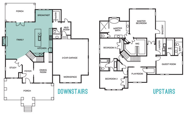
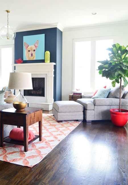
The walls in both the living room and the kitchen are Simply White, and then we layered in some colorful paint/textiles/art/accessories (like a navy fireplace column, a kitchen island in the same color, a breakfast nook full of colorful accessories, some bold art in both spaces, and a colorful rug and pillows, etc).
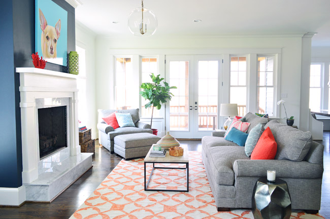
We had always wanted the fireplace to be the focal point of the living room, so we went with Hale Navy by Benjamin Moore to anchor that wall. And our awesome friend Lesli Devito painted a big portrait of Burger to bring a little cheekiness to the space (the TV will most likely hang there when the real family moves in, we just couldn’t resist an ode to Burger for fun during the show).
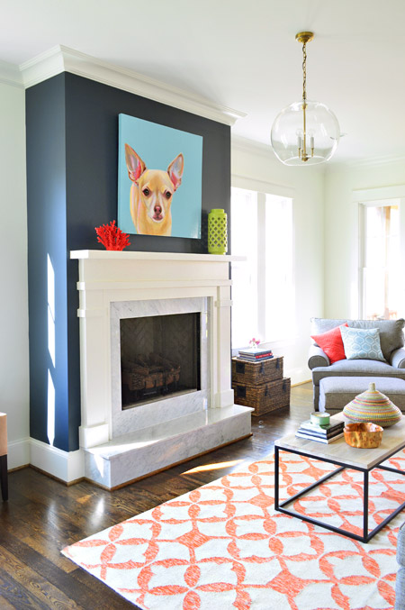
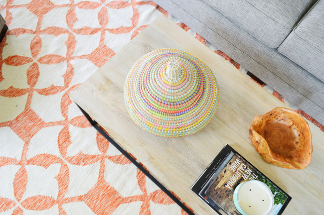
The coffee table and 9 x 12′ rug are both from West Elm, and that colorful basket is a HomeGoods find. The gray sofa, chair, and ottoman are from Green Front Furniture – it’s this model in the “smoke” color.
We selected the white wood mantle and marble surround/hearth through a local company and yes, the fact that the gas fireplace turns on with the flick of a switch on the side of the fireplace makes us crazy jealous. Updating our own fireplace may have climbed up our priority list after seeing how nice that is…
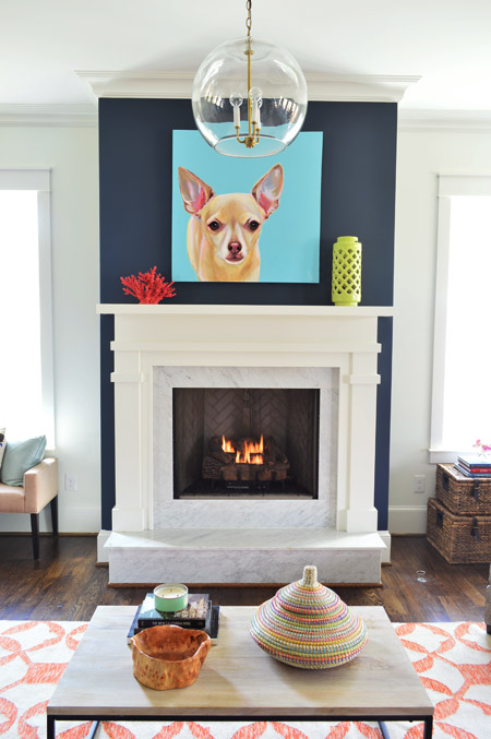
Here’s the view looking from the french doors that lead out to the back porch. In retrospect, we wish we placed the fixture box for that glass pendant light so it would be centered over the coffee table, but we chose electrical placements three months before furniture so it ended up a bit closer to the fireplace than we’d like (thankfully that’s a pretty simple thing to remedy after the show). This entire exercise has been one giant learning experience for us, and it’s amazing how many minute decisions (it feels like there were at least 1,000 of them) add up to one finished home.
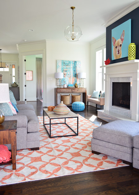
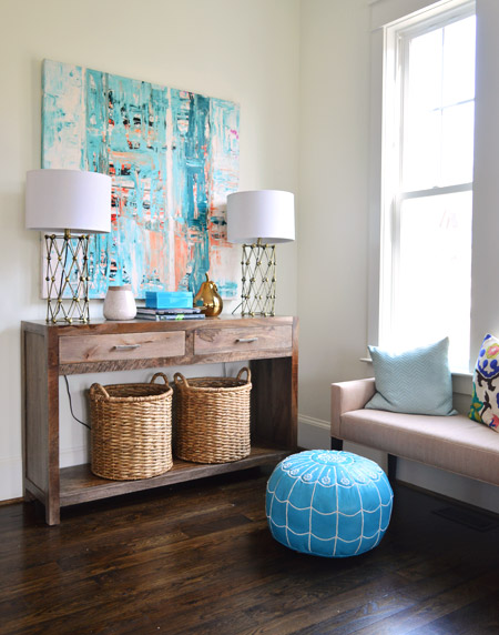
Back in the corner you can see this console, which was a HomeGoods score – as were the lamps – and the baskets on the bottom are from Target. The large scale art is on loan from Lindsay Cowles (it’s for sale, btw!), and the bench under the window is also from Green Front. The blue pouf is ours (bought on Joss & Main a while back and stolen from our own house in the name of filling up this one for the show). We took these photos before all of the white custom shutters got installed throughout the house, which really finish off each room.
The side table was a last minute buy from World Market and the gold-based lamp was a project from our book (once again stolen from our house in those final make-it-work hours). That red planter for the fiddle leaf fig is from Lowes.
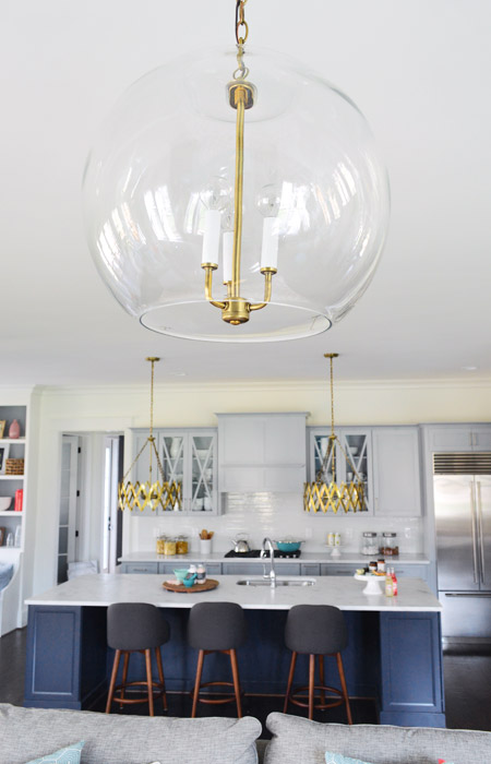
The living room light fixture was one of the last pieces we selected, since we were having trouble finding something that didn’t compete with the gold accordion lights in the adjoined kitchen (filling up this house in a matter of weeks made it nerve-wracking whenever we couldn’t find something and the clock was ticking down). It wasn’t until we saw the Clear Glass Chandelier hung up in the bathroom off of the main bedroom that we realized another one would look great down here, but instead of using silver hardware like the one in the bathroom, our friends a the Decorating Outlet were able to modify one to include gold hardware so it tied into the kitchen pendants.
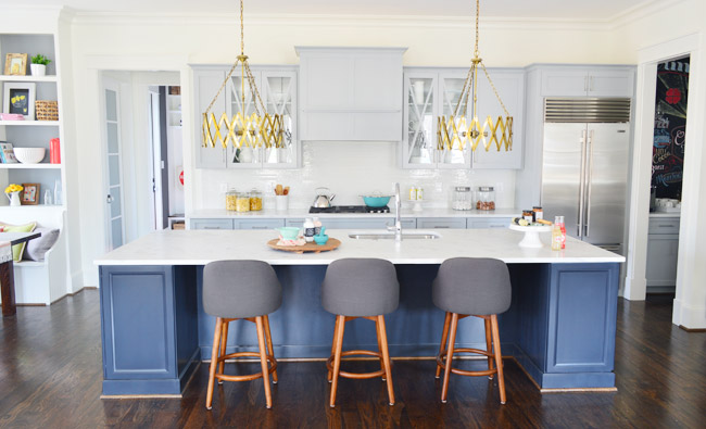
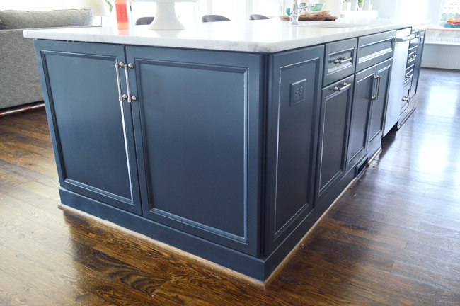
Let’s move into the kitchen, some of which you’ve seen before (in this post) but I’ll call things out again, just so the sources are all in one place. The cabinets are from a local shop called Affinity. Most are in a stock gray color they offer (which is similar to Benjamin Moore’s Gray Timber Wolf) and the island is painted Hale Navy like the fireplace column on the other side of the room.
Two questions that came up a few times when we last shared the kitchen were:
1. Why is the quarter round around the island wood toned instead of painted? That’s just a standard thing the builder does with oak floors since it tends to hide dust and scuffs more (we think it’s regional since all of our houses in Richmond have also had wood quarter round) but he’s happy to paint it if a buyer prefers that look.
2. Why don’t the cabinets go to the ceiling? Some other homes in the show with 9′ kitchens have ceiling-height cabinets, but our first floor has 10′ ceilings, and cabinets that go all the way up to that height are pretty unusual (the builder said most of his buyers don’t want to pay the upcharge to gain such tall cabinetry – although his carpentry team is happy to build some sweet upper storage to bridge the gap if a certain buyer is interested in that upgrade).
One other funny thing we heard a few times when we met people at a little pre-show party at the house to honor the builder was “oh my gosh on your blog this kitchen looked about half the size – it’s huge!” – so while I had our tripod set up I threw my body atop the counter as a reference point (you know, as any normal person would). The island is over 11ft long, so my six foot frame has plenty of room to sprawl out. Just in case you and a few friends want to take a nap up there.
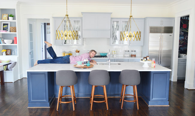
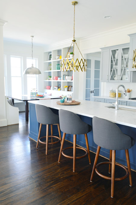
The stools are from West Elm, the gold accordion lights are from Shades of Light, the Wolf/Sub-Zero appliances are through a local company called Cline, and the cabinet pulls are from Liberty Hardware.
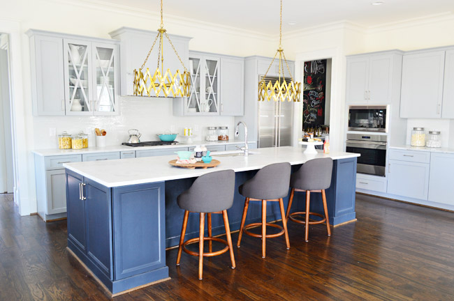
The counters are a White Moura marble that’s leathered (so it’s not a glossy, smooth finish) that we got through a local place called Eternal Stoneworks. To keep the glass cabinets from looking too busy, we just filled them with some white dishware from Target and HomeGoods.
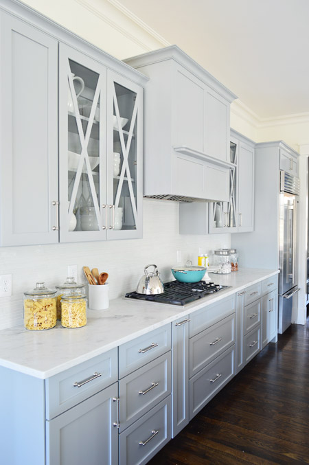
One thing we never really got into with you guys was how we worked with Affinity to design the cabinet layout. We knew deep drawer-bases seem to be more coveted than cabinets with deep shelves since they pull out for easier access, and the experts at Affinity also suggested ways to take advantage of narrow spaces – like a roll-out spice rack and a vertical cookie-sheet organizer.
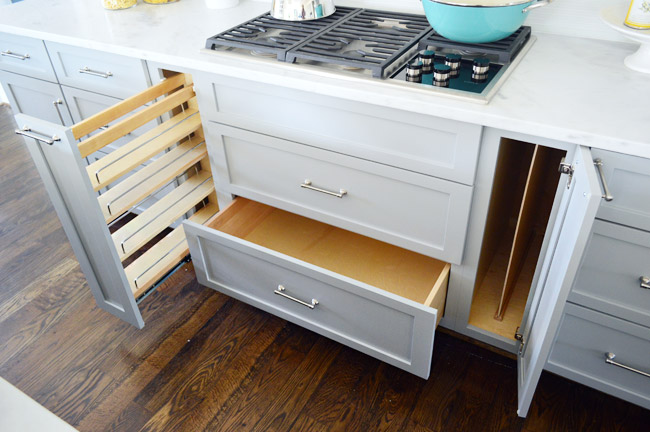
But perhaps my favorite storage areas in this whole kitchen are the big 30″ x 18″ cabinets on either end of the island. We used them a lot for stashing things out of the cleaning crew’s way and they were awesome. The island also houses the dishwasher, a roll-out double trash can cabinet, and tons of other storage spaces.
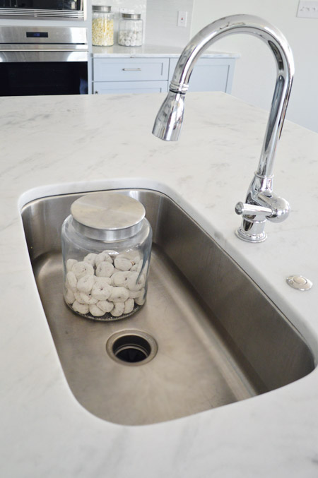
For the sink and faucet, we wanted something clean and functional. We went with this classic looking faucet and the deepest single sink the stone company offered. It’s 30″ wide and 10″ deep, which means it’s deep enough to hide a few canisters of donuts… you know, like if that’s the only thing handy you have on hand to show the scale.
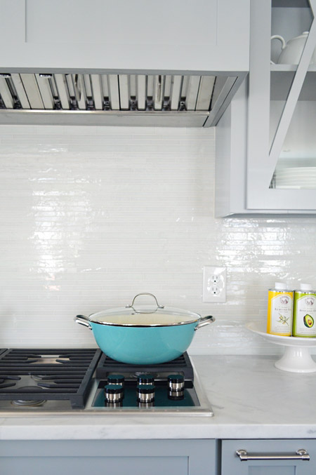
The backsplash brings some nice polish to the space, it’s called white blend waterfall glass tile from a local company called Mosaic. The aqua pan was from World Market and the oil cans and cake stand were from HomeGoods.
Looking to the left of the kitchen is the breakfast nook, which we turned into a built-in banquette. You can also see the frosted double-doors that house the walk-in pantry, which we’ll get to in a minute.
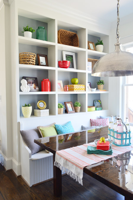
We wanted to do something a bit bolder than your average table-and-chairs for the breakfast nook, so we worked with the builder’s carpenter (also named John) to construct floor-to-ceiling bookcases on either side and include a wraparound bench. The nice thing about the shelves is that when you stand on the banquette you can easily access everything (even that top shelf) so unlike ceiling-height kitchen cabinets (which would necessitate some sort of ladder), these are pretty easy to clean/reach by comparison.
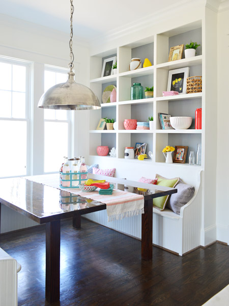
In addition to being a cozy space for family to gather, we pictured it almost being a casual spin on a china cabinet in a way. Instead of housing all of your fine china behind glass, you could display your everyday kitchenware, cookbooks, and framed art/photos in a less fussy setting.
The backs are painted Timber Wolf Gray to mimic the gray on the nearby cabinets. A big thanks to my sister (who works at Random House) and our publisher at Artisan who were able to provide some pretty cookbooks for us to use. Oh, and after we took these photos we had the show’s resident seamstress make some cushions for the bench. They’re deep gray like the backs of the stools at the island, so they tie in nicely.
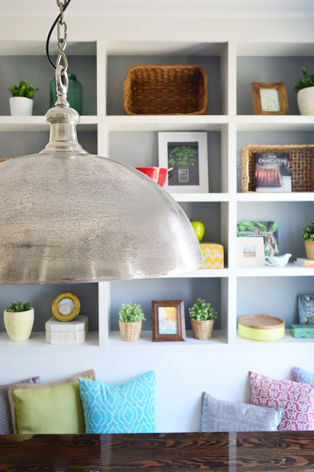
The light fixture is the Large Simple Dome from Shades of Light, and we thought it referenced all the stainless steel and silver finishes in the kitchen (like the appliances, cabinet hardware, faucet, sink, etc) without going too crazy with gold everywhere. Our take on mixing metals is that as long as each finish occurs a few times throughout the space, it looks intentional and layered – so one fixture or finish isn’t the odd man out.
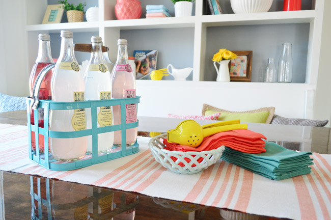
We considered setting the table more formally to emphasize how many people can fit around it, but opted instead for a more casual spread. The beverage container is from HomeGoods, the ceramic basket is from Target, and the napkins are from World Market along with the lemon squeezer.
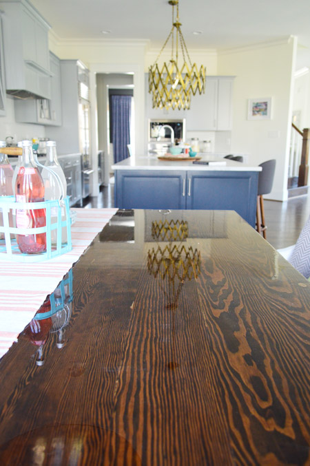
The table itself was a custom build by John the Carpenter. It’s 5′ deep by 6′ wide, so it’s definitely not a size you can find in stock in most places – but we needed it to fit the nook exactly. We were initially going to get one built by a local timber company, but after two trips out there and a flurry of emails it turned out to be out of our budget. But we love how this one turned out, especially the stain color (we used the same tone as the hardwood floors – Jacobean) and the glossy bar coat on the top.
And here’s the pantry. The shelving was built by John the Builder’s carpentry team and they made sure the frosted french doors we selected didn’t interfere with any of the storage or block the hallway flow (by choosing short double doors instead of one large door, and having them open into a recessed area before the pantry shelving begins, they don’t block anything that could be stored in the pantry or block the hallway flow from the mudroom). The glass prism flushmount light is from Shades of Light, and it’s also in the nearby hallway and mudroom.
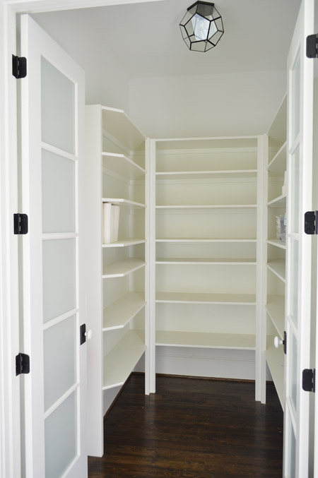
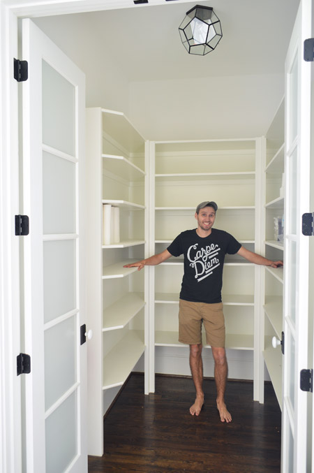
We realized that it was hard to tell scale from the photo above, so we snapped another picture with me for reference. It’s definitely on the generously sized side of things.
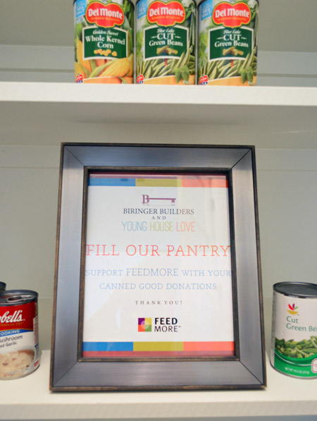
We chose not to “style” the pantry and took your suggestions to turn the room into a collection space for donated canned goods. So if you’re coming to Homearama, feel free to bring a canned good or two to benefit FeedMore (it’s our region’s hunger-relief charity organization). And if you don’t want to lug cans in your purse through the homes, you can also drop your donations off at the show’s front entrance / ticket counter.
We’re trying not to overload you guys with too much showhouse stuff all in a row, so we think we’ll just do one weekly update among other home/family stuff that’s going on in our house for the next few weeks. We also got to tour all six of the other showhouses yesterday, so we’re excited to share those with you guys in the form of a House Crashing post. Hopefully next week if we can get it together.
Psst – Wanna see more showhouse info & photos? Click here for Our Full Showhouse Tour, which includes final pictures of every room, the floor plan, budget info, a video walk-through, and shoppable showhouse furniture & accessories.

Canada Janelle says
Hey you two (four?!) – love the show home, yadda yadda, but here’s why I’m commenting: I’ve been a loyal YHL fan for a couple of years now – it’s actually one of the very few blogs I follow regularly. I have to say, since you’ve geared down on the number of weekly posts, whenever I arrive and there isn’t a new post, I am actually pretty pleased, because you seem like such a very nice family and the lack of a post is a reminder to me that you are (hopefully) enjoying life and each other and your lovely children at a more leisurely pace. It’s awesome – good for you! My husband and I are self employed and we have three small children – we are working on a plan to cut our five day week into four (longer) days for a lot of the same reasons you mentioned…so cheers to making family a priority!
YoungHouseLove says
Aw thanks so much Canada Janelle! You’re so sweet.
xo
s
Deb says
Loved the house, it was a fun way to spend an afternoon. You all did a fantastic job. Where did you get the great Ikat curtians in the upstairs bedroom?
YoungHouseLove says
Thanks Deb! Those were generously donated by U-Fab! They do a great job, and have such beautiful fabric.
xo
s
christine says
Looks awesome! Just realized something though- is that couch and chair set by the kitchen island the only seating area (i mean besides dining/kitchen seating)? Seems like a very large and expensive house to have only one room with a couch. Know what I mean?
YoungHouseLove says
There’s also bench seating on the left of the fireplace (next to that console under the window) and another bench next to the eat-in nook. There’s also a back porch that we haven’t shared yet, so if you throw open the doors to the right of the armchair, the living space expands a bunch. If we had more lead time we would have loved a bigger sectional instead of just a sofa, but with only a few weeks to fill the house up with furniture we couldn’t make it happen in time. It should be fun to see how the future owners furnish it though!
xo
s
Eva says
Just got back from Homearama and your house was amazing!!! I loved the little balcony off the master! Also the lights in the girl’s room ceiling alcove and the reading nook in the boy’s room. Definitely got my vote as the favorite house – hope you guys win!
YoungHouseLove says
Thanks so much Eva!
xo
s
Ginger says
Gorgeous! Love the island color.
kendrick says
Saw it today! You did a wonderful job. One of my favorites out of all the houses!
YoungHouseLove says
So glad!
xo
s
Amy says
Saw the houses at Homearama yesterday, and WOW–some really amazing rooms and decor, but yours gets the biggest WOW for actual liveability! The master bath, the breakfast area, the flow of the rooms, and that covered porch off the family made me want to stay all day! Gorgeous!!
YoungHouseLove says
Thanks so much Amy!
xo
s
Kristy says
That breakfast nook is amazing! I have never seen one done like that LOVE IT!!! Gorgeous house.
September says
I’m reading the Style at Home (Canada) magazine…page 132 in the June 2014 issue has a pic of your book and it’s on their Must Read list… We love you in Canada too!
Congrats on your sweet baby and finishing the show home. You guys are amazing!
YoungHouseLove says
No way! That’s awesome! Thanks for the tip!
xo
s
Carrie says
Just went to visit today and wow, even better in person! You guys did an amazing job, seriously. The whole house was awesome and so well thought out. I loved the kids bedrooms, especially the little Lego guys on the picture frame (-: the master was so happy and wonderful, and the office rug and art/tray were so great.
I am an interior designer and I know how much crazy work that was. Your accessorizing was spot on and actually made the house feel practical and welcoming which is hard for such a big space.
Wonderful job and congratulations on the baby!!!
YoungHouseLove says
Thanks so much Carrie, that’s so nice to hear!
xo
s
Melissa says
I’m so disappointed that life got in my way of actually making it up to Homearama for a weekend escape.
I can’t wait to see the rest of the house. I’m loving the navy kitchen, and I so wish my granite would let me change my cabinets to navy.
Oh, and I’m still in love with the green vanity in the kids’ bathroom.
Ellen says
We went today! We liked house 4, and yours had the best designing, but the last house, by LeGault, was the one with the features that would work for us. My husband kept saying, let’s look at that one! Referring to yours, he had no idea why we were even there! I had to explain to him how I even knew about this at all. We were loving the LeGault house because of the walk-out basement in-law suite. Yours had the best master bedroom. Good work!
Pia says
Perhaps someone has already asked but there are so many comments that I dont have time to browse them all trough. What I wanted to ask is that this is your first experience with doing the interior and decoration in a complete new build. It would be interesting to see the things that did not work out that well or things you might have done differently doing it all over again. Where theory was better than reality. And also where you thought something differently and it turned out even better than you had thought it would. Perhaps a post on that? It would be fun to see what you think now when it is done. I know that you mentioned some things but I think that it would be interesting to read.
And one more thing: Congratulations to your addition to your family! He looks lovely! I hope you get him to sleep properly soon.
YoungHouseLove says
We’d love to do a what we learned/what we’d change/what didn’t work/what surprised us post! There was a GIANT learning curve, for sure!
xo
s
Sara Jean says
My boyfriend and I traveled from Southern Maryland to attend Homearama. We LOVED your house! All of the homes were incredible but yours was definitely our favorite. It was so fun and inviting, full of personality! Fantastic job!You guys rock!
YoungHouseLove says
Thanks so much Sara Jean!
xo
s
Casey Leopardi says
Funny Homerama story….we went this weekend and it was so much fun! Your house was beautiful as were all the others. I was touring yours and was in the master closet and there was a girl stroking the sleeve of a sweater who said, “I wonder if this is his??” I had a good (silent) laugh. You guys definitely have admirers!
YoungHouseLove says
Bahahahaha!
xo
s
Megan says
Haha! I kept telling my husband- those are Sherry’s shoes, those are Jon’s and his dads ties, that pouf is from their house! It was pretty funny overhearing everyone talk about the different stuff in your home. One guy walked in with his wife and was like “apparently there’s some couple who blogs who designed this house!”
YoungHouseLove says
So funny!
xo
s
Lindsey says
I’d love to learn more about the landscaping – why the pavers were chosen, and what material the front walk is made of.
Long time reader, first time commenter. Thanks for all you do!
YoungHouseLove says
Oh yes, we have a full outdoor tour post (pics and a video) planned for you!
xo
s
Steph says
I have so much kitchen/pantry envy it physically hurts. That kitchen is a-maz-ing and I want to live there.
I’ve come to the conclusion that I want a double oven. Like that is one of my life goals. Next house… double oven!
Andrea says
The house looks beautiful! I used to work for a design firm that specialized in merchandising model homes so I appreciate all if the little details that went into this space. I totally related to your post about using multiple carts at target…we used to do that all the time! Power shopping was so much fun!
Karen says
I went to VA because of your site and information you kindly provided. My friend and I toured Farmville Green Furniture on Friday and Homarama on Saturday! Awesome weekend! In my opinion, your house took the prize for a “real” family home, not a sample home designed by a decorator! Everything about it was believable. Your blending of colors, design and wonderful collection of furniture and decorative items make this beautiful house look livable! Well worth the trip, job well done:)
Will probably return to Farmville to spend many days exploring all the stores there…my legs are killing me from climbing stairs!!
YoungHouseLove says
Thanks so much Karen! So glad you liked it!
xo
s
Stefanie says
Just wanted to drop a note and let you know how much we enjoyed Homearama this weekend! Perfect weather and such GORGEOUS houses. Seriously guys..pat yourselves on the back because that house was freakin’ AMAZING. I loved the little surprise lights hanging in the girl’s room and OMG THAT MASTER BATHROOM. I rubbed myself all over that shower tile and I have the pictures to prove it. I may have tagged you guys in far too many pictures on IG..I apologize!
Yours was my favorite house by far for not only the curb appeal (OMG THAT PORCH WHAT?!) but also the decor was way more me than any of the other houses. Though I wouldn’t mind having the shower that’s featured in the master bath in the house with the pool. THAT THING WAS AMAZEBALLS. I stood there with tears in my eyes wishing I could turn it on.
Basically I just wrote this novel to say GOOD JOB GUYS! You should be insanely proud of what you pulled off because it’s kinda effin’ awesome! Keep being the cool kids. =)
YoungHouseLove says
Thanks Stephanie! You’re so sweet! It’s awesome to see people on IG checking out the house. Makes our day! So glad you enjoyed it so much.
xo
s
Lisa says
Outstanding! I really love the choices you made.
I noticed that the switch on the fireplace and the outlet on the island appear to be painted the same color as the walls. I like it, and was wondering if they were special fixtures or if the painter just painted over what had been installed.
I have a gas fireplace, and love how convenient it is to turn on and off. Mine is in the corner, so the switch is right there, practically in the middle of the wall. It’s the only thing I don’t like about this fireplace. I’d love to find a way to hide it. Thanks!
YoungHouseLove says
I believe they sell paintable outlets and switches that hold the paint better so it doesn’t flake off like it would on shiny plastic.
xo
s
Emily says
Not sure if you have seen this but I came across the showhouse listing on Zillow.
http://www.zillow.com/homedetails/7812-Rock-Cress-Dr-Moseley-VA-23120/2107338750_zpid/
Congrats on your awards and for creating such a beautiful home!
Megan says
We went to the show over the weekend and your house won hands down. The layout just made the most sense and then of course I’m partial to your decorating style. Also, the guest bedroom and boys bedroom were amazing! Maybe because I hadn’t really seen them yet but I want to recreate the built in’s in the boys room- so awesome! My husband loved the window in the guest room and how the ceiling went up some to accommodate it, really made the room feel bigger. The whole show was awesome and there were definitely some “interesting” design choices in the houses but it was SO cool to see your house in person after reading about it for months. Great job guys:) Also, from the looks of the ballot boxes, you’re going to win people’s choice;)
YoungHouseLove says
Thanks so much Megan! Glad you had fun :)
xo
s
Megan says
Oh, sorry, I got so excited I forgot to ask my question… I think you guys had some input in the floor plan design… is that right? I couldn’t remember and was just curious how much of the floor plan was designer based vs. builder based. Seriously, the flow of a couple of houses just didn’t make sense- at least for someone my age with kiddos.
That said, I’d live in any of them, no prob;)
YoungHouseLove says
Almost all of it was the builder and the architect – we just made small suggestions and the team would either say “yes!” or “that might not work because…”
xo
s
Christine says
Agree with Megan that your floor plan was the most appealing to us because it was the simplest. All of the houses on the tour are stunning, but I couldn’t get my head around some of the other lay outs.
Jessica says
Do you guys have plans to add this to the “house tour” link of your website? I find myself clicking through those images from time to time for inspiration, and this house is AH-MA-ZING!! Would love for it to all be combined together in an easy-to-find spot! Where did all the throw pillows in the living room come from? And if you say HomeGoods, I will cry. My HomeGoods selection is always so blah in the pillow department :(
YoungHouseLove says
Yes, we’d love to add a house tour of the showhouse once we’re done sharing each room with everything in one place (including a video tour). And as for those pillows, they’re HomeGoods. Hope they come to yours soon!
xo
s
Jess @ Little House. Big Heart. says
Our original 1940s hardwood floors have original wood quarter round, too! I love the two tone look of it against our white baseboards. Kudos to your builder for finishing it out to look classy!
Katie says
We went to Home-a-Rama this weekend and had a complete blast. The house is even more beautiful in person. While owning a home like this one is no where in our near future, we got a lot of awesome ideas. (And my daughter left a little note for you guys in the notebook in the girl’s room before I could catch her. She was swooning.) Thank you for all your hard work. I feel inspired!
YoungHouseLove says
That’s so sweet!
xo
s
Poppy says
I just looked at all the houses on the homerama website (because I am impatient). Yours is by far my favorite, the others are too stuffy, while your style is fun and playful and colorful. Love it, great work.
Christine says
We also went to Homerama this weekend, and loved your house. I loved the mudroom/pantry/powder room, the lack of formal rooms that just go unused, both the front and back porches, and the upstairs playroom. Every kid we saw immediately went for the little game table in there. I think the Monopoly pieces were glued down(?) and that perplexed them for a sec. While we were going through your house, I think I recognized John’s parents going through! I may have sort of kinda geeked out over that.
YoungHouseLove says
So funny! They were there and apparently met a bunch of people! They love to chat, so next time feel free to say hi. And yes, we glued those small game pieces down after worrying a small child might pop something into their mouth. Paranoid Petersiks. Haha!
xo
s
Christine says
It was smart to glue them down! I thought you would like the idea of the little kids immediately “getting” what the room is. And them trying to pick up the pieces, only to have them not budge, and go, ‘huh?’ Also thought that room and the office could serve as guest rooms when there’s really a houseful– I love that flexibility! No, too shy to say hi to John’s parents, but they seemed very sweet! My husband overheard a lot of people talking about, ‘they,’ and, ‘them,’ meaning you and John!
YoungHouseLove says
You’re so sweet Christine! I’m so glad you liked the house- and we love that kids “got” that playroom/reading room right away :)
xo
s
Tara says
I love the coral planters shown on the bookcases in the breakfast nook area. Where did you find those beauties? Great job on the home!!
YoungHouseLove says
Those are HomeGoods finds!
xo
s
Zoe says
I feel sad commenting because everyone else is saying positive things.
but actually this show house thing has made me realise that I had the wrong idea about you guys.
I thought you were a little bit environmentally conscious because for years you have been talking about repurposing things and using what you had, like here, and here (for example)
https://www.younghouselove.com/2009/02/waste-not-want-not/
https://www.younghouselove.com/2011/09/the-updated-light-fixture-blues/
but this house seems to be in the ‘build big – NO build BIGGER!” mentality and then you can shop, shop SHOP! to fill it up with (stuff that will probably go into landfill??) where is all the stuff in the house going to go?
Do people really need 2 pantries? (butler pantry and other oversized pantry?)
the excess of this house is making me nauseous.
are there any eco features at all? solar panels? water tanks? thought given to passive cooling and heating?
when my husband and I renovated our house we reused almost all our furniture and put in tanks (in Australia we have droughts), solar panels, solar hot water, we fixed our house design and insulation for passive heating and cooling… it is not that hard – but it is better to do at build stage.
I just thought you guys were a little bit more about living with some awareness. I guess it is my mistake. I mean, we don’t really know you at all.
It seems it is just about buying things and decorating a room so that others can be inspired to buy things… etc
YoungHouseLove says
The builder made a bunch of eco choices (special insulation & heating/cooling systems, water saving toilets, energy star appliances, a tankless water heater, low-e windows, etc) and every item in this house was either donated to benefit Habitat for Humanity (they’ll be sold by the Habitat ReStore to make money for low income families), borrowed (they’ll be returned to that vendor), borrowed from our own home (like pillows/art/books), or were purchased by the builder (he’ll reuse those items in future homes) – so nothing will be sent to a landfill. We’re also donating our entire fee to Habitat, and the builder is donating a huge chunk of change to them as well :)
xo
s
Brooke says
What is the exterior paint colors you used for the house and trim? We are building a house right now and I am trying to narrow down exterior paint colors and have been looking at blues.
YoungHouseLove says
The house is Newburg Green (it’s more like a navy blue) and the white trim is Steam (both by Ben Moore).
xo
s
Trish says
Hey Guys,
Just wanted to tell you that your show house is amazing! We traveled from WV on Saturday to see it and the others. The details and quality of the work was way more than we expected to see. The outdoor decks and patio/fireplace were amazing. I was definitely the dork with your book taking my picture in randoms spots. Loved the light fixture in the playroom and the master bath shower. Thanks so much!
YoungHouseLove says
So glad you enjoyed it Trish!
xo
s
Katie says
Beautiful job on the house. I’m obsessed with the table runner on the banquette table- where can I get it?!?!
YoungHouseLove says
That’s from HomeGoods.
xo
s
Bekah R. says
Love the design choices you made for this house! Wish I could move right in;) Would you please share what brand/model/size gas fireplace you used?
Thanks!
YoungHouseLove says
That was ordered and installed through a local place called Interiors 2K. We chose the mantel from their catalog and the insert was just standard I believe.
xo
s
Rachel says
Can’t wait to see the house this Saturday! We are making a day of it in Richmond and going back to Sticky Rice AND trying that Proper Pie Company!
I heard from a friend that Ukrops got sold to another company who made their cupcakes for a while, but doesn’t anymore. I had some years ago and they were delish, and we are celebrating my birthday while in Richmond so I thought it would be fun to get cupcakes. :) Do you know if you can still get those cupcakes somewhere?
YoungHouseLove says
Martin’s still has them! Original Ukrops recipe! Just stop in and grab some from their bakery section :)
xo
s
Melissa says
I am swooning and drooling. Attractive, right? But this is so gorgeous!
Did I miss where the sofa and chair came from? I love them!
YoungHouseLove says
Thanks Melissa! They’re from Green Front here in VA.
xo
s
Sadie says
Just wondering if you decided to paint the front door that rust colour you originally picked out in a previous post. I see that it’s white (?) now, are you still planning on painting it?
YoungHouseLove says
Our team debated a bunch of options and ended up going with the most popular write-in vote in the comments of that post (white) so the sidelights are the same color (it makes the door feel wider and more in proportion to the house) and also so we could add some fun color with accessories (red side tables, patterned porch pillows, etc).
xo
s
Terrah says
Could you share where the canisters are from? I really like them and am currently in the process of trying to find some nice simple ones, like those, for my new kitchen. Also, do they have the gasket seal? Thank you!
YoungHouseLove says
They’re from HomeGoods. No seal but they’re glass and fit closed tightly. So far the donuts ago are still fresh!
xo
s
Kate says
The house is incredible! I love all the finishes! We are in the middle of a flooring to ceiling kitchen remodel and was wondering where you found the kitchen cabinet pulls? Congrats on the newest memeber! He is precious!
YoungHouseLove says
They’re from Liberty Hardware.
xo
s
Theresa W says
Have you discussed somewhere choosing cabinet pull sizes and placement? I searched but didn’t see anything. It looks like here you choose a standard size for all “vertical” door installations, and a few different sizes for the horizontal drawers, depending on drawer size?
YoungHouseLove says
They’re actually all the same sized pulls on every cabinet! The uppers were just hung vertically at the bottom of the doors so they’re easy access, and the lowers are mostly centered horizontally on drawers and placed vertically on cabinet doors (you can see them best in this picture I think). The cabinetry folks attached them, so they must have followed some basic standards (we didn’t mark anything for them) but we did provide the hardware from Liberty Hardware.
xo
s
Jim says
I have to give it to you. Those fixtures look great. Iv’e seen them popping around in restaurants here in Vancouver, Canada. I am sure they would look great in most in door homes. And your pantry, my god it’s bigger than most chicken den apartments we have in our downtown core.
Rachel says
I enjoyed this house so much! There were two pictures that were hanging in the hall right before I entered the master. Where are those from? I loved them!
Thank you!
YoungHouseLove says
Those are painted by Lesli Devito! Here’s her site: http://myoldcountryhouse.com/
xo
s
Haley says
I love using John as a size reference. It was definitely helpful.
Dreaming of those accordion light fixtures since you first shared them. Now I just need a house and a bunch of extra money
Christina says
You guys truly out did yourselves here. One question, where is the microwave?
YoungHouseLove says
Thanks Christina! It’s above the oven (it came as a wall mounted set).
xo
s
Carolyn says
This is so beautiful. Love the mix of colours, metals, wood with paint, dark and light.
I also think my new life goal is to live in a house with a constant supply of mini donuts. Do they come with the house? ;)
YoungHouseLove says
We have gone through so many we should have bought stock in those! Haha!
xo
s
Christine says
Sorry if this has been answered already, but I’ve been searching through your site for the name of the artist who created that beautiful print in the playroom. The blue/green watery one? Is it Lindsey Cowles, who did one of the other paintings in the house? Thank you!
YoungHouseLove says
It’s actually a find from World Market!
-John
Nancy Lunsford says
My husband, son, and I drove from Centreville, VA (~3 hours away) to see your home yesterday and it did not disappoint. Our little boy absolutely loved your little boy’s bedroom and now I’m wishing we had taken pics. I’m noticing that you sadly don’t have any images or descriptions of it on here. Might you be posting on it?
YoungHouseLove says
Yes, that’s in the hopper!
xo
s
Sarah says
I saw the house yeterday – great job! Can you tell me the source for the kitchen cabinet hardware? Thanks!
YoungHouseLove says
That was from Liberty Hardware.
xo
s
Meghan says
Loved the Homearama! There was a dresser you used in one of the bedrooms that I love! It’s white and has a geometric white pattern on the front. I can send you a picture if needed. I would love to know where you found this! Thank you so much!
YoungHouseLove says
So glad! That was from Green Front Furniture in VA.
xo
s
sara says
This is brilliant! I’ve been stalking that rug for a while for my master bedroom. Do you guys think it will lay ok over wall-to-wall carpet? I think it’s the perfect rug for my room but I hate the wrinkling that tends to happen when layering a rug. Please excuse image blur on my blog. Working out a few bugs!
http://embracemyspace.com/2013/07/31/curtain-call/
YoungHouseLove says
Yes, I think it would look awesome in there and lay well over a carpet since it’s a flat weave!
xo
s
sara says
Thanks, Sherry!