The ceiling hole is patched (see more on how I get that done here, complete with a ridiculous video of the process) – although admittedly the paint is probably still drying. But we’re ready to call this turkey done. For now.
This is one of those makeovers that wasn’t a total gut job, but was a series of smaller tweaks that added up to something pretty darn noticeable. In fact going into this we thought this just might be a “for now” fix that we’ll eventually redo completely (all that beige tile was hard to get behind) but now that we’ve made these upgrades we’re surprised how much we like the room – especially since we plan to redo the floor someday down the line with some hex tile, as seen in this mood board (more on that here).
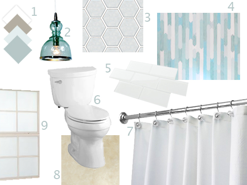
So other than a flooring update down the line, we might just leave the beige wall tile as-is (or eventually have it professionally reglazed to be white for a few hundred bucks, like we did to the tub in our first house). Which definitely wasn’t something we thought might be our solution going into things (we really thought we would have to demo out all of the tile in this bathroom to really make it feel fresh and updated). So that’s a nice surprise, even to people like us who have been DIYing for a long time – you never know when something “for now” will charm you into sticking with it for a while longer! And as much as we love a sledgehammer, you know we also love using what we have…
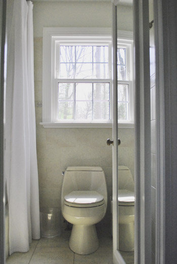
But enough chitchat. Let’s get to the before and after pics and the big ol’ budget breakdown. First the pics. Here’s the room before we did anything other than hang an extra long shower curtain at ceiling height (that’s one of our favorite small-bathroom tips – if you can’t trick the eye into making the room feel wider, you can at least make it feel taller and loftier by raising the curtain).
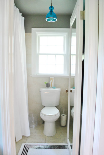
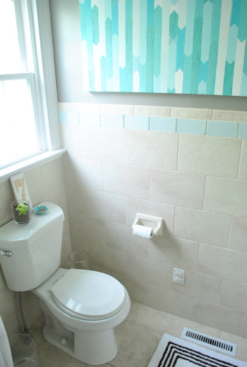
And here’s the room now, after some planning, some painting, some light-swapping, some art hanging, some trim-painting, a toilet-update, some window frosting, some shampoo wrangling, some door trimming, some border tile demo, some border retiling, and some light-moving.
Here’s another before pic from another angle.
And the updated after pic from that same angle. See how painting the walls darker, painting the trim bright white, swapping the repetitive tree border tiles with clear glass ones, and switching out the old squat almond toilet for a tall white one made it feel a lot less like a beige box?
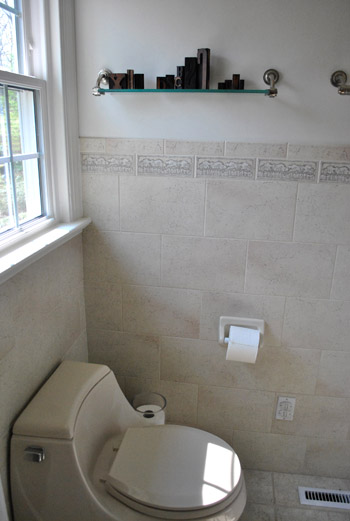
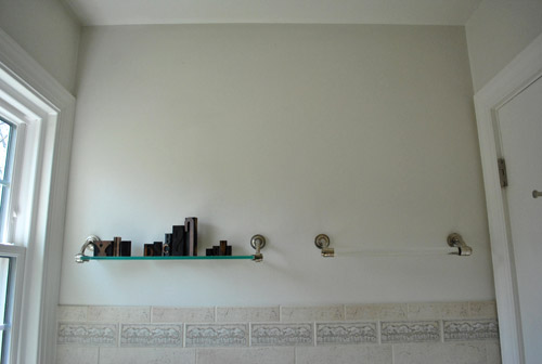
Here’s another before pic of the shelf and towel bar that we inherited (you almost felt like you might scrape your body on them whenever you walked in since it was such a tight space):
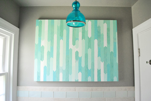
And here’s that wall now that we hung some DIY artwork I already had around and added a pretty blue pendant that we recently centered on the window and door:
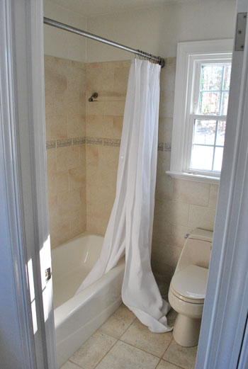
Here’s an old pic of the room from the hall before we even raised the shower curtain (it was taken on move in day)!
And here’s a shot from that angle now. It’s definitely not an entirely new room, but a few small upgrades added up to a nice little facelift that makes it feel a lot fresher, cleaner, newer, and less beige-on-beige. See how breaking things up with more white and dark gray paint along with some pops of cool blue make the tile feel a lot less pinky-beige than it did before we added those cool-toned accents and pops of white to temper things?
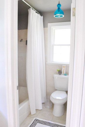
And since I can’t stop at just a few before and after pics, here are two more fun little detail shots. You know, for posterity.
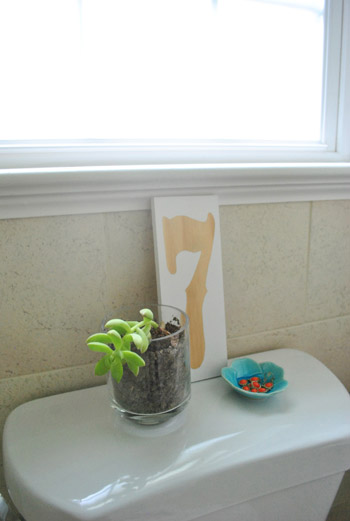
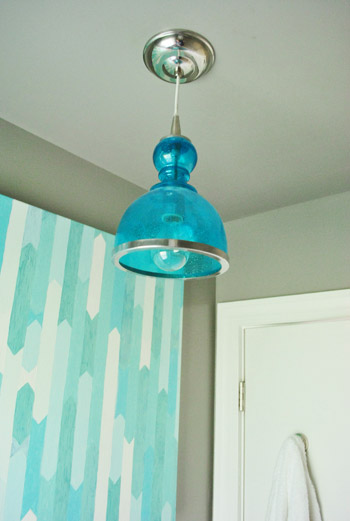
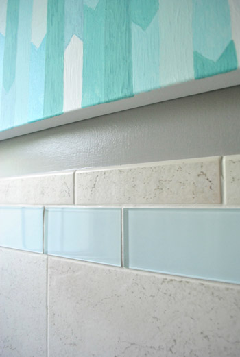
I think our favorite upgrade in here is the hardest to catch on film (in person it’s definitely what “shifted” this room from feeling old to feeling crisp and new), which is the little border tile switch-out.
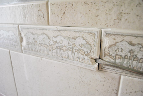
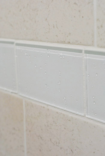
The new “snow white” clear glass tiles make such a difference (they’re not blue at all, they just reflect the accent color in these pics for some reason, so they look blue-green here).
My favorite thing about them is how they make little droplets of water that fall on them in the shower glitter like tiny glass beads.
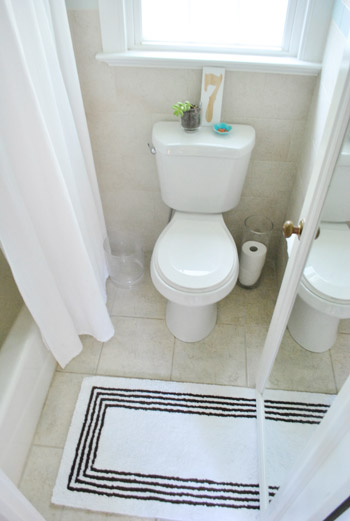
Here’s a shot that shows how tiny the room really is. Somehow shooting the floor seems to capture it best as the tiny space that it is. Yup, it’s literally four tiles deep and around three and a half tiles wide. Teensy. But cute.
So now our bathroom to-do list looks like this:
paint the walls so they have some contrastreplace the boob lightpaint the cream trim whitehang some bathroom-friendly artcraigslist the toilet and replace it with a classic white onedo something to add privacy to the windownix the ugly and cluttered showerhead caddyremove the door so we can shave the bottom to allow for a rug/bathmat (and add a door stopper so it doesn’t squash the art)replace the border tile around the roommove the blue pendant light to hang centered in front of the window- finally get a bath mat <– since this one is borrowed from the guest bath, we still have to get on that
- replace the floor tile & possibly reglaze the wall tile, just to completely freshen this old beige box (phase 2)
And our budget breakdown looks like this:
- painting the walls a moody gray color (Benjamin Moore’s Rockport Gray in Natura, we only needed a quart): $16
- upgrading an old boob light for a blue glass pendant from a local outlet (for around $100 less than one by Ballard): $80
- hanging a painting I made about a year ago and painting the trim white (with trim paint we already had): $0
- selling our old beige Kohler toilet on craigslist (for $60) and buying a taller white Glacier Bay one for $88: $28
- frosting the window for privacy (without blocking too much light): $0 (we had frosting film leftover from another project, but it’s usually around $20 for a giant tube of it at Home Depot)
- adding shower caddies for shampoo/soap/conditioner storage: $22
- trimming down the door so we could actually use a bath mat (the door was so tight to the floor it didn’t open all the way since it got caught on an air vent in the floor): $0
- redoing the new border tile (more on that here and here): $84
- moving the light so it’s centered on the window and door instead of oddly close to the shower curtain: $0
- TOTAL SPENT: $230
You can spend $230 on a toilet or a bathroom light alone, so that total makes us pretty darn happy. Even though it’s tiny, we crammed in lots of updates and it was nice to take things one week at a time and just do as much as we could handle as we inched along. I’m telling you, the “no rush” approach really does cut down on the stress-factor of a bathroom redo (especially when you’re not demo-ing your only full bathroom down to the studs so you don’t have anywhere to shower like we did at our first house). What about you guys? Have you bought any new toilets? Updated any border tile? Painted the walls? Hosted any bath mat fashion shows? I can’t wait to get my bath mat fashion show on when it comes to finally picking one for this room (so I can finally return the one above to the guest bathroom where it rightfully belongs).
Psst- To follow this bathroom sprucing project from the start, check out this planning post, this painting post, this light-swapping post, this art and trim-painting post, this toilet-updating post, this window frosting and shampoo wrangling post, this door trimming post, this border tile demo post, this border retiling post, and this post about moving the light.

Martha says
I think if you redid the floor eventually the beige tile on the walls would be fine! You’ve made the room look amazing already. I really, really love the art and the light together.
YoungHouseLove says
Aw thanks Martha!
xo,
s
Mesha Kendrick says
Just out of curiosity … what do you do for a vent fan? You may have mentioned it and I didnt notice, but I am really needing a solution in our bathroom which does not have one.
Looks great by the way!
YoungHouseLove says
We don’t have one in here (when we moved in we were really nervous and thought we would need to add one, but for whatever reason after a year and a half here we’ve been ok without it). We definitely leave the door open after we hop out to let things air out, but so far, so good!
xo,
s
Rasonda says
I was SOOO coming to ask this. We have an ugly fan that I was hoping to get rid of based on YHL’s response, but I am a little hesitant. The bathroom looks fresh and beautiful btw.
YoungHouseLove says
I would try using the room for a little while without it to see if you need it. Some rooms are stuffier than others (the bathroom in our old house needed one for sure)! Hope it helps!
xo,
s
Tara says
I recently made a comment to my husband about how I just noticed after 3 years that our master bathroom doesn’t have a fan and our guest bathroom does. He replied matter of factly that it’s because our master bathroom has a window and our guest bathroom doesn’t. I don’t know if he’s right, but it made sense to me. Maybe that’s the logic?
YoungHouseLove says
That could make a difference I think!
xo,
s
Amy says
Hey there!! Is your tub almond too? We have almond tub and toilet, and I’d love to at least change the toilet to a white one..just not sure if it will look odd having a white toilet and an almond tub. Just don’t have the $$ to do both right now. Thanks!!!
YoungHouseLove says
The tub is a weird color that’s sort of between white and almond. Haha. It’s exactly the same color as the tile, so we thought “why not add other pops of white with trim, toilet, shower curtain, etc – and then leave some of the beige color like the tile and the tub?” which seems to work ok together for now!
xo,
s
Kristina Strain says
Er, uh, don’t you mean “for posterity”? That made me chuckle. It’s impressive what a huge improvement moving that light fixture made!
YoungHouseLove says
Haha- yes!
xo,
s
kate says
Maybe I missed this, but where did you find a super tall shower curtain, or did you make it? Our bathroom is like a bathroom made for ants and I’d love to imitate your shower curtain trick :)
YoungHouseLove says
That was from amazon.com a while back! I searched for extra long shower curtain and 95 inch shower curtain to see what came up!
xo,
s
Monika says
Is your tub white and only the old toilet cream? We have an ALL cream bathroom. I wanted to reglaze the tiles white but that would leave the tub cream colored (sadly it’s not ceramic and can’t be glazed). I’m not sure if that will open a can of worms with having to replace the tub as well…
YoungHouseLove says
The tub is the same cream color as the tiles while the toilet was more of a darker beige. We switched that out for a white one to go with the white trim and shower curtain, and the cream tub still blends right in because it’s the same color as the tile!
xo,
s
Sarah says
Looks beautiful! Love the DIY art!
Ginny @ goofymonkeys says
The difference is amazing with a few smaller changes! And very frugal too :)
meghan cresawn says
Maybe you’ve mentioned this, but have you considered closing off the sink area and combining that with the toilet/shower area to make one big bathroom space? I was just thinking maybe joining the two would give you more room to work with, but it’s always hard to tell without having actually been in the space before. Just curious!
YoungHouseLove says
We have thought about it, but it would mean losing the light that comes into our bedroom from that window above the sink (it’s a dark room so we’re not that into that idea) and also would be a very long and narrow room, so it could be really awkward (only 6 feet wide by 12 feet long).
xo,
s
sarah says
You wouldn’t think that painting the ceiling darker would make the room feel taller but it totally does. I’m so impressed.
YoungHouseLove says
Thanks Sarah!
xo,
s
Paige @ Little Nostalgia says
It looks totally different! The two things that really made the biggest change for me were the paint and the shower curtain. They draw your eyeballs right up.
Sarah says
Where do you buy your BM paint? It’s crazy expensive at every place around my home (DC area) that carries it. Is this just city prices or am I missing something?
YoungHouseLove says
We just got a quart, so it’s less than a gallon. We get it at Virginia paint here in Richmond! It’s more money for certain types (ex: Natura, but we love that it’s no-VOC). Hope it helps!
xo,
s
Gabriella @ Our Life In Action says
OH SNAP SON!!!! I can’t believe that cost you $230.
We are redoing our bathroom right now…hope we can save as much as you. LOVE the DIY art piece. I’m going to copy that (if you don’t mind) using different colours. I love it!
YoungHouseLove says
Hahah- thanks Gabriella. I miss oh snap + son. Gotta work that combo more. Haha.
xo,
s
Allie ~ This Yellow House says
Wow! It looks so good! My favorite part is the art. Or maybe the light fixture. Ok I can’t pick, they are both great lol. Even tho it’s small room it has a lot of style!
Kathleen says
It all looks great! Good luck on your hunt for the perfect bath mat. I have to admit, that was the hardest part of our recent bathroom remodel. Luckily, I finally decided on one that I liked from Target. I should have just started my search there!
Check out our full renovation: http://projectsatthepicketts.blogspot.com/2012/07/i-painted-shower-curtain.html
YoungHouseLove says
SO cute! Love the whole room!
xo,
s
Sharin says
Just finished putting 1/2in hexagon tile in the weekend in black and white, while it looks amazing, especially after grouting, it was extremely difficult to line up the sheets. So I have a few oops spots that are hidden by the toilet and hutch we are putting in. Up next trim painting and subway tile for the bath surround, and installing the toilet and sink!
YoungHouseLove says
Sounds awesome! That makes me want to tackle it rightthissecond. I’m so bad at waiting! Haha.
xo,
s
Stephanie says
Love love LOVE this. I have 2.5 bathrooms in my townhouse all of which need a little love. So I’ve really enjoyed watching you tackle this bathroom. It’s amazing how these little updates created such an awesome room. I’m sure it’d look even better if you gutted it, but I think it’s awesome as is.
I haven’t done much yet to my bathrooms (like, I haven’t even painted…) but the best decision I made was to take the door off the tub/shower combo in the second bath and put up a curtain. We got one of those curved ones. It makes the bathroom look HUGE in comparison to before.
I have big plans for my half bath though. It’s tiny but it could look so fab. Just needs some TLC.
YoungHouseLove says
Aw, thanks Stephanie. You’re sweet. I have been in hotels with those curved rods and they’re so much fun!
xo,
s
Stephanie says
Yeah, it’s pretty sweet looking. I don’t actually use that bathroom, but it makes me happy to walk by it.
Leslie says
I think you may have just solved my pinky-beige room problem! We painted our tiny half bath “greige” recently, but it’s definitely been reading pink. I’ve been wracking my brain trying to think of an accent color for towels and art and such that will cut back on the pink-ness. And here you are, with your blue accents to save my bathroom. Yay!
P.S. I love the bathroom.
YoungHouseLove says
Aw thanks Leslie! Good luck with your room!
xo,
s
Ally says
Looks fantastic as always, Youngsters! :)
(I confess ~ I giggled upon seeing your #7 sitting on the toilet tank. I know it’s your lucky number, but all I could think was: That poop gets a 7 from the Russian judge! Maybe you should add a lucky #2? :)
xox
YoungHouseLove says
Haha- we always think of the Friends thing with Monica saying seven…seven….seven…seven. Haha.
xo,
s
Julia @ Life on Churchill says
It looks really good. I’m glad you did away with those glass shelves–and replacing the tiles was so smart. and for the price? amazing!
Crystal @ 29 Rue House says
This makes me want to do a full bath reno right this second! I’m surprised you didn’t link to the whole shelf/towel bar debacle! haha
YoungHouseLove says
Haha- oh yes, and then there was that.
xo,
s
Katy @ The Non-Consumer Advocate says
Looks great! I really do love the light fixture, so very much.
I am a firm believer than great light fixtures make the room. Here’s a post I wrote about repainting a rusty existing bathroom fixture to show off a darling vintage globe that I picked up at Goodwill for a couple of bucks:
http://thenonconsumeradvocate.com/2012/02/before-and-after-rusted-out-bathroom-light-fixture/
Katy
YoungHouseLove says
So cute! I totally agree that a light can make or break a space! Lights + paint (and curtains in a room other than a bathroom) can make such a difference!!
xo,
s
Katy @ The Non-Consumer Advocate says
Thanks! We put in $3 ceiling fixtures throughout our house when we bought the it in 1996 and have slowly been replacing them ever since. The only one left is in my older son’s room, but the ceiling is low, so the options are limited.
And BTW, did John experience any sweat lodge style visions while up in the attic? Cause that would have made it totally worth it! ;-)
Katy
YoungHouseLove says
Haha- I wish! Maybe next time (he says as he crosses his fingers that there’s never a next time).
-John
gina says
Love it, so pretty!
everything yall do is super duper!
Love yall.
hugs
-gina
Karen says
It looks great! I love the blue light fixture!
Candice says
I think it’s a great makeover. My fave is the tile. Quick question. If this were a larger bathroom, where would you place the rug(s)? I’m having a hard time with that in our new house (with bigger bathrooms!), but I definitely don’t like the potty-shaped rug.
YoungHouseLove says
Hmm, I think one to step out of from the tub is the only one you’d really need, right? I mean you could put one in front of the sink if you’d like (for color or interest) but the tub one is the functional one, so unless more would look better (and not cluttered) I’d keep it simple. Hope it helps!
xo,
s
shannon says
Totally unrelated, but I just have to give you props for all the Friends references lately (I noticed one in the comments). :)
YoungHouseLove says
Haha- thanks! Such a good show, gotta show the love.
xo,
s
Megan @ Two Live Colorfully says
I just love that light fixture! Such a bright pop of color!
Vanessa says
Looks great! I thought for sure someone whould have asked this by now-maybe I’m just the odd ball….what is the purpose of the short glass vase on the floor near the toilet? It’s just driving me crazy to wonder what goes in there. Towels? Soap? Magazines?
YoungHouseLove says
That’s a small acrylic trash can. Since it’s clear it feels less cluttered, but still works for wadded up tissues and stuff. Haha.
xo,
s
Becky says
Love.It. If the only light in my bathroom comes from a window above the shower, should I still use the ceiling to floor shower curtain?
Thanks. ~Becky in No. Calif.
YoungHouseLove says
I think in a light color (white) it should be fine! Our window and light are both outside of the curtain but it sort of glows through if that makes sense. No issues seeing things, even when we shower at night.
xo,
s
Koliti says
Your art and colors certainly brightened up your bathroom!
I appreciate your “just because we can, doesn’t mean we should” approach. (Completely gutting the room vs cosmetic, lively up-grades).
Your creative-eye and off-the-beaten-path-solution-seeking skills infuse your space with personality, charm, and FUN!
Jen M says
Everything turned out great! One questions [which may have already been asked] – now that you no longer have the towel rack, where do you put/hang your towels for before & after your shower? Back of the door? Just curious :)
YoungHouseLove says
Yup, two hooks on the back of the door work for us!
xo,
s
Ashley@AttemptsAtDomestication says
It’s definitely a big improvement! I love how much brighter it looks!
Megan F says
I have had terrible luck getting a succulent to live on the back of the toilet… any tips? I’ve even moved the little planter into a hurricane vase with rock. Looks pretty, but in a week or two the plant is dead. I have a snake plant on the counter that has thrived with the filtered light in that room (frosted glass) but just can’t win with succulents. Happy to hear suggestions if you have them!
YoungHouseLove says
We are only about 50% successful with plants in our house. Haha. One black thumb and one green one maybe? No tips, other than if something looks unhappy we move it to another spot and try to see if we are watering it too much (usually the issue, as opposed to watering too little).
xo,
s
Zoë says
Whoo boy, did we ever buy a new toilet, put in new tile, paint some walls, tried out different bath mats. In fact, I’m getting ready to send you some bathroom renovation pictures soon.
YoungHouseLove says
Yay! Would love to see them!
xo,
s
Natalie Czimskey says
Phi Sigma Pi eh? You may be the most famous alum. :-)
Kelsey says
The blue light fixture is the biggest game changer in my opinion. I love it! We are cursed with a teeny tiny master bath, too and our door swings in just barely missing the toilet – did you ever consider having the door swing out? I think most bathroom doors swing in but I think about swapping ours around all the time so wondered if you guys had considered it and if so why you decided against it?
YoungHouseLove says
We did think about that, but it would block the sink that way (and the sun coming through that window, which is one of the reasons we love that nook). So for now swinging in works better for us. But if your room has a different layout it could be a great choice!
xo,
s
Nicole Marie says
The bathroom looks wonderful! Did you ever think about changing the hinges so that the door opens out and not into the shower space? That way you might get a little more room in the space.
Just a thought…you guys did a terrific job!
YoungHouseLove says
Sadly it would block the sink that way (and the light that comes in from the window above it, which is one of our favorite things about that nook) so it wouldn’t work for us!
xo,
s
heather says
It’s nice you guys do these recaps so you can see it all in one place. I forgot a bunch of the little details over time. It really does look so much better. My favorite part is the toilet – where is it from again? I know it wasn’t expensive and it looks like it would be a great fit for our master bathroom (tall and small).
Even though you wouldn’t know it from my Pinterest, we aren’t onto our bathroom yet (my brain is well underway on the project though). That said, the boys did get 70 trusses cut this weekend for the house! They all got installed last night, which i’m writing a post about now. Here’s the “getting to that point” one though.
http://www.likeacupoftea.com/weekend-warriors/
YoungHouseLove says
It was from Home Depot (called Glacier Bay- we heard lots of good reviews and have been really happy with it so far). And wahoo for getting those trusses installed! Tons of work!
xo,
s
Marcia says
Love your site and didn’t know where to mention this but the link on the “House-Crashing” page from the last house you visited doesn’t seem to work. I get an error message when I try to see that lovely place with the white and black-wallpapered entryway and silver lamps.
YoungHouseLove says
Thanks for the tip Marcia! Off to fix it!
xo,
s
Priti says
WOW, that’s a great makeover. I like the glass tiles that you have used, don’t know where will find it in India but will definitely try it out. Can you please tell me if it’s a glass door in the last image or it’s just a mirror.
YoungHouseLove says
It’s a mirror that we framed out with molding to make it look built into the door!
xo,
s
Jane in STL says
Inspiring, as usual. As we embark on a complete bathroom gut job I have a couple of questions for anyone interested in answering. Our old home has ceramic tile on all of the bathroom walls. We are hoping to replace just those in the shower area and paint the rest of the new walls. Is there any need (utilitarian or aesthetic) to have tiles all around? And, since we have reglazed the tub twice now, and really don’t want to smash and haul a cast iron tub down 2 flights of refinished steps and floors, what’s the feedback on those retrofitted tub cover up thingees that just slip over the old tub? Maybe they are fiberglass and seem to come in all tub designs, sizes and shapes. Thoughts?
YoungHouseLove says
Anyone have feedback for Jane?
xo,
s
Priti says
Hi Jane, I would like to add that, yes it is necessary to use tiles in the bathroom since its the most moist area of our home and a plain wall will absorb a lot of water and make it more humid, but there are options that you can use tiles to cover only half of the portion of walls, I mean may 4-5 ft. from lower to the middle portion of the walls(vertically).
Sarah says
I’m curious about the professional reglazing possibility. We moved into a great just-built house last summer with subway tile backsplash in the kitchen–great in theory, but it’s a boring light brown. In my ideal world it would be white, but since it’s new I don’t really want to completely redo it. Do you have any advice about this process?
YoungHouseLove says
We got it done and really were happy with it (in our first house’s bathroom- on the tub). I would research a company and even call people they have worked for to get references. Apparently if done well it can last for over a decade, but if done poorly you can pay just as much and it can peel within a year!
xo,
s
John@Our Home From Scratch says
I love your bathroom. Especially the glass tiles you swapped! We still have a very bland builder grade bathroom that we’re just beginning to brainstorm on, but it’s going to be a long while before we get to it.
We had hex tiles in our first home’s bathroom. We added them during the renovation. They were awesome! It’s a very classic look. Only downside is they have a lot of grout lines, so they may need to be cleaned more often.
Jana says
I see from comments above that you don’t have an exhaust fan in this bathroom but maybe you can advise me based off previous/other bathrooms experience. I really want to put in an extra long shower curtain in our tiny bathroom but I’m concerned that elevating the tension rod close to the ceiling will block the steam and moisture from getting to the exhaust fan. Any thoughts?
YoungHouseLove says
We haven’t had any issues with that in our last house or this one. There’s usually a few inches above the rod and there’s circulation on the sides, so a rod to the ceiling doesn’t turn your shower into a steam shower or anything!
xo,
s
Krissy says
Ooh wow it looks fabulous! Loving the blue light and the painting, especially.
I’m hopeful that we will be able to start on small projects in our master bath, soon.. Lots of beigy tile to replace.. Even on the countertop. :-( (I hate grout, and especially hate cleaning grout on counters. Sigh.)
Carli says
What a nice improvement overall! For so little cost, you really made a big difference! Well done :)
Kate C. says
I know you won’t post this, let alone acknowledge this as you don’t post negative reviews. I have read your blog for YEARS and have loved watching you guys DIY. I recently stopped reading so frequently because the DIY projects were getting more and more…. hokey. I logged in today to check out the new projects to see the master bathroom redo. I am so disappointed. It looks like a college dorm room. The tile job doesn’t match, the rug looks cheap and out of place, the painting doesn’t fit the color scheme or the wall, the toilet is a nice touch but paired with the almond toilet holder makes no sense and the light, for the love of god, is bright teal. I have read many comments, especially on the bump, that smacks you guys down and I’ve always stood up for you because you seemed like honest people doing quality work on a budget. Enough is enough though. Stop being so freaking cheap and do it right.
YoungHouseLove says
Of course I’ll post this! We know as we make our house a home and share our choices they’re not going to be for everyone! We think the more personal you make a space, the less it’ll appeal to the masses, but the more it can feel like “you” if that makes sense! We’re very proud of the love we’ve poured into our house because, although it’s less safe & neutral, it’s much happier and more “us” than our first house. Sometimes we spend more money (ex: our cobblestone patio, our kitchen, our deck) and sometimes we work with what we have & avoid a total gut job if it’s not in the budget (like this bathroom, which is full of small updates anyone can do). Can’t splurge in every corner! And many readers seem to appreciate small budget-friendly changes as much as the larger renos we share. Besides, one man’s love-of-God-teal-light is another man’s (or lady’s) treasure!
xo,
s
Liz says
Can you let us know where you bought the blue light fixture or what the manufacturer is. It is such a pretty fixture.
YoungHouseLove says
Thanks Liz! It’s from a lighting store called Shades Of Light (shadesoflight.com), but we found it at a local lighting outlet called The Decorating Outlet here in Richmond! Ballard Designs also sells something similar if that helps.
xo,
s
Judy says
Love following you.. we too are doing our tiny little bathroom. I would love your philosophy of the one piece toilet vs. the 2 pc. If your Kohler toilet had of been white, would you have kept it? Our bathroom is so small that the one set of drawers in the cabinet can’t be opened fully because of the tank.. thus I was going to go for the shorter ‘squattier’ type toilet.. (I’m also changing from beige to white). There are so many type of toilets too.. the forums all say not to skimp on the price of toilets. They can be expensive! Did you look at the height of the bowl? (for a more comfty seat).. or the Flush maintenance number ? 1000/750/300? Maybe I’m overdoing my analysis of it.
YoungHouseLove says
It was a little low, so now that we have upgraded we realize a taller one is a lot more comfortable for us. Maybe try sitting on one in a showroom? Is that terrible? Might help you see if it feels right for you. When it came to choosing our new toilet, we just went with one that had lots of good ratings and a good price. Hope it helps!
xo,
s
Karen says
Love that teal light in the bathroom and all the other improvements. Sorry if this was asked before, but does it give off a teal-like light to the room, and if so, does it make putting on make-up a challenge (not that you ever need to wear make-up!). Thanks!
YoungHouseLove says
Thankfully it only gives off white light (since the light shines down on the room, and the bulb is clear). We asked that in the store though! Didn’t want to look like smurfs in there!
xo,
s