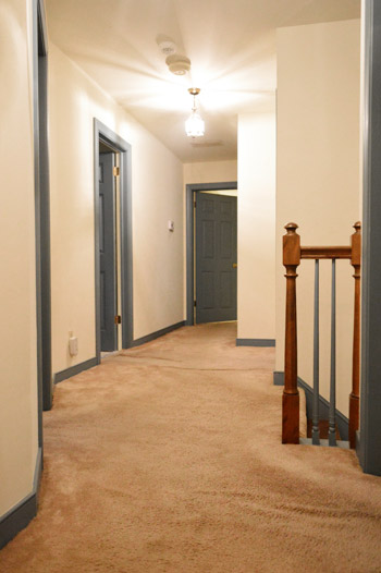
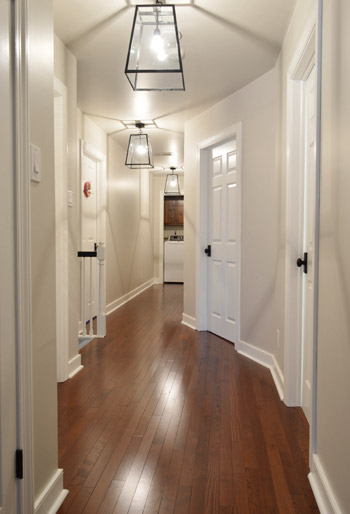
From moment one of seeing this house, something about the view of a series of three lights all in a row(ish) in the upstairs hallway made us inexplicably excited. Just call it “the tri-light zone” effect. We just knew that arrangement had serious potential. You know, once we looked past the old carpeting and the blue trim.
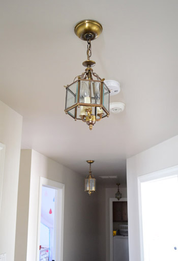
The existing lights were a little undersized for us (pictures don’t do it justice, but this is a 33 foot long hallway!), so although we considered spray painting them another color (oil-rubbed bronze? red? navy?), I worried it’d make them look a bit more gothic cathedral than we wanted. Plus, all three of them were crooked, one of them had a broken stem, and the middle one was actually bigger than the other two.
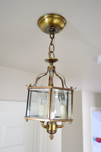
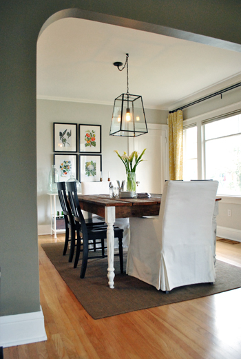
I’ve had these fixtures mentally bookmarked for years. Ever since we saw them in a House Crashing that we did in Portland, OR in 2012 I’ve wanted to work them into our home somehow. I like that they’re a mix of classic and modern, and that their dark finish offers some nice contrast but isn’t too heavy looking thanks to all the glass. The good news is that Sherry was with me (we don’t always agree on lights, so sometimes finding something we both like takes a while). The only issue was that the $250 price tag was a bit much for us since we’d need to buy three of them.
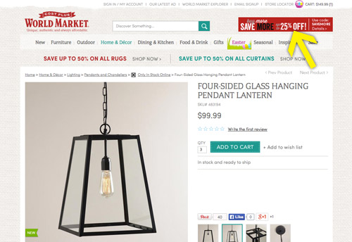
We hoped to find something similar at a local lighting outlet that we frequent (and even checked craigslist and the ReStore occasionally) but coming by three identical fixtures was tough. Then Sherry got an email alert about a World Market sale (25% off orders over $150) which lead her to these puppies – and we realized that after the sale they’d be $75 each, which means we could buy all three for less than the price of our single inspiration fixture!
Normally I wouldn’t take you through the installation process again, since I feel like I’ve done lots of posts like these – but I actually picked up a couple of tricks (albeit small ones) from observing the electrician work his magic at the showhouse. Trick #1 being leave the protective packaging on during installation. I guess I’ve always been so eager to unveil our new purchases that the first thing I usually did was strip away all of the plastic, cardboard and styrofoam. But I had a “well duh!” moment watching the electrician leave it all on (well, whatever didn’t interfere with installing it) to help prevent any damage while he worked. Of course he took it off before firing up the power and adding a bulb, but just hanging them with the added protection felt a lot better than rushing to strip it before manhandling things into place.
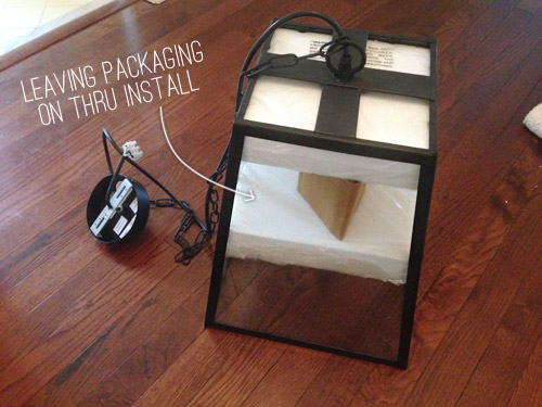
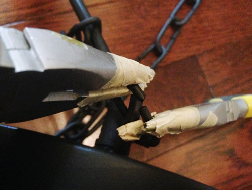
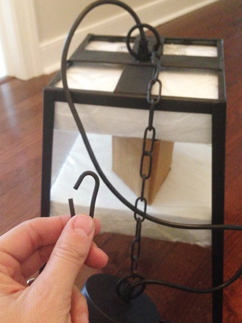
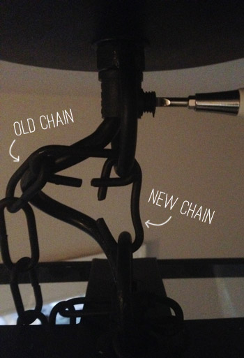
Obviously I would’ve loved to let these babies hang down on their chains a bit, but our 8ft ceilings weren’t gonna let it happen. So we had to shorten the chain by prying the links open with two pairs of pliers, the tips of which I wrapped in masking tape to keep them from scratching the finish off.
The previous lighting had been a bit low for my 6-foot self (well, the middle one outside of Clara’s room was – since that lantern was inexplicably larger than the other two), so we decided to hang the new lights by just one chain link – which would put them all a couple inches higher than that old middle light (it hung about 75″ from the ground). So even though these are larger scale fixtures, the bottom of each lantern ended up being 77″ from the floor after installation.
But back to the single link method. I kept one link handy, but left a longer string on the fixture for the time being. More on that in a minute.
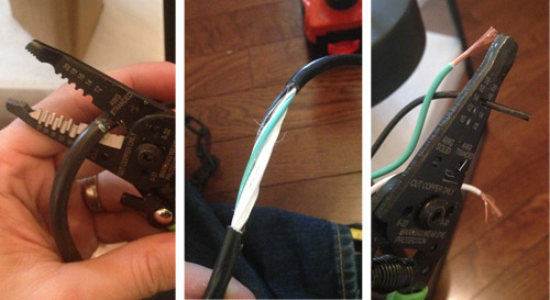
In addition to shortening the chain, I had to shorten the cord. So using my wire cutters I cut open the wire cover, pulled it off, and then stripped the ends of the white, black, and green wires.
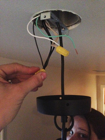
With Sherry supporting the fixture, I connected the wires to the matching ones in the ceiling. Sorry for the grainy pic, but we had the power off so lighting was limited up there.
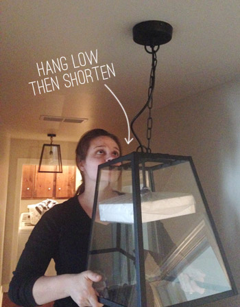
The second trick I picked up was to hang the fixture low and then raise it to your final desired height. With most light fixtures it’s much easier to raise them (by removing chain or feeding more wire into the ceiling) than to make them lower, especially if you’ve already cut your wire. So not only is this an easier way to get your perfect height, in our case it made installation much easier because Sherry didn’t have to hold the light as high and I wasn’t wiring in such a cramped space between the fixture and the ceiling.
Once everything was secured, I swapped out the long chain for the my single link and pushed the excess wire up into the canopy. You can see my screwdriver tightening the screw that pinches the wire in place.
It still took a fair amount of time to get all three installed. Maybe 3 hours? I always have a tough time guessing since I’m slowed down by photo taking and, in this case, fielding showhouse calls. But in the end we love the result.
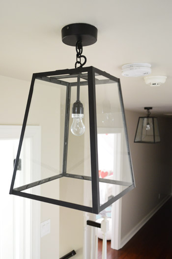
Just like the light in our foyer downstairs, we really like the high contrast look that these add. Even the way they tie into the dark door hinges, doorknobs, and the stained stair rail and runner that lead downstairs seems to make things feel more deliberate. They’re a bit oversized for the space, which may bother some folks – but it’s kinda what I dig most about them.
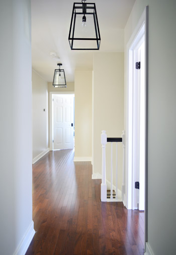
Adding some substantial wainscoting, interesting art, and other hallway updates should definitely bring more balance. So here’s our remaining to-do list:
- Reinstall & maybe modify the doors in front of the laundry area
- Add crown molding (not looking forward to those angles!)
- Add some nice thick wainscoting (it’ll bring more substance to the bottom half of the hallway)
- Get some art going on
Just for fun, here’s a hallway before shot for comparison.
In the function column, I feared that it might be a little darker (going from three 3-bulb fixtures to three single bulbs), but these take a higher wattage (60 instead of 40) and somehow the glass seems to reflect so much that it actually feels brighter. Could also be that half of the old bulbs were burned out too, so there’s that.
Here’s how things look with the clear bulbs that came with the fixtures when they’re on. They throw some angular shadows on the ceiling, but if we want less of that look we can switch them out for frosted bulbs (eventually we’d love to get LEDs in every fixture).
UPDATE! We’ve finally transitioned our entire house to LED lights (they save tons of energy & money, and they’re a lazy person’s best friend because you never have to change them). For anyone wondering, these are our favorite interior LEDs. Their glow is warm & natural (not weird/blue like some of the others we’ve tried) and they use around 90% less energy.
*This post contains affiliate links

Sarah @ Sarah's Daybook says
I LOVE THOSE!!! That is one of my favorite things that you have done to this house! Hey, what are you doing with the light above the garage?
Sarah
http://www.sarahsdaybook.wordpress.com
YoungHouseLove says
We’re on the case! Finally! Only took us a bunch of months. Haha! Hope to have an update for you soon!
xo
s
Kati says
The tri-light zone!! Bahahahahah! So smaht. I love ’em!
Melissa @ Loving Here says
I know! As hard as I try, I just don’t think Hubs and I will ever be as witty as you with our post titles. Let us in on the secret…do you come up with these in everyday conversation while working (as in, by accident) or do you sit and brainstorm the best post title while writing until you get a witty pun that’s classy and relevant? If you all are just naturally that funny, it’s going to make me want to be your real life best friends even more!!
http://www.lovinghere.com
YoungHouseLove says
I think we are just corny and puns pop into our heads sometimes, but a lot if our posts end up being sort of straight (like “from the curb to the office” or “some overdue office organization”) so we’re not always on the ball. Haha!
xo
s
Anele @ Success Along the Weighn says
I love the way those look going down the hallway! Very snazzy! (I’m bringing snazzy back (yeah!) because it’s highly underutilized.)
YoungHouseLove says
That sounds like a Justin Timberlake remix. “I’mmmmmm bringing snazzy baaaaaack. Them other girls don’t know how to act.”
xo
s
emily bufler says
that’s totally how I read it also….JT for life!
Mary Beth says
oh my gosh I’ve been WAITING TO SEE what you did with those hall lights! I can’t believe how much I love what you chose – your lighting tastes are impeccable… lol.
Just YESTERDAY I did a post on incredible light fixtures – and how it IS possible to find some inexpensive counterparts.
:)
Too funny!!
http://hystericallyeverafter.com/2014/03/26/wish-list-wednesday/
I am a lighting MANIAC.
Samantha says
I love the lines the shadows cast on the walls! May not be everyone’s cup of tea but I think it adds so much interest to the space!
Mary Beth says
I never even noticed that – now I love them even more! LOL
Katie says
I think the shadows on the ceilings almost make them look vaulted and higher, which is definitely a bonus!
Mary Beth says
Oh and P to the S… I am so jealous of your 33 foot hallway!! Our upstairs hall is 8 feet.
No joke. lol.
MB
YoungHouseLove says
We go back and forth on the length of the hallway. Nice to walk through, but it takes forever to lay flooring/paint/etc. That angled wall was no joke when we were installing the hardwoods plank by plank. Haha!
xo
s
Selena Blake says
Can’t wait to see it. Do you think the wainscoting would be too busy with the angles of the hallway? Wonder if that’s something you could photoshop. I can’t get over how gorgeous the hardwood is up there!
YoungHouseLove says
I have pinned a bunch if hallways like ours with it so I’ll have to link to them when we get into that project. We love the look!
xo
s
Minnie says
I probably would’ve opted for recessed lighting, but I love this look! Great choice.
Sew says
I like this post. I think the thing I appreciate most about you guys is that you talk through the challenges of DIY so we get a great glimpse of what it really takes to do the work.I’m thinking more of the concrete countertops here, but this is nice because you mentioned the significant time investment for installing a fixture that LOOKS pretty strightforward. Thank you.
Meg says
I actually really like the shadows the lights cast around the hallway. It adds an ephemeral architectural-ish detail to the ceiling (without going all permanent with molding and such). Nice.
Rosemary says
You are so right about paying attention to the spaces you pass through a dozen times a day – these spaces somehow set the tone for the whole house. We have the same sort of set-up with the bedrooms off a hallway, and we put our 2 light fixtures on dimmers, so that when we had to turn them on at night when the kids were little, we were not blinded by the brightness. Thanks for your great blog, I just love it!
Karen says
As usual, stunning! I love your blog, even though I am probably one of your oldest admirers. You two are amazing! Best of luck with your new little one. I can’t wait until he introduced to all of your fans! Also, could your Clara be any sweeter?
As I follow you, all I can imagine is how proud your parents’ must be of what you have and are accomplishing.
YoungHouseLove says
You’re so sweet Karen. Thanks so much!
xo
s
Maureen says
These are beautiful!
Emily says
They look great! I can see wanting to upgrade to LEDs at some point, but why not CFLs in the meantime? They’re in between in price, and you can often get them super cheap with rebates/discounts from your utility.
YoungHouseLove says
Thanks Emily, we have a bunch of those under the sink that we could sub in! We use them in about 50% of the house so far, but have been hoping to slowly transition to LEDs eventually just due to the whole mercury-when-broken thing.
xo
s
Lynne says
CFL’s drive me nuts! I have them in my hallways right now, and they are so dim when I first turn them on! It takes forever for them to come up to full light. I got one that claimed to be ‘bright from the start’ (clever, no?), but while it starts off bright enough, it actually dims after a couple minutes. So annoying! I am slowly trying to replace them all with LED’s.
haverwench says
This doesn’t seem like a spot where the bulbs would be at all likely to get jostled and broken, though. A bigger concern is, how often do you switch them on and off? The CFLs wear out much faster when they’re switched on and off frequently, which is why they’re not the best choice for bathrooms or closets. (However, we use them in our bathrooms anyway, and they still last for years.)
YoungHouseLove says
That’s a good point! I think I always worry about when I change them I might be up on a ladder and drop them, but so far I haven’t done that. Whew…
xo
s
Sandra T says
I once read that experts(!) were recommending that we change all of our lights to CFLs, and then someday to LEDs (this was when the LEDs first came out and were even more expensive, and not available in many sizes), but now they are just recommending to wait until you can afford it and replace any incandescents with LEDs. Yeah, the whole CFL thing was a bust! Btw, that last shot down the hallway looks great! I think the lights are a little over-sized, but it works. How about a pic with John standing underneath one to give us some perspective? :)
YoungHouseLove says
So interesting! And as for scale/perspective, the pic above the blue-trim before shot shows the lantern bottom hitting right below the doorway to Clara’s room which is 80″ from the floor, so hopefully that helps keep things in scale. John is 72″ tall and the bottom of the light is 77″ from the floor :)
xo
s
Julie says
I am not a big fan of CFLs due to the amount of time they take to warm up (they drive me insane in my kitchen), the original twisty shape, and the color they give off. That said, due to the mercury, I refuse to replace them until they die.
When I bought new lamps for my bedside table, I purchased some Cree LED bulbs at Home Depot and I am sold. They’re the first true energy efficient bulbs I’ve purchased that give off a beautiful light, they don’t require a warm up time, they work on a dimmer, and they’re pretty darn affordable!
Susan says
CFLs are great in rooms where you’ll have on the light for extended periods of time so they do come up to full brightness. In our hall, it tends to be an ON until we move into one of the rooms, then OFF, so they were always dim. That was annoying so we skip CFLs there. Just what works for us!
Rochelle Gorey says
Hi guys. It looks great. You mentioned doing art up here. This is the perfect space to showcase you kids’ art. That’s what we have done with our upstairs hallway and we love it!!
YoungHouseLove says
Love that!
xo
s
cappy says
I was wondering…how tall are your ceilings? We have a very dark hall upstairs and I ended up putting a light fixture that did not work at all. It hung too low and had a cap on top that blocked light from going up -major duh moment for me. I love how your lights radiate up towards the ceiling and they look perfect in height too.
YoungHouseLove says
Thanks so much Cappy! Our ceilings are standard height (well, technically they’re a few inches taller, like 8’2″). Isn’t that a funny quirk?
xo
s
Selena Blake says
I love how these feel elegant and casual. I wouldn’t have thought to put something (especially three) oversized in the hallway but it certainly makes more of a statement. Are you going to do a gallery wall up here? I’ll admit I’m missing that from the old house.
YoungHouseLove says
Me too! It’s definitely one thing we’ve considered! I think after we do the wainscoting we can see what looks nice above that visual line.
xo
s
Evelina says
These lights are so perfect for that space! I’m in love!
Kristen says
I’m not crazy about the size of the lights…. But, the shadows they cast are SO. COOL. love that
Lindsay Butler says
I know that my opinion does not matter at all, but for me this is a huge win. I am madly in love with those lights, and the entire hallway transformation.
I am so excited to see where this house ends up. Just gorgeous.
YoungHouseLove says
Thanks so much Lindsay!
xo
s
Alex says
Love them!! I don’t think they’re too big at all, even though I can’t really grasp just how long that hallway is (other than envisioning that old washer/dryer commercial with The Hallway That Never Ends). It seems balanced, though!
The hardwood floors look so good in this post! Give yourselves a pat on the back. Fa realz.
AND CAN WE JUST TAKE A MINUTE TO PROCESS THAT YOUR PORTLAND TRIP WAS TWO YEARS AGO?! Not two months ago! Oh man, time flies!
YoungHouseLove says
Isn’t that crazy?! We were back in Portland for the tour, so it was funny to realize that house crashing was from the home & garden show we did the year before!
xo
s
A'Dell says
Wait, you did the stairs!! Did I miss the post on that one ages ago or is that new? I am dyyyying to do this to my stairs so I’m eager to hear about it.
YoungHouseLove says
Oh yes, we did that a while back! Here’s that post for you. It ended up being a beast of a project (so much to paint, so many staples to remove, etc) but we’re so happy with how it came out!
xo
s
Vanessa says
These look great! Any tips on gauging (especially when buying online) how much space a fixture will take up and how much light they will let off? Like you mentioned the single bulb in the glass seems to give off more light then 3 old ones. It’s not like a rug where you can measure and map out/tape off how big it will be.
I always forget about world market – what a great find!
YoungHouseLove says
We double check the measurements before ordering (sometimes they just include the measurements of the fixture, and sometimes they include a drop from the ceiling if that’s fixed in some way, and not adjustable like a chain). Then we stand in that spot with a measuring tape to make sure there’s not too much drop/it’s not too low. For wattage, we just try to take room size into account (the hallway is super long, but not nearly as wide as most rooms, so we figured that three lamps with one bulb in different points throughout the hall should bounce around more than enough light). The bonus was realizing since they don’t have shades and their reflective glass makes them even brighter than we expected.
xo
s
MB says
I love these!!!! I’ve been eyeing the one from Pottery barn but of course it’s too expensive. Maybe I’ll get this one…
MB says
Just so you know, I went and bought the same light yesterday! Only $68! Thanks for inspiring me to get one :)
Oh and can John come over and hang it for me?
YoungHouseLove says
AWESOME! I’ll send John right over ;)
xo
s
Heidi says
I am envious of your ceiling height! I’m stuck with short ceilings, but I’d love to have lights like that in my hallway. I agree with others – that hallway would look amazing with a gallery wall or some wainscoting.
http://jax-and-jewels.blogspot.com
erin says
i dig it!!!!!! it looks like a million bucks!
Emily says
My husband and I have been working on a dramatic hallway update and should be putting the finishing touches up tonight. It started by wanting to change a light fixture and cover some old popcorn ceiling and morphed into a whole house rewire to replace knob and tube wiring from 1928. Yikes! After several weeks, and a mad dash the last few days, we finally have a safe and up to code house with gorgeous wood slat ceilings and chunky crown molding. Thanks to John and his Kreg crown pro tutorial, we were able to put up crown molding fairly painlessly for our first time! And I think my hubby is finally jumping on the DIY bandwagon with me :)
YoungHouseLove says
So glad!
xo
s
Shanna says
I like the lights, but the scale looks really off in the hallway. I think the lights are too large for the space. Obviously just my opinion here and it’s great that they were such a steal price-wise (and they are an improvement from what was there before). But I’m not sure it all works.
Jackie says
I agree – I like the lights but the scale doesn’t look right. Maybe if there were a photo with John standing under one?
YoungHouseLove says
We’d love to work a picture like that into a future post! In the meantime, if you compare the light outside of Clara’s room to her doorway in this shot, you can get some sense of scale (doorways are 80? from the floor and you can see their relation in that pic). John’s 72? tall, and the bottom of the lanterns hit at 77? from the floor. We also think once we add some visual weight to the bottom of the walls with wainscoting it’ll balance things out :)
xo
s
Jessie says
I agree. They are too big and angular for the space! I love the lights, just not in that hallway.
Laura @ Rather Square says
I love the clean lines of these fixtures! And it’s interesting how you saw them in a different setting at first (over a dining table) and thought to use them in a hallway instead. Thinking outside the box/lantern!
Jennah says
Can you share a pic with Jon standing under one? I love the style, but they look so low!
YoungHouseLove says
If you compare the one outside of Clara’s room to her doorway in this shot, you can get some sense of scale (doorways are 80″ from the floor and you can see their relation in that pic). John’s doing some showhouse stuff right now so he’s not home to snap a picture, but he’s 72″ tall and the bottom of the lanterns hit at 77″ :)
xo
s
katie {deranchification} says
Love, love, love the new lights! We actually picked out the same-ish ones for our long hallway and adjacent entry way and were able to find them at the Ballard Outlet. We hung ours lower though, and now you have me second-guessing that…
http://www.deranchification.com/2013/07/seeing-the-hallway-in-a-new-light/
YoungHouseLove says
Those look awesome Katie! I love them!
xo
s
Robin says
Wow! I never would have pictured those there. It looks natural in that dining room. But I think you made them work! I just love anything but standard boring hall lights.
Laurie says
Those are great! The hallway looks REALLY updated now.
I know what you mean by hallway. I started making mine over, which sounds crazy because it’s a hallway, but it has actually been a lot of work. But hey, it has a lot of visibility from the front door so it makes sense to update such a prominent space in your house!
Julia@Cuckoo4Design says
They are totally perfect for the hallway. Such a statement to have three of them in a row.
Debra @ MsMoozys Open House says
Oh I love how this turned out…..Hey btw what a great run and slide hallways, my kids and I would LOVE it! LOL Sorry just had to add that in. :-)
Beth says
I love them! Have you guys thought about a pocket door for the laundry room? That would give you some extra wall space!
YoungHouseLove says
Ooh, that would be nice!
xo
s
Lindsey says
As I watch what you do with this house, I wonder if you gave the previous owners your blog address so they could see the amazing transformation you are doing with this house. Your painting kitchen cabinets post from a couple years ago has given me just the right amount of motivation to finally paint ours. Now if we could get rid of this perpetual winter so we can take the project outdoors!
YoungHouseLove says
We have actually recently been in contact with the original owner’s children. It’s so awesome to hear from them – and we hope to share some pics and letters about their time here (we heard from the first owners of our first house and it was the coolest thing to get to document on our blog).
xo
s
Stephanie says
Too funny…..that House Tour is one of my favorites, and I was literally just looking at it again for some kitchen inspiration. I love that light, and that’s awesome you found a look alike for way cheaper. In my opinion, that light is more of a focal piece, and 3 in a row might be too much. I’m not sure how else it could’ve been done though with such a long hallway. Recessed lighting, yes, but that’s no fun!
Hanna Cage says
I think they look amazing — especially when on! I knnow you recenly painted the hallway. Do you feel they changed the paint color any, since the lighting is so different? I am trying to pick paint colors for one of our rooms that does not gat a lot of natural light and wondering if I should switch out the old, horrid light fixture first.
YoungHouseLove says
It’s definitely one of those light neutral colors that changes a lot depending on the time of day/light/etc. The funny thing is that although the name is Edgecomb Gray it’s much more of a light sand color in our house during most times of the day.
xo
s
Julie. says
i love this! thank you, also, for showing how to shorten a chain. i have a dining room light that is driving me nuts with it’s too-long chain… & a kitchen one, as well. i agree how cool it is when “not real rooms” get attention paid to them & how much it makes those little walks a bit more sweet. i need to do something about my upstairs landing/hallway. maybe a fresh coat of paint, some pictures & a new light fixture? thanks for sharing, for the tip & for the inspiration!!
jeannette says
your attention to detail, and the way the two of you reach consensus on each design item, is one of the great subthemes of this saga.
but what really excites me, design dork that i am, is the fantasy video in my head of walking up your beautiful black and white graphicallly carpeted stair case to find lanterns to match upstairs. they go perfectly together in a way that makes the sum greater than its fabulous parts. it sings. good one, guys, i’m really thrilled by the visuals.
YoungHouseLove says
You’re so sweet Jeannette! I gotta say that the dark railings and striped runner leading up to this hallway give me a little thrill with these lights up.
xo
s
jeannette says
it has one of the great principles of crowd control flow, or well designed public space — visual cues that hold your hand as you walk upstairs and then down the thematically coherent hall. the more i think about it, the better it gets. go, y’all.
YoungHouseLove says
Quit making us blush.
xo
s
Coran says
Ooooo!! I like. Very much! Beautiful and bright. Was just imaging it must look good with your hinges and door knobs and then you all said it :)
Tracey Bradshaw says
It looks amazing guys – from the floors, walls, doors, trim, stairs, lights and light switches the whole hallway looks like it’s in a newly built house (as long as I squint when looking towards the laundry)!
YoungHouseLove says
Oh yes, the squint is an important element ;)
xo
s
JC says
I have been trying to figure out what lights to use to replace my boob lights in my very long, tall (9 ft) hallway. You inspired me and I just ordered 3 of these off of the World Market website!
Thanks!
YoungHouseLove says
Oh man, that’s going to look awesome! Send pics! I’m jealous of your nine footers…
xo
s
Skeeter says
That doesn’t even look like the same hallway anymore. It’s looking AH-mazing!
Emily W says
Oh- it looks so great! I don’t think the lights look too over-sized for the space.
I’ve been wondering, how are y’all on the Before Bun/Barnacle to-do list? Has most everything been accomplished? With a month out, I imagine you may have to re-prioritize some things. Or not, y’all are so amazing that you have probably finished the list and then some!!
Thank you for sharing what you do with us!
YoungHouseLove says
Good question! We’re more ahead in some areas than we expected (for example, we didn’t know if we’d get to do the kitchen counters before he came) but in other areas we’re lagging behind (I really wanted no more blue trim before he was born and we still have it staring at us from the dining room). But painting trim isn’t as invasive as sanding ardex, so it was one of those calls we made since sectioning off the dining room is easier than losing access to the kitchen and getting things all dusty with a newborn.
xo
s
meghan says
no way, I’ve been looking at this light for my stairwell after I open up the ceiling a bit. this helps envision that so much better! how wide is your hallway? thanks!
YoungHouseLove says
The hallway is 43″ wide most of the way (it widens to 62″ at the top of the landing of the stairs).
xo
s
lizaanne says
The house is coming along like crazy – it doesn’t even look like the same place!! So beautiful, fresh, and modern, but in a very classic home – a perfect blend.
I always wonder when I see your after photos if the previous owners know you have this massive blog about their old house, and what they think of the transformation. I know if I saw all this great work I’d be sad I sold it!! :-)
Julianne says
I was thinking exactly the same thing! Then I try to think about what they would do to my house so I can do it while I still live there :)
Lisa@Double Door Ranch says
Perfect choices! I’ve been trolling for light fixtures since I swapped out my ugsville ceiling fan for a Moravian Star pendant. It lit a fire and now I’m hooked!
Martha says
LOVE those lights. And until this moment I had no idea World Market sold stuff online? How do I not know these things? Glad the Petersiks got my back.
Jenny says
The new lights look great! I have been considering some clear glass fixtures similar to these myself. Which leads to my question- Do you think LED bulbs will look good when they are totally visible? Can you buy clear glass LED bulbs? Maybe I am completely missing something, but I have only seen solid white ones (which I’m afraid will look like a lamp with no shade, or white ones with fan-like fins on them which also wouldn’t look good. I have those in a capiz chandelier and I love them- but you can’t see them. I tried some candelabra LEDs in another chandelier- but they were completely visible and looked ridiculous because the bottom half of the bulb was solid white and the top half glass. This also made it so all the light was cast upward, leaving it too dark under the chandelier. I love the look of clear glass bulbs, but I’m wondering how long they will be available since incandescent bulbs are produced in the US anymore. Sorry about the long comment!
YoungHouseLove says
We have used frosted bulbs (LEDs and regular ones and even frosted CFL ones that hide the swirly behind an exterior frosted casing) in open-bulb fixtures and haven’t really minded them. Some folks are more sensitive to that stuff and love the look of clear glass bulbs or edison bulbs more (meanwhile my undertone-crazy husband swears edison bulbs are too yellow for him to like them, haha).
xo
s
carol g says
What she said. I just hung a similar fixture in my dining room that takes 4 candelabra base bulbs. That whole white base is visible on the LED’s so I just gave up and went with the incandescent. I guess it’s a balance between save energy and aesthetics.
betty says
I loooove the look of Edison bulbs but hate the yellow undertone of them, as well. I’ve kept mine in the fixture, only because I don’t use that area much, but I would love to find an ascetically pleasing light bulbs that gives off good light.