Alternate punny post title: The Updated Light Fixture Blues. That’s right, we’ve got the blues, but we’re far from sad about our “new” light fixture in the office. We just opted for indigo blue spray paint and added a giant drum shade to our old brass friend. Hence the blues joke. But you’ll get a closer look in a minute. Patience, grasshopper.
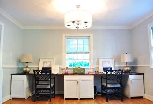
As a refresher, here’s what was there before (remember to ignore the lack of height due to the too-small frames leaning against the wall instead of proper hanging art and those we-probably-won’t-keep-them lamps on either side of our new desk). Our office was originally our house’s formal dining room, hence the whole formal dining room fixture feel.
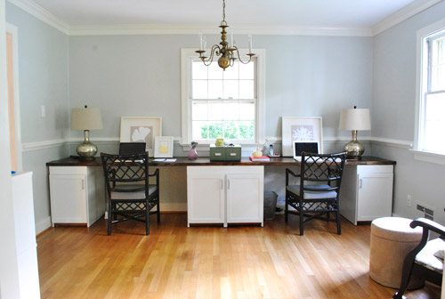
Speaking of its “feel.” Over the last nine months I’ve felt it a lot… with my head.

Though a more proper re-enactment of my many run-ins with the fixture would look something more like this. Just imagine a speech bubble with some expletives in it.

So even though the chandelier and I weren’t on speaking terms, after a brainstorming phone call with Katie B, Sherry convinced me that we should do our darndest to work with what we have. Again. See, we already spray painted a brass chandelier like this in our last dining room, so this time we wanted to do a bit more than just add a fresh coat of paint. So we decided to attempt to “modernize” it a bit by tweaking the silhouette, adding a big white drum shade around it, and bringing in some sophisticated-yet-kinda-unexpected color.
Luckily we had no trouble finding a jumbo shade at our first shopping stop, which is a local favorite of ours (The Decorating Outlet which we’ve probably mentioned ten million times – it’s also where we found Clara’s capiz chandelier and the shade for the pendant we made in our last office/guest room). The best part was that it was miraculously large enough (it had to be at least 24″ wide and it was exactly that).
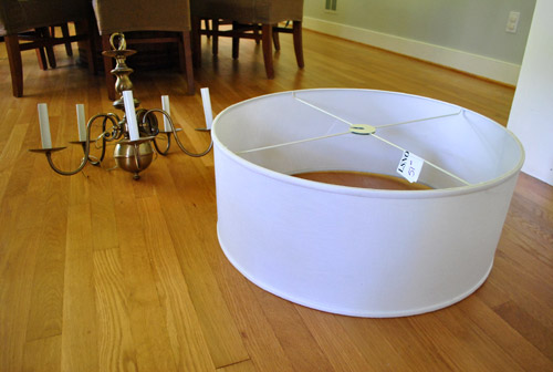
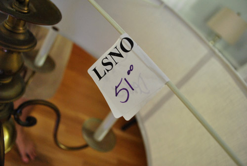
It was marked as $51, but after my better half sweetly pointed out a couple of subtle dents to the salesperson she was willing to sell it for $39. Score. I’ll point out the dents in a later picture – they’re not bad at all. But you know Sherry loves a deal. So even though $51 was a lot less than most 24″ drum shades like this $199 version that’s only 20″ wide (yes, ours is a full two feet wide), it never hurts to ask. And $39 was the magic number.
We also decided to eliminate the large ball on the bottom of the chandler since we felt like it would look funny sticking out of the drum shade (“like butt cheeks hanging out of a short skirt” as the wife so eloquently stated). Fortunately it just took a few twists of the bottom finial and the whole thing screwed right off (even the long rod that kept the ball part attached). We couldn’t believe it was hollow because we assumed it would be full of wiring or something.
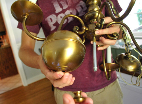
Here it is minus the ball (aka: with less junk in the trunk). We just reattached the finial to the shorter middle rod (since the extension rod that held the ball up screwed right off) and it was good to go.
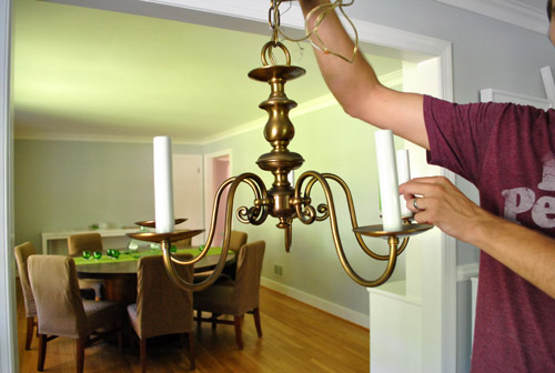
The next step was figuring out how to attach the drum shade, since it wasn’t exactly made for our old brass chandelier. The obvious choice was the bottom, since there was a nice little nub for the shade’s ring to slide on to (and the finial could be screwed back in to hold it up). It almost worked, but we didn’t like the idea of the shade’s straight & narrow crossbars being so in your face. They kinda messed with the original curves of the chandelier – ya know? So I gave it one of these faces and we moved on to the next idea:
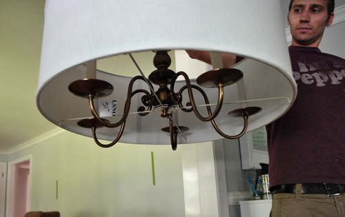
The obvious alternative was to hang the shade from the top (so the cross bars would be in the background instead of the foreground). The only problem was that the shade’s top-attachment-thingie was too narrow to slide onto the top of the chandelier. Harumph.
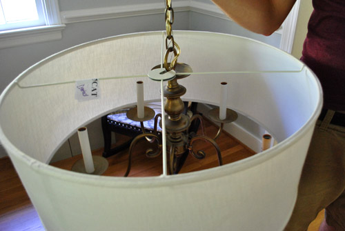
So we decided to improvise. The existing piece of notched metal had to go. Sherry was able to pry off half of it without a problem – just a little flick of the screw driver while steadying the “legs” so it didn’t tweak the shade.
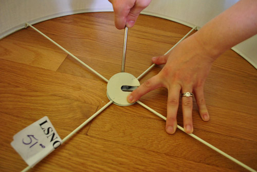
But the other half was more stubborn. We tried lots of tools, but it was requiring so much force that we started to get nervous about damaging the shape of the whole shade. (PS: You can see a couple of the small dents in the upper right of this picture – which are nearly impossible to detect from the outside of the shade).
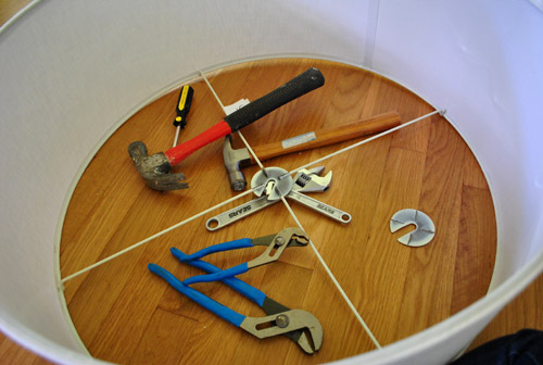
So we did what any demo-happy people would do. We broke out the hacksaw. Sherry was kind enough to photograph me looking like a sawing superhero, but it was actually she who did most of the sawing. Three out of four “legs” actually. She’s my hacksaw heroine.

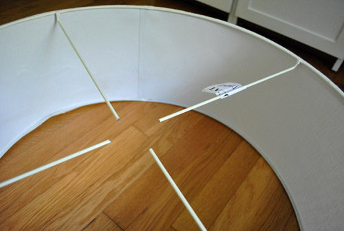
Removing the rest of that ring thing was just half of the battle. Okay, maybe a third of the battle. Because these four rods floating in mid-air certainly weren’t going to solve our problem. They needed to be stabilized by something, and that something needed to somehow fit onto our chandelier.
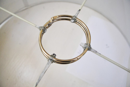
Luckily we found some spare 3″ binder rings in our office-supply drawer that were big enough to fit over the top of the chandelier. After a couple of attempts at super-gluing one to the four rods (and having the ring break off within seconds of trying to pick up the shade) I decided to try wiring it two of them together, thereby sandwiching the shade’s four rods. I just used some craft wire that we had around (pretty thin gauge stuff so it was easy to bend). The method was far from complicated. I just (messily) tied some wire round and round – sort of making a figure eight shape to secure things. I wouldn’t earn any merit badges for my wire knots, but they did the trick (and won’t be seen in the final assembly anyway, so… yay).
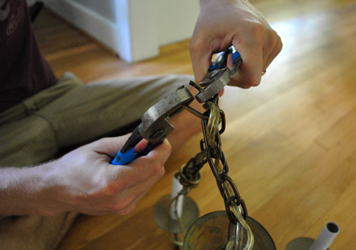
I can’t believe I haven’t mentioned one of the most important steps in our chandelier project: painting it raising it so I don’t hit my head anymore. This involved shortening the chain that it hung from and snipping the wiring to match the new height. Once we determined how many chain links we wanted to keep (by Sherry holding it up as I walked under it, a very scientific process) we just pried off the extraneous rings with two channel lock pliers. It was nice and easy – and a big step toward me (and my delicate man face) enjoying our final product.
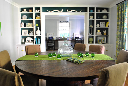
Painting it was a pretty important step too. At first we thought about something smoky like an un-shiny charcoal grey (not quite black, but close – sort of like a matte gunmetal color). But we thought it might be fun to take a little subtle risk with a rich deep color. And while in the spray paint aisle evaluating our options (yellow, green, teal, and even orange – all of which we might bring in a few other ways with things like upholstery and art), a can of indigo blue spray (in a satin finish) caught our eyes. Perhaps a nice nod to the backs of the built-ins in the adjoined dining room?
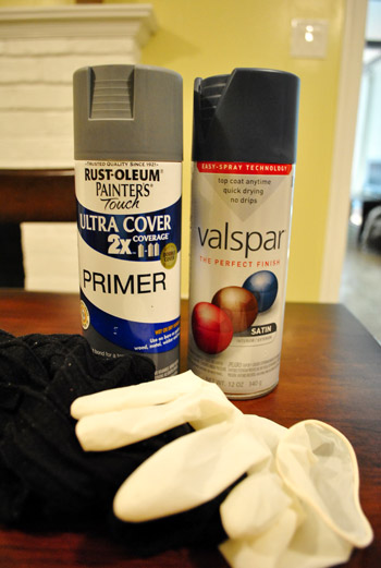
So Sherry gathered her supplies: spray primer, our freshly purchased indigo spray paint, rubber gloves, and some sexy black socks (you know, so she can impress all the neighbors with these legs). Because she needed to spray it while hanging (for the most easy-access) we decided to use the basement (with the door open and an equally-as-sexy-as-the-socks gas mask) where we could hang it from the ceiling and surround it with a drop cloth.
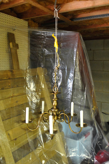
We were also sure to stuff some paper towels in the sockets to keep paint out of the interior part where the bulbs screw in (no sense in gumming up the works).
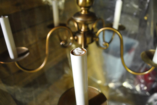
Sherry first did a coat of spray primer, which was a pretty cool color in itself. For a second we debated just leaving it…
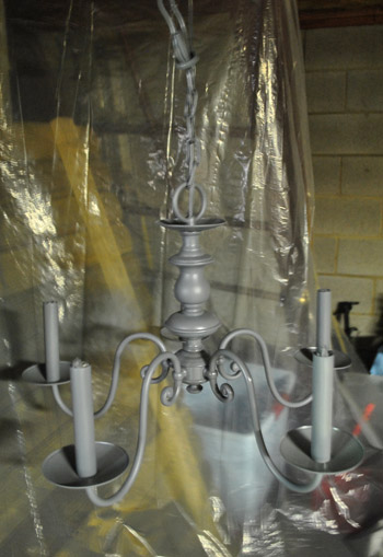
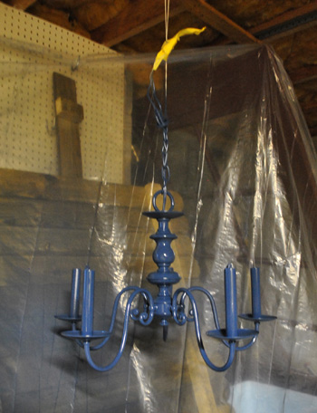
…but after going for the indigo we were immediately happy with the choice. It makes the whole thing look classic, but updated at the same time – at least in our humble what-the-heck-do-we-know opinion.
I don’t have many (okay, any) pictures of the process of re-installing it because it took all four of our hands (Clara’s hands were busy napping and Burger’s paws were probably partaking in a sleep-sesh too). But after sliding the shade down the chain so the rings rested on the top of the chandelier’s fluted center part (there’s a detailed pic of this coming up) Sherry held the whole thing up while I re-wired it to the ceiling in the same manner in which I had taken it down. That’s the extent of my electrician knowledge – just carefully redo what you undo. And I turn off the power to the entire house just in case things aren’t perfectly marked in the fuse box (they don’t call me John “Paranoid” Petersik for nothing).
And voila. The rich blue color is sort of hard to see in pictures but it’s nice and clear in person.
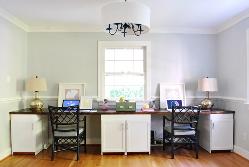
We love that it’s clean and understated from afar because we someday plan to drop a huge chandelier over the huge dining table (and didn’t want the office fixture to compete).
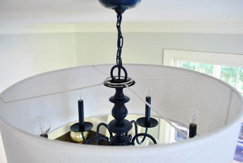
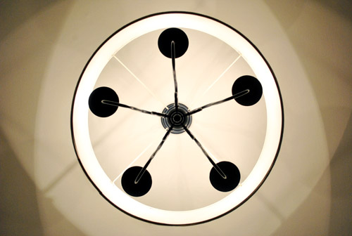
Here’s a shot from the top so you can see how the binder rings rest on top of the chandelier’s middle flute thing. Since the rings are smaller than the disk that they’re sitting on, they’re completely invisible from below. So only the flies on the ceiling get to enjoy this vantage point.
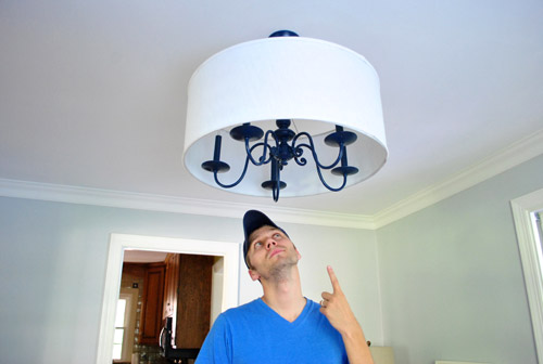
And of course, one of my favorite features of the new fixture is that I can walk right under it. Oh the simple pleasures in life. For you detail oriented folks, the bottom of the chandelier is 78″ from the floor.
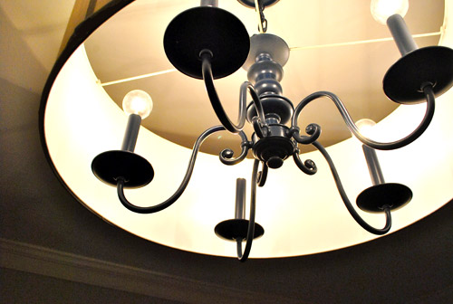
As much as we love the light off, it really comes alive when it’s on. The room feels light and bright and the shade diffuses the light much more evenly, meaning the chandelier no longer casts creepy five-legged shadows of itself on every wall.
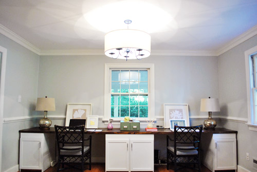
And we think the kaleidoscope pattern that it makes on the ceiling is pretty nifty.
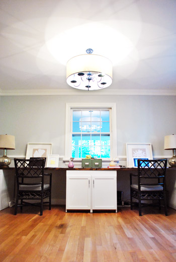
It’s also a really stellar size in person. The giant 13 foot desk could easily dwarf something smaller, but the light colored shade and clean lines keep it from feeling too heavy so it’s nice and airy – even with the deep blue tone on those ol’ brass legs.
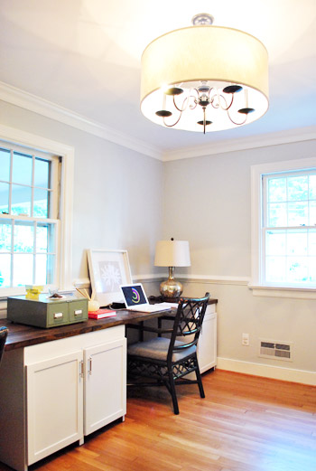
And oh yeah, we swapped out the traditional “flame” light bulbs for more modern globe-style bulbs (from Lowe’s). It’s a small detail, but we think it makes a big difference in crisping things up (we first fell in love with round bulbs around four years back when we used them on a similar dining chandelier in our first house that we spray painted white). We looked for CFL versions, but no dice- although we hear most things are going LED now, so here’s hoping they make little round chandelier ones soon.
In summary, we love it. Here’s the view from the floor (where Clara and Burger actually spend a fair amount of time). And speaking of the bean, she’s learning so many new words these days. It charmed us to no end when she woke up from her nap after we hung the “new” fixture and pointed right up at it and said “oooooh, light.”
Even though the update wasn’t totally free, it certainly beats the price of paying for a whole new fixture. Especially anything that’s two feet wide. Here’s the breakdown:
- Chandelier: $0 (already owned, but we’ve seen them for under $10 at yard sales and thrift stores)
- Drum Shade: $39 (from The Decorating Outlet, negotiated down from the already discounted price of $51)
- Binder rings & wire: $0 (already owned, maybe $4 if you had to buy them?)
- Tinted spray primer: $0 (already owned, but it’s around $7.50 from Lowe’s if you need some)
- Indigo spray paint: $3 (from Lowe’s)
- New globe light bulbs: $9 (from Lowe’s)
- TOTAL: $51
Not bad considering a nearly identical version (minus the deep blue color) was recently sold by Pottery Barn for $299 (looks like it’s currently out of stock).
I’m sure we’re not the only ones who’ve updated a chandelier or other light fixture, so we’d love to hear your experiences and even see pictures if you’ve got a place to link to them (like Flickr or your blog). Has anyone else gone for a non-traditional-but-surprisingly classic color? Or found another way to make an old fixture feel fresher? Who else hit their head on a light at least five times a week for thirty six weeks straight? Why the heck did we wait so long on this update anyway?

Jane says
Its not working for me..Somehow the drum shade trend is not tickling my fancy. Except for the really pretty ones(I remember a colorful one from one of your house crashing). It seems like its one of those “trend” items and a decade later people may look at it and go..why did we hand bid drums from the ceiling ? :)
Mel says
But they only spent $51…spending $300 on a trendy fixture? You have a point. Spending $51 on a trendy fixture? No big deal. Moreover, light fixture styles will come and go, just as they always have, regardless of how much you spend on them.
I say, nice work YHL!
Jane says
@Mel ,
That’s very true. I forgot that they DIYed it..I was merely looking at it from a design point of view. :)
Tessa says
I *love* the light fixture update, & have had a “make a large shade to go over the bedroom chandy” on my to-do list for 2 years now–even though I have the fabric ready & waiting! But I think Jane’s point could be a cool blog post – YHL forecast on the trends we love now but 10-20 years from now we’ll be saying “why???”!!! Like how granite countertops seem to be on their way (or already?) out and I wonder about those modern/sleek but longgg cabinetry handles…
YoungHouseLove says
I would hate to hurt anyone’s feelings though! Haha. I’m lame. The other day John and I were talking about how we thought two things would look incredibly dated in ten years and we thought it would make a good post but we know countless bloggers and friends who have these two things in their house so we feel bad doing it. No cajones, I tell ya.
xo,
s
Jane says
*hang big
Stacey says
this. is. AWESOME!!!!!
i have a somewhat similar “seen better days and is way too small for the room” chandy in our dining room, but w/ no $$ to buy the new one of my dreams, i’ve learned to live w/ it. but, NO MORE!!! i’m totally going to spray paint that sucker and search for a big ol’ drum shade to slap on it :) i’m thinking a glossy eggplant…and maybe some ribbon trim on the shade for an accent…mmmmmmm….
you guys rock!!!
Jordan G @ The Happy Homebodies says
I was able to modify a recessed light in my master closet to look like a crystal chandelier using Hobby Lobby floral and jewelry supplies. It COMPLETELY made the space, even the hubby couldn’t believe the difference (and he’s not a crystal chandelier person). It ended up costing me $35…
http://www.thehappyhomebodies.com/2011/08/tutorial-diy-faux-crystal-chandelier.html
YoungHouseLove says
So cute and shiiiny! Love it!
xo,
s
Keish says
Are you sure you are feeling ok, you didn’t orb the light ;) I’ve been wanting a new dining fixture but now I might just spray it blue to go with my living room curtains. Thanks for the great ideas!!
sally says
Have you seen that Martha Stewart has a new Spray paint kit out – early reviewers really like, although I haven’t even seen it to have an opinion. But any paint can be turned into a spray – even craft paint.
http://www.plaidonline.com/martha-stewart-crafts-spray-paint-kit-satin-finish/32242/item.htm
YoungHouseLove says
Wow- that sounds amazing!
xo,
s
Amanda says
I love it! You two + Katie B are such thinkers :D
Mel says
Just wanted to chime in and say that I freaking love it!
Ryan says
Hey! Love, love, love the new chandelier! Apple green chairs would look AWESOME in there! Anyway- about your both-of-you-are-working-so-there’s-no-pictures-of-the-process predicament(It doesn’t really bother me, but I thought I would share just in case!), have you ever thought about a remote for your camera?
I know the ones from Nikon total in at around 20 bucks, but http://www.ebay.com/itm/Remote-Control-NIKON-D90-D7000-D5000-D3000-ML-L3-/370495176773?pt=Camera_Camcorder_Remotes&hash=item56433bc045 i have that one and it works fabulously!
One of you could just have it in your pocket and every now and then and hit the single button on the remote :) I sound like a sales advertisement. Haha, I’m not, sorry! Have a great day :)
YoungHouseLove says
I actually think it’s a great thing for us to invest in! We usually try to set the timer when we needneedneed a pic with us both in action, but a remote would be even easier!
xo,
s
Sara D says
This is awesome! It makes me want to have an old brass fixture so I can do the same ha. Also want to share that I recently realized I play a little guessing game with myself when I read these…I know it says at the top who posts / writes each blog post, but I always skip looking at the name and try to guess which one of you is writing. It’s sort of fun. You both write so similarly but there are subtle differences I’ve picked up in the 2 years I’ve been following…of course when one of you mentions the other that gives it away. Good times.
YoungHouseLove says
Haha, we hear that others play that game too. Pretty funny! I know sometimes I forget who wrote which post so it’s definitely a fun little challenge. Haha.
xo,
s
Kai says
Absolutely love the blue! But… (not sure if it’s just my comp screen) the contrast between the indigo and the fresh shade make the desk lampshades look rather dingy yellow. Would look great again if you did recover them in a ‘pop’ fabric; especially love the idea of plum going in the room.
YoungHouseLove says
Hmm, maybe that’s just your monitor? Or if you’re looking at the pics with it on, all white shades are usually warm/yellow-ish when on. In person the shade is white white white and super crisp! See it in the pic on the floor next to the brass chandelier in the beginning-ish of the post? That’s the true in-person color. As for a pop of plum (and other tones like apple green, yellow, and eve turquoise) we’re excited to bring those in with window treatments, art, and even by painting/reupholstering the chairs. Hope it helps!
xo,
s
LARY says
It looks great! What a big improvement in such little time! So inspiring!
Asha says
Great idea! and a good inspiration for what we should do with our (ugly) dining room chandelier left by the previous owner. The step by step instructions are awesome too! Now the hubs can’t complain that it’s too hard. Might take time, but I like the end result! We still have a dining table under ours, but I like the idea of raising the chandelier. Too easy to bump/burn someone’s head at it’s current length. Thanks for the inspiration! Now if only our 1 yr old would nap like Clara. lol. ;)
YoungHouseLove says
Oh man she’s giving us a run for our money today. We usually get an hour and a half from 10:30-noon but it’s 1:20 and still no nap! Oh no!
xo,
s
Paige says
Totally UNrelated, but is this the same fabric as your curtains? I was looking for upholstered armchairs and this just happened to catch my eye!
http://www.urbanoutfitters.com/urban/catalog/productdetail.jsp?id=17995671&color=045&itemdescription=true&navAction=jump&search=true&isProduct=true&parentid=A_FURN_FURNITURE_CHAIR
YoungHouseLove says
Yes, isn’t that funny?
xo,
s
Andrea says
Love the makeover, particularly the unexpected indigo color! Overstock.com has a chandelier that’s pretty similar to the Pottery Barn version – not as thrifty as yalls, but still a pretty good bargain! http://www.overstock.com/Home-Garden/Indoor-4-light-Antique-Copper-Chandelier/4127717/product.html
YoungHouseLove says
Oh yeah that’s a great bargain! It’s not as big/wide, but otherwise looks pretty similar. Thanks for sharing it!
xo,
s
Nikki says
Are you guys keeping track of what design decisions are influenced by reader suggestions? I thought that might be a fun end of year stat to know that you made X number of decisions based on a direct reader suggestion. Just a thought :) Love the light fixture!!! I can’t wait to see what’s next!
YoungHouseLove says
We always try to shout people out when they recommend something that we later tackle (like yesterday’s post with a link to Bryn who shared the painted bed post idea). As for keeping a tally, it’s hard because sometimes folks suggest something that we’re already secretly planning (ex: we’ve been plotting to paint the chairs yellow, teal, apple green, indigo, or plum since before even building our desk, but we don’t share all of our plans ahead of time… and then someone will suggest one of those colors and we’ll say “Yes! We love that idea!”). Just last night we were sketching five hundred possible floor plans for the kitchen but we have no idea if any of them overlapped things someone might have suggested a few weeks back, ya know? But heck I bet with so many people commenting someone has probably already mentioned every last thing that we’ll end up doing to our house already. Haha. Right down to painting ceilings and adding hallway wainscoting!
xo,
s
Sara says
I love it! But I am so jealous because I’ve been planning to do the SAME thing, down to the color, in my bedroom. But all of the ugly chandys at my thrift store have been $30 to $50 =(. I’m inspired to keep searching =)
Carla says
That blue is a fabulous and unexpected color. I feel like you’ve been playing things a bit safe lately, so I’m loving the crisp blue … my other favorites are your yellow door, green shag rug, and the wall color in your kitchen and laundry room, which I suspect isn’t as mustardy yellow in person. The only thing about this light fixture is, well, the spindly light fixture peeking out of that modern tub-style shade. It looks like exactly what it is: An old light “hidden” by a huge shade. Ugh. The thing about the office is you now have a large space with the desk up against the wall, and with your backs to such a huge expanse, it’s not a healthy sitting position. This light fixture kind of exaggerates the disconnect. What are your plans for the rest of the office? Have you considered recessed lighting in the ceiling? I think there’s going to be too much going on with that heavy dining room table and the large chandelier you wanting to hang. Anyway, as always you certainly keep me coming back here. It’s really fun learning new design tricks and seeing your design evolution unfold like this.
YoungHouseLove says
After a 4.5 year evolution in our last house we know that nine months in means that we don’t have it all figured out yet, but we love where we’re headed! We’ve been sitting along the same wall since we moved in, so I guess it’s just what feels the most comfortable to us (we did debate other layouts and preferred this one). It’s definitely one of those personal choices that’s not for everyone though! As for our plans for the rest of the room, you can see a floor plan sketch here (we’ll probably add a nice armchair and ottoman to the corner across from the filing cabinet, and bring in a rug where Burger/Clara can hang).
xo,
s
Iomay says
I think it’s funny that I don’t think you’re playing it safe at all. You certainly have made bolder color choices and picked bolder design elements in this house than in your last home. There was a whole lotta white in the first home! But, ya know, I kind of dug that too :)
Iomay says
Oh man, you guys are making me wish we had repurposed ours in a similar fashion!!! We kept it but we installed brand new lighting instead. Post was 4 months too late :)
But, it’s awesome – thanks for sharing!!!
debbie c says
I love it! So creative to use the rings to hack the shade! I have a CB2 drum shade light, and an old brass fixture like yours that we sprayed black, maybe one day I’ll combine the two. Thanks for the idea! :)
Corinne says
I like the chandelier with the drum shade. I can totally see how the light just looks a little better. I used to have a chandelier like that in my first apartment, and I never turned it on because I hated the shadows it created! The color choice looks perfect too!
I’m in a predicament with two ceiling fans, particularly the one in my dining room. It’s so awkwardly placed, and tt’s not even positioned anywhere that it would be helpful in circulating air. Not to mention, it’s ugly – wooden blades with brass hardware, flame lights, and glass shades with a grandma-ish berry etching on them.
Has anyone ever painted a ceiling fan or just done SOMETHING to update one?
YoungHouseLove says
We’ve spray painted one! Worked like a charm! Just took it down and disassembled it and sprayed it and put it back together. Maybe you can google around for a specific tutorial?
xo,
s
Katie says
You all have SUCH good ideas! I love the color too, and the last picture was AH-mazing. Do you have any recommendations on how to make a boring white ceiling rosettes?
YoungHouseLove says
Hmm, not sure. Anyone have ideas for Katie?
xo,
s
andrea worley says
WOW! I love it. Such a great idea to make use of existing light fixture too! And, although I really loved the colors of your first house, I’m also loving the bolder colors you’re using in this home too. It’s great to see both, and see how you guys have incorporated the color pallets into two different homes.
debbie c says
By the way, I laughed out loud at Sherry’s short skirt/cheeks comparison! I actually saw a woman at the grocery store wearing very short shorts, and oh…it was not pretty.
Erika says
Very nice! I love the color you guys chose. I’m getting inspired to rework some of our hideous brass around here. Hmmmmm…..
Paige says
Ya know, I don’t normally like it when people stick light shades onto chandeliers, but I think this one would look weird without it! This way it looks more like an office, because who has a chandelier in their workspace? (Unless you’re at a lighting store, that is.)
Kara says
I haven’t read through all the comments so sorry if this is a duplicate, but they totally do make LEDs in the small globe size! We saw them at Sam’s Club the other day right next to the flame bulbs. They’re cheaper than the flame-shaped ones too, i think about $10 for 2 bulbs.
YoungHouseLove says
No wayyyy. Thanks for the heads up!
xo,
s
Alexis says
Love the redo. I’m especially fond of large drum shades.
Thanks for the lol with “delicate man face. Oh and the Dexter-ish spray paint setup with that plastic drop.
Bridgit says
Did you guys ditch the cool ombré lamp shades for the desk? I thought those might look cool with some bright bases.
YoungHouseLove says
Sadly we couldn’t find any bases for them, so back to Target they went. We thought with the soon-to-be stenciled walls and the chair rail and the (future) patterned window treatments and chair upholstery the whole two-tone thing might be too much. Who knows where we’ll end up!
xo,
s
Jessi says
I love it!!! I might just have to paint mine red. I am dying to change out my flames for globes too! You can check it out at my blog thewhitecakecompany.blogspot.com under “Lights”. You guys are so inspiring! It really make me excited to do things in my own home!
Thanks!!!
Lindsey says
That looks really similiar to the one I just purchased for our new home. The one I got is from World Imports – the Brisbane collection and it was half the cost of the Pottery Barn light.
YoungHouseLove says
Ooh sounds very pretty indeed! Not that we’re biased. Haha.
xo,
s
Robyn in Chicago says
When connecting the binder rings how did you get the wires to connect to the ends of the white sticks (sticks? what else do I call these? ha)? I see an extra silver something in the pic, but didn’t see you mention anything.
YoungHouseLove says
Hmm, not sure what the extra silver something is (maybe dried crazy glue that didn’t work) but we just used wire. We placed the rods between the rings and just looped the wire in a figure eight shape around and around and under and over and through until everything was bound together like a big double decker sandwich. Haha. Hope it helps!
xo,
s
Robyn in Chicago says
Ahhh. I’m an idiot. I see now that the ends of the rods look silver, but aren’t. I see the double decker sandwich now…thanks!
YoungHouseLove says
No, you’re not an idiot at all! We’re bad at explaining things sometimes. Haha. Double decker sandwich should have been in the original description. Haha.
xo,
s
Steph L says
I have been DREAMING of spray painting the old brass chandelier in our dining room (for 2 years), but I’ve been too nervous to do it!
I read in earlier comments – you didn’t do any prep work on the chandelier before spray painting it? That’s one thing I’ve been wondering about and kind of holding me back.
Thanks for the inspiration!!
YoungHouseLove says
Nope, the last chandelier we sprayed was nice and durable with spray primer followed by spray paint, so we used the same method!
xo,
s
Reenie says
Just DO IT Steph!!! You’ll be glad you did =) Don’t forget to spray paint the cord too. ;)
Lindsay says
I feel like I’ve posted the link to my light fixtures before but at least this time you asked for it http://materialsneeded.com/materialsneeded/archives/LampShade_8.9.11.php
I too ran into some challenges
YoungHouseLove says
So cute. I love that fabric!
xo,
s
Claire says
very pretty, but i think i prefer it without the shade
Emily @ EAK a House says
Love this! Karl did something like this on Design Star but I like the bigger shade you used (that and I’m pretty sure he outright bought the thing so double points for making it yourself). We just redid our back porch and I was being too cheap to buy a new light fixture so we made one out of an old lantern that was sitting around.
http://eakahouse.blogspot.com/2011/09/back-porch-before-and-after.html
YoungHouseLove says
Cute! I love the wood tone of the lantern with the ceiling.
xo,
s
Missy G. says
Yes! I knew that the revamped chandy reminded me of something that I saw recently! It is similar to the style Karl used in the master bedroom suite. Ah, I feel better now. Thanks, Emily. :)
madi says
It’s stunning! And I’m super jealous of the drum shade. I have the double-decker version (2 rows of arms, 8 bulbs) of that chandelier in my dining room, and have been searching for a shade for 3 years. So far the best I’ve done is spraying it to match the other wrought iron accents in the room, and adding individual shades. An improvement, but not perfect.
PS another vote for blue chairs :)
Jen says
Wow, that looks so much better then I ever would have expected. Great job!
FYI – a little S hook will temporarily (and inexpensively) raise the height of a fixture. Just attach to the loops in the chain. I often do that for parties where I need a fixture raised without making a permanent change. I used to do it when I rented as well.
YoungHouseLove says
So smart. Should’ve done that ages ago!
xo,
s
Kelly says
Thank you for being awesome! Love the change up. I’ve had a white drum shade sitting around forever and couldn’t figure out how to convert it like this. Will definitely try this in my new apt.
Nikki Kelly says
I made a beaded chandelier with the insides of those 80’s style fixtures where the light is inside of a glass box. Here is it!
http://theambitiousprocrastinator.blogspot.com/2011/06/fancy-schmancy-chandelier-completed.html
YoungHouseLove says
AMAAAAZING!
xo,
s
Nikki Kelly says
Thanks! I would like to try the chandelier in drum shade someday too. Yours looks great!
WYNNIE says
Loving the office so far. The only thing is my eyes go straight to the dark space at the bottom of the cabinets and the floor, the desk legs I guess… Does that catch the focus of anyone else??
YoungHouseLove says
Oh yeah we’re planning to frame that out with baseboard/trim molding so they look built in (no more legs)! Details within the next few weeks hopefully!
xo,
s
Ellen says
I noticed in the background of one of the pictures your previous-living-room-dining room – with no light source above the table. Do you have plans for one there? Would it involve running wires in the ceiling?
YoungHouseLove says
Oh yes, we’re going to look to an electrician to drop a fixture box in for us (right above the table) since we’re not quite capable of those big electrical undertakings!
xo,
s
Lauren says
Looks fantastic, as always! It’s such a treat to read YHL every day. Hope Clara got down for her nap! :)
YoungHouseLove says
Finally! But she’s back up already. Haha. We’re going through some sort of nap transition methinks. Oh well, she’s still cute.
xo,
s
Katie says
I was flipping through Parenting magazine today and saw some cool DIY Halloween craft ideas. This one caught my eye and I thought you might like it…a “Bony Chandelier”. It reminded me of your DIY clothespin light fixture and since I know you have a love of all things white/ceramic this seemed right up your alley :) And Burger may appreciate the “bones” as well! Maybe you could make it with real dog bones instead…could make a yummy treat for Burger after Halloween :)
http://www.parenting.com/gallery/easy-halloween-crafts-favors-and-games?pnid=461030
YoungHouseLove says
I love it!
xo,
s
rachel @ Just a Touch of Gray says
Looks so great… I love the color you chose!
Heather W says
Did you happen to make it to Target yesterday or today to check out the new Missoni(sp?) line??? Wow, I just happened to go by there today and it was crazy. Everything was pretty much sold out and crashed the website yesterday. I saw a shower curtain that was super cute but it was $39.99. Still debating that one. I did score a super cute shirt though. Just wondering if you checked it out at all.
YoungHouseLove says
We heard about the craziness yesterday and actually went early today instead. It was very picked over, but we did bring home a few things – some rain boots for Clara, a headband for Sherry and a decorative vase. It’ll probably get blogged about at some point. Looked like they had lots of cool stuff!
-John
Sarah says
OMG that light fixture looks awesome! It’s the first thing I notice when I look at that first picture. Amazing what such a little change could do. Looks FAB!
Megan says
I have wanted to do that for our dining room chandelier for some time. I can’t find a shade big enough (and cheap enough). Can’t believe you scored that shade so quickly and at that price!
Robyn @ Imperfect Nest says
So funny that y’all posted this today. I did a very similar makeover on my entry chandelier! Take a look if you get a chance or just get bored.
http://imperfectnest.com/restoration-hardware-inspired-pendant/
YoungHouseLove says
Gorgeous, gorgeous, gorgeous! I love it!
xo,
s
Melanie @ Mailbox Journey says
I love the shade of blue you chose. Are you still going to add french doors?
YoungHouseLove says
Still planning to, just not sure when we’ll get around to it.
-John