We’ll start this post off by saying that when it comes to decorating your house, we believe there are no right answers. Rules are meant to be broken and feathering your nest is definitely one of the most subjective and personal things you’ll ever do. Our mantra has always been “just do what you love” so you end up coming home to a house that makes you smile.
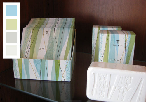
But what if you don’t know what you love? Just look at rooms in magazines and online and find out what tickles your fancy and use it as a springboard to take your house to the next level. Or stare at your favordominite painting or even a pair of earrings or a pretty invitation and use it as your inspiration – yes you can even design a room around a pattern on a napkin or a pretty soap box like this:
We love reminding people that we have absolutely no background in home improvement or interior design, we’re just two people who learned as we went and slowly updated our house on a budget and shared our progress as we went. And somewhere along the way we amassed enough confidence and on-the-job experience to help other people spruce up their spaces as well. But we definitely have made our fair share of mistakes, and we think those learning experiences have truly made us who we are today. They help us relate to everyone out there who’s also trying to fix up their home on a budget without any formal training- armed only with their wits, some elbow grease, and a lot of bullheaded determination. Oh yeah, we can totally relate to that.

And we have one more rule around here: don’t do something just because we suggest it. When we dish out advice on anything from a recommended paint color to a rug rule, we do it to help get the ball rolling and serve as a starting point. But we never want people to blindly do things just because “John and Sherry said it would work.” Because design is so subjective that there are about 100 ways to skin a cat. So it would just be crazy to robotically follow our suggestions without a bit of thought and consideration to see if they really feel right for you and your home. There’s not one right way to decorate your living room, there are about a hundred different solutions that would look fantastic. And that’s good news because it means you can follow your heart to a result that works for you instead of blindly hunting for the nonexistent one and only “answer” to your decorating dilemma.
BUT (there’s always a but, right?) on the flip side to that coin, we do get asked a few questions that are definitely highly debatable, so here’s our take on those decorating dilemmas. They’re really more like general suggestions that you can consider and apply in a way that makes sense to you or choose to completely ignore. Really it’s all about doing what you love, not what we say!
Controversial Question #1: Can your living room rug be shorter than the length of your sofa? Generally speaking we prefer for the rug to be at least a few inches longer than your sofa on both sides so it feels anchored by the rug instead of top heavy and a bit too bulky. So in smaller rooms with a sofa and a chair arrangement (like our den or living room) we usually recommend a 5 x 8 rug, but in any other seating arrangement (that involves a sofa and a loveseat, a sofa and two chairs next to each other, or a sectional) we always think an 8 x 10 rug works best to define that arrangement and ground everything with ease.
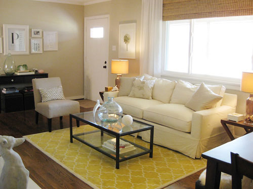
But rules are meant to be broken, so there’s a room over on domino.com with a rug that’s shorter than the sofa that’s awesome. See there really are no right answers here, so why not take home three potential rugs and see which one works best for your space (just return the two “losers” when you’re done and you haven’t wasted a cent trying out a few alternatives). Read more general rug rules right here.
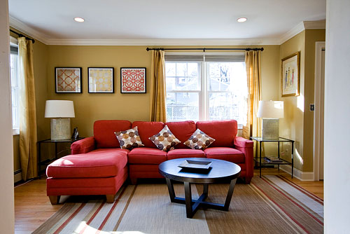
Controversial Question #2: Should large upholstered furnishings be covered only in neutral colors so they always feel classic, or can you get more bang for your buck with a brightly colored sofa or a fun patterned chair? We prefer classic upholstery and opt to bring in color with accessories, which is usually the safest way to ensure that you won’t tire of the look of a room and be forced to purchase large items in order to change the look (as opposed to switching out some accessories for a new look on a far smaller budget). For example, a bright abstract turquoise painting above the fireplace and some punchy orange and aqua pillows could totally change up the look of our den in under $100.
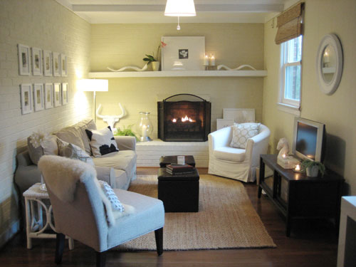
But again, rules are meant to be broken. Here’s a space with a bright red sofa that looks amazingly classic and fresh (see more info about this room makeover here):
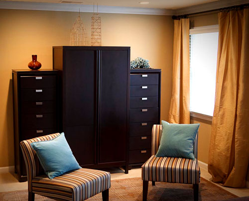
And here’s a bedroom makeover where we recommended graphic striped chairs that really made the space feel polished and luxe (without breaking the bank since they’re from Target). So sometimes some color or pattern in your furnishings can really make the room.
Controversial Question #3: Do all the frames in a room have to match? Personally, we love that every frame in our house is white so we can switch them out from room to room for an easy change (which has saved us some major moolah over the years since they’re so flexible and easily movable). Check out more framing ideas right here.
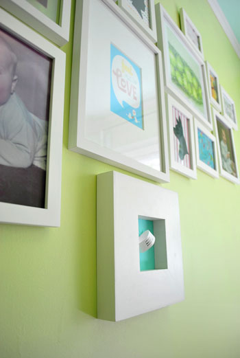
But they definitely don’t have to be all the same color throughout your house, or even throughout a room. There’s a space with a mixed display of frame finishes that looks eclectic, lovely, and collected over time from over on Apartment Therapy this morning. So again, it’s really all about what you like and what you have on hand so there’s no perfect answer in this category either.
Controversial Question #4: Do all wood furnishings have to match? No way. We actually believe that falling for the matchy-matchy look is the quickest way to a flat room that looks like you got everything in an afternoon from the same store. Here’s a post with a slew of details and suggestions on that subject – we really think layered materials, finishes, and tones can make a space feel dimensional, interesting and effortlessly stylish.
Controversial Question #5: Does all hardware (faucets, door knobs, fixtures, etc) have to match? Nope, definitely not. It can’t hurt if you have a small bathroom or kitchen and painstakingly ensure that every latch, pull, and fixture is the same brushed nickel finish, but we’ve also seen some amazing rooms with layered hardware and fixture choices (like antique brass mixed with silvery finishes). We actually wrote a big post all about this subject so click here for more info.
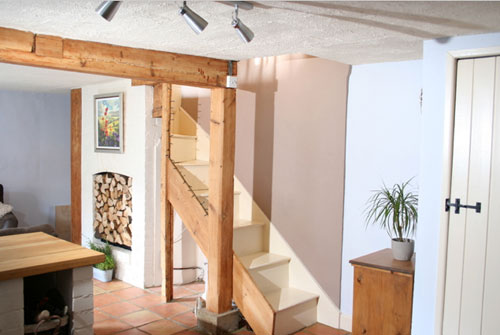
Controversial Question #6: Should all the trim in your house be the same color? Well, we love that all of our trim is a nice crisp white (it keeps our home feeling cohesive and current) but we’ve also seen houses with rich dark wood moldings in some rooms and clean white trim in others- and it looked pretty darn amazing as well. And here’s a lovely English casa with gorgeous raw wood beams that add tons of character and charm:
The bottom line? Do what you love (whether that’s mixing and matching trim throughout the house or keeping it all consistent and cohesive).
Controversial Question #7: Can you put an area rug over wall to wall carpeting? Our opinion: yes, yes, yes! We love rugs over wall to wall carpet. Any seating area that floats in a space (which is often how they look best, even in small rooms) needs something to ground and define just that distinct area. So a rug over a carpet (be it jute, wool, or anything really!) often looks fantastic in every space from a living or family room to a bedroom with a small seating area or a centered bed. In short: Go for it if it makes you happy (and avoid it if you disagree)!
Controversial Question #8: Besides paint, what’s the biggest way to transform a space? We believe that answer is undeniably curtains (as demonstrated by this amazing reader-submitted curtain makeover, which you can learn more about here):
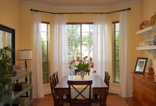
They really can make the room and create a taller, bigger, and more architectural effect. Here’s a post all about picking the perfect window treatments to spruce up your space, so you’re bound to find lots of ideas (don’t forget to check out the comment section for even more solutions).
So that’s our take on a few controversial decorating topics. What do you guys think? Are there any decorating rules that you happily break around your house? Or any that you stick to religiously without any interest in straying? Do tell.

Jessica @ How Sweer says
I really love the idea of having one kind of frame, but I think I would get so bored! I think having a handful of the same for interchanging purposes is great, but I love to add a little flair with some different ones!
Janice says
The area rug rule that I believe should not ever be broken is that, at the very minimum, the front legs of the chairs & sofa must be on the rug. That Domino shot, with the little tiny rug under the coffee table is a mistake I often see that drives me batty.
Jessie (Bites and Pieces) says
I loved reading this! I think I have broken most of the rules you mentioned. For instance, I have a dark blue sofa, all different types of woods furniture, and lots of mismatched frames. I think it give the house lots of character. :) I do love that large area rug rule though.
Sandy says
The thing that I dislike about so many people’s houses is when everything is matching from the light fixtures, to the faucets, cabinet hardware and even the cabinets throughout the entire house. I think this must have come from housing developments and the stuff that builders install. It is much more interesting to have different features and finishes throughout your house, otherwise it is a snooze of the “same old–same old” in every room– very boring. Why do people want everything to match?
liz @ bontempsbeignet says
We did the all white billowy curtain thing. I love that it looks nice and elliminates my fear of commitment with bold colors and patterns. We also have all black picture frames in our house. (way down at the bottom of this post you can see our little gallery)
http://bontempsbeignet.blogspot.com/2010/06/summer-to-do-list-gus-silhouette_08.html
Jamie says
That’s funny – I disagree with Janice. I prefer the Domino shot in which the couch is not on the rug. Just goes to show you that everyone has different tastes and rules!
Kasey says
We used to have a light neutral beige colored sofa. Since it was time for a new sofa we went and got us a deep blue sofa and loveseat. I would love a nice white colored sofa, however with a dog and a toddler running around I would more than likely find myself stressing over every little dog hair and every time my son even came within 2ft of the sofa [honestly, toddlers hands magically become dirty, no matter how many times you wash them]… I don’t want to have to stress over my furniture, so since we both like blue we found the perfect comfy sofa. The majority of the colors in our home are light, clean and neutral so the sofa really pops with the rest of our décor and we don’t have to worry about ‘little hands’ grabbing and climbing all over it.
Overall I think you have nailed all the controversial questions. I agree with all of them for the most part!
Danielle@NewlywedsParadise says
You know, I am glad you guys wrote this. Sometimes, I get a little annoyed at how people get on you guys for things you talk about. I always take everything as it is…an opinion. One thing I learned in fixing up my home is rules are meant to be broken! Great post!
Layla says
I agree with Janice, the little rug does nothing for me. I definitely think the sofa/chair legs need to be resting on the edge of the rug, at least. That said, I have a little rug in front of my sofa. And yes, it drives me nuts. :P
Jenny @ Words On Wendhurst says
On the subject of rugs, I think the rug can be smaller, when it is obviously intentional, like in that Domino picture. But when it’s a 4×6 rug under a 7 foot sofa, it just looks like a mistake. I’ve also seen a rug over wall-to-wall done right, and done wrong many times. So it just depends. :-)
Gemma says
Thanks guys – Great post! I love these little lessons for design dilemmas that people often struggle with.
Nichole@40daysof says
Love this post, and not just because my breakfast room made it in again. :) Rules are great guidelines, but can always be broken!
CoSkay says
Re: brightly colored furniture. You can try a good slipcover on your couch that can easily be changed over the years. Another idea is purchase a neutral couch but a brightly colored chair. The chair can be moved out of a room or reupholstered easier than a couch.
Cordia says
I am definitely one of those people who fall into the category of “I dont know what I love”. Well, it’s more I love a lot of things,lol. Your site and decorating advice has been a great inspiration. You could have fooled me that you dont have a background in interior design or home improvement! I love your style and I am having a hard time decorating my own home b/c I love a crisp white modern feel as well, but my 1920’s home with all the dark woodwork and built-ins doesnt fit that look. I do however love a warm homey Pottery Barn look too, which is what I was originally going for. I guess you have to work with what you have character-wise with your house too. I have decided though to paint all my trim in the upstairs white and “crispen” it up. My kitchen, once we can afford to do a complete remodel will be crisp and modern too. I cant wait for that to happen! Keep your ideas and advice coming! I know you are helping a lot of us out here figure out how to do things around our own homes!
hi-d says
That soap is beautiful! Love the packaging and the texture of the soap. Just adore your blog… :)
Elizabeth Johnson says
I’ve always been curious, what’s your take on dining table lighting? Should you lighting over your table match the shape of the table (round table, round pendent) or for example can you do a rectangle table with round lighting or vice versa?
YoungHouseLove says
Anything goes! We’ve seen round tables with rectangular chandeliers and vice versa. Sometimes echoing the table’s shape is the safest bet, but bucking tradition and avoiding that safe route can result in something spectacular!
xo,
s
Stephanie says
Ahhh, the dreaded rug rug rules! The rug I fell in love with was only available up to the 5×7 size. I had brought home a larger 8×10 size in a different pattern and couldn’t get that large of a rug to work right in my smaller space. I ended up going with the pattern I loved, the 5×7. My sofa and loveseat face each other, but while both are off the rug by about 3 inches, the length of the rug is longer than my sofas at least. But, I have referred to that as looking like a “postage stamp”. It works okay for me though. If I would pull the front legs of the sofas on the rug, we wouldn’t have any room to walk around the coffee table. What’s even more, is that it was physically impossible to even get it centered due to how the windows of the room are, but you’d have to get a tape measure out or really be looking for it to notice! My house is very frustrating like that.
Anacelie says
Thank you for this posting, and all the hard work you put into it. It is a great, visual reference to show contrasting solutions for each design dilemma. I think this is going to help a lot of people. Are there more postings like this coming in the future (I hope)?
YoungHouseLove says
Hey Anacelie,
We do plan to post more help-us-help-you posts like this in the future along with more tutorials, house crashings, reader redesigns, mood boards, and all the other things we like to share on the regular. Stay tuned…
xo,
s
Laura says
I think it is ok to break the rules if you have a really good eye, but for most of us, it is better to match the frames and buy big rugs. The other thing to consider is the “bones” of a room. If you have vaulted ceilings, huge windows and gorgeous woodwork, you can do a lot of weird stuff and have your room still look great. In my little square house, I have to be careful! Thanks for all the great tips. I redid my fireplace as per your instructions and I am going to send you some pictures of it sometime.
Tiffini S says
Ah, the rug thing. My rug is the same length as my couch (just because we like a LONG lounge around couch). But the bigger issue is, my 100 pound German Shepherd and my two-year-old. They like to play a little game called “Run at the living room rug and slide it across the wood floor like a surfboard.” The rules are fairly complicated.
So for the next few years, my rug is more of a fun object, rather than an object d’art. I figure that earns me a new rug when they’re done playing with it!
Shunte' says
I totally agree that decorating is very subjective. I don’t have any hardcore rules, I just do what feels right to me. The one thing that I definitely try to avoid is the matchy matchy thing. Mix it up a little!
Patti says
I made the mistake of buying a striped multi-colored couch when we first bought our home many years ago and boy was that a big mistake. I have been limited since then re: what to put in the room because of the colors in the couch. I think a solid color couch would be fine, be it neutral or a wow color, but not a multi-colored stripe or design. Thanks for the good advice!
Lindsey says
I break the “rules” all the time. If I love it, then I’ll find a way to work it into my home.
From the same “Nice Packaging” post you reference in this post, I took the Benjamin Moore’s Spellbound color that you recommended as an accent and painted most of my entryway/tv room that color. I love it beyond reason and get wonderful comments on my bold choice. It’s a room that has a huge bright red couch and overstuffed chair (another broken rule) and the dark blue actually neutralizes both pieces. White side tables and an entry way, along with leaving two walls a much lighter blue-gray keep the entire room from becoming gloomy.
I’ll send you pictures when I complete the room (the last two walls still need to be painted, but I can’t move the giant tv by myself!).
Lindsay@Tell'er all About It says
Great post, guys! I’ll echo Danielle from above – it’s all about your opinion and I too don’t like it when people get on you for little silly things that are ultimately, just a few things that have worked for you.
Good job, guys! Keep up the great work!
Marilyn says
I’m doing the area rug thing now since we pulled up the carpet and redid the hardwood floors under it. I have a question on finding a good area rug pad that won’t leave marks on the hardwood, any thoughts?
YoungHouseLove says
Hey Marilyn,
We’ve found area rug pads at places like Target and Home Depot and they’ve never left any sort of marks on our floors. Hope it helps!
xo,
s
Melissa says
love this post, thank you!
Candace says
Love all this info. Have a question about a window. I have one window and a slider in my family room, The window is butted right up against a wall on the left side with the rest of the wall(10 feet) to the right. The window is 58 inches wide. I am thinking of hanging a rod high and about 75 inches wide and pulling the curtains all the way to the right most of the time. I want to hang a bamboo blind high above the window and have it pulled up to almost the top of the window. I will have to close the ncurtains at night during the winter but can leave them open most of the time. What are your thoughts please?
Candace
YoungHouseLove says
Hey Candace,
We recommend good old trial and error here. Just grab a super long rod, and hold it up with some curtain panels on it to see what looks best. Good luck!
xo,
s
Laura J says
I love the idea of hanging curtains in a bay window the way it looks in #8 above. I’ve always hated swagged valances. I clicked on the link to see how the reader achieved this look but it look me to your post of “picking the perfect window treatments” instead. This post is also linked below your picture of the beautiful bay window treatments. I’m thinking that you meant for the first link to be to the reader’s own blog…?
YoungHouseLove says
Hey Laura J,
We actually meant for that link to take you to that post because we (and the reader) have answered every imaginable question right there in the comment section. Hope it helps!
xo,
s
Carole says
love that red sectional! I’ve always wanted a red couch, but never had the guts to do it!
there are certain pieces of furniture I own that don’t go at all with the rest of the style of the house (e.g., a rustic buffet we bought when we lived in Australia, an ornate desk that was my mom’s). I know they don’t ‘go’ with anything, but I would rather surround myself with things that have such great memories than live in a magazine-perfect place.
alice says
THANK YOU! ok so this just about cleared up every question we had.
heatherk says
Thank you so much for this post. I’m getting ready to make curtains for my soon-to-be-born first baby’s nursery. Everything I’ve read tells me I can’t go wrong with floor length curtains. But every bone in my body tells me that window length (~ 63 inches) or just below would be absolutely charming. Then I read something else that said any length other than floor length is “absolutely” wrong. Sigh. I might have to just go with the gut feeling on this one.
sophie says
I think the key, as you mention in your post, is confidence: confidence in your own aesthetic sensibilities and trust in your ability to make it work for you. Whenever I look at home tours, the ones that are most successful are those that breathe with life and personality, where the energy of the home owner/dweller comes through every piece in the rooms. I might actually hate the style they’ve chosen but still feel completely comfortable in that space because they’ve crafted a vibrant, unique, intimate and personal space.
My rule breaker – colour. I use WAY more of it than any design book recommends. our house is wild with it. red furniture, blue wall, yellow wall, colourful paintings, cushions, etc. It’s saturated with colour and if you just read what I’m writing, you’re probably writhing with horror. But the sapces work because our energy and our personality and our confidence makes them work. and that’s what matters.
There is nothing less cozy than a cold space that conforms to ‘designer specs’ but doesn’t breathe on its own.
Lyss says
Can you tell me the name of the paint color on the walls in question number 8? I have been trying to decide on a shade of yellow for over a month now and am close to giving up on yellow all together. But the shade in that kitchen is exactly what I have had in mind. Thanks!
YoungHouseLove says
Hey Lyss,
We don’t know that paint shade but here’s hoping the reader who submitted the pic will chime in with that info! Stay tuned…
xo,
s
marisa @ vinyasa mama says
Lyss,
I dont believe this is the color in the photo, but for a great yellow try Benjamin Moore Oriental Silk. It’s a retired color but they can still look it up and mix it for you. Very neutral, but a fabulous yellow.
Laura (youngDCliving) says
This was a fun post to read! While design and personal style are different for everyone, it was nice hearing your views on some of the most controversial design dilemmas out there. Thanks!
Sarah says
This might cost you a few dollars, but I have a friend that frames her kids art work in cheap and simple black frames and she has a place in her kitchen to hang them. When it comes to updating and switching artwork she buys new frames to go with the new artwork and stores the old favorites in a box in her attic (keeping the art in the frames) that way when her kids get older they can enjoy the perfectly preserved artwork!
Beth@Everyday Life of Bellom says
I think the only rule in life and decorating should be: if you love it, do it.
If at the end of the day you look around your home and you smile, that’s what matters!
Sabrina Jordan says
This is a great blog! So many people think certain style is black and white (i.e. my mother) haha. We love color! We have great blue couches and fun colorful ikea blankets and pillows for added interest. The rug thing has always been a love/hate relationship for me. Large rugs can be out of our price range (as we are VERY thrifty), so I simply bought 2 4 x 6 rugs from ikea at $17 each. Putting them side by side made a great rug which added interest and fit the size of the room. As for frames….we have a LOT of frames that are the same color but I like the occasional odd one, just to add some creative flare. Oh, and as for wood matching…I like them to match or at least compliment each other, but as of right now….we have so many different colors in our house it looks like a forest! And it works! I think monotony of everything looking the same is boring….just me though.
Sarah says
This is a great post, I love it, and completely agree that the best advice is “do what you love” …
(but it so makes my skin crawl every time I read the phrase “skin a cat”, which is oddly frequently around here – sorry, it’s just such gross and violent/bloodly imagery. eek.)
YoungHouseLove says
We shudder too! Another much too violent expression: kill two birds with one stone. Gross!
xo,
s
C.C. says
Great post! I have a collage of wedding pictures in our formal living room – while all the frames are black (and photos are black & white) each frame is unique! Some have lots of white matting, some have no matting, some are thick and fancy, some are simple and smooth.
We get TONS of compliments on how it turned out! :)
Krista Haws says
I end up doing what I love in our house. Some things match, some things don’t. The last owner used many different metals through out the house (chandeliers, light fixtures, fans, sinks, etc) and it makes it easier for us to use our eclectic taste. I don’t feel I have to be “married” to one metal and it looks better, in my opinion. I think that’s what this is all about, it’s what you like, your opinion, and being willing to take risks.
Jocelyn Stott says
Great post – as always!!!
Dani says
Such great advice on here. I went pillow shopping for my couch this weekend and had some of your advise in mind and I think I did a great job in what I picked out :)
I was wondering – I just bought a new house and I’m trying to decorate, with all new stuff, a living room and a family room…would it be possible if i sent you a couple pics if you could give me some criticism/advise??
YoungHouseLove says
Hey Dani,
Unfortunately with the new baby and writing ten posts a week there just aren’t enough hours in the day to dispense specific decorating advice via email. But our best advice to help you pin down your style and get ideas would be to rip out images from magazines that you love (you can also google around for inspiration) and use those rooms as a springboard. Hope it helps! And good luck!
xo,
s
Barbara says
Personally, I’m all for breaking the rules. I follow a lot of blogs, and I am tired of seeing all white houses, all white furniture, etc. In fact, on several DIY blogs, their only solution to ANY problem is “paint it white”!!
While it works for you, and your house is gorgeous, it doesn’t work for all of us.
PS: I own a teal colored mid-century sofa.
Mandy says
First, let me start by saying I love the pic of John holding the bathroom sink in his bare feet – that’s my kind of demolition! :)
I am also one who does what I love, and so far I have been lucky with things looking cohesive. We have all different variations of wood in our open floor plan, and it works. All our walls are varying shades of blue, green and khaki but all look completely different. My best friend and I got into a heated argument about some fabric I purchased for pillows (once I finish them I will have to send you pics!) and I finally just said “you may not like it or think it “works” but I do so deal with it!” and she later told me that she wishes she could just throw all the rules out the window like me cuz I seem to know what I’m doing without realizing it.
Krista says
Agree with above comments that rules to be broken, do what you love.
I personally shudder at the thought of matching picture frames throughout a room, let alone an entire house. The image of the mis-matched frames has far more visual interest.
PS, the rug issue is one thing I’ve struggled with, as we just purchased one that is pretty large for our space. Crawling babies trump all rules, as you will soon discover!
Amanda @ longroadset says
Hey John and Sherry-
Although I do often find myself referring to your ideas, as a way to communicate things I like or things that inspire me, but the thing that I love about your blog is that it’s great for inspiration. Sure I love the stripes in your bathroom, and it’s made me think about stripes (vertical) in my hallway. I don’t think I would have thought about that before.
Just like you guys painted wood paneling in an afternoon, and it took me 2 weeks. (Bad bad bad!)
I think people should just do what they love in there home. I’m never going to be a granite counter-top gal, even if everyone else is. (I love my current butcher block! Is amazing.) Now I just sound like i’m ranting. But when it comes to making your home YOUR HOME, you gotta do what you love. You can’t make it anything else but yours!
Tiffany says
Good post! Your home should be what you love..not what other people think it should look like. I think your herd of white porcelain animals is creepy…but you all love them. To each their own..do what you love!!
abriana says
this is unrelated to this post, but i was thinking of you guys today! do you have AC in your house?? on the 100 degree day we had today, i was thinking about the greener choice– ac versus swamp cooler versus other ways to cool a home. I thought it would be a good post idea for you guys! :)
YoungHouseLove says
Hi Abriana,
We do have central AC in our house (which has come quite in handy the last few weeks). We honestly didn’t use it very consistently in previous years because our brick house stayed pretty cool and we otherwise compensated with fans or warm-weather clothing. But now with Clara around we’ve been keeping things cooler for her, so the AC’s been put to use much more. But it’s definitely a good idea for a post. Adding it to our list!
-John
Handy Man, Crafty Woman says
“Do all wood furnishings need to match?” I hope not, because almost NOTHING matches around here! We like it that way.