We’ll start this post off by saying that when it comes to decorating your house, we believe there are no right answers. Rules are meant to be broken and feathering your nest is definitely one of the most subjective and personal things you’ll ever do. Our mantra has always been “just do what you love” so you end up coming home to a house that makes you smile.
But what if you don’t know what you love? Just look at rooms in magazines and online and find out what tickles your fancy and use it as a springboard to take your house to the next level. Or stare at your favordominite painting or even a pair of earrings or a pretty invitation and use it as your inspiration – yes you can even design a room around a pattern on a napkin or a pretty soap box like this:

We love reminding people that we have absolutely no background in home improvement or interior design, we’re just two people who learned as we went and slowly updated our house on a budget and shared our progress as we went. And somewhere along the way we amassed enough confidence and on-the-job experience to help other people spruce up their spaces as well. But we definitely have made our fair share of mistakes, and we think those learning experiences have truly made us who we are today. They help us relate to everyone out there who’s also trying to fix up their home on a budget without any formal training- armed only with their wits, some elbow grease, and a lot of bullheaded determination. Oh yeah, we can totally relate to that.

And we have one more rule around here: don’t do something just because we suggest it. When we dish out advice on anything from a recommended paint color to a rug rule, we do it to help get the ball rolling and serve as a starting point. But we never want people to blindly do things just because “John and Sherry said it would work.” Because design is so subjective that there are about 100 ways to skin a cat. So it would just be crazy to robotically follow our suggestions without a bit of thought and consideration to see if they really feel right for you and your home. There’s not one right way to decorate your living room, there are about a hundred different solutions that would look fantastic. And that’s good news because it means you can follow your heart to a result that works for you instead of blindly hunting for the nonexistent one and only “answer” to your decorating dilemma.
BUT (there’s always a but, right?) on the flip side to that coin, we do get asked a few questions that are definitely highly debatable, so here’s our take on those decorating dilemmas. They’re really more like general suggestions that you can consider and apply in a way that makes sense to you or choose to completely ignore. Really it’s all about doing what you love, not what we say!
Controversial Question #1: Can your living room rug be shorter than the length of your sofa? Generally speaking we prefer for the rug to be at least a few inches longer than your sofa on both sides so it feels anchored by the rug instead of top heavy and a bit too bulky. So in smaller rooms with a sofa and a chair arrangement (like our den or living room) we usually recommend a 5 x 8 rug, but in any other seating arrangement (that involves a sofa and a loveseat, a sofa and two chairs next to each other, or a sectional) we always think an 8 x 10 rug works best to define that arrangement and ground everything with ease.
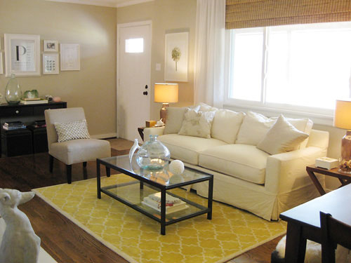
But rules are meant to be broken, so there’s a room over on domino.com with a rug that’s shorter than the sofa that’s awesome. See there really are no right answers here, so why not take home three potential rugs and see which one works best for your space (just return the two “losers” when you’re done and you haven’t wasted a cent trying out a few alternatives). Read more general rug rules right here.
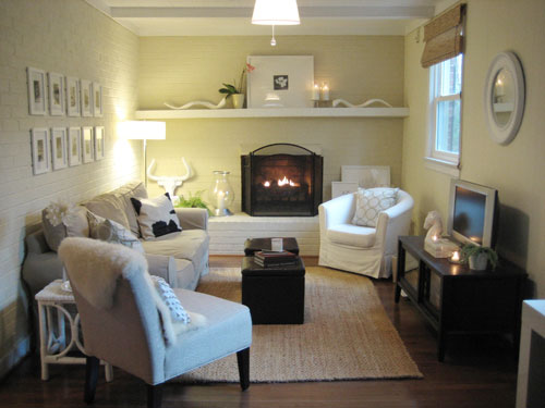
Controversial Question #2: Should large upholstered furnishings be covered only in neutral colors so they always feel classic, or can you get more bang for your buck with a brightly colored sofa or a fun patterned chair? We prefer classic upholstery and opt to bring in color with accessories, which is usually the safest way to ensure that you won’t tire of the look of a room and be forced to purchase large items in order to change the look (as opposed to switching out some accessories for a new look on a far smaller budget). For example, a bright abstract turquoise painting above the fireplace and some punchy orange and aqua pillows could totally change up the look of our den in under $100.
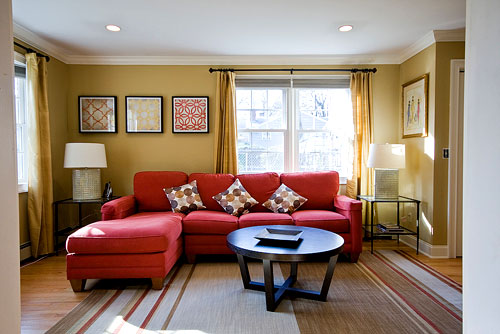
But again, rules are meant to be broken. Here’s a space with a bright red sofa that looks amazingly classic and fresh (see more info about this room makeover here):
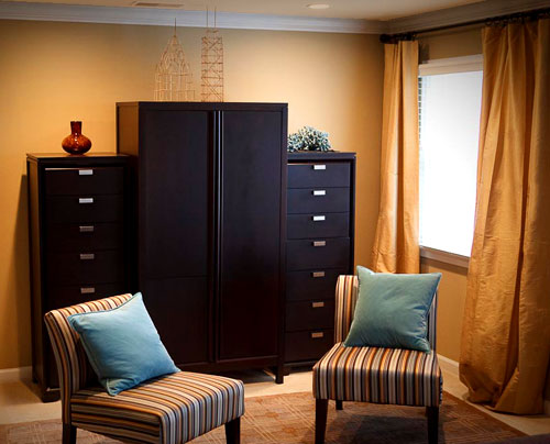
And here’s a bedroom makeover where we recommended graphic striped chairs that really made the space feel polished and luxe (without breaking the bank since they’re from Target). So sometimes some color or pattern in your furnishings can really make the room.
Controversial Question #3: Do all the frames in a room have to match? Personally, we love that every frame in our house is white so we can switch them out from room to room for an easy change (which has saved us some major moolah over the years since they’re so flexible and easily movable). Check out more framing ideas right here.
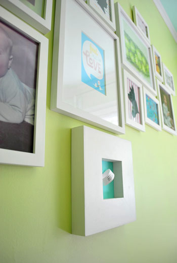
But they definitely don’t have to be all the same color throughout your house, or even throughout a room. There’s a space with a mixed display of frame finishes that looks eclectic, lovely, and collected over time from over on Apartment Therapy this morning. So again, it’s really all about what you like and what you have on hand so there’s no perfect answer in this category either.
Controversial Question #4: Do all wood furnishings have to match? No way. We actually believe that falling for the matchy-matchy look is the quickest way to a flat room that looks like you got everything in an afternoon from the same store. Here’s a post with a slew of details and suggestions on that subject – we really think layered materials, finishes, and tones can make a space feel dimensional, interesting and effortlessly stylish.
Controversial Question #5: Does all hardware (faucets, door knobs, fixtures, etc) have to match? Nope, definitely not. It can’t hurt if you have a small bathroom or kitchen and painstakingly ensure that every latch, pull, and fixture is the same brushed nickel finish, but we’ve also seen some amazing rooms with layered hardware and fixture choices (like antique brass mixed with silvery finishes). We actually wrote a big post all about this subject so click here for more info.
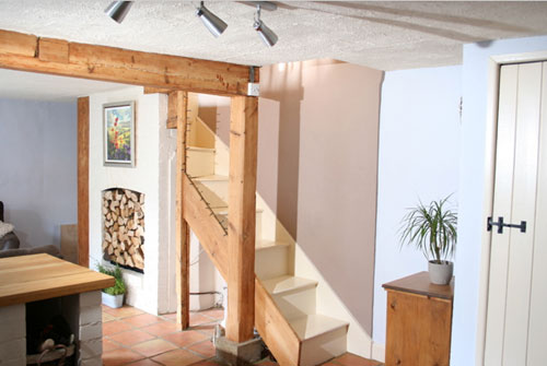
Controversial Question #6: Should all the trim in your house be the same color? Well, we love that all of our trim is a nice crisp white (it keeps our home feeling cohesive and current) but we’ve also seen houses with rich dark wood moldings in some rooms and clean white trim in others- and it looked pretty darn amazing as well. And here’s a lovely English casa with gorgeous raw wood beams that add tons of character and charm:
The bottom line? Do what you love (whether that’s mixing and matching trim throughout the house or keeping it all consistent and cohesive).
Controversial Question #7: Can you put an area rug over wall to wall carpeting? Our opinion: yes, yes, yes! We love rugs over wall to wall carpet. Any seating area that floats in a space (which is often how they look best, even in small rooms) needs something to ground and define just that distinct area. So a rug over a carpet (be it jute, wool, or anything really!) often looks fantastic in every space from a living or family room to a bedroom with a small seating area or a centered bed. In short: Go for it if it makes you happy (and avoid it if you disagree)!
Controversial Question #8: Besides paint, what’s the biggest way to transform a space? We believe that answer is undeniably curtains (as demonstrated by this amazing reader-submitted curtain makeover, which you can learn more about here):
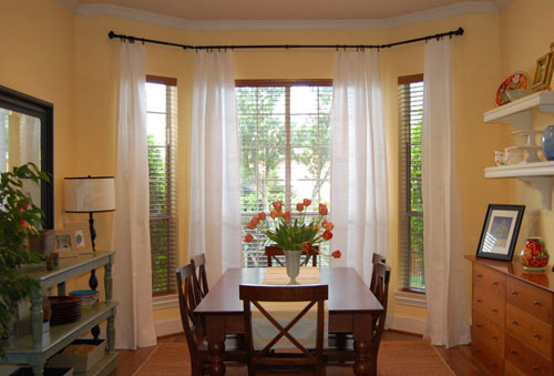
They really can make the room and create a taller, bigger, and more architectural effect. Here’s a post all about picking the perfect window treatments to spruce up your space, so you’re bound to find lots of ideas (don’t forget to check out the comment section for even more solutions).
So that’s our take on a few controversial decorating topics. What do you guys think? Are there any decorating rules that you happily break around your house? Or any that you stick to religiously without any interest in straying? Do tell.

casa_cuervo says
As a student of Soto Zen I cherish empty space. Also, I look at your house and think, “I’d hate to have to dust it.” That being said, I’ve always loved old frames with meaningful old photos. But I must say that I watched your framing video and was impressed. I’ve a wild hair to frame my great-grandparents photos and my family’s photos in a single color and strike up a relationship with my downstairs couch. I know very little about decor but to me, decor would be where art and comfort meet. Stylish livibility? I would like that. You guys have opened my eyes a bit. Thanks.
Carolyn says
A home should definitely reflect the personalities of the people living there. Currently I think all the rules in our house are broken! (thanks to my darling, toddler daughter) but that’s ok, because I know that this is just a (frustrating and messy) season, and a small part of the bigger picture. A home should be adaptable, and change as needed. So I say, break those rules and do what works for your situation!
Jacqueline says
Oh thank you! You thanked us today, but I’m reading the last few blogs backward, so now I pass it back to you. I get a lot of inspiration from your blog. I’d given up on the “design dilemma” of my family room. I was ready to toss out everything and start afresh. Now you didn’t solve it, but you gave me hope that I can find a design in which my forest green leather sofa (an oldie, but not cheap Hancock & Moore) will look good again. However, if you ever need another idea for a blog topic, could you show design alternatives for the TV wall? I’ve reviewed all of your moodboards; sometimes the wall with the big-screen TV is not shown in the “after” posting. In the man-cave one, John added a description of what accessories could be added, and where, but it’s hard to visualize. Seeing your “before” and “after” photos of the dining room curtain project, for example, gives me an idea of the significant impact of relatively small changes. Ciao!
YoungHouseLove says
Thanks so much for the thanks! And as for your post suggestion we’ll add it to our (admittedly very long) list. Stay tuned!
xo,
s
Cecilie says
I don’t know if you keep up with comments on older posts but I wondered something when reading this post: when creating gallery walls do you match the pictures / prints etc. or do you simply mix whatever you feel like at the moment? I am in the process of creating one or more gallery walls and I find myself wondering whether I should coordinate the prints and pictures or mix at will. I will be mixing frames but I plan on all of them being black (I have a large collection of early 20th century frames that I will spray paint black)… Any thoughts on how mixing and matching is too much?
Thank you for all your inspiration – my husband hears the words Young House Love often! Oh and by the way: I live in Bonn, Germany and a couple of months ago I spotted a guy in town who looked exactly like John. Guess there’s something to the “we all have a look alike theory” ;o)
YoungHouseLove says
It’s definitely a “do what you love” thing! In a picture gallery in our den we hung a series of black and white photos in a grid, but in Clara’s nursery we got a lot looser and hung whatever we liked in a variety of frames of different sizes. We love the look! And because all of your frames will be tied together by the black color, we think you can mix and match the art as you please!
xo,
s
p.s. Off to tell John that he has a German doppleganger!
Cecilie says
Thank you for answering, Sherry! I really appreciate it and once again my husband got to hear you mentioned in the same context as decorating ideas ;o) Thankfully he is a truly patient guy.
Leslie says
Love your blog! Just wanted to offer a piece of advice to any of your readers who decide to place an area rug atop wall-to-wall: invest in a good rug pad that specifically works for hard surfaces and carpet. Who knew a heavy 8×10 wool rug would shift under a queen bed!
Brittany says
John, you really should wear shoes when ripping out sinks and the like. I lost my grip on one and smashed those little piggies.
YoungHouseLove says
Very true! Don’t try that at home folks!
-John
jamie eads says
I read a number of blogs, so I may be somewhat confused.Was it your blog where someone mentioned that her husband wanted a recliner and you gave a suggestion of a recliner/sofa/chaise combination? If I’m at the correct blogspot could you please tell me where to find the date for this particular blog? Or even where to locate such a thing. thanks so very much..jamie
YoungHouseLove says
Hey Jamie,
It actually sounds like you’re referring to a recent column that we wrote for Do It Yourself magazine. Here’s that link for you: https://www.younghouselove.com/2010/05/he-said-she-said-something-in-ukrainian/
Hope it helps!
xo,
s
antmo says
Love your ideas and choice of colors, which brings me to my question. What colors are you using for the picture with the red couch and the one below with striped chairs. Beautiful!!!!
YoungHouseLove says
Just click the word “here” above that photo to see more info about that room makeover. Hope it helps!
xo,
s