Those of you who follow our updates on Facebook and Twitter may have tried to solve the mystery of why we slept in the guest bedroom for a few nights last weekend. Well… (drumroll? trumpets? cow bell?)… we painted the ceiling in the master bedroom. Yeeehaw!
One of our favorite things about blogging about our adventures in home improvement is that we’re still totally learning as we go. By no means have we cracked all the decorating codes, and we just love when we make some groundbreaking-to-us discovery along the way that we get to share with you guys. Well, this is one of those times.
After three years of loving Glidden’s Gentle Tide on the walls of our bedroom (it’s the only room we didn’t paint at least twice to get it right) we suddenly realized that our white crown molding paired with our white ceilings were sort of yawn. The entire room felt polished and luxe thanks to billowy floor to ceiling curtains, breezy blue tones, and crisp white trim… but the boring white ceiling made it feel like we had neglected the fifth wall in the space- and it certainly didn’t do anything to accent the crown molding that we introduced a while back for a bit more interest and architecture.
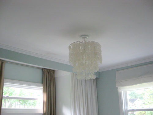
Nope, we were definitely not playing up all of our rooms positives, but that’s nothing that two $7 quarts of paint couldn’t solve. First we taped up some paint chips on the ceiling and studied them at all times of the day to figure out which one we liked best. Taping them to the ceiling is a super important step (as opposed to just holding the swatch up against the wall) because light hits that plane of the room in a totally different way (something that looks super light against the wall might look mega dark on the ceiling or vice versa). Once we had them all in place it was easy to see which swatches were too purple, too gray, too dark, too weird, and juuuust right.
We settled on the swatch at the end because it felt like a lighter version of the color on the wall with a bit of fresh celery worked in. We could have had the paint guys mix up a tint that was exactly the wall color with a bit more white in it (for an almost-guaranteed-victory) but we jumped at the chance to add a bit of soft interest by choosing a swatch with a bit more green in it to layer in more beachy blue-green without hitting anyone over the head. It just felt a bit fresher and subtly exciting (you can’t see much of the green in this shot but it’s more apparent in the next pic).
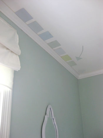
So fourteen dollars later we got to work with our two quarts of flat paint. What color was it? Glidden’s Cool Cucumber. A gorgeous super soft green just like the inside of a cucumber (the swatch actually doesn’t look blue at all, but taped up in our blue room it picked up some of those soft tones for a gorgeous effect). And why two quarts? We hate to pay $20 to store a huge gallon of paint when we only need about half of it, and it’s only around $14 for two quarts which we knew would cover well enough and leave us with some touch up paint that we could easily store (since it’s about a fourth of the size of a big gallon). Why flat paint? It hides more imperfections than eggshell or semi-gloss options, and for surfaces like a ceiling it’s nice to play those down with something that looks smooth and seamless. Here’s John getting his roll on (he’s the roller in the family while I’m the resident cutter-inner):

The moment we had even a smidge of paint on the ceiling we immediately knew we were doing the right thing. The crown molding went from “I’ll just sit here in the back of the class and act invisible” to “Oooh, I know the answer to that complicated math problem so I’ll shout ‘pick me pick me’ and flail my arm around.”
And these photos really don’t do the serene green color any justice whatsoever. It’s like the softest piece of sea glass that got battered by waves for years and only has a hint of celery green left to show for it. And it goes so perfectly with our greeny-gray-blue walls that we’re still congratulating ourselves for stepping a bit out of our comfort zone (instead of adding 50% more white to the Gentle Tide formula and calling it a day). It by no means shouts “green ceiling” but it adds to a layered look instead of something super matchy-matchy and we love that it’s not so super coordinated and it looks a bit more interesting and dimensional. Plus it really plays up the crown molding since we no longer have the white on white thing going on.
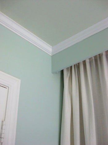
Most of all we love that we lost that blinding white ceiling but the room still feels airy and open. The ceilings actually feel higher since the super white paint made them more apparent (which made them feel closer) while the soft celery tone makes them feel a bit more like they recede into the sky.
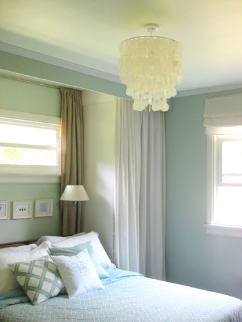
And the way that the light of the capiz chandelier bounces around the ceiling really makes the room feel like it’s glowing- like the shiny part of a sea shell or the inside of a limesicle. It really is cool and refreshing yet warm and enveloping. And although this last picture doesn’t do a great job of demonstrating it, the crown molding really does rise to meet us every morning, noon and night (check out the picture above this one for a better demonstration).
So that’s what we did last weekend in under three hours with less than fifteen bucks. And the reason we slept in the guest bedroom? Even though Glidden is naturally pretty low in VOCs, we always try to limit our exposure to paint since we use it so often, so sleeping in the guest bedroom for a few nights while we kept the windows open and a fan going in the master bedroom allowed us to appreciate another bedroom in our house. And tempt us to paint that ceiling as well. In fact I’m now dying to paint the ceilings in both of our guest bedrooms along with our living room and sunroom so stay tuned to see which one we attack next- and what color we choose.
Oh and let us know if you’ve had any decorating-related lightbulb moments lately. We never would have thought to paint our ceilings anything other than crisp clean white a few months ago, and we’re itching to know what sort of fun discoveries you guys are making on the home front. Do tell.

rachael says
I apologize if this is a repeat question, but we have a similar color blue-gray on the walls in the master and would LOVE to paint the ceiling too but are having a hard time deciding how to go about it because the middle part of the ceiling is recessed about 3 inches higher than the border (about a foot wide) (sorry if this is a weird description, I’m not sure how else to describe it). Do you have recommendations for colors? Right now the outer part is tan and the interior part is white. Should we paint the whole ceiling one color or stay with the two-toned look with different colors?
YoungHouseLove says
Oh yes, I’d go with all one color to make it feel more expansive (open and airy) and less fragmented.
xo,
s
Natalie says
I have only just discovered your blog and I love it! I draw so much inspiration from it, although sometimes it overwhelms me a bit as it makes me feel like I have so much work to do on my own house. My husband and I just got married, bought our house, and are expecting our first baby this coming August, and we don’t even know where to start with the house! Well, we are starting with the nursery, and then we will go from there, I suppose. Question: would it be super awkward if I just copied everything you guys did since I have no original ideas of my own, nor do I really know what my taste is, nor do I have an eye for decorating at all??
Anyways, my question (for now…I have a ton!) is: we have a bed that we just bought recently from a local store (buy local!) which is hand-made from local hardwood in nearby Scarborough, Maine. My husband had one rule for this bed: I wasn’t allowed to get it in white (my first knee jerk reaction for color since, as I mentioned before, I have no idea what I’m doing house-style wise..). So I chose a cottage blue color (it’s like a light, bright, crisp sky blue). What color should I paint my walls?? Do you think the blue featured here would work, or should I use a different color? The bed could easily look like a child’s bed, I feel like.
ps, we are big fans of Burger, as we have our own Mr Puppy Pants, a fluffy Australian Shepherd named Moseby who enjoys throw pillows and chewing on molding. He’s the only one with distinct decorating tastes.
YoungHouseLove says
Your blue bed sounds so sweet! I love it! I would go with some soft sand colored walls or soft gray walls since blue walls with a blue bed might be too much. Maybe try Ashen Tan by Benjamin Moore or Moonshine or Owl Gray by Ben Moore. Those colors are such pretty tones for the blue bed to work with and it should look nice and sophisticated (not like a little boy’s room at all). Good luck! And Burger sends his love to Moseby!
xo,
s
Morgan says
We are going to be painting the outside ceiling soon. Would you recommend exterior paint for a screened porch?
YoungHouseLove says
Definitely! Good luck!
xo,
s