Once again it’s one of those weeks where we’ll all over the place. After stenciling the floor in our bath and closet, eking out some seasonal craftiness, and hanging extra thick crown in Clara’s room we’re now in the midst of sealing the stenciled floors, completing the canopy wall in Clara’s room, ripping up the old carpeting on our stairs, and not-so-patiently waiting to grout the sunroom tile floor as soon as things dry up out there (Mother Nature is playing a cruel joke on us with all of this rain). And in the middle of it all, we got this question that I thought would be interesting to think about. So here we go.
Q: Do you two ever make painting mistakes? I feel like I’m always choosing the wrong color, or even worse, not picking anything at all because I’m so intimidated to make the wrong choice. After all these years of painting walls, trim, doors, ceilings, and even floors, do you have any tips for me? I’d love a roundup of paint mistakes you’ve made and what they taught you, mostly just to see if I can save myself from a similar fate! If you don’t have time to address this I understand, but I would really appreciate the help. And so would my walls :) – Marta F.
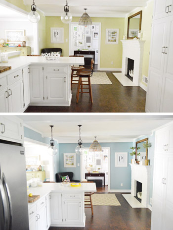
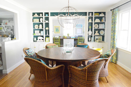
A: Generally we like to think of ourselves as having an okay eye for picking paint colors. We usually go into things with a clear vision for what we want, can typically pick colors quickly and confidently (our typical method is to hold swatches up in the room we’ll be painting and observe them in different lighting situations), and we’ve been known to buy a few test pots whenever we can’t make a choice based solely on the swatches. But we’re certainly not immune to making bad calls when it comes to paint selection. And actually, those missteps have been great learning experiences. So thanks for the question, Marta. Here are…


Suzanne says
We bought about 9 tinted SW samples in trying to select a gray tone for our open contemporary floor plan with lots of windows and skylights. The colors we selected would look blue on some walls and pink on others due to the variations of light. We finally had to abandon a grey tone and selected a just off white Swiss Coffee (BenjM) color that I had in a previous house. Not bold, but gives a crisp modern feel without feeling stark. BTW, we just installed Moss penny tile for our kitchen backsplash last week paired with Calacatta gold marble countertops and it looks gorgeous!
YoungHouseLove says
Oh my gosh that sounds amazing! I’d love to see a picture!
xo
s
Kathy says
I recently bit the bullet and decided to hire an interior decorator to help me pick out paint colors. She suggested a lovely grellow color for two interior walls in my log house. I painted one wall…it looked puke green. I decided to try the goldier version of the same color…one friend called it baby poop gold, another called it bile. Even though the colors looked great in direct sunlight, my logs did them no favors. So….sadly….I guess paid professionals can get it wrong too!!
YoungHouseLove says
Oh no! I’m so sorry about that Kathy!
xo
s
Jessica S says
My husband I bought our first house together this Spring, and we had about a month before we moved in that we could paint,and I picked out every color for the 1st floor at once! It was very stressful, and I was so afraid of making a mistake! Which I did, in the master bedroom. We have a beautiful double wedding ring quilt my grandmother made us for our wedding, and I was determined to use it despite the busy pattern and floral fabric (it is gorgeous as a whole, but probably not the fabric I would have picked myself :)). I selected a light neutral so as not to compete with the quilt, but I failed to consider quite how large the room actually is, so everything just looks lost and the room is not at all cozy. I’m currently looking for a darker color to make the room seem smaller and cozier, but my husband refuses to paint the room again, so I’m all on my own. :) I dislike it so much, though, that I just have to repaint! Black Pepper is actually a contender after seeing it in your bedroom!
YoungHouseLove says
Ooh, we really love Black Pepper! Good luck Jessica!
xo
s
Alainna says
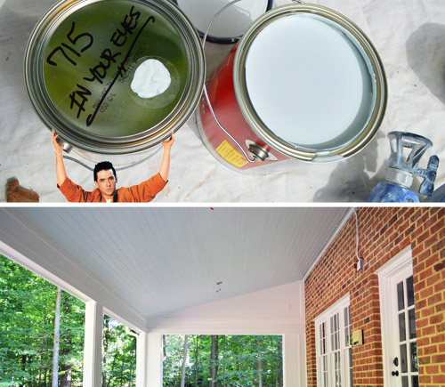
In Your Eyes came on Pandora as I read this. Maybe it’s a sign I need to paint something in my house that color. :) Thank you for the tips – have a great day!!
YoungHouseLove says
Hilarious! It’s definitely a sign.
xo
s
Terresa says
I know others have already made this comment, but I immediately thought of the green bathroom vanity. I could really appreciate the look you were going for and it could have been so cool, but then the color was obviously just wrong. But I’m glad you shared it, it helped comfort me in my color mistakes!!
YoungHouseLove says
Aw thanks Terresa!
xo
s
Amanda says
My problem with doing rooms myself is getting them to feel ‘finished’ – not as in an always tweaking them sort of way, but getting them to feel complete in a grown-up sort of way.
There’s just some sort of skill to finishing off a room (after paint and furniture) that I haven’t mastered. Suggestions?
YoungHouseLove says
Curtains and art are always a turning point for me when a room feels more finished. And a great rug (the right size is key I think). Those things can go into an almost done room and bam, looks so welcoming and complete. Hope it helps!
xo
s
Marie says
Have you guys seen this??!!!! Your on the anthropology website! http://www.anthropologie.com/anthro/product/home-room/27210285.jsp?cm_sp=Fluid-_-27210285-_-Regular_17
YoungHouseLove says
Ahhh, isn’t that crazy?!
xo
s
Janet says
Great post & so helpful! I’m stuck…can’t decide on paint colors (have an open floor plan), still have the ugly pinky-beige flat paint & hideous wallpaper from when I moved into my condo 4 years ago, and generally feel unable to make decorating decisions. Any advice?
YoungHouseLove says
I would just walk around the paint aisle and grab swatches that appeal to you. Then bring them home and start taping them up on the wall to see which ones you like! That’s usually how we start every time. Hope it helps!
xo
s
Chelsea @ Riding Escalators says
Haha! This is EXACTLY what happened with our dining room. We kept picturing this fallish muddy brown when we were choosing a paint color – and then ended up with an orange room. It was WAY too much against the green living room and ended up getting completely redone less than 2 years later!
http://ridingescalators.blogspot.com/2013/09/how-to-redo-your-dining-room-2-years.html
YoungHouseLove says
Aw, I see what you were going for but that shot with the green walls is a lot! I really love where you ended up though Chelsea!
xo
s
erin says
oh god. the bedroom. i had always wanted kind of a blue/green super light paint color for our bedroom but my husband wanted darker. so i just let him go for it. and it went up. INSTANTLY i hated it. but i lived with it for a year. i kept complaining about it, then somehow my husband finally got on the wagon and said it felt too cottagey! bingo! so we really waffled about what to do for the next paint. OMG that was dreadful. we got like 6 paint samples. and we ended up mixing our own but it’s PERFECT. i’m so satisfied now if only our bed would come!
YoungHouseLove says
It’s amazing that you mixed your own and got it perfect! I would never have the guts to do that!
xo
s
Kate C says
Such good tips! I am painting challenged. My living room had 4 large, dark paint trials up on the focus wall for over 2 years. Friends joked it was our modern art. We finally painted this year, and I’m happy that I didn’t go with a single one of those swatches!
I also have fallen victim to the “new color here and here and here” routine. Our bathroom is currently a color mistake, and my husbands office almost became one. Instead, I’ve decided to go with a neutral grey tone in both, with a wall in color, or a pattern of color on one wall instead. It’ll be much better.
We have one really tough one though. What would you do with two walls that flow through two separate rooms? My living room is a warm sand color with a blue accent wall, but the two long walls also continue straight into the kitchen. Warm sand will not look good in the kitchen. Right now the paint literally stops at a straight vertical line where the wall enters the kitchen, and we haven’t come up with a good way to create a color break. Have you ever run into this?
YoungHouseLove says
I have seen some pins on Pinterest where someone runs some pretty decorative molding down the wall in a vertical line to create sort of a border for the paint. Sounds terrible the way I’m describing it, but when it’s trimmed out nicely it makes sense I think!
xo
s
Chelsea @ Riding Escalators says
We had the same problem between our living and dining room areas – only ours were distinguished by paneling when we first bought the house! Since that was the first thing that had to go, we had to come up with another solution to creating a distinction between the two rooms and ended up building a very wide arch between the two. It didn’t cut off any space and is a great little architectural detail too. Not sure if it would work in your space – just another option!
http://ridingescalators.blogspot.com/2012/03/project-dining-room-fast-forward.html
YoungHouseLove says
Such a cool idea!
xo
s
Geertrude says
Oh, reading this post reminded me of our “white house” (our former house was all white when we bought it, floors, walls, everything). We tried to add some color and went for a reddish earth tone (the color of the rocks in central Australia). The first try looked orange, the second looked salmon. Luckily the third time was a charm, cause we were very close to giving up ;-)
Kati says
When my husband and I moved into our house 2 1/2 years ago, we also made Mistake #1 – we painted the living room green, the kitchen red, the bathroom yellow, our bedroom dark blue, etc. I love color, but unfortunately, I messed up big time! So now we are going through our house repainting, one room at a time. Thanks to you guys, I finally got the courage to paint my red brick fireplace white this past weekend, and I love it! Next up, painting our living room a neutral gray.
Thank you guys so much for all the inspiration! I just found your website about a month ago, and now I can’t wait to make some major changes to our house!
YoungHouseLove says
Thanks Kati, you’re so sweet!
xo
s
Famouscait says
Any tips for painting a giant master bedroom with an attached but tiny master bath? I’ve been trying to find the right grey to make the bedroom feel cozier, but it all looks way too overwhelming in the bath, which in addition to being tiny, has no natural light. My next idea was to find a color for the bedroom and then have the same paint mixed with 25-50% more white for the bath. Any thoughts on this?
YoungHouseLove says
Yes, I love the idea of a half-tint for the bathroom (50% more white will keep it from being too dark). You could try pulling two swatches like Rockport Gray and Gray Owl (both by BM) because one is about twice as dark as the other, and see how they look!
xo
s
Tressa says
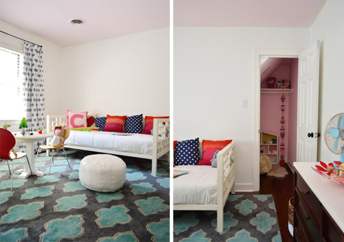
Maybe you could put a chair rail in Clara’s closet. You could paint the upper walls and ceiling white, where your eye level is, and keep it pink at her eye level. Happiness for everyone!
YoungHouseLove says
I thought about that too! Maybe some fun woodland wallpaper under a chair rail or something. I have this whole hidden cottage playhouse idea that I know she’ll love (the girl never met a stick or a rock that she didn’t like). Haha!
xo
s
Pia says
I saw your comment here S about hidden cottage playhouse idea and I thought about this wallpaper and I just had to send the link: http://www.tapetorama.se/display.php?item=54579&category=Wallpaper
Is from a Swedish site but can probably be found in the States as well. Called Little Explorer 3 from Tres Tintas.
Its small flowers and insects on it and you need a magnifying glass to see them all. That could be something to include for your bug loving kid….
YoungHouseLove says
So charming! Thanks so much for sharing!
xo
s
Susan says
What a great week – the 3rd Lloyd Dobbler/Say Anything reference. I have an open concept main floor – you can see from the front door sidelights all the way to FR sofa in the back of the house (and, shamefully, me lounging on it with Scandal on the iPad) Nearly 10 years ago, I painted each room a different shade of yellows, greens and reds – ugh. Now, I’m cycling back through with the help of the BM Affinity fan deck – a line of ‘144 harmonious hues…to create color flow throughout your home’, according to BM. I’ve selected one unifying color, Jute/AF-80, and match bolder fabric/accessories/rugs to colors in the deck to GUARANTEE they’ll ‘go’. The deck was $25 and has saved me hours of anguish and lots of $$!
YoungHouseLove says
So smart! Haven’t heard about that, but it sounds really error proof. It’s cool that they teach you to select one unifying color and to match bolder fabric/accessories/rugs to colors in the deck!
xo
s
Liz says
I once started painting my living room a color my mom and I now refer to as “caution tape yellow,” haha. Live and learn.
YoungHouseLove says
Oh man, that name paints a picture. A bright one. Ha!
xo
s
Allison says
My kitchen leads into my living room. The kitchen is grey, a colour my landlord chose. I’ve actually grown to love it. The living room is aqua… I picked it, and now I kind of hate it! I want to paint, probably more grey, but am having trouble because the rooms meet at an outside corner. I’m afraid that if I paint the living a similar but not identical colour, it will look really bizarre. Any tips?
YoungHouseLove says
Hmm, could you do the same color in both areas since they meet at an outside corner? Might be an easy way to get them to flow. Of course if you want to colors you can do that too, just hold the swatches up to see if they look nice meeting in that corner!
xo
s
Tams says
Great tips. I’ve had my share of paint mistakes too, like painting my first house bland city, all the walls were some form of tan, ugh!! The hubs and I wanted to go more colorful with our second house, but didn’t want it to look like a circus, so we picked colors from nature that of course go together, I mean, hello, they’re in nature :) Sunset orange for our kitchen, a soft yellow for our living room, and a beautiful deep sky blue for our dining room/office/whatever room. We went with a pretty apple green for our master bedroom. The colors sound crazy but they really work beautifully together. We got the color we desired but not the crazy circus house look.
Rosemary says
A few years ago I bought paint named “Sweet Marie”, a greyish purple (so I thought). Our painter was painting our bedroom with it and had done one wall, when I returned home and saw that it was the most horrible lavender, Easter eggish colour.
I was so upset, brought the can back to the store and told them that what I was really going for was more like a “Slutty Marie”…well, they totally understood, added some black to it and it turned out to be the exact colour I had in mind. Sometimes, the name of the paint can say more than you think!
YoungHouseLove says
Haha!
xo
s
Erin says
We had such trouble finding a gray that worked in the beautiful (but tiny and window-less (it really was lovely)) main bathroom of our first house. My husband ended up painting it three times. He was less than thrilled, but the end result was so perfect he didn’t hate me for too long. And I like to think it’s splendor helped us sell that house FSBO for nearly asking price! Ha. I wonder if he’d agree…
Angela says
Hi Guys! We recently moved to Austin from Dallas. We started painting our room and the color I let him pick ( the only one in ten years of marriage ) was so wrong. But I had bought 2 gallons already! yikes. So I bought a much darker color in the same family and added a little white and some grey and bam the perfect grey blue. Everyone keeps asking what color is that it is awesome! So lucked out on that one.
YoungHouseLove says
That’s awesome! So glad you saved it!
xo
s
Brandy says
Greys!!! I have had the toughest time choosing good greys. I was hip to this trend about five years ago & have probably chosen five incorrect shades of grey since! Too blue, too purple, too light, too brown. And it matters nada how popular the shade is on Pinterest or how great it looks on your favorite bloggers wall (I’m talking to u Rockport Grey;)…. it still may not work in your space. I’ve finally learned my lesson & followed your lead with hanging swatches & observing them in different lighting. Did that with the accent wall in my new house & landed on a shade & intensity I am happy with! And I’m sure nobody recognizes the shade name but that’s totes not important. What’s important is that you can live with it & love it!
YoungHouseLove says
I can’t believe Rockport Gray did you dirty like that! So glad the swatch method worked.
xo
s
Melissa says
This question was so up my alley. We just moved into a very open home, it has a beautiful neutral color up in every room but in an awful finish that shows every single greasy dirty handprint, so we desperately need to repaint, and although I like the color its pale color combined with the pale carpet seem to wash each other out. But I am paralyzed because I am the worst color picker. I normally have about 5-7 sample jars and still don’t care for it once it is up. I’m too indecisive, sometimes I’ll even decorate around the color rather than letting me be the boss. Its the subtle undertones that trip me up. I can’t always see them.
Kayla says
Perfect timing on this post!! I am finalizing the house color palette on our first house this week. Or at least round one. =)
Jessi says
I totally want to avoid mistake #1 in our house! It’s bad enough with almost every surface covered in myriad floral wallpaper, and the others in various shades of blue and green (love those colors, but too much of a good thing here…). But I really like color, the idea of being surrounded by white, taupe and grey depresses me. We picked a jewel tone blue for the master bedroom; should we totally avoid bold colors in the adjacent hall, future nursery, & bath, or could we play with color in the the rooms (the hall will definitely eventually be more neutral because it’s tiny)?
YoungHouseLove says
We’ve seen homes covered in jewel tones (every room!) that look awesome! I think as long as all your paint swatches for the whole house look nice in your hand together, it’s a great palette! It might be a red flag if you hold all the swatches you want to use and a few feel clashy or like they don’t belong – so that would be my tip. But you definitely don’t need to just do white, taupe, and gray! Go color crazy :)
xo
s
Jessi says
Thank you!! I am totally inept with color and am terrified that my house will look like a funhouse before we’re done :D
JessicaL says
I love having a ton of color throughout my home, however, what I have been finding now that works best for me is doing a light shade of what I like, or a neutral tone for the all-over color, then making it pop with lots of accent peices around the room with a bright version of the wall color I chose, or even an accent color. Makes it a lot easier when you want to change up your color pallet too! I actually was thinking about Clara’s closet before you even posted about it. I love the thought of cedar shingles on the ceiling in there, and maybe painting the side walls back to white, leaving the pink as the back wall peaking through? The back wall would make the side walls a soft shade of pink from reflection. Oh the choices!
YoungHouseLove says
So much fun! I was thinking about shingles on the slanted wall and maybe fun wallpaper on the back wall? Not sure where we’ll end up! Especially since Clara made such cool choices for her canopy wall, so I’d love to get her involved in her closet too!
xo
s
Brittany M says
I tried to post this yesterday but I don’t think it went through (got some kind of error msg).
But along the lines of painting….
Do you ever get paint all over the place and in your hair or soemthing? I feel like I never see a picture where there was a major “oops I dripped it on the wood floors”.
When I’m done painting a room it looks like Jackson Pollock got ahold of my paint brush…and not in a ‘I can sell the painting for a bazillion dollars’ kind of good way. I have to cover and tape every surface known to man when I paint. Please tell me it’s because you’ve been painting for years and it gets better with practice. :)
<3 Brittany
Brittany M says
oops…..I see my comment from yesterday.
Sorry!!
<3 Brittany
YoungHouseLove says
So glad it came through!
xo
s
Jill says
A stupid mistake from a first-time wall painter… that little sample container is NOT necessarily the same color as the gallon you order! I thought I was doing the right thing by using up the sample paint only to have to repaint huge sections that were just slightly darker. Lesson learned :)
YoungHouseLove says
Oh no! I didn’t know that could happen!
xo
s
Jill says
Also… Behr has an iphone App that lets you test their colors in your own rooms via photos. It’s called ColorSmart by Behr.
Christina says
The John Cusack randomness made me LOL. Good stuff.
Lindsy says
This was great! I have committed mistakes #1, #3, and #4 myself. There is something about a first house that makes you want to paint every room a distinct color. The freedom, the possibilities, the desire to “express yourself”…
Pam says
One thing I’d like to add about looking at the paint chips in the store – the overhead fluorescent lighting in the store means the colors look completely different than they do when you get them home. If I’m trying to select a turquoise color, I just grab about 8 or 10 different chips that I think are close, some that are on the blue side, some that look more green. Once I take them home, the color I thought was right is nowhere close!
YoungHouseLove says
Oh yeah, great tip! That’s such a bummer. We’ve bought a few paint decks, which really help since you have them all at home already and you don’t get tricked by that lighting!
xo
s
Krissy says
I picked a paint color for our bedroom 2 years before we did it. The bedroom was at the bottom of the redo list, so the paint chip sat pinned to the wall that whole time. I thought it was the perfect color. Then we started painting and I panicked because it looked SO MUCH darker. I thought it was going to be horrible, but we both loved it once it dried. Glad we stuck it out.
On the other hand, my mom picked a weird green to paint her kitchen/dining room… it’s like a dark lime. It looks nice in the afternoon, but the rest of the day? Rough. And there’s too many cabinets and things to cut in around, so she’s sticking it out for a while…
Amanda says
I recently purchased my first home and painted EVERY room. I was replacing most of the flooring too before moving in so wanted to paint before I had to worry about dripping paint on my new floors. I remembered your tip to “pick a whole house palette” but chose all the colors without seeing them in the space to be painted. I was unsure about almost every color until the new floors were installed. The new flooring changed everything and I love the colors! I never thought about the way colors reflect off other surfaces. Once again, your tips are right on!
Courtney says
We picked colors from the list you guys have (Glidden’s Water Chestnut and Gentle Tide). Since the living/dining/kitchen areas all flow into each other, we used Water Chestnut all throughout, and in the baby’s room (that’s where I tested it to see if I liked it). The big boys chose their own medium blue (one of the BM blues you had listed), and our room will be Water Chestnut with Gentle Tide as an accent wall. Gentle Tide will also go in the bathrooms. We did notice that the color is not as obvious with our orangey-brown trim, but hopefully we’ll be replacing or repainting it white.
In your experience, have you tried to coordinate your interior and exterior paints? My mother made the comment that the outside of the house is warm, while our interior palette runs a little more neutral/cool.
YoungHouseLove says
I think we always treat the outside of the house and the color palette inside as separate animals, just because an all brick exterior is a lot darker/more demanding than a light and bright palette inside, but that still somehow works!
xo
s
Suzette says
This is such a timely post! We just painted our basement and I used Edgecomb Gray – just like you all did for your entry. And we love it!! So I would say that one tip for choosing the right paint color is to see if Young House Love loves it :) Now, I need to use it all over my house to remedy mistake #1 at our house!
YoungHouseLove says
Haha! I’m so glad you love it!
xo
s
Megan @ Monroe Makeshift says
I used to be able to pick paint colors like no one’s business. When I first bought my house, my office was bright deep blue, the kitchen dark purple, the bathroom vibrant teal, the bedroom almost black. The living room and dining room were always steel gray and very cold looking (the same color looked great in my last place though!) So I repainted the living room to warm it up. And painted it again. And again. I’m on my third color and everything looks too yellow. The test pot reads gray, when the whole room is done – it’s butter yellow. Anyone have any suggestions?
YoungHouseLove says
Oh man, anyone have tips for Megan? Could it be your light bulbs (are they super yellow and switching them for daylight bulbs could help?).
xo
s
Jordan says
I just recently learned a very important lesson about yellow paint colors: any paint that has the word yellow in the name is too yellow for the walls. Luckily I learned it with paint samples before buying the gallon and committing :)
One of my biggest paint color fails was one summer when I was home from college and I painted my room at my parent’s house. I was going for a pale green, but wanted to make sure you could still see color…and ended up with LIME green walls. Then I moved away and left my parents with a lime green room in their house :) I think my mom is planning on repainting it soon (7 years later)
YoungHouseLove says
Haha, that’s a funny tip!
xo
s
Julia | alivingspace says
Ahhh this post is freaking me out! I’m literally in the middle (like the first coat of paint is drying right now) of painting one wall in my living room dark blue and I’m so nervous it’s going to be way too much! I keep telling myself once I get the second coat on it will look great, but its so very blue right now…
YoungHouseLove says
Ooh give it drying time (things dry darker) and wait for the second coat too before passing judgement. I hope it’s PERFECT!
xo
s
Lynn W says
My tip is to not live with something you don’t love. When we moved into this house 8 years ago we painted the bedroom a light spring green. I hated it from the time I rolled the first wall. I just this week picked a new color (I wanted aqua). Our bedroom is weird. Aqua turns baby blue, baby blue turns periwinkle. I got 4 different aqua-ish samples and put them on every wall. None of them were perfect. I took one that was a bit too dark and teal-ish and and mixed it with one that was too light and baby blue and came up with the perfect color, then took it to Home Depot and had it color matched. It’s exactly what I wanted! Finally after 8 years I am happy with the color in here.
YoungHouseLove says
That’s so smart! I love how you took the time to mix up the perfect color.
xo
s
Dana@chocolateandsunshine says
As much as I like to decorate my home, selecting a color has not always come easy. I have a small accent wall in the kitchen which is part of a very large open floor plan and I painted it 3 times before I finally settled on a bold wallpaper. Now I am happy.
By the way, I really like the blue ceiling of your porch. I loved it when you first introduced it and still do. You’ve certainly had some practice. With each home, you learn something new as you’ve just explained. Good luck!
YoungHouseLove says
Aw thanks Dana!
xo
s
brooke says
When I first painted our nursery, looking for a cheery green, we ended up with a neon color that made me so nauseous I had to close the door. And the neon glowed under the door as if aliens were landing- not where you want to lay your first born to rest!
Anika says
This is such a helpful post – thank you so much for taking the time to share some of the lessons you guys have learned along the way (there are so many times I literally take notes because I want to make sure I can save myself some time and headache by not making the same mistakes, especially if it’s new information aka what type of paint to use on trim!). I think the comments for this post had so many fun stories and great tips too – I love this little diy community!
I’m super excited for the pick this not that follow up post – thanks for incorporating suggestions/feedback!
YoungHouseLove says
Thanks Anika!
xo
s
Stephanie says
My daughter’s room would drive you nuts. It’s all pink, called cotton candy. Her whole room is painted the color of that closet with an accent wall in even a darker pink. It makes that part of the hallway glow. But you know what, she loves it!
YoungHouseLove says
If she loves it, it would never drive me nuts! Clara’s first nursery had green walls and a blue ceiling and big bright floral curtains and it made me smile like crazy!
xo
s
Gnome Lover says
Can I just say that “In Your Eyes” is the best name of a paint color ever? You should and could do a whole post where you pick paint colors based on their fabulous names!
On a serious note, I love that blue on the ceiling. It really is pretty.
Jenni
YoungHouseLove says
Haha! There are some good ones out there!
xo
s
Alicia says
You mentioned in a recent post that you use a nest thermostat- I was reading about the new fire alarm system they’ve brought out- do you have any plans to check those out?
YoungHouseLove says
They sound really cool, so I think we’ll check them out. Maybe “Santa” will get one for tech loving John for Christmas…
xo
s
Elisa Simpson says
You always seem to have such great timing. I’m currently planning & designing our second floor addition (aaahhhhhhh!!!) and I wasn’t sure how to go with paint colours and then you blog about this! :) some of these tips really help with the decision making process. I’ve discussed it with my gorgeous man and now we both agree on how to make it flow and also make it our own without rainbowing it. Thanks guys!
YoungHouseLove says
So glad! Good luck Elisa!
xo
s
Shelby says
I liked the grey yellow kitchen! It was nice to see something warmer toned IMO for an eating space. Blue suppresses appetite and I always feel it’s slightly out of place in kitchens and restaurants. Just a tad “cold”. Love it everywhere else though! :)