Once again it’s one of those weeks where we’ll all over the place. After stenciling the floor in our bath and closet, eking out some seasonal craftiness, and hanging extra thick crown in Clara’s room we’re now in the midst of sealing the stenciled floors, completing the canopy wall in Clara’s room, ripping up the old carpeting on our stairs, and not-so-patiently waiting to grout the sunroom tile floor as soon as things dry up out there (Mother Nature is playing a cruel joke on us with all of this rain). And in the middle of it all, we got this question that I thought would be interesting to think about. So here we go.
Q: Do you two ever make painting mistakes? I feel like I’m always choosing the wrong color, or even worse, not picking anything at all because I’m so intimidated to make the wrong choice. After all these years of painting walls, trim, doors, ceilings, and even floors, do you have any tips for me? I’d love a roundup of paint mistakes you’ve made and what they taught you, mostly just to see if I can save myself from a similar fate! If you don’t have time to address this I understand, but I would really appreciate the help. And so would my walls :) – Marta F.
A: Generally we like to think of ourselves as having an okay eye for picking paint colors. We usually go into things with a clear vision for what we want, can typically pick colors quickly and confidently (our typical method is to hold swatches up in the room we’ll be painting and observe them in different lighting situations), and we’ve been known to buy a few test pots whenever we can’t make a choice based solely on the swatches. But we’re certainly not immune to making bad calls when it comes to paint selection. And actually, those missteps have been great learning experiences. So thanks for the question, Marta. Here are…


Heather Fritsch says
Great paint tips! Thank you so much for sharing. We can definitely relate to paint issues. My husband and I had our townhouse painted prior to moving in, only to find that our “creamy yellow” was casting a lime green glow everywhere. For months after our walls looked like patchwork quilts. We had squares of yellow paint swatches on every wall, and when my mother-in-law visited she thought they were abstract art! Thankfully we settled on BM Hawthorne Yellow, and have loved it ever since.
On the subject of paint, I chuckled when I saw page 74 of HGTV Magazine’s November issue. A beautiful mudroom is featured that resembles your former blue painted foyer. You didn’t know your blue painted trim would make a comeback! :-)
YoungHouseLove says
So funny! I can’t wait to see it!
xo
s
Pia says
Paint is so hard to get right! I think that is where the name comes from pain(t). In our first owned appartment I wanted a light grayish blue cloud colour in the hallway and a warm sand colour in the livingroom. We ended up with a light scream:y blue the hallway and a pink livingroom. It was AWFUL! But then again. It is just paint. When we moved from that appartment the livingroom walls were creamy white and the hallway a soft olive green tone that took 10! samples to find. I love that you in the States acutally use so much colour! Here in Sweden ALL ceilings are white (no exceptions) and almost all walls are white as well. And almost all floors are hardwood oak floors. Serously boring.
Linnea says
I make color mistakes constantly. I painted the living room in my last flat 4 times! I even hired an interior designer to help me pick this time. She chose a very fashionable, greenish dark grey. I was very skeptical (as I too, love bright colors), but I thought it was time to step out of the comfort zone. After all, nothing I had done previously had turned out great either.
While it’s certainly in fashion with dark walls right now, it’s so depressing! I feel like I am in a cave. Even my kids complain about its oppressiveness. So, repainting it is.
YoungHouseLove says
Oh no!
xo
s
Anna, Sydney says
Entirely irrelevant (sorry). But just stumbled upon this:
http://diyshowoff.com/2013/10/24/anthropologie-inspired-wish-bone-tutorial/ (referring to first pic in this post). Just in case you haven’t already seen it. :)
YoungHouseLove says
Ahh! Isn’t that amazing?!
xo
s
Kathy says
Loved this post. It was very helpful in making me aware of not just the wall color but what it will do to an entire room, countertops and all. Here’s my idea for Claire’s room: A Dutch door on her little playroom. I saw it in a Mary Englebreit childrens decor book and I’ve wanted to do it ever since!
YoungHouseLove says
That’s so funny! I thought about that the other day but worried she’d bump her head on the top part of the door (since it separates and becomes sort of a swinging plank of wood). Anyone else have this issue? I’d love to make her one but don’t want her to get hurt in the name of cuteness. Haha!
xo
s
danielle says
What color white do you use on the ceiling? Do you use typical ceiling white or something else? What about your trim? THANK YOU! Love your color choices!!
YoungHouseLove says
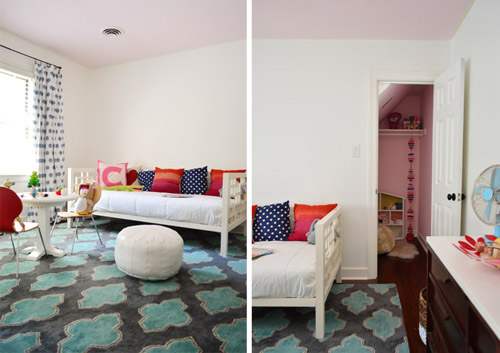
We typically use the same color on the ceilings and trim but it’s semi-gloss for the trim and flat for the ceiling (Simply White or Decorators White by Ben Moore are two of our favorites). We also have painted ceilings other soft colors (light green, subtle gray-purple, soft blue, etc) as a soft accent color in a room. And in small choppy spaces (like bathrooms and closets) we like to carry the same soft color that’s on the walls up to the ceiling so the room feels less choppy and more expanded.
xo
s
Karen Schravemade says
Oh, I love this. I’ve made quite a few colour blunders in my time! Not the least was trying to pick three different grey colours for three different rooms in our current house: one turned out purple, one turned out brown, and the last was grey-blue. Ack! I know why they call grey a “colour chameleon”. We’re building a new house at the moment and I finally got it right – a nice deep moody grey that actually stayed grey on the walls. Win!
karen @ paperfancy.com says
Thanks for these great tips!! Color is a tricky thing and you’re right that it looks different on different planes. If it’s a window wall the color might look darker but if the wall is across the room from a window it might look much lighter. Crazy! Good thing it’s just paint and we can redo and redo….
Kristin Smith says
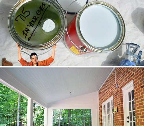
Hahahaha! I love the Lloyd Dobler holding up the “In your eyes” paint can!
Shannon [Our Home Notebook] says
So good to know I’m not the only one who’s had to try a few times to get the right colour. The kids room seems to constantly be the hardest for me. In our rental I was trying to pick a soft blue and the first one was more smurf blue. Thankfully the room needed another coat anyways so we were able to just correct the colour and keep going. Their current room took three tries to get right, which meant one extra whole room painting. I was trying to pick a sand tone and it kept reading pink in their room. So I switched course with a grey with green undertones which we love. I totally had to keep reminding myself it was just paint!
Tina says
This is amazingly timely for me. My sister and I close on our first house next month, and are having fits trying to agree on paint colors and make them jive together. I think you excellent tips have probably saved us from doing a massive repaint. So thanks. :D
Bonnie @ The Pin Junkie says
I’ve NEVER picked the right paint color the first time. Thanks for this helpful advice. I needed it!
kathleen says
A painting tip I learned the hard way…In my first house I had white trim everywhere but I picked a grey white for rooms with grey paint and cream white to go with taupe colors etc. It looked great in each room but I had 10 different cans of whites in my basement. Touch ups were a nightmare as I could not remember which white went where. Next house I chose Porter White Umber (a true white) for all trim in the whole house. Looks great with all the other colors and simple for repainting and touch ups
YoungHouseLove says
Great tip!
xo
s
Phyllis Quast says
I used to have HUGE struggles painting. It never looked the same as the swatches I would put up and/or paint on the wall. I finally consulted a paint specialist. She came to my house to help me choose colors. Here’s what I learned. Putting the colors up against a wall that already has color on it will affect the color of the swatch. So…we got big sheets of white posterboard and put the swatches on there and moved them around the room. HUGE difference. I was seeing the true color…and I got a house that I amcompletely happy with!
YoungHouseLove says
Really great tip!
xo
s
Victoria says
I’ve been pretty lucky with paint with two glaring (and I do mean GLARING) mistakes.
First I wanted a soft coral color in a dark hallway so I chose a color called “mango” that looked perfect in the swatch. I didn’t test it “in situ” but just started painting. So far, so good and looking lovely. Finished painting the hall and left the flat to do some shopping. When I came back the paint was pretty much dry and OMG it was neon orange! I seriously needed sunglasses to look at the walls and the color actually hurt my eyes. Epic fail.
I quickly (and wearing my sunglasses) watered down some white paint and white washed the neon orange walls. Thank goodness that worked – I now have a dusty soft coral color which is quite pretty.
Second, I decided (why??) to paint my dining room a soft yellow. The color looked beautiful in the swatch and lovely when I tested it on one wall. After I painted the whole dining room and the paint dried I hated it! The color made me feel nauseous – not what you want especially in a dining room. Since the dining room and living room are visible to each other I re-painted the dining room the soft gray I had in the living room. I should have done that in the first place because it made both rooms feel bigger. Paint and learn.
YoungHouseLove says
Aw, I love that you figured it out as you went though! Nice work under pressure!
xo
s
Beth says
I could have really used this post about 3 weeks ago! My husband and I are currently building a house (it’s in the final stages), and I had to pick paint colors very quickly before a painting party. I didn’t have time to look at the swatches in the actual rooms in varying light, not did I think to take the tile/carpet color into account. The green I chose for the kitchen is a bit “in your face” (as I read your #3, I did a mental forehead smack), and the greys I chose for the spare bedrooms, bathroom, and hallway are too cool for the accompanying flooring. BUT, I definitely could have done much worse; they’re nothing I can’t live with! I told myself, “YHL always says, ‘It’s just paint!’ Fairly cheap and easy fix.” I plan to let them be for a while before attempting to pick the perfect color… Again. A few years ago I would have freaked out and felt like a failure – thanks for teaching me that it’s not a big deal. It’s just paint :-)
YoungHouseLove says
Aw you’re so sweet Beth! All the best with everything. The new house sounds so exciting!
xo
s
lisha says
Lessons learned….I have many of those myself when it comes to painting! It’s funny becuz my kitchen is currently yellow and red and I’ve been wanting to paint it for over a year now. Once I was sick of those colors I couldn’t help referencing it to a carnival but now I’m thinking Mickey-Dee’s when I walk in it….ahhh it’s time I finally choose a new kitchen paint color!!!
Rachel says
Great timing! I have spent the last two days desperately repainting our toilet room after my golden honey toned choices turned into 70’s poo brown on the walls – no joke. I got about 80% done before I stepped back and saw just how sickly it was! I knew I couldn’t live with it another minute and raced off to get my leftover grey from the bathroom trim. So after swearing I was never going to have a grey room in my house….but it is so much better! Thanks for the little boost that I’m not alone in this :-)
Love your blog :-) I am in awe of what you achieve with a little person around. I am trying to renovate around a 19 month old, so sleep times are where it’s at!
Andrea says
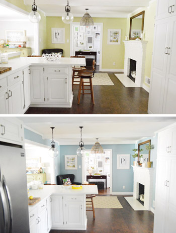
Hey! Love the blog. I’m sure you already answered this somewhere, but what color is the blue in your kitchen? My mom is redoing her kitchen and she’s having the hardest time finding the right blue. She’s painting her wood cabinets white and has hardwood floors and I think this blue will be perfect! PS I love your house!
YoungHouseLove says
Aw thanks Andrea! It’s Colorado Gray by Benjamin Moore.
xo
s
Firesparx says
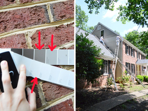
We had a similar near-miss with the exterior of our house. When we built our house we carefully picked the red brick we wanted, even going as far as stalking, err, I mean driving by, houses with the brick colours we were contemplating (our brick guy gave us the addresses). But when the skids of bricks arrived on site, I flipped. It just looked so orange! I wanted a nice red farmhouse brick with no hint of orange. Brick is a really permanent part of your house so you don’t want to screw it up! After calls to the brick supplier it turns out I couldn’t really return the brick without paying a huge stocking fee, not to mention delaying construction until a new brick arrived. We took the plunge and…phew!…brick colour was fine. Turns out that when you are looking at brick on a skid you are seeing the ends, so they tend to look a different colour than the front.
YoungHouseLove says
Woah, that’s so scary! So good to know, and so glad it worked out!
xo
s
Jacklyn J says
I have been out of town so just now catching up on past posts, but this one just reminds me of the dilemma that I have had for some years now. I live in a modern concept home with very few “dividing” walls. While this is great for feeling connected to family and guests it is killing me when it comes to paint colors. What is your advice for the newish style homes that are open but the owners want something more than the builder oatmeal color throughout? Thanks for your help!
YoungHouseLove says
I would do something not too crazy or trendy but not too neutral. Maybe a soft blue-gray? That would be so pretty everywhere but wouldn’t feel like a sea of beige. You also couldn’t ever go wrong with a soft pewter gray in my mind.
xo
s
Susan says
Just wondering (and sorry if I’ve missed it), how are you planning the flow of paint colors in your whole house this third time around?
YoungHouseLove says
Here’s the general (although it’s always changing) plan so far! https://www.younghouselove.com/2013/07/percolating-in-progress/
xo
s
Kylie says
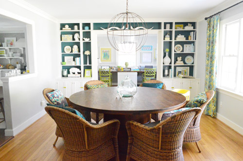
I think this is totally subjective. Muted, grayed-out colors are not my taste at all. I like saturated colors, I like bold walls, and we pull it off because it feels like us. It’s like that old chestnut of your dress not wearing you. I’ve learned over the years that the colors that really look good are the ones that feel good.
YoungHouseLove says
Amen. Just gotta do whatcha love! In our lighting situations we just couldn’t make ’em work, but we’ve seen it done amazingly well (like that photo at the end of this post) with stunning results! I love that you embrace it!
xo
s
Lisa says
Thank you for the great info! Do you happen to have any suggestions on choosing color for heavily textured walls? Our house has the original 1920’s textured plaster. I’ve been holding off on painting because I’ve been afraid all that texture in these small rooms would become the focal point if painted. I rarely see anything similar in magazines or blogs to find ideas. The only tip I really found so far was that colors may look darker on a textured wall than a smooth wall. Our walls look similar to the photos on this page:
http://www.contractortalk.com/f49/heavy-texture-plaster-walls-95320/
Thanks again for the tips!
YoungHouseLove says
Hmm, I’d keep it light and muted because I agree that anything bold or dark would emphasize the texture. Maybe a soft cream like Edgecomb Gray or a super light celery color?
xo
s
Liz F. says
Do you what the name and brand of your final color choices are? Thanks!
YoungHouseLove says
Most of them are Benjamin Moore. Which colors/rooms/photos in particular are you interested in?
xo
s
Sydney says
Whew, this article was like a consolation prize for my heart. I’m an artist an art teacher – painting should be easy when you’ve had years of color theory training, right? Wrong. My husband and I just bought our first house. I’m having a fantastic time painting, but in three rooms I’ve changed my mind regarding FIVE gallons of paint I’d already bought. Great huh? Painting a canvas is different than painting a room, and my art-driven self has gotta get it ‘perfect.’ On the bright side – Habitat for Humanity is going to get some high-quality paint donations, and I can use the rest in my classroom!
YoungHouseLove says
You’re so sweet Sydney! Good luck with everything!
xo
s