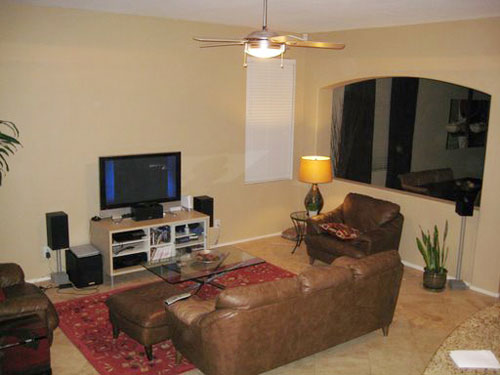
Tiffany totally made our Labor Day by sending us some amazing after photos from her family room re-do inspired by the globe-trotting moodboard we cooked up for her a couple months ago. But before we reveal Tiffany’s major makeover, let’s take a quick walk down memory lane. Behold, the family room before:

Tiffany called on us to help her create a cohesive look that exuded international flavor while maintaining a decidedly modern touch. So we worked with the existing couch, chairs and TV and created this gorgeous global moodboard to take her family room from tired to well traveled:

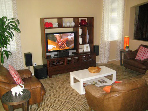
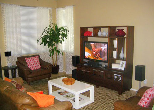
Tiffany followed our design plan to the letter, and expertly executed this incredible new look in her family room. Feast your eyes on the amazing transformation:


Our first clue that Tiffany loved her room was that she apparently even watches TV within her new color palette. But a better clue was her gracious letter:
I can’t decide which piece is my favorite, I just love it all. I thought the white table was a weird idea, but now that it’s here, it does exactly as you promised. The room feels lighter because of it. The rug is amazing and has really pulled the room together. The curtains, I don’t even know what to say there – perfection. The room has so many layers and so much texture now which is just what I wanted. Now, if I want to change things up, I can just switch out pillows or a few accessories with a different pop of color. I dig that. I love just sitting in this room now and can’t wait to have a get together soon. Seriously, I was trying to talk my husband into moving before because I hated this room so much and have redone it four times in the 5+ years we’ve lived here. Silly right, but it’s the room we spend the most time in besides our bedroom. I’ll be needing another mood board soon, I just can’t decide which room to choose next. Thanks so much to you both. My husband thanks you too since I won’t be redoing this room for a long time. -Tiffany
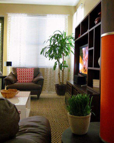
No thank YOU for letting us help you solve your design dilemma and for sharing your wonderful after pics. We’re sure you won’t mind, but we just had to share another angle of your new family room. How great are those curtains with that rug, people? Worldly and wonderful.

And I totally empathize with your husband’s relief that this room can be checked off your to-do list. Just say the word and we’ll get started on room number two!
Oh and Tiffany, let us know when you’re having that get together. We’ll be sure to clear our calendar…
Update: We sadly can no longer find the time to take on client commissioned mood boards (we now whip up general inspiration boards instead) but if we ever reinstate them we’ll make a big announcement!

Amanda says
It really looks great! Love the rug and the curtains. Perfection!
Jess says
I love everything! Did she get the red stools too?
Christy says
I have been waiting for the big reveal! I have been lucky enough to watch the in progress shots as Tiffany & her husband were making the improvments bit by bit. Love all of the splashes of orange & red everywhere.
The end result is awesome!
Tiffany says
Jess, I didn’t get the bar stools yet, but might have a chance this week. I’ve been so busy, but I’ll send a pic when those are done and when we finally order some shades. The off the shelf versions didn’t work out for us so we’ll have to customer order which means waiting. :(
I should mention the orange doesn’t look so electric & bright, but it looks amazing in person. Me + camera flash = not friends.
Anyone think we should put something on top of the TV unit? I go back & forth on that.
Thanks again Sherry & John. The next room is coming your way soon.
Jean says
Putting more “oomph” in the TV display/furniture made a huge difference! Unfortunately there don’t seem to be too many great ways to decorate a TV (and keep it functional) but this idea worked wonders.
Kyle says
Boy was I releived when I read here in the comments that you are getting the shades. I vote for nothing on top the TV unit.
Ally S says
Sherry & John, you should start charging for your services. This is amazing – it’s so good to see the after pictures, especially when the plan has been executed to the letter – it’s almost as if you went it and renovated it yourselves.
Amazing job Tiffany, it looks really great.
Kimberly says
I LOVE when people send in their after pictures! Thanks, Tiffany! Looks great. I vote for nothing actually sitting on top of the tv unit, but maybe a large picture/canvas/print hung on the wall just above the unit or just below the spot that would make it centered between the top of the unit and the ceiling? Or maybe a set of 3 panels that span the area above the unit and between the windows on either side? Congrats on your gorgeous room!
Carrie says
That looks so awesome. I love your design suggestions.
karen says
love the new do, but not feeling the flow. looks like the dining and living areas should be switched. can i suggest a floorplanner input for future do-overs?