Tweakity-tweak-tweak. That’s the sound of a little course correction that went on in our house last night. See, our kitchen underwent a little bracket redux. Yup, after taping things off, photoshopping them, and then (ahh!) drilling right through our wall of tile to install our brackets, we were completely sold on their spacing, which we landed on because:
- Functionally, that’s where the wall studs were
- We thought keeping the same distance between the brackets on each side of the hood would create balance on an unbalanced wall
But then we lived with them for a while and more things kept going into the kitchen (new lighting, a new dishwasher, new art, new floors) and with every change we noticed – first just in photos, and then in real life – that the eight brackets on the left side of the hood were – gasp – looking a little crowded.
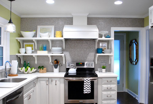
So sad. Especially since a few of you mentioned that you thought six would have looked great on that side after we installed them (but we were too drunk with excitement or adrenaline or whatever it is that gets into your blood when you take a room that looked crazy dark and dated and start updating it). I think it just took some time for our eyes to adjust, so we had to live with things and let the room evolve until it became unbelievably obvious to us. And then we were suddenly right there shaking our heads and saying “oh why did we go with eight brackets on this side when six would have looked soooooo much better?” It’s like when your mom tells you she doesn’t like your tenth grade boyfriend or your best friend confesses those jeans look terrible on you but you’re in denial or just somehow completely blind to it and then later it hits you and you have a what-was-I-thinking moment and ditch the dude/burn the pants.
Thank goodness nearly everything that we’ve done to both our first house and this one can evolve and change as we go (like the living room, for example) or our first house’s paint colors (we painted nearly every room at least twice there, along with painting the trim twice too). Live and learn, right? So the good news is that the whole: “if at first you don’t succeed, try, try again” thing really does have a ton of truth to it when it comes to making your house a home. Just keep your rooms moving and growing and someday they’ll be right where you want them to be! Even if you don’t get it right on the first (or even the fifth) try.
So here’s our kitchen after our little bracket redux. It’s simpler, right? And we actually love how the middle bracket lines up with the line of the counter, so it still has balance since things are aligned so they look intentional. Whew. Note: the middle bracket is in the direct middle of the other two, so if it looks further to the left or right, it’s just the angle of the pic.
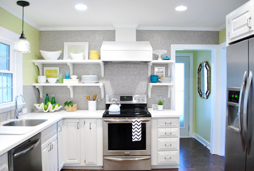
But we drilled through the tile to hang those eight brackets on the left side, so how did we undo that snafu?
Well, first we cleared the shelves (the black stuff is just small pieces of 3M removeable velcro that holds up my Love Life frame).
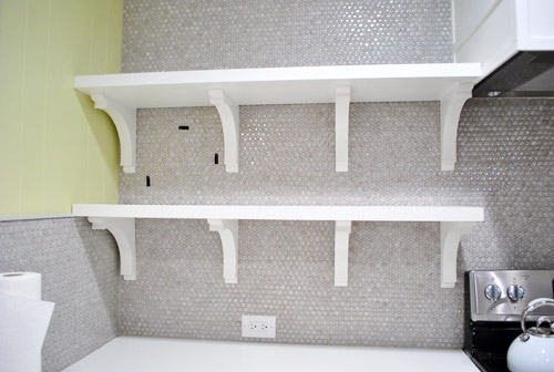
Then we removed the shelves (by unscrewing a few screws that connected them into the brackets) and slipped all the brackets off of the wall screws that they were resting on. You can vaguely see them in this picture below (they look like colons since there are two screws for each bracket).
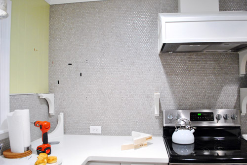
Then we measured and drilled new holes for our middle bracket using a drill bit meant for tile to drive the screw into the wall (these new holes would replace the two middle brackets of yore). Since these screws weren’t going into a stud this time, we used heavy duty anchors in each of the two holes to hold up each of the two brackets (the top bracket and bottom one). Since the outside brackets on each of the shelves go into studs and the heavy duty anchors are really darn strong, each shelf could probably support a few John pull ups. Yup, they’re in there good.
Next we chiseled out the old tiles that had holes drilled into them. I completed this task completely on my own in about five minutes (seriously it was really easy) by using a flat-head screwdriver and a hammer to bang the screwdriver into the grout around each tile that I wanted to remove (sort of creating a chisel).
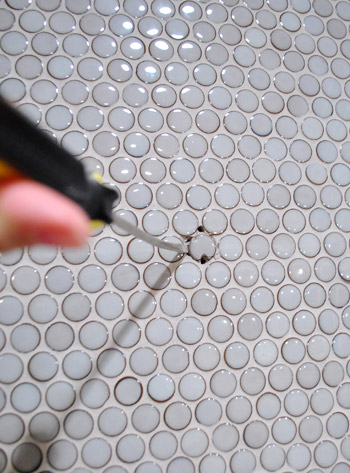
After about four chiselings around each tile, they just popped right out. Oh and see how one of the holes was in the tile (which we removed) but one of them was just in the grout? That happened with each bracket, which was nice because it meant we only had to pop one tile out and just would need fresh grout to fill those second holes.
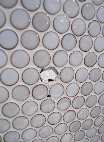
Next I used tile adhesive to stick new tiles right back into those holes:
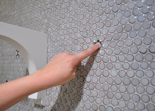
And then all that was left was to mix up a tiny batch of grout to fill those telltale holes around the new tiles.
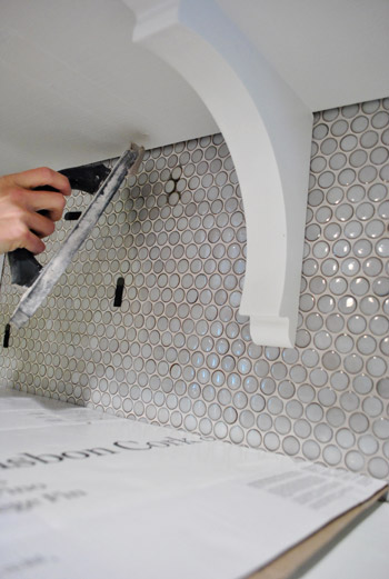
Ta-daaaa! It’s like those extra two brackets were never there!

Well, if you squint you can see that the grout is still drying in these pics, haha. But once it dried it was completely impossible to tell that we replaced a few tiles and moved those brackets. Whew. And as for how much this upgrade cost: zero point zero dollars. Hurrah.
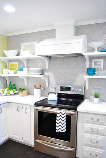
Here are those babies with a little side-angle action going on:
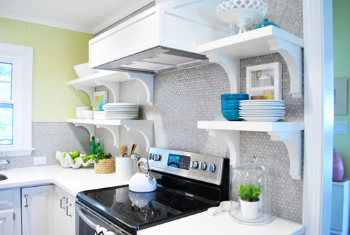
And here they are completely from the side (I love this view, so I always find myself glancing to the right when I walk in the door from the laundry room to gaze).
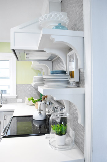
So the lesson is that even if you’re thinking things through, mapping them out on the wall with tape, and relying on photoshop before pulling the trigger – you still might end up tweaking things after you dive in, do something, and live with it for a while. But thankfully there are so many re-DIYable things, that home improvement is hardly ever a one-shot-only endeavor. It’s probably safe to say that every project has at least nine lives, like a cat. And getting started is the only way to get any closer to that elusive finish line, anyway!
What have you guys done and then redone lately? Anything you’ve lived with that has slowly started nagging at you and jumped back onto your to-do list? Have you ever chiseled tiles out? It’s totally my new favorite thing to do. Sometimes it’s just satisfying to bang on something with a hammer and watch the dust fly.

Laura says
It looks much less crowded – good decision! We plan to move our daughter into another bedroom soon, but when we moved in last year I just wanted to paint that room once to get it done. Now with curtains and bedding I think the color is all wrong. So much for just doing it once!
Lulu says
SO much better!!! Kudos to you for having the guts to undo what you did and drill through the precious tile.
LauraC says
You guys are awesome in that you admit you changed your minds. I agree it looks much better with 6 rather than 8. Happy Thursday!
emily says
SUCH an improvement! I must say, I was not a fan of the brackets and thought all along that you should have stuck with floating shelves… and while I still think that’s what I would do personally, they look great in your kitchen. It’s like the wall can breathe now :] SOLD!
NellyKelly says
Wow, it really looks great! I love that once you realized you wanted a change you dove right in and did it. My usual is just to let it drive me crazy for the next decade! I feel like I hesitate so much to put a hole in any wall, and here you are changing thins around on tile… That’s it, no more excuses for me!
Diana @ Boy + Girl says
I never thought that four looked crowded. But three is much more spacious. It lets the items on your shelving pop a little more.
keri says
i’m totally in the 6 bracket camp, vs. 8. When you first hung them I thought…hmmm…looks very heavy…but it’s your house, not mine so I bit my tongue! Looks fabulous now.
Lindsay @ Me, Ed and Pea says
Great tweak :) Looks so much lighter on the left.
Brooke Buckingham says
I need to replace a tile on our fireplace hearth and you’ve just inspired me to tackle that project! I was afraid it would be a pain in the you-know-what, but after reading your post, it looks doable! By the way, I didn’t notice that 8 brackets looked a little crowded until you removed two. 6 does look so much better. Good work! :)
cara says
looks much better with just the 6. Great job. The kitchen looks so good!
Ever says
Did you ever consider painting the front panel of the hood cover with some black board paint, so that you can write on it? I think that would look great, and kind of tie in with the black on the stove.
YoungHouseLove says
Always another possibility down the line!
xo,
s
elaine says
Much lighter! Looks great! And fun to see how easy that tile was to fix. Another selling point for the super chic penny tile. Tile: 1 – 4th bracket: 0! Great job guys.
Laura M. says
wow– it seriously make a HUGE difference! I didn’t think they looked TOO crowded before, but now seeing the after I totally agree. You guys are so brave to “undo” your old work and re-do it. I would’ve just lived with it. Either I’m not brave enough or I’m totally lazy– not sure which is more true! :)
Sabrina says
Oohlala, I see side-bracket!
This change does make a big difference, looks great.
I’vw been slowly forcing changes on my boyfriend’s place that he lived in for a decade before I got there, so pretty much everything’s being redone from his point of view. He’s not thrilled about doing paint touch ups, but it’s been good so far.
Georgia says
Isn’t amazing how something so small can make SUCH a difference! You were brave with those tiles. Our house has chicken tiles (or maybe roster) as the back splash to the stove which I HATE, but I’ve been too scared to get in there and try and get them out. Once again, you have, like explorers of old, paved the way. Someone hand me a hammer and a screwdriver, STAT!
Kristin ~ Bien Living Design says
Yep, that really makes a huge different & looks so much better! Design is always a work in progress :) That’s what makes it so much fun. Right??
Jaren says
I love the entire look! I am working with a client right now and she chose some amazing tiles from ann sacks. we are doing similiar open shelves…thanks for posting-we will do less brackets because of you!! cheers!
btw, what did you use for counters? is it cambria? she chose white cliff and it looks very similiar to yours. LOVE the entire look!
YoungHouseLove says
It’s actually Glacier White Corian! So cheap through Home Depot ($33 a square foot I think!).
xo,
s
Angela R. says
I love it so much better! I never commented but I always felt it was too heavy with 4 on the one side- I really LOVE it now!! Lookin’ awesome in the kitchen- I’m really digging it!! I’m glad you had the guts to admit it- and publicly at that!
I decided this AM that the red wall that was ALL I ever wanted when I bought a house HAS to go- I can’t even stand it anymore! I haven’t told anybody else, because I made such a stupidly big deal about it… I commend you for your honesty- it’s refreshing!
YoungHouseLove says
Aw thanks Angela! We rarely get things right on the first try around here! Haha.
xo,
s
Ellen says
It looks great!
Now do you have some awesome project for the extra brackets?
YoungHouseLove says
We’re wondering if they’ll look cool under the peninsula or just get in the way. Will keep you posted!
xo,
s
Jeannie says
That is so much better. I was wondering what was…off about it. But that looks perfect.
Shunta says
First, oh!! that small change makes a breathable difference! Looks so good in there!! Second, J or S, I did a search looking for the entry you all did about your decision to do baby led weaning (I’m almost 100% sure I’m not making this entry up in my head) but I just came up with comments and not an actual post. Did you do an entry where you explained the “why” and “what” of baby led weaning? Thanks so much! :-)
YoungHouseLove says
Oh yes, it was over on BabyCenter, so just follow that blue voice bubble button on our sidebar and scroll back for that! Hope it helps!
xo,
s
Shunta says
Ah, it was on baby center! that’ll explain it! Thanks!!
Sarah says
You’re both so talented and HARD WORKING! I, too, thought it didn’t look just right before but just couldn’t “put my finger” on what was wrong. Looks so much better!
Amanda says
I loved the shelves before, and I love them even more now! I am seriously impressed with your creative and brave problem-solving — meaning chiseling into the tiles. Thanks for continuing to share your process with us!
Susan says
when I started reading I thought “why the fuss?” When I saw the After photo I was totally on board. Great decision, it really does make a difference!
Amanda R says
I loved it before, but this is so much easier on the eyes! It looks like you decluttered that whole corner, even though you only changed the brackets. Glad to see the tile switch out was so simple. Must have been a little heart-wrenching to drill into that tile yet again, though!
Kristen says
Love the six brackets!! The space looks so nice now!
Libby says
okay first of all, it looks sooooooo much better with less brackets! it didn’t bother me before but now that i can compare the two photos i agree that its so much better. kudos to you guys for not trying to convince yourselves that 8 brackets worked just to avoid having to deal with the tiles with holes in them. to be perfectly honest i might not have been so brave. and it turned out great!
and yes, i have most certainly had to tweak house projects! pretty much all of them, in fact. each time i go through the same process: 1) i put a lot of work/$$ into something; 2) because of that hard work/expense, i convince myself that its amazing; 3) i start to realize its not amazing but spend the next several days/weeks/months convincing myself that i love it; 4) i finally do fix it and am super glad that i did. the most recent instance was a way too big and super ugly tufted headboard i ordered from target.com…i convinced myself it was okay for a few days b/c i didn’t want to lose $50 to ship it back but finally accepted the truth and off it went. now i have a bed that i absolutely love, and no convincing myself is involved!! :)
YoungHouseLove says
Such a great lesson!
xo,
s
Ashley says
It never occurred to me that it was looking crowded, but the comparison now that there are 3 vs. 4: WOW! Good call. Looks amazing!!
jesse says
Like almost all the other commenters, this looks way better. I didn’t like it before and thought it was way to heavy and busy on the eye. Now, it is perfect. In my kitchen I would have gone with invisible mounts, but for y’all this works great! So glad you changed it!!!
Lindsey Rockers says
Wow… It looks so much better! I always thought it looked a little crowded on that side but I couldn’t figure out what it was. I think i just figured it was the styling… but it was definitely the brackets. So awesome because I couldn’t figure out what was bugging me before and now that i see that side with only 6…. it looks fantastic! Should have known it wasn’t the styling… Sherry always rocks that!
Heather says
So much better! Good job guys!
Eric Estate says
I still think FLOATING shelves would look awesome.
YoungHouseLove says
Oh yes, that’s a debate for the ages. Floating vs. brackets. We just love the added interest the brackets offer, but floating is another way to go for sure!
xo,
s
Lisa L says
So you used removable velcro to secure pictures on to the wall? That’s really neat, I wouldn’t think the velcro would be strong enough.
YoungHouseLove says
Oh yes, that 3M stuff is heavy duty. Love it!
xo,
s
Courtney says
Live and learn right? The new spacing looks great and I imagine it feels more open on the counter directly below the shelves as well. I guess the “rule of 3” really does apply to most things. :)
The most recent change we’ve made was painting out master bedroom a deep blue. I LOVE the colour but, because we are crappy painters, I’m not loving the finish. As paint pros, do you have any fix-it tips? Maybe a third coat would help?
http://courtneywalker.blogspot.com/2012/02/after-narrowing-down-our-paint-choices.html
YoungHouseLove says
I would try sanding down anything that looks lumpy or bumpy and then maybe another coat (applied thinly and evenly) would make things look better? Good luck!
xo,
s
Karen F says
Looks great (add me to the chorus of people who thought it maybe looked too crowded before) – removing those brackets was a vast improvement. And I’m SO impressed with your tile patch job! Good on you for deciding something needed to be changed, and then following through! Once again, you guys rock!
By the way, I think I repinned about 30 reader projects from the pinterest challenge yesterday – I’m so inspired! Maybe I’ll actually participate next time :)
Jenna says
It looks great now!
These pictures you’ve posted all have the most gorgeous blue color (in the first pic, the color outside your door, and in the second, the color outside your over-the-sink window). Have you guys ever considered repainting your kitchen? Because looking at your first two pics, I think a version of that blue would look soooooo amazing in there! That color just look so amazing w/the rest of your kitchen, I feel like it washes out the grellow by comparison!
YoungHouseLove says
In person the grellow is so much fun – but admittedly it’s hard to read in pics. We think blue with all the gray tile would be too cool, so we love the warmer golden undertones. For now it’ll stay, but who knows what color those walls will be down the line!
xo,
s
Elizabeth says
Amazing difference!!!
nicole chiles says
The Freakanomics authors do a pod cast…and they had one about sunk cost vs opportunity cost. They say most people miss opportunities because they are too attatched to the idea that they are already too invested to change direction. Bravo for recognizing that it wasn’t too late to change and worth the extra effort to tweak!!!!!
YoungHouseLove says
So interesting! We’ll have to check it out!
xo,
s
Erika @ thelindenlife says
I don’t think I would have noticed the heaviness, however now that I can look at the ‘before’ and ‘after’ I totally see it! Good thing I am not an interior designer… my eye would fail me every time. The whole kitchen looks fantastic – congrats!!
Chloe says
I had thought there was something a little off about that side of the room and now everything looks great!
Misty says
Oh,That looks sooooo much better! I thought it looked a little busy/crowded but I couldn’t put my exact finger on what it was that made it look that way. Either way I still love the new kitchen.
Melissa says
Wow!!! You are right- it looks a lot less cluttered! To be honest, I wasn’t a fan of the brackets before and now, I am loving them. And since this is my first comment in a long time, I want to add that I LOVE LOVE LOVE your kitchen! It is beautiful! Well done y’all :)
Courtney says
I can only imagine how that “uh oh” realization moment felt…a little scary I’m sure! I love the 6 bracket look though, and thanks for the tip on how to patch tile. :)
Nan says
We have moved our kitchen cabinets around THREE times and changed the counter tops TWICE in the last six months. No, you have not read that incorrectly… My guy says this is the last time. He is wonderful!
Eliza says
Yes! That was driving me nuts before and was the only thing keeping me from being completely in love with your kitchen. Looks amazing now – great job.
LIZ says
I love the updated. I have to admit that I thought it looked crowded when I first saw it… but it still looked beautiful… and I didn’t want to comment negatively. But… I’m sooo glad you did this. It makes a huge difference… and really looks better balanced to me! Great job with all the little details!
Joy says
Wow! What a difference! It look so much more elegant. Glad you didn’t have to move heaven and earth to switch it up :)
Tracy says
This is why you guys rock. Not afraid to make mistakes, and definitely not afraid to fix them. Makes it a lot easier to pull the trigger on certain projects when you just tell yourself you will fix it if you don’t like it. The shelves look great.
Lisa says
Looks great! This kind of thing is my favorite part about your blog, you are real and change your mind and write about it and we all learn from it. Thanks. :)
Traci says
Oh wow, what a huge difference that made. Good call!